10,000 search results
(0.075 seconds)
- SF Hallucination Shadow - Unknown license

- SF Retroesque Outline - Unknown license

- SF Planetary Orbiter - Unknown license

- SF Espresso Shack - Unknown license

- SF Cosmic Age - Unknown license

- SF Willamette Extended - Unknown license

- SF Port McKenzie - Unknown license

- SF Groove Machine - Unknown license

- SF Synthonic Pop - Unknown license

- SF Baroquesque Extended - Unknown license

- SF Laundromatic Extended - Unknown license

- SF Zero Gravity - Unknown license

- SF Baroquesque Condensed - Unknown license

- SF Speedwaystar Condensed - Unknown license

- Losta Parka by Creativemedialab,
$20.00 Parka is a unique and fashionable stencil font with tons of alternatives and ligatures. Softly curved alternates match the solid and masculine looks for the balance of shape. Perfect for any titles, branding, logo, and many more.
 - Nord by Letterwerk,
$25.00 Nord is a capital letter font made for display use. The 4 styles can either stand alone or be used for effects by adding different colors to each stackable style. Check the PDF-FILE for more informations.
 - Anboug by ahweproject,
$14.00 Anboug is a gorgeous and bold handwritten font, crafted to give your headlines and logotype projects a retro touch. This font reads as strong, confident, and dynamic and can add tons of nostalgic character to your designs.
 - Peter Sellers by Type-Ø-Tones,
$40.00 Peter Sellers is a revival display font. We wanted to pay homage to the fifties graphic design with this stylish typeface. Use the “Base” style alone or overlap it with “Volume” and change it to another colour.
 - Schindler by Red Rooster Collection,
$45.00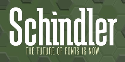 An original design.
 - Sinclair Script by Red Rooster Collection,
$45.00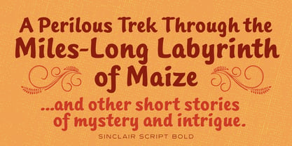 An original design.
 - Grove Script by Red Rooster Collection,
$45.00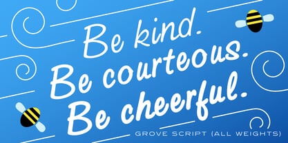 An original design.
 - Pipeline by Red Rooster Collection,
$45.00An original design. - Javelin by Red Rooster Collection,
$45.00An original design. - Iron Maiden by Red Rooster Collection,
$45.00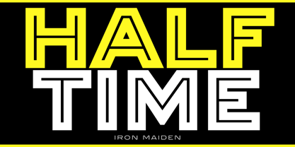 An original design.
 - MagicMedieval - Unknown license

- Thermometer by Woodcutter,
$55.00 Font Thermometer, with a shattered style, imitating the effect of an earthquake in your designs, ideal for posters, covers of your work, with an aspect of destruction and movement.
 - Afrika Motifs by CastleType,
$49.00 A collection of over 50 border patterns based on geometric motifs from various African tribes, including the Ashanti, Bushongo, and Zulu. Use for accents on stationery, greeting cards, etc.
 - Sumi Strokes by James J. Connell,
$9.00Sumi Strokes was created as a set of simple abstract brush stokes that could be used on their own or in conjunction with one another to form a painting. - Agoxes Game by Sealoung,
$10.00 Agoxes Game is an awesome display font. It features an authentic style that makes it perfect for games, posters, movies, magazines and any design that requires a great look!
 - KG By The Grace Of God by Kimberly Geswein,
$5.00 Inspired by the decayed lettering on the signs at Siesta Key beach painted on weather-worn old wood in Florida, these letters are made to look like peeling paint.
 - Newshawk JNL by Jeff Levine,
$29.00Jeff Levine's Newshawk JNL emulates the tall, condensed headline fonts often used years ago when an urgent story broke and a newspaper rushed an "Extra" edition to the streets. - Rackham by Scriptorium,
$18.00Rackham Italic is based on the hand lettered titles of Arthur Rackham from the book English Fairytales. The Rackham font is based on his more familiar title lettering style. - Blackhaus by Canada Type,
$25.00Almost a half of a millennium after being mistaken for the original 4th century Gothic alphabet and falsely labeled "barbaric" by the European Renaissance, the blackletter alphabet was still flourishing exclusively in early 20th century Germany, not only as an ode to Gutenberg and the country's rich printing history, but also as a continuous evolution, taking on new shapes and textures influenced by almost every other form of alphabet available. Blackletter would continue to go strong in Germany until just before the second World War, when it died a political death at the height of its hybridization. For almost 50 years after the war, blackletter was very rarely used in a prominent manner, but it continued to be seen sparely in a variety of settings, almost as a subliminal reminder of western civilization's first printed letters; on certificates and official documents of all kinds, religious publications, holiday cards and posters, to name a few. In the early 21st century, blackletter type has been appearing sporadically on visible media, but as of late 2005, it is not known how long the renewed interest will last, or even whether or not it will catch on at all. The last few years before World War II were arguably the most fascinating and creative in modern blackletter design. During those years, and as demonstrated with the grid-based Leather font, the geometric sans serif was influencing the blackletter forms, taking them away from their previous Jugendstil (Art Nouveau) hybridizations. Blackhaus is a digitization and elaborate expansion of a typeface called Kursachsen Auszeichnung, designed in 1937 by Peterpaul Weiss for the Schriftguss foundry in Dresden. This is one of very few designs from that time attempting to infuse more Bauhaus than Jugendstil into the Blackletter forms. This is why we used a concatenation of the words blackletter and Bauhaus to name this face. The result of injecting Bauhaus elements into blackletter turned out to be a typeface that is very legible and usable in modern settings, while at the same time harking back to the historical forms of early printing. The original 1937 design was just one typeface of basic letters and numbers. After digitizing and expanding it, we developed a lighter version, then added a few alternates to both weights. The Rough style came as a mechanically-grunged afterthought, due to current user demand for such treatment. Having the flexibility of 2 weights and many alternates of a blackletter typeface is not a very common find in digital fonts. More specifically, having the flexibility of 2 weights and alternates of a 20th century blackletter typeface is almost unheard of in digital fonts. So the Blackhaus family can be quite useful and versatile in an imaginative designer's hands. - Patched by Mans Greback,
$39.00 Patches is a multi-faceted, victorian-era serif typeface for when you need something more than plain text. Get that extra attention while adding a genuine, original appearance to your message. Patches was designed from scratch to give a sense quality and depth. Its designer Mans Greback has created a typeface with a complex structure, yet one that will be easy to master. This work will suit every style, taste and skill level. It is a decorative and completely hand-drawn design in vintage lettering, with the perks and flexibility of present-day technology, which is exactly what you'd expect from a modern typeface. Whether you are making a decorative floral headline, drawing a cowboy logo, or creating a unique design based on this ornamental font, the hopes are that Patches can give you a set of tools and inspiration to bring out the best of your artistry. Standing on the shoulders of giants, it was inspired by a wide range of works, and will hopefully be able to continue to teach and inspire future artists. Or at least help you become a better designer when you're designing an elegant and classic headline. Set the coloring of Patches to light gold and cream tones to apply a luxurious look, or in dark tones for a more rugged impression. Bold, bright colors will make it appear In the mid-1800s, decorative design flourished in the Western major cities. Victorian style thrived and encouraged techniques such as enamelling, embroidery and calligraphy. From the 1880s onwards, there were a series of reactions to higher Victorian tastes, with Art Deco reaching the heights of the 20th century. However, the Victorian art persisted popularity, as it changed to more sophisticated designs which made it more attractive to specific professions and groups. The evolution of the Victorian style in the mid-20th century was a key factor in the succession of the movement. Classic shops and salons, sport designs and traditional festivals, and later Rock'n'Roll and Harley Davidson-themed graphics inspired the continued development of the art. Aspiring to carry on this tradition, this typeface family consists twelve different high-quality variations. The main ones are Patched and Patched In – an outlined variation – and each one provided in five weights: Thin, Light, Medium, Bold and Black. Additionally, the two rough fonts Hangaround and Prospects, that tries to grasp the rough, earthy atmosphere of a shady motorcycle club. The font is built with advanced OpenType functionality and has a guaranteed top-notch quality, containing stylistic and contextual alternates, ligatures and more features; all to give you full control and customizability. It has extensive lingual support, covering all Latin-based languages, from North Europa to South Africa, from America to South-East Asia. It contains all characters and symbols you'll ever need, including all punctuation and numbers.
 - Eskapade by TypeTogether,
$53.50 The Eskapade font family is the result of Alisa Nowak’s research into Roman and German blackletter forms, mainly Fraktur letters. The idea was to adapt these broken forms into a contemporary family instead of creating a faithful revival of a historical typeface. On one hand, the ten normal Eskapade styles are conceived for continuous text in books and magazines with good legibility in smaller sizes. On the other hand, the six angled Eskapade Fraktur styles capture the reader’s attention in headlines with its mixture of round and straight forms as seen in ‘e’, ‘g’, and ‘o’. Eskapade works exceptionally well for branding, logotypes, and visual identities, for editorials like magazines, fanzines, or posters, and for packaging. Eskapade roman adopts a humanist structure, but is more condensed than other oldstyle serifs. The reason behind this stems from the goal of closely resembling the Fraktur style to create harmony in mixed text settings. Legibility is enhanced by its low contrast between thick and thin strokes and its tall x-height. Eskapade offers an airy and light typographic colour with its smooth design. Eskapade italic is based on the Cancellaresca script and shows some particularities in its condensed and round forms. This structure also provided the base for Eskapade Fraktur italic. Eskapade Fraktur is more contrasted and slightly bolder than the usual darkness of a regular weight. The innovative Eskapade Fraktur italic, equally based on the Cancellaresca script previously mentioned, is secondarily influenced by the Sütterlin forms — an unique script practiced in Germany in the vanishingly short period between 1915 and 1941. The new ornaments are also hybrid Sütterlin forms to fit with the smooth roman styles. Although there are many Fraktur-style typefaces available today, they usually lack italics, and their italics are usually slanted uprights rather than proper italics. This motivated extensive experimentation with the italic Fraktur shapes and resulted in Eskapade Fraktur’s unusual and interesting solutions. In addition to standard capitals, it offers a second set of more decorative capitals with double-stroke lines to intensify creative application and encourage experimental use. The Thin and Black Fraktur styles are meant for display sizes (headlines, posters, branding, and signage). A typeface with this much tension needs to keep a good harmony between strokes and counters, so Eskapade Black has amplified inktraps and a more dynamic structure seen in the contrast between straight and round forms. These qualities make the family bolder and more enticing, especially with the included uppercase alternates. The Fraktur’s black weights are strident, refusing to let the white of the paper win the tug-of-war. It also won’t give away its secrets: Is it modern or historic, edgy or amicable, beguiling ornamentation or brutish presentation? That all depends on how the radically expanded Eskapade family is used, but its 16 fonts certainly aren’t tame.
 - MVB Magnesium by MVB,
$39.00Mark van Bronkhorst's MVB Magnesium is based on his impressions of a style of lettering often seen on early 20th century hand-painted signage. With its thick-thin strokes and angled terminals, MVB Magnesium is a warmer, less common alternative whenever one might use a sans serif in all-caps. It is available in two widths. - Moon Child by Angele Kamp,
$28.00 Introducing Moon Child, an elegant collection of two fonts that pair perfectly together. This collection will make designing Instagram quotes, websites & invitations effortless. What's Included Moon Child Script An elegant script font that includes ligatures that give you that gorgeous hand-lettered look. Moon Child Caps This is an all caps font that pairs perfectly with the script font
 - Rozza by Serebryakov,
$49.00 Rozza is a single weight stencil cursive fat face font for extremal display use. Looking at this font the story of beauty and the beast comes to mind. That is how I would describe it. On the one hand prickly and dangerous, and on the other - pulsating beauty and passion. Try to combine Rozza together with Displace — great pair!
 - Pontif LP by LetterPerfect,
$39.00 Pontif is a typeface based on the inscriptional lettering work of Luca Horfei, the Vatican scribe who designed the major inscriptions for Pope Sixtus V's Baroque-makeover of Rome in the sixteenth century. Garrett Boge modeled the design on a Horfei manuscript and on-site research in Rome in 1996. Pontif is part of the LetterPerfect Baroque Set.
 - Benderville by Patricia Lillie,
$39.00Benderville comes with a solid construction, an ample x-height, an angular edge, and an attitude to match. A sort of rangy slab-serif with a voice all its own -- a voice that seems to holler "Hey! What you lookin' at?" Its sturdy single weight has a complete character set, including ligatures, diacriticals, and other symbols.


