10,000 search results
(0.031 seconds)
- Babetta by Viktor Nübel Type Design,
$- Babetta is a display typeface that comes with some decorative typographical features. Alongside a set of arrows and flower icons, it also includes an alternative ›E‹, some special diacritic marks, a wavy ›S‹ and a series of ligatures. It features 5 weights, a special ›Neon‹ version and supports a wide range of Latin languages. This typographical tool box provides a large and playful variety of options for headlines and logotypes. Babetta supports Latin and Cyrillic languages. The initial inspiration for Babetta was an illuminated vintage shop sign—that of a famous bookstore in Berlin called Karl-Marx-Buchhandlung that dates back to the days of East Germany. During the course of the design process, this slightly shabby historical original was kissed by an Italian Art Deco beauty and has blossomed into a new typeface with its own special charm. The aim was not to preserve the original lettering, but to use it as a starting point for typographical exploration.
 - Pitkin JNL by Jeff Levine,
$29.00Borrowing from the 1940s, and inspired by printed text found in an old catalog, the slightly imperfect letterforms of Pitkin JNL emulate the hand-lettered look of signs and show cards. - Modernique by Monotype,
$29.99The Modernique font has an Art Deco flair. Contrast between thick and thin strokes is extreme, making this font only suitable for display. The Lowercase f, i and j are unusual. - Poster 1492 by LightHouse,
$49.00A bold typeface with very very extensive cap height, and short descenders. Poster 1492 is suitable for headlines, titles, newspapers, magazines, and advertisements. Poster 1492 is an OpenType/TTF Unicode font. - Stanford by profonts,
$41.99 The strong, geometric letterforms of this typeface incorporate a heavy outline and were inspired by college and university sportswear, making Stanford an excellent choice for work associated with sports in general.
 - Secret Diary by Hanoded,
$15.00 Secret Diary is a nice bit of uncomplicated handwriting: it is rounded, feminine, legible and above all - natural in appearance. Secret Diary comes with some ligatures and an overdose of diacritics.
 - Daresiel by Scriptorium,
$18.00Daresiel is an elegant script font based on a sample of Edwardian period hand lettering. It has elaborate curls and embellishments and some other interesting features like the elongated 'f' character. - Diamond Pride by Illushvara,
$15.00 Diamond Pride is a sweet and beautiful script font. It features an elegant style that makes it perfect for logos, branding, invitations, stationery, wedding designs, social media posts, and much more.
 - Heretic by Device,
$39.00 Heretic surrounds itself with an atmosphere of evil, carnival freakshow and no-nonsense thuggery. Mix the black and condensed weights of this octagonal blackletter together for more interesting, yet disconcerting results.
 - Nagarawa by Beewest Studio,
$50.00 Nagarawa is an Asian style font, very suitable for various logotypes for Asian nuanced products, such as Asian food, martial arts clubs, music, novel and comic titles, apharel clothing and others.
 - Sheppaloe by Khurasan,
$8.00 Sheppaloe is a fresh handwritten font with an elegant and vintage feeling. Sheppaloe includes a full set capital and lowercase letters, as well as multi-lingual support, currency figures, numerals, & punctuation.
 - Gold Empire by Rockboys Studio,
$23.00 Gold Empire is an incredibly unique and distinct blackletter font. It will add a unique touch to your designs. Use it for tattoo designs, logos, posters, book covers, albums and more!
 - Trolltunga by High Peak,
$25.00 A unique slab serif with strong shapes give it an unmistakable character and charm. Every letter has been designed with passion and the family comes with lots of opentype features. Enjoy!
 - Candykitchen by Vanderfont,
$19.00 Casual and sugary, Candykitchen is an inline face with a weight problem. Frosted with occasional swashy finishing strokes and a few errant bulbous terminals, this face wants space in your cupboard.
 - Tectónica by Untype,
$29.00 Tectónica is an elegant and stable heavy-duty didonish typeface in three different flavors: the strong and sober Poster Style, the fancy and classic Engraved Style and the playful and sexy Swash Style, each of one includes a distinctive set of alternates, ligatures, numbers and plenty of other resources and OpenType features for your text delight. With heavy contrast and solid presence yet full of delicate details and variations, Tectónica was especially designed for being used in headings, logotypes, large text settings and display use in general where a well-founded and firm yet graceful and refined statement is needed.
 - Overspray - Personal use only

- Waverly CF by Connary Fagen,
$25.00 Waverly CF combines the tone and flow of art deco with updated, clean letterforms and a modernized construction. Variation in letter width creates a pleasant rhythm perfect for artwork and logos. Waverly CF offers wide language support across Latin and Cyrillic glyphs, and includes a host of swashes and alternate letterforms. Waverly CF is an expressive display typeface and pairs well with simple, elegant serifs like Artifex CF and Artifex Hand CF. All typefaces from Connary Fagen include free updates, including new features, and free technical support.
 - Serenity by Device,
$39.00 A versatile and elegant sans serif with a hint of Futura and a dash of Gill, but entirely its own design. Clear and legible in small sizes, refined and authoritative in larger sizes, Serenity is perfect for corporations, institutions, museums, galleries, editorial and publishing. Seven weights from a fine Thin to an impactful Heavy, plus italics, present a full range for all text and headline needs. Comes with full international character support, tabular and old-style numerals and alternate versions for the R, K, a and g.
 - Fishbones by Funk King,
$5.00 Fishbones is a font set consisting of fish-bone font-bats. Nothing fishy here – an extensive set of characters makes this an unusual and versatile font.
 - Remora Sans by G-Type,
$39.00 Remora is an extensive new humanist sans serif which comes in 2 style variations, the effervescent Remora Sans and its corporate business partner Remora Corp . Both styles include 5 individual width sets ranging from the condensed W1 to the extra-wide W5. Furthermore, with an impressive 7 weights (Thin to Ultra) and true matching italics in each pack Remora is an ultra versatile super family comprising 140 individual fonts, perfect for any typographic assignment or design brief. Remora was designed by G-Type founder Nick Cooke. Both the Sans and Corp families share the same proportions, with the exception of certain key characters that change the overall appearance. Remora Sans is an exuberant and characterful typeface while Remora Corp, as its name suggests, is a businesslike typeface more suited to corporate typography. Quite early on in the design process Nick decided to give Remora Corp equal billing instead of incorporating these glyphs as alternates or a stylistic set that may get overlooked. “I created two separate families after learning a valuable lesson with one of my earlier typefaces, Houschka”, says Nick. “Houschka contained distinctive rounded A’s W’s and w’s, with ‘straight’ styles as character alternates. Even though style sets and alternates are easy to activate they are rarely used, so after many requests for customised versions of the fonts with the straight characters as defaults it was decided to create the separate ‘Alt’ family. So I cut straight to the chase with the two Remora variants and created two complementary families.” Both sets contain many shared letterforms, but it is the alternate characters that significantly alter the appearance of each font. Remora has been carefully designed for optimum legibility at large and very small sizes. Although fairly monolinear in appearance, especially in the lighter weights, particular attention has been paid to optical correction like the overshoots of the curved characters. Open counters and painstaking attention to detail (e.g. weight contrast between horizontal and vertical strokes, junctions of shoulders and stems etc) all boost readability and make Remora a great choice across all media. Remora Sans and Corp are ‘humanist’ rather than ‘geometric’ in style, meaning they’re not strictly based on rectangles and circles, resulting in a warm and friendlier feel. The slightly ’super-elliptical’ rounded forms create generously attractive curves. Remora has very distinctive italics in that they are only inclined by 8 degrees, but are not just based on slanted uprights. The italic styles are very alluring when used for display at large sizes and the good news is they come bundled free with their respective uprights. Each family also contains many OpenType features including proportional and tabular numbers, small caps, discretionary ligatures, plus five stylistic sets for ultra versatile typography.
 - Remora Corp by G-Type,
$39.00 Remora is an extensive new humanist sans serif which comes in 2 style variations, the effervescent Remora Sans and its corporate business partner Remora Corp. Both styles include 5 individual width sets ranging from the condensed W1 to the extra-wide W5. Furthermore, with an impressive 7 weights (Thin to Ultra) and true matching italics in each pack Remora is an ultra versatile super family comprising 140 individual fonts, perfect for any typographic assignment or design brief. Remora was designed by G-Type founder Nick Cooke. Both the Sans and Corp families share the same proportions, with the exception of certain key characters that change the overall appearance. Remora Sans is an exuberant and characterful typeface while Remora Corp, as its name suggests, is a businesslike typeface more suited to corporate typography. Quite early on in the design process Nick decided to give Remora Corp equal billing instead of incorporating these glyphs as alternates or a stylistic set that may get overlooked. “I created two separate families after learning a valuable lesson with one of my earlier typefaces, Houschka”, says Nick. “Houschka contained distinctive rounded A’s W’s and w’s, with ‘straight’ styles as character alternates. Even though style sets and alternates are easy to activate they are rarely used, so after many requests for customised versions of the fonts with the straight characters as defaults it was decided to create the separate ‘Alt’ family. So I cut straight to the chase with the two Remora variants and created two complementary families.” Both sets contain many shared letterforms, but it is the alternate characters that significantly alter the appearance of each font. Remora has been carefully designed for optimum legibility at large and very small sizes. Although fairly monolinear in appearance, especially in the lighter weights, particular attention has been paid to optical correction like the overshoots of the curved characters. Open counters and painstaking attention to detail (e.g. weight contrast between horizontal and vertical strokes, junctions of shoulders and stems etc) all boost readability and make Remora a great choice across all media. Remora Sans and Corp are ‘humanist’ rather than ‘geometric’ in style, meaning they’re not strictly based on rectangles and circles, resulting in a warm and friendlier feel. The slightly ’super-elliptical’ rounded forms create generously attractive curves. Remora has very distinctive italics in that they are only inclined by 8 degrees, but are not just based on slanted uprights. The italic styles are very alluring when used for display at large sizes and the good news is they come bundled free with their respective uprights. Each family also contains many OpenType features including proportional and tabular numbers, small caps, discretionary ligatures, plus five stylistic sets for ultra versatile typography.
 - Quaint Gothic SG by Spiece Graphics,
$39.00 Distinctively Art Nouveau with a touch of Arts & Crafts, Quaint Gothic is a typographic gem from the late nineteenth century. Also known as Desdemona, this undulating and organic typeface is a versatile and refreshing alternative to many of the font designs on the market today. Quaint Gothic comes complete with an alternate set of caps and a new set of lowercase characters. And for your convenience, a nifty set of small caps and small figures are included in this version. You may also want to access the word-on-a-wave logotypes like “to” and “and” located in the special character slots. They’re great for constructing provocative headlines and titles. Quaint Gothic is also available as an OpenType font. It contains lining and oldstyle figures, prebuilt fractions, stylistic alternates, a wide variety of discretionary ligatures and word ornaments. These advanced features currently work in Adobe Creative Suite InDesign and Illustrator. Check for OpenType advanced feature support in other applications as it gradually becomes available with upgrades.
 - Komet Pro by Jan Fromm,
$65.00 Komet is a sturdy typeface with a calm and upright feel. Although it derives inspiration from classical English sans-serifs, it’s not too closely related to that model. Komet, instead, feels rather more lively and contemporary. Its compact spacing, low stroke contrast and heavy dots and accents give it an almost monolinear quality. The diagonals are slightly curved and the counters of the round letters such as b, o and q are generously wide. The muted, understated middle weights are built for extended body copy, while Komet’s thin and dark weights look brisk and assertive and make for subtly expressive headlines. Komet is an ideal choice for editorial design, branding and corporate design. The Komet Pro family comes in eight weights with matching italics, from Thin to Black. Each font contains around 850 glyphs, including a rich repertoire of OpenType features. Small caps, ligatures, ten different figure sets with matching currency symbols, stylistic alternates and arrows make Komet Pro a comprehensive toolkit for ambitious typography.
 - Komet by Jan Fromm,
$45.00 Komet is a sturdy typeface with a calm and upright feel. Although it derives inspiration from classical English sans-serifs, it’s not too closely related to that model. Komet, instead, feels rather more lively and contemporary. Its compact spacing, low stroke contrast and heavy dots and accents give it an almost monolinear quality. The diagonals are slightly curved and the counters of the round letters such as b, o and q are generously wide. The muted, understated middle weights are built for extended body copy, while Komet’s thin and dark weights look brisk and assertive and make for subtly expressive headlines. Komet is an ideal choice for editorial design, branding and corporate design. The Komet family comes in eight weights with matching italics, from Thin to Black. The glyph set of each font contains around 520 glyphs and provides good everyday support for most Latin-based languages. For a wider range of advanced OpenType features, Komet Pro is also available.
 - Peppo by Paweł Burgiel,
$38.00 Peppo is an informal, simple, readable and easy-on-the-eyes handwritten typeface inspired by hand-written script. Each font providing an organic and spontaneous hand lettering feel. Combination of 12 styles (3 widths and 4 weights) and wide range of glyphs guarantee high freedom and flexibility of typographic work. Peppo typeface includes extended Latin characters with capitals, small letters and small capitals, lining and old style figures, superscripts, scientific inferiors, currency symbols and arrows. You can use this font to create childrenís publications, posters, CD labels, T-shirts, coffee mugs, and banners. Important technical notice: Combining diacritical marks (U+0300, U+0301, U+0303, U+0309, U+0323) are only 'compatibility characters' for codepage 'MS Windows 1258 Vietnamese'. Combining diacritical marks (U+0312, U+0315, U+0326) are only 'compatibility characters' for Czech, Latvian, Romanian and Slovak language. OpenType features 'Mark to Base' and 'Mark to Mark' is not supported. Kerning is prepared as single ('flat') table for maximum possible compatibility with older software.
 - Marco by TypeTogether,
$49.00 Marco is a lively text face, with an informal touch, inspired by 15th century Italian letter-forms with strong calligraphic traces and intended to be used primarily in continuous and intensive reading conditions. Marco is full of features required for high-quality book typography, including: strong language-support in extended Latin, Cyrillic and polytonic Greek, a multitude of swashes in the italic styles of Latin and Cyrillic, stylistic alternates to obtain the best possible solutions and other typographic niceties. Inspiration for Marco goes back to Italian humanist typography such as those of Nicholas Jenson or Aldus Manutius, and general influences from calligraphy. As a result, Marco has matured into a personal and unique text face where its lively and somewhat informal style is an ideal counterpart to its careful and ingenious crafting. Toshi Omagari’s Marco features a huge set of over 1900 characters per style —and almost 2600 in the italics— and is available in Regular, SemiBold, Bold with matching Italics.
 - Sympathetic by Bülent Yüksel,
$19.00 “Sympathetic Font” multi-purpose use is an open designed font. It is possible to produce unlimited designs using this font. “Sympathetic Font” is made up of 24 different forms. Hearts, square, triangle, circles, moon and stars, horizontal and vertical lines, sloping inner lines and wavy lines. Shading and decorations are also available. Ideally suited for advertising and packaging, logo, branding, slogans and creative industries, poster and billboards as well as web and screen design. You can create unique designs using fonts in layers. TECHNICAL: Sympathetic provides advanced typographical support for Latin-based languages. An extended character set, supporting Central, Western and Eastern European languages, rounds up the family. “Sympathetic” has 24 different forms and italics total 48 types. The family contains a set of 321 characters. Stylistic Alternates, Localized Forms and Old Style Figures just one touch easy In all graphic programs. Sympathetic is the perfect font for web use. You can enjoy using it.
 - TT Livret by TypeType,
$39.00 If you still think that an antiqua is a typeface with a strong historical character that difficult to apply in modern realities, meet the new typeface from TypeType! TT Livret is an elegant, modern and functional antiqua featuring a calm text and an expressive display subfamily. TT Livret useful links: Specimen | Graphic presentation | Customization options This font looks harmonious in books and other periodicals, on posters or on magazine covers. The scope is not limited to the printing industry, because TT Livret looks aesthetically pleasing wherever text is used. The text subfamily has uniwidth proportions and a calm spirit, oval round characters, free spacing and more open apertures. The glossy display subfamily is proportional and has round signs that are as close to a circle as possible, the apertures are closed, and the spacing is dense. The font has an intermediate subfamily - Subhead, which can look more relaxed when used as text font, or be contrasting and used as a display font. In TT Livret, we have embodied the idea of an antiqua that will be comfortable to use in modern realities. This is a functional font, where the text face does not distract from reading, and the display face, on the contrary, attracts attention. The TT Livret font family consists of 32 faces: 15 upright, 15 oblique, and 2 variable fonts. Each face has 1031 glyphs. The font contains 26 OpenType features, as well as a large number of ligatures. There are many alternative characters in italics, which are especially diverse in Cyrillic.
 - Tannen by Rafael Jordan,
$30.00 Tannen is an interpretation of the Emil Meyer’s Tannenberg, the result is a fun and cool blackletter display built without curves and casual look with a lot of personality and expressivity. It has 3 independent styles (regular, inline and shadow) that can be combined with each other, plus a stencil style. Tannen counts with 3 weights per style, OpenType features (ligatures, alternates, fractions and more) and supports dozens of latin languages.
 - Bamble Hearts by Awan Senja,
$14.00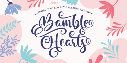 Bamble Hearts is a lovely calligraphy font. It has a modern and elegant look and is perfect for logos, branding, invitations, photography, wedding stationary, labels, and every other design which needs an unique and luxurious touch. This font is PUA encoded which means you can access all of the cute glyphs and swashes with ease! It also features a wealth of special features including alternate glyphs and ligatures.
 - Pimpus by 066.FONT,
$9.99 Pimpus is a display font in which each letter has been handwritten, giving it an authentic and original character. It exudes a varied and extravagant style, and with its daring and sophisticated letterforms, Pimpus attracts attention and gives projects a touch of nonchalance. It is ideal for creative projects such as posters, invitations or branding materials, where a striking and distinctive text finish is sought that stands out. Remastered in 2023.
 - Triz by Typeóca,
$30.00 Triz is a high-contrast monospaced sans-serif, bringing together a typewriter rhythm and a fashion magazine look. With 5 different weights and 3 different contrast variations, Triz shines on both footnotes and headlines. With more than 1.000 glyphs, the Triz has an extensive language support and a lot of features, like its distinctive 'thin' alternates for diacritics, symbols and punctuation, small caps, arrows, manicules and much more.
 - Hexaframe CF by Connary Fagen,
$35.00 Hexaframe CF evokes the awe and potential of of heavy machinery and robotics. Clad in tough polygons and rounded edges, Hexaframe is a perfect typeface for corporate identity, STEM toys, and user interface design. Hexaframe CF pairs well with simple typefaces set in contrasting sizes, including Greycliff CF, Artifex CF, and Visby CF. All typefaces from Connary Fagen include free updates, including new features, and free technical support.
 - Kelpie by Olga Umpeleva,
$30.00 Kelpie is a hand-drawn typeface based on informal writing and includes 2 styles: regular and monoline. It is a full of energy font with the irregular look and slightly scrawled letterforms with long ascenders and descenders. Kelpie can look casual, open and friendly or even add an eerie undertone to your text. It is recommended to use for display titles and small amount of text, words or short phrases.
 - 14 Segment LED Display by Matthias Luh,
$12.00 '14 Segment LED Display' is a detailed and extensive reproduction of an 14 segment LED Display which is especially used in electrical devices like automobile radios and hi-fi systems. Even though these electrical devices mostly use capital letters and numbers only, '14 Segment Display' also includes lower case letters, a lot of punctation and special characters and even Greek letters. This font is also available in Bold and Italic.
 - Cocaine by Chank,
$39.95Chank worked with Josh Eshbach, an intern from Minneapolis College of Art and Design, to create Cocaine as the Chank Font of the Month for November 2000. Inspired by Speedball type designs of the ’20s and ’30s, Cocaine has been redrawn and streamlined for use in the digital age. Curvy and round and relishing in its idiosyncrasies, Cocaine recalls vintage French wine posters and antique sheet music covers. - Dusan Script by Tour De Force,
$15.00 The Dusan Script font family is a wonderful set of handwriting script fonts that captures the graceful flow and idiosyncrasies of Dusan's penmanship. The Dusan Script font family has an airy, natural personality, with open counters and features that make it legible at small and large sizes. Dusan Script Family consists of two fonts, Regular and Bold, and offers a fresh handwriting style to grace invitations, cards, newsletters, advertisements and correspondence.
 - Aristelle by My Creative Land,
$25.00 Aristelle Family is a beautiful, hand-lettered script that was created using Leonardt III EF nib. Aristelle Script is full of OpenType features such as initial and terminal swashes, ligatures, and ornaments and is best used in an OpenType-aware software. Aristelle Sans and Sans Condensed are well additions to the Aristelle Script and all three fonts shall help you create organic, stylish, and full-of-character designs.
 - Neue Alter by OzType.,
$30.00 Introducing Neue Alter: the harmonious blend of readability and dynamic details : With 4 weights and their corresponding italics, you'll find your ideal style. The regular weight showcases even strokes for effortless legibility, while the light and semibold weights offer a robust texture, ideal for impactful headlines and compelling paragraphs. It's perfectly proportioned and is an excellent choice for captions, navigation systems, and anything that requires concise, accurate language
 - Kiyosace by Olivetype,
$23.00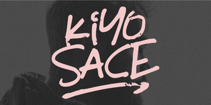 Kiyosace is an authentic brush font with very cool textures and a natural feel. It's perfect for posters, headlines, and logotypes. Its rough and tough style gives it a unique authenticity that sets it apart from the rest. Kiyosace font includes : Standard Latin Uppercase and Lowercase Numbers, symbols, and punctuations Swashes Multilingual Support. PUA Encoded and fully accessible without additional design software Simple Installations Works on PC & Mac Thank You.
