10,000 search results
(0.033 seconds)
- PRIMITIVE by JAF 34,
$1.90 PRIMITIVE is an attempt for an essential of urban culture, especially graffiti and the unique pixaçao. PRIMITIVE is also inspired by the ancient cultures, especially scandinavian tribes as an anagram to the present. This "vandalism" is viewed from several angles. PRIMITIVE is one of them. PRIMITIVE is one of the modern headline fonts which include a lot of alternates, a variation of one word for a comfortable use. Two weights, ligatures and stylistic sets are obvious. And this cheap price is a support to this independent culture from me.
 - Friz Biz by studiocharlie,
$24.00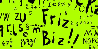 Friz Biz is an handwritten font; your designs will be really funny and fancy!
 - Alton JNL by Jeff Levine,
$29.00Alton JNL is an ultra-bold sanserif design that's perfect for any headline application. - Glorio by Authentic,
$39.50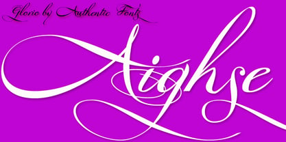 Glorio is an exceptionally elegant Copperplate typeface, perfect for letterheads, invitations and business cards.
 - Castiana by Sebastian Cabaj,
$29.00 Castiana is an elegant font inspired by old books, medieval typography, and rustic art.
 - Joyful Turkey by Putracetol,
$16.00 Joyful Turkey - Display Thanksgiving Font is a charming and playful typeface designed to embrace the spirit of Thanksgiving. Its quirky and rounded characters add an element of fun and warmth to your designs, making it the perfect choice for projects that celebrate this special holiday. This font includes seven delightful decorative variations with Thanksgiving-themed elements such as turkey, pumpkin, pie, leaves, and more. Ideal for Thanksgiving-themed designs, including invitation cards, birthday invites with a Thanksgiving theme, party decorations, logos, stickers, clothing, packaging, children's books, magazines, and more, Joyful Turkey brings a delightful and heartwarming touch to your creative projects. With its whimsical and cheerful style, this font captures the essence of gratitude and celebration, making it an ideal choice for designs that reflect the Thanksgiving spirit.
 - TradaSans by Hoftype,
$49.00 TradaSans is a new addition in the range of Univers and Helvetica. It represents a fresh face in this ongoing strong category of sans serif typefaces. TradaSans slightly squarish tendency, and its technical and neutral look create an objective and factual appearance. TradaSans is an ideal typeface for universal use. It offers high reading qualities with longer text applications and its sophisticated design details make it a distinctive headline typeface. TradaSans consists of 20 well tuned weights and is well equipped for advanced typography. It comes in OpenType format with extended support for up to 80 languages. All weights contain small caps, ligatures, superior characters, proportional lining figures, tabular lining figures, proportional old style figures, lining old style figures, matching currency symbols, fraction- and scientific numerals, matching arrows and alternate characters.
 - Easy Mind by Putracetol,
$22.00 Easy Mind - Retro Script Font is a captivating retro script typeface designed to transport your designs to a bold and vintage world. Its distinctive style showcases the perfect blend of boldness and retro aesthetics, making it an ideal choice for various creative applications. This font comes with an extensive set of alternative characters, each offering a multitude of unique shapes and swashes, adding versatility and flair to your designs. Perfect for logos, packaging, invitations, greeting cards, posters, magazines, titles, business branding, and all projects with a retro or vintage theme, Easy Mind infuses your designs with a sense of nostalgia and timeless charm. With its bold and retro style, this font allows you to effortlessly channel the spirit of the past into your creative projects, giving them a distinctive and classic touch.
 - Serofina by insigne,
$24.99 Serofina is an adaptable and fluid connected script with plenty of alternate flourish options. From clean and flowing to cute and frilly, Serofina can do it. The Serofina family comes with four weights, including a unique hairline, which makes it a versatile investment for a wide range of design possibilities. All weights include the OpenType programming to automatically and seamlessly swap out the default characters for 45 alternate forms and 18 auto-replacing ligatures. These alternates can make the face appear to be more simplified, restrained or frilly. Serofina also includes seven ornaments and old-style numbers. Check out the sample images to see these features in action. Serofina is a highly versatile script family and its range of weights make it perfect for whenever you need an expressive and original typeface.
 - Figment by Scholtz Fonts,
$10.00 Like a figment of the imagination, this very readable font wafts across the page, leading the reader into a world of enchantment. Ethereal and fluid, it is reminiscent of sorcerer's spells written on ancient parchment. It manages, by the distortion of its characters, to transform a simple serif font into something quite different. Wavy outlines and an uneven baseline create an impression of fluidity and magic, while retaining the essential clarity of the classic serif body font. Use Figment for: -- Children's books -- Halloween advertising media -- book covers -- movie titles -- swing tickets -- posters Figment is available in two styles, Figment Regular and Figment Force (a wider and bolder style) The font has been professionally letterspaced and kerned. All upper and lower case characters, punctuation, numerals and accented characters are present.
 - Simah Arabic by Zaza type,
$29.00 Simah Arabic typeface Simah Arabic is an Arabic typeface that supports Arabic. It has a warm and humane feeling. It's legible, soft, clear, flexible, simple, and contemporary. With a handful set of OpenType features and alternatives. It has an expressive character with its friendly shapes. It's legible, Clear, Flexible, Simple, Modern. With a handful set of Open Type features and alternatives. The design is inspired by the Kufic calligraphic style and influenced by the Naskh style. Simah Arabic is highly crafted in order to perform well both on screen and in print. it functions well even on small font sizes. It has a wide range of use possibilities headlines, logotypes, branding, books, magazines, motion graphics, and use on the web and Tv. Simah Arabic consists of five weights
 - Simah pro Arabic by Zaza type,
$29.00 Simah pro Arabic is an Arabic typeface from simah family type family It has a warm and humane feeling. It's legible, soft, clear, flexible, simple, and contemporary. With a handful set of OpenType features and alternatives. It has an expressive character with its friendly shapes. It's legible, Clear, Flexible, Simple, Modern. With a handful set of Open Type features and alternatives. The design is inspired by the Kufic calligraphic style and influenced by the Naskh style. Simah is highly crafted in order to perform well both on screen and in print. it functions well even on small font sizes. It has a wide range of use possibilities headlines, logotypes, branding, books, magazines, motion graphics, and use on the web and Tv. Simah Simah pro Arabic consists of five weights
 - Only You Pro by LeType,
$49.90 Only You is handmade, and specially romantic. It was made to brighten your projects, turning everything more beautiful. The special encounter between uppercase letters and lowercase letters is perfect. Only You is unicase, with 888 glyphs, and what’s better: it has one special alternative for all letters as uppercase, and that creates an infinity of combinations. Only You is brilliant, gorgeous, and multilingual - it also includes the Cyrillic version! It has more than 200 ligatures, several alternates and swashes. You can also obtain an unlimited number of possibilities in your layout - there are several possibilities for starting and finishing a word. Do you want some more? You should take a look at Only You Icons with more than 300 options between icons, ribbons and frames that will make your project very attractive and romantic. The font doesn't have PDF and works better in softwares that support the complete OpenType function.
 - Clever Science by Putracetol,
$16.00 Clever Science - 11 Quirky Education Theme Font is a delightful and versatile typeface designed with an education theme in mind. It features quirky, rounded characters with a playful and cheerful appeal at each endpoint. This font can be used either on its own or in combination with its various charming variations. With its 11 distinctive variations, including regular, lab, DNA, electric, tube, ruler, gear, microscope, and more, Clever Science brings a fun and educational atmosphere to your designs. It's perfectly suited for projects related to children, schools, education, cheerfulness, playfulness, and kindergarten themes. This font is an excellent choice for creating logos, crafting projects, invitations, children's activities, birthday cards, greeting cards, stickers, children's books, and kids' magazines. It seamlessly integrates into designs related to children and education. With its playful and educational theme, Clever Science helps you create engaging and charming visuals for young audiences and educational purposes.
 - New Year Deco by Wing's Art Studio,
$9.00 New Year Deco: An Art Deco Font for Festive Celebrations! Raise a glass to the New Year with this elegant, vintage inspired Art Deco header font. This first edition of New Year Deco is the introduction to an experimental design that I hope will evolve into the ultimate in Art Deco fonts. Starting with 4 alternative styles with varying degrees of decorative flourish, this all-caps design is tailor-made for invitations, award ceremonies, elegant title designs and logos. It includes unique uppercase and lowercase characters, along with numerals, punctuation and language support. And also includes a variety of illustrated symbols, underlines and icons for an extra graphic touch. See the visuals for more. For the future development of this font I encourage my customers to contact me with suggestions and requests. If you would like to see a bolder, thinner, fatter, taller or wider version, contact me and I’ll add it to the next update!
 - FS Rufus by Fontsmith,
$80.00 Ligatures FS Rufus is an outgoing, likable sort of font with an eccentric streak. Wide letterforms and curious ink-traps make for an engaging personality, and a set of discretionary ligatures make FS Rufus irresistible to designers wanting to play. Not a small set, either: there are some 80 different options available. Wide The decision was made early on to make the letterforms of FS Rufus luxuriously wide. This generates a distinctive visual texture when the font is used for text. With other weights available for headlines, FS Rufus brings a curiously engaging look to editorial, magazine covers and advertising. Just look at my ink traps Ink traps are normally the preserve of fonts intended for printing at small sizes, in newspapers or directories – extra notches necessary to prevent ink from pooling. FS Rufus turns the ink trap into a beautiful eccentricity, flaunting it in both its lowercase and capitals. Take a look at the “h”, “a” and “k”, and the “B” and “N”. Attention-seeking? Moi?
 - Prored by Tour De Force,
$25.00 Prored is an avantgarde sans serif typeface that contains 5 weights – Light, Regular, Bold, ExtraBold and Black. It is small and compact font family with own characteristic expression, constructed to be safe choice for all kinds of typographic tasks. With specific curved endings that are adhered on baseline, Prored includes tiny note of singularity – just enough to make it’s own identity recognizable and catchy. Taller x-height gives an afterimage of a bit narrowed look, but with rational proportions and well balanced weights, 5 of them are really sufficient and capable to handle extreme typographic issues. Especially charming is Black which can be used also as display typeface in situations where elegant solutions are required in combination with stronger visibility. Beside Central Europe, Prored also contains glyphs for Turkish and Baltic languages. Highly neutral impression recommends Prored as an excellent choice for branding campaigns or new identities. Recommended for use in: branding campaigns, identities, editorial publications, packages, web design, as web font and many more.
 - Endless Sunrise by Wing's Art Studio,
$10.00 A hand-made retro script font duo inspired by 80s action movies! This hand-made, retro styled script font was born from a childhood watching countless 80s action movies. Stories of inspirational heroism and competition, all set against impossibly beautiful Summer sunsets. And no self-respecting 80s movie would be without the coolest title design, setting the stage with a seemingly spontaneous glide of the designer’s brush. Endless Sunrise aims to capture this spirit through it’s loose, hand-drawn design and complimentary sans-serif. It comes with a complete set of alternatives and underlines for true customisation, meaning you’ll never have to repeat an E or an I; the tale-tell signs that give away other script fonts. It also features uppercase and lowercase characters, along with numerals, punctuation and language support. An awesome font that will work equally well across film, sports, music, merch and more! Find more from The Video Store Collection at Wingsart Studio
 - Babetta by Viktor Nübel Type Design,
$- Babetta is a display typeface that comes with some decorative typographical features. Alongside a set of arrows and flower icons, it also includes an alternative ›E‹, some special diacritic marks, a wavy ›S‹ and a series of ligatures. It features 5 weights, a special ›Neon‹ version and supports a wide range of Latin languages. This typographical tool box provides a large and playful variety of options for headlines and logotypes. Babetta supports Latin and Cyrillic languages. The initial inspiration for Babetta was an illuminated vintage shop sign—that of a famous bookstore in Berlin called Karl-Marx-Buchhandlung that dates back to the days of East Germany. During the course of the design process, this slightly shabby historical original was kissed by an Italian Art Deco beauty and has blossomed into a new typeface with its own special charm. The aim was not to preserve the original lettering, but to use it as a starting point for typographical exploration.
 - Leronda by Larin Type Co,
$16.00 Leronda is an awesome font that can look austere and classic or vintage and softer and more pliable thanks to alternatives. They will add charisma, diversity to your project and emphasize your brave decision. Also lowercase ligatures are included in this font, use them and it will also show your personality. This font is quite heavy weight and is perfect for creating logos, headlines, advertising, branding, book covers and magazines, and much more. Use it in headings and text to highlight important information. This font is easy to use and has OpenType features.
 - Pitkin JNL by Jeff Levine,
$29.00Borrowing from the 1940s, and inspired by printed text found in an old catalog, the slightly imperfect letterforms of Pitkin JNL emulate the hand-lettered look of signs and show cards. - Modernique by Monotype,
$29.99The Modernique font has an Art Deco flair. Contrast between thick and thin strokes is extreme, making this font only suitable for display. The Lowercase f, i and j are unusual. - Poster 1492 by LightHouse,
$49.00A bold typeface with very very extensive cap height, and short descenders. Poster 1492 is suitable for headlines, titles, newspapers, magazines, and advertisements. Poster 1492 is an OpenType/TTF Unicode font. - Stanford by profonts,
$41.99 The strong, geometric letterforms of this typeface incorporate a heavy outline and were inspired by college and university sportswear, making Stanford an excellent choice for work associated with sports in general.
 - Secret Diary by Hanoded,
$15.00 Secret Diary is a nice bit of uncomplicated handwriting: it is rounded, feminine, legible and above all - natural in appearance. Secret Diary comes with some ligatures and an overdose of diacritics.
 - Daresiel by Scriptorium,
$18.00Daresiel is an elegant script font based on a sample of Edwardian period hand lettering. It has elaborate curls and embellishments and some other interesting features like the elongated 'f' character. - Diamond Pride by Illushvara,
$15.00 Diamond Pride is a sweet and beautiful script font. It features an elegant style that makes it perfect for logos, branding, invitations, stationery, wedding designs, social media posts, and much more.
 - Heretic by Device,
$39.00 Heretic surrounds itself with an atmosphere of evil, carnival freakshow and no-nonsense thuggery. Mix the black and condensed weights of this octagonal blackletter together for more interesting, yet disconcerting results.
 - Nagarawa by Beewest Studio,
$50.00 Nagarawa is an Asian style font, very suitable for various logotypes for Asian nuanced products, such as Asian food, martial arts clubs, music, novel and comic titles, apharel clothing and others.
 - Sheppaloe by Khurasan,
$8.00 Sheppaloe is a fresh handwritten font with an elegant and vintage feeling. Sheppaloe includes a full set capital and lowercase letters, as well as multi-lingual support, currency figures, numerals, & punctuation.
 - Gold Empire by Rockboys Studio,
$23.00 Gold Empire is an incredibly unique and distinct blackletter font. It will add a unique touch to your designs. Use it for tattoo designs, logos, posters, book covers, albums and more!
 - Trolltunga by High Peak,
$25.00 A unique slab serif with strong shapes give it an unmistakable character and charm. Every letter has been designed with passion and the family comes with lots of opentype features. Enjoy!
 - Candykitchen by Vanderfont,
$19.00 Casual and sugary, Candykitchen is an inline face with a weight problem. Frosted with occasional swashy finishing strokes and a few errant bulbous terminals, this face wants space in your cupboard.
 - Overspray - Personal use only

- Tectónica by Untype,
$29.00 Tectónica is an elegant and stable heavy-duty didonish typeface in three different flavors: the strong and sober Poster Style, the fancy and classic Engraved Style and the playful and sexy Swash Style, each of one includes a distinctive set of alternates, ligatures, numbers and plenty of other resources and OpenType features for your text delight. With heavy contrast and solid presence yet full of delicate details and variations, Tectónica was especially designed for being used in headings, logotypes, large text settings and display use in general where a well-founded and firm yet graceful and refined statement is needed.
 - Waverly CF by Connary Fagen,
$25.00 Waverly CF combines the tone and flow of art deco with updated, clean letterforms and a modernized construction. Variation in letter width creates a pleasant rhythm perfect for artwork and logos. Waverly CF offers wide language support across Latin and Cyrillic glyphs, and includes a host of swashes and alternate letterforms. Waverly CF is an expressive display typeface and pairs well with simple, elegant serifs like Artifex CF and Artifex Hand CF. All typefaces from Connary Fagen include free updates, including new features, and free technical support.
 - Serenity by Device,
$39.00 A versatile and elegant sans serif with a hint of Futura and a dash of Gill, but entirely its own design. Clear and legible in small sizes, refined and authoritative in larger sizes, Serenity is perfect for corporations, institutions, museums, galleries, editorial and publishing. Seven weights from a fine Thin to an impactful Heavy, plus italics, present a full range for all text and headline needs. Comes with full international character support, tabular and old-style numerals and alternate versions for the R, K, a and g.
 - Remora Sans by G-Type,
$39.00 Remora is an extensive new humanist sans serif which comes in 2 style variations, the effervescent Remora Sans and its corporate business partner Remora Corp . Both styles include 5 individual width sets ranging from the condensed W1 to the extra-wide W5. Furthermore, with an impressive 7 weights (Thin to Ultra) and true matching italics in each pack Remora is an ultra versatile super family comprising 140 individual fonts, perfect for any typographic assignment or design brief. Remora was designed by G-Type founder Nick Cooke. Both the Sans and Corp families share the same proportions, with the exception of certain key characters that change the overall appearance. Remora Sans is an exuberant and characterful typeface while Remora Corp, as its name suggests, is a businesslike typeface more suited to corporate typography. Quite early on in the design process Nick decided to give Remora Corp equal billing instead of incorporating these glyphs as alternates or a stylistic set that may get overlooked. “I created two separate families after learning a valuable lesson with one of my earlier typefaces, Houschka”, says Nick. “Houschka contained distinctive rounded A’s W’s and w’s, with ‘straight’ styles as character alternates. Even though style sets and alternates are easy to activate they are rarely used, so after many requests for customised versions of the fonts with the straight characters as defaults it was decided to create the separate ‘Alt’ family. So I cut straight to the chase with the two Remora variants and created two complementary families.” Both sets contain many shared letterforms, but it is the alternate characters that significantly alter the appearance of each font. Remora has been carefully designed for optimum legibility at large and very small sizes. Although fairly monolinear in appearance, especially in the lighter weights, particular attention has been paid to optical correction like the overshoots of the curved characters. Open counters and painstaking attention to detail (e.g. weight contrast between horizontal and vertical strokes, junctions of shoulders and stems etc) all boost readability and make Remora a great choice across all media. Remora Sans and Corp are ‘humanist’ rather than ‘geometric’ in style, meaning they’re not strictly based on rectangles and circles, resulting in a warm and friendlier feel. The slightly ’super-elliptical’ rounded forms create generously attractive curves. Remora has very distinctive italics in that they are only inclined by 8 degrees, but are not just based on slanted uprights. The italic styles are very alluring when used for display at large sizes and the good news is they come bundled free with their respective uprights. Each family also contains many OpenType features including proportional and tabular numbers, small caps, discretionary ligatures, plus five stylistic sets for ultra versatile typography.
 - Remora Corp by G-Type,
$39.00 Remora is an extensive new humanist sans serif which comes in 2 style variations, the effervescent Remora Sans and its corporate business partner Remora Corp. Both styles include 5 individual width sets ranging from the condensed W1 to the extra-wide W5. Furthermore, with an impressive 7 weights (Thin to Ultra) and true matching italics in each pack Remora is an ultra versatile super family comprising 140 individual fonts, perfect for any typographic assignment or design brief. Remora was designed by G-Type founder Nick Cooke. Both the Sans and Corp families share the same proportions, with the exception of certain key characters that change the overall appearance. Remora Sans is an exuberant and characterful typeface while Remora Corp, as its name suggests, is a businesslike typeface more suited to corporate typography. Quite early on in the design process Nick decided to give Remora Corp equal billing instead of incorporating these glyphs as alternates or a stylistic set that may get overlooked. “I created two separate families after learning a valuable lesson with one of my earlier typefaces, Houschka”, says Nick. “Houschka contained distinctive rounded A’s W’s and w’s, with ‘straight’ styles as character alternates. Even though style sets and alternates are easy to activate they are rarely used, so after many requests for customised versions of the fonts with the straight characters as defaults it was decided to create the separate ‘Alt’ family. So I cut straight to the chase with the two Remora variants and created two complementary families.” Both sets contain many shared letterforms, but it is the alternate characters that significantly alter the appearance of each font. Remora has been carefully designed for optimum legibility at large and very small sizes. Although fairly monolinear in appearance, especially in the lighter weights, particular attention has been paid to optical correction like the overshoots of the curved characters. Open counters and painstaking attention to detail (e.g. weight contrast between horizontal and vertical strokes, junctions of shoulders and stems etc) all boost readability and make Remora a great choice across all media. Remora Sans and Corp are ‘humanist’ rather than ‘geometric’ in style, meaning they’re not strictly based on rectangles and circles, resulting in a warm and friendlier feel. The slightly ’super-elliptical’ rounded forms create generously attractive curves. Remora has very distinctive italics in that they are only inclined by 8 degrees, but are not just based on slanted uprights. The italic styles are very alluring when used for display at large sizes and the good news is they come bundled free with their respective uprights. Each family also contains many OpenType features including proportional and tabular numbers, small caps, discretionary ligatures, plus five stylistic sets for ultra versatile typography.
 - Fishbones by Funk King,
$5.00 Fishbones is a font set consisting of fish-bone font-bats. Nothing fishy here – an extensive set of characters makes this an unusual and versatile font.
