10,000 search results
(0.029 seconds)
- VTC Wanderland by Vintage Type Company,
$18.00 Wanderland Display Font is an inky, uncial display typeface with 271 characters, Adobe Latin 1 language support, and a small collection of swashes, ornaments, and alternates. As a modern take on an old style, Wanderland makes a great font choice for bold signage, branding & logo designs, cover designs, video titles, and label & packaging designs. Designed for use in large sizes with soft corners for a vintage, ink-bled aesthetic. Activate the included ornaments and swashes with the Swash OpenType feature and by using the numerals and A to I of the alphabet.
 - Mikhael Handwritten by Letterara,
$16.00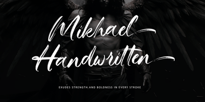 Introducing Mikhael Handwritten, an authentic brush script font that brings a raw and energetic vibe to your designs. With its dynamic strokes and natural brush texture, this font is crafted to make a bold statement in logos, posters, packaging, and various design projects. Its striking appearance and smooth flow make it an ideal choice for conveying a strong and stylish impression. PUA encoding ensures effortless access to all the expressive glyphs. Elevate your projects with Mikhael Handwritten, a font that effortlessly infuses vigor and character into your creative endeavors.
 - Peanut Ache by PizzaDude.dk,
$17.00 I don't know what it is with me and peanuts. I simply love it! I like peanuts in all kinds of meals: breakfast, lunch, dinner and even in desserts! But with an addiction like this, an overload of peanuts sometimes appear...and I guess that's where the name of this font comes from :) The Peanut Ache font is super clean, and super steady - use it for anything that needs a clean look! I've added 5 slightly different versions of each letter, and this really helps making your text to look even more fresh and lively!
 - Tulpe Fraktur NF by Nick's Fonts,
$10.00Tucked inside the November 5, 1927 issue of a German signpainters' trade paper was a single sheet headed Der Schilder und Schriftenmaler, which featured an alphabet called "Neue Fraktur". An exuberant (if somewhat unconventional) combination of Art Deco sensibilities and blackletter forms, the font retains its freshness, even today. Included in this version are Deco bishops fingers at the bar and broken bar positions, and a styling, horn-blowing herald at ASCII circumflex and tilde positions. Both versions of the font include 1252 Latin and 1250 CE (with localization for Romanian and Moldovan) character sets. - SK Clumster Sans by Shriftovik,
$32.00 SK Clumster Sans is an extravagant multilingual geometric grotesque, developed under the impression of the unique and exciting aesthetics of font design. Its structure is enlivened by an innovative combination of geometric and organic shapes that transform the familiar letter pattern. SK Clumster Sans creates a unique visual impression through a combination of shapes, a large symbolic and weights set, in addition to lively and dynamic angles and lines. The font is suitable for creating original design works that reflect the creative potential of the author and his bold experiments in the field of design.
 - QEWUR by Twinletter,
$15.00 Introducing QEWUR, our newest font, an authentic font with a Japanese style theme, with an attractive and decent font shape to make your project elegant, special, gorgeous, and charming, and easy to remember for the audience. Logotypes, food banners, branding, brochure, posters, movie titles, book titles, quotes, and more may all benefit from this font. Of course, using this font in your various design projects will make them excellent and outstanding; many viewers are drawn to the striking and unusual graphic display. Start utilizing this typeface in your projects to make them stand out.
 - Girard by House Industries,
$33.00 Whatever the medium, Girard’s love for typography was the common thread that wove his work together. We are honored that the Girard family has entrusted us to celebrate and expand upon the legacy of this design icon with this collection of fonts. The Girard Slab family gracefully synthesizes illustrative sensibilities into a practical typographic framework. Slab’s three widths and four weights ensure versatility in a modern editorial setting while its gentle curves transcend the sterility of traditional typography to add an unprecedented warmth and personality. From boutique chocolate packaging to the titling sequence for an indie vegan superhero cartoon, Girard Script deftly adds a contemporary sophistication to text and display settings. Inspired by a workhorse lettering style that helped Alexander Girard implement thousands of design elements in his overhaul of the Braniff identity system, Girard Sky pulls its weight in any contemporary application. In Girard Sansusie, each character stands alone as an illustrative element while coming together with its counterparts as a whimsical yet functional typeface. FEATURES: The ligatures feature substitutes specially-drawn letter combinations that combine two, three or even four characters to create smoother transitions and simulate lettering sensibilities. Girard Slab’s three widths and four weights ensure versatility in a modern editorial setting while its gentle curves transcend the sterility of traditional typography to add an unprecedented warmth and personality. Copious alternate characters and “smart” OpenType programming allow Sansusie to escape the rigid confines of typography to come alive as if flowing from Girard’s sketchpad. This animation shows a sampling of the swash characters available in the font. GIRARD CREDITS: Typeface Design: Alexander Girard, Ben Kiel, Ken Barber, Laura Meseguer Typeface Production: Ben Kiel Typeface Direction: Christian Schwartz, Andy Cruz, Ken Barber Like all good subversives, House Industries hides in plain sight while amplifying the look, feel and style of the world’s most interesting brands, products and people. Based in Delaware, visually influencing the world.
 - Crestwood by Ascender,
$29.99Crestwood is an updated version of an elegant semi-formal script typeface originally released by the Ludlow Type Foundry in 1937. Crestwood is best used at larger sizes, and is wonderful for invitations and greeting cards. Character Set: Latin-1 - Avebury by Parkinson,
$25.00 An ultra black blackletter, Avebury Black and Avebury Inline were inspired by an early blackletter from the Caslon Foundry. Early blackletters from the Bruce Type Foundry are also reflected in this slightly modernized and more readable typeface. Caution. For display only.
 - Anita Honey by Rezastudio,
$9.00 Anita Honey is an adorable quirky handwritten font. It will add an incredibly joyful touch to your designs. Fall in love with its playful style and use it to create beautiful stationary art, eye-catching social media posts, and much more!
 - Hoxie JNL by Jeff Levine,
$29.00Hoxie JNL is based on an example found in an old sign painter's design book from the early 1900s and has been translated to digital form by Jeff Levine. All of the quirks and charm of hand lettering have remained. - Brokve by MKGD,
$13.00 Brokve is a Croatian word used along the Dalmatian coast. It means “nails", as in the; hammer and nails, variety. It’s tall thin strokes and jutting points give it a very spike-like appearance; suitable for any uses that are intense, jarring or just plain edgy. There is no lower case for Brokve as it is a display font. The upper case serves as both the upper and lower case letters. Brokve has a glyph count of 392 and supports the following languages; Afrikaans, Albanian, Asu, Basque, Bemba, Bena, Bosnian, Catalan, Chiga, Colognian, Cornish, Croatian, Czech, Danish, Embu, English, Esperanto, Estonian, Faroese, Filipino, Finnish, French, Friulian, Galician, German, Gusii, Hungarian, Icelandic, Indonesian, Irish, Italian, Kabuverdianu, Kalaallisut, Kalenjin, Kamba, Kikuyu, Kinyarwanda, Latvian, Lithuanian, Low German, Lower Sorbian, Luo, Luxembourgish, Luyia, Machame, Makhuwa-Meetto, Makonde, Malagasy, Malay, Maltese, Manx, Meru, Morisyen, North Ndebele, Norwegian Bokmål, Norwegian Nynorsk, Nyankole, Oromo, Polish, Portuguese, Romanian, Romansh, Rombo, Rundi, Rwa, Samburu, Sango, Sangu, Scottish Gaelic, Sena, Shambala, Shona, Slovak, Slovenian, Soga, Somali, Spanish, Swahili, Swedish, Swiss German, Taita, Teso, Turkmen, Upper Sorbian, Vunjo, Walser, and Zulu.
 - Okiku by Hanoded,
$15.00 The tale of Okiku Of The Nine Plates is an old Japanese story full of lust, deceit, murder and revenge. It tells of Okiku, a beautiful servant whose master lusts after her. After she refuses his amorous advances, he accuses her of stealing a costly plate and has her thrown down a well, where she dies. She then turns into an Onryō (a vengeful spirit). Okiku font is a thin, all caps, scratched typeface. Upper and lower case differ and can be interchanged. Okiku comes with an afterlife of diacritics.
 - Bremoleaf by Alit Design,
$22.00 Introducing "Bremoleaf" - The Nature-Inspired Font 🌿 Embrace the beauty of nature with "Bremoleaf," a unique and versatile font that seamlessly blends the organic elegance of leaves with a harmonious mix of sans serif and script elements. This exquisite typeface is more than just a font; it's a work of art that brings the enchantment of nature to your creative projects. 🌱 The "Bremoleaf" font is a perfect choice for those who seek a harmonious fusion of two distinct typographic styles. It effortlessly combines the sleek and modern characteristics of sans serif letters with the flowing, graceful curves of an elegant script. This harmonious pairing creates a visually captivating and versatile typeface that suits a wide range of design needs. 🌿 With dynamic ligatures and an extensive selection of alternates, "Bremoleaf" offers endless possibilities to express your creativity. These ligatures and alternatives seamlessly flow, enhancing the readability and aesthetic appeal of your text. Whether you're designing a logo, a wedding invitation, a branding project, or any other creative endeavor, "Bremoleaf" has you covered. ✨ "Bremoleaf" boasts a wide range of characters and symbols, providing support for a staggering 708 characters. This inclusive font enables you to create content in various languages and styles with ease. Plus, it includes PUA (Private Use Area) Unicode, ensuring that you can access all its special characters and unique features effortlessly. 🌍 "Bremoleaf" is not bound by language or borders. It offers comprehensive multilingual support, making it the perfect choice for projects that target global audiences. From English to Spanish, French to Vietnamse, this font will help you convey your message beautifully and effectively. Experience the enchantment of "Bremoleaf" and elevate your design projects to new heights. This nature-inspired font brings the organic beauty of leaves to your creations, offering an irresistible combination of style and functionality. With "Bremoleaf," your designs will flourish like never before.
 - Monterchi by Zetafonts,
$39.00 In 1459, while visiting his dying mother, Italian painter Piero della Francesca spent seven days creating a fresco of a pregnant madonna in a small country church in the hilltown of Monterchi (Italy). Hailed today as one of the masterpieces of Italian Renaissance, the fresco was given a new branding in 2019 by Art Director Riccardo Falcinelli who asked the Zetafonts team to develop a custom font for the project. The resulting typeface system, designed by Cosimo Lorenzo Pancini together with Andrea Tartarelli and Maria Chiara Fantini as a rework of Francesco Canovaro original Beatrix Antiqua, is a 50-weights ode to the beauty of classical roman letterforms, that pairs elegant alternates and quirky ligatures with an array of design options for clear and effective editorial, signage, logo and wayfinding design. The base display family, Monterchi, allows endless design expressions with a range of six weights from the slender thin to the strong extrabold, all with matching italics and an array of over one hundred discretionary ligatures. A fine-tuned companion Monterchi Text has been developed to excel in body use, with a larger x-height and wider spacing - clear and legible even at small sizes. The use range of the family is enriched by Monterchi Serif and Monterchi Sans that feature different contemporary interpretations of the same classical geometric skeleton, allowing for layered editorial design and variation. All the fifty fonts in the Monterchi Type System feature an extended character set of over 1100 glyphs covering over 200 languages using the Latin alphabet, as well as Greek and Russian Cyrillic. Open Type features include small caps, positional figures, alternate letterforms, stylistic sets and discretionary ligatures. With his elegant, historical aesthetic, Monterchi embodies the spirit of early Renaissance and the humanist obsession with constructed and geometric beauty - still managing to function as a workhorse family, ready to help any designer in need of a timeless classic look, or looking for the right ligature to transform a simple word into a striking wordmark.
 - Biotech by Arendxstudio,
$20.00 Biotech is hand painted typeface with a messy, rough and strong feel, perfectly suited for any design occasions. Get inspired by its bold charm!
 - Good Thinking by Letterara,
$14.00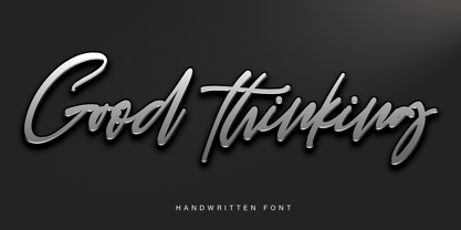 Good Thinking is a beautifully designed handwritten font that’s both authentic and charming. Use it to turn any design project into a true standout!
 - Srikaya by HandletterYean,
$10.00 Srikaya is a display typeface with a cheerful vibe and autumn nuance. Use it for any creative project in need of a whimsical vibe.
 - Oh Beloved by Nissa Nana,
$19.00 Oh Beloved is a beautiful script font with a classy, elegant, and modern look. It will add a personal touch to any design project!
 - DT Skiart Serif Leaf by Dragon Tongue Foundry,
$10.00 ‘Skiart Serif Leaf’ has been on a long growing path getting to where it is now. Originally inspired by the san serif font ‘Skia’ by Mathew Carter for Apple. ‘Skiart’ was designed to feel more like a serifed font, but without any serifs. It took a step between sans serif and serif fonts. Next on the path towards a serif font came Skiart Serif Mini, with tiny serifs added. This was a true serif font, although they were subtle. This font ‘Skiart Serif Leaf’ is the next in the series. After many reiterations, ‘Skiart Serif Leaf’ was built and rebuilt many times until finally, this version deserved to be presented to the world. Style and flow had been added to this font. It remained fully readable and feels as clean and normal as any of the best body copy serifs, and yet has an original modern flair to it. The font feels strong and solid while having a subtle organic flow in its form. If compared to one of the more commonly used serifs like ‘Times New Roman’, the ‘Skiart Serif Leaf’ lowercase is more open with a taller x-height, increasing its readability and friendliness. The serifs are smaller and less distracting. They are not pretending to be ligatures. This font may be organic but is not in anyway script like. Where ‘Times’ makes its p q b d forms out of a barely touching oval and stem, the ‘Serif Leaf’ forms are much more firmly attached, appearing clearly as single letters. The standard setting for the a’s and g’s are round single story, feeling warmer and more inviting in the ‘Serif Leaf’ font. Much more friendly than the stuffy double storied versions in fonts like ‘Times’ etc. ‘Skiart Serif Font’ comes with a somewhat organic italic.
 - Kurri Island by Mans Greback,
$29.00 Kurri Island is a positive sans-serif typeface. It was drawn and created by Måns Grebäck between 2017 and 2020. With its slightly irregular strokes and bends the font has a characteristic fun and comical and look. The sans is easy-going and relaxed while being serious enough to be used professionally. Kurri Island is an extensive multi-style font family, composed of 24 high quality fonts. The weights are Thin, Light, Regular, Medium, Bold and Black. Being favorably used as a block letter sans-serif, it has an additional Caps style to maximize the impression, and each font are provided as Italic. Its range of styles gives the typeface great flexibility, while also giving the ability to emphasize phrases or words. Kurri Island contains all characters you'll ever need, including all punctuation and numbers. It has an extensive lingual support, covering all European Latin-based scripts.
 - Organon Sans by G-Type,
$60.00 The six weight Organon Sans typeface is a stylish and feature-laden OpenType family which complements its sister Organon Serif, both components working in tandem to create an elegant, legible and thoughtfully designed suite of fonts which share similar cap & x heights, stem widths and ascender/descender values. Tapered stems give the Organon Sans fonts an attractively robust appearance.
 - Stove Plate JNL by Jeff Levine,
$29.00 An old printer's advertising cut for Red Star Oil Stoves yielded a typeface that was both vintage and somewhat techno at the same time. Originally drawn as a slanted logo, the individual letters had an array of chamfered, angled and flat sides combined with a bold outline. This font is available in both vertical and oblique versions.
 - Quixley by ITC,
$29.00Quixley was designed by Vince Whitlock, who was inspired by an old Zoltan Nagy typeface. The capitals can be used alone or combined with the lowercase and should be set with close letter and word spacing. Quixley is an eye-catching, condensed display typeface whose unusual angles and marked stroke contrast lend it marvelous visual appeal. - Megren by Azzam Ridhamalik,
$18.00 Introducing Megren, an experimental display typeface combining a simple and clean sans serif typeface with an elegant copperplate script typeface. Consists of 1 font file with copperplate script typeface on the uppercase and sans serif on the lowercase. The combination of different typefaces looks modern and fashionable but also gives a nostalgic retro vibes at the same time.
 - Hedley New by moretype,
$25.00 Hedley New is a reconstructed relative of Hedley, originally released in 2004. Building on its clean, original, simple charm, Hedley New has grown to be an elegant, clean, usable sans. Having been completely re-drawn, with new spacing and kerning, Hedley New is now an Opentype font containing small caps, tabular, proportional and old style numerals and ligatures.
 - P22 Da Vinci by P22 Type Foundry,
$24.95 The great Italian artist, inventor, and visionary Leonardo da Vinci created an extraordinary variety of work which continues to amaze those who study it. This set faithfully captures Leonardo's remarkable imagination and includes an exclusive Da Vinci Backwards font (reflecting the artist's own unique style of handwriting). The 72 extras included are drawn from Leonardo's sketchbooks and journals.
 - Counter Courage by Viaction Type.Co,
$15.00 Counter Courage is a vintage-style sans serif font with an ink effect that’s perfect for industrial and vintage-themed designs. This font is equipped with the opentype feature and supports multilingual. Included in the fonts: Uppercase Lowercase Symbols & Pointing Alternate Characters Multilingual Support Get it now at an affordable price and high value for your needs. Thank You.
 - Kidela Sketch by insigne,
$21.99 Kidela Sketch is an energetic and eccentric serif typeface rendered in a sketchy style. The typeface includes 64 auto-replacing discretionary ligatures to extend the natural sketched look, oldstyle figures and small caps. Please see the sample brochure to see these features in action. Kidela Sketch is an excellent choice when you need a fun and interesting serif.
 - Mikeys Roman NF by Nick's Fonts,
$10.00Here's an amalgam of letterforms from two giants of the handlettering pantheon: an uppercase based on the work of Mike Stevens, and a lowercase based on the work of Alf Becker. The two work in perfect harmony to create warm, friendly and engaging headlines. Both versions contain the complete Latin 1252, Central European 1250 and Turkish 1254 character sets. - Spitzkant by Julien Fincker,
$29.00 About the design Spitzkant is a serif typeface family that is characterized by strong contrasts. Pointed, sharp serifs and edges contrast with round and fine forms, making it very individual and expressive. This makes it particularly suitable for branding, editorial, packaging and advertising. The high-contrast display version has been complemented by a lower-contrast text version, making Spitzkant in combination suitable for both strong headlines and extensive body text. An allrounder that can be used for many purposes. Features The Spitzkant Head and Text family has a total of 2 optical sizes, 5 weights and 20 styles, from thin to bold and matching italics. With over 850 characters, it covers over 200 Latin-based languages. It also has an extended set of currency symbols and a whole range of open type features. For example, there are alternative characters as Stylistic Sets, Small Caps, automatic fractions and many other features. Ligatures Especially the extensive selection of ligatures (standard and optional) is a special feature which was an important part during the design process. With over 95 different ligatures there are many possibilities to give headlines and logos an individual touch. Get the Variable Font here: https://www.myfonts.com/fonts/julien-fincker/spitzkant-variable/
 - Cora by TypeTogether,
$49.00 Cora is a sans serif with an experimental bent, offering a large x-height, some contrast of stroke weight, and capitals inspired by classical lettering. The large x-height gives it a voice with a little more volume so that those in the back of the room have no trouble hearing. Because the letters seem slightly large, Cora remains clear at smaller point sizes. It is a typeface intended to perform well on screen without losing its attraction in print and the nature of its shapes allows for condensation or expansion without becoming severely distorted. The uppercase exhibits classical proportions found in ancient Roman inscriptions, which provides opportunities for setting titles in all caps. Cora Opentype Pro has a full range of numerals for every use, small caps, the most common open type features and supports many languages that use the latin extended alphabet. It is available in a range of three weights plus Italics. CoraBasic is a reduced version of Cora. It is still an OT-font but without any particular features except of a set of ligatures, class-kerning and language support including CE and Baltic.
 - Rocher by Harbor Type,
$29.00 🏆 Selected for Tipos Latinos 8. 🏆 Hiii Typography 2018 Merit Award. Rocher was designed while looking for an answer to a simple question: what would a typeface look like if it was made of stone? It certainly would look solid, but did we have to add cracks and rubble so it would resemble rocks? We didn’t think so. We decided to tackle the problem a different way. We added corners where there usually aren’t any and threw some unusual letterforms into the mix. The result is a typeface that feels like stone, but if you look closely there is nothing inherently stony about it. Unexpected corners provide just the right amount of roughness, while unusual letterforms give the text an informal aesthetic, traces of something naive and handmade. A family was born when the sturdy letterforms were turned into a series of playful layers. With 9 fonts in total, Rocher can be mixed and matched to create unique layered compositions that add depth to the layout. We designed Rocher to be used in logotypes, packaging, mobile apps and headlines. We are confident you will find another handful of scenarios where it can shine.
 - Weg by Huerta Tipográfica,
$18.00 WEG* font is an experimental type system where legibility isn’t the focus. This project studies how glyphs are constructed and how their ductus can be modified. I explored how far I can move the limits if I don’t worry about the legibility. In Weg, letters are built by a single line that connects them, along with words and paragraphs. When weight decreases, the legibility of the signs increases. This is the first stage. It’s a project in expansion. The set contains uppercase, lining figures and basic punctuation in three weights: Regular, Light and Thin. The current supported languages are Spanish, Guaraní and English. If you need any other language, please let me know. I would like to expand the character set. Second stage project WEG is an experimental in-expansion font family. Here I present to you the second stage. I’m planning the first upgrade for middle 2021. I’m preparing a pattern set for July 2021. Here you can see the first four patterns. If you buy the font before July 2021, you’ll get this upgrade! • Second stage April - July 2021: pattern set (first four ready). • This upgrade will be available on August 2021.
 - Whiskey Sour by Fenotype,
$25.00 Whiskey Sour, a robust vintage serif that is as delightful as it is confident. With its soft and warm aesthetic, this typeface effortlessly captures the essence of approachable confidence, making it a tasteful choice for your typographic needs. Whiskey Sour is based on Tomato Ketchup, an earlier release of Fenotype. It has larger and taller uppercase and plenty of differences in lowercase characters, the most significant ones being letters a, h, m and n. Whiskey Sour is an excellent choice for modern graphic design, offering a distinctive touch of familiarity. Whether gracing logos, packaging, restaurant graphics, or any display application, this versatile typeface shines in headlines and shorter texts. Experiment with reduced tracking for a more compact visual impact, or, when using it in small sizes, add a touch of tracking to ensure legibility. Whiskey Sour is naturally equipped with lots of OpenType features: try spicing up your designs with Swash, Stylistic, or Titling Alternates or Discretionary Ligatures. In total Whiskey Sour has 134 Alternate glyphs that can be accessed from OpenType controls or Character Window. See the full selection of Alternates in the specimen posters.
 - Golestan by Naghi Naghachian,
$84.00 Golestan is designed by Naghi Naghashian. It is a Font family, in 2 weights, Regular and Bold. This font is a contribution to modernisation of Arabic typography, gives the font design of Arabic letters real typographic arrangement und provides more typographic flexibility. Golestan supports Arabic, Persian and Urdu. It also includes proportional and tabular numerals for the supported languages. Golestan design fulfills the following needs: A Explicitly crafted for use in electronic media fulfills the demands of electronic communication. B Suitability for multiple applications. Gives the widest potential acceptability. C Extreme legibility not only in small sizes, but also when the type is filtered or skewed, e.g., in Photoshop or Illustrator. Golestan’s simplified forms may be artificial obliqued in InDesign or Illustrator, without any loss in quality for the effected text. D An attractive typographic image. Golestan was developed for multiple languages and writing conventions. Golestan supports Arabic, Persian and Urdu. It also includes proportional and tabular numerals for the supported languages. E The highest degree of calligraphic grace and the clarity of geometric typography.
 - Quiel by Ardyanatypes,
$15.00 QUIEL is a font inspired by modern and retro styles blended with elegance. With its dynamic shape, this font is suitable for any design to showcase a stylish, retro, or classic ambience. With nine available weights, QUIEL can easily be adjusted to suit various design preferences. The advantages of QUIEL are not only in its appealing appearance but also in its flexibility in terms of language. This font supports multiple languages, making it easy to use in different countries and languages. Furthermore, QUIEL comes with ligatures and alternate styles, which can enhance the visual appeal of your designs. The inclusion of alternative fonts also provides a range of options for combination. QUIEL is highly suitable for branding projects and various design needs, such as business cards, name tags, advertisements, posters, invitations, branding, logos, magazines, merchandise, and presentations. The unique modern letterforms of QUIEL allow for interesting combinations with various other font types. With its diversity and flexibility, QUIEL is the perfect choice to elevate the visual aspect of your designs, providing an elegant and captivating touch.
 - Beauty Starlight by Ardian Nuvianto,
$23.00 Beauty Starlight is a mesmerizing script font that radiates elegance and grace. With its intricate and flowing letterforms, this font captures the essence of celestial beauty, making it a perfect choice for projects that demand a touch of sophistication and charm. The delicate curves of Beauty Starlight bring a sense of refinement to your designs, making it ideal for wedding invitations, luxury branding, and any creative endeavor that seeks to convey a sense of timeless beauty. The script's versatility allows it to seamlessly blend into various design contexts, offering a touch of glamour and individuality. The effortless strokes of Beauty Starlight evoke a sense of handwritten artistry, providing a personalized and human touch to your projects. Whether you're designing logos, packaging, or social media graphics, this font invites you to infuse your work with a celestial glow. Embrace the celestial beauty of Beauty Starlight script font and watch as your designs shine with an ethereal allure. Elevate your typographic expressions with this font that blends grace with a touch of starlight magic.
 - Afsane by Naghi Naghachian,
$94.00 Afsane is a sans-serif headline font family designed by Naghi Naghashian in 3 weights, Light, regular and Bold.This font is a contribution to modernisation of Arabic typography, gives the font design of Arabic letters real typographic arrangement und provides more typographic flexibility. Afsane supports Arabic, Persian and Urdu. It also includes proportional and tabular numerals for the supported languages. Afsane design fulfills the following needs: A. Explicitly crafted for use in electronic media fulfills the demands of electronic communication. B. Suitability for multiple applications. Gives the widest potential acceptability. C. Extreme legibility not only in small sizes, but also when the type is filtered or skewed, e.g., in Photoshop or Illustrator. Afsane’s simplified forms may be artificial obliqued in InDesign or Illustrator, without any loss in quality for the effected text. D. An attractive typographic image. Afsane was developed for multiple languages and writing conventions. Afsane supports Arabic, Persian and Urdu. It also includes proportional and tabular numerals for the supported languages. E. The highest degree of calligraphic grace and the clarity of geometric typography.
 - Nameh by Naghi Naghachian,
$105.00 Nameh is a single weight sans-serif headline font designed by Naghi Naghashian. It is a condensed big title font. This font is a contribution to modernize the Arabic typography, gives the font design of Arabic letters real typographic arrangement and provides more typographic flexibility. Nameh supports Arabic, Persian (Farsi) and Urdu. It also includes proportional and tabular numerals for the supported languages. Nameh design fulfills the following needs: A Explicitly crafted for use in electronic media fulfills the demands of electronic communication. B Suitability for multiple applications. Gives the widest potential acceptability. C Extreme legibility not only in small sizes, but also when the type is filtered or skewed, e.g., in Photoshop or Illustrator. Nima’s simplified forms may be artificial oblilqued in InDesign or Illustrator, without any loss in quality for the effected text. D An attractive typographic image. Nameh was developed for multiple languages and writing conventions. Nameh supports Arabic, Persian and Urdu. It also includes proportional and tabular numerals for the supported languages. E The highest degree of calligraphic grace and the clarity of geometric typography.