10,000 search results
(0.028 seconds)
- FG Callie by YOFF,
$13.95 FG Callie is a Calligraphy font, but it shouldn't be taken too seriously :) With curly ends on the descenders and her not so straight lines it's more of a fun font.
 - Bogardus by Vozzy,
$10.00 Introducing vintage label font named Bogardus. This font family has an alternates for small letters of Eanglish alphabet, additional characters and multilungual support (check out all available characters on previews). Typeface has four styles: Regular, Inline, Italic, Aged. This font will look good on any designs like a poster, T-shirt, label, logo, etc.
 - Asterx by Ingrimayne Type,
$7.95 In the 19th century typefaces with star-like serifs developed from the medieval type styles, retaining the sharp corners and peaks of some of the blackletter types but losing the flourishes on the upper-case letters. Asterx is in that tradition of star-footed typefaces, though it is not modeled on any particular one.
 - Marching Band JNL by Jeff Levine,
$29.00 The cover of "Intermediate Steps to the Band" (an instructional book for marching band originally published by Mills Music in 1947) featured the title in a hand lettered multi-line sans serif with Art Deco influence. Re-drawn as a digital typeface named Marching Band JNL, it is available in both regular and oblique versions.
 - Gelora by Beewest Studio,
$10.00 This Gelora font is luxurious and classic engraved that is suitable for any design such as book covers, posters, quote designs, apparel, etc. This font is inspired by a colossal theme from the Roman Empire or something like a Gladiator story, but I found this font also looks suitable for a western cowboy theme.
 - Nucleo by HansCo,
$17.00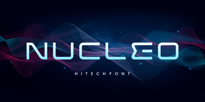 INTRODUCING NUCLEO – Modern Display typeface! NUCLEO is a modern monoline font with unique style that will make your design looks modern and futuristic. You can use this font for any purpose, especially to make logotype like a technology logo brand. This typeface is comes in uppercase, lowercase, punctuation, symbols, numerals, etc also support multilingual. Enjoy!
 - Speed Test by Kaer,
$20.00 Hey! I'm happy to introduce to you my new font in fast speed style. Dry brush stroke with grunge lines and dots. Perfect for Taxi logo, Race poster, Sport identity, etc. You’ll get: * Uppercase (lowercase glyphs are the same) * Numbers * Symbols Please feel free to request any help you need: kaer.pro@gmail.com Best, Roman.
 - Little Merry by Astageni,
$15.00 "Introducing Little Merry — the bubbly, round typeface that adds a touch of whimsy to your design endeavors! This fun and friendly script font boasts a bold style, perfect for sparking creativity in your projects. Whether you're crafting T-shirt designs, phone cases, greeting cards, invitations, mugs, or anything else you can imagine, Little Merry is here to infuse your creations with charm. Let your designs come to life with this delightful font and unleash your creative spirit!"
 - Optima Cyrillic by Linotype,
$65.00Many typefaces are distinctive or attractive at the expense of legibility and versatility. Not so the Optima® family. Simultaneously standing out and fitting in, there are few projects or imaging environments outside of its range. Although Optima is almost always grouped with sans serif typefaces, it should be considered a serifless roman. True to its Roman heritage, Optima has wide, full-bodied characters – especially in the capitals. Only the E, F and L deviate with narrow forms. Consistent with other Zapf designs, the cap S in Optima appears slightly top-heavy with a slight tilt to the right. The M is splayed, and the N, like a serif design, has light vertical strokes. The lowercase a and g in Optima are high-legibility two-storied designs. Optima can be set within a wide choice of line spacing values – from very tight to very open. In fact, there are few limits to the amount of white space that can be added between lines of text. Optima also benefits from a wide range of letter spacing capability. It can be set quite tight, or even slightly open – especially the capitals. If there are any guidelines, Optima should be set more open than tight. It’s not that readability is affected that much when Optima is set on the snug side; it’s just that the unhurried elegance and light gray typographic color created by the face are disrupted when letters are set too tight. Optima is also about as gregarious as a typeface can be. It mixes well with virtually any serif design and a surprisingly large number of sans serif faces. The Optima family is available in six weights, from roman to extra black, each with an italic counterpart. In addition, the family is available as a suite of OpenType® Pro fonts, providing for the automatic insertion of small caps, ligatures and alternate characters, in addition to offering an extended character set supporting most Central European and many Eastern European languages. When you’re ready to find its perfect pairing, browse these fantastic matches: Monotype Century Old Style™, Dante®, Frutiger® Serif, Joanna® Nova, Malabar™, and Soho®. - Optima by Linotype,
$45.99 Many typefaces are distinctive or attractive at the expense of legibility and versatility. Not so the Optima® family. Simultaneously standing out and fitting in, there are few projects or imaging environments outside of its range. Although Optima is almost always grouped with sans serif typefaces, it should be considered a serifless roman. True to its Roman heritage, Optima has wide, full-bodied characters – especially in the capitals. Only the E, F and L deviate with narrow forms. Consistent with other Zapf designs, the cap S in Optima appears slightly top-heavy with a slight tilt to the right. The M is splayed, and the N, like a serif design, has light vertical strokes. The lowercase a and g in Optima are high-legibility two-storied designs. Optima can be set within a wide choice of line spacing values – from very tight to very open. In fact, there are few limits to the amount of white space that can be added between lines of text. Optima also benefits from a wide range of letter spacing capability. It can be set quite tight, or even slightly open – especially the capitals. If there are any guidelines, Optima should be set more open than tight. It’s not that readability is affected that much when Optima is set on the snug side; it’s just that the unhurried elegance and light gray typographic color created by the face are disrupted when letters are set too tight. Optima is also about as gregarious as a typeface can be. It mixes well with virtually any serif design and a surprisingly large number of sans serif faces. The Optima family is available in six weights, from roman to extra black, each with an italic counterpart. In addition, the family is available as a suite of OpenType® Pro fonts, providing for the automatic insertion of small caps, ligatures and alternate characters, in addition to offering an extended character set supporting most Central European and many Eastern European languages. When you’re ready to find its perfect pairing, browse these fantastic matches: Monotype Century Old Style™, Dante®, Frutiger® Serif, Joanna® Nova, Malabar™ and Soho®.
 - IronType SG by Spiece Graphics,
$39.00 IronType (formerly known as Ironman) is an extra bold geometric titling face in the Art Deco poster tradition. A warm sense of strength and playfulness runs throughout this design. Triangular-shaped crossbars are some of its distinguishing characteristics. The face also contains some very amusing alternates. The tails of the alternate cap K and R extend below the line and the alternate cap N has a hump instead of a diagonal stroke. A handy set of lowercase letters with lining and smaller figures are also included. IronType Extra Bold is now available in the OpenType Std format. Some new characters have been added to this OpenType version. These advanced features work in current versions of Adobe Creative Suite InDesign, Creative Suite Illustrator, and Quark XPress. Check for OpenType advanced feature support in other applications as it gradually becomes available with upgrades.
 - Uni Sans by Fontfabric,
$29.00 Important! There is a whole new redesigned version (remake) of Uni Sans called Uni Neue . The Uni Sans font family includes 14 weights - seven uprights with seven italics. It is characterized by excellent legibility in both - web & print design areas, well-finished geometric designs, optimized kerning, excellent web-font performance and legibility etc. Inspired by the classic grotesque strong typefaces like DIN and Dax - Uni Sans has his own unique style in expressed perfect softened geometric forms. The font family is most suitable for headlines of all sizes, as well as for text blocks that come in both maximum and minimum variations. Uni Sans font styles are applicable for any type of graphic design in web, print, motion graphics etc and perfect for t-shirts and other items like posters, logos. PDF Specimen also available - click here .
 - Mackay by René Bieder,
$39.00 Mackay is a powerful transitional serif in 6 weights plus matching italics, designed for screen and print. The eccentric serifs on uppercase letters like E, F, L and T are inspired by Alexander Kay’s “Ronaldson” from 1884, working as the starting point for the family. The lowercase letters follow the traditional Antiqua model with attributes tracing back to drawings from the early 20th century. The “grotesk” lowercase a, as well as the sharp lowercase s, derived from the closed shapes of uppercase letters like C, G or S, create a compact and bold appearance while a large x-height and small descenders add a modern look. In favor of a dynamic and elegant impression, the design of the italic cuts come with a strong calligraphic influence. This results in completely new shapes for letters like lowercase a or g, ensuring a smooth integration into their surrounding letters while maintaining a distinctive appearance when combining with romans. The family comes with a variety of opentype features like case sensitive shapes, old style figures, fractions, ordinals and many more. Additional attention was given to the standard and discretionary ligatures, extending the structure of the basic glyphs with elegantly designed letter combinations for g/i, i/t or s/t. According to their dynamic architecture, the italic weights are equipped with additional initial swash characters to subtle accentuate the calligraphic roots. As a result of a high stroke contrast the family works great in paragraphs with medium to large font sizes like headlines, short paragraphs or logos. With its 12 cuts, the family meets all requirements on high quality typography.
 - Casta by Dirtyline Studio,
$39.00 Casta is strong Modern contrasts make this typeface both impressive at display sizes and easily readable in text size, while the sharp shapes of the triangular serifs and the distinctive letter shapes show their strength in logo design and impressive editorial use. Casta come with elegant style, strength and contrasts, with features an extended latin character set of 429 glyphs covering over 28 languages, and includes advanced open type features like standard and discretionary ligatures, positional numerals, stylistic alternates and case sensitive brackets. Mixing versatility and personality, Casta is ready to be like a top model on the design catwalk, making your projects looking classic but contemporary, finely tuned but assertive, and elegant as the best luxury fashion.
 - Narcost by Skypia,
$15.00 Narcost is a modern vintage serif font packaged in a modern and classy style, complete with access to your OpenType features to access a large selection of alternates letters and ligatures, the choice of letters you like from variations of uppercase and lowercase letters to get a display luxurious and elegant. Unique, playful and versatile serif family with 35 ligatures and 61alternates to beautify the design you like. This font is perfect for branding projects, Logo design, Clothing Branding, packaging, magazine headings, advertising, T-shirts, postcards and much more. What is included: Narcost Regular Narcost Italic Features · All Uppercase and Lowercase · Number & Symbol · Supported Languages · Alternates and Ligatures · PUA Encoded Thank you, Skypia
 - Birthday Party by Senekaligrafika,
$12.00 "Birthday Party" is a playful handwriting font special for childish display,that puts a smile on your project and will inspire you to create something fun and memorable.It is perfect for greeting card, headings, flyer, product packaging, book cover, printed quotes, logos, etc. "Birthday Party" will help you to create special and touching typographical design for childish projects, for every day or the happiest day in life, summer vacations, baby shower, happy birthday cards and many more. It is really universal and modern font. The owner of endless possibilities!
 - Ye Carbon by Yinon Ezra,
$30.00 Slab-serif typeface, with pulsating and flexible forms, which gives the font its humanistic character. Ye Carbon crystallized into its forms in search for graphic language that would represent a sense of matter, of letters written by hand. The delicate finishes at the edges of the letters, and the flexibility of the of shapes, gives a feeling of matter, and bring the font to life. Ye Carbon will be a wonderful tool for variety of uses, thanks to its neat nature, and its forms in motion vibe, a rare and winning combination.
 - Witchkin by Factory738,
$15.00 Are you looking for a font that can take your horror projects to the next level? Look no further than Witchkin – the perfect font for all your spooky needs! With its unique atmosphere and high-quality design, you’ll be able to create a project that will give your audience chills. Try Witchkin and bring your nightmares to life! 6 Styles Basic Latin A-Z and a-z Numerals & Punctuation Stylistic Ligatures and Alternate Glyphs Multilingual Support for ä ö ü Ä Ö Ü … Thanks for looking, and I hope you enjoy it.
 - Bubble World by Senekaligrafika,
$12.00 "Birthday Party" is a playful handwriting font special for childish display,that puts a smile on your project and will inspire you to create something fun and memorable.It is perfect for greeting card, headings, flyer, product packaging, book cover, printed quotes, logos, etc. "Birthday Party" will help you to create special and touching typographical design for childish projects, for every day or the happiest day in life, summer vacations, baby shower, happy birthday cards and many more. It is really universal and modern font. The owner of endless possibilities!
 - Viva Maria by Autographis,
$39.50 Viva Maria could have been used for that famous, hilarious movie by Louis Malle staring Brigitte Bardot and Jeanne Moreau. Maybe in a remake someone will use this very lively script in the credits and advertising material. Olé!
 - Pepperminta by PizzaDude.dk,
$16.00 A curly and playful sans serif font with blurry lines. Fits nice to anything that has to do with products for kids! Comes with 3 different versions of each lowercase letter, and they automatically cycle as you type
 - Alfrere Banner by Greater Albion Typefounders,
$12.00 Alfrere Banner is a 1950s inspired masthead typeface, designed to complement our ‘Alfrere Sans’ typeface family. These two Banner faces, offered in regular and incised forms, emphasise horizontal lines and have a distinct ’streamline-era’ feel to them.
 - Kollate by Invasi Studio,
$19.00 Kollate - a display serif with a line, simple, clean, and visually elegant. Specially designed for elegant-themed projects, perfectly suitable for creating simple, clean, lifestyle designs such as logos, titles, magazines, and more. The font features standard ligatures.
 - Big Citee by Rex Face,
$19.99 Big Citee is a robust, industrial looking display font. Its name is linked to the characters' strong stems looking like a wall of sky scrapers. Big Citee is strong and impactful, making it ideal for headlines and signage.
 - Noopla by Rex Face,
$20.00 Noopla is a modern sans-serif display font. Key characters are formed with sweeping and flowing lines, resulting in some really interesting word forms. With four weights, Noopla is great for branding, headlines, signage, social media and more.
 - Bowman by ParaType,
$25.00Bowman is an informal slab-serif face written by hand with a marker. Its live and playful nature makes it suitable for comic books, illustrations, informal advertising and package design. Designer Alexandra Korolkova. Released by ParaType in 2010. - Mr Robot by Hipopotam Studio,
$16.00 Mr Robot is a typeface designed for our next book for children. We wanted to have a colorful, dimensional and edgy looking letters for headlines. There are three ways to use Mr Robot. You can align three text frames with same text but with different colors and font styles (Regular, Shadow 1 or Shadow 3 and Shadow 2) or with ALLinONE font style but select a different OpenType Stylistic Sets (set 1 is like Shadow 1, set 2 like Shadow 2 and set 3 like Shadow 3). This works great but we don’t like to have unnecessary text frames in our layouts so we added a very cool Contextual Alternates OpenType feature. You just need Mr Robot ALLinONE style and only one text frame. First make sure that Contextual Alternates is off. Type every character three times (RRROOOBBBOOOTTT), select colors for each letter (first letter of every three is a side shadow, second is bottom shadow and third is a front of the dimensional letter). When everything is set just turn Contextual Alternates back on. Styles and alignment will be set automatically. Check out the Users Manual for a visual explanation. For web fonts it is better (at least for now) to use the first method (with font styles) as the OpenType features are not supported in older browsers.
 - Spiderwort by Nathatype,
$29.00 Spiderwort is a lovely script font designed in a natural handwriting look. Like the other cursive fonts, the letters are interconnected to each other. This font type is perfectly applicable for texts that combine uppercases and lower cases in order for the writing to look flawlessly connected. Furthermore, it expresses soft and relaxing nuances to use in informal texts. The character of this font is the low contrasts in thin, unfirm lines. Nevertheless, it shows you unique, artistic displays on your designs particularly when you use it well and based on the desired theme. You can apply this font for any text sizes because it is greatly legible and also enjoy the available features here. Features: Ligatures Stylistic Sets Multilingual Supports PUA Encoded Numerals and Punctuations Spiderwort fits best for various design projects, such as brandings, invitations, greeting cards, name cards, quotes, printed products, merchandise, social media, etc. Find out more ways to use this font by taking a look at the font preview. Thanks for purchasing our fonts. Hopefully, you have a great time using our font. Feel free to contact us anytime for further information or when you have trouble with the font. Thanks a lot and happy designing.
 - Quayside by Eclectotype,
$40.00 Quayside is a deliciously thick and bulbous baseball script, with a wealth of OpenType features. Features include: Contextual alternates - I would suggest having these on by default; they make letters connect more smoothly (uppercase letters like M and H, which are normally non-connecting for all-caps purposes, connect to lowercase letters. The swash variant of J, and all o and b characters connect to any e character at a lower junction for a smoother join). Contextual alternates also make sure special end-forms of lowercase letters are used at the ends of words. Ligatures - A nice collection of useful ligatures which make the text flow smoother. Swash - Gives you more exuberant capitals. Not recommended for all-caps usage! The swash function also gives a variation of the ampersand and turns # into a nice numero symbol. Oldstyle Figures - lining figures are default but with the flick of a switch in OpenType savvy applications, you get expressive oldstyle figures. Quayside is a versatile typeface. Depending on the mood you're after, it can easily be retro or modern, fun or (fairly) serious. I'm often pleasantly surprised by the wide variety of uses my fonts get put to, and I can't wait to see what you do with this one!
 - Fazeta Sans by Adtypo,
$32.00 Fazeta Sans is a perfect companion to serif typeface Fazeta. Two light weights were added, so the complete typeface consist of 14 fonts (7 weights + matching italics). The fine gradation lets you choose perfect weight for any type of project. Every font have 1140 glyphs – just like the serif version and contains the same features, so use and combining of whole typeface is very comfortable. Also fixed kerning allows better comfort for eyes by reading and shortens the length of the text. I tried to preserve sharp and cold impression from serif version, but some straight lines had to be curved due to the natural limitation of sans typefaces (for example the upper arch of “f” is shaped more smooth). However it keeps extremely open form. A little playfulness was left at the end of letters “k, K, and R”, but if you want, this can be eliminated by using a rigorous SS01 feature. Serifs were here transformed into a small yaw from main stroke and so enlive the monotony of sans kind of types. Also slight cutting the top of the letters helping to surprisingly vivid final impression. Fazeta Sans is therefore suitable for wide range of type sizes – from small marginalies to huge poster sizes. To see more please check the PDF specimen.
 - Ningsih Script by Bexxtype,
$15.00 Hello! This font is a challenge from my future wife. Ningsih Script a new fresh & modern script with a handmade calligraphy style, decorative characters and a dancing baseline! So beautiful on invitation like greeting cards, branding materials, business cards, quotes, posters, and more!! Ningsih Script come with 520 glyphs. The alternative characters were divided into several Open Type features such as Swash, Stylistic Sets, Stylistic Alternates, Contextual Alternates. The Open Type features can be accessed by using Open Type savvy programs such as Adobe Illustrator, Adobe InDesign, Adobe Photoshop Corel Draw X version, And Microsoft Word. And this Font has given PUA unicode (specially coded fonts). so that all the alternate characters can easily be accessed in full by a craftsman or designer. Foreign Languages Support: ÀÁÂÃÄÅÇÈÉÊËÌÍÎÏÐÑÒÓÔÕÖØÙÚÛÜÝßàáâãäåæçèéêëìíîïðñòóôõöøùúûüýÿ Ningsih Script : Uppercase & Lowercase International Languange & Symbols Support Punctuation & Number PUA Unicode Range Standard Stylistic Alternates Stylistic Set 1-21 Character Variant Contextual. If you don't have a program that supports OpenType features such as Adobe Illustrator and CorelDraw X Versions, you can access all the alternate glyphs using Font Book (Mac) or Character Map Windows). If you have any question, don't hesitate to contact me by email bexxtype@gmail.com Thanks and happy designing :-) Thank You for purchase!
 - Hot Script by Lián Types,
$49.00 Say hello to another of my hot and trendy scripts, Hot Script! I got the inspiration for this one in the world of sign painters. My neighbourhood, and more specifically the avenue were I live, is very well known for its ''parrillas'': For those who don't know what this means, well, it may be better to live the experience rather than reading these lines. Villa Urquiza is full of restaurants with an argentinian flavour, with a ''gauchezco'' feel. Here you can taste some of the best ''asados'' in the entire world. Ok, this made me hungry, let's go back to type: These amazing venues still mantain genuine elements from the past, and try to preserve the beauty of the handcrafted. Parrillas of Buenos Aires have all their walls, windows and doors lettered with chalk or paint. I've always wanted to make a font out of that, and Hot Script is my first attempt. I believe the results are great! Hot Script follows some rules of the flat brush (see terminals, and tails especially in caps) but its contrast of thicks and thins was manually altered to make the font better for a wider range of uses. Although the sexy curves and versatility of Hot seemed to be enough, I decided to spice it a little more by creating some layers for it: Hot Script Shine Solo or Hot Script Shades Solo combined with Hot Script will give outstanding results. (Look for them combined in the posters above and dare to deny it!) Go make your project more savory! This font is Hot, hot, hot!
 - Daiquiri by Wiescher Design,
$39.50 Daiquiri is a revival of a handlettered font in two weights, from an ad for Puerto Rico Rum dating back to the forties or fifties. I found the ad on a French antique market on my last visit for Mardi Gras in Nice. The ad read "Breeze through the heat, be a Daiquiri fan". That's why they had this "fan" in the illustration! Did they want you to rotate like a fan when you had enough Daiquiris? Or did they just do it for that little "Jeu des mots"? Anyway I found the handlettering very pretty, so I took those few letters and made a whole font out of them. I think Daiquiri has that touch that brings those happy and uncomplicated times back when advertising was still fun. I started something like 20 years later in advertising and things had gotten more stringent. We already had to satisfy those marketing guys with their scholarly attitude. They have taken all the fun out of the job, for the creators as well as for the consumers. I would like to see more uncomplicated ads like this again, yours Gert Wiescher
 - FS Olivia Paneuropean by Fontsmith,
$90.00Antwerp On a visit to Belgium and the Netherlands while still an MA student at Reading University, Eleni Beveratou made some important discoveries. First, there was the letter ‘g’ from the Didot family seen at Plantin Moretus Museum in Antwerp, which seemed “almost like a mistake”. Then there were strange details such as the serifs on the “l”, “h”, “k”, “b” and “d” in Egmont Cursive and other typefaces by Sjoerk Hendrik de Roos, found in volumes of poetry she picked up from a chaotic bookshop in Amsterdam. These were characters that stood out from the text but seemed to blend harmoniously with the rest of the letters. “And there it was, the spark. I decided to design a typeface that would capture the details of the process of writing.” A guiding hand Eleni shared her initial thoughts with Phil Garnham and Jason Smith. They liked what they saw in her tentative first sketches, and gave her the chance to develop her ideas further. Phil, in particular, provided valuable input as FS Olivia took shape. Eleni’s main influence – the handwritten – would give the font its character. “When creating a typeface,” says Eleni, “it’s fair to say that it reflects some of the designer’s personality. And that’s certainly the case with FS Olivia. “Although technology is part of my everyday life. I am a great admirer of traditional graphic design where you can touch and feel paper and ink.” Irregular “What I particularly like,” says Eleni, “is that a printed item can develop its own personality sometimes as a result of imperfections in the print. “FS Olivia has some of these characteristics as it’s inspired by handwriting, and yet it also includes some very modern features.” Feminine and fascinating, FS Olivia captures the expressive twists and turns of (the poet’s?) pen on paper, with low junctions, deep top serifs and semi-rounded edges. Round outstrokes contrast with the rough corners of the instroke, while strong diagonals and inclined serifs create a richly textured pattern. Polytonic It’s only fitting that there should be a version of this poetic font for one of the birthplaces of poetry and song. Eleni, who hails from Athens, developed an extensive range of glyphs that could be used for the Greek language, in both modern and ancient texts. For the latter, there is a version of Olivia for displaying polytonic Greek (a system that utilises a range of accents and “breathings”), which brings the 21st century technology of OpenType to the presentation of poetic texts from Ancient Greece. Just think what Homer could have done with that. - FS Olivia by Fontsmith,
$70.00 Antwerp On a visit to Belgium and the Netherlands while still an MA student at Reading University, Eleni Beveratou made some important discoveries. First, there was the letter ‘g’ from the Didot family seen at Plantin Moretus Museum in Antwerp, which seemed “almost like a mistake”. Then there were strange details such as the serifs on the “l”, “h”, “k”, “b” and “d” in Egmont Cursive and other typefaces by Sjoerk Hendrik de Roos, found in volumes of poetry she picked up from a chaotic bookshop in Amsterdam. These were characters that stood out from the text but seemed to blend harmoniously with the rest of the letters. “And there it was, the spark. I decided to design a typeface that would capture the details of the process of writing.” A guiding hand Eleni shared her initial thoughts with Phil Garnham and Jason Smith. They liked what they saw in her tentative first sketches, and gave her the chance to develop her ideas further. Phil, in particular, provided valuable input as FS Olivia took shape. Eleni’s main influence – the handwritten – would give the font its character. “When creating a typeface,” says Eleni, “it’s fair to say that it reflects some of the designer’s personality. And that’s certainly the case with FS Olivia. “Although technology is part of my everyday life. I am a great admirer of traditional graphic design where you can touch and feel paper and ink.” Irregular “What I particularly like,” says Eleni, “is that a printed item can develop its own personality sometimes as a result of imperfections in the print. “FS Olivia has some of these characteristics as it’s inspired by handwriting, and yet it also includes some very modern features.” Feminine and fascinating, FS Olivia captures the expressive twists and turns of (the poet’s?) pen on paper, with low junctions, deep top serifs and semi-rounded edges. Round outstrokes contrast with the rough corners of the instroke, while strong diagonals and inclined serifs create a richly textured pattern. Polytonic It’s only fitting that there should be a version of this poetic font for one of the birthplaces of poetry and song. Eleni, who hails from Athens, developed an extensive range of glyphs that could be used for the Greek language, in both modern and ancient texts. For the latter, there is a version of Olivia for displaying polytonic Greek (a system that utilises a range of accents and “breathings”), which brings the 21st century technology of OpenType to the presentation of poetic texts from Ancient Greece. Just think what Homer could have done with that.
 - Loominaire by IbraCreative,
$37.00 Introducing Loominaire - A Modern Futuristic Font! Step into the future with Loominaire, a captivating and cutting-edge font that embodies the essence of modernity and innovation. Designed to make your designs stand out and leave a lasting impression, Loominaire brings a touch of sleek sophistication to your creative projects. With its clean lines and geometric precision, Loominaire exudes an aura of futuristic elegance. Each letter is meticulously crafted to create a harmonious balance between contemporary aesthetics and legibility, ensuring that your message is conveyed with clarity and style. This font is perfect for those seeking to add a touch of modernity to their branding, advertisements, websites, posters, and more. Captivate your audience with Loominaire's versatility, whether you're creating a high-tech logo, a sci-fi movie poster, or a forward-thinking website interface. Loominaire unleashes your creative potential with its extensive character set, including uppercase and lowercase letters, numerals, punctuation marks, and a variety of special symbols. Its versatility extends beyond the confines of traditional design, allowing you to explore endless possibilities and push the boundaries of visual communication. Embrace the future of typography with Loominaire - a font that bridges the gap between contemporary design and futuristic aesthetics. Let your creativity soar and watch as your designs come to life with a touch of modern elegance. Unlock the power of Loominaire today and revolutionize your creative projects with this extraordinary modern futuristic font.
 - Mundbind NL by Hanoded,
$15.00 I just visited my good friend Jakob Fischer from Pizzadude.dk in Denmark. As always we talked fonts, drank coffee and walked endlessly through Copenhagen, the city where he lives. We thought it would be a fun idea to each create a font from a handmade sign we saw in the city. We only had like 7 glyphs to work with, so the rest was up to our imagination. We also thought it would be nice to give the fonts a similar name. Mundbind means mask in Danish. When you Google translate it, it will give you the wrong translation (it will say 'mouth piece'), so trust me on this one! My font is called Mundbind NL - where the NL stands for Netherlands. Jakob will hopefully call his finished font Mundbind DK - where the DK stands for Denmark. Mundbind NL comes with a monster load of diacritics (including Vietnamese) and two alternate glyphs for the lower case letters that will cycle as you type.
 - Lugano by Greater Albion Typefounders,
$14.00 Lugano has it’s inspiration in 1920s advertising material and is ideal for lively banner lettering, posters and cover design. Four typefaces are offered - Lugano comes in regular, alternate, striped and alternate striped forms. Try it out and inject a little fun into your work today!
 - Hey Sucka by Stationjack,
$18.00 Hey Sucka is a hand drawn, bold and playful cartoon like font. Upper and lowecase, numbers, punctuation and special characters including advanced latin, basic cryllic and advanced cryllic character sets. This font would be ideal to use on product packaging, magazines, posters, t-shirts.
 - FF InnerCity by FontFont,
$30.99 British type designer James Closs created this display FontFont in 1994. The family contains 2 weights and is ideally suited for film and tv and poster and billboards. FF InnerCity provides advanced typographical support with features such as ligatures. It comes with proportional lining figures.