10,000 search results
(0.044 seconds)
- Portada by TypeTogether,
$35.00 For everyone wishing for a modern serif that’s as clear and readable as a sans in restrictive digital environments, meet Portada by Veronika Burian and José Scaglione. Sans serifs are commonly used on small screens to save space and carry a modern tone. Serifs may appear fickle and unsteady, pixel grids change from one product to another, and space is at a premium. Portada now provides a serif option for these restrictive digital environments, putting that old trope to rest. The screen has met its serif match. Portada was created from and for the digital world — from e-ink or harsh grids to Retina capability — making it one of the few serifs of its kind. Portada’s text and titling styles were engineered for superlative performance, making great use of sturdy serifs, wide proportions, ample x-height, clear interior negative space, and its subservient personality. After all, words always take priority in text. It’s not all business, though. Portada’s italics contain an artefact of calligraphy in which the directionality of the instrokes and the returning curves of the outstrokes give the family a little unexpected brio. Yet even the terminals are stopped short of flourished self-absorption to retain their digital clarity. When printed these details are downright comforting. Portada’s titling styles enact slight changes while reducing the individual width of each character and keeping the internal space clear. Titling italics have increased expressiveness across a few characters rather than maxing out the personality in each individual glyph. Digital magazines, newspapers, your favourite novel, and all forms of continuous screen reading benefit from Portada’s features. This family can also cover many of the needs developers have: user interface, showing data intensive apps on screen, even one-word directives and dialogs. And, as a free download, an exhaustive set of dark and light icons is included to maintain Portada’s consistent presence, whether as a word or an image. The complete Portada family (eight text styles, ten titling styles, and one icon set) is designed for extensive, clear screen use — a rare serif on equal footing with a sans.
 - Algebra Style by Sensatype Studio,
$15.00 An Unique Modern Display font that we created special for unique branding needs, with weird shape will be ready to add value of your brand. It so nice to leverage designer or product owner that need solutions to make their design look more standout and modern. And specially for this font, We prepared any characters to help you create unlimited variations for your creative needs. Algebra Unique Modern Display Font ready with: Ready with Unique Characters Preview as a inspirations that you can do with Algebra font Ready with Lowercase and Uppercase characters Wish you enjoy our font. :)
 - Tokyo Style by Sensatype Studio,
$15.00 Tokyo Style is a Modern sans serif display font that special created for Modern needs with unique style. A New Display font that we created special for Unique branding needs, with weird style that ready to add value of your brand. It's so nice to leverage designer or product owner that need solutions to make their design look more unique and urban. Tokyo Style Unique Sans Serif font ready with: All Uppercase characters Numbers and Punctuations Preview as a inspirations that you can do with Tokyo Style font Available for PC and Mac Wish you enjoy our font. :)
 - Flamboyan Style by Sensatype Studio,
$15.00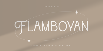 An unique font for unique feminine branding needs, with extra alternates in unique shape will be ready to add value of your brand. It so nice to leverage designer or product owner that need solutions to make their design look more unique and modern. And specially for this font, We prepared any alternate characters to help you create unlimited variations for your creative needs. Flamboyan Feminine Modern Display Font ready with: Any options to get creative variations (combination of Alternates) Preview as a inspirations that you can do with this font Ready with Lowercase and Uppercase characters Wish you enjoy our font. :)
 - Androgino by Cititype,
$17.00 Androgino is a unique handwritten font with deconstruction concept, where each letters connected to others with different spaces and sizes and sometimes overlaps. This font has an abstract 'dual interpretation'. On the one hand, the unique design of the letters does not have a stylistic tendency. On the other hand, the letters are combined in a unique form when they become sentences. Coupled with several ligatures that add diversity and give a certain surprise and impression when typed. Unique and stand out is the right definition for Androgino. It’s another word of Androgynous, Feminism which is masculine, suitable for all types of branding.
 - The Drunken Sailor font, crafted by the prolific Manfred Klein, is a whimsical and playful typeface that embodies the spirit of maritime lore and the rolling waves of the sea. Its letters, with their...
- Macaw by Unio Creative Solutions,
$4.00 “Macaw” is a welcome addition to our library, a modern serif typeface with roots in classical typography. Its forms are sober and delicate in its lightest weights and as the width increases to the boldest, it unleashes a powerful and distinctive emphasis on your project. Developed in a range of four weights with a matching set of true italics, the design of Macaw takes its inspiration from the Italian newspaper market at the beginning of last the century, a time where roman typography was predominant. In fact, the main purpose of this typeface is to preserve versatility and legibility, to prescind from any text size. A multilanguage serif family with a unique fluidity to modern and classic projects. Particularly useful for any editorial need and seamlessly adaptable to any destination of use such as corporate identity, web design, and social feeds. Specifications: - Files included: Macaw Light, Macaw Regular, Macaw Medium, Macaw Bold with corresponding italics - Formats:.otf - Multi-language support (Central, Eastern, Western European languages) Thanks for viewing, Unio.
 - Finalist Round Slab by Bülent Yüksel,
$19.00 The font was intended primarily to have a stronger body. It has a simple geometrical surface. This font has a strong personality, that makes it perfect for use in headline sizes but means it also works gracefully within text blocks. "Finalist Round Slab" is carefully crafted and a unique slab serif. Use for websites, print, motion graphics, logo design, packaging design, t-shirts and more. The designation “Finalist Round Slab Regular” forms the central point. The first figure of the number describes the stroke thickness: Thin to Black. "Finalist Round Slab" comes 7 weights and italics total 14 types. The family contains a set of 450+ characters. Case-Sensitive Forms, Classes and Features, Fractions, Superior, Inferior, Denominator, Numerator, Old Style Figures just one touch easy In all graphic programs. You can enjoy using it. UPDATES: - 30 December 2015 Opentype Feature (fractions) and some kerning. - 11 June 2018 Solving some UNICODE problems on the internet. - 12 March 2019 Some error has been fixed. - 19 November 2019 Some error has been fixed. - 16 August 2021 New Version - 2.0 Some error has been fixed.
 - Sinoreta by Mans Greback,
$69.00 Sinoreta is a classic serif font with a bold retro style that adds sophistication and elegance to any design. The decorative alternates add a touch of uniqueness, making Sinoreta perfect for projects that require a bold and proper typographic presence. Whether it's branding, logos, headlines, or editorial designs, Sinoreta will bring a timeless and tasteful touch to your work. This font is designed by Mans Greback in 2023 and combines traditional serif style with modern design elements. Choose Sinoreta for a retro, elegant and versatile font that will make your designs stand out. The Sinoreta family consists of four high-quality fonts: Regular, Italic, Bold and Bold Italic The font is built with advanced OpenType functionality and has a guaranteed top-notch quality, containing stylistic and contextual alternates, ligatures and more features; all to give you full control and customizability. It has extensive lingual support, covering all Latin-based languages, from Northern Europe to South Africa, from America to South-East Asia. It contains all characters and symbols you'll ever need, including all punctuation and numbers.
 - Astralaga by SG Type,
$19.00 Elegant, graceful, and timeless. Astralaga is a versatile font family with a timeless, classic appeal, over 50 alternates & ligatures and multilingual support. Every letter has been hand-drawn and crafted with the upmost care. The variety of weights provide a range of choices that will help you find the best typographic character for your project. All 5 weights are well-suited for large display uses and high impact headlines. The available stylistic alternates and ligatures offer a number of different options that give your project a unique look. This high contrast serif typeface features a total of 1850 glyphs and offers comprehensive language support. THE 5 WEIGHTS OF ASTRALAGA Astralaga Light – very delicate and elegant Astralaga Regular – a classic beauty with gorgeous shapes Astralaga Medium – a great midground between lights and bolds Astralaga Semibold – high contrast and high impact Astralaga Bold – pure boldness and elegance FEATURES 5 weights High contrast 40 ligatures per weight 11 alternate glyphs per weight 1850 glyphs Comprehensive language support OpenType features: Access All Alternates, Discretionary Ligatures, Fractions, Kerning, Standard Ligatures, Stylistic Alternates, Stylistic Set 1, Superscript
 - Honey Beachy Sh by Sohel Studio,
$14.00 Honey Beachy is a retro display serif font that exudes a classic charm and bold character. With its design inspired by retro styles, this font brings an elegant touch and evokes a sense of the past. Each letter is meticulously crafted with careful attention to detail and proportion, resulting in a visually appealing and unique appearance. Honey Beachy is perfect for projects that require a vintage feel, such as posters, logos, packaging, and promotional materials that aim to capture a nostalgic and sophisticated atmosphere. This font will add a special touch to your designs and captivate viewers with its retro allure and distinctiveness. Honey Beachy Features: - Regular And Outline - Uppercase And Lowercase - Alternates And Ligature - Numerals & Punctuation - Accented characters - Multilingual Support - Unicode PUA Encoded While using this product, if you encounter any problem or spot something we may have missed, please don't hesitate to drop us a message. We'd love to hear your feedbacks in order to further fine-tune our products. Thanks and have a wonderful day .
 - Shackie Handpainted by Mans Greback,
$59.00 Shackie Handpainted is a striking custom lettering font, embodying the charm and flair of a script brush. This logotype font is perfect for projects requiring a cool and edgy touch, such as T-shirt designs and sign painting. With its unique hand-painted style, Shackie Handpainted brings a distinctive appeal to your creative work. The font's dynamic brushstrokes lend it the authentic feel of a sign painter's masterpiece, making it an excellent choice for projects that call for custom lettering and a personal touch. The Shackie Handpainted font family includes six expressive styles to suit various design needs: The weights Thin, Regular and Bold, with each thickness as Italic. The font is built with advanced OpenType functionality and has a guaranteed top-notch quality, containing stylistic and contextual alternates, ligatures and more features; all to give you full control and customizability. It has extensive lingual support, covering all Latin-based languages, from Northern Europe to South Africa, from America to South-East Asia. It contains all characters and symbols you'll ever need, including all punctuation and numbers.
 - Catenary by Active Depth,
$6.00 The Catenary typeface was designed with the goal of creating an extremely-readable sans-serif font that could weather the future. Inspired by the beauty of the catenary curve, it's a blend of the transitional and the geometric that allows it to be readable while keeping its forms precise and consistent. Every character in its set is unique, leaving no confusion between similar letter forms. Sixes and nines can be distinguished even when they're upside down or sideways. The number one, the lowercase-L, and the uppercase-I can never be confused with one another, even without context. Throw b, d, g, p, and q into a jumble and the challenge of distinguishing the characters can easily be overcome. The Catenary family consists of eight fonts, six of which, the standard light/italic, regular/italic, and bold/italic, work as both excellent text fonts and exceptional display fonts. The two bonus fonts, a stencil and a guerrilla grunge style, make for great additional display font choices. The Catenary family is extremely versatile and ready for your toughest design work.
 - Mullingar by Fontdation,
$18.00 Introducing Mullingar, our latest submission to the display typeface’s world library. Heavily inspired by the letters that are used in old/classic advertisements and signpainting culture, with a little magic touch of modern twist to keep this family relevant. Mullingar letterforms were built from bold and blocky base, unique serif combinations, clean plus smooth curves, and sharp edges. Available in six styles (Regular, Bold, Light, plus Slanted in each version), that guaranteed to give you joy in designing. Mullingar family is a reminiscent of retro sign painting, featuring a rustic architecture that makes it quite at home in a wide variety of design themes. Its blocky characters are best used in bold signage, headlines, advertising, logo designs, product packaging, merchandise, apparel, posters, album artwork, book covers, titling, etc. This typeface also provides additional versatility through OpenType feature, offering discretionary ligatures, standard ligatures, and stylistic alternates. It extends multilingual support to Basic Latin, Western European, Euro, and Pan African Latin languages for design projects intended for an international audience.
 - Redpine by Taznix Creative,
$15.00 Redpine is an unique and simple sans serif font. Use it to add that special retro touch to any design idea you can think of! There are 2 types of fonts in Redpine, namely clean and textured. If you need a clean and aesthetic design, you can use the regular redpine or you want to use as a rough design or some scratch effect, you can use textured Redpine. Redpine is perfect for branding projects, logo, social media posts, advertisements, product packaging, product designs, label, photography, watermark, invitation, stationery and any projects that need retro taste. What's Included : Standard glyphs Ligature Works on PC & Mac Simple installations Accessible in the Adobe Illustrator, Adobe Photoshop, Adobe InDesign, even work on Microsoft Word. PUA Encoded Characters - Fully accessible without additional design software. Fonts include multilingual support for; ä ö ü Ä Ö Ü ß ¿ ¡ Image used : All photographs/pictures/vector used in the preview are not included, they are intended for illustration purpose only. Hope you enjoy with our font! Taznix
 - Slatz by CozyFonts,
$20.00 The Slatz Font Family is Vertical. It has a slender, consistent weight that is best used in limited, left to Right, space limitations as to maximize font height. Slatz font variations all have extremely clean edges and even the serif versions are crisply defined with a flat-pointed serif for an added unique character. The designed intent was for a tight kern, however evenly letterspacing these family members give a distinct personality and continues to command the negative space just as in tight kerned examples. The compatible relationship of these font family members, serif to sans serif, and regular to italic is seamless and the overall design coloring of words as sentences is well balanced and extremely legible. The Slatz Family fonts are matching members glyph to glyph yet there is a noticeable difference between the serif and sans serif members. The sans serif works in contemporary and vintage settings. The serif members work particularly well in vintage, period applications. The Bold and Drop versions of Slatz also fit the above descriptions and also work on their own.
 - Adriane Text by Typefolio,
$49.00 Adriane Text was designed between 2006 and 2007 with additional production completed by Silas Dilworth for this 2008 release [v1.002]. Focusing on text composition and unique typographic characteristics, details within the characters provide both personality and excellent legibility at small sizes. With a medium contrast, a predominantly vertical axis, and a generous x-height, it can be classified as a transitional typeface. This package of advanced OpenType fonts consists of the style-linked quartet of Regular and Bold weights accompanied by corresponding Italics, each of which include small caps and full support for Extended Latin character sets - now including Central European diacritics. Old style and lining figures are provided in both proportional and tabular spacing, and an extensive set of ligatures, ornaments, dingbats, and alternate ampersands are available across the family. The Italics possess a fluidity that contrasts with the staid posture of the Roman styles. The degree of inclination for the uppercase and lowercase characters are slightly different, offering an enhanced visual rhythm in the text settings.
 - Morro by Great Scott,
$16.00 Morro is based on simple geometric shapes – circles, triangles and rectangles. Imagine cutting circles, triangels and rectangles from paper and arranging them into letters where the outer edges form a filled figure. Arranging figures like this to form letters is nothing unique. You can find several beautiful examples of alphabets that inspired the creation of Morro. Everywhere from a 1936 booklet by Draughtsman called ”Modern lettering for all branches of commercial arts” to obvious examples is from the paragon of the design industry - Milton Glaser - with his typeface Baby Teeth. What sets Morro apart from other digitized versions of Glasers' ”Baby teeth”, or other similar designed fonts, is that Morro is expanded into lower case and also supports Basic latin, Western European, Central European, south Eastern European and Pinyin. There are also stylistic alternatives to some of the glyphs. Morro Regular works like a stencil and is accompanied by a block shadow style and an outline. The Morro family of fonts are layered and can be superimposed on each other to create several types of text effects.
 - Kardinal by Ani Dimitrova,
$30.00 Kardinal is a sans serif humanistic type family. The family has 16 weights, ranging from Thin to Black with extra drawn italics and small caps versions. The Kardinal type family is ideally suites for small text, books and magazines, branding, posters, as well as web and screen design, headlines and more. Kardinal comes in 16 styles with extended language support. All weights contain standard ligatures, proportional figures, tabular figures, old style figure, numerals and arrows, matching currency symbols and fraction. The construction of characters combines clean grotesque style and calligraphic features with humanist fragrance. Out standing for the designs are the small serifs. They are giving the letters movement and freshness, as well as contribute to a better readability in different volume texts and including lots of details that give it a unique personality. The Regular and Medium weights are perfect for body text while the italic give an interesting texture to the text. The range of styles give a good flexibility to this family. The fonts are carefully hinted and perfect for digital use.
 - Booer by Product Type,
$18.00 Introduce the Booer Font Express Your Creativity with a Powerful and Modern Gaming Style. Booer display is a font that reflects the power and style of the gaming world in a sharp, modern package. Booer is the perfect solution for a variety of projects that require a unique theme, whether it's a film, game, or streaming event. Her bold and exciting style provides room for creativity to flourish. What Makes Booer Special: Powerful Gaming Style, Booer Design exudes power, capturing the essence of the gaming world. Each letter is a statement of dominance and modernity. Two Style Families: The Booer font offers two different style families: Regular and Italic. This advantage allows you to adapt your designs to various contexts, whether requiring a strong presence or an elegant touch. Multilingual Support: Booer Font supports multiple languages, allowing you to connect with a global audience easily. Enhance your designs and make an impact with Booer Fonts. It's not just a font; it's a gateway to a bold, modern, and compelling visual world. Download Font Booer now and experience the thrill of creating unforgettable designs!
 - Xkanz by Xuveki,
$10.00 XKANZ is a futuristic, robotic, variable display font geared towards cyberpunk poster text, cover text, and futuristic UI. It can easily shine as both as header and body. Wide glyphs, high weight and corner contrast, and "connectors" that bridge the gap between the stems, it's this mix of elements that give XKANZ its unique look. The purchase includes two static styles, regular and oblique, and a variable font file with a interpolatable 0-12 degree slant axis. Extensive multilingual support covering most latin characters 4 stylistic sets that include alternates for the D, I, R, and E glyphs, along with symbol/punctuation alternates such as the parenthesis, brackets, and more. Possible updates include condensed versions. The updates will be free and available to everyone who has already purchases XKANZ. This one was a wild and weird journey. It took A LOT of iteration to get to this end product. I'm proud to share it. Enjoy All questions, requests, or inquiries can be sent to abe.xuveki@gmail.com or DM'd to Xuveki on Instagram (https://www.instagram.com/xuveki)
 - Agefin Regad by Product Type,
$17.00 Introducing Agefin Regad, the perfect solution for your superhero-themed projects! With its bold and standout serif design, Agefin Regad is the ideal font for any project that requires a robust and impactful look. Agefin Regad comes in two families: regular and slant, allowing you to choose the perfect style for your design. Whether you’re creating logos, headlines, or posters, Agefin Regad has got you covered. With its unique and attention-grabbing design, Agefin Regad is the perfect choice for projects that need to stand out from the crowd. And with its multilingual support, you can use it for projects all over the world. Get Agefin Regad today and take your superhero-themed designs to the next level! What’s Included : File font All glyphs Iso Latin 1 Ligature, Alternate We highly recommend using a program that supports OpenType features and Glyphs panels like many Adobe apps and Corel Draw, so you can see and access all Glyph variations. PUA Encoded Characters – Fully accessible without additional design software. Fonts include Multilingual support
 - Bunaero by Buntype,
$24.50 Buntypes Bunaero™ combines classical and contemporary characteristics to a unique and distinctive font family with extravagant but also harmonious appearance. The characters are clear, open and sometimes bellied. Especially the caps have a very high waistline. The font was manually hinted and contains extensive handcrafted kerning tables to ensure flawless appearance in all media. It supports at least 99 languages incl. Vietnamese and provides ligatures, alternative glyphs, special localized forms and even more enjoyable OpenType® features. Feature Summary*: - 9 weights, 18 styles: Hair, Light, Thin, SemiLight, Regular, SemiBold, Bold, ExtraBold and Heavy and corresponding italics - Supports at least 99 Languages incl. eastern european and vietnamese languages - Overall width: Narrow or Space-Saving - Advanced f- ligature set including fb - Discretionary s- and c- ligatures - Alternative Characters: a, e, f, g, i, k, l, t, v, w, y, J, K, Q, R, and more - Capital German Eszett - Extra characters with Polish Kreska - Catalan Punt Volat - Extra characters with alternate minimalistic Cedille * Some features may only be available in OpenType®-savvy applications
 - SF Seen by Sultan Fonts,
$9.99 "Seen" is the name of the gods in Kingdom of Hadhramaut 3,000 years ago Kingdom of Hadhramaut - Wikipedia "Seen" Font Family Will Add a Splash Of Historical Musnad writing To Your Designs Coming in 4 Styles: Regular,Medium,Bold and Black, "Seen" Font Family is a serif typeface designed by Sultan Maqtari. Each style of the font is incredible in its own way, with attractive curves, spacing, and ligatures. Ideal for bold headlines, short sentences, unique logos, and general graphics, this typeface will effortlessly add a hint of Musnad writing and a splash of Amazing past to any design. "سين" اسم آلهة في مملكة حضرموت قبل ٣٠٠٠ عام ستضيف مجموعة خطوط "سين" لمسة من كتابات المسند التاريخية إلى تصاميمك. تأتي عائلة الخطوط "سين" بأربعة أنماط: عادي،متوسط،عريض واسود ، وهي عبارة عن خط مزخرف صممه سلطان المقطري. كل نمط من الخط لا يصدق بطريقته الخاصة ، مع منحنيات جذابة ، ومسافات ، ووصلة ربط. مثالي للعناوين العريضة والجمل القصيرة والشعارات الفريدة والرسومات العامة ، سيضيف هذا الخط دون عناء لمسة من كتابة المسند ونفحة من الماضي المذهل إلى أي تصميم.
 - Magnesit Stencil by Rekord,
$22.00 Sporty and brawly, Magnesit Stencil creates impact everywhere it lands. Impressive headlines are its specialty, but it feels right at home used in packaging, branding and poster design. With a very tall x-height, wide language support and minimalistic yet playful appearance, it can take on any serious typographic job. Four distinct styles expand the possibilites even further: the straight to the point Regular, the friendly Soft and the determined Hard styles share metrics across related Magnesit and Magnesit Dark families, so you can mix and match to achieve exactly the effect you need. The SuperSoft style unique to the Magnesit Stencil family carries the concept to the extreme, mixing soft organic curves with rigid modularity inherent to stencil signage. Magnesit Stencil works great with illustrations, the generous shapes can be easily filled with strong imagery to great effect. Based on the best-selling Grim, Magnesit is a vast improvement of the concept with long awaited addition of lowercase, reworked proportions, spacing and kerning, expanded language support and useful icons to satisfy even the most demanding typographers’ needs.
 - Relato by Emtype Foundry,
$69.00 Relato has a low contrast and “a muscular” structure that makes it useful for setting longer text. In display sizes it has a variety of details that lends it a unique and personal expression. The formal principle of the serif, the variety of terminal strokes and the combination of curves and semi-straight lines gives the Relato a more “human” flavor. The inspiration for the design comes from different traditional calligraphic styles. The upper case letter, for example, is based on roman capitals from the Rennaissance, whereas the lower case relates to humanist handwriting. Even so, Relato is a decidedly contemporary typeface, proposing individual ideas on the design of type. The italic has a distinct typographic color thanks to the construction principle of broken lines. The bold weights have an increased contrast in the union of the strokes which helps improve legibility in small sizes and reinforce their personality in display sizes. The family consists of a Regular version, Italic, Small caps, Semibold and Bold. For a sans serif version of Relato, please see Relato Sans.
 - Hostilica by Heypentype,
$20.00 Hostilica is a semi-serif family designed by mixing classic serifs in the age of romanticism era with contemporary modern shape and curves. It gives a warm, friendly, and inviting feeling without losing a formality of text fonts. Every weight was designed carefully to provide a unique look while maintained the unity of the type family. A thin weight gives your content an elegant, luxurious design feel. While the regular weight, designed for body text, gives your content a warm and friendly design feel. The bold weight will make your headlines stand-out with its fat counters and curves. Therefore, Hostilica will accomodate all your design needs, from text to display, from catchy to luxury. The italics of each weight will spice up your design project especially with letter 'f,s,r,k, and y'. Those italic versions paired with alternate and discretional ligatures will add an organic feeling to your designs. The italic styles are designed by emulating a handwriting stroke, and will give a more personal feel while still maintained a formal sense.
 - Xkans SQ by Xuveki,
$10.00 XKANZ SQ is a blockier, more rigid variant of a previous font: XKANZ. It's a futuristic, robotic, variable display font geared towards cyberpunk poster text, cover text, and futuristic UI. It can easily shine as both as header and body. Wide glyphs, high weight and corner contrast, and "connectors" that bridge the gap between the stems, it's this mix of elements that give XKANZ its unique look. The family package (same price as any individual style) includes two static styles, regular and oblique, and a variable font file with a interpolatable 0-12 degree slant axis. Each style includes extensive multilingual support covering most latin characters. 4 stylistic sets that include alternates for the D, I, R, and E glyphs, along with symbol/punctuation alternates such as the parenthesis, brackets, and more. Possible updates include condensed versions. The updates will be free and available to everyone who has already purchases XKANZ SQ. All questions, requests, or inquiries can be sent to abe.xuveki@gmail.com or DM'd to Xuveki on Instagram (https://www.instagram.com/xuveki)
 - Enchanter by Cloveron Media,
$49.00 Cloveron Media unveils its first serif font that goes beyond the formal nature of typography. It celebrates the artistic expressions of graphic designers within themselves. The Name Mary Anne Remulla is the Master Designer behind the Enchanter Font. She aims to make graphic designers filled with delight and enjoy typography with its extensively artistic alternates and multilingual characters. The Font Style The serif style, known for its formal touch to typographic design, infuses the font with its professionalism as its regular. Using its middle alternate adds a hint of unique touch without losing the serif style's essence. The Enchanter font's start and end alternates are the designer's illustrations of design balance, which elevates its charm and enticing nature that adds to its overall artistic power. "I am fascinated by art and so by design. A font with alternates was my great revelation that I can do typography artistically, enthusiastically, and with freedom. I later found myself fascinated and lost in paper space, which then ended up that I completed my first font creation with extensive alternates for each letter." - Mary Anne Remulla
 - Yuk Ngexi by Product Type,
$17.00 Meet the Yuk Ngexi Font: Strong, Bold, and Fun in Gaming Style. Who says design has to be boring? With the Yuk Ngexi Font, you can bring a touch of power, thickness, and gaming style fun to your every project. The Yuk Ngexi font is the perfect solution for various projects that require a unique theme. Whether it's for movies, games, or streaming game events, this font provides unmatched appeal. This font is designed with a strong gaming touch, giving each character a bold and striking feel. The Yuk Ngexi font comes in four different style variants: Regular, Blury, Outline, and Shadow. This gives you the flexibility to bring in a variety of nuances in your designs. Yuk Ngexi also supports multiple languages, allowing you to connect with a global audience easily. With Yuk Ngexi Font, you don't just get a font, you get the key to bringing creativity, power, and fun to each of your designs. Download the Yuk Ngexi Font now and watch how your design turns into something extraordinary!
 - Ripe Mango by Sohel Studio,
$14.00 Ripe Mango is a retro display serif font that exudes a classic charm and bold character. With its design inspired by retro styles, this font brings an elegant touch and evokes a sense of the past. Each letter is meticulously crafted with careful attention to detail and proportion, resulting in a visually appealing and unique appearance. Ripe Mango is perfect for projects that require a vintage feel, such as posters, logos, packaging, and promotional materials that aim to capture a nostalgic and sophisticated atmosphere. This font will add a special touch to your designs and captivate viewers with its retro allure and distinctiveness. Ripe Mango Features: - 4 Weight (Regular, Slant, Semi Bold, Outline) - Uppercase And Lowercase - Alternates And Ligature - Numerals & Punctuation - Accented characters - Multilingual Support - Unicode PUA Encoded While using this product, if you encounter any problem or spot something we may have missed, please don't hesitate to drop us a message. We'd love to hear your feedbacks in order to further fine-tune our products. Thanks and have a wonderful day .
 - Rabento by Mans Greback,
$59.00 Rabento is an original serif family, with articulate and big letterforms. The typeface was drawn and created by Mans Greback between the years 2018-2021, and is designed to assure a unique and confident character to any headline, logotype or title. A display typeface made for large text displays, it is still clear and legible. With great contrast, this lettering has precise hairline thin horizontal parts, a bold and expressive outline and fat slab serifs. It has traditional traits, but a new and modern design, which together makes for an impactful and notable type setting. Rabento is provided in six high-quality styles: Regular, Italic, Bold, Bold Italic, Black & Black Italic. The font is built with advanced OpenType functionality and has a guaranteed top-notch quality, containing stylistic and contextual alternates, ligatures and more features; all to give you full control and customizability. It has extensive lingual support, covering all Latin-based languages, from North Europe to South Africa, from America to South-East Asia. It contains all characters and symbols you'll ever need, including all punctuation and numbers.
 - Magnirum Serif by Mans Greback,
$79.00 Magnirum Serif is a serif typeface with a medieval flair. Drawing inspiration from historic Roman typography and medieval design, Magnirum Serif is a timeless creation that exudes beauty and elegance. While its serifs and ornaments echo the intricacies of ancient manuscripts, the typeface is designed for modern legibility and regular usage. It combines the best of both worlds, offering a unique blend of historic charm and contemporary readability. Add symbol # after any letter to place a crown on top of it. Example: Cro#wn Magnirum Serif is built with advanced OpenType functionality and has a guaranteed top-notch quality, containing stylistic and contextual alternates, ligatures, and more features; all to give you full control and customizability. It has extensive lingual support, covering all Latin-based languages, and includes all the characters and symbols you'll ever need. Behind this captivating creation is Mans Greback. Renowned for his skill in marrying historical elements with modern utility, Greback has crafted Magnirum Serif to be a versatile yet nostalgic typeface. His portfolio showcases his ability to bring stories and emotions into the realm of type design.
 - Backstroke by Eclectotype,
$50.00 Normal and upright italic script fonts line a well-trodden path; left-leaning fonts (or "rightalics" as they're confusingly called), on the other hand, are a rarity. Here at Eclectotype Fonts we don't like to do things too conventionally, so here's Backstroke, a laid back script with a unique voice. With contextual alternates for start and end forms of certain characters, swash versions of L, Q and Z (surely the most used initial caps!), and a handful of stylistic sets, Backstroke is a restrained script. Stylistic sets are: 1. the start forms of i, j, m, n, and p are used always instead of only at word starts. 2. lower case ascenders get a whole lot loopier. 3. alternate versions of G, N and Y. 4. swash L, Q and Z. 5. swaps the default Polish script lslash for a more familiar version While fonts that lean the wrong way may be a bit more difficult to fit into your layouts than boring old regular italics, they will reward you with their individuality. Why not give it a go?
 - Filiya by Anastasia Kuznetsova,
$19.00 Say hello to 'Filiya'! This is a funky hand-drawn handwritten font, perfect for all your holiday designs!! Add some retro fun using the 'Filiya' font inspired by the 70s font! This font is perfect for all your retro designs, procreate designs, social media, shirts, stickers, branding, logos, prints, Cricut designs, svg designs and more! This font includes a basic set of retro letters from A to Z, as well as some fun festive Christmas themed letters. Create, enjoy and create your own unique image! 'Filiya' is available in five versions! The kit includes - regular, contour, shadow, luminous and doodle!! Font Features: - A-Z; a-z character set; - 1 language (English); - numbers and punctuation marks, symbols. Fonts can be opened and used in any software that can read standard fonts, even in MS Word. No special software is required to get started. It is recommended to use it in Adobe Illustrator or Adobe Photoshop. Made with love and magic ♡ Thank you for reading it, and do not hesitate to send me a message if you have any questions! ~ Anastasia
 - Enoway by Valentino Vergan,
$17.00 Enoway is a modern elegant typeface, which leans towards the Neue Nouveau style. The Enoway typeface was inspired by the early the Art Nouveau typographic designs, which was characterized by decorative designs and embellished stroke endings. The Enoway typeface has a high-contrast and a thin hairline, this gives the typeface a modern but nostalgic look. The Enoway typeface comes in two styles, Regular and Oblique. The Enoway typeface can be paired with a minimal sans serif or light script font, this combination will give your next project a modern and unique look. The Enoway typeface is very versatile and can cover a wide range of project such as: fashion branding, mastheads, magazines, feminine logos, facebook banners, wedding invitations, Instagram posts, websites, blog posts, pull quotes, editorials, product packaging, trendy social media posts, advertisements and much more. If you are looking for something modern and nostalgic for you next project, Enoway is the font for you. ENOWAY INCLUDES A FULL SET OF: Uppercase and lowercase letters. Numbers. Punctuation. Ligatures. Alternate characters. Multilingual symbols. We hope you enjoy using the Enoway typeface.
 - Scion by Type Innovations,
$39.00 ‘Scion’ is an original design by Alex Kaczun. The inspiration for the typeface came from the Toyota SCION logo, which bears its name. In Alex’s own words, "I loved the simplicity, proportions and hi-tech look of the logo and decided to create an entire new design series based on its unique look". The fonts come in five flavors: thin, light, regular, bold and black. All the font weights were designed systematically on tabular widths so that the user can make adjustments to overall type color without changing the line length. In addition, Alex Kaczun has provided us with several alternate glyph substitions to further enhance the overall appeal of this contemporary new design. The large Pro font character set, which supports most Central European and many Eastern European languages, makes this typeface series ideally suited for display copy as well as text composition. In the near future, Alex plans to include a narrow, compressed and ultra expanded, along with true-drawn italic variations to further expand the possibilities of this great new display series.
 - Brave Hunter by Jafar07,
$12.00 Brave Hunter is a meticulously designed modern serif font that aims to elevate the professional and luxurious look of your design projects. Its clean and elegant style makes it a perfect fit for headlines, logos, and branding. This font comes in both regular and italic variants, allowing you to mix and match them to create a consistent and coherent look. With its unique and memorable characters, Brave Hunter strengthens your brand identity and conveys a professional and trustworthy impression. With high quality and comprehensive OpenType features, Brave Hunter offers flexibility in design and ensures consistent quality output across various media. Whether you're looking for a font for web design, print, or social media, Brave Hunter is ready to help you enhance the quality of your design. With Brave Hunter font, you can create elegant, professional, and upscale designs that will enhance your brand image and make it more trustworthy. Don't hesitate to choose Brave Hunter for any of your design projects that require a modern and professional serif font.
 - Rilo by Michael Prewitt,
$20.00 Rilo is an 18 style semi-condensed sans-serif with 9 weights + Italics. This unique OpenType typeface has a handful of unique glyphs with conservative stylistic alternatives. • 18 Styles (9 weights + italics) • OpenType alternates • Western European language
 - Stitching of Children by Wildan Type,
$9.00 Stitching of Children is a fun and quirky handwritten font with a unique style, playful look & feel! embodies fun. Use this gorgeous and unique font to bring any DIY. you also can enjoy many unic alternate style