10,000 search results
(0.019 seconds)
- Eva Antiqua SG by Spiece Graphics,
$39.00 Based on the 1922 Klingspor model by German designer Rudolf Koch, this hand-drawn quill roman has an informal and curiously delicate appearance. The typeface was known in Germany as Koch Antiqua and in the rest of Europe as Locarno. Eve, as it was called in the United States, continues to enjoy great popularity in advertising and book publishing circles. This deluxe version includes display light, display heavy, and display black as well as the hard-to-find display light and heavy (Koch Kursiv) italics. Eva-Paramount, which is based on Morris Benton's 1928 ATF Paramount, has also been included. It contains a set of alternates characters that are in keeping with the light and heavy display letter styles. Eva-Antiqua is also available in the OpenType Std format. Alternates are now merged together into each style as stylistic alternates or as swashes. These advanced features currently work in Adobe Creative Suite InDesign, Creative Suite Illustrator, and Quark XPress 7. Check for OpenType advanced feature support in other applications as it gradually becomes available with upgrades.
 - Garamond Antiqua Pro by RMU,
$50.00 A font classic as a RMU redesign - a small yet mighty family with a West and Central European character set plus Cyrillic. All three styles include small caps and oldstyle figures.
 - ManTiqua-BlaXX - Unknown license

- Antisa Brush by Stripes Studio,
$20.00 Antisa Brush is a super casual hand brushed script with detailed brush stroke texture, and a quirky, Can be used for various purposes. such as the title, signature, letterhead, signage, labels, newsletters, posters, logos, correspondence, wedding invitations, badges, etc.
 - Intrique Script by Mans Greback,
$59.00
- Artisual Deco by Mans Greback,
$59.00 Inspired by 1920's Art Deco, Artisual Deco is a 2020's celebration dedicated to the hundred-year-old history of geometric design. This retro typeface will be the perfect fit for your logo designs or graphic project. Drawn, created and published in 2021, the typeface has vintage letterforms with a classy personality. Artisual Deco contains ten high-quality styles: Thin, Light, Regular, Bold and Black with each weight provided as Upright and Italic. It has extensive lingual support, covering all Latin-based languages, from North Europa to South Africa, from America to South-East Asia. It contains all characters and symbols you'll ever need, including all punctuation and numbers.
 - Zantiqa 4F by 4th february,
$19.00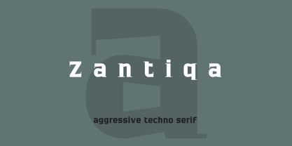
- Gans Antigua by Intellecta Design,
$9.00See also other font families inspired by Gans' original typefaces: Gans Tipo Adorno , Gans Lath Modern and Gans Titular Adornada . - FranTique NF by Nick's Fonts,
$10.00The 1905 Barnhart Brothers & Spindler catalog featured an ultrawide face called "French Antique Extended". The letterforms have been faithfully rendered here, but this font’s kerning calls for a lot of overlapping and interlocking that the original cast-metal face wouldn't have been able to duplicate. Both versions of the font include 1252 Latin, 1250 CE (with localization for Romanian and Moldovan). - HV Olive and Figs by Harmonais Visual,
$15.00 Olive&Figs - a classic Roman-culture-inspired calligraphic serif with elegant, regal, artistic touch. Specially designed for regal, classy projects, perfectly suitable for creating elegant, simple, lifestyle design such as logos, title, packaging and more.
 - Anti by Type Firm,
$39.99 If we look up the definition of the word "grotesque", we find the following: "Odd or unnatural in shape, appearance, or character; fantastically ugly or absurd; bizarre." Following this definition, the design for Anti aims to create an un-compromised version of a grotesque sans-serif – where decorative details live in balance with brutalist shapes. The result is an alphabet with a slightly modernist feeling and an eccentric touch, that work wonders at small sizes. The typeface comes with four weights – light to bold – and features a character set supporting Central and Eastern European as well as Western European languages.
 - Antu by Eurotypo,
$34.00 Antu is a handwriting font, it looks like a real lettering with great visual impact. Take advantage of being able to choose an organic, flexible font with its connection alternatives that makes your text flow natural and better. Antu font includes Open Type features, containing 452 glyphs, a full complement of international characters, standard and contextual alternatives, stylistic sets, and ligatures. All of this makes the text lively and animated, without the monotony of obviously repeating letterforms. Antu font is the perfect choice for titles, logos, posters, packaging, invitations, greeting cards, magazine and book covers, children's items, fashion, and wherever you want! I hope you enjoy it!
 - Shanks Antique 5 AOE Pro by Astigmatic,
$24.95 Shanks Antique 5 Pro is an iconic antique English typestyle rooted in tradition. It is the historical revival and elaboration of the “Antique No. 5” typeface created by Stevens, Shanks & Sons in 1865. What began as a basic character set of Capitals, lowercase, numerals, and a small handful of punctuation characters has been expanded to a full character set including unlimited fractionals, superiors & inferiors, ordinals, tabular & proportional figures, and an expanded language glyph set, all with a smallcaps and Caps to Smallcap set to match. Reviving history looks and feels good. Perfect for wedding invitations, historical ephemera recreations, and classically elegant text settings.
 - Antique Stencil Borders Two JNL by Jeff Levine,
$29.00 Antique Stencil Borders Two JNL is the follow-up collection to the July, 2018 release of Antique Stencil Borders JNL and features twenty-six more decorative stencil borders from various vintage sources.
 - Wood Bonnet Antique No.7 by astype,
$41.00 Wood Bonnet Antique No.7 is based on real vintage wood type blocks from Switzerland. The very distressed letters give a warm analogue vintage charm on printing. These kind of wood type letters were very common and often named by generic names like Roman, French or Antique followed by a catalog number. But these letters have some very quirky details hard to find else were. » pdf specimen « The font offers up to five glyph variations of all the Latin base letters, figures and some additional letters. An OpenType glyph-rotator is programmed to emulate the randomness of old school printing on live typing. All dingbats of the specimen file are included in the font data too.
 - Square Unique - Unknown license

- Square Unique - Unknown license

- Square Unique - Unknown license

- Unique VP by VP Creative Shop,
$49.00 Introducing Unique - Decorative Serif Font Unique is decorative, elegant font with tons of alternate glyphs, ligatures and multilingual support. It's a very versatile font that works great in large and small sizes. Unique is perfect for branding projects, home-ware designs, product packaging, magazine headers - or simply as a stylish text overlay to any background image. Uppercase, lowercase, numeral,punctuation & Symbol Alternate glyphs Ligatures Multilingual support How to access alternate glyphs? To access alternate glyphs in Adobe InDesign or Illustrator, choose Window Type & Tables Glyphs In Photoshop, choose Window Glyphs. In the panel that opens, click the Show menu and choose Alternates for Selection. Double-click an alternate's thumbnail to swap them out. Feel free to contact me if you have any questions! Mock ups and backgrounds used are not included. Thank you! Enjoy!
 - Gothic Unique by Wooden Type Fonts,
$15.00 A revival of an unusual wooden type font of the 19th century, a sans serif, suitable for display.
 - TXT Altius by Illustration Ink,
$3.00Add a unique, stylish touch to your creative lettering. Download this TrueType font to add interest to scrapbook journaling and greeting card captions. - LD Unique by Illustration Ink,
$3.00Download this "Unique" font…it'll add a whole new twist to your scrapbook journaling. - Antic Mosaic by Gleb Guralnyk,
$14.00 Hello, Introducing a vintage font "Antic Mosaic". It's a decorative typeface made of hundreds of mosaic tiles. Five included font variations will help to create different color combinations. Antic Mosaic supports most of the west european languages and also includes ukrainian cyrillic characters (check out the screenshot with all available glyphs).
 - Unique Wood by Solotype,
$19.95Wood type maker W. H. Page designed this in 1870. Caps, figures and points only. A great decorative for old-timey poster work. - Antia Notario by Putracetol,
$16.00 Antia Notario is a modern vintage serif font with beautiful ligatures, tons of alternative glyphs and multilingual support. It’s bold, groovy, clean and unique with vintage fell. Antia Notario is very versatile font that works great in large and small sizes. Helps to create layout design in 60s or 70s design projects. Come with open type feature with a lot of alternates, its help you to make great lettering. Antia Notario best uses for heading headlines, cover, poster, logos, quotes, product packaging, merchandise, social media & greeting cards and many more.
 - Mateo Unique by IbraCreative,
$14.37 Mateo is an extraordinary and unique handwritten typeface that stands out with its captivating originality. With letters that seem like hand-drawn works of art, each character in Mateo carries a distinct personality, exuding a sense of authenticity and creativity. The charmingly irregular lines and artistic flourishes lend this typeface an artistic and handcrafted feel, making it a perfect choice for projects that require a touch of individuality and unconventional style. Mateo’s versatility is showcased in its ability to seamlessly adapt to diverse design contexts, whether used for eye-catching logos, expressive quotes, or artistic illustrations. With its one-of-a-kind appearance, Mateo transcends traditional typefaces, inviting viewers to explore the world of handwritten artistry in every stroke and curve
 - Bodoni Unique by Monotype,
$29.99This Bodoni caps only font was an experiment from Dave Farey how tall such a Bodoni could be elongated in its design. It reminds to the look of a fence, but in large sizes it may fit on a narrow window. - Archive Antiqua Extra Condensed by Archive Type,
$19.95Extra condensed display typeface. - Mengelt Basel Antiqua Paneuropean by Linotype,
$103.99Inspired by the excellent serif fonts of the Basel printer of the 15th and 16 Century, Christian Mengelt designed the Mengelt Basel Antiqua. The typeface is a Renaissance Antiqua with stylistic reference to the historical model, but with the technical and typographic qualities of a modern text typeface with excellent reading quality. - Zapf Renaissance Antiqua SH by Scangraphic Digital Type Collection,
$26.00 Since the release of these fonts most typefaces in the Scangraphic Type Collection appear in two versions. One is designed specifically for headline typesetting (SH: Scangraphic Headline Types) and one specifically for text typesetting (SB Scangraphic Bodytypes). The most obvious differentiation can be found in the spacing. That of the Bodytypes is adjusted for readability. That of the Headline Types is decidedly more narrow in order to do justice to the requirements of headline typesetting. The kerning tables, as well, have been individualized for each of these type varieties. In addition to the adjustment of spacing, there are also adjustments in the design. For the Bodytypes, fine spaces were created which prevented the smear effect on acute angles in small typesizes. For a number of Bodytypes, hairlines and serifs were thickened or the whole typeface was adjusted to meet the optical requirements for setting type in small sizes. For the German lower-case diacritical marks, all Headline Types complements contain alternative integrated accents which allow the compact setting of lower-case headlines.
 - Zapf Renaissance Antiqua SB by Scangraphic Digital Type Collection,
$26.00 Since the release of these fonts most typefaces in the Scangraphic Type Collection appear in two versions. One is designed specifically for headline typesetting (SH: Scangraphic Headline Types) and one specifically for text typesetting (SB Scangraphic Bodytypes). The most obvious differentiation can be found in the spacing. That of the Bodytypes is adjusted for readability. That of the Headline Types is decidedly more narrow in order to do justice to the requirements of headline typesetting. The kerning tables, as well, have been individualized for each of these type varieties. In addition to the adjustment of spacing, there are also adjustments in the design. For the Bodytypes, fine spaces were created which prevented the smear effect on acute angles in small typesizes. For a number of Bodytypes, hairlines and serifs were thickened or the whole typeface was adjusted to meet the optical requirements for setting type in small sizes. For the German lower-case diacritical marks, all Headline Types complements contain alternative integrated accents which allow the compact setting of lower-case headlines.
 - Zapf Renaissance Antiqua EF by Elsner+Flake,
$35.00 - Kifisia Antigua NF by Nick's Fonts,
$10.00This rough-and-ready display face is based on El Greco Antique, released by the Fundición Richard Gans of Madrid in the 1930s. Distressed but not distressing, rough yet charming, ragged around the edges but curiously refined. Named after a village in Greece which is the ancestral home of the forebears of the Curtii. Both versions of the font include 1252 Latin, 1250 CE (with localization for Romanian and Moldovan). - Neo Afrique Pro by Tondi Republk,
$17.00 Neo Afrique sans a neo-futuristic typeface with a modern decorative twist. This typeface design came out of further development and refinement on an original typeface that i created some time ago, Durango Sans. True in nature to it's predecessor, Neo Afrique was also born out of this desire to fuse two different aesthetics, the geometric Neo-Futuristic aesthetic, fused with flourishing decorative forms from Art Nouveau and the later Lubalinesque aesthetics. This typeface will form part of a larger body of work that is meant to be an exploration of Afrikan neo-futurism, using the immense power of visual-linguistic narratives to catalyse new cultural movement and perception.
 - Gans Antigua Manuscrito by Intellecta Design,
$14.95Gans Antigua Manuscrito is a revival font by Intellecta Design. researched at the rare catalogue from the extinct Fundicion Richard Gans, from Madrid. See also other font families inspired by Gans' original typefaces: Gans Tipo Adorno , Gans Lath Modern , Gans Titular Adornada , Gans Ibarra , Gans Antigua , Gans Fulgor and Gans Radio Lumina . - Kis Antiqua Now TB Pro by Elsner+Flake,
$99.00 In the course of the re-vitalization of its Typoart typeface inventory, Elsner+Flake decided in 2006 to offer the “Kis Antiqua” by Hildegard Korger, in a re-worked form and with an extended sortiment, as an OpenType Pro-version. After consultation with Hildegard Korger, Elsner+Flake tasked the Leipzig type designer Erhard Kaiser with the execution of the re-design and expansion of the sortiment. Detlef Schäfer writes in “Fotosatzschriften Type-Design+Schrifthersteller”, VEB Fachbuchverlag Leipzig, 1989: No other printing type has ever generated as far-reaching a controversy as this typeface which Jan Tschichold called the most beautiful of all the old Antiqua types. For a long time, it was thought to have been designed by Anton Janson. In 1720 a large number of the original types were displayed in the catalog of the „Ehrhardische Gycery“ (Ehrhardt Typefoundry) in Leipzig. Recently, thanks to the research performed by Beatrice Warde and especially György Haimann, it has been proven unambiguously that the originator of this typeface was Miklós (Nicholas) Tótfalusi Kis (pronounced „Kisch“) who was born in 1650 in the Hungarian town of Tótfal. His calvinistic church had sent him to the Netherlands to oversee the printing of a Hungarian language bible. He studied printing and punch cutting and earned special recognition for his Armenian and Hebrew types. Upon his return to Hungary, an emergency situation forced him to sell several of his matrice sets to the Ehrhardt Typefoundry in Leipzig. In Hungary he printed from his own typefaces, but religious tensions arose between him and one of his church elders. He died at an early age in 1702. The significant characteristics of the “Dutch Antiqua” by Kis are the larger body size, relatively small lower case letters and strong upper case letters, which show clearly defined contrasts in the stroke widths. The “Kis Antiqua” is less elegant than the Garamond, rather somewhat austere in a calvinistic way, but its expression is unique and full of tension. The upper and lower case serifs are only slightly concave, and the upper case O as well as the lower case o have, for the first time, a vertical axis. In the replica, sensitively and respectfully (responsibly) drawn by Hildegard Korger, these characteristics of this pleasantly readable and beautiful face have been well met. For Typoart it was clear that this typeface has to appear under its only true name “Kis Antiqua.” It will be used primarily in book design. Elsner+Flake added two headline weights, which are available as a separate font family Kis Antiqua Now TH Pro Designer: Miklós (Nicholas) Tótfalusi Kis, 1686 Hildegard Korger, 1986-1988 Erhard Kaiser, 2008
 - Kis Antiqua Now TH Pro by Elsner+Flake,
$99.00 In the course of the re-vitalization of its Typoart typeface inventory, Elsner+Flake decided in 2006 to offer the “Kis Antiqua” by Hildegard Korger, in a re-worked form and with an extended sortiment, as an OpenType Pro-version. After consultation with Hildegard Korger, Elsner+Flake tasked the Leipzig type designer Erhard Kaiser with the execution of the re-design and expansion of the sortiment. Detlef Schäfer writes in “Fotosatzschriften Type-Design+Schrifthersteller”, VEB Fachbuchverlag Leipzig, 1989: No other printing type has ever generated as far-reaching a controversy as this typeface which Jan Tschichold called the most beautiful of all the old Antiqua types. For a long time, it was thought to have been designed by Anton Janson. In 1720 a large number of the original types were displayed in the catalog of the „Ehrhardische Gycery“ (Ehrhardt Typefoundry) in Leipzig. Recently, thanks to the research performed by Beatrice Warde and especially György Haimann, it has been proven unambiguously that the originator of this typeface was Miklós (Nicholas) Tótfalusi Kis (pronounced Kisch) who was born in 1650 in the Hungarian town of Tótfal. His calvinistic church had sent him to the Netherlands to oversee the printing of a Hungarian language bible. He studied printing and punch cutting and earned special recognition for his Armenian and Hebrew types. Upon his return to Hungary, an emergency situation forced him to sell several of his matrice sets to the Ehrhardt Typefoundry in Leipzig. In Hungary he printed from his own typefaces, but religious tensions arose between him and one of his church elders. He died at an early age in 1702. The significant characteristics of the “Dutch Antiqua” by Kis are the larger body size, relatively small lower case letters and strong upper case letters, which show clearly defined contrasts in the stroke widths. The “Kis Antiqua” is less elegant than the Garamond, rather somewhat austere in a calvinistic way, but its expression is unique and full of tension. The upper and lower case serifs are only slightly concave, and the upper case O as well as the lower case o have, for the first time, a vertical axis. In the replica, sensitively and respectfully (responsibly) drawn by Hildegard Korger, these characteristics of this pleasantly readable and beautiful face have been well met. For Typoart it was clear that this typeface has to appear under its only true name “Kis Antiqua.” It will be used primarily in book design. Elsner+Flake added these two headline weights, which are available besides a separate font family Kis Antiqua Now TB Pro. Designer: Miklós (Nicholas) Tótfalusi Kis, 1686 Hildegard Korger, 1986-1988 Erhard Kaiser, 2008
 - Anti Grotesk by 60 KILOS,
$20.00 Anti Grotesk is a personal and internal fight. It tries to build elements capable of building personality, message, and introspection through their own shapes. How to escape from trends being part of them, how to design not establishing commercial and economical interests. Why you started designing and why are you designing today, are some of the concepts that build the universe of Anti Grotesk.
 - Anti Gravity by Epiclinez,
$12.00 Anti Gravity is a cute and funny handwritten font. It’s simple and playful style makes this design incredibly versatile, fitting a wide variety of creative ideas.
 - Polytype Artimus II Frames by Prime Graphics,
$45.00


