10,000 search results
(0.069 seconds)
- Bodoni Poster by Linotype,
$29.99 Giambattista Bodoni (1740–1813) was called the King of Printers and the Bodoni font owes its creation in 1767 to his masterful cutting techniques. Predecessors in a similar style were the typefaces of Pierre Simon Fournier (1712–1768) and the Didot family (1689–1836). The Bodoni font distinguishes itself through the strength of its characters and embodies the rational thinking of the Enlightenment. The new typefaces displaced the Old Face and Transitional styles and was the most popular typeface until the mid-19th century. Bodoni’s influence on typography was dominant until the end of the 19th century and even today inspires new creations. Working with this font requires care, as the strong emphasis of the vertical strokes and the marked contrast between the fine and thick lines lessens Bodoni’s legibility, and the font is therefore better in larger print with generous spacing. Chauncey H. Griffith’s Poster Bodoni displays characteristics of the advertisement fonts of the first half of the 20th century. The font was most often used for posters and signs, eventually including neon signs.
 - Rapsodia by Andinistas,
$59.00 @andinistas presents Rapsodia, an uncommon roman caps font with serif and high contrast, designed by #carlosfabiancg. Rapsodia was inspired by Stunt Roman, Speedball Textbook for Pen & Brush Lettering by Ross F. George. Rapsodia has a high and sweetened amount of contrast between thin and thick with drop-shaped finishes, reminiscent of Didot, Baskerville and Bodoni. Its artistic accent translates into Tuscan letters drawn with a flexible tip pen. In that order, Rapsodia combines the visual theatricality of an art nouveau corset, with creative historical classics such as Liza Minnelli, Gene Simmons and Freddie Mercury. Its calligraphic curlers full of Mannerist virtuosity are unnatural in Roman caps typefaces with serif. That is why its internal vein in ascending and descending flourishes protrudes with Chicano circus details like triangular diamonds located in vertical strokes. Rapsodia serves to design words and phrases in fine publications, for this reason most of its upper and lower case letters communicate feelings with classic and luxurious sensation through substitutes, ligatures and alternatives for beginning, middle or end of word, functioning as initials and terminals.
 - Langston by Type Innovations,
$39.00 Langston is an original design by Alex Kaczun. It’s part of a series of lettering experiments, manipulating body proportions, characteristic elements and spacing to achieve some dramatic visual effects. It is hard to characterize if Langston is an outline or inline font. The outline has the same thickness and proportions as the stems. And the inter-letter spacing is also visually similar. This creates a dynamic and interesting visual harmony throughout. Furthermore, certain design elements like the accents and punctuation symbols, break with the outline treatment, and morph into an interesting play between inline and outline. The overall effect is stunning and mesmerizing. Langston is a display font not intended for text use. It was designed specifically for display headlines, logotype, branding and similar applications.This attractive display comes in roman with lower case and lining figures.The font is also available with true small capitals and old style figures. A special version was created with decorative initial capitals to further enhance the possibilities. The large Pro font character set supports most Central European and many Eastern European languages.
 - The·demon·font by KalaamFonts,
$- “THE DEMON FONT” has been specifically created for a very contemporary graphical usage. It represents Gore, Violence, and Lust with Sinful appearance; with diabolical appearance and reflects the dark side in its every character, which may not be Ideal for daily use. But some expressions never look good in the boldest, brightest of Type, for it is their Vocabularic nature and deep interpretations. In such cases The Demon Font shall fill the role gracefully. INSPIRATION When I recently started my web graphic novel focusing around Demonic Possessions, Crime and Paranormal occurrences, I felt the need to have a type that spoke very unconventionally and supported the language of my story. I wanted to break apart from the usual Comic Sans like typefaces used for decades in Pop cultural mainstream Comics, and wanted something very sublime and independent in style concurrent to the the parallel digital media of Web Comic genre. Thus I created my own type to help translate the communication of my plot thicker to the plain old “Lettering” Font.
 - Argo Nova by Eliezer Grawe,
$- In Greek mythology, Argo was the ship on which Jason and the Argonauts sailed from Iolcos to Colchis to retrieve the Golden Fleece. The Argo Nova font is an adventure though geometric sans universe with a touch of humanistic feel, bringing a different look with curved vertical strokes and high contrast on thicker weights. Designed with OpenType features, it includes extended Latin support, fractions, tabular and old-style figures, ligatures and more. With no excess in mind, it came in 10 styles (5 uprights and is matching italics) and it is a font family ideal for text, branding, signage, editorial, print and web design creations. 5 weights: Thin, Light, Regular, Bold and Black Matching italics Lining and old-style figures with proportional and tabular spacing Ligatures on “f” Alternate characters for a, æ, g and ß Fractions Ordinals Extended language support, designed following the Underware Latin Plus character set, with 534 glyphs, supporting 219 Latin based languages (see https://underware.nl/latin_plus/languages/). * Some features require an application with OpenType support.
 - ITC Merss by ITC,
$29.99ITC Merss proves that sometimes accidents work out just fine. Late one evening Eduardo Manso, an Argentinean graphic and type designer, spilled coffee on his desk. When he began to wipe up the mess, he noticed that one of the splashes looked like a roman letter 'l' - complete with serifs. This triggered his imagination. “What if a complete alphabet was created with this same irregular flow to the character designs?” ITC Merss was the result of Manso's experiments with “fluid” letter shapes. The oddly handsome design looks aged and spontaneous at the same time. Its irregular texture is striking-the result of careful modeling of character shapes. While Manso wanted to maintain the free-form character of spilled liquid, he also knew the individual letters had to work together with an underlying harmony. When not experimenting with typefaces - or spilled coffee - Manso creates award-winning graphic and publication designs. A contributor to the design magazine el Huevo (the Egg), he also writes articles on type and typography and is part of the publication's design team. - Core Sans DS by S-Core,
$20.00 Core Sans DS is a rounded version of Core Sans D and a modern interpretation of condensed sans-serif typeface designed by S-Core and the whole family consists of 2 widths (Condensed, Normal), 7 weights (Thin, Light, Regular, Medium, Bold, Heavy, Black) with their corresponding italics. Core Sans DS features a condensed geometric construction and has a large x-height which enhances legibility. The family is ideal for signage, headline as well as body text. Core Sans DS is a part of the Core Sans Series such as Core Sans N SC, Core Sans N, Core Sans NR, Core Sans M, Core Sans G,Core Sans A, Core Sans GS and Core Sans ES. Letterform in this type family is simple, clean and highly readable. The spaces between individual letter forms are precisely adjusted to create the perfect typesetting. Core Sans DS supports complete Basic Latin, Cyrillic, Central European, Turkish, Baltic character sets. Each font includes proportional figures, tabular figures, numerators, denominators, superscript, scientific inferiors, subscript, fractions and case features.
 - Bellwood Gothic by Breauhare,
$19.99 Bellwood Gothic™ is an unorthodox but happy pairing of upper and lowercases that breaks typographic rules: its capitals evoke traditional early 20th century styling and strength. Lowercase displays a softer, more warm and friendly flavor that points to a Bauhaus aesthetic. But for some strange reason they work so well together! Therein lies the mystique of this font. Overall it isn’t strictly uniform in stroke but shows some variation of color. The sofa poster includes a cameo appearance by breauhare’s own popular Daddy’s Hand™ font. Bellwood Gothic’s nostalgic flavor of the 1960s & 1970s still conveys a modern look that lends itself to sports, fashion, lifestyle and more. The wide track of the lettering helps short words easily fill spaces. Includes stylistic alternates for the lowercase a, e, & l (L), plus 13 uppercase letters! Among OpenType features are Stylistic Alternates, Stylistic Sets, Ligatures, Fractions, & Case-sensitive forms. Extended support for Western, Central, and Eastern European languages is included. Use it for headlines, subheads, branding, editorial, packaging, and logos!
 - DT Partel by Dragon Tongue Foundry,
$9.00 DT Portal: This stylised, partially serifed font, made with a slightly rounded square form, may have been inspired initially by old cathode ray tubes and computer screens. Although not intended to be purely a ‘tech’ font, it can have a strong tech feel to it. More suited to being a headline font than body text. It also appears to have a monospaced look to it, since most letters, (other than letters like ‘i, l and t’), do have the same width. There is some automatic contextual shape adjustment happening in places, to avoid taking up too much space, so contextual ligatures should be turned on. As is the case with most of my fonts, when given the choice, ‘metric’ spacing should be used in preference to ‘optical’. Initially this font was going to be called ‘DT Portal’, because its form was similar to that of a window or doorway. But due to other fonts already having that name, I chose to rename it as ‘DT Partel’, for no reason other than it is only a very small change visually.
 - Magnum Sans Pro by FontMesa,
$39.00 Magnum Sans Pro is a strong neutral sans serif consisting of eleven weights with true Italic, Oblique and an alt upright set called Alfa. The definition of Magnum is a large wine bottle that's twice the capacity of one 750ml bottle, today the name is used in any product offering double the capacity, Magnum Sans achieves this by offering two slanted and two upright versions plus a standard and pro set. Designed to be highly readable, Magnum Sans Pro is ideal for text, signage, headlines and media broadcasting or anywhere else quick readable lettering is needed. With the stylistic alternates and swash caps you can expand your creativity in logo designing. Sprinkle in an alternate letter or two makes for a dynamic appeal that's sure to get attention in advertising. This Pro set includes additional language support for Vietnamese, Pin Yin and Greek. Opentype features in the Pro set include, Alternate Fractions, Case Sensitive Forms, Denominators, Numerators, Discretionary Ligatures, Standard Ligatures, Old-style Figures, Tabular Figures, Proportional Figures, Ordinals, Scientific Inferiors, Superscript, Subscript, Stylistic Alternates, Swash Caps, Arrows and Enclosed Alphanumerics.
 - Tazugane Gothic by Monotype,
$187.99 The Tazugane Gothic typeface family is the first original Japanese typeface created by Monotype. Designed by Akira Kobayashi, Kazuhiro Yamada and Ryota Doi of the Monotype Studio, the Tazugane Gothic typeface offers ten weights and was developed to complement the classic Latin typeface, Neue Frutiger. The design of the Tazugane Gothic typeface balances an original, humanistic style with elements of traditional Japanese handwriting. The two typefaces work together in a natural, seamless and adaptable manner so that Japanese and Latin texts can be used side-by-side for a wide range of applications, including in magazines, books and other print media; on digital devices; in branding and corporate identity systems; and in signage for buildings, highways and mass transit. Tazugane Gothic was updated to support the “Reiwa” new era symbol. Reiwa can be written as two kanji: 令和. This update to Tazugane Gothic includes Reiwa designed as a single ligature and is encoded as U+32FF. The inspiration for the Tazugane Gothic typeface is as elegant as its design. Since antiquity, cranes have been regarded in East Asia as auspicious birds for their noble appearance and elegance in flight. The typeface is named Tazugane Gothic in honor of the longevity of the crane, with the goal that it will be used for many years to come. The combination of the Tazugane Gothic typefaces’ traditional and humanistic elements, along with its intended ability to complement popular Latin typefaces, makes it one of the most uniquely flexible designs for applications where Japanese and Latin texts can be used together. The typeface family was created to have wide appeal, with a pleasing and consistent experience for readers, for use on screen, in print, in signage, packaging and advertising. Tazugane Gothic has 10 weights. The Light, Book, Regular, Medium and Bold weights are considered best for text sizes. The Ultra Light, Thin, Heavy, Black and Extra Black weights are recommended for headline sizes.
 - Built by Typodermic,
$11.95 In the world of journalism, headlines are the lifeblood of a publication. They need to be compact, sturdy, and project a voice that exudes trust and neutrality. Enter Built, the font family designed specifically for creating striking headlines that grab the reader’s attention. With its wraparound curves and subtle curls, Built evokes a feel of a bygone newspaper era without being too old-fashioned. The font family is available in five weights, ranging from Extra-Light to Bold, each with its own unique character and style. But what sets Built apart from other fonts is its ability to scale up without sacrificing readability. Lighter typefaces may look great on paper, but on-screen, they can quickly become unreadable if not properly designed. With Built, however, the font becomes narrower as it becomes lighter, allowing designers to set oversized page titles without worrying about copyfitting. In addition to its unique scaling capabilities, Built also offers a simple solution to the problem of aligning numbers in headlines. By disabling kerning, Built ensures that all numerals, monetary symbols, and most math symbols will line up perfectly, saving designers time and frustration. Built also includes a range of other typographical features, such as fractions, primes, ordinals, and vertically compact accents. And as the font becomes lighter, the asterisk grows more legs, allowing it to appear tonally even in Extra-Light. So whether you’re designing a front page for a major newspaper or simply need to create eye-catching headlines for your blog, Built is the font family that can deliver the perfect balance of style and readability. With its range of weights and styles, it’s the perfect choice for any journalist or designer looking to make a bold statement on-screen. Most Latin-based European writing systems are supported, including the following languages. Afaan Oromo, Afar, Afrikaans, Albanian, Alsatian, Aromanian, Aymara, Bashkir (Latin), Basque, Belarusian (Latin), Bemba, Bikol, Bosnian, Breton, Cape Verdean, Creole, Catalan, Cebuano, Chamorro, Chavacano, Chichewa, Crimean Tatar (Latin), Croatian, Czech, Danish, Dawan, Dholuo, Dutch, English, Estonian, Faroese, Fijian, Filipino, Finnish, French, Frisian, Friulian, Gagauz (Latin), Galician, Ganda, Genoese, German, Greenlandic, Guadeloupean Creole, Haitian Creole, Hawaiian, Hiligaynon, Hungarian, Icelandic, Ilocano, Indonesian, Irish, Italian, Jamaican, Kaqchikel, Karakalpak (Latin), Kashubian, Kikongo, Kinyarwanda, Kirundi, Kurdish (Latin), Latvian, Lithuanian, Lombard, Low Saxon, Luxembourgish, Maasai, Makhuwa, Malay, Maltese, Māori, Moldovan, Montenegrin, Ndebele, Neapolitan, Norwegian, Novial, Occitan, Ossetian (Latin), Papiamento, Piedmontese, Polish, Portuguese, Quechua, Rarotongan, Romanian, Romansh, Sami, Sango, Saramaccan, Sardinian, Scottish Gaelic, Serbian (Latin), Shona, Sicilian, Silesian, Slovak, Slovenian, Somali, Sorbian, Sotho, Spanish, Swahili, Swazi, Swedish, Tagalog, Tahitian, Tetum, Tongan, Tshiluba, Tsonga, Tswana, Tumbuka, Turkish, Turkmen (Latin), Tuvaluan, Uzbek (Latin), Venetian, Vepsian, Võro, Walloon, Waray-Waray, Wayuu, Welsh, Wolof, Xhosa, Yapese, Zapotec Zulu and Zuni.
 - FS Brabo Paneuropean by Fontsmith,
$90.00Worldly Even though it’s a new arrival, FS Brabo has seen the world. Designed by a Brazilian working in London and studying in Belgium under a Dutchman, it’s certainly well-travelled. And it was inspired by the extraordinary archive of early book typefaces at the world-renowned Plantin-Moretus Museum in Antwerp, while Fernando Mello was attending Frank Blokland’s Expert class Type Design course at the Plantin Institute of Typography. It was there that Fernando became engrossed in the collection of early metal type, matrices, punches and type samples by figures such as Garamond and Granjon. So much so that he took on the mighty task of developing ‘a beautiful, functional, serifed text font’ of his own. Heroic FS Brabo’s journey from sketch to font family took an epic three years, starting in Antwerp, continuing at Fontsmith in London, and reaching its conclusion back in Fernando’s home city of São Paulo. No wonder Fernando was reminded of another titanic face-off: that of Antwerp’s Roman hero of legend, Silvius Brabo, and the evil ogre, Antigoon. Brabo came to the town’s rescue after the tyrannical giant had been charging ships’ captains extortionate taxes and chopping off the hands of those who refused to pay up. Having finally downed Antigoon after a long and terrible duel, Brabo cut off the giant’s own hand and threw it into the river Scheldt, unwittingly giving the town its name: the Dutch for ‘hand-throw’ is hand werpen. What better way for Fernando to name his literary typeface than after the hero of Antwerp’s oldest tale? The garalde factor FS Brabo is not a revival, but a very much a contemporary, personal interpretation of a garalde – a class of typeface originating in the 16th century that includes Bembo, Garamond and Plantin, with characteristically rounded serifs and moderate contrast between strokes. Brabo’s ‘ct’ and ‘st’ ligatures, upper-case italic swashes and contextual ending ligatures – ‘as’, ‘is’, ‘us’ – all preserve the beauty and character of traditional typefaces, but its serifs are chunkier than a garalde. Their sharp cuts and squared edges give them a crispness at text sizes, helping to bring a beautifully bookish personality to hardworking modern applications. A workhorse with pedigree It may give the appearance of a simple, four-weight typeface, but FS Brabo has hidden depths beneath its simplicity and beauty. OpenType features such as cap italic swashes, contextual ending swashes – programmed only to appear at the end of words – and stylistic alternatives make this a complete and well-equipped typeface. Comprehensive testing was carried out at text and display sizes, too, to prevent counters from filling in. All of which makes FS Brabo a very modern take on a traditional workhorse serif typeface: colourful and versatile enough to adorn not just editorial projects but also signage, advertising and logotypes. - Periodico by Emtype Foundry,
$69.00 Periódico (newspaper in Spanish), was originally commissioned by the Spanish daily newspaper ABC. Inspired by old Spanish typographic engravings, mostly from the second half of the 18th Century, we picked out the most relevant details of Spanish typography as the source of that inspiration, and instead of making a revival or an interpretation of these models, we started from scratch to create a truly original font family. The goal was to achieve a very distinctive family, functional and versatile at the same time, and reminiscent of old Spanish typography. Although we have borrowed many details from the old Spanish typography, like the nail, which is present in the letters U, G, or J, which we worked and evolved in order to be applied on other letters, we have also left behind several others. One example is the tilde of the ñ engraved by Gerónimo Gil, a very distinctive element of Spanish typography that was intentionally omitted for being too atypical to be used in a contemporary font. The letters a and g are probably the most distinctive of the Periódico family. The shape of the bowl in the letter a, with the top arch in diagonal position, is very characteristic of old Spanish types. In Periódico, we emphasized this detail by applying it to many other letters (such as g, j, and t) up to a point that it became the leitmotiv of this family. The formal finish of serifs and terminals is something that gives great personality to any typeface, so we came up with plenty of alternatives in order to find the exact shape we wanted: sober, elegant, and contemporary. Even though the serifs are geometric, the upper terminals have a curve with a dynamic very similar to the arch in the a or the notch in the j. The terminals in the capitals follow the same style, but, in this case, the inspiration comes from Pradell’s Missal, which on the other hand has been influenced by the types engraved by Johann Michael Fleischman in the Netherlands. Eighteenth-Century types were mostly used for printing books. Therefore, they had very generous proportions (large ascendents and descendants) and high contrast, but today, these characteristics do not work well in newspapers because of the worldwide demand for more space-saving fonts. The adaptation of the type’s proportions to be used for a newspaper was one of the most interesting parts of the project, specially the time taken to find the perfect balance between the x height\ and legibility. Periódico is presented in 30 different styles, for a total of 30 fonts—10 for text (from Light to Bold) and 20 for display sizes (from Thin to Ultra Black); this family results in an extensive system capable of solving all the needs of a large publication.
 - Stadtmitte by Letritas,
$25.00 Stadtmitte is a grotesque font with a distinctly industrial flair. It is inspired on a reinterpretation of the Berlin’s vernacular signs and characters created under the DIN 1451 norm. By the early 1900s, german painters and sign makers started to spread this unmistakable way of font drawing used back then on freight trains. Such letter design was both very easy to read and build, hence it started to quickly spread until it became a standard in 1936 for highway signage. Stadtmitte is not aimed to be yet another literal remake of those drawings but rather a revision of shapes and concepts that seeks to transport us to Germany’s industrial way of creating and displaying information, therefore being suitable for a wide scope of design uses, considering its own nature and different available weights. The typeface has 8 weights, ranging from “thin” to “black”, and two versions: "regular" and "italic". Its 16 files contain 618 characters with ligatures, alternates, small caps, old-style and tabular numbers, and case sensitive figures. It supports 219 Latin-based languages, spanning through 212 different countries. Stadtmitte supports this languages: Abenaki, Afaan Oromo, Afar, Afrikaans, Albanian, Alsatian, Amis, Anuta, Aragonese, Aranese, Aromanian, Arrernte, Arvanitic (Latin), Asturian, Atayal, Aymara, Bashkir (Latin), Basque, Bemba, Bikol, Bislama, Bosnian, Breton, Cape Verdean Creole, Catalan, Cebuano, Chamorro, Chavacano, Chichewa, Chickasaw, Cimbrian, Cofán, Corsican Creek,Crimean Tatar (Latin),Croatian, Czech, Dawan, Delaware, Dholuo, Drehu, Dutch, English, Estonian, Faroese, Fijian Filipino, Finnish, Folkspraak, French, Frisian, Friulian, Gagauz (Latin), Galician, Ganda, Genoese, German, Gikuyu, Gooniyandi, Greenlandic (Kalaallisut)Guadeloupean, Creole, Gwich’in, Haitian, Creole, Hän, Hawaiian, Hiligaynon, Hopi, Hotcąk (Latin), Hungarian, Icelandic, Ido, IgboI, locano, Indonesian, Interglossa, Interlingua, Irish, Istro-Romanian, Italian, Jamaican, Javanese (Latin), Jèrriais, Kala Lagaw Ya, Kapampangan (Latin), Kaqchikel, Karakalpak (Latin), Karelian (Latin), Kashubian, Kikongo, Kinyarwanda, Kiribati, Kirundi, Klingon, Ladin, Latin, Latino sine Flexione, Latvian, Lithuanian, Lojban, Lombard, Low Saxon, Luxembourgish, Maasai, Makhuwa, Malay, Maltese, Manx, Māori, Marquesan, Megleno-Romanian, Meriam Mir, Mirandese, Mohawk, Moldovan, Montagnais, Montenegrin, Murrinh-Patha, Nagamese Creole, Ndebele, Neapolitan, Ngiyambaa, Niuean, Noongar, Norwegian, Novial, Occidental, Occitan, Old Icelandic, Old Norse, Oshiwambo, Ossetian (Latin), Palauan, Papiamento, Piedmontese, Polish, Portuguese, Potawatomi, Q’eqchi’, Quechua, Rarotongan, Romanian, Romansh, Rotokas, Sami (Inari Sami), Sami (Lule Sami), Sami (Northern Sami), Sami (Southern Sami), Samoan, Sango, Saramaccan, Sardinian, Scottish Gaelic, Serbian (Latin), Seri, Seychellois Creole, Shawnee, Shona, Sicilian, Silesian, Slovak, Slovenian, Slovio (Latin), Somali, Sorbian (Lower Sorbian), Sorbian (Upper Sorbian), Sotho (Northern), Sotho (Southern), Spanish, Sranan, Sundanese (Latin), Swahili, Swazi, Swedish, Tagalog, Tahitian, Tetum, Tok Pisin, Tokelauan, Tongan, Tshiluba, Tsonga, Tswana, Tumbuka, Turkish, Turkmen (Latin), Tuvaluan, Tzotzil, Uzbek (Latin), Venetian, Vepsian, Volapük, Võro, Wallisian, Walloon, Waray-Waray, Warlpiri, Wayuu, Welsh, Wik-Mungkan, Wiradjuri, Wolof, Xavante, Xhosa, Yapese, Yindjibarndi,
 - FS Brabo by Fontsmith,
$80.00 Worldly Even though it’s a new arrival, FS Brabo has seen the world. Designed by a Brazilian working in London and studying in Belgium under a Dutchman, it’s certainly well-travelled. And it was inspired by the extraordinary archive of early book typefaces at the world-renowned Plantin-Moretus Museum in Antwerp, while Fernando Mello was attending Frank Blokland’s Expert class Type Design course at the Plantin Institute of Typography. It was there that Fernando became engrossed in the collection of early metal type, matrices, punches and type samples by figures such as Garamond and Granjon. So much so that he took on the mighty task of developing ‘a beautiful, functional, serifed text font’ of his own. Heroic FS Brabo’s journey from sketch to font family took an epic three years, starting in Antwerp, continuing at Fontsmith in London, and reaching its conclusion back in Fernando’s home city of São Paulo. No wonder Fernando was reminded of another titanic face-off: that of Antwerp’s Roman hero of legend, Silvius Brabo, and the evil ogre, Antigoon. Brabo came to the town’s rescue after the tyrannical giant had been charging ships’ captains extortionate taxes and chopping off the hands of those who refused to pay up. Having finally downed Antigoon after a long and terrible duel, Brabo cut off the giant’s own hand and threw it into the river Scheldt, unwittingly giving the town its name: the Dutch for ‘hand-throw’ is hand werpen. What better way for Fernando to name his literary typeface than after the hero of Antwerp’s oldest tale? The garalde factor FS Brabo is not a revival, but a very much a contemporary, personal interpretation of a garalde – a class of typeface originating in the 16th century that includes Bembo, Garamond and Plantin, with characteristically rounded serifs and moderate contrast between strokes. Brabo’s ‘ct’ and ‘st’ ligatures, upper-case italic swashes and contextual ending ligatures – ‘as’, ‘is’, ‘us’ – all preserve the beauty and character of traditional typefaces, but its serifs are chunkier than a garalde. Their sharp cuts and squared edges give them a crispness at text sizes, helping to bring a beautifully bookish personality to hardworking modern applications. A workhorse with pedigree It may give the appearance of a simple, four-weight typeface, but FS Brabo has hidden depths beneath its simplicity and beauty. OpenType features such as cap italic swashes, contextual ending swashes – programmed only to appear at the end of words – and stylistic alternatives make this a complete and well-equipped typeface. Comprehensive testing was carried out at text and display sizes, too, to prevent counters from filling in. All of which makes FS Brabo a very modern take on a traditional workhorse serif typeface: colourful and versatile enough to adorn not just editorial projects but also signage, advertising and logotypes.
 - Copihue by Letritas,
$30.00 Copihue is the newest font from the foundry of Juan Pablo De Gregorio. A Sans-Serif with some humanist hints, it displays simple and subtle yet sober, vivid strokes. This font’s personality unfolds itself as long as we are reading it. The aim of Copihue is neither to be as neutral as a grotesque font nor to become as predictable as a fully geometric typeface can be. This typography wants to appeal to the likes of designers who prefer all-rounder fonts, the ones who fit well in most layouts. With this purpose in mind, Juan Pablo studied elements of different typefaces and styles to cast them into Copihue, which boasts a personality that makes it a great fit for different compositions and designs. Copihue has a slanted version with "real italics". These italics are slightly more condensed than the regular version, in order to give it a different text texture. The typeface has 9 weights, ranging from “hair” to “black”, and two versions: "regular" and "italic". Its 18 files contain 749 characters with ligatures, alternates, small caps, oldstyle and tabular numbers, fractions, and case sensitive figures. It supports 219 Latin-based languages, spanning through 212 different countries. Copihue supports this languages: Abenaki, Afaan Oromo, Afar, Afrikaans, Albanian, Alsatian, Amis, Anuta, Aragonese, Aranese, Aromanian, Arrernte, Arvanitic (Latin), Asturian, Atayal, Aymara, Bashkir (Latin), Basque, Bemba, Bikol, Bislama, Bosnian, Breton, Cape Verdean Creole, Catalan, Cebuano, Chamorro, Chavacano, Chichewa, Chickasaw, Cimbrian, Cofán, Corsican Creek,Crimean Tatar (Latin),Croatian, Czech, Dawan, Delaware, Dholuo, Drehu, Dutch, English, Estonian, Faroese, Fijian Filipino, Finnish, Folkspraak, French, Frisian, Friulian, Gagauz (Latin), Galician, Ganda, Genoese, German, Gikuyu, Gooniyandi, Greenlandic (Kalaallisut)Guadeloupean, Creole, Gwich’in, Haitian, Creole, Hän, Hawaiian, Hiligaynon, Hopi, Hotc?k (Latin), Hungarian, Icelandic, Ido, IgboI, locano, Indonesian, Interglossa, Interlingua, Irish, Istro-Romanian, Italian, Jamaican, Javanese (Latin), Jèrriais, Kala Lagaw Ya, Kapampangan (Latin), Kaqchikel, Karakalpak (Latin), Karelian (Latin), Kashubian, Kikongo, Kinyarwanda, Kiribati, Kirundi, Klingon, Ladin, Latin, Latino sine Flexione, Latvian, Lithuanian, Lojban, Lombard, Low Saxon, Luxembourgish, Maasai, Makhuwa, Malay, Maltese, Manx, M?ori, Marquesan, Megleno-Romanian, Meriam Mir, Mirandese, Mohawk, Moldovan, Montagnais, Montenegrin, Murrinh-Patha, Nagamese Creole, Ndebele, Neapolitan, Ngiyambaa, Niuean, Noongar, Norwegian, Novial, Occidental, Occitan, Old Icelandic, Old Norse, Oshiwambo, Ossetian (Latin), Palauan, Papiamento, Piedmontese, Polish, Portuguese, Potawatomi, Q’eqchi’, Quechua, Rarotongan, Romanian, Romansh, Rotokas, Sami (Inari Sami), Sami (Lule Sami), Sami (Northern Sami), Sami (Southern Sami), Samoan, Sango, Saramaccan, Sardinian, Scottish Gaelic, Serbian (Latin), Seri, Seychellois Creole, Shawnee, Shona, Sicilian, Silesian, Slovak, Slovenian, Slovio (Latin), Somali, Sorbian (Lower Sorbian), Sorbian (Upper Sorbian), Sotho (Northern), Sotho (Southern), Spanish, Sranan, Sundanese (Latin), Swahili, Swazi, Swedish, Tagalog, Tahitian, Tetum, Tok Pisin, Tokelauan, Tongan, Tshiluba, Tsonga, Tswana, Tumbuka, Turkish, Turkmen (Latin), Tuvaluan, Tzotzil, Uzbek (Latin), Venetian, Vepsian, Volapük, Võro, Wallisian, Walloon, Waray-Waray, Warlpiri, Wayuu, Welsh, Wik-Mungkan, Wiradjuri, Wolof, Xavante, Xhosa, Yapese, Yindjibarndi, Zapotec, Zulu, Zuni.
 - Karchas by Deeezy,
$14.00 Trendy, classy & modern style serif font for your fancy projects. Elegant, fashion and classic style on Karchas font will be great for any branding project. Lot of alternates and ligatures will help you to create unique and original logo design or website header! Enjoy :) -Multilingual support -Lot of alternate characters -Lot of ligatures -Great for modern branding projects!
 - Pritude Radiance by Sohel Studio,
$16.00 Pritude Radiance is a Modern elegant branding serif typeface with Unique alternative , multilingual support with perfect kerning. This typeface is perfect for an elegant & luxury logo , classy editorial design, women's magazine, fashion brand , cosmetic brand, fashion promotion , modern advertising design, invitation card, art quote, home decoration , book/cover titles, special events, Tote bag, T-shirt, Advertising and much more.
 - Tape Font by Vladimir & vladimir,
$- Although this condensed type is ideal for titles and headlines, it has small caps and letters with diacritical marks included as well. It keeps readability at mind, while trying to be as much "done-by-hand" as it can. It has unique tears on each edge of each letter and tilting on certain "slices of tape".
 - Wedding Dress by Letterara,
$14.00 Wedding dress is a beautiful light handwritten font with a unique feel and looks stunning. This gentle font will look gorgeous on a variety of design ideas. This font is PUA encoded which means you can access all of the amazing glyphs and swashes with ease! It also features a wealth of special features including alternate glyphs and ligatures.
 - Badona by gravitart,
$29.95 Badona is a custom typeface which is applicable for web, print especially for magazines, brochures, posters, flyers and motion graphics. Both weights are perfect for logos (light size has an elegant look and the regular one gives a unique feel). Regular size is also applicable for text. Badona has 232 glyphs and supports Turkish and West European languages.
 - Giliant by Sohel Studio,
$16.00 Giliant is a Modern elegant serif typeface with Unique alternative , multilingual support with perfect kerning. This typeface is perfect for an elegant & luxury logo , classy editorial design, women's magazine, fashion brand , cosmetic brand, fashion promotion , modern advertising design, invitation card, art quote, home decoration , book/cover titles, special events, Tote bag, T-shirt, Advertising and much more.
 - Dagstam by Deeezy,
$14.00 Trendy, classy & modern style serif font for your fancy projects. Elegant, fashion and classic style on Dagstam font will be great for any branding project. Lot of alternates and ligatures will help you to create unique and original logo design or website header! Enjoy :) -Multilingual support -Lot of alternate characters -Lot of ligatures -Great for modern branding projects!
 - Churchward Conserif by BluHead Studio,
$25.00BluHead Studio LLC is pleased to announce the release of 4 fonts from the Churchward Conserif family designed by New Zealand typeface designer Joseph Churchward. BluHead Studio is in the process of digitizing many of the fonts in Churchward's extensive library of exciting and unique designs and will be releasing them in OpenType format on a regular basis. - The Morille by Wildan Type,
$15.00 The Morille is display bold serif typeface. The shape is classic and unique style. You can also get more elegant serif in alternate and ligature. With vintage fill It's great for logotypes, wedding invitations, romantic cards, labels, packaging, spelling of names and others. Add to your most creative ideas and watch how they bring them to life!
 - Dex Gothic by Linotype,
$29.99Dex Gothic is another sort of stencil type. Instead of the "normal" routine of blocked-out horizontal or vertical areas, Dex Gothic creates its stencil appearance through the unique placement of diagonals. The result is a technical-like appearance, which bears some resemblance to 1980s technology products. Dex Gothic should be used large in headlines or logos. - Blantik Calligprahy by Hanzel Space,
$25.00 Introducing Blantik Script Font. This font is made with a unique touch of curves and has a vintage feel complemented by an interesting swash. This font is perfect for all your design needs. These include logos, posters, movie titles, branding, book covers, flyers, and others. Whats Include: Blantik Multilingual Support Alternates, ligature, Thank You... Hanzel Space
 - Cyritech by Tadiar,
$12.00 Cyritech is stylish futuristic geometric tech Three Fonts' Family designed for such areas as hi-tech, future, sport, space, army, games and many others. The feature of this font that it has serifs of triangle shape, that allows organic letters' connection, which makes it interesting and unique. Multilingual support (Latin extended). It is designed for header and text both.
 - Nesora GT by Gartype Studio,
$10.00 Lookin for unique logo font? we present to you Nesora, a bold handwritten font that was comes with alternates font and multilingual glyphs to easily use this uniwue logotype font Nesora is very suitable like as logo, tagline, adventure project, posters, book cover & etc.To use alternate this font just change the regular font to alternate font.
 - Hypercrack by Invasi Studio,
$19.00 Introduction of our new collection of playful doodle font styles. The Hypercrack Handwritten all-caps Font with scribbles styles font. Also, Hypercrack has a unique stylistic alternates character. So you can create a combination of whatever you want! This font is perfect for your display project for headlines, quotes, editorial design, print posters, and much more.
 - Bagerich by Zealab Fonts Division,
$10.00 Bagerich is font designed by Reza Rasenda & Riska Candra Dewi, with design choices inspired by the Art Nouveau era. Bagerich comes with stylistic, alternates, ligatures and supports multilingual languages. Create unique & beautiful logotype, use it as an elegant solution for your next magazine layout, or choose Bagerich for any graphics that require a sleek look with a elegant flair.
 - Brilanys Signature by Multype Studio,
$19.00 Brilanys Signature is a clean, elegant hand-drawn script font with unique curves and an elegant inky flow. Features : uppercase, lowercase, symbol, number, ligature, and also support multi language. Brilanys Signature is perfect for photography, watermark, social media posts, advertisements, logos & branding, invitation, product designs, label, stationery, wedding designs, product packaging, special events or anything that need handwriting taste.
 - Majer by Sensatype Studio,
$15.00 Majer is a sans serif font with modern, luxury, elegant, unique and classy-look. This font crafted specials for logo design projects, ready to use on Logo, Branding, Magazine, Social Media, and Many more that needs modern touches. Majer is also included full set of: uppercase and lowercase letters multilingual characters numerals punctuation Wish you enjoy our font. :)
 - Vabi Dasabi by Chekart,
$20.00 Vabi Dasabi is a unique japanese hand drawn brush font. It comes with uppercase and lowercase characters, set of punctuation marks, numbers, alternative set of latin characters and numbers, Cyrillic characters, ligatures and multilingual support. Perfect for logos, quotes, posters, branding projects, product packaging, t-shirt, book cover, greeting cards and applicable for any graphic design.
 - Govanka by Arunatype,
$15.00 Govanka is a beautiful and classic handwritten font. It is the best choice for creating attractive logos, branding projects, weddings, magazines, shops, and quotes. Each letter has a unique and beautiful touch, which will bring your designs to life! This font is PUA encoded, which means you can access all of the glyphs and swashes with ease!
 - Metalsoup by Alit Design,
$20.00 "Metal Soup" is a captivating blackletter font that exudes a unique blend of boldness and a dynamic, distressed aesthetic. With its robust design, this font is perfect for making a striking statement in your design projects. "Metal Soup" boasts 720 characters and offers comprehensive multilingual support, making it versatile and adaptable for a wide range of creative applications.
 - Davina by Nirmalagraphics,
$14.00 I made Davina for display purposes and it can be used for logos with a vintage style, for flyers, brochures, leaflets and more. If you like a logo with a semi-vintage style, thick, unique and clean, it means you have to buy and use Davina! This font also has Multi-Lingual support and more than 15 Ligatures.
 - Blossom Riviera by Olivetype,
$18.00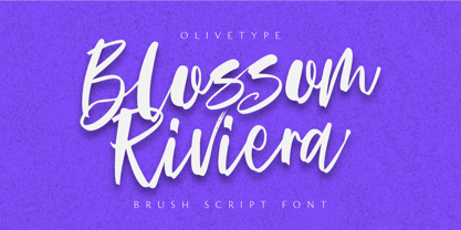 Blossom Riviera is the perfect brush script font for giving your projects a natural, handmade feel. With its cool, awesome texture, it's perfect for creating beautiful, unique logos and headlines. So what’s included : Standard Latin Numbers, symbols, punctuations and ligatures Multilingual Support. PUA Encoded and fully accessible without additional design software Simple Installations Works on PC & Mac Thank You!
 - Sikyla Display by Tony Type Studio,
$16.00 Sikyla Display is a very beautiful and unique Sans Serif font that has never existed, Sikyla Display font offers a variety of alternatives and very interesting ligatures used to design various displays. Sikyla Display also offers several font styles that we collect in one font, you can use according to the theme that is suitable for your design.