10,000 search results
(0.028 seconds)
- Montoro Display by FoxType,
$12.00 Montoro Display is a Brand New Luxury Typeface with a powerful font family. It has a dependable and uncompromising style, with controlled letterforms and modern touches. It looks amazing in logos, magazines, and movies . Montoro Font would be perfect for branding, headlines, Captions, paragraph, and posters . The various weights allow you to experiment with a wide range of applications. It's created to make an impression without sacrificing its beauty and readability. It's shown a clean, minimalist, warmth, quirky, yet still purposed to be versatile The Typeface includes Six Weights - Regular, Medium, SemiBold, Bold, ExtraBold, and Black. All offer wide language support, upper and lower cases, numerals and extended punctuation. Thank you for taking the time to look into the font.
 - Stripated by Aah Yes,
$6.95 Stripated is an informal funky font mainly for distinctive headlines and posters, or similar display work. There's still all the features you'd expect like Class Kerning and accented characters, ligatures for ffi, ffl and so on, and a few other extras. The four versions are set up as follows: Plain has all the letters and black stripes in the normal vertical alignment; Jumbled One has the lower case letters all jiggled about but the boxes still square and vertical; Jumbled Two has ALL letters, numbers, and virtually all punctuation jumbled up; and Wild has all that and the black boxes going slightly off square as well. There's 3 different Space characters and a few other character variations in Stylistic Alternates (fuller details in the zip).
 - FF Karbid by FontFont,
$58.99 German type designer Verena Gerlach created this display and sans FontFont between 1999 and 2011. The family has 10 weights, ranging from Light to Black (including italics) and is ideally suited for advertising and packaging, editorial and publishing, logo, branding and creative industries, small text as well as web and screen design. FF Karbid provides advanced typographical support with features such as ligatures, alternate characters, case-sensitive forms, fractions, super- and subscript characters, and stylistic alternates. It comes with a complete range of figure set options – oldstyle and lining figures, each in tabular and proportional widths. This FontFont is a member of the FF Karbid super family, which also includes FF Karbid Display, FF Karbid Slab, and FF Karbid Text.
 - Pomarosa by Andinistas,
$29.95 Pomarosa is a typographic family that consists of capital roman letters and twisted lower case letters set randomly. Each one of them is characterized by its multiple calibers and widths. Pomarosa was planned to accompany graphic works done with different techniques and materials such as hand made collages. The narrowness of its glyphs involve its audience with abstract imprecision. Its spirit was born between fabric snippets intervened with pencil and painting. Its three members work in group and also in words or phrases with a non-finished look. Regular Pomarosa and Standard Pomarosa have 260 glyphs each. Both of them simulate to have been done by a right-handed person that works with its left hand. Pomarosa dingbats has 26 illustrations useful for frames and textures.
 - Bonsai by Three Islands Press,
$29.00 Years ago, I developed an interest in the Japanese art of dwarfed potted trees, bonsai. I bought some books on the subject from Brooklyn Botanic Garden. In one -- Handbook on Bonsai: Special Techniques (seventh printing, February 1976) -- the type was bad. Old worn lead type, I suspect, spread wide in the tops of characters and disappearing on the bottoms. Two decades later, I came across my Brooklyn Botanic Garden collection and was struck again by this interesting type. Inspired, I made a typeface. Didn't take me long to decide on a name for it, either: a name with a double-meaning, based both on its look and its inspiration. Bonsai, the typeface, has two styles, a roman and a true italic.
 - Geon by cretype,
$20.00 Geon Family is a modern sans-serif typeface that is clean, simple and highly readable. Letters in this type family are designed with geometric shapes without any decorative distractions. The spaces between individual letter forms are precisely adjusted to create the perfect typesetting. Geon is a versatile type family of 54 fonts. Geon family consists of 9 weights (Thin, ExtraLight, Light, Regular, Medium, Bold, ExtraBold, Heavy & Black) & 3 widths (Condensed, Normal & Expanded)with their corresponding italics. The Open Type fonts contain complete Latin 1252, Cyrillic, Central European 1250, Turkish 1254 character sets. Each font includes proportional figures, tabular figures, numerators, denominators, superscript, scientific inferiors, subscript, fractions and case features. We highly recommend it for use in books, web pages, screen displays, and so on.
 - Teip by Alex Jacque,
$15.00 Teip, designed by Alex Jacque in 2014, is a layerable geometric typeface system. Teip developed as a typographic exploration of overlapping tape where a over/under, foreground/background interplay would be a stylistic motif throughout. For the most part, the uppercase characters have a vertical stress in the foreground, while lowercase have the horizontal stressed in the foreground. Because this is a unicase typeface, upper and lower case glyphs can be mixed for a more random feel in the shape of individual words and the flow of sentences. In Teip, glyph widths and kerning are the same across all styles and weights. This opens up the ability to easily layer one style on top of another to create a large number of color and stylistic combinations.
 - Meowtant Kittens by Hanoded,
$16.00 My youngest son Boris has his birthday in a week. He turns 8, and he loves to play with those Danish building blocks - you know what I’m talking about. Last year he developed an interest in Star Wars n(no idea how that came to be), so we bought him some Star Wars-themed blocks for his birthday. I am now watching the movies with him and it is fun to witness his enthusiasm. The only drawback is the fact that we now seem to have a Chewbacca in our home… Meowtant Kittens is a font I drew with a fineliner and then digitised. Of course the name was influenced by the movies I am watching with Boris, even though they don’t feature any Meowtant Kittens.
 - Coarse Grind by Hanoded,
$15.00 I bought a new coffee machine - the piston variety. It is shiny, made in Italy and I can make a killer espresso or latte with it. I usually start off the day with a pour over coffee and save my milky coffee for later. I also have two grinders: one for a coarse grind (pour over) and one for a finer grind (espresso and latte). Yes, you will probably say that it’s quite extravagant to have two grinders, but I do like my coffee! Anyways, this is what I thought of when I worked on Coarse Grind. Coarse Grind is a well balanced all caps display font. It comes with extensive language support and a set of alternates for the lower case letters.
 - FF Tisa Paneuropean by FontFont,
$69.00 Slovenian type designer Mitja Miklavcic created this serif FontFont between 2008 and 2010. The family has 14 weights, ranging from Thin to Black (including italics) and is ideally suited for advertising and packaging, book text, editorial and publishing, logo, branding and creative industries, poster and billboards, small text as well as web and screen design. FF Tisa provides advanced typographical support with features such as ligatures, small capitals, alternate characters, case-sensitive forms, fractions, and super- and subscript characters. It comes with a complete range of figure set options – oldstyle and lining figures, each in tabular and proportional widths. In 2007, FF Tisa received the TDC2 award. This FontFont is a member of the FF Tisa super family, which also includes FF Tisa Sans.
 - Cantiga by Isaco Type,
$19.00 Cantiga is a monophonic song or melody, sometimes repetitive, often with unpretentious themes. In the same simplicity, this font family combines robustness with some very fine details, with 44 versions for various purposes. Choose thinner (or thicker) versions for titles, and intermediate versions (normal, medium, etc.) to small sizes. Explore the condensed versions when you need to save space. Use the light versions for special cases in huge sizes. Cantiga intended to be your new "Swiss army knife" sans typeface. The Cantiga family consists of 2 widths (normal and condensed) with 11 weights each, plus their respective italic versions. The fonts are available in OpenType PS format and have extended character set to support CE, Baltic, Turkish as well as Western European languages.
 - Average Handwriting by Inclusive Fonts,
$9.99 From tablet to table – from freehand to font – Average Handwriting was designed originally in freehand on paper then onto a tablet with the help of an appropriate app to give it a ‘wet brush’ feel – this was transferred to paper then tweaked PS and only then imported into a font design programme – this is how we work to keep the original flourishes and a freehand feel to the font. Thus, a well-ordered handwriting with both elements of freehand and precision. It looks especially good in lower-case text situations, delivering an original look - there again you may be looking for a new display font for some large graphic projects such as posters, Average Handwriting also works well in these situations, again, delivering an original look.
 - F2F Metamorfosi by Linotype,
$29.99The techno sound of the 1990s, a personal computer, font creation software, and some inspiration all came together to inspire the F2F (Face2Face) font series. Alessio Leonardi and his friends had the demand to create new unusual typefaces, which would be used in the leading German techno magazine of the day, Frontpage. Even typeset as small as 6-points, in nearly undecipherable layouts, it was a pleasure for the kids to read and try to decrypt the messages. Letterforms in F2F Metamorfosi are parts of other characters that have been rotated to take on new meaning. For instance, an upside down V has become an A, a German ß has become the B, and a left parenthesis has become the C, etc. - Tabac Micro by Suitcase Type Foundry,
$39.00 When they say everything’s already been invented, they’re exaggerating a bit. But not much. When we design new typefaces, whether we like it or not, we have in our memories the historical legacy and invention of our predecessors. That’s also true for more detailed work on optical sizes, intended for the largest or the smallest typesetting. Although for display sizes we give room for fantasy and elegance when shaping fine serifs or smooth drawings full of refined details, for styles designed for footnotes and other small texts we do the exact opposite – pragmatically and rationally, with knowledge of the optical properties of small text. And that’s precisely the case for the Tabac Micro subfamily, a sans-serif typeface derived from Tabac Sans.
 - ITC Coconino by ITC,
$29.99ITC Coconino is the work of Serbian designer Slobodan Miladinov. His original inspiration for this monostroked typeface was the idea of translating certain auditory impressions into type, in this case, the surprising and confusing music of the Serbian hip hop musician Voodoo Popeye." Miladinov is an art director in Belgrade and created Coconino using a "freemouse" technique with Adobe Illustrator and sees his work as "computer calligraphy which allows for a specific directness and immediacy in notation." The strokes of this font are simple and abrupt with a studied irregularity. The forms can look either cheerful and lighthearted or chaotic and subtly disturbing. Coconino was named for the home of hte Krazy KAt comics and even includes a few additional characters from the strip." - Jiho by cretype,
$20.00 Jiho Family is a modern sans-serif typeface that is clean, simple and highly readable. Letters in this type family are designed with minimal & modern shapes without any decorative distractions. The spaces between individual letter forms are precisely adjusted to create the perfect typesetting. Jiho is versatile type family of 18 fonts. Jiho family consists of 9 weights (Thin, ExtraLight, Light, Regular, Medium, Bold, ExtraBold, Heavy & Black) with their corresponding italics. The Open Type fonts contain complete Latin 1252, Cyrillic, Central European 1250, Turkish 1254 character sets. Each font includes proportional figures, tabular figures, numerators, denominators, superscript, scientific inferiors, subscript, fractions, old style-figures and case features. We highly recommend it for use in signage, books, web pages, screen displays, and so on.
 - Steelplate Gothic Pro by Red Rooster Collection,
$60.00 Steelplate Gothic Pro is a sans serif font family with traditional and drop shadow weights. It shares letterform similarities to conventional Copperplate Gothic families, but has no spur serif endings. Most of the original designs came from the Western Type Foundry when BB&S acquired it in 1918; all were cut by Robert Wiebking. It was recast in 1954 by American Type Founders (ATF). Steve Jackaman (ITF) designed and produced a digital version of the original single weight in 1997. In 2017, Jackaman completely redrew and expanded the family, adding entirely new condensed variants and true small caps. Steelplate Gothic Pro has a masculine, industrial feel, and works effortlessly at display and subhead sizes. It shares letterforms with its sans serif sister family, Barnsley Gothic.
 - Donchenko Serif by Donchenko,
$15.00 Donchenko Serif is a leisurely, elegant, minimalist serif typeface that combines references to medieval half-uncials with Art Nouveau motifs. Its styles are well readable and at the same time have individual features, which makes this typeface stand out from the rest. Donchenko Serif is a "universal soldier". It's great for any challenge. It is also good for typing books or articles, designing corporate identity and promotional materials, or creating display cases. A wide range of Latin, Greek, Cyrillic and special characters provides extensive language support for all European languages. Font Donchenko Serif Regular was developed by designer Oleksandr Donchenko in Lviv (Ukraine) in the first half of 2022. His daughter - Sofia Donchenko - took part in the development some letters. Donchenko Serif - Good font for good people!
 - Little Paws by Tigade Std,
$25.00 Little Paws. Are you team Cat or team Dog? Doesn't matter which side you are pick to, this font is cuteness overload. It is for everyone, not only limited to Cat or Dog but also open for any Pet Lovers. This font is suitable for happy theme, cute, party, holiday, kids and many more. It is also suitable for Logo, Cards, Branding, Social Media, Youtube Thumbnail, Advertisement, Posters, any many others. To make it easier for you to design, we provide two additional font family to enhance the beauty of the design. Features: - Standard Characters (Uppercase and Lowercase) - Numerals - Punctuation - International Characters Disclaimer: Clips arts shown in the posters/images are not included. It is for promotional purpose. Enjoy designing and stay Safe! Tigadestd
 - Frink Rio by Brenners Template,
$19.00 Frink Rio Modren Grotesk Font Family It has evolved to converge wider and more trendy design needs. By designing the thin style vertical stem value as 10pt, the contrast between individual styles is ensured. Great care has been taken to ensure that the characteristics of individual Glyphs are well reflected in the each style. Extended Cyrillic language support will help make this font family more universal. And the support of various OpenType Features will respond to the designer's coverage in a variety of ways. OpenType Features Ligatures - fi, fl Small Caps (from lowercases) Ordinals (1st. 2nd. 3rd, 4~9th) Oldstyle Figures Tabular Figures Fractions Scientific Inferiors Superscrpt (lowercases. numbers) Check in advance how the apps you are using support these OpenType Features.
 - RF Rufo by Russian Fonts,
$29.00 Rufo — condensed geometric sans serif with the closed forms. Contains 12 fonts. 6 regular and 6 italic. From thin to black. A rich palette gives full freedom for creativity and bright decisions. Extensive area of use. The versatility of the sans serif typeface covers various aspects of graphic design. Web, printed materials, clothing, logos, posters, labels and much more. Rufo is pragmatic typeface. Can save space and will accommodate a large amount of information in a limited space. The font was designed so that condensed letters remains readable even in small sizes. Opentype: alternate numbers, oldstyle numbers, arrows, fractions and automatic fractions, case sensitive forms, superscript and subscript, numerators and denominators. Support: cyrillic, cyrillic extended, latin, latin extended (Western European, Central European, South-East).
 - Satron by Aah Yes,
$3.95A reminder of the days of flower power, Satron is quite a bit different, slightly hippy and slightly grungy. Although it is not in any way an attempt to emulate the fonts used in that era, it evokes the mood of the time. There's two different shapes making up each character, with a grungy black one in front of a hippy white one. The combined effect however is quite novel and modern. There's also a jumbled version with the letters rotated and whacked around, in case you want it funky-flavored. There's all the main characters plus lots of extra accented letters as well. The package contains both OTF and TTF versions - install either OTF or TTF, not both versions on the same machine. - Garnet Euro Typewriter by Coniglio Type,
$19.95Garnet is a rare TT typewriter face, made digital from analog samples gathered with great care by Coniglio Type. A time and place; type and life. Garnet Euro Typewriter is the first new release by designer Joseph V Coniglio in over 5 years. It is contemporary designer type, made from the struck steel hammers of an art deco san serif face transferred from a mechanical 1926 Royal Portable typewriter. It has an obsessively complete commercial roman character set ––for the pre-opentype environment of the late 1990's. Yes, it has that great “Monopoly Game” question mark -- and all on a period-piece typewriter! You should have no trouble grafting that sorely needed Euro symbol.” –And he very well did! - Bechamel Roman by Andinistas,
$39.00 BECHAMEL ROMAN was born interpreting unicase letterings of the movie "Willy Wonka and the chocolate factory". Later these ideas matured with flexible tip nib and paper mixing their naive proportions with some classic ingredients of Baskerville, Bodoni, Didot, Round Hand Script, Graffiti and labels found in Venezuela and Colombia. BECHAMEL ROMAN designed to be combined with Bechamel. BECHAMEL Script, Vein, Words & Ornaments were hand drawn to design words and phrases in logos, packaging, posters, envelopes and greeting cards. BECHAMEL ROMAN 1,2,3 & 4 is an experimental font family designed by #carlosfabiancg. It includes an irregular look to communicate craftsmanship. Its multiple upper cases with condensed width and naive lines are notable for their expressive drawing with a high amount of contrast between thick and thin strokes.
 - Affable by Scholtz Fonts,
$21.00 An elegant, contemporary and quirky handwriting font inspired by fonts such as Satisfaction and Nothing. There are many handwriting fonts out there, almost all of them tending to highlight the individuality of a particular person's handwriting. I wanted to go beyond this. What I've always wanted was to write in an elegant, casual yet legible style: something which my own hand often refuses to do. So I set out to produce the handwriting of my dreams - this font. While it doesn't match my dreams 100%, it certainly comes close! Affable comes in three styles, Affable Regular, Affable Blak and Affable Lite. The Affable family is fully professional, carefully letterspaced and kerned. All upper and lower case characters, punctuation, numerals and accented characters are present.
 - Hobo Symbols Chaulk by SymbolMinded,
$29.99 During the period of the Great American Depression, “hobos” created a system of symbols to communicate and assist fellow travelers. These symbols would mark a home, farm, fence or other structure to indicate what to expect in the area. They would tip off travelers on how to find food, stay safe and what to avoid and more. In some areas of the USA, these symbols are still visible and have also become part of the American popular culture. These 96 symbols are accompanied by a pdf describing what the symbol was used to indicate. The meanings and symbols are by no means the complete list and there may be additional or alternative meanings. These are for casual use and not historical or anthropologically completely accurate.
 - Capital Love by Harald Geisler,
$68.34 Capital Love just contains capital letters decorated with hearts. By pressing a lowercase button a alternative to the uppercase letter will appear. All shapes are drawn individually and do not oblige a geometrical system. The lighthearted vivid ductus remind me of a quality that can be found in the dynamics of Keith Haring drawings. Capital Love is a part of the Light Hearted Font Collection that is inspired by a recording of Jean Baudrillard with the title, "Die Macht der Verführung" (The Power of Seduction) from 2006. Further inspiration came from the article, "The shape of the heart: I'm all yours". The heart represents sacred and secular love: a bloodless sacrifice. by British writer Louisa Young printed in EYE magazine (#43) London, 2002.
 - Big by Walking Fearless,
$20.00 BIG is an elegant condensed display font created for strong and impactful headlines. It comes from a series of hand printed specimens taken from wood type found in Andrew Howard’s Studio in Porto (Portugal). A wooden type that reassembles the industrial victorian style which has now been expanded to 20 cuts, ranging from ExtraLight to Bold, with Italics and a stencil version, covering all your needs for a striking visual effect just with plain type with distinctive features and personality, standing out from the crowded world of display sans serif. The font was engineered with essential OpenType features, that allows the user to compose the headlines in two different heights, with case-sensitive punctuation, symbols and special ligatures such as “the”, “of” and “le”.
 - HWT Lustig Elements by Hamilton Wood Type Collection,
$24.95 'Euclid. A New Type,' originally designed in the 1930s by modern American designer Alvin Lustig (1915-1955), has been revived as 'Lustig Elements' through a collaboration of designers Craig Welsh and Elaine Lustig Cohen. Only twelve letterforms from the original font design had been retained in archive material in the many decades since its initial development. Lustig Elements combines four simple, geometric shapes aligned to an underlying grid with letterform designs that hold true to the spirit of the original font. Lustig Elements initially came to life in 2015 as wood type cut at Hamilton Wood Type & Printing Museum. The digital version expands on the basic character set with a pro expanded latin character set, small caps and even an Inline variation.
 - Diethelm AR by ARTypes,
$35.00 Based on the 10- and 36-point Diethelm-Antiqua types designed by Walter Diethelm and issued by Haas (Münchenstein) 1948-51. DiethelmAR™ series text-size fonts are based on the 10-point designs. Eastern European accents, swash capitals, alternative figures and small capitals are available. The DiethelmARd fonts are based on the 36-point (dreicicero) designs. OpenType fonts are available individually or in two packages: text fonts (with EE accents, small capitals) and display fonts.
 - Hip Pop NF by Nick's Fonts,
$10.00Type designer Friedrich Poppl is perhaps best known for his classic text faces and elegant scripts, but it seems he had a playful side as well. This frisky face is based on Dynamische Antiqua, which Poppl did for the Stempel foundry in 1960, but which was never released. Bright, bold and bouncy, it’s the perfect choice for headlines with impish impact. Both versions of this font include the complete Unicode Latin 1252 and Central European 1250 character sets. - Blogh by Eko Bimantara,
$19.00 Blogh is fat and quirky display font. Its heavy weight and sturdy letterforms with characterized by extreme artificial inktrap, make it uniquely perfect for headlines and titles.
 - Olde Crilt by Graffiti Fonts,
$19.99With 2 full alphabets & a full array of symbols & decorations this style can look elegant or insane. New English is easy to customize for infinite unique looks. - Thellor by Awanstudio,
$15.00 Thellor is an elegant handwritten script font. Get inspired by its unique shape and character! Thellor contains standard characters, lowercase, uppercase, numbers, punctuation, ligatures, and international characters.
 - Ballers by Graffiti Fonts,
$19.99Handwritten letters inspired by various ancient & modern scripts. Ballers is a "gangsterish" tag font that avoids overlap & features long acenders & decenders for an eye catching unique style. - Gastino by Ronin Design,
$15.00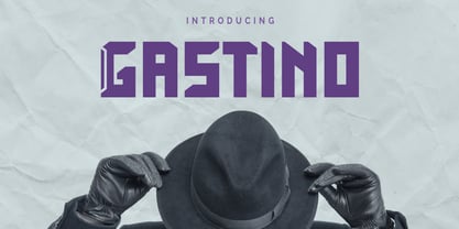 Gastino is an casual and unique display font. Gastino is designed for any project, this font is perfect for poster design, logotype design, advertising and many more.
 - New English by Graffiti Fonts,
$34.99 With 2 full alphabets & a full array of symbols & decorations this style can look elegant or insane. New English is easy to customize for infinite unique looks.
 - Fried Churros by Tigade Std,
$9.00 Fried Churros is a cute, unique and fun display font. It embodies playfulness and authenticity and is the perfect choice for any children activity or school project.
 - Jules Thicket by Rachel White Art,
$14.00 Jules Thicket is a wonky caps font, with kicky angles. Mix and match caps and lowercase letters to create a unique hand-lettered look in your designs.
 - Vope Dome by Sipanji21,
$10.00 Vope Dome is an incredibly unique and chunky lettered display font. Add this font to your favorite creative ideas and notice how it makes them come alive!