1,246 search results
(0.068 seconds)
- Byronic by Alan Meeks,
$30.00 Byronic is soft modern sans-serif but with an antique style lower-case. The rounded end soft look gives Byronic a friendly soft look whilst still retaining a classical typographic appearance. A very clean style and slightly condensed it is excellent for text setting and headline with an unusual loser case that compliments the caps perfectly. Available in a range of 5 weights and 5 italics and a Latin Pro character set of 430 characters including ranging numerals and small caps.
 - Directors Cut Pro by Type Innovations,
$39.00 Directors Cut Pro is a compelling new font series designed by Alex Kaczun. It recently won the second place—a commendation in the Canberra Typeface Competition. This handsome Geometric Antique serif design is based on the early 19-century Moderns and Scotch styles, infused with the warm charm of traditional antique, added for interest. Capturing the best of both ages: it's warm, comforting and persuasive. Directors Cut Pro's graceful aspects naturally invite uses at large sizes, for which we have created a stunning and elegant lighter weight. But, this workhorse typeface series incorporates a solid regular weight, along with its italic—ideal for a multitude of text purposes, at varying point sizes. A robust Bold weight is available for headlines and emphasis. Director Cut Pro comes with proportional as well as tabular lining figures for quickly setting up charts and tables. It also contains an extended character set—including most Central European languages. Alex Kaczun is in the process of expanding this typeface series to include additional weights, styles and proportions. Stay tuned! The large Pro font character set supports most Central European and many Eastern European languages.
 - King Tut by Canada Type,
$24.95 King Tut is a restoration and expansion of the original Egyptian Expanded, a single bold face cut in 1850 by Miller & Richard, the famous Edinburgh founders. This aesthetic, though originally issued to help drive simple print advertising of those days, is perhaps the longest lasting genre of typeface. This aesthetic flourished in the later part of the 19th century, helped by the surge of similar faces from England (such as Figgins' Antique 6 and Expanded Antique), and became the defining index of the old American wild west that continues to this very day. King Tut serves up its impact through a balance between the wide, compact letterforms and elegant curvature that manages to come through even in confined areas. The family's weight variety allows for more options in counterspace use as well as precision in the amount of curve definition and contrast needed by the typographer. The lighter weights completely oppose that 19th century boldness and expose the alphabet's skeleton in a strive for simplicity that fits modern applications. With generous language support to boot, King Tut's diverse offerings make it an essential addition to today's designer repertoire.
 - Fantique Four by Digital Empires can be described as a font that beautifully merges the charm of antique design elements with a dash of modern flair, making it a unique offering in the landscape of d...
- Bellarosa by Letterara,
$12.00 Bellarosa is a refined and delicate handwritten font. This lovely script font has a wide spectrum of applications ranging from greeting cards to headlines and is guaranteed to add a romantic feel to your next project. It will turn any design project into a true stand-out. Add it to your most creative ideas and notice how it makes them come alive! This font is PUA encoded which means you can access all of the amazing glyphs and swashes with ease! It also features a wealth of special features including alternate glyphs, swashes, and ligatures.
 - Le Vangeline by Reyrey Blue Std,
$14.00 Le Vangeline - is a romantic calligraphy font, with classic root and elegant touch. It is perfect for any projects such as : logos, branding projects, homeware designs, product packaging, mugs, quotes, posters, shopping bags, t-shirts, book covers, name card, invitation cards, greeting cards, label, photography, watermark, special events, and all your other lovely projects that need a beautiful script taste. Add it to your most creative ideas and notice how it makes them come alive! Features : · All Uppercase and Lowercase · Number & Symbol · Supported Languages · Alternates and Ligatures · PUA Encoded
 - Steampipe by Just My Type,
$25.00 Jules Verne. Wild, Wild West. Tomorrowland. The Past’s extrapolation of the Future. So it was wrong, it’s still romantic. Steampipe is a font constructed of bits and pieces, reminiscent of the ironwork construction of the Crystal Palace or the inner workings of The Time Machine. Although it works fine as is, it comes alive with some Photoshop Layer Styles. Steampipe has the most extensive kerning of any font I've designed, just so (most) letters fit together as if they were constructed as a unit; use them in a program that supports special kerning.
 - Helliya Signature by Balevgraph Studio,
$14.00 Helliya Signature is a lovely and timeless handwritten font. It is the best choice for creating eye catching logos, branding and quotes. Every letter has a unique and beautiful touch, which will make your design come alive! This font is PUA encoded which means you can access all of the glyphs and swashes with ease! What's Included : TTF Uppercase, Lowercase, Numerals & Punctuations Ligature & Alternate Works on PC & Mac Simple installations Multilingual support Compatible with Silhouette Studio, Cricut Design Space, Scan N Cut, Adobe Illustrator and other cutting and design programs.
 - Still Valentine by Letterara,
$13.00 Still Valentine is a lovely romantic handwritten font with lots of authenticities!. It has beautiful and well-balanced characters and as a result, it matches a wide pool of designs. It will turn any design project into a true stand out. Add it to your most creative ideas and notice how it makes them come alive! This font is PUA encoded which means you can access all of the amazing glyphs and swashes with ease! It also features a wealth of special features including alternate glyphs and ligatures.
 - Alphonse by RagamKata,
$16.00 Alphonse Script Font exudes charm with its distinctive letter details. Crafted with a bold yet modern style, this font presents characters that are not just clear but also invite the eye to explore the beauty of its typography. With available alternate swash accents, each word comes alive, allowing users to express their creativity in an elegant and captivating manner. This font is good for logo design, Social media, Movie Titles, Books Titles, a short text even a long text letter and good for your secondary text font with sans or serif.
 - Lovely Christmas by Reyrey Blue Std,
$16.00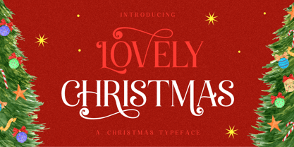 Introducing, Lovely Christmas Typeface. This font has many extra swirly characters to give more playful and swirliness into the design. Lovely Christmas Typeface is well-suited for advertising, layout design for quotes or body copy, best used as a display for headings, logos, branding, magazines, product packaging, invitations. logotypes, and much more. It matches each of your holiday creations so add this font to your designs and make them come alive! Features : · All Uppercase and Lowercase · Number & Symbol · Supported Languages · Alternates · PUA Encoded Hope you enjoy with our font!
 - Daddy's Hand by Breauhare,
$39.00 Daddy’s Hand is based on the actual handwriting of my dad. He always prided himself on his fine penmanship, and to see him write was kind of like watching a ballroom dance--his pen would smoothly and elegantly waltz across the paper as he wrote, gliding effortlessly. I know if he were alive today he would be quite honored that his handwriting is now a font. This font can be used for all sorts of elegant occasions or advertising, and has ligatures & alternate letters. Digitized by John Bomparte.
 - Mother Love by Letterara,
$12.00 Mother Love is a lovely romantic script font with lots of authenticities!. It has beautiful and well-balanced characters and as a result, it matches a wide pool of designs. It will turn any design project into a true stand out. Add it to your most creative ideas and notice how it makes them come alive! This font is PUA encoded which means you can access all of the amazing glyphs and swashes with ease! It also features a wealth of special features including alternate glyphs and ligatures.
 - Terrified AOE by Astigmatic,
$19.00 Terrified AOE was inspired by vintage horror movie poster titling from the 1960's. It is a Capitals and smallcaps typeface, that really feels like a mix of three typefaces in one. While the Capitals and Smallcaps typesetting works to the effect of the original inspirations, each case also works well amongst itself independently, and having very different vibes. I've always been a huge fan of horror movies, and some of the lettering from vintage horror movie posters are so cool and alive, I only wish there were more of them recreated as display fonts.
 - Uncencored Halloween by Ably Creative,
$12.00 Uncensored Halloween is a cute font for Helloween. Expertly designed to become a true favorite, this font has the potential to take your every creative idea to the highest level! Add it to any of your Halloween-related designs and see how to make it come alive, add this font to your creative ideas and see how to make it so scary. An uncensored Halloween font, eye-catching, cute horror-style font for you to use in your future projects. With this unique font, you're sure to make your designs stand out!
 - Tomket Boys by Dumadi,
$20.00 Tomket Boys is a fun and relaxing typeface ready to perfect your designs. This font lends itself to full color in a design so that the design feels alive. with support Uppercase, Lowercase, Numbers, Symbol, Ligature, Multilingual. Tomket Boys is perfect for product names, advertising designs, children's game titles, event titles, t-shirt designs, posters, web, banners, book covers, social media, and other designs. Compatible with design studios such as Photoshop, Affinity Design, Adobe Illustrator or Silhouette. That makes it great for creative projects. Thank you, Toni Dzulham - Dumadistyle
 - Gacko by Beary,
$10.00 Are you looking for a display serif type with fun Ligature? You came to the right Font. Gacko is a display serif type with fun Ligature look attractive and natural. Masterfully designed to become a true favorite, this font has the potential to bring each of your creative ideas to the highest level! Every single letters have been carefully crafted to make your text looks beautiful. Gacko is PUA encoded, which means you could access all of the glyphs! Every letter has a unique and beautiful touch, which will make your design come alive! Thanks
 - Funkley by Craft Supply Co,
$15.00 Introducing Funkley - Funky Font. It can be used to create almost all types of design projects like print materials. Just use your imagination and your project will become more alive and look great than ever with Funkley - Handmade Funky Font. You want to make a greeting card or a package design, or even a brand identity, craft design, any DIY project, book title, wedding font, pop vintage design, retro design or any purpose to make your art / design project look pretty and trendy? Feel free to play with this fonts!
 - Harriella by Letterara,
$14.00 Harriella is a refined and delicate handwritten font. This lovely script font has a wide spectrum of applications ranging from greeting cards to headlines and is guaranteed to add a romantic feel to your next project. It will turn any design project into a true stand-out. Add it to your most creative ideas and notice how it makes them come alive! This font is PUA encoded which means you can access all of the amazing glyphs and swashes with ease! It also features a wealth of special features including alternate glyphs, swashes, and ligatures.
 - Filson Pro by Mostardesign,
$26.00 Designed by Olivier Gourvat in 2014, Filson Pro is a new geometric sans serif family with versatility in mind. With its 575 glyphs and its round aspect, this typeface covers all kind of graphic and web design projects. This font family contains 16 fonts from Thin to Black with a professional range of Opentype functions such as pro kerning,lining and oldstyle figures, stylistic alternates, case sensitive forms, localized forms and f-ligatures. For better typographic control, Filson Pro also includes Opentype class kerning with thousands of kerning pairs.
 - Displace Serif by Serebryakov,
$35.00 Displace Serif is a continuation of my Displace fonts. Adding serifs allows you to see the font in a new way. There is a more pronounced charm of Italian monumental fonts, but in an expressive way. The appearance of the serifs allowed the font to move to the antiqua class, but this is purely a formal matter. The proportion of serifs changes markedly from weight to weight, allowing the font to retain its decorative character. In the Light drawing the serifs are barely visible and delicate, while in the Black they are in superposition. The font is catchy, noticeable, which makes it suitable for graphics requiring instantaneous spectator emotions. Displace Serif is suitable for editorial design, as despite the modern image it retains the classic concept.
 - Gaultier by Borutta Group,
$39.00 Gaultier is the result of over 5 years of work on a typeface inspired by my favourite creators in European typography – Claude Garamond, Robert Granjon and Eric Gill. The main idea of the project was to create a sans-serif antiqua with all features reserved for serif typefaces. In addition to the rich set of characters, Neuropa includes: Small Caps, Superscript, Subscript, Ligatures, Discretionary Ligatures, Contextual Alternates, Swash Variants and 5 different styles of digits. Upright styles with delicate contrast corresponds with the expressive form of italics inspired by Granjon italic construction. Gaultier will work wherever we want to emphasize modernity without forgetting tradition. The sharp character of the whole family is perfect for longer texts, visual communications and branding purposes.
 - Gyst Variable by phospho,
$90.00 Gyst is a neo-humanist sans-serif typeface that artfully blends the principles of Grotesque and Antiqua. With its classic uprights and the serifs in its true italics, Gyst spans the arc from a modern humanistic sans serif to a captivating calligraphic serif. Contrasting strokes and luscious, on the other hand razor-edged terminals reflect a sense of grace, thriving at the intersection of geometric precision and flourishing sophistication. Made for body text as well a s display use. In any situation, you will find the autonomous cursive posture to be a perfect playmate for the upright. Gyst Variable is a TTF Variable Font with a weight axis and a whole lot Alternates and Ligatures. Gyst is also available in four static upright and italic weights.
 - Bernhard by Linotype,
$29.99 The German typeface artist Lucian Bernhard designed Bernhard Antiqua as the first of his many text typefaces. The first weights were produced in 1912 by the foundry Flinsch in Frankfurt am Main. Further weights followed in the 1920s, produced by the Bauersche foundry, which had acquired Flinsch in the meantime. Bernhard font is an alphabet with a marked historical influence. It brings the viewer back to the early 20th century, when the bold forms of this typeface graced advertising displays and posters. Distinguishing characteristics of this typeface are the cross of the capital W and the rounding of the capital R. Linotype's Bernhard condensed bold, with its narrow, robust forms, is best for headlines in medium and larger point sizes.
 - Weiss by Linotype,
$29.99The German poet, painter, calligrapher and type designer Emil Rudolf Weiß originally created this eponymous typeface for the Bauer Foundry of Frankfurt. Long known and loved by metal type enthusiasts under the name "Weiss Antiqua," this design was inspired by typefaces from the Italian Renaissance while still distinctly reflecting the artistic and poetic personality of its twentieth-century designer. Weiss has tall ascenders, sharp apex points, and a low-slung midsection on the caps. The italic moves like a classical ballerina. Weiss is one of the earliest contemporary serif types to have italics based on the chancery style of writing. The Weiss family works well for warmly legible text typography; and it's also an original choice for refined headline and display graphics." - Levato by Linotype,
$29.99 Levato, the first font designed by Felix Bonge, is an Antiqua that is full of character and is refined but by no means sterile. This typeface provides for a wide range of options for creating individual designs. It was not really Felix Bonge's intention to create a whole font family when, as a second year student, he began several exercises in contrast and proportion as part of the typeface design course of Professor Veljovi? at Hamburg University of Applied Sciences. However, these initial studies developed into a project that Bonge persisted with over the following years while working towards his degree. He continually had new insights and ideas that he was able to exploit for his font. Of particular importance, he claims, was a calligraphy seminar, which prompted him to completely rework his concept. It took him several years before his extensive font Levato™ was ready. Although the forms of Levato are ultimately derived from Renaissance Antiqua, Bonge has slightly increased the relative contrast in his version. This gives the font a graceful appearance that is further emphasized by the reduced x-height and the associated prominence of the ascenders. And, in addition, the relatively fine serifs, which are almost linear at their ends, infuse Levato with a hint of classical Antiqua á la Bodoni. At the same time, Bonge cleverly compensates for the sterilising tendency of this font form. Soft and rounded serif attachments and rounded line apexes offset the severe nature of the font and provide it with an aura of vivacity. This effect is promoted by the calligraphic-like foot of the lowercase h, n and m and the not quite horizontal bars of the uppercase E and F. Overall, Bonge has succeeded in creating a refined and yet very dynamic typeface. Levato is available in five weights; Light, Regular, Medium, Bold and Black, in each case with the corresponding italic versions. Bonge treats Levato Italic as a genuine cursive typeface. Its letters are thus slightly narrower than the analogous upright letters and their forms are considerably more curvilinear. All the versions of Levato boast an enormous range of characters to meet all possible requirements. In addition to four sets of minuscule and majuscule numerals for tabular and proportional typesetting, there are also small caps, numerous ligatures, ornamental characters and even swash variants of letters. With their generous, sweeping curves, the swash variants (available as OpenType versions) can be used for striking titling effects or as initials.
 - Pueblito by Corradine Fonts,
$15.00 Pueblito is a hand drawn font with a rustic and antique appearance. Was inspired from old books and newspapers but express a very own personality and not necessary represent a specific classic style. The family consists of twelve fonts in six weights plus a set of ornaments in order to compose all kind of texts. Using Pueblito in your projects, you can obtain an original aged flavor and just by adding a subtle texture effect will help you to obtain the desired vintage look.
 - Flat10 Holy by Dharma Type,
$14.99 Super decorative wood type looking pixel font which has mysterious, elegant and gorgeous impressions. This 8-bit pixel font is designed with respect for 80s game designers and the pixel font pioneers in middle 90s. Use at size 10 pixels or multiples of 10 and anti-alias off is recommended. List of our Pixel Font Project. ·Flat10 Antique ·Flat10 Artdeco ·Flat10 Arts&Crafts ·Flat10 fraktur ·Flat10 Holy ·Flat10 Holly ·Flat10 Segments ·Flat10 Stencil ·Flat20 Gothic ·Flat20 Headline ·Flat20 Hippies ·Flat20 Streamer ·Behrensmeyer Vigesimals ·Civilite Vigesimals
 - Asta by LLW Studio,
$16.00 Asta, named after the adorable pup in the “Thin Man” movies from the 1930‘s and early ‘40‘s, is an Art Deco / Streamline Moderne all-caps display font. Inspired by forms from the iconic machinery of the day like trains and autos, Asta has a heavy and masculine proportion, a cut-in “grille” effect and a slight slant which emphasizes its moderne roots. Fantastic for illustration or retro applications like antique product “logos,” signs and vintage packaging, or for a fun & funky ‘70‘s Disco look.
 - Flat10 Fraktur by Dharma Type,
$14.99 The pixelated blackletter which called Fraktur, the most famous calligraphic letter in Germany. This 8-bit pixel font is designed with respect for 80s game designers and the pixel font pioneers in middle 90s. Use at size 10 pixels or multiples of 10 and anti-alias off is recommended. List of our Pixel Font Project. ·Flat10 Antique ·Flat10 Artdeco ·Flat10 Arts&Crafts ·Flat10 fraktur ·Flat10 Holy ·Flat10 Holly ·Flat10 Segments ·Flat10 Stencil ·Flat20 Gothic ·Flat20 Headline ·Flat20 Hippies ·Flat20 Streamer ·Behrensmeyer Vigesimals ·Civilite Vigesimals
 - Flat10 Holly by Dharma Type,
$14.99 Very decorative pixel font which has organic and soft impressions. The best pixel font for Christmas. This 8-bit pixel font is designed with respect for 80s game designers and the pixel font pioneers in middle 90s. Use at size 10 pixels or multiples of 10 and anti-alias off is recommended. List of our Pixel Font Project. ·Flat10 Antique ·Flat10 Artdeco ·Flat10 Arts&Crafts ·Flat10 fraktur ·Flat10 Holy ·Flat10 Holly ·Flat10 Segments ·Flat10 Stencil ·Flat20 Gothic ·Flat20 Headline ·Flat20 Hippies ·Flat20 Streamer ·Behrensmeyer Vigesimals ·Civilite Vigesimals
 - Vintage Stencil Art JNL by Jeff Levine,
$29.00 Vintage Stencil Art JNL collects another twenty-six charming designs, all re-drawn from antique and vintage stencil sources. These images make for the perfect embellishment to typographic projects which utilize stencil type, or the designs can be applied as decorative thematic backgrounds (such as a flower show, nature walks and so forth). For reproduction as saleable commercial products such as stencils, decals, stickers, transfers, etc. please refer to the terms and conditions which are clearly stated in the font's End User License Agreement regarding specialized licensing.
 - Kantor by T4 Foundry,
$21.00Kantor's modular stroke and humanist axis defines it as an old-style 15th century Venetian serif typeface. At the same time, the lowercase Kantor alphabet is relatively compressed and has the vertical stems of a textura blackletter. However, Kantor has distinct, penformed shapes and has also kept all the organic irregularities of traditional handwriting (or punch-cutting, as it were). Kantor is not happy, not sad - but calm and dignified. Perfect for buddhist poems, fantasy video games and antique scrolls to give that "long time ago"-feeling. - Streamers NF by Nick's Fonts,
$10.00This curly, swirly antique offering is based on a Victorian-era typeface called "Fillet". Opening and closing flourishes can be found at the brace and bracket positions, and the ribbon effect can be carried between words by using the underscore character in place of a space. Due to the highly ornate nature of this font, it does not contain math operators, fractions or superior numbers. Both versions of the font include 1252 Latin and 1250 CE (with localization for Romanian and Moldovan) character sets. - P22 Tuscan Expanded by IHOF,
$24.95 P22 Tuscan Expanded is a digitization of the mid-19th Century Woodtype font "Antique Tuscan Expanded - Wells & Webb 1854". Specimens of this font are rarely, if ever, seen with a lower case. It is noted in the book American Wood Type 1828-1900 by Rob Roy Kelly that the lower case is "missing". This version was digitized from a recently discovered full set including all lower case plus ff ligatures. One unique feature of this design is the heart shape formed in the V, X & Y.
 - Rossika by ParaType,
$25.00 Rossika is a four-style typeface designed by Oleg Karpinsky in 2002-2004 for the ParaType company. The general design and some letterforms were borrowed from antique Russian typefaces of XV-XVIII centuries. For example, the upper Cyrillic N has a diagonal stem, a tail of Ц character is attached in the center unlike major contemporary designs. Some characters have alternatives. There are several Latin and Cyrillic ligatures. Rossika is intended for logos, headlines and short text blocks: posters, calendars, post cards, diplomas, certificates and the like.
 - PR Scrolls 03 by PR Fonts,
$10.00 Inspired by food labels, signs and coats of arms, PR-Scrolls is a collection of images which can be used for framing text in contexts where antiquity, craftsmanship, or traditional quality are conveyed. There are several sets of glyphs which work together to make a variety of shapes, or banners of custom length. Most of the glyphs are presented in a range of three or more widths. Scrolls 3 has a greater unity of detail, and a greater variety of form than our earlier designs.
 - Olde Megrat NF by Nick's Fonts,
$10.00This rough-hewn offering is patterned after Antikva Margaret, designed by Zoltán Nagy for VGC in the mid-60s. Its energetic and, at times, eccentric letterforms make this face a perfect choice for headlines and subheads that will be noticed. Both versions include the complete Latin 1252, Central European 1250 and Turkish 1254 character sets, as well as localization for Moldovan and Romanian. - Parisine Std by Typofonderie,
$59.00 Ultra legible forceful sanserif in 32 fonts Parisine was born as official parisian métro signage typeface. This family of typefaces has become over years one of the symbols of Paris the Johnston for the London Underground or the Helvetica for the New York Subway. The Parisine was created to accompany travelers in their daily use: ultra-readable, friendly, human while the context is a priori hostile. Meanwhile, Parisine is now a workhorse and economical sanserif font family, highly legible, who can be considered as a more human alternative to the industrial-mechanical Din typeface family. More human, but not fancy: No strange “swashy” f, or cursive v, w etc. on the italics, to keep certain expected regularity, important for information design, signages, and any subjects where legibility, sobriety came first. Born as signage typeface family, the various widths and weights permit a wider range of applications. In editorial projects, the Compress version will enhances your headlines, banners, allowing ultra large settings on pages. The Narrow version will be useful as direct compagnon mixed to standard width version when the space is limited. The various Parisine typeface subfamilies Parisine is organised in various widths and subsets, from the original family Parisine, Parisine Gris featuring lighter versions of the usual weights and italics, Parisine Clair featuring extra light styles, to Parisine Sombre with his darker and extremly black weights as we can seen in Frutiger Black or Antique Olive Nord. Many years of adjustments were necessary to refine this complex family. Initially, Parisine was designed by Jean François Porchez in 1996 for Ratp to solely fulfil the unique needs of signage legibility. Parisine remain the official corporate typeface of the public transport in Paris, the worldwide capital for tourism, and now integral part of the French touch. Directly related, Parisine Office was initially created for Ratp’s internal and external communication, Parisine Office is available at Typofonderie too. Not connected with Ratp and public transports, Parisine Plus was created as an informal version of Parisine. Parisine: Introducing narrow and compressed families About Parisine Parisine helps Parisians catch the right bus Observateur du design star of 2007
 - Paris Metro by Studio K,
$45.00 Nothing is more iconic of Paris than its antique Metro signs, which are the inspiration for this typeface. The signs vary from station to station, some featuring plain block capitals, others the most exquisite Art Nouveau. This example falls somewhere in between. and should inject a strong gallic flavour into any design or publishing project. To recreate the Metro effect in Photoshop, set your text white on red, then go to Layer Style> Inner Shadow. Or with Paris Metro Reverse set your text red on white, then go to Layer Style> Drop Shadow.