10,000 search results
(0.011 seconds)
- Anti by Type Firm,
$39.99 If we look up the definition of the word "grotesque", we find the following: "Odd or unnatural in shape, appearance, or character; fantastically ugly or absurd; bizarre." Following this definition, the design for Anti aims to create an un-compromised version of a grotesque sans-serif – where decorative details live in balance with brutalist shapes. The result is an alphabet with a slightly modernist feeling and an eccentric touch, that work wonders at small sizes. The typeface comes with four weights – light to bold – and features a character set supporting Central and Eastern European as well as Western European languages.
 - Anti Grotesk by 60 KILOS,
$20.00 Anti Grotesk is a personal and internal fight. It tries to build elements capable of building personality, message, and introspection through their own shapes. How to escape from trends being part of them, how to design not establishing commercial and economical interests. Why you started designing and why are you designing today, are some of the concepts that build the universe of Anti Grotesk.
 - Anti Gravity by Epiclinez,
$12.00 Anti Gravity is a cute and funny handwritten font. It’s simple and playful style makes this design incredibly versatile, fitting a wide variety of creative ideas.
 - Annie - Unknown license

- Antio by Nantia.co,
$12.00 ANTIO Greek Font is a brush font. ANTIO Greek Font is an all Caps marker font. Also, the font is a multilingual font with Greek (of course), Latin characters and diacritics. The style of this typeface is perfect for your modern graphic design needs. Food packaging, restaurant menus, coffee and bar menus, and food industry branding are some examples of the numeral applications of this typeface. The shabby-chic style of the font is perfect for your graphic design needs like social media quotes, blog headers, posters, art projects and why not packaging, and logotypes.
 - Antibes by Barmoor Foundry,
$15.00 Antibes is a casual italic face with print caps and cursive lowercase letters. Antibes works well with colorful, freeform illustration and travel-related material like illustrated travel brochures and callouts for maps. All-caps paragraphs are an easy read and letter-spaced all-cap treatments can be used for titling.
 - Antik by Sulthan Studio,
$10.00 A fun font that is truly extraordinary, handwritten as it is, a combination of lowercase and uppercase letters, really cool, has a playful impression but is very amazing, very suitable for all jobs because this font has its own free style and courage.
 - Antu by Eurotypo,
$34.00 Antu is a handwriting font, it looks like a real lettering with great visual impact. Take advantage of being able to choose an organic, flexible font with its connection alternatives that makes your text flow natural and better. Antu font includes Open Type features, containing 452 glyphs, a full complement of international characters, standard and contextual alternatives, stylistic sets, and ligatures. All of this makes the text lively and animated, without the monotony of obviously repeating letterforms. Antu font is the perfect choice for titles, logos, posters, packaging, invitations, greeting cards, magazine and book covers, children's items, fashion, and wherever you want! I hope you enjoy it!
 - Andy by Monotype,
$40.99This childish script by Monotype designer Steve Matteson strikes a great balance between informality and legibility. The TrueType versions have been extensively tuned (hinted) for high legibility at small sizes on screen at a quality level termed ESQ (enhanced screen quality) by the foundry. - Andis by JAM Type Design,
$- Andis’ rough cut makes it an interesting display typeface, but thanks to its generous x-height and firm serifs, Andis works equally well in text sizes. The typeface’s idiosyncratic italic builds a strong contrast with the roman. Andis is both functional and expressive; using it lends a humanistic touch to editorial or advertising work.
 - Antically by Ali Hamidi,
$10.00 Antically is a superb handwritten font that will make your work stand out through its elegant and curvy lines. It is perfect for product packaging, branding project, magazine covers, social media, wedding, or just used to express words above the background.
 - Antey by AKTF,
$20.00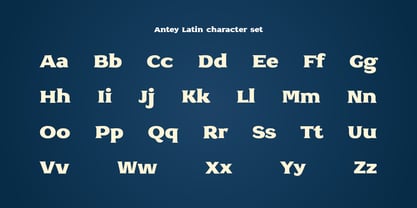
- Fantis by Intellecta Design,
$22.00a fancy font - Altis by Typolar,
$72.00 Altis combines geometric regularity and soulfulness into one font family. It resembles the traditional sanserif from the early 20th century, which communicates friendly and reads extremely well. Bring out its optimistic airiness with light styles or exploit the masculine strength of the bolds. Altis has been developed to fit present-day editorial conditions and publishing models. There are ten optically-balanced weights and practical OpenType features, which make the family versatile and operationally spot-on.
 - Santi by Latinotype,
$39.00 Santi, our new grotesque font offers 9 weight variants along with their corresponding italics. This typeface perfectly blends a classic character with sublime modern touches, creating a striking aesthetic without resorting to fanfare. Santi's versatility transcends current trends and gives it a timeless quality. This typeface blends effortlessly into classic or contemporary projects, offering a perfect balance between the familiar and the innovative.
 - Anji by MC Creative,
$15.00 Anji is a font with a modern Calligrapy look and energetic. With extra attention to quick strokes and sharp details, is ready and perfectly fit for your logo designs, music projects & social media posts, event poster, brand imagery, product packaging, handwritten quotes, merchandise, etc. What’s Included : Standard glyphs Ligature Works on PC & Mac Simple installations Accessible in the Adobe Illustrator, Adobe Photoshop, Adobe InDesign, even work on Microsoft Word. PUA Encoded Characters – Fully accessible without additional design software. Fonts include multilingual support for; ä ö ü Ä Ö Ü ß ¿ ¡
 - Santis by Latinotype,
$45.00 Santis is a multiface type, special for logos, brands, magazines and editorial world. Especially for setting trends in fashion and design. The particularity of this font is that you can easily read it, even when applying swash type letters. It is a Didot based font. Santis versatility can harmoniously display a word or phrase. Santis has 1017 glyphs with alternate characters, numbers and ligatures ornaments specially created for a better design. For best results use with Open Type. Designed by Enrique Hernandez with technical support of Daniel Hernández.
 - ocr-t by FaceType,
$7.00 Being a geometric sanserif ocr-t comes in eleven weights from ultrawhite to infrablack (brightwhite, white, silver, lightgrey, grey, darkgrey, anthracite, black, jetblack). With more than 600 glyphs it covers all your typographic needs and manages to stay at the same place no matter which width you’re using. Its readability and legibility is more than fine although it needs no kerning. The infrablack is really black, in order to achieve this, the form of letters change from darkgrey to anthracite from upright to some kind of upright italic. This also gives opportunity to mix two weights with same colour but different architecture. Find also stylistic sets, alternate letters, lots of bullets, different arrows, hands and well: kind of hearts.
 - OCR A by Linotype,
$29.00The goal of this font design was to create forms which could be used and reproduced electronically and remain legible. Technicians from the European Computer Manufacturers’ Association and Adrian Frutiger combined strict mathematical criteria with typographic tradition to solve both technical and aesthetic problems. OCR was the resulting font and was made a world standard in 1973. The font has an objective, technical character and was created specifically for multimedia, although its distinctive appearance has also made it a popular typographical trend. - OCR-A by Bitstream,
$29.99A set of capitals adequate for machine reading only; this barely legible pioneer sees declining use. - OCR B by Linotype,
$40.99OCR A and OCR B are standardized, monospaced fonts designed for Optical Character Recognition" on electronic devices. OCR A was developed to meet the standards set by the American National Standards Institute in 1966 for the processing of documents by banks, credit card companies and similar businesses. This font was intended to be "read" by scanning devices, and not necessarily by humans. However, because of its "techno" look, it has been re-discovered for advertising and display graphics. OCR B was designed in 1968 by Adrian Frutiger to meet the standards of the European Computer Manufacturer's Association. It was intended for use on products that were to be scanned by electronic devices as well as read by humans. OCR B was made a world standard in 1973, and is more legible to human eyes than most other OCR fonts. Though less appealingly geeky than OCR A, the OCR B version also has a distinctive technical appearance that makes it a hit with graphic designers. - OCR One by ParaType,
$25.00Designed at ParaType in 1997 by Tagir Safayev. Based on OCR-A typeface (1968) of American Type Founders. A simple sans serif typeface designed to meet the requirements of the US Bureau of Standards for optical character recognition. - OCR Be by T-26,
$29.00 - Anti Atom Font by TypoGraphicDesign,
$19.00 The typeface Anti Atom is designed from 2021 for the font foundry Typo Graphic Design by Manuel Viergutz as a political statement #antiatom #atomkraftneindanke The display font based on the original Anti Atom Sonne from Anne Lund. Thanks to Stefan Bergmeier for the Input. 4 font-styles (Sun, Cap, Mirror, Outline) with 375 glyphs (Adobe Latin 2) incl. 100+ decorative extras like icons, arrows, dingbats, emojis, symbols, geometric shapes (type the word #LOVE for or #SMILE for as OpenType-Feature dlig) and stylistic alternates (3 stylistic sets). For use in logos, magazines, posters, advertisement plus as webfont for decorative headlines. The font works best for display size. Have fun with this font & use the DEMO-FONT (with reduced glyph-set) FOR FREE! Font Specifications ■ Font Name: Anti Atom ■ Font Styles: 4 (Sun, Cap, Mirror, Outline) + Icons + DEMO (with reduced glyph-set) ■ Font Category: Display for headline size ■ Glyph Set: 374 glyphs (Adobe Latin 2) incl. 100+ icons (decorative extras like arrows, dingbats, emojis, symbols) ■ Design Date: 2021 ■ Type Designer: Manuel Viergutz
 - Anti Valentines Day by Aldedesign,
$25.00 Anti Valentine’s Day is a flowing handwritten font, described by an elegant touch, perfect for your favorite projects. This font is PUA encoded which means you can access all glyphs and swashes with ease!
 - OCRJ by Test Pilot Collective,
$29.00 - Ogre by Australian Type Foundry,
$30.00A funky, lively display font originally designed for a tourism publication. - Acre by Jonathan Ball,
$24.00 Acre is a geometric sans-serif type family of eight weights that's both inspired by and named after my great grandfather, Tex Acre. Tex was an artist and sign maker whose handcrafted signs illuminated the roadsides of the American Midwest and typified mid-century Americana. Acre is a tribute to him, his work, and many of my favorite early 20th century geometric typefaces. With eight weights ranging from Thin to Black, Acre is an extremely versatile family that can be used for display, text, or anything in between. Acre offers full European language support plus many OpenType features such as tabular and oldstyle figures.
 - OCRK by Test Pilot Collective,
$29.00 - OCR-A AI by Apply Interactive,
$90.00OCR-A AI Text is the version for normal use when the text will be read by humans. OCR-A AI is the version to use for machine reading. - OCR-A M by URW Type Foundry,
$35.00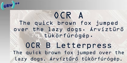
- FF Typestar OCR by FontFont,
$62.99 German type designer Steffen Sauerteig created this slab FontFont in 1999. The font is ideally suited for logo, branding and creative industries and software and gaming. FF Typestar OCR provides advanced typographical support with features such as ligatures, alternate characters, case-sensitive forms, super- and subscript characters, and stylistic alternates. It comes with tabular lining figures. This FontFont is a member of the FF Typestar super family, which also includes FF Typestar.
 - Interleave OCR SB by Scangraphic Digital Type Collection,
$26.00Since the release of these fonts most typefaces in the Scangraphic Type Collection appear in two versions. One is designed specifically for headline typesetting (SH: Scangraphic Headline Types) and one specifically for text typesetting (SB Scangraphic Bodytypes). The most obvious differentiation can be found in the spacing. That of the Bodytypes is adjusted for readability. That of the Headline Types is decidedly more narrow in order to do justice to the requirements of headline typesetting. The kerning tables, as well, have been individualized for each of these type varieties. In addition to the adjustment of spacing, there are also adjustments in the design. For the Bodytypes, fine spaces were created which prevented the smear effect on acute angles in small typesizes. For a number of Bodytypes, hairlines and serifs were thickened or the whole typeface was adjusted to meet the optical requirements for setting type in small sizes. For the German lower-case diacritical marks, all Headline Types complements contain alternative integrated accents which allow the compact setting of lower-case headlines. Please note that Interleave SB and Interleave OCR SB are versions which are for decorative purposes only. - OCR-B BT by Bitstream,
$29.99Adrian Frutiger’s distinguished and successful 1966 design for the European Computer Manufacturers’ Association improving readability of letters for both machines and humans. OCR-B is replacing OCR-A. - OCR A SB by Scangraphic Digital Type Collection,
$26.00Since the release of these fonts most typefaces in the Scangraphic Type Collection appear in two versions. One is designed specifically for headline typesetting (SH: Scangraphic Headline Types) and one specifically for text typesetting (SB Scangraphic Bodytypes). The most obvious differentiation can be found in the spacing. That of the Bodytypes is adjusted for readability. That of the Headline Types is decidedly more narrow in order to do justice to the requirements of headline typesetting. The kerning tables, as well, have been individualized for each of these type varieties. In addition to the adjustment of spacing, there are also adjustments in the design. For the Bodytypes, fine spaces were created which prevented the smear effect on acute angles in small typesizes. For a number of Bodytypes, hairlines and serifs were thickened or the whole typeface was adjusted to meet the optical requirements for setting type in small sizes. For the German lower-case diacritical marks, all Headline Types complements contain alternative integrated accents which allow the compact setting of lower-case headlines. - OCR-B EF by Elsner+Flake,
$35.00 - OCR B SB by Scangraphic Digital Type Collection,
$26.00Since the release of these fonts most typefaces in the Scangraphic Type Collection appear in two versions. One is designed specifically for headline typesetting (SH: Scangraphic Headline Types) and one specifically for text typesetting (SB Scangraphic Bodytypes). The most obvious differentiation can be found in the spacing. That of the Bodytypes is adjusted for readability. That of the Headline Types is decidedly more narrow in order to do justice to the requirements of headline typesetting. The kerning tables, as well, have been individualized for each of these type varieties. In addition to the adjustment of spacing, there are also adjustments in the design. For the Bodytypes, fine spaces were created which prevented the smear effect on acute angles in small typesizes. For a number of Bodytypes, hairlines and serifs were thickened or the whole typeface was adjusted to meet the optical requirements for setting type in small sizes. For the German lower-case diacritical marks, all Headline Types complements contain alternative integrated accents which allow the compact setting of lower-case headlines. - OCR A Tribute by Linotype,
$57.99OCR-A was originally designed in 1968 as a machine-readable alphabet. Its functionality was its most important element, instead of its design. Over the following decades, the typeface has become popular in the design world nevertheless. But typographically pleasing results are often hard to come by, due to the original design’s “non-design design”, as well as its undeveloped character set. In 2006, Miriam Röttgers revised and extended OCR-A, creating OCR A Tribute. OCR A Tribute is a typeface family comprising of two versions: one in which the glyphs have been proportionally-spaced, and another that is monospaced. In the monospaced version, all glyphs have the same width, like the letters in the original OCR-A font do. Both versions of OCR A Tribute contain complete character sets and expert glyphs, as well as lining and old style figures. Now you can rest easy, and finally use this classic design for display purposes and headlines! - OCR-A EF by Elsner+Flake,
$35.00 - OCR A Extended by Monotype,
$40.99OCR A and OCR B are standardized, monospaced fonts designed for Optical Character Recognition" on electronic devices. OCR A was developed to meet the standards set by the American National Standards Institute in 1966 for the processing of documents by banks, credit card companies and similar businesses. This font was intended to be "read" by scanning devices, and not necessarily by humans. However, because of its "techno" look, it has been re-discovered for advertising and display graphics. OCR B was designed in 1968 by Adrian Frutiger to meet the standards of the European Computer Manufacturer's Association. It was intended for use on products that were to be scanned by electronic devices as well as read by humans. OCR B was made a world standard in 1973, and is more legible to human eyes than most other OCR fonts. Though less appealingly geeky than OCR A, the OCR B version also has a distinctive technical appearance that makes it a hit with graphic designers.

Page 1 of 250Next page