10,000 search results
(0.049 seconds)
- Lonely Cowpoke by 10four,
$20.00 Inspired by circus billboards, old west posters and torn paper constructs, "Lonely Cowpoke" is an oddity of bold graphic forms and cheerful curving lines. Revelling in its own quirky nature, this playful font lightens up any mood.
 - Aanaar by Letterjuice,
$66.00 This typeface comes from a self initiated project called Sápmi, which aims to contribute to keep a group of minority languages alive through solving issues in the education environment. This re-thought edition takes the name of Aanaar and joins our library with a bigger character set and two new weights which complete the typeface providing a big typographic palette as well as adding stylistic two-story a and g for more advanced readers as well as to enable the typeface to be used in other environments. The typeface was originally designed for children’s text books. Analysing kid’s typeface design, we identified some important problems and solved them within the boundaries we had. The main concern in a typeface which will be used by children is letter recognition, as they have not yet fully develop their reading skills. For example, letters like “a” and “g” share a very similar structure in this particular kind of typefaces, where the only distinctive part is the descender of the “g”. It is known that the lower part of the letter is the less important feature when reading, therefore we decided to make a clear distinction between them by having an “a” with a spur on the top right. This also helped distinguishing “a” and “o”. Children typefaces usually have one story “a”, making “a” usually too close to “o”. Additionally we moved the joint in “a” upwards and narrowed very slightly the “a” to make sure they cannot be mistaken. More generally, the x-height is fairly tall and the typeface has a bit of movement which give it a good rhythm helping moving along nicely when reading. Aanaar consists of 5 weights (Light, Regular, Medium, Bold and Black) plus two Italics (Light Italic and Italic).
 - Jenson Classico by Linotype,
$29.99In 1458, Charles VII sent the Frenchman Nicolas Jenson to learn the craft of movable type in Mainz, the city where Gutenberg was working. Jenson was supposed to return to France with his newly learned skills, but instead he traveled to Italy, as did other itinerant printers of the time. From 1468 on, he was in Venice, where he flourished as a punchcutter, printer and publisher. He was probably the first non-German printer of movable type, and he produced about 150 editions. Though his punches have vanished, his books have not, and those produced from about 1470 until his death in 1480 have served as a source of inspiration for type designers over centuries. His Roman type is often called the first true Roman." Notable in almost all Jensonian Romans is the angled crossbar on the lowercase e, which is known as the "Venetian Oldstyle e." In the 1990s, Robert Slimbach designed his contemporary interpretation, Adobe Jenson™. It was first released by Adobe in 1996, and re-released in 2000 as a full-featured OpenType font with extended language support and many typographic refinements. A remarkable tour de force, Adobe Jenson provides flexibility for a complete range of text and display composition; it has huge character sets in specially designed optical sizes for captions, text, subheads, and display. The weight range includes light, regular, semibold, and bold. Jenson did not design an italic type to accompany his roman, so Slimbach used the italic types cut by Ludovico degli Arrighi in 1524-27 as his models for the italics in Adobe Jenson. Use this family for book and magazine composition, or for display work when the design calls for a sense of graciousness and dignity. - Spooky Grave by Letterara,
$14.00 Spooky Grave is a chunky lettered and spooky display font. Add this font to your favorite Halloween-themed ideas: invitations, banner, advertising, logo, movie, poster, novel, app game scary or horror, and notice how it makes them come alive! No matter the topic, this font will be an incredible asset to your fonts’ library, as it has the potential to elevate any creation. This font is PUA encoded which means you can access all of the glyphs.
 - Miluero by Luxfont,
$18.00 Introducing the stylized Miluero family. Graceful cut, rounded corners combined with austere shapes. Accent fonts with color padding and a classic basic monochrome version in the set. Perfect for logos, headlines and captions. Looks elegant in a minimalist modern design. An assortment of colors will help you get started quickly. This font family is based on the Regular font Pacardo - which means that if necessary you can combine these two families and they will be absolutely stylistically identical and complement each other. Check the quality before purchasing and try the FREE DEMO version of the font to make sure your software supports color fonts. P.s. Have suggestions for color combinations? Write me an email with the subject "Miluero Color" on: ld.luxfont@gmail.com Features: - Free Demo font to check it works. - Uppercase and lowercase the same size but different forms. - Color in letters. - Kerning. IMPORTANT: - Multicolor version of this font will show up only in apps that are compatible with color fonts, like Adobe Photoshop CC 2017.0.1 and above, Illustrator CC 2018. Learn more about color fonts & their support in third-party apps on www.colorfonts.wtf -Don't worry about what you can't see the preview of the font in the tab "Individual Styles" - all fonts are working and have passed technical inspection, but not displayed, they just because the website MyFonts is not yet able to show a preview of colored fonts. Then if you have software with support colored fonts - you can be sure that after installing fonts into the system you will be able to use them like every other classic font. Question/answer: How to install a font? The procedure for installing the font in the system has not changed. Install the font as you would install the classic fonts. How can I change the font color to my color? · Adobe Illustrator: Convert text to outline and easily change color to your taste as if you were repainting a simple vector shape. · Adobe Photoshop: You can easily repaint text layer with Layer effects and color overlay. ld.luxfont@gmail.com
 - Binder by Grype,
$16.00 Our Binder Family is a revival and expansion of Binder-Style, a typeface designed by Joseph Binder and released by D. Stempel AG in 1959. It originally was a single weight. In later film type adaptations, a bold style, and an outline with drop shadow style were made available. However, this typeface never really had a true sense of family or larger language compatible character set. The original Binder-style typeface found revived popularity with its super condensed style when it appeared on the movie poster for "Silence of the Lambs". It was always a disappointment to me how this typestyle had never gained more traction in use. And so, many years later, we decided to revive the original typestyle, and expand it with a range of weights and obliques to pair with those weights. We've moved most of the unusual lowercase forms to a Stylistic Alternates feature, along with unicast alternates for the Capitals. The family includes a full standard character set with expansive international support of latin based languages, and 4 weights jumping from Thin to Bold, along with 4 accompanying obliques. This family is ready for you to eat it up with a nice glass of Chianti. Here's what's included with the Binder Family: 538 glyphs per style - including Capitals, Lowercase, Numerals, Punctuation and an extensive character set that covers multilingual support of latin based languages. 4 weights: Thin, Light, Regular, & Bold. Accompanying Obliques with each weight/width style. TTF formatted fonts have been hinted for optimal performance. Here's why the Binder Family is for you: You're in need of a stylish condensed font with a variety of weights and obliques for your designs You're a fan of the typographic works of Joseph Binder, but wish there was more to them You love the style of Agency and Bank Gothic, but want something uber-narrow You are desperate to recreate the movie poster from Silence of the Lambs You just like to collect quality fonts to add to your design arsenal
 - Monschone by Zealab Fonts Division,
$18.00 Monshcone is a minimalist luxury and gorgeous font that is both classically elegant and inherently modern. Create unique word mark logo, beautiful wedding invitations, use it as an elegant solution for your next magazine layout, or choose this font for any graphics that require a sleek look with an elegant flair.
 - Solitas Contrast by insigne,
$39.00 This sleek, high contrast typeface means business, but it looks great on any project, no matter how big or small. Solitas Contrast was developed because existing high contrast sans options were neither modern nor crisp. This design challenge was solved through a series of typefaces: the original low-contrast Solitas, its serifed cousins, and now a high contrast sans—each carefully considered for an organic and free flowing look. It evokes a Dutch or european feel. Solitas Contrast is a modern, clean sans-serif with a distinctive style and impact.
 - Goldbarre by Greater Albion Typefounders,
$19.95 Goldbarre is a finely engraved slab serif face in the spirit of ‘between the wars’ commercial confidence. It’s a solid and dependable face of distinction for use on certificates and posters which need to convey an emphatic yet refined message. The letterforms of Goldbarre combine finely hatched shading with and embossed, three-dimensional, quality. The utility of the family is further enhanced with Goldbarre No 2 - a solid shaded face, Goldebarre No 3 - an open embossed face, and Goldbarre No 4 - a basic black slab-serif face.
 - Ribka by Craft Supply Co,
$20.00 Ribka - The Elegant Pointed Serif Font harmoniously blends the classic appeal of sharp serifs with an exquisite sense of sophistication. This typeface radiates timeless charm, making it an excellent choice for projects that seek a touch of enduring beauty and grace. Whether you're creating invitations, developing branding materials, or curating editorial content, Ribka seamlessly instills a sense of opulence and distinction into your work. With its precise and pointed serifs, Ribka stands as an emblem of timeless sophistication in the realm of typography, elevating any project with an essence of refinement and exclusivity
 - Duality by Typodermic,
$11.95 Are you ready to unleash your wild side? Look no further than Duality, the tough and eccentric display typeface that will add a truly unique and unforgettable flair to your message. These fonts are not for the faint of heart—their wild slab-serifs and insane ball-terminals will make your text stand out in a sea of bland and boring fonts. Choose from three different styles to make your message truly pop. The regular style is perfect for making a bold statement, while the gritty Sand style adds an extra layer of texture and edge. And if you really want to make a statement, go for the letterpress Steel style—its rugged, industrial look will make your text look like it was stamped onto the page with raw, unbridled power. Whether you’re designing a poster, a logo, or anything in between, Duality is the perfect choice for anyone who wants to inject some wild, untamed energy into their typography. So go ahead, embrace the madness, and let Duality take your design to the next level. Most Latin-based European writing systems are supported, including the following languages. Afaan Oromo, Afar, Afrikaans, Albanian, Alsatian, Aromanian, Aymara, Bashkir (Latin), Basque, Belarusian (Latin), Bemba, Bikol, Bosnian, Breton, Cape Verdean, Creole, Catalan, Cebuano, Chamorro, Chavacano, Chichewa, Crimean Tatar (Latin), Croatian, Czech, Danish, Dawan, Dholuo, Dutch, English, Estonian, Faroese, Fijian, Filipino, Finnish, French, Frisian, Friulian, Gagauz (Latin), Galician, Ganda, Genoese, German, Greenlandic, Guadeloupean Creole, Haitian Creole, Hawaiian, Hiligaynon, Hungarian, Icelandic, Ilocano, Indonesian, Irish, Italian, Jamaican, Kaqchikel, Karakalpak (Latin), Kashubian, Kikongo, Kinyarwanda, Kirundi, Kurdish (Latin), Latvian, Lithuanian, Lombard, Low Saxon, Luxembourgish, Maasai, Makhuwa, Malay, Maltese, Māori, Moldovan, Montenegrin, Ndebele, Neapolitan, Norwegian, Novial, Occitan, Ossetian (Latin), Papiamento, Piedmontese, Polish, Portuguese, Quechua, Rarotongan, Romanian, Romansh, Sami, Sango, Saramaccan, Sardinian, Scottish Gaelic, Serbian (Latin), Shona, Sicilian, Silesian, Slovak, Slovenian, Somali, Sorbian, Sotho, Spanish, Swahili, Swazi, Swedish, Tagalog, Tahitian, Tetum, Tongan, Tshiluba, Tsonga, Tswana, Tumbuka, Turkish, Turkmen (Latin), Tuvaluan, Uzbek (Latin), Venetian, Vepsian, Võro, Walloon, Waray-Waray, Wayuu, Welsh, Wolof, Xhosa, Yapese, Zapotec Zulu and Zuni.
 - AM Floriana by URW Type Foundry,
$39.99 The origin of AM Floriana is already several decades ago. At a time when there was no photo set and the choice of metal type fonts was still very manageable, Alois Menacher received an order to design a custom business logo from a flower shop. He then created a hand-drawn lettering based on the form of leaves and plants. Now Alois Menacher professionally designed and developed AM Floriana on the basis of this lettering. AM Floriana is ideally suited for packaging design, as well as for display design and logo design. AM Floriana is available as a Bold version and will soon be complemented by further cuts.
 - TT Phobos by TypeType,
$35.00 TT Phobos useful links: Specimen | Graphic presentation | Customization options TT Phobos is a pliable display serif with a soft and gentle character. The features of the typeface are the moderate contrast between bold and thin strokes, pliable visual compensators, and the counter-clockwise bend of internal ovals. In addition to 6 weights and 6 italic, TT Phobos also includes two original decorative fonts, inline and stencil. Despite its pliability and display character, TT Phobos is dynamic enough and is well suited for text arrays even in large text blocks. The serifs of letters are completely asymmetrical and bring in dynamics when reading the text from left to right. Thanks to the harmonious contrast of black and white forms and internal negative spaces of the letters, as well as its broad letter spacing, the typeface is well read in small sizes. In this case, the character of the letters is completely preserved, partially thanks to the exaggerated elegant visual compensators. The ornamental pattern used in TT Phobos Inline varies for capital and lowercase letters. Capital letters implement a more complex double inline with a rhombic element in the middle, and in the lower case features a simplified form of the inline, made in a single movement. Thanks to the original cutting, TT Phobos Stencil stands out for its expression, and the rounded cuts add even more visual style to the font. TT Phobos consists of 14 faces: 6 weights (Light, Regular, DemiBold, Bold, ExtraBold, Black), 6 Italics, inline and stencil. There are 17 ligatures in TT Phobos, including several Cyrillic ones. The typeface has stylistic alternates, which adds an italic effect to the upright fonts, and a little solemnity of the upright version to the italics. In addition, we have not forgotten about the old-style figures and other useful OpenType features, such as ordn, sups, sinf, dnom, numr, onum, tnum, pnum, liga, dlig, salt (ss01), frac, case.
 - Tazugane Gothic by Monotype,
$187.99 The Tazugane Gothic typeface family is the first original Japanese typeface created by Monotype. Designed by Akira Kobayashi, Kazuhiro Yamada and Ryota Doi of the Monotype Studio, the Tazugane Gothic typeface offers ten weights and was developed to complement the classic Latin typeface, Neue Frutiger. The design of the Tazugane Gothic typeface balances an original, humanistic style with elements of traditional Japanese handwriting. The two typefaces work together in a natural, seamless and adaptable manner so that Japanese and Latin texts can be used side-by-side for a wide range of applications, including in magazines, books and other print media; on digital devices; in branding and corporate identity systems; and in signage for buildings, highways and mass transit. Tazugane Gothic was updated to support the “Reiwa” new era symbol. Reiwa can be written as two kanji: 令和. This update to Tazugane Gothic includes Reiwa designed as a single ligature and is encoded as U+32FF. The inspiration for the Tazugane Gothic typeface is as elegant as its design. Since antiquity, cranes have been regarded in East Asia as auspicious birds for their noble appearance and elegance in flight. The typeface is named Tazugane Gothic in honor of the longevity of the crane, with the goal that it will be used for many years to come. The combination of the Tazugane Gothic typefaces’ traditional and humanistic elements, along with its intended ability to complement popular Latin typefaces, makes it one of the most uniquely flexible designs for applications where Japanese and Latin texts can be used together. The typeface family was created to have wide appeal, with a pleasing and consistent experience for readers, for use on screen, in print, in signage, packaging and advertising. Tazugane Gothic has 10 weights. The Light, Book, Regular, Medium and Bold weights are considered best for text sizes. The Ultra Light, Thin, Heavy, Black and Extra Black weights are recommended for headline sizes.
 - Normandia by Canada Type,
$30.00 Designed over three years after the second World War, and published in 1949 by the Nebiolo foundry, Normandia was Alessandro Butti’s take on the fat face. As it usually was with Butti’s designs, this face effectively injected a catchy yet expertly calculated calligraphic spin into its source of inspiration — which was the essentially geometric/deco, thicker model of Bodoni’s very popular aesthetic. The metal Normandia saw some widespread use for a handful of years after its publication, not least because of the multitude of sizes in which it was available. It stepped out of the limelight by the mid-1950s, due to a combination of the popularity of cold type and Nebiolo’s refusal to retool its faces for new technologies. It was copied by a few small film typesetting outfits on both sides of the Atlantic, but never really found its way back to the mainstream. By the time computer type became the norm, Normandia was pretty much relegated to a type historian’s collection of anecdotes. This digital update of the classic series revives and refines the three original metal designs (Tonda/Regular, Corsiva/Italic, and Contornata/Outline) and expands the character set to more than 600 glyphs per font, including small caps, six types of figures, fractions and nut fractions, a full set of f-ligatures, some stylistic alternates, and other fine typography niceties.
 - Halfroy by Heypentype,
$20.00 Halfroy is our answer to generic geometric sans trends exploding nowadays who creates sameness. Halfroy brings new sans perspectives by combining rounded and sharp edges to create delicate sans fonts. See the difference by looking at counter-shapes compared to outline, insides counter shapes you will sees a sharp edges while round but not geometrical on outlines. Halfroy gives your project unique visual impact whatever your design project is, but we recommend using thin, semibold to Fat as display then light and regular. Halfroy taken inspirations not from looking at other sans typeface, but its design inspirations comes from observing a land contour and geographical statistics in our city, Kota Batu. We found that our city geographic consist of steep slope like waves with sharp peaks and surrounded by small and third highest mountains peak on our country. From then on we begin visualize and applied on few letters. Take a look on our 'O', 'f', 's' letters, its like a stone carved letters. Its hard edges and soft edges outline clearly draws from our inspiration source. Even Halfroy looks stony, hard as individual letters, we treat this type with humanist approach in mind. Therefore you can sense a friendly yet casuals of typical sans serif fonts when it grouped together to form a words or sentences. We hope Halfroy will gives your design project a unique on its own.
 - Axiforma by Kastelov,
$55.00 Axiforma was designed with the single idea of creating a font that starts with the letter A, because let's face it, this is the best letter. For those of you who didn't see it coming, Axiforma is a /drum roll/ geometric sans in 20 weights. If you are thinking "Oh boy, another geometric sans", you clearly know your stuff. Yet, Axiforma is different in at least three crucial ways: 1) It's made by me 2) It's not free 3) It's polite and humble Additionally, Axiforma is packed with Opentype such as oldstyle numbers, fractions, case sensitive alternates, localized forms, stylistic sets, cyrillic alphabets (Bulgarian & Russian) and many more. Basically it's quite extensive and kinda great. Upon using Axiforma, clients will start to behave differently around you and may even start paying you. Your spouse will start working out again just to gain your attention and your kid will become instantly popular at school. After all you are using Axiforma and rumors do spread quickly. That's what we are talking about - raw font power. With Axiforma regular typed text is suddently transformed into first class design. That includes branding, posters, headlines, display, presentation materials, websites, logotypes, etc. The world will now be your playground. To sum it up, Axiforma is badass, thus you should have it and use it everywhere.
 - Mr Robot by Hipopotam Studio,
$16.00 Mr Robot is a typeface designed for our next book for children. We wanted to have a colorful, dimensional and edgy looking letters for headlines. There are three ways to use Mr Robot. You can align three text frames with same text but with different colors and font styles (Regular, Shadow 1 or Shadow 3 and Shadow 2) or with ALLinONE font style but select a different OpenType Stylistic Sets (set 1 is like Shadow 1, set 2 like Shadow 2 and set 3 like Shadow 3). This works great but we don’t like to have unnecessary text frames in our layouts so we added a very cool Contextual Alternates OpenType feature. You just need Mr Robot ALLinONE style and only one text frame. First make sure that Contextual Alternates is off. Type every character three times (RRROOOBBBOOOTTT), select colors for each letter (first letter of every three is a side shadow, second is bottom shadow and third is a front of the dimensional letter). When everything is set just turn Contextual Alternates back on. Styles and alignment will be set automatically. Check out the Users Manual for a visual explanation. For web fonts it is better (at least for now) to use the first method (with font styles) as the OpenType features are not supported in older browsers.
 - Cas Pixalatte by Casloop Studio,
$10.00 Cas Pixalatte Typeface - Dive into Y2K Nostalgia with Pixel Perfection Unleash the power of pixelated aesthetics with Cas Pixalatte Typeface, a cutting-edge font inspired by the iconic Y2K era. This unique typeface is a masterful blend of typography, graphic design, and pixel art, crafted to infuse your projects with a distinct visual style that's both nostalgic and contemporary. Two Distinct Pixel Font Styles Tailor your designs with precision by choosing between the 'Regular' and 'Rounded' styles, allowing you to achieve the perfect balance between retro charm and modern aesthetics. Multi-Language Support Cas Pixalatte goes beyond borders, offering comprehensive support for Latin-based languages across Western Europe, Central Europe, South Eastern Europe, South America, Oceania, and Esperanto. Why Cas Pixalatte? Here's what sets it apart: Visual Versatility: Whether you're working on a gaming interface, website design, or branding project, Cas Pixalatte adds a unique visual flair, making your creations truly stand out. Easy Integration: With a range of file formats, seamless integration into your design workflow is guaranteed, ensuring a hassle-free creative process. Global Appeal: Break language barriers with multi-language support, allowing you to reach audiences around the world without compromise. Elevate your design, embrace nostalgia, and make a lasting impression with Cas Pixalatte Typeface. Discover the possibilities, unlock creativity, and transform your projects into unforgettable visual experiences.
 - Chillink by Four Lines Std,
$15.00 Get ready to chill and thrill with Chillink Font! With its bold and playful style, this font is sure to make your text pop and stand out from the crowd. Plus, its unparalleled readability and versatility make it the perfect choice for any project, whether it's a social media post, website design, or even a logo. The best thing about Chillink Font is that it's so easy to use! Just copy and paste it into any project, and you'll be ready to go in no time at all.
 - Maqin Larisa by Typia Nesia,
$20.00 Maqin Larisa an excellent typeface for modern typography desain and hand lettering logo designs. Maqin Larisa typeface is suitable for any design needs, branding, modern invitation design, blog design, modern advertising design, art quote, cover title, t-shirts, any lettering design needs and more. Maqin Larisa comes with upper and lowercase Standard Characters, Punctuation, Numerals. And other Glyphs variation of the OpenType features such as Standard Ligature, Stylistic Alternate (with a completely new set of both lower and uppercase characters) and Stylistic Set (ss01, ss02, ss03, ss04, ss05).
 - Eulogy Family by pentagonistudio,
$9.00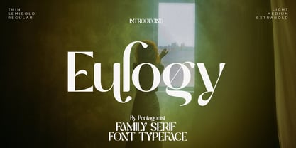 Eulogy Is A Serif Family Font and Variable Display Inspired By Retro and Vintage Style. . SOFTWARE REQUIREMENTS : Fonts and alternate : No special software required they may be used in any basic program /website apps that allows standard fonts That's it folks! You can go ahead and get cracking :) Follow My Shop For Upcoming Updates Including Additional Glyphs And Language Support. And Please Message Me If You Want Your Language Included or If There Are Any Features or Glyph Requests, Feel Free to Send me A Message. Have a Good Day !
 - Killen Seven by Factory738,
$15.00 Halloween is quickly approaching!!! Killen Seven is an excellent choice for any Halloween project. Get inspired by its spooky atmosphere and use it to make any Horror project stand out. It has separate lower and uppercase letters, as well as numbers, punctuation, and multilingual letters. The Ligatures will come in handy for whatever your imagination can come up with! 7 Styles Basic Latin A-Z and a-z Numerals & Punctuation Stylistic Ligatures Multilingual Support for ä ö ü Ä Ö Ü ... Free updates and feature additions Thanks for looking, and I hope you enjoy it.
 - Ruina Inline by RodrigoTypo,
$25.00 Ruina inline is an alternate version of Ruina, containing inline and also oblique, a very expressive font that can be seen in any casual design
 - Hostania by Attract Studio,
$17.00 Hostania is a beautiful and nostalgic serif typeface that looks amazing in both large and small settings as both display and body text. Best used as a showcase for titles and logos, sharp curves and a decorative alternative that give any project an extra touch of class. Includes: Alternative Styles Multiple Languages Supported PUA Encoded Characters.
 - Buchery by HansCo,
$15.00 Buchery is handwritten bold and rough font with dry brush texture. This texture is very detailed. Buchery is suitable for logos, shirts, fashion, blogs, websites, product branding, posters, flyers, any print template or for text overlay to any background image. Alternative and swash characters are also available. If you use Adobe / Corel Draw you just block one of the letters / numbers (for swash) and an arrow will appear under the letter, and you can replace it with alternative characters.
 - Evans by Zetafonts,
$39.00 Evans was named after Walker Evans, an american photojournalist whose photographs often featured unassuming subjects – ordinary people, roadside scenes, and the subtle details of the American landscape. His ability to find beauty in simplicity and appreciate the mundane inspired Cosimo Lorenzo Pancini and Andrea Tartarelli to create this typographic family that aims to convey the ideals of journalistic storytelling: simplicity, clarity, and unpretentious honesty. Looking for a soothing, relaxed visual flow in body text, Evans was designed by gently narrowing classical proportions to answer the designers' need of maximizing the arrangement of lengthy text within confined spaces. Combining the vintage appeal of a semi-condensed old-style structure with a very slight transitional slanted axis resulted in text-oriented typeface with visual charm on both printed and digital pages. Subtly reducing the size of majuscules allowed the effect of an increased x-height, balancing space saving with increased readability at same point size. Using soft, semi-calligraphic shapes and keeping a generous letter spacing, the designers embraced a minimalist approach, aiming at a smooth reading experience. For maximum versatility, Evans provides two distinct variations tailored to different purposes: the Regular and the Narrow subfamilies. While both are fine-tuned for body text applications , the second is suited also for display-oriented contexts, where attention-grabbing headlines take center stage. Each subfamily is developed in a range of 8 weights from Extralight to Heavy, and includes over 700 glyphs with full coverage of language using extened latin glyphs. True italics are designed for all weights, providing additional typographic control through the design of Swash Alternates, available through Open Type features that also include Standard and Discretionary Ligatures, Positional Numerals, Case Sensitive Forms and Stylistic Alternates. The family is complemented also by a rich set of Ornaments, available both as special glyphs or in a separate font. With its retro-inspired design and unwavering commitment to form and function, Evans effortlessly extends its versatility from editorial design to digital interfaces and logo creation, inviting users to appreciate the beauty in simplicity, find joy in the ordinary, and embrace a relaxed and unhurried mindset.
 - Eve Of Ocean by Look Minus Today,
$14.00 Introducing Eve Of Ocean - Modern elegant serif typeface by Rijesain x Look minus today Eve Of Ocean is an elegant and modern impression, this serif font will add an attractive and professional look to any design project you use it for. It features a harmonious balance of firmness and grace, making it suitable for a range of design projects such as wedding invitations, fashion magazines, and promotional posters. Eve of Ocean is a great choice for designers who want to add a touch of luxury and style to their work. Its readability and accessibility make it perfect for both print and digital designs. Features: - Lowercase and Uppercase - Beautiful Alternates & Ligatures - Numerals & Punctuation - Multilingual & Symbol HOW TO ACCESS ALTERNATE CHARACTERS Open glyphs panel: In Adobe Illustrator go to Window - Type – glyphs In Adobe Photoshop go to Window – glyphs Contact me with an inbox message If you have any question. Thank you and have a nice day !
 - Kora Vibes by Jehansyah,
$15.00 Kora Vibes is an elegant and modern serif font with a luxurious feel. Perfect for any title or large font, emails, magazines, book titles, movies, notes, brands, logos and more. This font is PUA coded, which means you can easily access all the glyphs and swashes!
 - Cloudbusting by Ana's Fonts,
$15.00 Cloudbusting is a playful sans serif font with a bubble letters look, lots of variations and an extra set of drawings. Perfect for any design that needs a bold font, such as logotypes, quotes and social media posts, website and magazine layouts, and poster designs. Cloudbusting includes: An outline font A filled font A set of 62 outline drawings A set of 62 filled drawings Cloudbusting is an all caps font, with two versions for each letter, which makes it fun to use in animations and designs with a handmade look.
 - Mon de Tresor by Reyrey Blue Std,
$14.00 Mon De Tresor is an elegant and thin lettered sans serif font. Perfect for editorial projects, Logo design, Clothing Branding, product packaging, magazine headers, or simply as a stylish text overlay to any background image. It will add a luxury spark to any design project that you wish to create! Includes: Uppercase and Lowercase Ligatures Stylistic Alternate
 - Aries Streaks by Rachel McBride Creative,
$9.00 Aries Streaks is the perfect typeface for any project in need of spunk, edge, or youth. It's extremely eccentric while remaining legible, and has both an air of nostalgia and modern style. Great for use on titles, labels, handwritten projects, and large text projects. Glyph count: 440 and supports most western languages.
 - Northgate by Stringlabs Creative Studio,
$25.00 Northgate delivers an incredibly bold and unique font experience. This script will make a great addition to any crafter’s toolbox. Northgate Path is a flowing and elegant handwritten font, created with the help of a brush pen. Get inspired by its unique and beautiful style and add it to your favorite designs!
 - Mantika Book by Linotype,
$50.99 Mantika Book was originally conceived and drawn parallel to the first Agilita drawings. *[images: pencil drawings] It took several years before having a chance looking at these designs again. But then, my first impulse was to turn this alphabet into a new sanserif, which was to become Mantika Sans. This was the starting point to conceive a super family consisting of different design styles and corresponding weights. The initial drawings of Mantika Book were refined and an Italic was developed to go with it. The aim was to create a modern serif typeface which is reminiscent of humanistic Renaissance typefaces, yet without following a particular historic model. Its large x-height for one is far away from original Renaissance models. Mantika Book was designed as a companion serif typeface to Mantika Sans that can be set for lengthy texts as in books, hence its name. It shares the same x-height with Mantika Sans but has longer ascenders and descenders, making for better word shapes in long, continuous reading. The approach of an ›old-style‹ looking typeface with large minuscules makes Mantika Book also a choice for magazine text settings where one often needs smaller point sizes to fit in a multiple columns layout. The unique details of Mantika Book are the asymetric bracketed serifs in the upright font and its higher stroke contrast than usual in a Renaissance style. The stems are slightly curved inwards. Also, the Italics have a low degree of inclination, which makes longer passages of text set in Italic rather pleasing to read. Another feature Mantika Book shares with Mantika Sans is that all four weights take up the same line length. It covers all European languages plus Cyrillic and Greek, is equipped with lots of useful scientific symbols [double square brackets, angle brackets, empty set, arrows] and the regular weight has small caps. There is a kind of an old-style feeling to Mantika Book, yet these citations were turned into a contemporary serif typeface with a soft but sturdy character.
 - Motorway by K-Type,
$20.00 MOTORWAY is the companion typeface to TRANSPORT, the British road sign lettering. The Motorway alphabet was created for the route numbers on motorway signage, and is taller and narrower than the accompanying place names and distances which are printed in Transport. However, for Motorway Jock Kinneir and Margaret Calvert created only the numbers 0 to 9, the capitals A, B, E, M, N, S and W, ampersand, slash, parentheses and a comma. So, although the lettering made its first appearance on the Preston bypass in 1958, K-Type Motorway is the first complete typeface and contains all upper and lower case letters, plus a full complement of punctuation, symbols and Latin Extended-A accented characters. As with the Transport alphabet the starting point was Akzidenz Grotesk, Motorway taking inspiration from condensed versions. Changes were mainly driven by a quest for legibility, resulting in some reduced contrast between horizontal and vertical strokes, and Gill-esque straight diagonal limbs on the 6 and 9, and high vertex for the M. Kinneir and Calvert designed the limited range of characters in two weights; a SemiBold 'Permanent' weight for use as white letters on blue motorway signs, and a Bold 'Temporary' weight for heavier black letters on yellow non-permanent signage. In addition to creating full fonts in both original weights, the K-Type family adds a new Regular weight, plus a set of italics, completing a highly usable condensed typeface which, while rooted in history, is fully functional for both print and web usage. The K-Type fonts are spaced and kerned normally, simply increase the tracking to recapture the generous spacing of motorway signage.
 - Tebel Sans by Ardyanatypes,
$15.00 Tebel Sans is a modern, ultra-bold sans-serif font perfect for all kinds of designs. With nine different thickness variations and two different typefaces (regular and italic), this font is the ideal choice for your designs. Its unique thickness makes your design look like a bold and elegant title. It is also a practical body text, with a large selection of different font families available in Opentype features such as multilingual ligature. Alternative fonts make it even more attractive and valuable for various graphic designs. Tebel Sans has a uniqueness that makes your designs look more powerful and modern. Languages Support :Afrikaans, Albanian, Asturian, Asu, Azerbaijani, Basque, Bemba, Bena, Bosnian, Breton, Catalan, Chiga, Colognian, Cornish, Croatian, Czech, Danish, Dutch, Embu, English, Esperanto, Estonian, Faroese, Filipino, Finnish, French, Friulian, Galician, German, Gusii, Hungarian, Icelandic, Igbo, Indonesian, Irish, Italian, Kabuverdianu, Kalaallisut, Kalenjin, Kamba, Kikuyu, Kinyarwanda, Latvian, Lithuanian, Low German, Lower Sorbian, Luo, Luxembourgish, Luyia, Machame, Makhuwa-Meetto, Makonde, Malagasy, Malay, Maltese, Manx, Meru, Morisyen, North Ndebele, Norwegian Bokmål, Norwegian Nynorsk, Nyankole, Oromo, Polish, Portuguese, Quechua, Romanian, Romansh, Rombo, Rundi, Rwa, Samburu, Sango, Sangu, Scottish Gaelic, Sena, Shambala, Shona, Slovak, Slovenian, Soga, Somali, Spanish, Swahili, Swedish, Swiss German, Taita, Teso, Turkish, Turkmen, Upper Sorbian, Vietnamese, Vunjo, Walser, Welsh, Western Frisian, Yoruba, Zulu
 - Ribfest by FontMesa,
$25.00 Ribfest is a new font based on lettering found on old United States currency from the 1800’s. Named after the Ribfest held in Naperville IL over 4th of July weekend each year, this font will be perfect for your next summer barbecue party. Ribfest offers three Fill fonts that can be layered behind the main open faced fonts, the regular Fill font covers the complete opening on the main fonts while the Fill T for top and Fill B for bottom gives you the option to fill with two different colors for top and bottom. The Fill fonts for Ribfest may also be used as stand alone fonts, the Fill T and Fill B fonts when layered together creates a unique look on its own. Expand your summertime fun with Ribfest and save me some of those rib’s, with extra barbecue sauce please. Special Note: When using the Opentype format of Ribfest, if you experience some letters appearing too bold at point sizes of 36 or above please install the truetype version that came with your purchase. Due to the extra detail in this font some graphics drivers may increase the boldness of the Opentype version of this font, the solution is to uninstall the Opentype and install the Truetype version.
 - AnoStencil by Alias,
$60.00 Stencil typefaces are popular because they are striking and decorative, and their associations - whether Utility, Travel, Vernacular, etc - are evocative. Anostencil is developed from, but not exactly like, our Ano typeface. Ano’s geometric skeleton, tweaked a bit, allows for a level of abstraction while retaining legibility. Some of Ano’s characters, such as the a, e, f and r, have been amended to make clearer, more graphic shapes when the stencil design has been applied. Different application of the stencil gaps in the letters make functional but decorative and expressive linear forms. This is particularly evident in Anostencil’s extended character set which features codified, semi abstract shapes. So the stencil design in Anostencil has been applied in not necessarily the most logical or immediate way, but in a way that makes each letter a striking and graphic shape.
 - Jaque PS by pentagonistudio,
$19.00 Jaque Is A Vintage Serif Character Inspired By Stylish and Retro Style. SOFTWARE REQUIREMENTS : Fonts and alternate : No special software required they may be used in any basic program /website apps that allows standard fonts That's it folks! You can go ahead and get cracking :) Follow My Shop For Upcoming Updates Including Additional Glyphs And Language Support. And Please Message Me If You Want Your Language Included or If There Are Any Features or Glyph Requests, Feel Free to Send me A Message. Have a Good Day !
 - Kuano by pentagonistudio,
$19.00 Kuano Is Classy Display Serif Character Inspired By Modern and Ligature Characters. SOFTWARE REQUIREMENTS : Fonts and alternate : No special software required they may be used in any basic program /website apps that allows standard fonts That's it folks! You can go ahead and get cracking :) Follow My Shop For Upcoming Updates Including Additional Glyphs And Language Support. And Please Message Me If You Want Your Language Included or If There Are Any Features or Glyph Requests, Feel Free to Send me A Message. Have a Good Day !