10,000 search results
(0.036 seconds)
- Ingy Ding MCD by Ingrimayne Type,
$21.00 This font began as an attempt of draw alternatives to the images of Microsoft’s Wingdings, but then grew beyond that. This new version from late 2010 has over 1400 characters, including almost all of the geometric shapes in unicode 2500 and 2B00 ranges, almost all of the arrows in the unicode 2100, 2700, 2900, and 2B00 ranges, almost all of the dingbats and symbols in the unicode 2600 and 2700 ranges, many of the pictures, symbols, and emoticons in the 1F300 to 1F600 ranges, and a few of the miscellaneous technical items in the 2300 range. There are also pictures on the standard open type letters, most of which can be accessed from the keyboard. However, most of the characters in this typeface have to be accessed using their unicode designation. In Windows this is done with the alt key and the unicode hex number. On the Macintosh the easiest way (and for the five digit unicode characters, perhaps the only way) is to use the “Special Characters” window under the Edit Menu in the Finder. A unicode index of the font is provided in a pdf file that was generated using FontLab. However, it only has four of the unicode digits for the five-digit elements. Almost all of the unicode numbers starting with F should have a 1 in front of the F.
 - Roller Poster by HiH,
$12.00 Roller Poster is named after Alfred Roller. In 1902, Roller created a poster to advertise the 16th exhibit of Austrian Artists and Sculptures Association, representing the Vienna Secession movement. The exhibit was to take place in Vienna during January & February 1903. The location is not mentioned because everyone in Vienna knew it would be held at the exhibit hall in the Secession Building at Friedrichstraþe 12, a few blocks south of the Opernring, near the Naschmarkt. Designed by Joseph Maria Olbrich in 1897, the buiilding has been restored and stands today as one finest of the many fine examples of Art Nouveau architecture in Vienna (see vienna_secession_bldg.jpg). Because of its dome, it is called “the golden cabbage.” The poster itself is unique. The word “secession” is in one type style and takes up two-thirds of the elongated poster. At the bottom of the poster are the details in a different lettering style. It is this second style at the bottom that is the basis for the font Roller Poster. In keeping with our regular naming conventions, we were going to call it Roller Gezeichnete (hand-drawn), but the wonderful play on both words and the shape of the three S’s in secession was too compelling. In November 1965 there was an exhibit of Jugendstil and Expressionist art at the University of California. Alfred Roller’s Secession Poster was part of that exhibit. Wes Wilson was designing promotional material at Contact Printing in San Francisco. Among their clients was a rock promoter named Bill Graham, staging dance-concerts at Fillmore Auditorium. Wilson saw the catalog from the UC exhibit and Roller’s lettering. Wilson adapted Roller’s letter forms to his own fluid style. The result was the poster for the August 12-13, 1966 Jefferson Airplane/Grateful Dead concert at Fillmore put on by Graham (BG23-1). Wilson continued to use Roller’s letter forms on most of the posters he did for Graham through May 1967, when he stopped working for Graham. The posters were extremely successful and the lettering style along with Roller’s letter forms were picked up by other artists, including Bonnie MacLean, Clifford Charles Seeley, James Gardner, and others. The Secession poster and the Fillmore posters have inspired a number of fonts in addition to ours. Among them are JONAH BLACK (& WHITE) by Rececca Alaccari, LOVE SOLID by Leslie Carbarga and MOJO by Jim Parkinson. Each is different and yet each clearly shows its bloodlines. Our font differs in two ways: 1) the general differences in the interpretation of the letter forms and 2) the modification of the basic letter form to incorporate the diacriticals within the implied frame of the letter, after the manner of the original design by Roller. We borrowed Carbarga’s solution to the slashed O and used it, in a modified form, for other characters as well to accomplish the same purpose. We recommend that you buy ours and at least one of the other three. According to Alaccari, a version called URBAN was released by Franklin Lettering in the 70’s (and is shown on page 51 of The Solotype Catalog). For comparison of our font to original design, see image files roller_poster_2s.jpg of original poster and roller_poster_2sx.jpg showing reconstruction using our font for the lower portion (recontructed area indicated by blue bar). Please note the consistency of character width. In the lower case, 23 of the basic 26 letters are 1/2 EM Square wide. The ‘i’ is an eighth narrower, while the ‘m’& ‘w’ are one quarter wider. All the Upper Case letters are 1/8 EM wider than the lower case. This is to make it easier to fill a geometrical shape like a rectangle, allowing you to capture a little of the flavor of Wes Wilson’s Fillmore West poster using only a word processor. We have also included a number of shapes for use as spacers and endcaps. If you have a drawing program that allows you to edit an ‘envelope’ around the letters to distort their shape, you can really get creative. I used Corel Draw for the gallary images, but there are other programs that can accomplish the same thing. The image file “roller_poster_keys.jpg” shows the complete character set with the keystrokes required for each character (see “HiH_Font_readme.txt” for instruction on inserting the non-keyboard characters). The file “roller_poster_widths.jpg” shows the exact width of each character in EM units (based on 1000 units per EM square). You will notice that the font is set wide for readability. However, most programs will allow you to tighten up on the character spacing after the manner of Roller & Wilson. In MS Word, for example, go to the FORMAT menu > FONT > CHARACTER SPACING. Go to the second Drop-Down Menu, labeled ‘Spacing’ and select "condensed' and then set the amount that you want to condense ‘by’ (key on the little arrows); two points (2.0) is a godd place to start. Let your motto be EXPLORE & EXPERIMENT. Art Nouveau has always been one of my favorite movements in art -- I grew up in a home with a couple of Mucha prints hanging on the living room wall. Perhaps because of that and because I lived through the sixties, I have enjoyed researching and designing this font more than any other I have worked on. Let’s face it (pardon the pun), Roller Poster is a FUN font. You owe it to yourself to have fun using it.
 - Transit Display by KC Fonts,
$24.00 Transit Display is simply two fonts: Regular & Italic. It is an all uppercase based font that takes the grungy look that you love one step further by offering you that do it yourself eroded stamp look with a modern flair. Transit Display will work with any of your stylized design needs! Transit Display also has a larger character set for multilingual support. For a customized look to your works, switch between uppercase and lowercase for a change of grunge to the letters.
 - Boarding House by Hanoded,
$15.00 I have never stayed at a boarding house myself, but I’ve heard some horror stories. When I have finished painting the three fonts (using Chinese ink and a small brush), I didn’t have to think long for a name. Boarding House family consists of three distinct hand painted fonts - the complement each other, but can be used separately as well. Use Boarding House for your halloween posters, mystery novels or websites. All fonts come with an attic full of diacritics.
 - Lady Ice Revisited - Unknown license

- Spekulatus by Bogstav,
$18.00 Spekulatus is a made up name, and that was what I needed for a font like this. I am not sure which category it fits in: grunge, square, handmade, rough or maybe even graffiti? Well, let's just say that it fits in all 5 - or perhaps even more? All letters are handdrawn, and messed up a bit with a thin fine white liner, leaving a gentle grungy and worn effect. I've added 5 different versions of each letter, which is quite nice - not having the same letters repeating all the time!
 - Southern Belle by Angie Makes,
$12.00 Southern Belle, a cute little handdrawn font with a ton of character and a slow, southern drawl, was inspired by sweet tea and southern blossoms. Its uppercase letterforms would be a great fit for logos, envelope addresses, and more! This Southern Belle font features repeating borders, and a ton of cute little doodles. (try using + + +, = = = , and _ _ _ to see borders repeat). To access all of the characters in this font, we recommend using the glyphs panel in Adobe Illustrator. This font works best in open type aware software. Comes as an .otf font file. NOTE: To access all of the cute extras in this font that are not accessible from your keyboard, you will need software with open type glyph capabilities such as ADOBE ILLUSTRATOR or ADOBE INDESIGN.
 - Dharma Slab by Dharma Type,
$19.99 Dharma Slab is an antiqued slab serif designed inspired by 1800s-style wood type. All glyphs had been designed carefully to be retro-looking of the old time and to fill all with nostalgia. This condensed font family with 42 styles will be the best solution for posters, titles and anywhere you need impact. To complete your work perfectly, Gothic Extras family is ready for free. They include borders, ornaments and frames designed using vintage catalog of Hamilton in 1800s as a model. Incidentally, g, r and y has their alternative glyphs that can be available with OpenType salt feature and tabular figures can be available with tnum feature. Be sure to check out the sans serif style of this Dharma series named Dharma Gothic.
 - FS Kitty by Fontsmith,
$50.00 Cute FS Kitty is the type equivalent of Bagpuss: plump, cute, cuddly and not fond of exercise. So don’t go giving it a run-out on body copy; FS Kitty is an all-caps font made for showing off in posters and headlines, and on products, point-of sale and especially sweets. Blubber Kitty had been quietly curled up in Phil Garnham’s sketchbook for a year before he brought it out to be brushed up. “It was in the mix as a basic form when I started thinking about FS Lola. It was a twisted, bubbly beauty – quite squishable and huggable. The working file was called Blubber. “At that time it was a basic construction of strokes. I created the ‘A’ first, purely as a shape to play with, not as type. I flipped it for ‘V’, and copied that for a ‘W’. I flipped the ‘W’ for an ‘M’... I thought, ‘This looks a bit wacky, but I like it,’ and just carried on. The most tricky characters were the ‘B’ ‘P’ and ‘R’. I must have drawn about 20 kinds of B for this, just to get it to fit.” Variety “When the regular weight of Kitty had been designed,” says Jason Smith, “it just felt like a natural progression to go on and explore how far we could go with it: Light, Solid, Headline, Shadow.” Phil Garnham thinks there’s still more to come. “There are some really individual characters in this font that I think have yet to be exploited: the Greek Omega symbol, the strange face in the ampersand. Like Bagpuss, Kitty has kept a low profile so far. “We know people are using Kitty. In fact, it was the first of any of our fonts that we sold on the day it was released. But I still haven’t seen it out there in the wild. It’s going to be a exciting moment.”
 - FS Kitty Variable by Fontsmith,
$199.99Cute FS Kitty is the type equivalent of Bagpuss: plump, cute, cuddly and not fond of exercise. So don’t go giving it a run-out on body copy; FS Kitty is an all-caps font made for showing off in posters and headlines, and on products, point-of sale and especially sweets. Blubber Kitty had been quietly curled up in Phil Garnham’s sketchbook for a year before he brought it out to be brushed up. “It was in the mix as a basic form when I started thinking about FS Lola. It was a twisted, bubbly beauty – quite squishable and huggable. The working file was called Blubber. “At that time it was a basic construction of strokes. I created the ‘A’ first, purely as a shape to play with, not as type. I flipped it for ‘V’, and copied that for a ‘W’. I flipped the ‘W’ for an ‘M’... I thought, ‘This looks a bit wacky, but I like it,’ and just carried on. The most tricky characters were the ‘B’ ‘P’ and ‘R’. I must have drawn about 20 kinds of B for this, just to get it to fit.” Variety “When the regular weight of Kitty had been designed,” says Jason Smith, “it just felt like a natural progression to go on and explore how far we could go with it: Light, Solid, Headline, Shadow.” Phil Garnham thinks there’s still more to come. “There are some really individual characters in this font that I think have yet to be exploited: the Greek Omega symbol, the strange face in the ampersand. Like Bagpuss, Kitty has kept a low profile so far. “We know people are using Kitty. In fact, it was the first of any of our fonts that we sold on the day it was released. But I still haven’t seen it out there in the wild. It’s going to be a exciting moment.” - Utshani by Scholtz Fonts,
$21.00 Utshani means "grass" in the African language: Zulu. Grass has softness but it also has great strength and many African craft implements are made from it. When we describe someone as being "like the grass", it is meant as a compliment for it means that they can be tender and strong. The fluid African font, Utshani, was designed to suggest the flexibility and strength of grass. In this way it contrasts with the majority of other "African-inspired" fonts, which tend to be heavy and hard-edged. It can be used in a wide variety of situations, in adverts and on posters and invitations. The font includes all upper and lower case letters, all numerals and punctuation as well as all special and accented characters. The font has been professionally letterspaced and kerned, and the inter-line gap has been carefully checked.
 - Compasse by Dharma Type,
$24.99 Compasse is a semi-condensed sans-serif family designed by Ryoichi Tsunekawa and the whole family consists of 12 style: six weights from Thin to ExtraBold and their matching Italics. The range of styles provides flexibility for title, headline and body text. And the large x-heights increases legibility and readability. The basic skeleton of their letterform was not designed over-modularly but moderately semi-modularly (adjusted by designer's experience). Therefore the typical artificiality and unnaturalness which come from module-design does not exist in this family. The sophisticated letterform and its universal, neutral, and standard design make it possible to be used across a wide range of applications in all medias, all purposes. Compasse supports almost all european languages: Western, Central, South Eastern Europeans and afrikaans. And superior figures, inferior figures, denominators, numerators and fraction can be accessed by using OpenType features.
 - Sernest by Letterhend,
$19.00 Sernest Display is a strong and bold sans serif with a touch of vintage look and feel. This type of font perfectly made to be applied especially in logo, headline, signage and the other various formal forms such as invitations, labels, logos, magazines, books, greeting / wedding cards, packaging, fashion, make up, stationery, novels, labels or any type of advertising purpose. Features : uppercase & lowercase numbers and punctuation multilingual alternates / swashes and ligatures PUA encoded We highly recommend using a program that supports OpenType features and Glyphs panels like many of Adobe apps and Corel Draw, so you can see and access all Glyph variations. How to access opentype feature : letterhend.com/tutorials/using-opentype-feature-in-any-software/ Email us to letterhend@gmail.com if you need something! Happy Designing!
 - Miss Donna by Scholtz Fonts,
$15.00 Miss Donna - contemporary, powerful, versatile and casual. Curvy, sassy, fast-talking, and utterly useable, she takes you into the world of movie posters, decor ads, fashion posters and tags, greeting cards and invitations. Her lines are bold, clean and legible. The Miss Donna family comes in four styles: - REGULAR - clean good lines and generous curves - for decor ads, greeting cards, copy - NARROW - slim (more compact), and elegant with contained curves - for greeting cards, invitations, copy - BLACK - bold statement, round, generous curves - for movie posters, fashion posters - BLACK CAPS - especially designed for "all-caps" printed text. Use for headings & subheads. Miss Donna Black Caps contains capitals in two sizes and this gives you the ability to generate text of two types: - a correctly spaced and kerned upper case, OR - a TRUE Small Caps -- as opposed to the false Small Caps produced by a well-known word processing application. In a correctly proportioned Small Caps the stroke width should not be reduced in the same proportion as the letter height is reduced. The stroke width of the small capitals should rather be equal or close to the stroke width of the corresponding upper case characters. Note: When using script fonts it is NOT usually advisable to use text in ALL caps. The best effects for headings and subheads are obtained with an initial upper case letter followed by lower case characters. BUT, Miss Donna will still produce excellent results with all caps if you are using an application that supports kerning. If you are using upper and lower case then it is not necessary to use kerning, although it may make a slight difference on occasion. Miss Donna contains over 235 characters - (upper and lower case characters, punctuation, numerals, symbols and accented characters are present). It has all the accented characters used in the major European languages.
 - Aaux Next Wide by Positype,
$22.00 When the original Aaux was introduced in 2002, I intended to go back and expand the family to offer more versatility. Years went by before I was willing to pick it up again and invest the proper time into building a viable and useful recut. Just putting a new designation and tweaking a few glyphs here and there would not do the designer or the typeface justice; instead, I chose to redraw each glyph's skeleton from scratch for the four main subsets of the super family along with their italics. Each glyph across the super family is 'connected at the hip' with each style—each character carries the no frills, simple architecture that endeared so many users to it. The new recut expands the family to an enormous 72 typefaces! The original has spawned Compressed, Condensed and Wide subsets—all with corresponding weights—for complete flexibility. Additionally, all of the original weight variants have all been incorporated within the OpenType shell: Small Caps and Old Style Figures are there along with new tabular figures, numerators and denominators, expanded f-ligatures and a complete Central European character set.
 - Aaux Next by Positype,
$22.00 When the original Aaux was introduced in 2002, I intended to go back and expand the family to offer more versatility. Years went by before I was willing to pick it up again and invest the proper time into building a viable and useful recut. Just putting a new designation and tweaking a few glyphs here and there would not do the designer or the typeface justice; instead, I chose to redraw each glyph's skeleton from scratch for the four main subsets of the super family along with their italics. Each glyph across the super family is 'connected at the hip' with each style—each character carries the no frills, simple architecture that endeared so many users to it. The new recut expands the family to an enormous 72 typefaces! The original has spawned Compressed, Condensed and Wide subsets—all with corresponding weights—for complete flexibility. Additionally, all of the original weight variants have all been incorporated within the OpenType shell: Small Caps and Old Style Figures are there along with new tabular figures, numerators and denominators, expanded f-ligatures and a complete Central European character set.
 - Aaux Next Cond by Positype,
$22.00 When the original Aaux was introduced in 2002, I intended to go back and expand the family to offer more versatility. Years went by before I was willing to pick it up again and invest the proper time into building a viable and useful recut. Just putting a new designation and tweaking a few glyphs here and there would not do the designer or the typeface justice; instead, I chose to redraw each glyph's skeleton from scratch for the four main subsets of the super family along with their italics. Each glyph across the super family is 'connected at the hip' with each style—each character carries the no frills, simple architecture that endeared so many users to it. The new recut expands the family to an enormous 72 typefaces! The original has spawned Compressed, Condensed and Wide subsets—all with corresponding weights—for complete flexibility. Additionally, all of the original weight variants have all been incorporated within the OpenType shell: Small Caps and Old Style Figures are there along with new tabular figures, numerators and denominators, expanded f-ligatures and a complete Central European character set.
 - Helldorado Pro by CheapProFonts,
$10.00 A classic "wild west" or circus type font - perfect for oldstyle posters and anything needing an antiquated look. I have switched a few letters around, and made the uppercase M narrower - and then kerned it and expanded the character set. "Howdy pardiner!" ALL fonts from CheapProFonts have very extensive language support: They contain some unusual diacritic letters (some of which are contained in the Latin Extended-B Unicode block) supporting: Cornish, Filipino (Tagalog), Guarani, Luxembourgian, Malagasy, Romanian, Ulithian and Welsh. They also contain all glyphs in the Latin Extended-A Unicode block (which among others cover the Central European and Baltic areas) supporting: Afrikaans, Belarusian (Lacinka), Bosnian, Catalan, Chichewa, Croatian, Czech, Dutch, Esperanto, Greenlandic, Hungarian, Kashubian, Kurdish (Kurmanji), Latvian, Lithuanian, Maltese, Maori, Polish, Saami (Inari), Saami (North), Serbian (latin), Slovak(ian), Slovene, Sorbian (Lower), Sorbian (Upper), Turkish and Turkmen. And they of course contain all the usual "western" glyphs supporting: Albanian, Basque, Breton, Chamorro, Danish, Estonian, Faroese, Finnish, French, Frisian, Galican, German, Icelandic, Indonesian, Irish (Gaelic), Italian, Northern Sotho, Norwegian, Occitan, Portuguese, Rhaeto-Romance, Sami (Lule), Sami (South), Scots (Gaelic), Spanish, Swedish, Tswana, Walloon and Yapese.
 - Aaux Next Comp by Positype,
$22.00 When the original Aaux was introduced in 2002, I intended to go back and expand the family to offer more versatility. Years went by before I was willing to pick it up again and invest the proper time into building a viable and useful recut. Just putting a new designation and tweaking a few glyphs here and there would not do the designer or the typeface justice; instead, I chose to redraw each glyph's skeleton from scratch for the four main subsets of the super family along with their italics. Each glyph across the super family is 'connected at the hip' with each style—each character carries the no frills, simple architecture that endeared so many users to it. The new recut expands the family to an enormous 72 typefaces! The original has spawned Compressed, Condensed and Wide subsets—all with corresponding weights—for complete flexibility. Additionally, all of the original weight variants have all been incorporated within the OpenType shell: Small Caps and Old Style Figures are there along with new tabular figures, numerators and denominators, expanded f-ligatures and a complete Central European character set.
 - End Crawl by Wing's Art Studio,
$10.00 End Crawl - A Halloween Brush Font Introducing a new creeping terror this Halloween, End Crawl is a hand-drawn brush font inspired by the gore-soaked horror movies and comic books of the 1970s and 80s. This textured all-caps design evokes a nervous energy that will leave your readers frozen in suspense! With a bold painted look surrounded by an anxious outline, it offers the tools to leave your readers stomach in knots! The End Crawl font family includes all-caps uppercase and lowercase characters, along with numerals, punctuation, symbols and language support. Also included are a complete set of alternative characters and additional paint marks, drips and splashes. Wingsart Studio Design Tip! The uppercase and lowercase characters work great when mixed in an alternating fashion, with shapes that combine to create a dynamic, trembling look that's perfect for the Halloween season. Add the alternatives and paint marks into the mix and you'll have yourself a title or header design that looks truly custom-made. I've even included the base font and outlines separately, allowing to overlay your own colour combinations!
 - Ramadesh by Typotheticals,
$5.00Lightly playful, this font had a lot of influences in its design. I liked the look of this style in three fonts and decided to create my own version. This is it. Included is a version called Italic, but it is not a true Italic, just a variation in some lower case letters. - Mutually Beneficial by Java Pep,
$15.00 Introducing handwritten style font called Mutually Beneficial. For feeling like a handwritten style vibe, this font comes with more than 40+ ligature sets and full alternate in the uppercase characters. Mutually Beneficial font is perfect for branding, headlines, subtitle, wedding invitations, greeting cards, signature name, logotype, handwritten quotes, advertising, social media post, etc.
 - Whirled Peas NF by Nick's Fonts,
$10.00In his book Showcard Alphabets, Dan X. Solo called this little gem "Whitestone Scrawl". This version is beefed up slightly and the letter proportions have been altered somewhat, but it's still LOADS of fun. The Opentype version of this font supports Unicode 1250 (Central European) languages, as well as Unicode 1252 (Latin) languages. - Soulgate by Bluestype Studio,
$16.00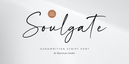 Hello ! This is our newest product font called Soulgate. Soulgate is a handwritten font that is naturally created and looks charming. The font you need is here for your design! This font is suitable for use on branding, social media, business cards, weddings, t-shirt designs, logotype, magazines, quotes, fashion, watermarks, invitations, signatures.
 - Casual Tune JNL by Jeff Levine,
$29.00 Brush-style lettering has been a perennial favorite for designers and sign painters because it brings to mind casual, relaxed or friendly themes. A vintage piece of sheet music called “Pretty Butterfly” by Sunny Skylar features the titled hand lettered in a simple, informal design which became the inspiration for Casual Tune JNL.
 - Sheepman by Dharma Type,
$19.99 Sheepman inspired by and based on retro William Page’s No.506 typeface which is popular wooden type fonts of the 19th century. To make soft and natural impressions, the original polygonal design was changed to rounded design. All glyphs had been designed carefully to be retro-looking of the old time and to fill all with nostalgia. This modern wood type includes 3 weights and their matching slanted style and all style have sprayed ends(beginning) alternates for F, H, L, M, N, P, U, f, h, j, m, n, p, q, and u which can be accessed by using OpenType Stylistic alternates or swash alts. Sheepman will be the best solution for posters, titles and anywhere you need vintage lettering.
 - House Of Cards by Dharma Type,
$19.99 House of Cards is inspired by and based on retro Hamilton’s Teniers typeface which is popular wooden type fonts of the 19th century. To make natural and contemporary impressions, the original lowercase design was slightly changed from the original but all glyphs had been designed carefully to be retro-looking of the old time and to fill all with nostalgia. This modern wood type includes 2 weights and their matching italic style and all style have sprayed ends(beginning) alternates for F, H, P, U, f, h, m, n, t, u, and w which can be accessed by using OpenType Stylistic alternates or swash alts. House of Cards will be the best solution for posters, titles and anywhere you need vintage lettering.
 - Amstrong Script by Lucky Type,
$14.00 Introducing Amstrong Signature Script font. Hi Designers, come again to complete your script font collection! This is a classic thin font with an italic style. This font comes with several modern swirly alternates that can make your work look elegant, sweet and perfect. With this style, this font will be suitable for logos, branding projects, product packaging, mugs, quotes, posters, shopping bags, logos, t-shirts, book covers, business cards, invitation cards, greeting cards, and all your other beautiful projects. Amstrong Signature Script font, includes various language support. You can use this font for your work very easily because it contains many features. Contains a complete set of upper and lowercase letters, punctuation, numbers and multilingual support. This font also includes several ligatures and alternative styles Set Stylistic For those of you who have software that is able to work OpenType (Corel Draw / Photoshop / Illustrator / InDesign). Files include: Amstrong Signature Script.OTF If you don't have a program that supports OpenType features such as Adobe Illustrator and CorelDraw X Version, you can access all alternative glyphs using Font Book (Mac) or Character Map (Windows): How to access all alternative characters using Adobe Illustrator: https://www.youtube.com/watch?v=XzwjMkbB-wQ How to access all alternative characters, using Windows Character Map with Photoshop: https://www.youtube.com/watch?v=Go9vacoYmBw
 - Trevor by TypeTogether,
$36.80 Teo Tuominen’s Trevor took its first breath as a revival of an 18th century antiqua, but culminated in an entirely new and good-natured family. Trevor is an affable slab serif in nature: both heavy and kind. Known for their familiarity and their dark colour, the terminals of slab serifs put additional weight along the line to maintain an inky presence. Their clunky forms reveal slight immaturity and arouse the reader’s sympathy for the subject at hand. Trevor connects with others by consciously riding the line between being personal and commanding. One goal with Trevor was to pair the robust nature of a low contrast slab serif with more sophisticated elements, such as the ball terminals. So wherever one looks in Trevor, rounded corners rule the day, softening the overall appearance by mimicking ink spread made by old metal type. The easygoing look is tempered by very few inktraps and sharp corners, mostly to the inside of characters and in acute angles. Whatever Trevor is paired with, it has an altruistic outlook in that it sees the best in others. It’s the neighbourly type family — the neighbour you actually want. Trevor’s almost monolinear weight and high x-height give it a typewriter look in the extralight and light weights, but the whole family was made to work with many other font styles, design work, and information structures. It certainly finds its home in packaging and advertising, its sturdy verticality and narrowness fit the needs of headlines and intro text, and its seven weights are primed for plays and involved text needing many layers of distinction. The black weight is treated like a separate display style with altered ball terminals and serifs to capitalise on the added heft. Trevor’s seven roman weights cover the Latin A Extended glyph set to bring its kindly and commanding outlook to your projects. Along with alternate version of the ‘R’ in the black weight, its OpenType features include both tabular and proportional lining and oldstyle figures, ligatures, and fractions. The complete Trevor family, along with our entire catalogue, has been optimised for today’s varied screen uses.
 - Hello Smile by Gatype,
$14.00 You can get the latest Hello Smile original handwritten simple font model now! With an updated hand calligraphy model with special glyphs that have been given a combination of fantasy and handwritten ink. This font will look beautiful on any design, Wedding designs, branding materials, blog titles, quotes and invitations, and business cards. OpenType includes: Alternative Style Set style Ligature SWASH Thank you so much for viewing and Enjoying it.
 - BAKRUV by Twinletter,
$17.00 Find the perfect balance between classic and modern with the Bakruv font collection. Coming with a classic serif theme, this font is the ideal solution for projects that require a touch of classic modernism. Each letter is carefully designed, combining beauty and elegance in one package. With ligature and alternate features, Bakruv provides flexibility in creating a unique and attractive appearance. The richness of characters offered allows you to express your creativity more freely. Also, this font supports multilingualism, allowing you to convey your message fluently in multiple languages. Get an unforgettable design experience with Bakruv. Each letter exudes strength and courage, bringing a standout look to your project. Enjoy the high quality of every detail of this font, ensuring an impressive and professional end result. Explore the Bakruv collection now and add an irreplaceable touch of classic modernism to your designs. Make an unforgettable impression with this high-quality font. What’s Included : File font All glyphs Iso Latin 1 Alternate, Ligature Simple installations We highly recommend using a program that supports OpenType features and Glyphs panels like many Adobe apps and Corel Draw so that you can see and access all Glyph variations. PUA Encoded Characters – Fully accessible without additional design software. Fonts include Multilingual support
 - Little Apple by Bale Type,
$13.00 Little Apple is a cute and tall sans serif font. It is both friendly and fun and can be used for various creations that require a neat touch. You can combine the uppercase and lowercase to get more natural lettering. Little Apple support multi language.
 - Stina by profonts,
$41.99 profonts Stina is an cursive font based on cross stitch pattern. It can be used in (very) tall letters but it also keeps legible in smaller sizes. Because of its joined letter pairs and ligatures it keeps the flow of a "handwritten" cursive font. So, you ever felt like stitching? - Start today.
 - Brazil Pixo Reto by Just in Type,
$20.00In Brazil, young people sign their gang names on the top of São Paulo City buildings. Their letters are tall and structured just like the buildings that they have to scale. For them, typography has become an extreme sport. The font Brazil Pixo Reto pays homage to these new athletes of design. - Nifty Script by URW Type Foundry,
$49.99 The “Ultimate Script”? Not yet, but we’re working on it! Just think: Loads of ligatures, contextual variations and stylistic alternates, coupled with easy use…Just what you’ve been looking for all this time? Well, here it is with all of its typographic power. The perfect partner for you: Technically adept, but still good-looking! What more do you want? Die „Ultimative Schreibschrift“? Noch nicht, aber wir arbeiten dran! Man denke nur an: Mengen an Ligaturen, kontextbezogenen Varianten und stilistischen Alternativen, gekoppelt mit leichter Handhabung…Genau das, was Sie die ganze Zeit gesucht haben? Na denn, hier ist es in all seiner typographischen Mächtigkeit. Die perfekte Partnerin für Sie: Technisch versiert, aber auch gut aussehend! Was wollen Sie mehr?
 - Fifty Fifty by Up Up Creative,
$16.00 Fifty Fifty is an editorial serif font (regular and italic) with smooth curves and more than 100 ligatures. It’s gorgeous in all caps, but the lowercase letters can really hold their own. Fifty Fifty is perfect for headlines, editorial design, monograms, branding, logos, poster design, and more. Fifty Fifty includes approximately 700 glyphs and a whopping 115 standard and discretionary ligatures. Additional OpenType features include character variants, stylistic sets, and multilingual support (including multiple currency symbols).
 - Faculty by Device,
$39.00 Faculty is a robust, warm and rational sans, with a large x-height that lends clarity in text and headline. Functional, clear and authoritative, it still has character. Stroke terminals are cut vertically or horizontally, minimising inter-letter gaps and lending it an even 'colour' in extended settings. Suitable for both headlines and text, the family has extensive language support, alternative characters, lining, tabular and old style numerals, making it a versatile all-purpose type system.
 - Ms Claudy by Calamar,
$20.00 Ms. Claudy is an elegant modern calligraphy font that will look awesome on wedding and event stationery, logos and branding materials, cards and so on. Ms Claudy includes includes full set of Uppercase and Lowercase Basic Characters, Numerals and Punctuation. Also it contains ligatures and a lot of stylistic alternates to perfectly re-create natural calligraphy (check the previews in order to see them all). You can check your language typing characters in text box above.
 - Firstland by Matra Creative,
$15.00 Firstland-Handwritten Fonts have many alternatives that give you the possibility to make your text almost handwritten with all the imperfections and captivating variations that the original handwriting has. Firstland will work perfectly for fashion, brand e-commerce, blog trends, boutiques, store brands, logos, weddings or any business that wants to look luxurious.
 - Fun Baking by Vozzy,
$10.00 Introducing a vintage look label font named Fun Baking. All available characters you can see at the screenshot. This font have 7 styles - Regular, Outline, Texture, Shine, Shine FX, Outline FX and Texture FX. This funny style font will good viewed on any retro design like poster, t-shirt, label, logo etc.
