10,000 search results
(0.022 seconds)
- Mont Rose by Eurotypo,
$24.00 Rose fonts are based on examples published in the book "Script Lettering" written by M. Meijer in 1957. These kind of handmade lettering were served as a point of departure or inspiration for many other designers along the time. These writings had flowing lines, elegant curves and flourishes, which gave him a lot of rhythm and unique personality. Mont Rose is thin, feminine, friendly and sexy, each font contain 637 glyphs with many stylistic variations, swashes and ligatures in all its letters, and a set of interesting catchwords that you can mix and match to achieve a more interesting effect in your design project. They support also, Central, Eastern and Western European languages. Mont Rose are very versatile fonts, ideal for high-end logos, magazines and book covers, fashion, headlines, cards, posters, websites, packaging. Using these fonts you will achieve a very elegant and warm work.
 - Radium by Typespec,
$32.00 Radium is a futuristic display face with a robust attitude and sharp geometric ideals. Drawing inspiration from computer games, graffiti and nineties dance music, Radium is a versatile typeface for branding, posters, packaging and point of sale. Radium is available in three weights and comes in OpenType (.otf) format for Mac and Windows. Features: Radium supports the following OpenType features: Standard ligatures, discretionary ligatures, ordinals, custom fractions, numerators, denominators, superscript, scientific inferiors, proportional and tabular lining figures, and a slashed zero. Supported Languages: Each weight has a 528 glyph character set for use in the following Latin languages: Albanian, Afrikaans, Basque, Bosnian, Breton, Catalan, Croatian, Czech, Danish, Dutch, English, Esperanto, Estonian, Faroese, Finnish, French, Gaelic, German, Greenlandic, Hungarian, Icelandic, Indonesian, Irish, Italian, Latvian, Lithuanian, Luxembourgish, Maltese, Norwegian, Occitan, Polish, Portuguese, Romanian, Sami, Serbian (Latin), Slovak, Slovene, Sorbian, Spanish, Swedish, Swahili, Turkish, Walloon and Welsh.
 - Balter Serif by Art Grootfontein,
$19.00 Balter Serif is a hand-drawn layered typeface family inspired by sign painting, 1960’s movie posters and jazz album lettering. It can look fresh and modern or exquisitely vintage. Combine upper, lowercase and alternates to create a handmade custom lettered look, then layer the styles using colors to add value and depth to your designs ! Balter Serif works perfectly in short headlines. It is suitable to create a wide range of projects from posters to branding, logos, packaging, magazines and more. Features Uppercase & Small caps Numbers & Symbols International Glyphs 60 Alternates & swashes 70 Ligatures 30 Letter combinations Quick tip for layered fonts in Adobe Illustrator : Click and drag out a text frame to start (don’t just click with the cursor on the page). Then select the stacked text frames, go to Type in the menu bar > Area Type Options > Offset: First Baseline and select “Fixed”.
 - Capraia by CAST,
$45.00 Capraia is a book typeface, with a heavily quirky look when shown at big sizes, and with an irregular but attractive rhythm at text sizes. Capraia Book and Regular are designed specifically for continuous texts: Book meets a current preference of Italian publishers for lighter faces, while the slightly heavier Regular is intended for the wider international market. True to its vocation for publishing, Capraia has a big x-height, medium contrast and wide bracketed serifs. Furthermore, its slightly flattened curves, some unconventional roman letterforms (a, G, Q) and the 'slanted roman' italics, along with design details such as ball terminals, give to the whole family a very contemporary appeal. Originally the design was intended as a tribute to Caslon's Great Primer but at a certain point the designer was enthralled by Baskerville. Capraia is the unpredicted and original result of that intense experience.
 - Quatre by Blank Is The New Black,
$15.00 Quatre is a clean, friendly, monoline display script with a number of subtle but significant features. Originally based on the style of cursive you may or may not have been taught in middle school, Quatre has a clean geometric flow to it while containing a robust set of OpenType features such as ligatures, swash capitals, and stylistic alternates that give it a unique look. With over 700 glyphs, coverage for over 30 languages, arbitrary fractions, contextual alternates and more, Quatre will have you covered for whatever situation you may run into. I mean, probably. I can’t know every single weird way you might be trying to use it. The point is, it’s got all of the bells and whistles you could reasonably hope for. Make sure you open up the OpenType panel in Illustrator, Photoshop, and InDesign to make use of all of those features.
 - Soccerboy by Chank,
$99.00 1977 was a good year for soccer. Attendance for the North American Soccer League (NASL) grew 33%, to 13,000 per game. Brazillian soccer legend Pelé played his final match, kicking for both the New York Cosmos and Santos of Brazil. And a soccerboy named Charlie was crowned with the nickname Chanky. In honor of his soccer hero Pelé, Charlie insisted the neighbor kids call him Chelé. They laughed at him and called him Chanky after Spanky from the Little Rascals. As he grew into his manhood, he became Chank the internationally renowned font designer. Chank created this font Soccerboy, as filtered through the artistic eyes of his 1977 childhood. It's a tri-line font, hand-drawn in Chank's signature cartoon whimsy. Soccerboy encourages play with color and alternate characters. Create coloring effects yourself using layers and the magic wand and paint bucket tools in Adobe Photoshop or Illustrator.
 - New Kakuji by Edomoji Type,
$15.00 New Kakuji is designed from the Kakuji style of characters originating during the Edo period of Japan. New Kakuji has expanded the historical character set to include the surnames from the ancient Chinese text: Hundred Family Surnames, as well as the most common surnames in Japan, in addition to many other historically and culturally significant words, going well beyond the scope of characters that were used in the Edo period. No other font has expanded the character set of the Kakuji Style to the same extent as New Kakuji. A Latin alphabet expansion inspired by the old Kakuji style has also been included for western audiences and designers. New Kakuji contains over 500 Chinese/Japanese characters along with over 200 additional Latin characters or symbols. The solid and blocky style of New Kakuji is ideal for seal designs or other branding designs and should be used at larger point sizes.
 - Play Day Stencil JNL by Jeff Levine,
$29.00 The typography on a 1964 children’s activity book published by Whitman entitled “Build with Stencils” was in a bold, condensed design. The only problem was that the ‘rails’ [the parts that divide a letter into stencil pieces] were too narrow and would disappear at smaller point sizes. Widening the ‘rails’ just a bit greatly improved the appearance of the stencil characters. Play Day Stencil JNL is now available in both regular and oblique versions. In its day, the Whitman Publishing Company of Racine, Wisconsin published dozens of activity books for children, including a number of them with stencils. The company was a division of Western Publishers from the early 1900s through the 1970s, but went through a number of sales and name changes. Currently [as Whitman once again] it is owned by Anderson Press, and is known for its line of coin folders and books on coin collecting.
 - Opal by Linotype,
$29.99 Opal Pro is a text family designed by Hannes von Döhren in 2008. It gives every text a noble character. The typeface has long ascenders that clearly rise above the capital letters and a low x-height. Opal’s letters sport inktraps at stroke junctions, which on one hand create a cutout feeling and on the other hand strengthens the image in larger point sizes. In total, the letterforms have clear emphasis on their verticals and horizontals; they do not fear the weight on their curves. In addition to the Italic and Bold, the Opal type family includes a Script face, whose letterforms include connections, similar to handwriting. On top of that, the typeface possesses swash letters for italic and script, small caps, many ligatures and borders & ornaments. With a little bit of care, designers will be able to create the finest of traditional, elegant work with this family.
 - ABTS Crestwing by Albatross,
$19.95 ABTS Crestwing is a unique initial font with extraordinary flexibility and beauty. There are 5 wing styles to choose from. The wings are accessed through typing numbers. The 5 pairs are: [1, 2] [3, 4] [5, 6] [7, 8] & [9, 0]. The odd numbers in the pairs will give you a left wing, and the even numbers will give you a right wing. The letters are separated into upper and lowercase. Uppercase has a crest point, the lowercase does not, giving you the ability to string letters together to form words and phrases, and place the tip of the crest above the letter of your choosing. Optional endcaps are available using the brackets on your keyboard "[, ]." This allows you to cap off a word if you wish not to use a wing to do so. Crestwing is both beautiful and unique, and works best at large sizes.
 - Stapel by ParaType,
$30.00 Stapel is a contemporary closed sans serif with sci-fi looking forms and eloquent, thin stroke joints. The superfamily consists of three subfamilies of different width: Normal, Narrow and Condensed. Each subfamily contains seven weights with corresponding true italics. Additionally, there are several extra wide bold styles. All these styles work perfectly in headings and short display texts. Another important subfamily is Stapel Text which includes upright and italic styles of lower contrast and more generous spacing. Text styles are great for body text in small and medium point sizes. Most styles include alternate characters, proportional and lining figures, math symbols, fractions, currency signs and case-dependent punctuation. A wide range of styles and typographic features makes Stapel ideal for use in brand identity, infographics and all kinds of designs related to technology, science, finance, politics or sports. Stapel was designed by Alexander Lubovenko and released by Paratype in 2020.
 - Sumergible Script by Andinistas,
$39.95 Sumergible Script is a striking font that simulates it has been written with a dry pointed brush on textured paper. Its purpose is to decorate and accompany photos, illustrations and textures by letters designed with a generous horizontal spacing between lowercase which reinforces the idea of hurriedly and interrupted cursive calligraphy. In that sense it is spontaneous and useful to form vibrant words and sentences, shining short messages on book covers, posters and other graphic design media. Sumergible Script has new alternative letter forms that are activated with OpenType features creating hierarchy changes in writing. With Swash for example, you can change the character case with metric and similar proportions. With Titling it becomes even more expressive capitalization. Other OpenType features are: Fractions and Superscript. In short, Sumergible Script is designed to mix and match words and short phrases with a vital and expressive handwritten feel.
 - Monkton Book Condensed by Club Type,
$36.99 Packing more copy in a narrow space is the main reason for using a condensed type. Characters with a more ovular shape tend to be less wide than their circular counterparts and will allow for more letters per line. In narrow columns for example, this typeface can provide up to 25% more copy than the regular typeface in the same space. Another reason is when a larger type size is called for — used sparingly it is useful for headings or headlines. For emphasis, narrower letters can provide a stark contrast in the flow of reading, creating impact while retaining typographic character. Condensed types can specially useful in tables and charts because typically both use few words in each block. If space now allows, you may think about the luxury of a larger point size. This optimizes space while keeping your typography more easily legible.
 - Ceebo by Oliver Matelowski,
$55.00 Ceebo is a friendly sans-serif, which show some aspects of a humanist and grotesque typeface. It retained more details of writing and got some forms and characteristics of an italic. The font contains some alternative glyphs. It also contains some ligatures and discretionary ligatures. In addition, there are adjusted figures and additional character for uppercase letters, lowercase letters and small caps, which react by OpenType-Feature. The font was designed to stay legible also in small sizes: beside as possible open counters, a tall x-high, distinct vents and cuts, it especially are the details of the glyphs which make it discernable. The regular weight is slightly thinner than other sans-serif fonts, moreover the diacritics and small glyphs were designed for small sizes by taller and more open forms. The resulting “ruggedness” is mellowed by half-rounded stems and pointed stem ends.
 - Annlie by ITC,
$29.99Annlie™ Extra Bold and Annlie Extra Bold Italic are two display faces designed by Fred Lambert in 1966 for the Annlie type family. These two samples from the Annlie family are both fat faces. Fat faces were offshoots of the modern, or Didone, typefaces that were de rigueur during the early 1800s. These fat faces were among the first typefaces to be used solely for advertising purposes. Naturally, they were always used in larger point sizes, in display functions. Annlie could be called an optimization of these old advertising typefaces. With high x-heights, ultra contrast between thick and thin strokes, and perfectly engineered drawing techniques, Annlie is a highly crafted typeface. Give it a spin in your next advertising campaign! Annlie’s fine thin strokes are very graceful in their appearance, and lend a strong, yet soft, feminine feeling to anything they touch. - Blue Plaque by K-Type,
$20.00 Blue Plaque is a distressed font that simulates the low relief, white-painted lettering on English Heritage plaques attached to buildings where famous people have lived. For creating mock plaques, a blank disk, with the English Heritage title at the top and the logo at the bottom, is included at the brace left { keystroke, and also at the section § keystroke. A blank plaque without the English Heritage title and logo is included at the bar | keystroke. A distressed English Heritage logo is included at the asterisk * keystroke. he outer ring of the blue plaques, which is glazed in dark grey, is included at the brace right } keystroke, and also at the plusminus ± keystroke. Photoshop's Outer Bevel Layer Style is perfect for adding a relief appearance to the letters. Buyers are welcome to request a 1000px jpeg image of a blank blue plaque by emailing K-Type directly https://www.k-type.com/contact/
 - Gill Hebrew by Lerfu,
$55.00Near the end of his life, legendary type designer Eric Gill lived in Jerusalem, and became interested in the typesetting of the Hebrew alphabet and the challenges it entailed. He designed his own Hebrew font which has not (to my knowledge) been digitized before. It is sometimes held up as an example of how not to do a Hebrew font: Gill introduced strange serifs and shapes that were jarring to readers used to more traditional fonts. But it is quite readable, and does start to grow on you after a while; extended text in Gill Hebrew is possible. I've added a set of alternate digits that are based on the shapes of the letters (Gill's digits are pretty standard text figures). I've also made some of the Unicode Hebrew symbols that Gill didn't (e.g. New Sheqel Sign, Alef-Lamed ligature, etc.) and also included vowel-points. - Gill Sans Nova by Monotype,
$61.99 The Gill Sans® Nova typeface, by Monotype Studio designer George Ryan, expands the much-loved Gill Sans family from 18 to 43 fonts and features a coordinated range of roman and condensed designs. Several new display fonts are available, including a suite of six inline weights, shadowed outline fonts that were never digitized and Gill Sans Nova Deco that was previously withdrawn from the Monotype library. A variety of OpenType® features are supported that make it possible to include experimental characters from different points in Gill Sans’s long history, including pointed diagonals on ‘A’, ‘V’ and ‘W’ and alternatives for ‘b’, ‘d’, ‘p’ and ‘q.’ Proportional figures are also available as an alternative to the tabular designs. The Gill Sans Nova family has a large character set that supports Latin, Greek and Cyrillic languages. The display weights support Latin only. “Gill Sans was fast to strike a chord with people after its initial 1928 release and quickly became popular,” explains Ryan. “It’s been adapted for every publishing technology, from mechanical typesetting to digital imaging – always receiving the best treatment from Monotype in each iteration. This is especially true with all that we’ve added to the new series, while still retaining the familiarity of Gill Sans. My goal was to ensure clarity across digital environments, add missing weights, and bring more personality to the family with new display fonts, as well as Gill-inspired alternate characters.” The Gill Sans Nova typeface family is part of the new Eric Gill Series, drawing on Monotype's heritage to remaster and expand and revitalize Eric Gill’s body of work, with more weights, more characters and more languages to meet a wide range of design requirements. The Series also brings to life new elements inspired by some of Gill’s unreleased work, recently discovered in Monotype’s archive of original typeface drawings, designer correspondence and documents from the last century.
 - Biome by Monotype,
$29.99 In the sketches that formed the basis for his typeface Biome, Crossgrove experimented with inner and outer shapes in different styles, adapted letters to the form of the super-ellipse, and added curves only to remove these again. His challenge was to find a harmonious and coherent approach that provided sufficient contrast with existing fonts. Biome is essentially in the sans serif tradition and the letters exhibit only minor variations in terms of line thickness. There is still a suggestion of the super-ellipse at many points, but this never becomes the predominant design factor. While most of the terminals of the vertical strokes are only slightly rounded, the horizontals and diagonals have pronounced arches and it is these that basically determine the round and soft character of the typeface. The more unconventionally shaped letters, such as the lowercase 'g' with its two semi-open counters and the 'k' and 'x' with their crossbars, provide Biome with an individual personality. And this effect is emphasized by the generously rounded links in the 'v' and 'w' and the uppercase 'M' and 'N'. Biome has been designed as a typeface super-family. From the near hairline Extra Light to the amply proportioned Ultra, there are seven clearly differentiated weights and three tracking widths. There are oblique italic versions of all variants. The range includes small caps and numeral sets containing lowercase and uppercase digits. With its available range of characters, Biome can be used to set texts in all Eastern European languages. Although the remarkable individuality of Biome is most clearly apparent in the larger point sizes, this typeface is not just suitable for producing headlines and logos. Biome's elegant visual effects mean that it is equally comfortable in short texts while its large x-height and generous counters make it readily legible even in the small font sizes. Biome is a contemporary typeface that employs mid-20th century futurist elements which ironically give it a retro feel.
 - Meloche by Typodermic,
$11.95 Allow me to introduce you to Meloche—a typeface that embodies the charm and elegance of the late 19th century. Meloche is not just any sans-serif typeface, it’s a one-of-a-kind grotesque typeface that draws inspiration from the hand-painted French signs of yesteryear. Meloche comes in seven weights and obliques, offering you the freedom to choose the perfect weight for your design needs. It also boasts of numeric ordinals, fractions, old-style numerals, and a simple Q—all possible thanks to its OpenType capabilities. Meloche offers you access to twenty weight-matched fleur-de-lis symbols in OpenType-savvy applications. Simply input the shortcodes [fleur1] [fleur2] [fleur3], and you can add a touch of French royalty to your designs. With Meloche, you can add a vintage French flavor to your message, evoking a sense of nostalgia and history. Let your designs transport your audience to the romantic streets of Paris. If you’re looking to add a touch of history and charm to your designs, Meloche is the perfect typeface for you. Its unique design and advanced OpenType capabilities make it an ideal choice for any project that requires a touch of Parisian elegance. Most Latin-based European, Vietnamese, Greek, and most Cyrillic-based writing systems are supported, including the following languages. Afaan Oromo, Afar, Afrikaans, Albanian, Alsatian, Aromanian, Aymara, Azerbaijani, Bashkir, Bashkir (Latin), Basque, Belarusian, Belarusian (Latin), Bemba, Bikol, Bosnian, Breton, Bulgarian, Buryat, Cape Verdean, Creole, Catalan, Cebuano, Chamorro, Chavacano, Chichewa, Crimean Tatar (Latin), Croatian, Czech, Danish, Dawan, Dholuo, Dungan, Dutch, English, Estonian, Faroese, Fijian, Filipino, Finnish, French, Frisian, Friulian, Gagauz (Latin), Galician, Ganda, Genoese, German, Gikuyu, Greenlandic, Guadeloupean Creole, Haitian Creole, Hawaiian, Hiligaynon, Hungarian, Icelandic, Igbo, Ilocano, Indonesian, Irish, Italian, Jamaican, Kaingang, Khalkha, Kalmyk, Kanuri, Kaqchikel, Karakalpak (Latin), Kashubian, Kazakh, Kikongo, Kinyarwanda, Kirundi, Komi-Permyak, Kurdish, Kurdish (Latin), Kyrgyz, Latvian, Lithuanian, Lombard, Low Saxon, Luxembourgish, Maasai, Macedonian, Makhuwa, Malay, Maltese, Māori, Moldovan, Montenegrin, Nahuatl, Ndebele, Neapolitan, Norwegian, Novial, Occitan, Ossetian, Ossetian (Latin), Papiamento, Piedmontese, Polish, Portuguese, Quechua, Rarotongan, Romanian, Romansh, Russian, Rusyn, Sami, Sango, Saramaccan, Sardinian, Scottish Gaelic, Serbian, Serbian (Latin), Shona, Sicilian, Silesian, Slovak, Slovenian, Somali, Sorbian, Sotho, Spanish, Swahili, Swazi, Swedish, Tagalog, Tahitian, Tajik, Tatar, Tetum, Tongan, Tshiluba, Tsonga, Tswana, Tumbuka, Turkish, Turkmen (Latin), Tuvaluan, Ukrainian, Uzbek, Uzbek (Latin), Venda, Venetian, Vepsian, Vietnamese, Võro, Walloon, Waray-Waray, Wayuu, Welsh, Wolof, Xavante, Xhosa, Yapese, Zapotec, Zarma, Zazaki, Zulu and Zuni.
 - Fairbank by Monotype,
$29.99Monotype Bembo is generally regarded as one of the most handsome revivals of Aldus Manutius' 15th century roman type, but the original had no italic counterpart. The story is told that Stanley Morison commissioned Alfred Fairbank, a renowned calligrapher, to create the first italic for Bembo, which was released as metal fonts in 1929. Alfred Fairbank, however, claimed that he drew the design as an independent project and then sold his drawings to Monotype. According to him, the statement has been made that I was asked to design an italic for the Bembo roman. This is not so. Had the request been made, the italic type produced would have been different." Whichever version you believe, it was obvious that Fairbank's design - while undeniably beautiful - was not harmonious with Bembo roman. A second, more conventional italic was eventually drawn and added to the Bembo family. Fairbank's first design, which was based on the work of sixteenth-century writing master Ludovico degli Arrighi, managed to have a modest life of its own as a standalone font of metal type. It never made the leap into phototype fonts, however, and the face could have been lost, were it not for Robin Nicholas, Monotype Imaging's Head of Typography in the United Kingdom, and Carl Crossgrove, a senior designer for Monotype Imaging in the US. Nicholas and Crossgrove used the original drawings for Fairbank as the starting point for a new digital design, but this was only the beginning. They improved spacing, added subtle kerning and optimized the design for digital imaging. In addition, Nicholas created an alternative set of lowercase letters, fancy and swash capitals and enough alternate characters to personalize virtually any design project. By the time his work was complete, Nicholas and Crossgrove had created a small type family that included Fairbank, a revived version of the earlier metal font, and Fairbank Chancery, a more calligraphic rendition of the design. An additional suite of ornate caps, elegant ligatures, and beginning and ending letters accompanies both fonts, as does a full complement of lowercase swash characters. Now, instead of a failed Bembo italic, Fairbank emerges in its true glory: a sumptuous, elegant design that will lend a note of grace to holiday greetings, invitations, and any application where its Italianate beauty is called for." - HelenaScript ES - 100% free

- Lava-Lava - Unknown license

- Scarious by Rillatype,
$15.00 Scarious is perfectly made to be applied for logos, logotype, magazines, book, branding, packaging, fashion, stationary, novel, display use and more. if you have any other question feel free to hit us on rillatype@gmail.com
 - Pure And Simple Everytime by Weknow,
$25.00 Give a simple rounded fun groovy, fancy, to any text project, also cool for a logotype. I created this font while listening to a lightning seed song, pure and simple, and having fun with it.
 - Daimaru by Arendxstudio,
$16.00 Introducing Daimaru Modern Signature font, hand made with brushing. Beautiful for wedding card design, logotype, website header, fashion design and any more. Features : • Character Set A-Z • Numerals & Punctuations (OpenType Standard) • Accents (Multilingual characters) • Ligature
 - Black Ocean by Fargun Studio,
$14.00 Introducing Black Ocean!! Handwritten font with quick dry strokes and a signature style. perfect for branding projects, home ware designs, product packaging or simply as a stylish text overlay to any background image or posters.
 - Bethanny Script by Slex Studio,
$11.00 Bethanny simplifies elegance into one truly outstanding handwritten font. Whether you’re looking for fonts for Instagram or calligraphy scripts for DIY projects, this font will turn any creative idea into a true piece of art!
 - Khat Jannah by Motagadeda Type,
$40.00 Introducing Khat Jannah, a captivating and unique font that breaks away from traditional design conventions. This exceptional typeface pushes the boundaries of Arabic typography, offering a distinct and visually striking display font unlike any other.
 - Bronzen Abundance by Kaer,
$14.00 Vintage font with premium decoration. Classic line serif font. Bronzen Abundance is perfect to use in any alcohol labels, glamour posters, luxury identity, and more. Comes in four font styles: pattern, filled, line and colored.
 - Bucks by Stereo Type Haus,
$20.00 The idea was to create a legible font based on graffiti (wide tip marker) hand styles. Special attention to tight spacing, stylish caps & alternate drips bring an authentic street aesthetic into any layout or signage.
 - MTF Hip Hip Yay by Miss Tiina Fonts,
$10.00 Hip Hip Yay is a fun and quirky display color font capable of taking any product out of the ordinary! Use it on bold and bright creations such as banners, posters, covers, titles, magazines, etc.
 - Menthol Signature by Din Studio,
$29.00 Menthol signature is a classy monoline font. Made for any professional project branding. Every letter has a unique and beautiful touch. Includes: Mentol Signature(OTF) Features: Beautiful Ligatures PUA Encoded Multilingual Support Numerals and Punctuation
 - Blacksign by Creativework Studio,
$18.00 Blacksign is a cursive brushed handwritten font, featuring a lovely style. No matter the topic, this font will be an incredible asset to your fonts’ library, as it has the potential to elevate any creation.
 - Assinatura by Letterara,
$12.00 Assinatura comes from Portuguese which means signature. Assinatura is a hand drawn script with a natural style. This signature script moves with ease across any design, and adds a large dose of confidence and style.
 - Ledgewood by Balpirick,
$15.00 Ledgewood is a clean and stylish handwritten font, carefully handcrafted to become a true favorite. This font will look outstanding in any context, whether it’s being used on busy backgrounds or as a standalone headline!
 - Timeless Series by Sakha Design,
$12.00 Timeless Series is a cool, bold and thick lettered display font. No matter the topic, this font will be an incredible asset to your fonts’ library, as it has the potential to elevate any creation.
 - Cute Bubble by Creaditive Design,
$14.00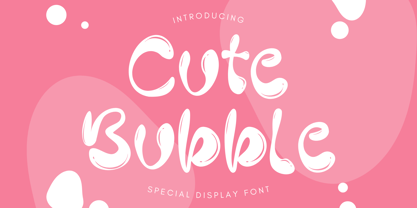 Cute Bubble is a fun, playful and friendly display font. It is perfect for any kid or cute design that need bubble effect. Just choose this font, your special cute project can be more cuteness.
 - Glittery by Balpirick,
$15.00 Glittery simplifies elegance into one truly outstanding handwritten font. Whether you’re looking for fonts for Instagram or calligraphy scripts for DIY projects, this font will turn any creative idea into a true piece of art!
 - Ancherr by Tama Putra,
$12.00 Ancherr is a horror brush typeface. It is suitable for any design needs, branding, art quote, cover title, t-shirts, posters and more. The Ancherr typeface includes multi-lingual and currency support, numerals, and punctuations.

