10,000 search results
(0.032 seconds)
- Acerola by Gestu,
$50.00 Acerola is a contemporary script font based on calligraphy with the pointed brush. The letterforms have a touch of chancery with a fresh look, full of details and offering great readability. It contains a various OpenType features and supports most Latin-based languages. Over 1200 glyphs make up this display font that can be used for all manner of applications. Acerola includes alternate characters, swashed capitals, terminal forms, ligatures, stylistic sets and small caps. Acerola stands out in any typographic composition and certainly will make your design looks like unique and handmade.
 - Stronger by MlkWsn,
$25.00 Stronger is a supercharged, street-wise brush font bursting with energy. With extra attention to quick strokes and sharp details, Stronger is ideal for logos, apparel, quotes, product packaging, or anything which needs a typographic turbo-boost. What's Included: Stronger Regular - The standard version of the font. Perfect for titles and logos. Stronger Swash - Need a cool underline under your text or a splash of paint? This font set has you covered. Type any letter a-z using this font, and you'll get a unique swash to accompany the font
 - Blonde Fraktur by ParaType,
$30.00 Blonde Fraktur is a free interpretation of the Gothic theme in Cyrillic. The font is neither Fraktur nor any other Gothic script from the formal point of view, but it makes text look like Gothic script, no matter which language is used. Blonde Fraktur was written with a quill by Alexandra Korolkova and prepared in digital form by Alexandra Pushkova. The font contains a set of alternatives and swashed variations. It suits well for advertising of beer, sausages, pubs and other places where Gothic scripts are commonly used.
 - FHA Modernized Ideal Classic by Fontry West,
$25.00 Frank H. Atkinson's book Atkinson Sign Painting was published in 1909. For decades, this book served as the manual for sign painters - a handbook for hand lettering. Atkinson’s book described techniques, layouts and several sample alphabets. Modernized Ideal Classic was inspired by one of these demonstration alphabets. Although Classic has its beginnings in art deco, it is very comfortable in any period or style of design. It is most appropriate in headline and display text, poster copy and signs. We've included some nice stylistic alternates and an interesting array of ligatures.
 - Times Eighteen by Linotype,
$29.00In 1931, The Times of London commissioned a new text type design from Stanley Morison and the Monotype Corporation, after Morison had written an article criticizing The Times for being badly printed and typographically behind the times. The new design was supervised by Stanley Morison and drawn by Victor Lardent, an artist from the advertising department of The Times. Morison used an older typeface, Plantin, as the basis for his design, but made revisions for legibility and economy of space (always important concerns for newspapers). As the old type used by the newspaper had been called Times Old Roman," Morison's revision became "Times New Roman." The Times of London debuted the new typeface in October 1932, and after one year the design was released for commercial sale. The Linotype version, called simply "Times," was optimized for line-casting technology, though the differences in the basic design are subtle. The typeface was very successful for the Times of London, which used a higher grade of newsprint than most newspapers. The better, whiter paper enhanced the new typeface's high degree of contrast and sharp serifs, and created a sparkling, modern look. In 1972, Walter Tracy designed Times Europa for The Times of London. This was a sturdier version, and it was needed to hold up to the newest demands of newspaper printing: faster presses and cheaper paper. In the United States, the Times font family has enjoyed popularity as a magazine and book type since the 1940s. Times continues to be very popular around the world because of its versatility and readability. And because it is a standard font on most computers and digital printers, it has become universally familiar as the office workhorse. Times™, Times™ Europa, and Times New Roman™ are sure bets for proposals, annual reports, office correspondence, magazines, and newspapers. Linotype offers many versions of this font: Times™ is the universal version of Times, used formerly as the matrices for the Linotype hot metal line-casting machines. The basic four weights of roman, italic, bold and bold italic are standard fonts on most printers. There are also small caps, Old style Figures, phonetic characters, and Central European characters. Times™ Ten is the version specially designed for smaller text (12 point and below); its characters are wider and the hairlines are a little stronger. Times Ten has many weights for Latin typography, as well as several weights for Central European, Cyrillic, and Greek typesetting. Times™ Eighteen is the headline version, ideal for point sizes of 18 and larger. The characters are subtly condensed and the hairlines are finer. Times™ Europa is the Walter Tracy re-design of 1972, its sturdier characters and open counterspaces maintain readability in rougher printing conditions. Times New Roman™ is the historic font version first drawn by Victor Lardent and Stanley Morison for the Monotype hot metal caster." - Times Europa LT by Linotype,
$29.99In 1931, The Times of London commissioned a new text type design from Stanley Morison and the Monotype Corporation, after Morison had written an article criticizing The Times for being badly printed and typographically behind the times. The new design was supervised by Stanley Morison and drawn by Victor Lardent, an artist from the advertising department of The Times. Morison used an older typeface, Plantin, as the basis for his design, but made revisions for legibility and economy of space (always important concerns for newspapers). As the old type used by the newspaper had been called Times Old Roman," Morison's revision became "Times New Roman." The Times of London debuted the new typeface in October 1932, and after one year the design was released for commercial sale. The Linotype version, called simply "Times," was optimized for line-casting technology, though the differences in the basic design are subtle. The typeface was very successful for the Times of London, which used a higher grade of newsprint than most newspapers. The better, whiter paper enhanced the new typeface's high degree of contrast and sharp serifs, and created a sparkling, modern look. In 1972, Walter Tracy designed Times Europa for The Times of London. This was a sturdier version, and it was needed to hold up to the newest demands of newspaper printing: faster presses and cheaper paper. In the United States, the Times font family has enjoyed popularity as a magazine and book type since the 1940s. Times continues to be very popular around the world because of its versatility and readability. And because it is a standard font on most computers and digital printers, it has become universally familiar as the office workhorse. Times™, Times™ Europa, and Times New Roman™ are sure bets for proposals, annual reports, office correspondence, magazines, and newspapers. Linotype offers many versions of this font: Times™ is the universal version of Times, used formerly as the matrices for the Linotype hot metal line-casting machines. The basic four weights of roman, italic, bold and bold italic are standard fonts on most printers. There are also small caps, Old style Figures, phonetic characters, and Central European characters. Times™ Ten is the version specially designed for smaller text (12 point and below); its characters are wider and the hairlines are a little stronger. Times Ten has many weights for Latin typography, as well as several weights for Central European, Cyrillic, and Greek typesetting. Times™ Eighteen is the headline version, ideal for point sizes of 18 and larger. The characters are subtly condensed and the hairlines are finer. Times™ Europa is the Walter Tracy re-design of 1972, its sturdier characters and open counterspaces maintain readability in rougher printing conditions. Times New Roman™ is the historic font version first drawn by Victor Lardent and Stanley Morison for the Monotype hot metal caster." - Times Ten by Linotype,
$40.99In 1931, The Times of London commissioned a new text type design from Stanley Morison and the Monotype Corporation, after Morison had written an article criticizing The Times for being badly printed and typographically behind the times. The new design was supervised by Stanley Morison and drawn by Victor Lardent, an artist from the advertising department of The Times. Morison used an older typeface, Plantin, as the basis for his design, but made revisions for legibility and economy of space (always important concerns for newspapers). As the old type used by the newspaper had been called Times Old Roman," Morison's revision became "Times New Roman." The Times of London debuted the new typeface in October 1932, and after one year the design was released for commercial sale. The Linotype version, called simply "Times," was optimized for line-casting technology, though the differences in the basic design are subtle. The typeface was very successful for the Times of London, which used a higher grade of newsprint than most newspapers. The better, whiter paper enhanced the new typeface's high degree of contrast and sharp serifs, and created a sparkling, modern look. In 1972, Walter Tracy designed Times Europa for The Times of London. This was a sturdier version, and it was needed to hold up to the newest demands of newspaper printing: faster presses and cheaper paper. In the United States, the Times font family has enjoyed popularity as a magazine and book type since the 1940s. Times continues to be very popular around the world because of its versatility and readability. And because it is a standard font on most computers and digital printers, it has become universally familiar as the office workhorse. Times™, Times™ Europa, and Times New Roman™ are sure bets for proposals, annual reports, office correspondence, magazines, and newspapers. Linotype offers many versions of this font: Times™ is the universal version of Times, used formerly as the matrices for the Linotype hot metal line-casting machines. The basic four weights of roman, italic, bold and bold italic are standard fonts on most printers. There are also small caps, Old style Figures, phonetic characters, and Central European characters. Times™ Ten is the version specially designed for smaller text (12 point and below); its characters are wider and the hairlines are a little stronger. Times Ten has many weights for Latin typography, as well as several weights for Central European, Cyrillic, and Greek typesetting. Times™ Eighteen is the headline version, ideal for point sizes of 18 and larger. The characters are subtly condensed and the hairlines are finer. Times™ Europa is the Walter Tracy re-design of 1972, its sturdier characters and open counterspaces maintain readability in rougher printing conditions. Times New Roman™ is the historic font version first drawn by Victor Lardent and Stanley Morison for the Monotype hot metal caster." - Times Ten Paneuropean by Linotype,
$92.99In 1931, The Times of London commissioned a new text type design from Stanley Morison and the Monotype Corporation, after Morison had written an article criticizing The Times for being badly printed and typographically behind the times. The new design was supervised by Stanley Morison and drawn by Victor Lardent, an artist from the advertising department of The Times. Morison used an older typeface, Plantin, as the basis for his design, but made revisions for legibility and economy of space (always important concerns for newspapers). As the old type used by the newspaper had been called Times Old Roman," Morison's revision became "Times New Roman." The Times of London debuted the new typeface in October 1932, and after one year the design was released for commercial sale. The Linotype version, called simply "Times," was optimized for line-casting technology, though the differences in the basic design are subtle. The typeface was very successful for the Times of London, which used a higher grade of newsprint than most newspapers. The better, whiter paper enhanced the new typeface's high degree of contrast and sharp serifs, and created a sparkling, modern look. In 1972, Walter Tracy designed Times Europa for The Times of London. This was a sturdier version, and it was needed to hold up to the newest demands of newspaper printing: faster presses and cheaper paper. In the United States, the Times font family has enjoyed popularity as a magazine and book type since the 1940s. Times continues to be very popular around the world because of its versatility and readability. And because it is a standard font on most computers and digital printers, it has become universally familiar as the office workhorse. Times™, Times™ Europa, and Times New Roman™ are sure bets for proposals, annual reports, office correspondence, magazines, and newspapers. Linotype offers many versions of this font: Times™ is the universal version of Times, used formerly as the matrices for the Linotype hot metal line-casting machines. The basic four weights of roman, italic, bold and bold italic are standard fonts on most printers. There are also small caps, Old style Figures, phonetic characters, and Central European characters. Times™ Ten is the version specially designed for smaller text (12 point and below); its characters are wider and the hairlines are a little stronger. Times Ten has many weights for Latin typography, as well as several weights for Central European, Cyrillic, and Greek typesetting. Times™ Eighteen is the headline version, ideal for point sizes of 18 and larger. The characters are subtly condensed and the hairlines are finer. Times™ Europa is the Walter Tracy re-design of 1972, its sturdier characters and open counterspaces maintain readability in rougher printing conditions. Times New Roman™ is the historic font version first drawn by Victor Lardent and Stanley Morison for the Monotype hot metal caster." - Times by Linotype,
$40.99In 1931, The Times of London commissioned a new text type design from Stanley Morison and the Monotype Corporation, after Morison had written an article criticizing The Times for being badly printed and typographically behind the times. The new design was supervised by Stanley Morison and drawn by Victor Lardent, an artist from the advertising department of The Times. Morison used an older typeface, Plantin, as the basis for his design, but made revisions for legibility and economy of space (always important concerns for newspapers). As the old type used by the newspaper had been called Times Old Roman," Morison's revision became "Times New Roman." The Times of London debuted the new typeface in October 1932, and after one year the design was released for commercial sale. The Linotype version, called simply "Times," was optimized for line-casting technology, though the differences in the basic design are subtle. The typeface was very successful for the Times of London, which used a higher grade of newsprint than most newspapers. The better, whiter paper enhanced the new typeface's high degree of contrast and sharp serifs, and created a sparkling, modern look. In 1972, Walter Tracy designed Times Europa for The Times of London. This was a sturdier version, and it was needed to hold up to the newest demands of newspaper printing: faster presses and cheaper paper. In the United States, the Times font family has enjoyed popularity as a magazine and book type since the 1940s. Times continues to be very popular around the world because of its versatility and readability. And because it is a standard font on most computers and digital printers, it has become universally familiar as the office workhorse. Times™, Times™ Europa, and Times New Roman™ are sure bets for proposals, annual reports, office correspondence, magazines, and newspapers. Linotype offers many versions of this font: Times™ is the universal version of Times, used formerly as the matrices for the Linotype hot metal line-casting machines. The basic four weights of roman, italic, bold and bold italic are standard fonts on most printers. There are also small caps, Old style Figures, phonetic characters, and Central European characters. Times™ Ten is the version specially designed for smaller text (12 point and below); its characters are wider and the hairlines are a little stronger. Times Ten has many weights for Latin typography, as well as several weights for Central European, Cyrillic, and Greek typesetting. Times™ Eighteen is the headline version, ideal for point sizes of 18 and larger. The characters are subtly condensed and the hairlines are finer. Times™ Europa is the Walter Tracy re-design of 1972, its sturdier characters and open counterspaces maintain readability in rougher printing conditions. Times New Roman™ is the historic font version first drawn by Victor Lardent and Stanley Morison for the Monotype hot metal caster." - Chinese Rocks by Typodermic,
$11.95 In the bustling world of rough, grungy typography, there’s one typeface that stands out among the rest—Chinese Rocks. This iconic typeface draws inspiration from the hand-cut rubber-stamp writing found on Chinese export crates from the twentieth century. It’s a typeface that captures the raw, unpolished energy of the streets and infuses it into your messaging. What sets Chinese Rocks apart is its artisanal, handcrafted quality. Each letter is carefully carved to give your words a unique, personal touch that cannot be replicated by any other font. With Chinese Rocks, your text takes on a casual, laid-back vibe that speaks to the rawness and authenticity of modern culture. This versatile font comes in sixteen different styles, including Fat, Condensed, and Shaded. Each variation offers a different take on the classic Chinese Rocks style, allowing you to tailor your messaging to fit any occasion or application. Whether you’re looking to make a bold statement or add a touch of personality to your branding, Chinese Rocks has you covered. So why settle for a generic font that doesn’t capture your essence? Chinese Rocks is the typeface that captures your personality and turns your words into art. Try it out today and discover the power of authentic, handcrafted typography. Most Latin-based European writing systems are supported, including the following languages. Afaan Oromo, Afar, Afrikaans, Albanian, Alsatian, Aromanian, Aymara, Bashkir (Latin), Basque, Belarusian (Latin), Bemba, Bikol, Bosnian, Breton, Cape Verdean, Creole, Catalan, Cebuano, Chamorro, Chavacano, Chichewa, Crimean Tatar (Latin), Croatian, Czech, Danish, Dawan, Dholuo, Dutch, English, Estonian, Faroese, Fijian, Filipino, Finnish, French, Frisian, Friulian, Gagauz (Latin), Galician, Ganda, Genoese, German, Greenlandic, Guadeloupean Creole, Haitian Creole, Hawaiian, Hiligaynon, Hungarian, Icelandic, Ilocano, Indonesian, Irish, Italian, Jamaican, Kaqchikel, Karakalpak (Latin), Kashubian, Kikongo, Kinyarwanda, Kirundi, Kurdish (Latin), Latvian, Lithuanian, Lombard, Low Saxon, Luxembourgish, Maasai, Makhuwa, Malay, Maltese, Māori, Moldovan, Montenegrin, Ndebele, Neapolitan, Norwegian, Novial, Occitan, Ossetian (Latin), Papiamento, Piedmontese, Polish, Portuguese, Quechua, Rarotongan, Romanian, Romansh, Sami, Sango, Saramaccan, Sardinian, Scottish Gaelic, Serbian (Latin), Shona, Sicilian, Silesian, Slovak, Slovenian, Somali, Sorbian, Sotho, Spanish, Swahili, Swazi, Swedish, Tagalog, Tahitian, Tetum, Tongan, Tshiluba, Tsonga, Tswana, Tumbuka, Turkish, Turkmen (Latin), Tuvaluan, Uzbek (Latin), Venetian, Vepsian, Võro, Walloon, Waray-Waray, Wayuu, Welsh, Wolof, Xhosa, Yapese, Zapotec Zulu and Zuni.
 - Funtrude by Colllab Studio,
$9.00 "Hi there, thank you for passing by. Colllab Studio is here. We crafted best collection of typefaces in a variety of styles to keep you covered for any project that comes your way! When you have a project that needs a fun, unique font to make it pop, you can’t go wrong with Funtrude. Funtrude comes in three styles: Basic, Extrude, and Hole. Each style has more than 350 of the most beautiful glyphs you could ever dream of seeing. The Extrude style is great for titles, headings, and any other text where you want to use a bold font but don’t want it to be overly bold; the Basic style will work great for things like product names or subheadings; and the Hole style is perfect for anything else! Each individual style comes with its own swashes—so your fonts can look just as beautiful when they’re all capitalized as they do when they’re in normal text. What makes us so excited about this product is how much we love to use it ourselves. When we saw Funtrude for the first time, we couldn’t believe our eyes—it was everything we had ever wanted in a font, plus it was super affordable. GET IT NOW....!!! A Million Thanks Colllab Studio www.colllabstudio.com
 - Ameyasi by Fype Co,
$16.00 Thanks for checking out Ameyasi! Ameyasi is a modern script Typeface with Multilingual Support, it has style striking display font full of energy allowing you to create beautiful hand-made typography. Covering a wide range of project types such as perfect for logos, printed quotes, invitations, cards, product packaging, headers, and photography.
 - MohoBis Pro by John Moore Type Foundry,
$36.00 MohoBis is a fancy font based on the multiplication of a source in many strokes way to create a texture called kinetic. This can mean substantial savings in printing ink. Parallel serves to create unusual headlines and prominent texts that provides an attractive modern typeface, ideal for packaging, editorial design and logos.
 - Dino Smile by Reyrey Blue Std,
$16.00 Dino Smile is a playful handwritten typeface. It is perfect for headings, logotypes, book covers, printed quotes, apparel designs, flyers, greeting cards, etc. It comes with multilingual support also. This unique font will make your project shine, super sweet, and lovely. Features : · All Uppercase and Lowercase · Number & Symbol · Supported Languages · Ligatures · PUA Encoded
 - Contenu EBook by Hackberry Font Foundry,
$19.95 Because ebooks will not normally accept .otf fonts, and they don't support Opentype features, this font family was designed to be used for the ebook conversions of print books. It uses old style figures. The italics are slanted a bit more. And Heavy is a little bolder than the bold in Contenu Book.
 - Rockmore by Almarkha Type,
$29.00 Rockmore is a bold script font with a clear style and dramatic movements. This font is great for logos, printed quotes, invitations, cards, product packaging, headers, Logotype, Letterhead, Poster, Apparel Design, and much more! Rockmore comes with uppercase, lowercase, numerals, accents (Multilingual characters), punctuations and a lot of gorgeous variations on each character!
 - Glitch by Roman Polishchuk,
$30.00 Glitch is an accentuated modern typeface. It emphasizes the digital identity of your product. More often than not, pixel fonts look rough. Glitch has a more elegant, subtle shape, improving perception. Gitch is suitable for crypto projects, programmers, and game design. It also has its place in printing, web design, and media.
 - Curwen Initials by ARTypes,
$30.00Transcribed from letters designed by Jan van Krimpen for The Curwen Press at Plaistow, London, in 1925; printed on pages 49, 51 & 53 of A Specimen Book of Types and Ornaments in Use at The Curwen Press (1928). A setting at 120 pt is recommended to match the size of the original. - Churchward Lorina by BluHead Studio,
$25.00 Churchward Lorina is a four weight typeface family originally designed in 1996 by New Zealand type designer Joseph Churchward. A personable geometric sans serif, it possesses some of Churchward's trademark quirkiness but reamins highly legible and readable on screen as well as in print. The family includes Light, Regular, Bold and Black.
 - Elegeion Script by Patricia Lillie,
$29.00Built of all straight lines, Elegeion Script -- inspired by retro printers' scripts with a dash of calligraphy and handwriting thrown in -- mimics the imperfections and irregularities of old letterpress printing. Even better, it comes with lots and lots of swashy alternate characters and ligatures, including a full set of "long s" ligatures. - Aligarh by NamelaType,
$23.00 Aligarh is a semi-slab serif font formed with a smooth rounded bracket whose edges end with unique shapes, an exploration of combining unique styles in a typefaces. Designed to be used in a variety of media both print and digital media. 18 fonts built from 9 sizes and supported by open types.
 - ITC Zemke Hand by ITC,
$29.99Zemke Hand was based on the handwriting of its creator, Deborah Zemke, who also designed the symbol font ITC Situations. Cheerful and carefree, the characters have the consciously sketchy look of printed handwriting. ITC Zemke Hand will please young and very young readers and is perfect for cartoons, comics and children's books. - Fourties by Aestherica Studio,
$12.00 Fourties is an elegant bold hand-brushed display font with capital letters. With a cool style, it will add a bold and powerful touch to your projects, inspiring you to create something bold too. Fourties is ideal for headings, flyers, greeting cards, product packaging, book covers, printed quotes, logotypes, and album covers.
 - Dividers by Dingbatcave,
$15.00Formerly only available from my own font site for orders over $50, Ann’s Dividers are now being made available separately. Decorative, spirally, funky and artsy lines and separators perfect for web graphics or on a printed page. A must-have for all web graphic designers. There are 72 characters in this font. - Unytour Display by NicolassFonts,
$25.00 Unytour Display is a modern sans-serif font family of 36 fonts. It includes nine weights with italics from Extra Light to Heavy. Each weight includes alternatives (A,G,I,R,a,l) and OpenType features. Unytour Display features excellent legibility for print, as it does for reproduction on TV screens and more.
 - Treatmill by Wacaksara co,
$14.00 Treatmill is a playful hand-lettered font family. There are 9 font families included from thin to black styles. It is perfect for title, headings, flyer, greeting cards, product packaging, book cover, printed quotes, logotype, apparel design, album covers, children book, comic etc. Treatmill comes with uppercase, lowercase, numbers, punctuation, multilingual support. Cheers!!
 - Noelle by Jen Wagner Co.,
$15.00 Noelle is a classic, minimalist serif and script duo that functions beautifully in modern design work. Noelle serif features geometric, clean lines; modern serifs, and just a touch of vintage while Noelle script brings in femininity and delicateness. Noelle looks gorgeous in logo work as well as web headings and printed materials.
 - Miracle Script by Din Studio,
$22.00 Miracle Script is modern logo typeface. This font will be suitable for t-shirt printing, name-card design, branding projects, product packaging, quotes, logos, book covers, and all other lovely projects. Miracle Script will further power your design with the included extruded weight. For more information you can contact me : donis4design@gmail.com
 - Csorna by Edcreative,
$15.00 Csorna is a script typeface with a monoline style. Perfect for your next creative project like Logo Type, printed quotes, invitations, cards, product packaging, headers, letterheads, posters, clothing designs, labels and more. The name Costa itself is taken from the name of a city in Hungary and this name already has special permission
 - Calliform by Lemonthe,
$12.00 Calliform is a modern script calligraphy font with an elegant classical touch, featuring sharp strokes and carefully designed curves. Equipped with 70 decorative alternate characters, it is a suitable choice for various design projects such as logos, branding, greeting cards, wedding designs, printing, advertising, packaging, wall decoration, titles, web design, and more.
 - ITC Schizoid by ITC,
$29.99ITC Schizoid, from designer Frank Marciuliano, displays a stroke contrast which could not be larger, abrupt and uncompromising. Fine strokes turn into thick bars and create angular, consciously awkward forms. Nervous, unbalanced and amusing, Schizoid is an appropriate name for this font. The experimental ITC Schizoid is best used for headlines in print. - Patient by Garisman Studio,
$22.00 Patient was born in the modern era which was inspired by the letters found in various print and digital media. Comes with a modern and futuristic style that will rock your great design! It is suitable for you to use in logotype designs, posters, typography, t-shirts, tickets, and other modern designs.
 - Morning Paper JNL by Jeff Levine,
$29.00 Morning Paper JNL is part of a small series of fonts re-drawn from screen captures of original vintage newspaper headlines. The typefaces are classic wood and metal faces that were popular in all forms of print of the time. This sans is a companion to Final Edition JNL and Evening Paper JNL.
 - Oblique Rain by NREY,
$19.00 Introducing a cool monoline script font family - Oblique Rain. Typeface is based on handwriting text, like school work or retro letters. Works great applied to logos, prints, quotes, magazine headers, clothing, and many others! Features: Uppercase Lowercase Numeral & Punctuation Standart Ligatures Stylistic Alternates PUA Encoded Multilingual Support I hope you enjoy it! Thanks!
 - Frank Reaction by Will Stewart,
$40.00 A high quality hand rendered pencil script that includes a variety of contextual alternates to ensure the best handwritten look. Frank Reaction works brilliantly when used for both display and body copy and it is available for both print and web application. Use Frank Reaction to give your work personality and life.
 - Just Simple by Stefani Letter,
$14.00 Just Simple is a playful monoline handwritten. It was inspired by a marker pen, and is perfect for logos, t-shirts, branding, prints, and much more! This font is PUA encoded which means you can access all of the cute glyphs with ease! It also features a wealth of special features including ligatures.
 - Mistday Script by Pointlab,
$13.00 Mistday Script is a modern handwritten font with elegant signature-style. This font has a very beautiful movement, dynamic dah certainly very elegant. Mistday Script contains OpenType features such as stylistic alternates, swashes & ligatures. Perfect for logo, printed quotes, badges, insignia, packaging, headline, poster, t-shirt / apparel, greeting card, and wedding invitation, & more!
 - ClickBits by Fonthead Design,
$25.00ClickBits is a comprehensive set of web-related icons for online and print applications. The ClickBits system is made up of 792 icons and arrows in 11 fonts. Whether you need a web 2.0 starburst, icons for your blog, or graphics for your e-commerce application, ClickBits will have what you need. - Ceriburn by Typeskets,
$18.00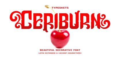 Ceriburn is inspired by the sweetness and richness of cherries. It easily evokes impressions of nature, elegance, and romanticism. You can use this stunning decorative font for logos, packaging, business cards, crafts, books, labels, headlines, invitations, print templates, and a multitude of other design ideas! Letter, Number & Punctuation, Accent Characters, Alternates Features.
 - Rushbold by Sign Studio,
$15.00 Rushbold inspired by the old brush style that has a fat body, it will really help to bring out a warm, retro, vintage, classic, playful feel. Has 2 Stylistic Sets (Upper & Lowercase) and other Alternate Characters. Each section has a smooth line so that for large prints it will still look good.