10,000 search results
(0.019 seconds)
- Brooklyner by Hanoded,
$15.00 Brooklyner font is based on the typeface used for The Brooklynite, a magazine which saw its heyday in the 1920's. The typeface before you is an all caps affair, making it a perfect choice for headlines, posters and ads. Since I had to work with just a handful of glyphs (11 to be precise), it took me a while to design the rest. Brooklyner font is loose, cartoonesque and very legible - and it comes with extensive language support.
 - Venio by Craft Supply Co,
$20.00 Venio – Double Line Font: Display Typography with Art Deco Flair Deco-inspired Elegance Infused with Art Deco sophistication, Venio, a double-line sans-serif font, brings timeless elegance to your designs. Distinctive Display Presence Venio ensures a bold yet refined aesthetic for logos and headlines, making your display stand out with its distinctive double-line design. Artful Symmetry Paying homage to Art Deco’s geometric precision, Venio’s symmetrical lines provide a visually pleasing experience, adding a touch of artistic flair.
 - Fineprint by Monotype,
$29.99The script typeface named Fineprint is based on its designer's own handwriting, or at least as Steve Matteson saw his handwriting on a really good day. Unlike many digitizations of handwriting, Fineprint maintains a consistent harmony and balance across its letters in a line of text. The Fineprint family includes a number of swash and alternate letterforms, which helps pull this quirky personal nature off. Use Fineprint whenever you want to make something appear personal, friendly, or informal! - Mc Cartey by Maulana Creative,
$11.00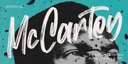 Mc Cartey is a Fancy Handwritten Brush Display font. With raw brush stroke, slanted and fun character with a ligatures. To give you an extra creative work. Mc Cartey font support multilingual more than 100+ language. This font is good for logo design, Social media, Movie Titles, Books Titles, a short text even a long text letter and good for your secondary text font with sans or serif. Make a stunning work with Mc Cartey font. Cheers, MaulanaCreative
 - Fattalsfort by Maulana Creative,
$13.00 Fattalsfort is a Handwritten Brush font. With Bold raw brush stroke, slant and fun character with a bit of ligature and swashes. To give you an extra creative work. Fattalsfort font support multilingual more than 100+ language. This font is good for logo design, Social media, Movie Titles, Books Titles, a short text even a long text letter and good for your secondary text font with sans or serif. Make a stunning work with Fattalsfort font. Cheers, MaulanaCreative
 - GS Frank by Great Scott,
$8.00 GS Frank is an uppercase display typeface inspired by the classics DIN, Eurostile and a dash of Futura. Perfect for prints, t-shirts, posters and such. Supports Basic, Western European, Central European and South Eastern European latin characters.
 - Baby Doodles by Outside the Line,
$19.00 Fun, little illustrations of baby toys, baby clothes and baby stuff. 27 darling doodle-like baby illustrations and 3 script and printed baby titles. This font is another of the many picture and doodles fonts from this foundry.
 - Dead Meal by Fonts of Chaos,
$10.00 Dead Meal is a cute hand made font made for pixel art style. Yes a mix of handmade pixel font style. Say like that is weird but trust me, it's simple useable for print works and web works.
 - Digital Stitch by 2D Typo,
$28.00 Digital Stitch is the embroidery of digital era. This font is a blend of pixel stylization of traditional cross-stitch embroidery and stylization of printed circuit boards. There is a big collection of ornaments in the symbols set.
 - Mixed Messages JNL by Jeff Levine,
$29.00Mixed Messages JNL brings back a favorite old theme... mixing up various letters and numbers from different fonts to create a printed message that resembles a ransom note or a collage of type with many styles of lettering. - Suredog by Fontmill Foundry,
$20.00One year old Suredog font. Affectionate with print and good with other sans but will probably chase a serif. Suredog is truly deserving of a loving home for the rest of her life. Please give Suredog a chance. - Ornaments 3 AR by ARTypes,
$30.00Ornaments 3 contains ornaments based on designs by Bernard Naudin for Deberny et Peignot, c. 1924; and ornaments based on designs by Oldrich Menhart, Karel Svolinsky and Jaroslav Slab for the state printing office of Czechoslovakia and Grafotechna. - Blue Creek Rounded by ActiveSphere,
$30.00 BlueCreek Rounded is a extra condensed geometric typeface, and works best in text and display applications, such as headline, posters, signage, magazine, print, product branding, corporate branding, logos and titles. Several alternate characters are included in this typeface.
 - Fairmont by Solotype,
$19.95This is one of the Victorian standards for job printing issued by the Barnhart Brothers and Spindler Foundry about 1891. It looks old without being decorative, a good counterpoint to fancier types in today¹s old fashioned typography. - Crassified by Spareartist,
$6.66 Crassified is a modern display font inspired by blackletter typefaces. The typeface has a strong effect that adds a certain elegance and class to both digital and print designs. It’s ideal for crafting logos, posters, covers, and more.
 - Shalleh by Akifatype,
$14.00 Shalleh is a bold script font, featuring Arabic Style. Designed expertly to make your project or work more modern, this font can be used for various projects such as: greeting cards, branding, logos, screen printing, and many others.
 - Economica PRO by Underground,
$29.90 Economica Pro is a font specially developed for printing complex situations. It has been tested successfully in very small sizes without losing legibility. It's ink traps ensure its smooth operation even in low quality papers. Ideal for newspapers.
 - Hermanz Titling by California Type Foundry,
$47.00 Hermanz™ Titling is inspired by the most majestic caps that Hermann Zapf ever drew. They are inscriptional caps, square caps, or “capitalis monumentalis”. These caps are some of the most beautiful letters made by one of the greatest talents of our time; so beautiful they deserve to be seen and appreciated by everyone. If you do any work for churches, wedding, funeral, anniversary, or other ceremonies, for the fine arts, exclusive clubs, or higher education—you will love how these letters make your brochures, pamphlets and announcements look. Hermanz Titling works for anything labeled "fine": fine dining, fine music, fine art (pamphlets, books, posters, cookbooks). It also fits well for religious topics: posters, events, websites, hymnals, for biblical; and ceremonies, religious or otherwise. Emotions It Can Communicate: • Importance • Timelessness • Special Event • Tradition • Reverence • Artistry • Beauty Released June 2021 on the Memorial of Hermann Zapf, as part of the California Type Foundry Memorial Series: Honoring the life and work of the great font designers. FONT STORY The Majestic Caps When I was on one of my visits to rare books rooms I found some large caps of Hermann Zapf, and I knew that I had to make a font inspired by these. I was surprised that no one had ever made them into a font. They were some of the most beautiful caps I had ever seen. These caps were surprisingly difficult to make. I thought it would take me a week or two; to get the detail and spirit right took significantly longer– but it was well worth the effort! When you print Hermanz Titling on a page, you will see what I mean. Even when printed digitally, it’s the closest thing to letterpress. You might even have some people thing it was printed by a traditional method with ink! (Note: Unless printed at very large sizes, this font is not recommended for actual letterpress, because the serifs are too thin.) If you do any work for churches, wedding, funeral, anniversary, or other ceremonies, for the fine arts, exclusive clubs, or higher education—you will love how these letters make your brochures, pamphlets and announcements look. Enjoy this breathtaking font, and may it help inspire people with your messages! –Dave Lawrence & the California Type Foundry
 - 1968 GLC Graffiti by GLC,
$38.00 This font was inspired by the paint brushed letters in use in the 60 - 70s for protest slogans tagged on the cities walls. In those days, we didn't commonly use aerosols like today, so we used paint brushes, with paint or tar cans, drew the letters, and ran away quickly ! Capitals and lower case have the same size, and a lot of alternates characters or ligatures allows the user to vary each letter (until tree alternates for single letters) in each word of a text . Likewise, the words may be easily underscored or intersected by a few stains looking like paint spots, substituted to the following standards characters: [greater], [less], [dagger], [backslash], [bullet], and [underscore].
 - Chicken Mayo by Mightyfire,
$15.00 Chicken Mayo - Handmade Cartoon Font is a playful and whimsical typeface that brings a sense of fun and lightheartedness to any design. Characterized by its bold and exaggerated strokes, this font features quirky shapes, reminiscent of the animated world. The letters are typically rounded and bubbly, adding a cheerful and approachable vibe.
 - Josefov by Ingo,
$28.00 A narrow, modern Slab Serif. JOSEFOV is directly derived from the sans serif text font ”Hedwig“. Therefore, of course, it pairs best with “Hedwig”. The basic thought was to create a font with heavy rounded serifs in the style of ”Clarendon“ but which hardly reminds one of that particular font. The form principle of rounded serifs is applied whenever possible — for example at the points where the individual strokes of the characters join one another. JOSEFOV seems very technical, very constructed (and truly is). In order to soften up the rigid impression, the serifs are applied at some points contrary to the tradition handed down, as with the upper case A C G K M V W and the lower case a b d h i j k l s t. Historically there is no example of the laterally oriented serifs of capital and small s (S) and C G. On the other hand, the double-sided serifs on the stems of b d h k l appear at the beginning of modern times in the very first serif types from five hundred years ago. The double-sided serifs of A M V W were also customary in the first decades of printing. JOSEVOV is particularly suitable for topics such as nature, folklore, culture, music, nutrition.
 - Sassoon Infant by Sassoon-Williams,
$48.00 An upright typeface family developed to meet the demand for letters to produce pupil material for handwriting as well as for reading. Upright letters with extended ascenders and descenders are ideal on screen. They facilitate word recognition. The exit strokes link words together visually, and in handwriting they lead to spontaneous joins along the baseline leading logically to a joined-up hand. Teachers can print desk strips, charts of letter families and alphabet friezes, as well as consistent material across the curriculum. Together these typefaces provide a valuable resource for special needs teachers. When starting point and stroke direction has been learned, the arrow font (Tracker B) can be dropped and the simpler Tracker font used. Tracker B font, with its direction arrows helps pupils to start in the correct place. Motor movements can be refined by keeping inside the line. When starting and direction is no problem, the arrow can be dropped and the plain Tracker font used. When starting point and stroke direction have been learned, the arrow font (Dotted B) can be dropped and the simpler Dotted font used. Free to download resources How to access Stylistic Sets of alternative letters in these fonts Purchasers of this font package may use their Order Number to receive a free Copybook PDF by Rosemary Sassoon recommended for effective teaching
 - Pagnol by Typorium,
$15.00 The Pagnol typeface has been designed with a principle developed by A. M. Cassandre in 1937, when the great French designer created the Peignot typeface following paleographic studies on the evolution of letterforms. Researches in the history of writing have proved that the lowercase "a" is at its origin nothing but the "A" shape transformed through centuries by scribes until the invention of printing. A large number of lowercases meanwhile kept their original shapes. If the scribes’ hand didn’t find the necessity to simplify them, it is only because these letters could be easily written. Integrating the classical shapes of capitals to the lowercases has already been used, keeping the lowercases which are only a deformation of capitals. Nevertheless, the respect of readability imposes to keep ascendants and descendants from traditional lowercases which serve as optical focus points in a text and make reading easier. The particularity of Pagnol is to use rounded shapes on top and bottom of pointed capital letters to make them fit with corresponding lowercases (Aa, Mm, Nn, Vv, Ww, Zz). Lowercases proportions are wide, to be in tune with classic lowercase shapes in order to optimize readability. Five weights in roman and italic have been designed to offer a wide palette of typographic possibilities in all sizes and all paper and screen supports.
 - Shapiro Base by OGJ Type Design,
$29.00 The bold cut is a good starting point for a branding.
 - KG Life Is Messy by Kimberly Geswein,
$5.00 A messy, markered, painted font in pure whimsical and messy style.
 - Buddy jim - Unknown license

- Glamsy by Krafted,
$10.00 Wish to give your design that vintage and classy look? Great fonts inspire emotion, and choosing the right one will push your brand in the right direction. Introducing Glamsy - A Vintage Modern Font. From merch and printed materials to websites and social media campaigns, Glamsy is ready for any project. Try it out and see the impact that a chic font can make. What you’ll get: Multilingual & Ligature Support Full sets of Punctuation and Numerals Compatible with: Adobe Suite Microsoft Office KeyNote Pages Software Requirements: The fonts that you’ll receive in the pack are widely supported by most software. In order to get the full functionality of the selection of standard ligatures (custom created letters) in the script font, any software that can read OpenType fonts will work. We hope you enjoy this font and that it makes your branding sparkle! Feel free to reach out to us if you’d like more information or if you have any concerns.
 - Ciubby by Krafted,
$10.00 Looking for a fun display font that makes your design bold and original? A great 3D font can be a real head-turner, leaving standard fonts in the dust. Introducing Ciubby - A Chubby Display Font. From T-shirts to headlines, Ciubby is perfect for any type of project. It works equally well for web and print, allowing you to use it across your brand. Let’s get creative! What you’ll get: Multilingual & Ligature Support Full sets of Punctuation and Numerals Compatible with: Adobe Suite Microsoft Office KeyNote Pages Software Requirements: The fonts that you’ll receive in the pack are widely supported by most software. In order to get the full functionality of the selection of standard ligatures (custom created letters) in the script font, any software that can read OpenType fonts will work. We hope you enjoy this font and that it makes your branding sparkle! Feel free to reach out to us if you’d like more information or if you have any concerns.
 - Amalia by Krafted,
$10.00 Want to impress your guests with stunning invitations? Maybe create event posters that will inspire the audience? It all starts with the right font. Introducing Amalia – A Modern Calligraphy Font. A blend of elegance and refinement, this font gives a whole different note to your printed cards, invitations, and promotions. On top of this, it’s fantastic for packaging and clothing, as well as for any project that requires charm and style. What you’ll get: Multilingual & Ligature Support Full sets of Punctuation and Numerals Compatible with: Adobe Suite Microsoft Office KeyNote Pages Software Requirements: The fonts that you’ll receive in the pack are widely supported by most software. In order to get the full functionality of the selection of standard ligatures (custom created letters) in the script font, any software that can read OpenType fonts will work. We hope you enjoy this font and that it makes your branding sparkle! Feel free to reach out to us if you’d like more information or if you have any concerns.
 - Arista 2.0 - Personal use only

- Bistecca - Personal use only

- Duepuntozero - Personal use only

- Targa - Personal use only

- Byron - Personal use only

- A10 STAR Black by Mogtahid,
$90.00 As a former typographer / lino and calligrapher, Abdallah NASRI had recourse to the nature of the idea of an "INTERCHANGEABLE" collection for types who in reality offer a police collar parallel to the complex typeface of the variable. Our fashion is outlined by a simple calculation defined by superimposed geometric circles where we used only its ¼ to fill the need for the angles of each of our letters. Always with the idea of having in the same allocated space, the same letter nested as many times as fat example from Hairline to Ultrabold. It was in this way that I was able to obtain a large number of styles, with a very interesting kerning which prompted me to extend the font to other languages with +1000 characters and +600 glyphs. I have always been treasured by the all in "1". I assure you that I sought to obtain the maximum of Visibility for a use S / Titling TV, WEB Pages and Typography Typo; once the difficult thing was done, I was rewarded by a font that has countless typographic openings for the world of graphics with 10 styles of weights in hand, and again I am happy to have personalized the charm of each letter by new details; I do not regret the time spent on thinking about it so that it is useful and at the same time pleasant as a working tool, finally profitable in all sectors and more multilingual, without forgetting that it is a family of inter change c ' is to say: All the types occupy the same height of the body and it is their fats which differs in the same space width of each of the letters, therefore no interference in spacing. Here, an additional alternative, a participation of a septuagenarian in the service of the love of modern digital typography. • TEST: At 50% screen in a body of 12 pixels, the A10 STAR Alphabet subjected to a test, has a clear Readability / Visibility. • P.S: A10 STAR integrates Diacriticism in all its forms. Texte d'origine : Abdallah NASRI a eu recours en étant ancien typographe/lino et calligraphe à la nature de l'idée d'une collection "INTERCHANGEABLE" pour les types qui en réalité offre un collier de police parallèle à la fonte complexe du variable. Notre mode est esquissé par un calcul simple défini par des ronds géométrique superposés où on a utilisé seulement son ¼ pour garnir le besoin des angles de chacune de nos lettres. Toujours dans l’idée à avoir dans le même espacement alloué, la même lettre imbriquée autant de fois de graisse exemple du Hairline à Ultrabold. C’est de cette manière que j’ai pu obtenir un grand nombre de styles, avec un crénage très intéressant ce qui m’a incité à étendre la police à d’autres langues avec +1000 caractères et +600 glyphes. J’ai toujours été prisé par le tout en « 1 ». Je vous assure que j’ai cherché à obtenir le maximum de Visibilité pour une utilisation S/Titrage TV, Pages WEB et Maquette typo ; une fois le difficile fait, j’ai été récompensé par une police qui possède d’innombrable ouverture typographique pour le monde du Graphisme avec comme atout en main 10 styles de graisses, et encore je suis content pour avoir personnalisé le charme de chaque lettre par des détails nouveaux ; je ne regrette pas le temps passé dessus à réfléchir pour qu’il soit utile et à la fois agréable comme outil de travail, enfin profitable tous secteurs confondus et en plus multilingue, sans oublié que c’est une famille d’inter change c’est-à-dire : Tous les types occupent la même hauteur du corps et c'est leurs graisses qui diffère dans un même espace largeur de chacune des lettres, donc aucune interférence dans l’espacement. Voilà, une alternative supplémentaire, une participation d’un septuagénaire au service de l’amour de la typographie numérique moderne. • TEST : A 50% d'écran dans un corps de 12 pixels, l'Alphabet A10 STAR soumise a un test, présente une nette Lisibilité / Visibilité. • P.S : A10 STAR intégre la Diacritique dans toutes ses formes.
 - Street Punks by Wing's Art Studio,
$10.00 Street Punks: Graffiti Inspired Marker Pen and Paint Brush Font A hand-drawn font inspired by graffiti and skate culture that comes in two pen and paint styles. Plus a shed-load of alternatives for designs that come straight off the pen (or brush). What happens when you combine graffiti, skate culture and 80s movies? You get Street Punks; a gritty, no-nonsense design that's equally at home on a ripped t-shirt or opening a horror movie (with ninjas!) Choose the slick look of marker pens or the textured roughness of paint brushes. Mix them up, play around and have fun. It's up to you! Street Punks comes with a complete set of alternatives and underlines with each style, so you’ll never have to repeat an E or an I; the tale-tell signs that give away other hand-made fonts. It also features all-caps uppercase and lowercase characters, along with numerals, punctuation and language support. It's a font that gives you tools to create some truly unique designs with just a little bit of work. The perfect choice for t-shirts, posters, stickers, movie titles, YouTubers and more! Street Punks: Marker and Paint Marker Regular Marker Alternative Marker Underlines* Paint Regular Paint Alternative Paint Underlines* *Underlines are assigned to keys: ABCDEFGHIJKLMNOP Find more from The Video Store Collection at Wingsart Studio
 - Zoney by Mans Greback,
$59.00 Zoney is a rustic slab serif typeface family. The lettering was hand-painted by Mans Greback between 2019 and 2021. It will give any project a handmade, natural and down-to-earth look. The font comes in four styles: Regular, Italic, Bold and Italic Bold It has very extensive lingual support, covering all European Latin scripts as well as Cyrillic. The font contains all characters you'll ever need, including all punctuation and numbers.
 - Regeneration by Comicraft,
$69.00 It’s the end, but the moment has been prepared for... the Time War is over and things are wearing a bit thin, time for a new face, a new body, a new companion for our Timelord font... a REGENERATION! Features: 138 automatic connecting ligatures Language support for Western & Central Europe and Vietnamese Solid Variable Font for complete control of weight and italic Levels Variable font can access any point between Inline, Midline & Outline
 - See You Again by Seemly Fonts,
$14.00 See You Again is a brand new and thin lettered display font. See You Again is perfectly suited for stationery, logos, t-shirt, paper, print design, website header, photo frame, flyer, music cover, poster, image slider, and much more.
 - Mighty Star by Typefactory,
$14.00 Mighty Star is a fun and rough serif font useful for a wide variety of designs, its charming look will definitely make your crafts more fabulous! Great for your personal needs, promotional projects, gifts, scrapbooks, printing, and much more.


