10,000 search results
(0.042 seconds)
- Bropella by Martype co,
$20.00 Introducing, Bropella. A bold sans with unique alternates and swashes! Comes with classic style and modern design with strong bold feels, of course this font perfect for headline, logotype, apparel, branding, packaging, editorial and etc. --- What's Include ? - Alternates - Ligatures - Swashes - And Many More! --- Support for 66 languages Afrikaans, Albanian, ,Basque, Bemba, Bena, Breton, Catalan, Chiga, Cornish, Danish, Dutch, English, Estonian, Faroese, Filipino, Finnish, French, Friulian, Galician, German, Gusii, Indonesian, Irish, Italian, Kabuverdianu, Kalenjin, Kinyarwanda, Luo, Luxembourgish, Luyia, Machame, Makhuwa, Meetto, Makonde, Malagasy, Manx, Morisyen, North, Ndebele, Norwegian, Bokmål, Norwegian, Nynorsk, Nyankole, Oromo, Portuguese, Quechua, Romansh, Rombo, Rundi, Rwa, Samburu, Sango, Sangu, Scottish, Gaelic, Sena, Shambala, Shona, Soga, Somali, Spanish, Swahili, Swedish, Swiss, ,German, Taita, Teso, Uzbek (Latin), Volapük, VunjoZulu, --- Thanks! Happy Desigining :) Umar
 - Native Stories by Prioritype,
$19.00 Native Stories - Classic Serif Font. A serif font with a stylish, classic feel is ready to work with your design projects. There are two styles, namely Regular and Italic. Perfect for applying to poster designs, branding, magazines, merchandise, logos and more. Features: Uppercase, Lowercase, Numeral, Punctuation & Multilingual. Multilingual contained: Afrikaans, Albanian, Asu, Basque, Bemba, Bena, Breton, Catalan, Chiga, Cornish, Danish, Dutch, English, Estonian, Filipino, Finnish, French, Friulian, Galician, German, Gusii, Indonesian, Irish, Italian, Kabuverdianu, Kalenjin, Kinyarwanda, Luo, Luxembourgish, Luyia, Machame, Makhuwa-Meetto, Makonde, Malagasy, Manx, Morisyen, North Ndebele, Norwegian Bokmål, Norwegian Nynorsk, Nyankole, Oromo, Portuguese, Quechua, Romansh, Rombo, Rundi, Rwa, Samburu, Sango, Sangu, Scottish Gaelic, Sena, Shambala, Shona, Soga, Somali, Spanish, Swahili, Swedish, Swiss German, Taita, Teso, Uzbek (Latin), Volapük, Vunjo, Zulu. Thanks!
 - Monsterio by Haksen,
$17.00 Monsterio is a futuristic modern slab serif style with Uppercase and Lowercase feel nice balanced. Provide alternates font in lowercase with wider style make the design letter looks incridible. Honestly it works perfectly for headlines, logos, posters, packaging, T-shirts and much more. Font Features : Regular and Italic version Character set A-Z in uppercase and lowercase Alternates in Lowercase Numerals & Punctuation Accented Characters Multiple Languages Supported Format File: OTF Recommended to use in Adobe Illustrator or Adobe Photoshop with opentype feature. How to access Alternate Characters? Open glyphs panel : In Adobe Photoshop choose tool Window glyphs In Adobe Illustrator choose tool Type glyphs If you have questions, just send me a message and I'm glad to help. Have a great day, Haksen Std
 - Sunday Cake by Arendxstudio,
$13.00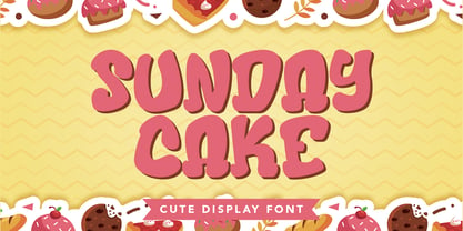 Sunday Cake - Cute Display Font is a font with distinctive handwritten characters perfect for branding projects, logos, wedding designs, media posts, advertisements, product packaging, product designs, labels, photography, watermarks, invitations, stationery, and any project who need handwritten dishes. Features : • Character Set A-Z • Numerals & Punctuations (OpenType Standard) • Accents (Multilingual characters) • Ligature Multilingual Support : Afrikaans, Albanian, Asu, Basque, Bemba, Bena, Catalan, Chiga, Cornish, Danish, English, Estonian, Faroese, Filipino, Finnish, French, Friulian, Galician, German, Gusii, Icelandic, Indonesian, Irish, Italian, Kabuverdianu, Kalenjin, Kinyarwanda, Low German, Luo, Luxembourgish, Luyia, Machame, Makhuwa-Meetto, Makonde, Malagasy, Malay, Manx, Morisyen, North Ndebele, Norwegian Bokmål, Norwegian Nynorsk, Nyankole, Oromo, Portuguese, Romansh, Rombo, Rundi, Rwa, Samburu, Sango, Sangu, Scottish Gaelic, Sena, Shambala, Shona, Soga, Somali, Spanish, Swahili, Swedish, Swiss German, Taita, Teso, Vunjo, Zulu
 - Treatment by Arendxstudio,
$13.00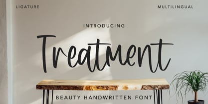 Treatment - Beauty Handwritten Font is a font with distinctive handwritten characters perfect for branding projects, logos, wedding designs, media posts, advertisements, product packaging, product designs, labels, photography, watermarks, invitations, stationery, and any project who need handwritten dishes. Features : • Character Set A-Z • Numerals & Punctuations (OpenType Standard) • Accents (Multilingual characters) • Ligature Multilingual Support : Afrikaans, Albanian, Asu, Basque, Bemba, Bena, Catalan, Chiga, Cornish, Danish, English, Estonian, Faroese, Filipino, Finnish, French, Friulian, Galician, German, Gusii, Icelandic, Indonesian, Irish, Italian, Kabuverdianu, Kalenjin, Kinyarwanda, Low German, Luo, Luxembourgish, Luyia, Machame, Makhuwa-Meetto, Makonde, Malagasy, Malay, Manx, Morisyen, North Ndebele, Norwegian Bokmål, Norwegian Nynorsk, Nyankole, Oromo, Portuguese, Romansh, Rombo, Rundi, Rwa, Samburu, Sango, Sangu, Scottish Gaelic, Sena, Shambala, Shona, Soga, Somali, Spanish, Swahili, Swedish, Swiss German, Taita, Teso, Vunjo, Zulu
 - Meteor Fall by Arendxstudio,
$13.00 Meteor Fall - Comic Display Font is a font with distinctive handwritten characters perfect for branding projects, logos, wedding designs, media posts, advertisements, product packaging, product designs, labels, photography, watermarks, invitations, stationery, and any project who need handwritten dishes. Features : • Character Set A-Z • Numerals & Punctuations (OpenType Standard) • Accents (Multilingual characters) • Ligature Multilingual Support : Afrikaans, Albanian, Asu, Basque, Bemba, Bena, Catalan, Chiga, Cornish, Danish, English, Estonian, Faroese, Filipino, Finnish, French, Friulian, Galician, German, Gusii, Icelandic, Indonesian, Irish, Italian, Kabuverdianu, Kalenjin, Kinyarwanda, Low German, Luo, Luxembourgish, Luyia, Machame, Makhuwa-Meetto, Makonde, Malagasy, Malay, Manx, Morisyen, North Ndebele, Norwegian Bokmål, Norwegian Nynorsk, Nyankole, Oromo, Portuguese, Romansh, Rombo, Rundi, Rwa, Samburu, Sango, Sangu, Scottish Gaelic, Sena, Shambala, Shona, Soga, Somali, Spanish, Swahili, Swedish, Swiss German, Taita, Teso, Vunjo, Zulu
 - Emperatriz by Latinotype,
$19.00 Emperatriz—with deep roots in the Roman tradition—is an elegant font and, above all, firmly situated in the present, featuring monumental forms and a classical design yet with a contemporary twist. It is a refreshing, clean, modern display font, perfect for the editorial design of magazines and catalogs, for the creation of titles and short texts, on book covers and large format publications, or as part of a corporate identity, logos, packaging and labels. Every variant in the family has generous counter forms, with ligatures and alternative capitals (Q, R, P, O), as well as oldstyle and Roman numerals, manicules, and monetary and mathematical symbols, providing a complete set with language support for more than 200 Latin script languages.
 - Wild Plants by Arendxstudio,
$13.00 Wild Plants - Groovy Retro Display Font is a font with distinctive handwritten characters perfect for branding projects, logos, wedding designs, media posts, advertisements, product packaging, product designs, labels, photography, watermarks, invitations, stationery, and any project who need handwritten dishes. Features : • Character Set A-Z • Numerals & Punctuations (OpenType Standard) • Accents (Multilingual characters) • Ligature Multilingual Support : Afrikaans, Albanian, Asu, Basque, Bemba, Bena, Catalan, Chiga, Cornish, Danish, English, Estonian, Faroese, Filipino, Finnish, French, Friulian, Galician, German, Gusii, Icelandic, Indonesian, Irish, Italian, Kabuverdianu, Kalenjin, Kinyarwanda, Low German, Luo, Luxembourgish, Luyia, Machame, Makhuwa-Meetto, Makonde, Malagasy, Malay, Manx, Morisyen, North Ndebele, Norwegian Bokmål, Norwegian Nynorsk, Nyankole, Oromo, Portuguese, Romansh, Rombo, Rundi, Rwa, Samburu, Sango, Sangu, Scottish Gaelic, Sena, Shambala, Shona, Soga, Somali, Spanish, Swahili, Swedish, Swiss German, Taita, Teso, Vunjo, Zulu
 - Lucifer Sans by Daniel Brokstad,
$29.00 Lucifer Sans is a modern sans serif font rooted in Scandinavian geometry and minimalism, mixed with a healthy dose of black metal and irreverent attitude. Harsh vertical cuts and angles throughout the font creates a very strict and hard look, that can either be amplified or loosened up through its stylistic sets. Lucifer Sans family contains 162 font, 9 different weights and width, plus italics. In addition there are 3 different stylistic sets. This creates substantially diverse set of characters for contrasting against another and makes it a versatile font for different formats. Style 01 takes on an almost hand drawn style, while Style 02 enhances the geometric aspects of the font further. Style 03 uses only the rounded letter 01 without the hand drawn variations.
 - Bubble Dope by Arendxstudio,
$13.00 Bubble Dope - Groovy Display Font is a font with distinctive handwritten characters perfect for branding projects, logos, wedding designs, media posts, advertisements, product packaging, product designs, labels, photography, watermarks, invitations, stationery, and any project who need handwritten dishes. Features : • Character Set A-Z • Numerals & Punctuations (OpenType Standard) • Accents (Multilingual characters) • Ligature Multilingual Support : Afrikaans, Albanian, Asu, Basque, Bemba, Bena, Catalan, Chiga, Cornish, Danish, English, Estonian, Faroese, Filipino, Finnish, French, Friulian, Galician, German, Gusii, Icelandic, Indonesian, Irish, Italian, Kabuverdianu, Kalenjin, Kinyarwanda, Low German, Luo, Luxembourgish, Luyia, Machame, Makhuwa-Meetto, Makonde, Malagasy, Malay, Manx, Morisyen, North Ndebele, Norwegian Bokmål, Norwegian Nynorsk, Nyankole, Oromo, Portuguese, Romansh, Rombo, Rundi, Rwa, Samburu, Sango, Sangu, Scottish Gaelic, Sena, Shambala, Shona, Soga, Somali, Spanish, Swahili, Swedish, Swiss German, Taita, Teso, Vunjo, Zulu
 - Peaches Blessed by Prioritype,
$19.00 Peaches blessed is a great paired font because it has organic characteristics and is luxurious to look at. With the additional characters in these two fonts, it makes your display more enjoyable. Great for branding, logos, wedding invitations, quotes and more. Features: Uppercase, Lowercase, Numeral, Punctuation, Multilingual Ligatures & Alternates. Multilingual contained: Afrikaans, Albanian, Asu, Basque, Bemba, Bena, Breton, Catalan, Chiga, Cornish, Danish, Dutch, English, Estonian, Filipino, Finnish, French, Friulian, Galician, German, Gusii, Indonesian, Irish, Italian, Kabuverdianu, Kalenjin, Kinyarwanda, Luo, Luxembourgish, Luyia, Machame, Makhuwa-Meetto, Makonde, Malagasy, Manx, Morisyen, North Ndebele, Norwegian Bokmål, Norwegian Nynorsk, Nyankole, Oromo, Portuguese, Quechua, Romansh, Rombo, Rundi, Rwa, Samburu, Sango, Sangu, Scottish Gaelic, Sena, Shambala, Shona, Soga, Somali, Spanish, Swahili, Swedish, Swiss German, Taita, Teso, Uzbek (Latin), Volapük, Vunjo, Zulu. Thanks!
 - Absolute Inky by Arendxstudio,
$13.00 Absolute Inky - Funny Comic Display Font is a font with distinctive handwritten characters perfect for branding projects, logos, wedding designs, media posts, advertisements, product packaging, product designs, labels, photography, watermarks, invitations, stationery, and any project who need handwritten dishes. Features : • Character Set A-Z • Numerals & Punctuations (OpenType Standard) • Accents (Multilingual characters) • Ligature Multilingual Support : Afrikaans, Albanian, Asu, Basque, Bemba, Bena, Catalan, Chiga, Cornish, Danish, English, Estonian, Faroese, Filipino, Finnish, French, Friulian, Galician, German, Gusii, Icelandic, Indonesian, Irish, Italian, Kabuverdianu, Kalenjin, Kinyarwanda, Low German, Luo, Luxembourgish, Luyia, Machame, Makhuwa-Meetto, Makonde, Malagasy, Malay, Manx, Morisyen, North Ndebele, Norwegian Bokmål, Norwegian Nynorsk, Nyankole, Oromo, Portuguese, Romansh, Rombo, Rundi, Rwa, Samburu, Sango, Sangu, Scottish Gaelic, Sena, Shambala, Shona, Soga, Somali, Spanish, Swahili, Swedish, Swiss German, Taita, Teso, Vunjo, Zulu
 - Joyful Berlin by Arendxstudio,
$13.00 Joyful Berlin - Comic Display Font is a font with distinctive handwritten characters perfect for branding projects, logos, wedding designs, media posts, advertisements, product packaging, product designs, labels, photography, watermarks, invitations, stationery, and any project who need handwritten dishes. Features : • Character Set A-Z • Numerals & Punctuations (OpenType Standard) • Accents (Multilingual characters) • Ligature Multilingual Support : Afrikaans, Albanian, Asu, Basque, Bemba, Bena, Catalan, Chiga, Cornish, Danish, English, Estonian, Faroese, Filipino, Finnish, French, Friulian, Galician, German, Gusii, Icelandic, Indonesian, Irish, Italian, Kabuverdianu, Kalenjin, Kinyarwanda, Low German, Luo, Luxembourgish, Luyia, Machame, Makhuwa-Meetto, Makonde, Malagasy, Malay, Manx, Morisyen, North Ndebele, Norwegian Bokmål, Norwegian Nynorsk, Nyankole, Oromo, Portuguese, Romansh, Rombo, Rundi, Rwa, Samburu, Sango, Sangu, Scottish Gaelic, Sena, Shambala, Shona, Soga, Somali, Spanish, Swahili, Swedish, Swiss German, Taita, Teso, Vunjo, Zulu
 - Geogrotesque Stencil by Emtype Foundry,
$69.00 Geogrotesque Stencil is a member of the popular Geogrotesque family, and despite being thought as a display typeface, it goes one step further and tries to solve some of the typical problems with stencils fonts. Geogrotesque Stencil comes with 3 widths of cut (A, B and C). These cuts not only allow a better performance when printing at different sizes, you can also move across versions A, B or C in accordance to the rigidity of the material used. The family consists of 42 styles, 7 weights with 3 versions each plus italics, all of them in Open Type format including ligatures, tabular figures, fractions, numerators, denominators, superiors and inferiors with support for Central and Eastern European languages. For more details see the PDF.
 - Sunny Evening by Arendxstudio,
$13.00 Sunny Evening - Groovy Trendy Font is a font with distinctive handwritten characters perfect for branding projects, logos, wedding designs, media posts, advertisements, product packaging, product designs, labels, photography, watermarks, invitations, stationery, and any project who need handwritten dishes. Features : • Character Set A-Z • Numerals & Punctuations (OpenType Standard) • Accents (Multilingual characters) • Ligature Multilingual Support : Afrikaans, Albanian, Asu, Basque, Bemba, Bena, Catalan, Chiga, Cornish, Danish, English, Estonian, Faroese, Filipino, Finnish, French, Friulian, Galician, German, Gusii, Icelandic, Indonesian, Irish, Italian, Kabuverdianu, Kalenjin, Kinyarwanda, Low German, Luo, Luxembourgish, Luyia, Machame, Makhuwa-Meetto, Makonde, Malagasy, Malay, Manx, Morisyen, North Ndebele, Norwegian Bokmål, Norwegian Nynorsk, Nyankole, Oromo, Portuguese, Romansh, Rombo, Rundi, Rwa, Samburu, Sango, Sangu, Scottish Gaelic, Sena, Shambala, Shona, Soga, Somali, Spanish, Swahili, Swedish, Swiss German, Taita, Teso, Vunjo, Zulu
 - Railroad Gothic by Linotype,
$29.99Railroad Gothic was originally designed in 1906 for ATF (American Type Founders). This uppercase-only typeface is very condensed and also heavy, giving it a distinct 19th American wood type feeling. Like those 19th Century classics, Railroad Gothic is best used when set really big. Originally designed for use in railroad signage, Railroad Gothic has since been adapted for use in many American tabloid journals, which employ it in screaming headlines. When you need to set something large and loud for the whole world to see, this old ATF classic may be right for you. Railroad Gothic is an all caps font, and is available in digital format exclusively from Linotype. The typeface is included in the Take Type 4 collection from Linotype GmbH." - Tropical Vibe by Arendxstudio,
$13.00 Tropical Vibe - Groovy Retro Font is a font with distinctive handwritten characters perfect for branding projects, logos, wedding designs, media posts, advertisements, product packaging, product designs, labels, photography, watermarks, invitations, stationery, and any project who need handwritten dishes. Features : • Character Set A-Z • Numerals & Punctuations (OpenType Standard) • Accents (Multilingual characters) • Ligature Multilingual Support : Afrikaans, Albanian, Asu, Basque, Bemba, Bena, Catalan, Chiga, Cornish, Danish, English, Estonian, Faroese, Filipino, Finnish, French, Friulian, Galician, German, Gusii, Icelandic, Indonesian, Irish, Italian, Kabuverdianu, Kalenjin, Kinyarwanda, Low German, Luo, Luxembourgish, Luyia, Machame, Makhuwa-Meetto, Makonde, Malagasy, Malay, Manx, Morisyen, North Ndebele, Norwegian Bokmål, Norwegian Nynorsk, Nyankole, Oromo, Portuguese, Romansh, Rombo, Rundi, Rwa, Samburu, Sango, Sangu, Scottish Gaelic, Sena, Shambala, Shona, Soga, Somali, Spanish, Swahili, Swedish, Swiss German, Taita, Teso, Vunjo, Zulu
 - Sansterdam by NREY,
$19.00 Sansterdam is a modern condenced grotesque font family. It's great for titles, posters, logos. Condensed font allows to include more information in one line. Sansterdam has special Deco version with circle uppercase letters and oldstyle numbers for more vintage feeling. Also Sansterdam has signature script font with many ligatures and alternates for more unforgettable combinations! Font looks amazing as alone words and as full text blocks. Also it good for bright captions and logos. Language support more than 30 languages: Afrikaans, Basque, Bosnian, Catalan, Croatian, Czech, Danish, Dutch, English, Estonian, Filipino, Finnish, French, Galician, German, Indonesian, Irish, Italian, Latvian, Lithuanian, Malay, Norwegian Bokmal, Portuguese, Romanian, Russian, Slovak, Slovenian, Spanish, Swahili, Swedish, Zulu etc. Download Sansterdam for your next project today! Thank you and have a great day!
 - Seamize by Epyto Type Co,
$19.00 Seamize is a display typeface, with a few experimental vibes and a semi-psychedelic feel. It works perfectly for creative projects such as logo, T-shirt/apparel, badge, invitation, packaging, headline, poster, magazine, greeting card, and many other purposes.
 - Random Phrase by Bogstav,
$18.00 Every now and then you can use a good phrase, and luckily there's a lot to choose from. This font also have a lot to choose from, because I've added 7 different (and hastily written) versions of each letter.
 - Nouveau Heading JNL by Jeff Levine,
$29.00 Some pleasant Art Nouveau spurred serif hand lettering was found on the cover of a 1902 issue of “The Century Magazine”. This is now the digital typeface Nouveau Heading JNL, and is available in both regular and oblique versions.
 - Long Tall Palito by Pedro Teixeira,
$15.00 This font can make a great art element to emphasize, to provide impact, can stand out as a banner, or with a few words in headers and headlines and allow you to optimize space and keep neat and organized.
 - Just Great JNL by Jeff Levine,
$29.00 A 1940s British music collection of classical music piano pieces entitled "The Great Masters Series" had its title hand-lettered in a free form, casual sans serif with a cartoon style. This is now available as Just Great JNL.
 - Nouveau Stencil Ornate JNL by Jeff Levine,
$29.00 A 1902 publication entitled "Lettering for Schools & Colleges" had an example of an ornate, hand drawn stencil alphabet in the Art Nouveau style. This is now available digitally as Nouveau Stencil Ornate JNL, in both regular and oblique versions.
 - Lawbreaker JNL by Jeff Levine,
$29.00 The December, 1935 movie poster for James Cagney in “Public Enemy” has its title hand lettered in a bold, squared, slab serif type style. Now digitally recreated as Lawbreaker JNL, it is available in both regular and oblique versions.
 - Sign Expert JNL by Jeff Levine,
$29.00 An elegant, yet informal Roman alphabet with Art Nouveau influences was found amidst the pages of the 1922 edition of “The Expert Sign Painter”. It is now available digitally as Sign Expert JNL in both regular and oblique versions.
 - Annifont is a testament to the creative prowess of Annie de la Vega, a testament to her imaginative prowess and keen eye for design. This font embodies a blend of artistic flair and practicality, mak...
- The font named GoodPeace by Dirt2 can be characterized as embodying a unique blend of artistic flair and a message of harmony. It is a testament to the power of type design in conveying more than jus...
- Poligon by Halbfett,
$30.00 Poligon is a large family of geometric sans serif fonts. It is inspired by classic typefaces from the geometric-sans genre, like Futura and Avant Garde Gothic, whose shapes were constructed from circles and straight lines. Every character has been crafted to give it a distinct and individual feel. The family is an excellent choice for both corporate design and editorial design projects because of its range of weights, as well as its legibility in text. The typeface family ships in two different formats. Depending on your preference, you can install the typeface as two Variable Fonts or use the family’s eight static OpenType font files instead. Those weights run from Thin to Black. While the static-format fonts offer a good intermediary-step selection, users who install the Variable Fonts have vastly greater control over the stroke width in their upright and italic texts. The weight axes in Poligon’s Variable Fonts allow users to differentiate between almost 1,000 possible font weights. That enables you to fine-tune your text’s exact appearance on-screen or in print. But even the static fonts satisfy the need for flexibility, creating harmonious variations of texture and emphasis. Despite their rigid geometry, the fonts have a playful air to them. That playfulness and uniqueness can be dialed up by applying stylistic alternates via the fonts’ four Stylistic Sets. The first of these replaces “G”, “M”, and “&” with alternate, more outgoing shapes. Stylistic Set 2 has an alternate “ß”; Stylistic Set 3 has a “Q” with a longer tail and another “G”. Stylistic Set 3 has alternates for “A”, “K“, “Q”, “R”, “S”, “Y”, and “Z”.
 - Charter BT by Bitstream,
$50.99 Originally released in 1987, Charter incorporates three important features: compact set width to give economical copyfit; generous x-height to give readability at small point sizes; and sturdy open letterforms to give reliable reproduction at both typesetter and laser printer resolutions. The design brings a clarity and freshness to everyday documents, such as newsletters, textbooks, directories and technical manuals, where the reader’s concentration must not be interrupted by unfamiliar letterforms but where typographic dullness can itself impair comprehension. The Italic has cursive letterforms - so is instantly distinguishable, while being readable enough in its own right for continuous text. The Charter BT Pro Pack features 6 fonts: roman, italic, bold, bold italic, black, and black italic. The fonts include characters originally developed for expert sets, such as ligatures, ornaments, old style figures, small caps, and superiors. The Pro Pack fonts support Western, Central European, and Eastern European languages. OpenType fonts are a cross-platform font format. The same OpenType font can be installed on Mac OS X, Windows, Linux, and Unix systems. Mac OS X and Windows 2000, XP, and Vista have built-in support for OpenType. OpenType fonts also work on Linux, Unix, and earlier versions of Windows, where they are recognized as TrueType fonts. OpenType includes many more features than the standard TrueType and PostScript formats, including the ability to install the same font on different platforms, crucial for document portability. OpenType fonts boost productivity because graphic designers and business professionals do not have to wrestle with many different fonts. With OpenType, customers have larger character sets to work with and fewer font files to deal with.
 - Grunge Serifia is not a canonical font widely recognized under this name as of my last update in early 2023. However, the conceptual idea of a "Grunge Serifia" font paints a vivid image that blends t...
- Zinc Boomerang - Unknown license

- Huxley Vertical by Bitstream,
$29.99 The PARATYPE library is our latest major addition, consisting of more than 370 typefaces. In the spirit of the perestroika changes and following the collapse of the Soviet Union, a group of Russian type designers quit the state-owned Polygraphmash foundry to establish ParaType, the first, and now largest Russian digital type foundry. The ParaType team under the supervision of Vladimir Yefimov creates new typefaces and explores the Russian typographic heritage by making digital versions of existing Russian designs: these include the hits of Soviet typography such as Literaturnaya and Journal Sans. Most ParaType fonts are available in Western/Roman, Central European, Turkish and Cyrillic encodings. The Russian constructivist and avant garde movements of the early 20th century inspired many ParaType typefaces, including Rodchenko, Quadrat Grotesk, Ariergard, Unovis, Tauern, Dublon and Stroganov. The ParaType library also includes many excellent book and newspaper typefaces such as Octava, Lazurski, Bannikova, Neva or Petersburg. On the other hand, if you need a pretty face to knock your clients dead, meet the ParaType girls: Tatiana, Betina, Hortensia, Irina, Liana, Nataliscript, Nina, Olga and Vesna (also check Zhikharev who is not a girl but still very pretty). ParaType excels in adding Cyrillic characters to existing Latin typefaces — if your company is ever going to do business with Eastern Europe, we recommend you make them part of your corporate identity! ParaType created CE and Cyrillic versions of popular typefaces licensed from other foundries, including Bell Gothic, Caslon, English 157, Futura, Original Garamond, Gothic 725, Humanist 531, Kis, Raleigh, or Zapf Elliptical 711.
 - Seventies by Lián Types,
$37.00 'Meeeeoooow'! Seventies is another of my 'funkadelic' attempts (1) to fill the existing gap of seventyish looking fonts. In my opinion, that decade has a hidden treasure regarding type that remains unexplored: Only very few fonts rescue its 'groovy' essence, its ‘colourful’ qualities. But, don't have a cow man , and keep on truckin! With Seventies, my new foxy mama , your projects will stand out among the rest. Since there’s not much information available about this kind of lettering I had to get ideas from other styles: Nowadays it’s easy to find all kind of books or guides to understand and practice how different styles of calligraphy and lettering should be done. However, for some reason, 60s and 70s letters seemed to ignore/be free of rules... Was this suggesting the birth of postmodernism? I incorporated some ideas of the copperplate style of calligraphy: The ductus of its forms may be compared to the way letters are made in snell/engrosser’s script. Obviously, this is just the idea behind; the delicacy of thins is replaced here with the graceful imprint of really thick thicks with a brushy look and tons of good vibe . Seventies will work awesome in posters, brands, magazines, book-covers of any kind, due to its modern look adapted to our century. Well, catch you on the flip~side ! STYLES To make you more psyched , Seventies is a layered font! See examples in the posters using Seventies Shade, Seventies Shine and Seventies Printed. NOTES (1) My first one was with Beatle in 2014.
 - Rotis Semi Sans by Monotype,
$40.99 Rotis¿ is a comprehensive family group with Sans Serif, Semi Sans, Serif, and Semi Serif styles, for a total of 17 weights including italics. The four families have similar weights, heights and proportions; though the Sans is primarily monotone, the Semi Sans has swelling strokes, the Semi Serif has just a few serifs, and the Serif has serifs and strokes with mostly vertical axes. Designed by Otl Aicher for Agfa in 1989, Rotis has become something of a European zeitgeist. This highly rationalized yet intriguing type is seen everywhere, from book text to billboards. The blending of sans with serif was almost revolutionary when Aicher first started working on the idea. Traditionalists felt that discarding serifs from some forms and giving unusual curves and edges to others might be something new, but not something better. But Rotis was based on those principles, and has proven itself not only highly legible, but also remarkably successful on a wide scale. Rotis is easily identifiable in all its styles by the cap C and lowercase c and e: note the hooked tops, serifless bottoms, and underslung body curves. Aicher is a long-time teacher of design and has many years of practical experience as a graphic designer. He named Rotis after the small village in southern German where he lives. Rotis¿ is suitable for just about any use: book text, documentation, business reports, business correspondence, magazines, newspapers, posters, advertisements, multimedia, and corporate design.Today Rotis ia also available with pan european caracter set.
 - Amerika Pro by CheapProFonts,
$- This is the 200th font released by CheapProFonts, and again I wanted to make something special - so I have chosen to upgrade another well-known font by the infamous Fredrick "Apostrophe" Nader: Amerika! The whole character set for this stylish font has been polished for consistent baseline placement and serif thickness, and proper overshoots has been implemented. All the alternate letterforms (and some new ones) have been included as OpenType alternates AND they have now been made available with accents, too! The Greek and Cyrillic letterforms are properly encoded and kerned. I hope many will enjoy the improvements - and naturally: it is still free! ALL fonts from CheapProFonts have very extensive language support: They contain some unusual diacritic letters (some of which are contained in the Latin Extended-B Unicode block) supporting: Cornish, Filipino (Tagalog), Guarani, Luxembourgian, Malagasy, Romanian, Ulithian and Welsh. They also contain all glyphs in the Latin Extended-A Unicode block (which among others cover the Central European and Baltic areas) supporting: Afrikaans, Belarusian (Lacinka), Bosnian, Catalan, Chichewa, Croatian, Czech, Dutch, Esperanto, Greenlandic, Hungarian, Kashubian, Kurdish (Kurmanji), Latvian, Lithuanian, Maltese, Maori, Polish, Saami (Inari), Saami (North), Serbian (latin), Slovak(ian), Slovene, Sorbian (Lower), Sorbian (Upper), Turkish and Turkmen. And they of course contain all the usual "western" glyphs supporting: Albanian, Basque, Breton, Chamorro, Danish, Estonian, Faroese, Finnish, French, Frisian, Galican, German, Icelandic, Indonesian, Irish (Gaelic), Italian, Northern Sotho, Norwegian, Occitan, Portuguese, Rhaeto-Romance, Sami (Lule), Sami (South), Scots (Gaelic), Spanish, Swedish, Tswana, Walloon and Yapese.
 - Technical SCRIPTURE by MMC-TypEngine,
$19.00 ‘Technical Scripture’ 2015-2021 A manuscript look, Pixel labyrinthine Display Type System… Plus, an Optical “Layered Game”, Retro Futuristic Sci-Fi Digital interface evolving placeholder… Now with 3D Styles! It was designed as a pair to its brother font ‘Technical Signature’ a Small Caps Font, both inspired by antique Greek, mosaics zig-zag ornaments “ancient times computer” intentionally as a Romanic variation with same metrics... Searching for Technical Solutions, it resulted in many combined styles by matching the primary ones so there’s plenty variations for multi-purpose texting like layered typesetting or simply monochromatic designs… Plus got accurate streaming resolution, therefore some sub-families like Stamp and Texture implicates greater points for minimum size as Regular and Light is appropriated to Small Optical Text reductions. *The New 3’s Upgraded Edition Improvements consisted of Correct ‘Font Info’ (verified data-debugging) rescaled glyphs, quick design review, better style linking with correspondent renamed fonts, addition of automatic OT features encoding, 3D Styles and Italics. Ps. This actual Typeface was quickly re-edited for technical reasons and hasn’t yet reached the intended design, it will soon receive a more tangible redesign upgrade, mainly in lowercases to enhance cursive style. Due to other priorities. Tip: Give preference to THE LYSERGIC UPPERCASES! Multilanguage Support: Western & Eastern European, Baltic, Turkish, Greek, and Cyrillic. This Type is pleasant to Technician Compositions, Such as Briefs layouts manuscript, Old Engineering & Crafts Logos or Support Text, Op-Art Posters, Stamps, Labels, movies and Cartoons Ludic Scripts, sites and of course Video Games! Try ‘Technical Scripture’ & Have some Power to the Pixel! Padang!
 - Rotis Semi Sans Paneuropean by Monotype,
$92.99Rotis¿ is a comprehensive family group with Sans Serif, Semi Sans, Serif, and Semi Serif styles, for a total of 17 weights including italics. The four families have similar weights, heights and proportions; though the Sans is primarily monotone, the Semi Sans has swelling strokes, the Semi Serif has just a few serifs, and the Serif has serifs and strokes with mostly vertical axes. Designed by Otl Aicher for Agfa in 1989, Rotis has become something of a European zeitgeist. This highly rationalized yet intriguing type is seen everywhere, from book text to billboards. The blending of sans with serif was almost revolutionary when Aicher first started working on the idea. Traditionalists felt that discarding serifs from some forms and giving unusual curves and edges to others might be something new, but not something better. But Rotis was based on those principles, and has proven itself not only highly legible, but also remarkably successful on a wide scale. Rotis is easily identifiable in all its styles by the cap C and lowercase c and e: note the hooked tops, serifless bottoms, and underslung body curves. Aicher is a long-time teacher of design and has many years of practical experience as a graphic designer. He named Rotis after the small village in southern German where he lives. Rotis¿ is suitable for just about any use: book text, documentation, business reports, business correspondence, magazines, newspapers, posters, advertisements, multimedia, and corporate design.Today Rotis ia also available with pan european caracter set. - Typist Slab Mono by VanderKeur,
$25.00 The typeface Typist originated during an extensive research on the origin and development of typewriter typestyles. The first commercially manufactured typewriter came on the market in 1878 by Remington. The typestyles on these machines were only possible in capitals, the combination of capitals and lowercase came available around the end of the nineteenth century. Apart from a few exceptions, most typestyles had a fixed letter width and a more or less unambiguous design that resembled a thread-like structure. A lot of this mechanical structure was due to the method the typestyles were produced. Looking at type-specimens for print before the first typewriters were good enough to came on the market we can see that in 1853 and in 1882 Bruce’s Type Foundry already had printing type that had a structure of the typewriter typestyles. Of course printing types were proportional designed as typewriter typestyles had a fixed width. So it is possible that except from the method of production for typewriter typestyles, the design of printing types were copied. In the design of the Typist, the purpose was – next to the monospace feature – to include some of the features of the early typewriter typestyles. Features such as the ball terminals and the remarkable design of the letter Q. This new typeface lacks the mechanical and cold look of the early typewriter typestyles. The Typist comes in six weights with matching italics in two versions. One that resembled the early typewriter typestyles (Typist Slab) and a version designed with coding programmers in mind (Typist Code).
 - Rotis Semi Serif Paneuropean by Monotype,
$92.99Rotis¿ is a comprehensive family group with Sans Serif, Semi Sans, Serif, and Semi Serif styles, for a total of 17 weights including italics. The four families have similar weights, heights and proportions; though the Sans is primarily monotone, the Semi Sans has swelling strokes, the Semi Serif has just a few serifs, and the Serif has serifs and strokes with mostly vertical axes. Designed by Otl Aicher for Agfa in 1989, Rotis has become something of a European zeitgeist. This highly rationalized yet intriguing type is seen everywhere, from book text to billboards. The blending of sans with serif was almost revolutionary when Aicher first started working on the idea. Traditionalists felt that discarding serifs from some forms and giving unusual curves and edges to others might be something new, but not something better. But Rotis was based on those principles, and has proven itself not only highly legible, but also remarkably successful on a wide scale. Rotis is easily identifiable in all its styles by the cap C and lowercase c and e: note the hooked tops, serifless bottoms, and underslung body curves. Aicher is a long-time teacher of design and has many years of practical experience as a graphic designer. He named Rotis after the small village in southern German where he lives. Rotis¿ is suitable for just about any use: book text, documentation, business reports, business correspondence, magazines, newspapers, posters, advertisements, multimedia, and corporate design. Today Rotis ia also available with paneuropean caracter set.
