10,000 search results
(0.03 seconds)
- An Electronic Display LED LCD LED7 Seg 3 by Fortune Fonts Ltd.,
$15.00 * For when you need the most realistic looking electronic display. * See User Manuals Main advantages: - Spacing between characters does not change when entering a decimal point or colon between them. - Custom characters can be produced by selecting any combination of segments to be displayed. Low cost electronic displays have a fixed number of segments that can be turned on or off to represent different symbols. A digital watch would be the most common example. Fonts typically available for depicting electronic displays are often in the artistic style of these common LED or LCD displays. They provide the look-and-feel, but fall short when technical accuracy is required. Failure to represent an accurate and consistent representation of the real thing can be a cringe-worthy experience for the product design and marketing team, or even the hobbyist for that matter. To solve this problem, Fortune Fonts has released a range of fonts that accurately depict the displays typically found on low cost electronic devices: watches, answering machines, car stereos, alarm clocks, microwaves and toys. These fonts come with numbers, letters and symbols predefined. However, they also allow you to create your own segment combinations for the custom symbols you need. When producing manuals, marketing material and user interfaces, accuracy is an all-or-nothing concept. Instructions in the user manual describe how to turn these fonts into realistic displays according to your own design, in the manner of the images above. If you cannot see a license option for your specific application, such a license may be purchased from here. By purchasing &/or using &/or distributing the fonts the buyer user and distributor (including Monotype Imaging Inc. & Monotype Imaging Hong Kong) agree to (1) indemnify & hold harmless the foundry, for any consequential, incidental, punitive or other damages of any kind resulting from the use of the deliverables including, but not limited to, loss of revenues, profits, goodwill, savings, due to; including, but not limited to, failure of the deliverables to perform it’s described function, or the deliverable’s infringement of patents, copyrights, trademarks, design rights, contract claims, trade secrets, or other proprietary rights of the foundry, distributor, buyer or other parties (2) not use the fonts to assist in design of, or be incorporated into, non-software displays
 - An Electronic Display LED LCD LED7 Seg 2 by Fortune Fonts Ltd.,
$15.00 * For when you need the most realistic looking electronic display. * See User Manuals Main advantages: - Spacing between characters does not change when entering a decimal point or colon between them. - Custom characters can be produced by selecting any combination of segments to be displayed. Low cost electronic displays have a fixed number of segments that can be turned on or off to represent different symbols. A digital watch would be the most common example. Fonts typically available for depicting electronic displays are often in the artistic style of these common LED or LCD displays. They provide the look-and-feel, but fall short when technical accuracy is required. Failure to represent an accurate and consistent representation of the real thing can be a cringe-worthy experience for the product design and marketing team, or even the hobbyist for that matter. To solve this problem, Fortune Fonts has released a range of fonts that accurately depict the displays typically found on low cost electronic devices: watches, answering machines, car stereos, alarm clocks, microwaves and toys. These fonts come with numbers, letters and symbols predefined. However, they also allow you to create your own segment combinations for the custom symbols you need. When producing manuals, marketing material and user interfaces, accuracy is an all-or-nothing concept. Instructions in the user manual describe how to turn these fonts into realistic displays according to your own design, in the manner of the images above. If you cannot see a license option for your specific application, such a license may be purchased from here. By purchasing &/or using &/or distributing the fonts the buyer user and distributor (including Monotype Imaging Inc. & Monotype Imaging Hong Kong) agree to (1) indemnify & hold harmless the foundry, for any consequential, incidental, punitive or other damages of any kind resulting from the use of the deliverables including, but not limited to, loss of revenues, profits, goodwill, savings, due to; including, but not limited to, failure of the deliverables to perform it’s described function, or the deliverable’s infringement of patents, copyrights, trademarks, design rights, contract claims, trade secrets, or other proprietary rights of the foundry, distributor, buyer or other parties (2) not use the fonts to assist in design of, or be incorporated into, non-software displays
 - An Electronic Display LED LCD LED7 Seg Platz by Fortune Fonts Ltd.,
$15.00 * For when you need the most realistic looking electronic display. * See User Manuals Main advantages: - Spacing between characters does not change when entering a decimal point or colon between them. - Custom characters can be produced by selecting any combination of segments to be displayed. Low cost electronic displays have a fixed number of segments that can be turned on or off to represent different symbols. A digital watch would be the most common example. Fonts typically available for depicting electronic displays are often in the artistic style of these common LED or LCD displays. They provide the look-and-feel, but fall short when technical accuracy is required. Failure to represent an accurate and consistent representation of the real thing can be a cringe-worthy experience for the product design and marketing team, or even the hobbyist for that matter. To solve this problem, Fortune Fonts has released a range of fonts that accurately depict the displays typically found on low cost electronic devices: watches, answering machines, car stereos, alarm clocks, microwaves and toys. These fonts come with numbers, letters and symbols predefined. However, they also allow you to create your own segment combinations for the custom symbols you need. When producing manuals, marketing material and user interfaces, accuracy is an all-or-nothing concept. Instructions in the user manual describe how to turn these fonts into realistic displays according to your own design, in the manner of the images above. If you cannot see a license option for your specific application, such a license may be purchased from here. By purchasing &/or using &/or distributing the fonts the buyer user and distributor (including Monotype Imaging Inc. & Monotype Imaging Hong Kong) agree to (1) indemnify & hold harmless the foundry, for any consequential, incidental, punitive or other damages of any kind resulting from the use of the deliverables including, but not limited to, loss of revenues, profits, goodwill, savings, due to; including, but not limited to, failure of the deliverables to perform it’s described function, or the deliverable’s infringement of patents, copyrights, trademarks, design rights, contract claims, trade secrets, or other proprietary rights of the foundry, distributor, buyer or other parties (2) not use the fonts to assist in design of, or be incorporated into, non-software displays
 - An Electronic Display LED LCD LED7 Seg dots1 by Fortune Fonts Ltd.,
$15.00 * For when you need the most realistic looking electronic display. * See User Manuals Main advantages: - Spacing between characters does not change when entering a decimal point or colon between them. - Custom characters can be produced by selecting any combination of segments to be displayed. Low cost electronic displays have a fixed number of segments that can be turned on or off to represent different symbols. A digital watch would be the most common example. Fonts typically available for depicting electronic displays are often in the artistic style of these common LED or LCD displays. They provide the look-and-feel, but fall short when technical accuracy is required. Failure to represent an accurate and consistent representation of the real thing can be a cringe-worthy experience for the product design and marketing team, or even the hobbyist for that matter. To solve this problem, Fortune Fonts has released a range of fonts that accurately depict the displays typically found on low cost electronic devices: watches, answering machines, car stereos, alarm clocks, microwaves and toys. These fonts come with numbers, letters and symbols predefined. However, they also allow you to create your own segment combinations for the custom symbols you need. When producing manuals, marketing material and user interfaces, accuracy is an all-or-nothing concept. Instructions in the user manual describe how to turn these fonts into realistic displays according to your own design, in the manner of the images above. If you cannot see a license option for your specific application, such a license may be purchased from here. By purchasing &/or using &/or distributing the fonts the buyer user and distributor (including Monotype Imaging Inc. & Monotype Imaging Hong Kong) agree to (1) indemnify & hold harmless the foundry, for any consequential, incidental, punitive or other damages of any kind resulting from the use of the deliverables including, but not limited to, loss of revenues, profits, goodwill, savings, due to; including, but not limited to, failure of the deliverables to perform it’s described function, or the deliverable’s infringement of patents, copyrights, trademarks, design rights, contract claims, trade secrets, or other proprietary rights of the foundry, distributor, buyer or other parties (2) not use the fonts to assist in design of, or be incorporated into, non-software displays.
 - An Electronic Display LED LCD LED14 Seg 1 by Fortune Fonts Ltd.,
$15.00 * For when you need the most realistic looking electronic display. * See User Manuals Main advantages: - Spacing between characters does not change when entering a decimal point or colon between them. - Custom characters can be produced by selecting any combination of segments to be displayed. Low cost electronic displays have a fixed number of segments that can be turned on or off to represent different symbols. A digital watch would be the most common example. Fonts typically available for depicting electronic displays are often in the artistic style of these common LED or LCD displays. They provide the look-and-feel, but fall short when technical accuracy is required. Failure to represent an accurate and consistent representation of the real thing can be a cringe-worthy experience for the product design and marketing team, or even the hobbyist for that matter. To solve this problem, Fortune Fonts has released a range of fonts that accurately depict the displays typically found on low cost electronic devices: watches, answering machines, car stereos, alarm clocks, microwaves and toys. These fonts come with numbers, letters and symbols predefined. However, they also allow you to create your own segment combinations for the custom symbols you need. When producing manuals, marketing material and user interfaces, accuracy is an all-or-nothing concept. Instructions in the user manual describe how to turn these fonts into realistic displays according to your own design, in the manner of the images above. If you cannot see a license option for your specific application, such a license may be purchased from here. By purchasing &/or using &/or distributing the fonts the buyer user and distributor (including Monotype Imaging Inc. & Monotype Imaging Hong Kong) agree to (1) indemnify & hold harmless the foundry, for any consequential, incidental, punitive or other damages of any kind resulting from the use of the deliverables including, but not limited to, loss of revenues, profits, goodwill, savings, due to; including, but not limited to, failure of the deliverables to perform it’s described function, or the deliverable’s infringement of patents, copyrights, trademarks, design rights, contract claims, trade secrets, or other proprietary rights of the foundry, distributor, buyer or other parties (2) not use the fonts to assist in design of, or be incorporated into, non-software displays
 - Alma by Sudtipos,
$69.00 From the technical hand of Alejandro Paul and the creative jungle in the mind of Angel Koziupa, comes a wild-natured script. Alma may appear slightly weathered, but still maintains a sharp and determined face. The casual strokes are at times pointed, yet ultimately playful. Released in OpenType format to expand possibilities of use with lots of alternates when used with OpenType-aware applications such as AdobeCS.
 - Monday Christmas by Letterafandi Studio,
$16.00 Angela Christmas is a simple and quirky handwritten font. You can use for logos, branding, invitations, stationery, wedding designs, social media posts, and much more!
 - Windsor by URW Type Foundry,
$35.99 Windsor is an unusual design cut by Stephenson Blake in 1905. Windsor is a bold face with heavy rounded serifs and strong diagonal stress. Capitals M and W are widely splayed, P and R have very large upper bowls. The Lowercase a h m and n of the Windsor font have angled right hand stems, e has an angled cross-stroke. The overall effect is one of friendliness and warmth. Use the Windsor font in advertising, on posters and for general display work.
 - Windsor by Monotype,
$40.99 Windsor is an unusual design cut by Stephenson Blake in 1905. Windsor is a bold face with heavy rounded serifs and strong diagonal stress. Capitals “M” and “W” are widely splayed, “P” and “R” have very large upper bowls. The Lowercase “a”, “h” “m” and “n” of the Windsor font have angled right hand stems, “e” has an angled cross-stroke. The overall effect is one of friendliness and warmth. Use the Windsor font in advertising, on posters and for general display work.
 - Monni by Matt Chansky,
$29.00 Meet Monni, a clean and balanced sans-serif typeface family—fresh-faced and cosmopolitan with a high x-height. Monni sports finely crafted angles, complemented by confident squared punctuation. This sans-serif has a universal appeal accentuated by select modern angles. Perfect for campaign work with its memorable lines, clear consistency, and optimization for screens. Noteworthy for both headline and body copy needs. Monni is sure to aid in brand retention. Monni is generously multilingual, including Ukrainian and comes in 5 weights, from light to black. With nearly 800 total glyphs, Monni’s versatility will make an excellent addition to any professional font collection.
 - Aladin Pro by Sudtipos,
$29.00 Aladin is a calligraphic art deco face with an eastern touch, designed by Angel Koziupa and produced by Alejandro Paul. Casual, airy counters and friendly terminals give it an advantage as a packaging font for exotic coffees and teas. It also serves quite well on posters and book jackets where relaying the famous sense of Eastern hospitality and playfulness is a must.
 - Matchbox by K-Type,
$20.00 Display font for pixel lovers - mad for right angles and hard edges? Constructivists ate my bitmaps.
 - South Central by Loshaj Foundry,
$9.00 "To us it ain't vandalism. It's just letting the people know: We grew up here. This is our neighborhood. And as they pass by they know where we're at." – Los Angeles gang member Graffiti is equivalent to local news, its intended purpose is to inform general populace where gang members are, where they operate, as far as territory lines, and which neighborhoods are at war. Gang Graffiti can be used for: – Marking territory with graffiti. – It's a form of gang advertisement. – Letting people know who's in the gang, living, dead, or in prison. – Which neighborhoods they are at war with. – Who are their allies. Graffiti has along history, specifically Los Angeles gang graffiti, which has has been around since the 1930s. South Central typeface includes uppercase letters, numbers, and select punctuation glyphs.
 - Quarzo by Corradine Fonts,
$39.95 This script font is inspired by the flexible nib strokes to create a concatenation of refinement with character mixing the contrast with pronounced but rounded angles. This angles along with the inktraps give the font a better performance when printing. Texts will have a very even rhythm due to its consistency on the stroke’s angle and spacing. The words can receive a dramatic touch by using the wide range of glyphs with curly and refined ornamentation. There are lots of caps and number variants dressed up with a variety of swashes. Also, two sets of versatile ornaments will be found: a first set of ending flourishes that match with any lowercase letter and a second set of independent flourishes to be placed around the words. Quarzo will give a great sophistication level to invitations, cards, tags, menus, advertising and packaging. Its character map covers Western and Central European characters.
 - Primavera by Sudtipos,
$49.00 Primavera is a fresh and spirited take on casual handwriting. The usual playfulness and expertise of Angel Koziupa's forms, along with the smooth, crisp outlines of Alejandro Paul, provide a humorous and lively typeface in two styles that fit perfectly on food packaging labels, greeting cards, journals or wherever a design needs to convey freshness, young spirit, and a cool spring breeze.
 - Pelita by Lafontype,
$25.00 Pelita is a sans serif family which is divided into 2 sub-families, Regular and Grande. Pelita is designed with a terminal that forms a curved angle on one side so as to give the impression of representing firmness and softness. The grande version is a modified version of the main version, but is designed more streamlined with curves and more extreme angles.
 - Judera by deFharo,
$11.00 Judera is an unicase and monospaced experimental typography of subtractive geometric construction with no diagonals with two styles plus italics which have a 13° inclination. • Flat: font of straight lines with all angles at 90° • Ring: Rounded in its external vertices with angles proportional to the constructive grid.
 - Home Room JNL by Jeff Levine,
$29.00The inspiration for Home Room JNL was a 1950s-era package of die cut cardboard letters and numbers manufactured for educators by the Mutual Aids Company of Los Angeles, California. Pre-cut lettering was popular with teachers who used them in their classrooms for posters, bulletin boards, displays and flash cards. These bold, blocky letters are great for headlines or for recreating the look of school days past. - Felipe by Sudtipos,
$49.00 As a follow-up to his popular Chocolate font, Angel Koziupa softens his brush again to produce Felipe, a font made in the memory of his brother. As packaging-friendly and versatile as any Koziupa font, Felipe contains fresh perspectives on old characters. Some of the majuscules and figures show characteristics normally reserved for minuscules. The overall color of the font is somewhat bittersweet, which adds to its ability to capture the attention in display settings. Felipe is ideal for packaging, signs, culinary-related designs, and posters.
 - P22 Cage by P22 Type Foundry,
$24.95 Based on the handwriting and sketches of American experimental composer John Cage, this set was produced in conjunction with The Museum of Contemporary Art in Los Angeles and the John Cage Trust. This unique collection includes 52 graphic extras culled from the composer's notes and scores, as well as the "Cage Silence" font inspired by Cage's seminal work 4' 33".
 - Candombe Pro by Sudtipos,
$45.00 Prolific calligrapher Angel Koziupa and designer Alejandro Paul charm us once again with an imaginative typeface. Named after the Afro-Uruguayan drum-based rhythm, Camdombe conveys both a upbeat spirit and youthful joy. Its unique forms dance with each other, complementing their wild, brush-lettered origins. This inherent spontaneity makes it an ideal choice for signage, titles, and greeting cards.
 - Fifty Five MF by Masterfont,
$59.00 This high contrast nib strokes and angle make this delicate handwriting stand out on your next greeting card.
 - WWFancyHats - Unknown license

- F2F El Dee Cons by Linotype,
$29.99The Face2Face (F2F) series was inspired by the techno sound of the mid-1990s, personal computers and new font creation software. For years, Thomas Nagel and his friends formed a unique type design collective, which churned out a substantial amount of fresh, new fonts, none of which complied with the traditional rules of typography. Many of these typefaces were used to create layouts for the leading German techno magazine of the 1990s, Frontpage. Nagel and his fellows would even set in type at 6 points, in order to make it nearly unreadable. It was a pleasure for the kids to read and decrypt these messages! F2F EI Dee Cons one of 41 Face2Face fonts included in the Take Type 5 collection from Linotype. Nagel designed nine of these himself." - AmarilloUSAF - Unknown license

- Galeb by Tour De Force,
$25.00 Galeb is simple geometric sans font family in 4 weights - Light, Regular, Bold and Black, ideal for corporate and editorial projects. With angled stem endings, Galeb gives enough impression to be used as display font as well.
 - Conquera by Device,
$39.00 Conquera is an extended caps-only font in five weights plus an inline. It is refined and masculine without being heavy-handed - the angled stokes and pointed vertices lend it a stylish, upmarket Moderne poise. Suitable for man's grooming products, supercar showroom brochures, high-end developments, space vehicles and home technology. Letterspacing at small sizes adds extra sophistication. Includes an alternative A with a triangular crossbar and full international character set.
 - Kurkuma by Hanoded,
$15.00 Kurkuma (Turmeric in Dutch) is a spice I use in all of my curries. And I love curry! It's not more than fair to name a font after my favorite ingredient, so here you have it: Kurkuma. It is a unique and somewhat bizarre font with both an angelic and a diabolical side. I wouldn't set a whole text in it, but it does look great in headlines, posters and websites.
 - Oshawa by Fauzistudio,
$15.00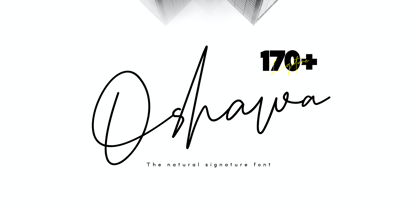 Oshawa is a signature font with a natural and professional style, ideal for creating handwritten style logos, wedding stationery, photographer watermark logos, modern websites, and more. Oshawa is equipped with 177 handwritten ligatures that add a natural angle.
 - Showcard - Unknown license

- Du by sugargliderz,
$20.00 Du is a self hommage to Uncertain Felttip. Uncertain, made in 2008, is a typeface which reproduced faithfully the style in which I am writing on copy paper, usually using the felt-tip pen. This time, I wrote the new family by the same method but using the tablet PC and the touch pen. Although, as for some characters, Uncertain differs in a form, it is the result of reflecting my hand writing. I wrote all the characters. If it is original, all the characters diverted and composed, for example, characters, such as Aacute and Agrave, are written. Different specification from Uncertain is family composition. Although Uncertain had only 3 weight, 7 weight were designed for Du. This way a user can choose his favorite weight because the variation of weights increased.
 - Zafran Arabic by Boharat Cairo,
$20.00 Zafran is an elegant industrial display typeface, full of curves and sharp angles, the typeface has an oblique feeling and unified spaces that create neat alignments.
 - Darbee Legend by OGJ Type Design,
$35.00A characteristic feature of the Darbee Legend is its boxy forms and the angled (unpainted) terminals. Regular to bold plus italic and a variable font (upright). - A Charming Font Outline - Unknown license

- Conifer by Ryan Keightley,
$15.00 Conifer is a blocky geometric sans serif font that adheres to strict grid rules in order to define its corner angles. Its seemingly rigid form is tempered by the soft, rounded corners, and fine notched details present at acute angles in the glyphs. Available in a clean solid and a varied, textured rough. The result is a rugged, retro, typeface that is at home in fashion lookbooks and wood-carved park signage alike.
 - Estrand by Firstype Studio,
$16.00 Hello, design enthusiasts! Allow me to present "Estrand" - a distinctive Display font with a penchant for sharp angles and bold character. Estrand features an edgy and angular design, characterized by rigid corners and a slightly condensed form that exudes a sense of precision and boldness. The font is crafted with sharp angles, giving it a unique and commanding presence. Its condensed nature ensures a sleek and modern aesthetic, making it an excellent choice for designs that demand a tinge of fierceness. Key Features: Sharp Angles and Bold Character: Estrand embraces a sharp design with well-defined angles, adding a touch of assertiveness to your typographic compositions. Slightly Condensed Form: The font's condensed structure contributes to a sleek and modern look, allowing for efficient use of space in various design applications. Distinctive and Commanding: With its firm personality, Estrand stands out as a font that commands attention and leaves a lasting impression. Versatility: Whether applied to branding, logos, or any design project, Estrand's unique characteristics make it adaptable to a wide range of creative endeavors. Estrand is your go-to font for designs that demand a sharp and distinctive edge. If you have any inquiries or require further information, feel free to reach out. Your feedback is highly appreciated. Thank you for considering "Estrand" for your design endeavors.
 - P22 Mercian by IHOF,
$24.95 P22 Mercian is a Roman font with distinctively angled stub serifs. Comparatively even in weight and color. Designed for continuous text setting.
 - Drone by Barnbrook Fonts,
$30.00 Drone is a deliberately misproportioned typeface, inspired by hand-drawn lettering found in Spanish/Hispanic Catholic churches in the Philippines and Los Angeles. These naive letterforms appeared to be ‘copies of copies’ – and in aiming to recreate the beauty of the Vatican and the Sistine Chapel they instead created something unique with its own charm and beauty. As a curious aside, the forms are reminiscent of those found in 16th century English calligraphy too. Drone is available in two styles: No.666 and No.90210.
 - Roskrift - Personal use only

- wood sticks - Unknown license


