10,000 search results
(0.035 seconds)
- Slightly Hollow - Unknown license

- Horizontes Script by Sudtipos,
$39.00 Horizontes Script is the result of Panco’s personal experimental calligraphy project. Designed with the goal of finding a balance between spontaneity, elegance and beauty, his first typography was born and inspired on the horizon´s blue line from the city he was born. Relaxed, energic and very natural. With different alternatives of proportion, a wide range of ligatures, initial letters, terminals, floritures, Horizontes Script comes in two weight for large and small formats. “Horizontes Script” results in an ideal font for titles and short texts that find something else to show more than just words. A casual and harmonious font with strong personality. Great for projects that need to connote class and style without being too formal. Ideal for design that need to transmit warmth and humanity feel to be applied on invitations, labels, poetry, songs or thoughts. Created by Panco Sassano, under the supervision of the experienced typographer Ale Paul – in a duo work - “Horizontes Script” is the latest typeface by Sudtipos.
 - Direct Mail by Partnrz,
$15.00 Direct mail designers rejoice! Finally, a font family made just for you. Created to be as in-your-face as possible: for use as a primary headline; for dates and phone numbers; and for coupon heads and price points. Tired of kerning numbers for your coupons and prices? Then you'll love this font! All of the kerning has been done for you. (No more spacey 1's!) Designed for a tight kern - just track it in on larger sizes. Instead of standard weights, this font was designed to fit different width needs. Have a long headline, but your client wants it in one line and tall? Use the extra-condensed. Need something really bold for a phone number or price point, but you don't have much height available? Use the fat. And there are two more widths for those in-betweens. And to top it off - you can get them all in an oblique as well.
 - Quirky by Scholtz Fonts,
$19.95 The idea for Quirky was born while I was looking at a book of etchings by British artist Graham Clarke. His signature, crawling spider-like across the page, fascinated me with its casual, almost messy, inky dark and light drama. I started scribbling the alphabet as I imagined he would write it, based on his signature, then continued, adding curls, making the characters more angular, and refining the dramatic play between dark and light. Finally, Quirky appeared. Apparently casual, Quirky is, in fact, a true connected script. Quirky is characteristic of contemporary handwriting: It appears loose, angular, unstructured, and free, while maintaining good form and legibility. Its baseline is varied, creating an impression of impatient handwriting, without losing legibility. Quirky comes in five styles: condensed -- the most dramatic form, with great drama between thick and thin condensed black -- as with condensed but allows the user to provide exceptional emphasis wide -- increased readability wide black -- increased readability and emphasis splat -- messy and ink-blotted -- a hint of grunge Use Quirky for advertising, for humorous greeting cards, for a funky fashion look or tongue-in-cheek spooky media. Quirky is a fully professional font with extensive use of OpenType Ligatures. For example: most common double letter combinations such as "ee" are rendered as two, slightly different shaped "e"s. This variation in letter shapes removes the cues by which the reader identifies that he is viewing a FONT and thus conveys a strong sense of hand-lettered text. Language support includes all European character sets and has been designed to be used with the following languages: Afrikaans, Albanian, Basque, Bemba, Cornish, Danish, Dutch, English, Estonian, Faroese, Filipino, Finnish, French, Galician, Ganda, German, Icelandic, Indonesian, Irish, Italian, Kinyarwanda, Luo, Malagasy, Malay, Manx, Morisyen, North Ndebele, Norwegian Bokmål, Norwegian Nynorsk, Nyankole, Oromo, Portuguese, Romansh, Sango, Shona, Somali, Spanish, Swahili, Swedish, Swiss German and Zulu.
 - Beta Dance - Unknown license

- Tertius by Scholtz Fonts,
$21.00 Tertius, with its high ascenders and clubbed serifs, is a modern interpretation of the classic Carolingian style (7th - 9th centuries AD). There was no capital form in the Carolinian hand and Roman square capitals were originally used with it. The Carolingian hand began, after a while, to develop more cursive tendencies as people looked for a way to speed up the writing process. I have “capitalized” on this trend and have devised an appropriate and dramatic set of flowing capitals for this family. With its elegant swashes and bold letter shapes, Tertius embodies the romance of medieval life, of knights, castles, and chivalry. Tertius comes in four styles:- -- Regular: with elegant, smoothly penned characters; -- Crenellated: written with a scratchy pen over rough parchment -- many drops of ink and blotches have been left on the parchment (“Crenellated” means battlements -- the rough protrusions on the top of castle walls); and -- Romantic: the capitals have been loosely overwritten generating a contemporary version of illuminated capitals. -- Illuminated: richly decorated illuminated capitals for use with Tertius Regular (28 characters) All fonts have been carefully crafted, letterspaced and kerned and contain full character sets of 237 characters.
 - ITC Napoleone Slab by ITC,
$29.99There is something straight-forward and no-nonsense about slab serifed typefaces. Calligraphic designs, on the other hand, evoke a sense of humanity and immediacy - even intimacy. ITC Napoleone Slab combines both slab serif and calligraphic design traits into a single typeface design. Heady stuff. The result is unlike almost any other slab serif typeface. According to designer Silvio Napoleone, “The concept developed from my explorations as a student in an independent lettering class. I sketched many historical letterforms by brush. I continued experimenting for several years after, sketching by hand and on the computer. Eventually, I chose the slab serif for production because of its distinctive design quality.” ITC Napoleone Slab is exceptionally versatile. The family is economical in width and contains true italic designs, oldstyle numbers and a suite of special ligatures. According to Silvio, “Napoleone Slab was designed to work well at all sizes, and in on-screen applications.” Silvio currently lives in Toronto, where he works for a “young, enthusiastic interactive firm.” His designs have been exhibited nationally and internationally, and his work was also part of a traveling exhibit for the American Institute of Graphic Arts. - Long Vacation by Din Studio,
$27.00 Do you want something prominent yet legible? This is Long Vacation, our new handwritten font, ideal for all of your design needs. Long Vacation is a visually interesting handwritten font showing a unique handwriting style giving the natural, lovely nuances on your designs. The flowing letters are interconnected and the scratches that connect the letters make the font look more natural. Details on each letter and curves on the edges show high contrasts. Due to its great legibility, you can apply this font to both big and small text sizes. Additionally, enjoy the features available here. Features: Stylistic Sets Multilingual Supports PUA Encoded Numerals and Punctuations Long Vacation fits best for various design projects, such as brandings, posters, banners, invitations, greeting cards, magazine covers, quotes, printed products, merchandise, logos, social media, etc. Find out more ways to use this font by taking a look at the font preview. Thanks for purchasing our fonts. Hopefully, you have a great time using our font. Feel free to contact us anytime for further information or when you have trouble with the font. Thanks a lot and happy designing.
 - FS Untitled Variable by Fontsmith,
$319.99Developer-friendly The studio has developed a wide array of weights for FS Untitled – 12 in all, in roman and italic – with the intention of meeting every on-screen need. All recognisably part of a family, each weight brings a different edge or personality to headline or body copy. There’s more. Type on screen has a tendency to fill in or blow so for each weight, there’s the choice of two marginally different versions, allowing designers and developers to go up or down a touch in weight. They’re free to use the font at any size on any background colour without fear of causing optical obstacles. And to make life even easier for developers, the 12 weight pairs have each been designated with a number from 100 (Thin) to 750 (Bold), corresponding to the system used to denote font weight in CSS code. Selecting a weight is always light work. Easy on the pixels ‘It’s a digital-first world,’ says Jason Smith, ‘and I wanted to make something that was really functional for digital brands’. FS Untitled was made for modern screens. Its shapes and proportions, x-height and cap height were modelled around the pixel grids of even low-resolution displays. So there are no angles in the A, V and W, just gently curving strokes that fit, not fight, with the pixels, and reduce the dependency on font hinting. Forms are simplified and modular – there are no spurs on the r or d, for example – and the space between the dot of the i and its stem is larger than usual. The result is a clearer, more legible typeface – functional but with bags of character. Screen beginnings FS Untitled got its start on the box. Its roots lie in Fontsmith’s creation of the typeface for Channel 4’s rebrand in 2005: the classic, quirky, edgy C4 headline font, with its rounded square shapes (inspired by the classic cartoon TV shape of a squidgy rectangle), and a toned-down version for use in text, captions and content graphics. The studio has built on the characteristics that made the original face so pixel-friendly: its blend of almost-flat horizontals and verticals with just enough openness and curve at the corners to keep the font looking friendly. The curves of the o, c and e are classic Fontsmith – typical of the dedication its designers puts into sculpting letterforms. Look out for… FS Untitled wouldn’t be a Fontsmith typeface if it didn’t have its quirks, some warranted, some wanton. There’s the rounded junction at the base of the E, for example, and the strong, solid contours of the punctuation marks and numerals. Notice, too, the distinctive, open shape of the A, V, W, X and Y, created by strokes that start off straight before curving into their diagonal path. Some would call the look bow-legged; we’d call it big-hearted. - FS Untitled by Fontsmith,
$80.00 Developer-friendly The studio has developed a wide array of weights for FS Untitled – 12 in all, in roman and italic – with the intention of meeting every on-screen need. All recognisably part of a family, each weight brings a different edge or personality to headline or body copy. There’s more. Type on screen has a tendency to fill in or blow so for each weight, there’s the choice of two marginally different versions, allowing designers and developers to go up or down a touch in weight. They’re free to use the font at any size on any background colour without fear of causing optical obstacles. And to make life even easier for developers, the 12 weight pairs have each been designated with a number from 100 (Thin) to 750 (Bold), corresponding to the system used to denote font weight in CSS code. Selecting a weight is always light work. Easy on the pixels ‘It’s a digital-first world,’ says Jason Smith, ‘and I wanted to make something that was really functional for digital brands’. FS Untitled was made for modern screens. Its shapes and proportions, x-height and cap height were modelled around the pixel grids of even low-resolution displays. So there are no angles in the A, V and W, just gently curving strokes that fit, not fight, with the pixels, and reduce the dependency on font hinting. Forms are simplified and modular – there are no spurs on the r or d, for example – and the space between the dot of the i and its stem is larger than usual. The result is a clearer, more legible typeface – functional but with bags of character. Screen beginnings FS Untitled got its start on the box. Its roots lie in Fontsmith’s creation of the typeface for Channel 4’s rebrand in 2005: the classic, quirky, edgy C4 headline font, with its rounded square shapes (inspired by the classic cartoon TV shape of a squidgy rectangle), and a toned-down version for use in text, captions and content graphics. The studio has built on the characteristics that made the original face so pixel-friendly: its blend of almost-flat horizontals and verticals with just enough openness and curve at the corners to keep the font looking friendly. The curves of the o, c and e are classic Fontsmith – typical of the dedication its designers puts into sculpting letterforms. Look out for… FS Untitled wouldn’t be a Fontsmith typeface if it didn’t have its quirks, some warranted, some wanton. There’s the rounded junction at the base of the E, for example, and the strong, solid contours of the punctuation marks and numerals. Notice, too, the distinctive, open shape of the A, V, W, X and Y, created by strokes that start off straight before curving into their diagonal path. Some would call the look bow-legged; we’d call it big-hearted.
 - Centennial Script by Canada Type,
$24.95 Centennial Script was designed and cut by Hermann Ihlenburg in 1876 (the centennial of American independence, hence the typeface's name) for the MacKellar, Smiths & Jordan foundry in Philadelphia. Ihlenburg was then only 33 years old, and these beautiful forms put him on his way to become the most prolific and innovative deco, ornamental and script typeface designer and punch cutter of the nineteenth century. In trying to be a true homage to the history of the new world, Centennial Script transcends its then-contemporary deco fashion to embrace script elements historically similar to lettering found on maps or political documents of the 18th century. Letters like the p and s extend themselves high and mighty to accentuate words and lines of text in a fancy hand-drawn manner. The dots on the i and j are those of a careful scribe who acknowledges the importance of the document being lettered. The lowercase letters connect with two slight angular motions of the hand, also very carefully and elegantly. Even the ligatures and ending swashes Ihlenburg made for this face were reminiscent of a mapmaker's patient hand, though Ihlenburg's elegant touch in them cannot be mistaken. Although Centennial Script was one of the few Ihlenburg faces to make it to film type technology, the transition was neither credited nor faultless. The film type version was a bit sloppy in the way the connectors were made, so the lowercase needed a lot of manual work to typeset properly. To alleviate such waste of time for the user of this digital version, the connectors were redrawn according to the original metal ones made by Ihlenburg himself, and tested thoroughly in print to ensure the quality of the typeface's flowing cursive nature. This wasn't an easy task, and very time-consuming, since the changing angles on both ends of the connection made it impossible to escape from having to build every lowercase letter with both left and right connectors that would fit with the rest of the letters. This is one typeface that couldn't be revived in any other manner than the way it was originally made, regardless of more than 130 years of technological advances since the face was designed. Centennial Script comes in all popular font formats, and supports most Latin-based languages. Also included is an Alts fonts that contains alternates, ligatures, snap-on swash endings, some ornaments, as well as a complete set of the lowercase without left side connectors, for a more natural combination when following a majuscule, or just in case the user finds it fit to set the copy in a non-connecting script instead of the face's original connected flow. Centennial Script Pro, the OpenType version, combines the main font with the Alts font in a feature-packed single font. Use the ligature feature to set wordmarks like Mr, Ms, Mrs, Dr, and &Co, the stylistic alternates feature to replace some letters with their alternative forms, the contextual alternates feature for better uppercase-lowercase sequences, and the titling feature to set your text in a disconnected script. Centennial Script is the only script we currently know of that can be set connected or disconnected simultaneously, either using the titling feature in the OpenType Pro version, or manually in the other formats.
 - Rogue Serif by Device,
$29.00 Recently the Rogue family was designed as an accompaniment to Paralucent for Loaded, London's notorious lads-mag that had found its design being cloned by the competition and sought something unique to set it apart.
 - Sandikza by Falling Angel,
$- Sandikza started out as an idea for a metal titles and some games. Or anything that was printed distorted. In other word something harsh. It makes a death or dirt feeling anywhere it is used.
 - Cutie Kitty by HansCo,
$15.00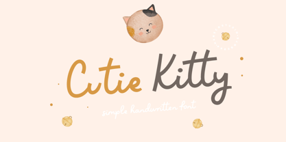 Cutie Kitty Font is a simple, modern and natural handwritten font. This font is perfect for creating logo, watermark, branding, wedding invitation, quote, tagline, or anything else. Let's make something beautiful project with this. Enjoy!
 - Tacky Song by Bogstav,
$17.00 To be honest - there is nothing tacky about this font! The font has its origins in both comic and graffiti, but can be used in a great variety where something handmade/comic/unusual is needed!
 - TT Geekette by TypeTrends,
$27.00 TT Geekette is an experimental variable* serif with friendly and flexible character of shapes. In this project, we wanted to get away from simplifications and dry geometry and to experiment with the smoothness, softness and plasticity of forms. And in order to make the project a little more stylish and serious, we decided to make the font monospaced. When creating TT Geekette, we did not rely on traditional writing techniques or on the influence of pen movement on the font pattern. Despite the fact that judging by certain characters TT Geekette is a serif, the font is specifically “built” and “drawn”. There are several systemic techniques in font design, such as “loops” which set the plastic rhythm for the entire typeface. Variability in TT Geekette is influenced by contrast buildup in the font—moving the slider to adjust the variability axis, you gradually move from a completely non-contrast monolinear serif font to a font with a pronounced reverse contrast. In addition, with the help of the variability slider, you can remove serifs from the monolinear essence of the font. The TT Geekette family consists of 3 styles: the TT Geekette Bones—monolinear font, the TT Geekette Muscles—reverse contrast serif, and the TT Geekette Variable font. Each style contains over 450 glyphs. And yes, technically the typeface can be used in programming, at least you are guaranteed to get your share of bright emotions. *An important clarification regarding variable fonts. At the moment, not all graphic editors, programs and browsers support variable fonts. You can check the status of support for the variability of your software here: v-fonts.com/support/
 - Garelina by Riasyletter_Studio,
$19.00 Looking for a minimalist and luxurious serif font for logos, web design, clothing promotions, brochures, and more? Garelina is the answer. This font has thin and smooth lines that make it look elegant and luxurious. Garelina is perfect for branding and promotion purposes. With its delicate typography, this font can add aesthetic value to your design. Garelina also has several letter variants making it easy to use for various design types. With Garelina, you can create minimalist designs that still look luxurious and elegant. This font is perfect for companies that want to display a professional and stylish image. Do not hesitate to try Garelina on your design now. You will be surprised how easy it is to make elegant and luxurious designs with this serif font. Garelina, the elegant and luxurious serif font for your branding needs. What's Included : - Garelina OTF - More than 250 of glyphs (include Uppercase, Lowercase, Numerals & Punctuations,Ligatures and Stylistic) - Multilingual support - Works on PC & Mac - Simple installations - Accessible in the Adobe Illustrator, Adobe Photoshop, Adobe InDesign, even work on Microsoft Word. - PUA Encoded Characters (fully accessible without additional design software) Support For Language : Albanian, Basque, Breton, Chamorro, Danish, Dutch, English, Finnish, French, Frisian, Galician, German, Italian, Malagasy, Norwegian, Portuguese, Spanish, Alsatian, Aragonese, Arapaho, Arrernte, Asturian, Aymara, Bislama, Cebuano, Corsican, Fijian, French_creole, Genoese, Gilbertese, Greenlandic, Haitian_creole, Hiligaynon, Hmong, Hopi, Ibanag, Iloko_ilokano, Indonesian, Interglossa_glosa, Interlingua, Irish_gaelic, Jerriais, Lojban, Lombard, Luxembourgeois, Manx, Mohawk, Norfolk_pitcairnese, Occitan, Oromo, Pangasinan, Papiamento, Piedmontese, Potawatomi, Rhaeto-romance, Romansh, Rotokas, Sami_lule, Samoan, Sardinian, Scots_gaelic, Seychelles_creole, Shona, Sicilian, Somali, Southern_ndebele, Swahili, Swati_swazi, Tagalog_filipino_pilipino, Tetum, Tok_pisin, Uyghur_latinized, Volapuk, Walloon, Warlpiri, Xhosa, Yapese, Zulu, Latinbasic, Ubasic, Demo
 - FS Rome by Fontsmith,
$50.00 Trajan The original template for this one-weight, all-caps font was the inscription on Trajan’s Column, carved in AD 113 to celebrate the emperor Trajan’s victory in the Dacian Wars. College student Jason Smith copied the stone lettering from the cast on display in London’s Victoria & Albert Museum. In Roman times, the signmaker would paint letters onto stone with a wide brush for the stone mason to chisel out later. The signwriter would end each stroke with a flick of his brush, which the mason would also carve into the stone. Ecce (as they would have said in Rome): the serif was born. Hand-crafted “I first drew this typeface when I was 17,” says Jason. “I drew it with a very sharp 9H pencil on polydraw film. “Then, using a Rotring pen, I inked the letters in and scraped back the serifs so they were perfectly sharp. These letters were then reduced on a PMT camera. I’d designed my first typeface, although it wasn’t digitised till much later.” Digitised Years after Jason had drawn the original typeface, its transfer into digital form made further refinements necessary. The serifs and weights needed thickening slightly, creating a crisp, new version whose delicate elegance is best appreciated in larger sizes. A classically-inspired font, timeless and perfectly-proportioned, to reflect the refinement of premium brands.
 - P22 Marcel by P22 Type Foundry,
$24.95 The font Marcel is named in honor of Marcel Heuzé, a Frenchman who was conscripted into labor during World War II. During the months Marcel was in Germany, he wrote letters to his beloved wife and daughters back home in rural France. Marcel’s letters contain rare first-person testimony of day-to-day survival within a labor camp, along with the most beautiful expressions of love imaginable. The letters — stained and scarred with censor marks — were the original source documents used by designer Carolyn Porter to create a script font that retains the expressive character of Marcel Heuzé’s original handwriting. The result of years of research and design work, P22 Marcel Script features more than 1300 glyphs. The font is a highly readable running script that includes textural details that capture the look of ink on paper. The font Marcel Caps is a hand-lettered titling face intended as a companion to the Script. Marcel EuroPost One and Two each feature more than 200 postmarks, cancellation and censor marks, and other embellishments found on historical letters and documents.
 - Ocean Beach by LLW Studio,
$22.00 Ocean Beach is a fun, retro, all-caps Nautical Art Deco headline font. It sports geometric letterforms, perfect circles and highly stylized crossbars with waves on several letters—think the beach, flags rippling in the breeze and Fred and Ginger tap-dancing merrily on the deck of a ship! The inspiration for this font are the many whimsical nautical-themed buildings still to be found dotting the landscapes of America, from South Beach in Miami to hidden gems tucked away in industrial areas of southern California. I was fascinated by some of them when I was growing up, and in doing research on Art Deco styles I found many images of these wonderful buildings sporting portholes, streamlined moderne details and even faux rivets. Ocean Beach is created with a 3-stroke detail, and the complexity of the design will be appreciated better in larger sizes of type (36 pts or larger). Use this font for any application that needs a bold, decorative or Art Deco look; great for signage, magazine layout, illustration, posters and packaging.
 - Ranelte Deco by insigne,
$5.00 With the original Ranelte, Insigne Design pays tribute to the strong, simple forms of the long-lasting DIN series. Now, Ranelte Deco, a new variant on the classic-inspired font, makes a more specific statement with some unique styles that are clearly contemporary. It’s the type of face that you’ll find adds great value to your high-tech and bleeding edge design uses. Ranelte Deco is designed for title use and posters. Since it’s an experimental display font, there are no OpenType features, but the typeface fully covers Latin-based languages. Remember, even a timeless classic can be reshaped to something beautiful. See how the new style of Ranelte Deco can make your next masterpiece.
 - WildForest by Enfeeltype,
$15.00 This font was born out of love with nature, designed to preserve and instill an even greater appreciation for our world. WildForest is a modern typeface born from the wild. This font was born out of love with this nature, and its intention is to capture the spark of something beautiful, yet wild and full of life. This font was designed with a careful eye on the details and has accents that recall the spirit of nature, made in a style that will be loved by both professionals and amateurs. Made with care and precision, WildForest appeals to both professional designers and amateur designers alike. Worthy of any article or design, WildForest embodies a typeface that is truly unique.
 - Ginza Display Inline by Positype,
$22.00Sometimes you get an idea stuck in your head and the only way to get rid of that demon is to put something down on paper. A year later the doodles became a skeleton, and then the skeleton had a body, then the body had a name, then the name got a personality. What was left was a clean set of ten fonts that encompass a very simple skeleton with a lot of visual appeal. During the process, I saw ways to expand the typeface's display capabilities by producing inline styles as well as a down-and-dirty rough set. Each font has a full set of glyphs that include Central European and Small Cap characters. - Barcore by Barkar Designs,
$12.00 This font was designed to create unique typography in graphic design. It consists of one style and only capital letters. It is deliberately complicated by the addition of styles and lines that are not traditional for the latin or cyrillic alphabet, which adds zest, makes you look closely. The uniqueness of this font also lies in the fact that it is made in a geometric style using only square angles or perfect rounding in glyphs. This font will add futurism to your project, the unusual font always looks stylish and memorable. I am sure that the font will come in handy for those who want to add something new, modern and unique to their work.
 - Aceituna by Hanoded,
$15.00 Aceituna means ‘olive’ in Spanish. It comes from the Arabic Al-Zeitoun. I am multi-tasking today: finishing this font and thinking about what to cook for my family tonight (yes, I am the one who cooks!). We normally eat Asian food, but I was toying with the idea of serving something Mediterranean and realised we had run out of olives. So there you have it: the super simple trick of naming a new font! But enough of cooking: Aceituna font was made with a Japanese brush pen. It is a very versatile font: tall and thin, elegant and a little messy. A hint of texture and, like olives, it goes with almost anything.
 - Ginza by Positype,
$22.00Sometimes you get an idea stuck in your head and the only way to get rid of that demon is to put something down on paper. A year later the doodles became a skeleton, and then the skeleton had a body, then the body had a name, then the name got a personality. What was left was a clean set of ten fonts that encompass a very simple skeleton with a lot of visual appeal. During the process, I saw ways to expand the typeface’s display capabilities by producing inline styles as well as a down-and-dirty rough set. Each font has a full set of glyphs that include Central European and Small Cap characters. - Caniste by Ilham Herry,
$20.00 The vintage typeface returns with the Caniste typeface family. My passion for something with a vintage aesthetic is one reason I created Caniste. Inspired by antique ephemera such as cigar box labels that were common in the 19th century, it harkens back to the beauty of typographic design at that time. The Caniste font family is an all-caps serif font with uppercase titling. It comes in 6 weights: Extra Light, Light, Regular, Semibold, Bold, and Ultra Bold. It also has very user-friendly Extras, such as scrolls, ornaments, and panels, and allows you to create beautiful ornamentation to suit your needs. I hope you enjoy using the Caniste fonts. Thank you!
 - ALS Klementina by Art. Lebedev Studio,
$63.00 Klementina is a cursive typeface based on brush pen handwriting. It has flowing feminine shapes and letters drawn with care and love, much like you find in a romantic young lady's album. All characters settle into a line with ease, partially thanks to a number of ligatures and contextual alternates that help you avoid unpleasant combinations. This type is ideal to set something personal and touching. It will have this effect regardless of the presence of any sense in the text. Due to the attention paid to fine details it looks great even in big sizes. Klementina will come as a helping muse to any designer working with wedding invitations, announcements, gift and delicatessen packaging, or magazine layouts.
 - Angilena by Mantype Studio,
$14.00 Angilena is an elegant, unique font that uses ligatures to smoothly link letters. Perfect for adding a unique twist to word-mark logos, monograms or pull quotes. Angilena has 51 ligatures as well as numbers and punctuation making it super versatile. Ligatures are able to be turned off if needed for body copy. To make it look more unique, here we prepared some ligatures:ca cb ch ck cm cn cp cr ea eb eh ek em en ep er ib id ih ik il iga ig ga gi mg ng ob oh ok om on op or oo tb th tk tm tn tp tt ti tu ro vo wo yo vi wi yi
 - ATF Brush by ATF Collection,
$59.00 Oh, Brush … beloved script emblem of plumbers, mechanics, bodegas, lunch counters, and other low-rent concerns. Since 1942, you have given faceless apartment buildings a name, brought life to the badges and banners of otherwise tedious trade conventions, and lent excitement to the postcards of middle America’s unsung travel destinations. We have seen so much of you … but not enough! We need more weights: how about five, extending beyond humdrum Medium? We want swash alternates, too, plus lively ligatures and sporty underline tails! Give us cleaner curves and smoother connections, but stay true to your frisky self! Like a nail salon that offers cucumber water, the new ATF Brush is one step classier than the rest.
 - Pill Gothic by Betatype,
$40.00 Pill Gothic walks the tightrope between a heads down, hard working, utilitarian sans and something that stands out, saying, "Look at me!" Designers looking for a type that will work in blocks of text for callouts, captions and headlines will find that unique balance with Pill. Pill Gothic asks the question: what is the effect of a few truly unique characters on the meaning of a type? In particular, the 'a' and the 'g', while relating strongly to the forms of the other characters, stand out from the traditional milieu of sans serif types. The name Pill Gothic came from early studies of the condensed weight where the lower case characters had the shape of a pill capsule.
 - Risolla Calisto by HansCo,
$12.00 Risolla Calisto is an elegant handwritten font with a little bold style also stay look clean and modern. This font carries a slightly masculine feel while still working on a background with a feminine theme. This font come with many ligature style that give you a sleek, elegant look for your logos, business card, wedding invitations, quotes, advertisements, and more. Highly recommended to use it in OpenType capable software - there are plenty out there nowadays as technology catches up with design. The OpenType features can be accessed by using programs such as Adobe Illustrator, Adobe InDesign, Adobe Photoshop Corel Draw X version, Afinity and more. Let's create something beautiful today with Golden Stanbury. Enjoy!
 - Ginza Display Rough by Positype,
$22.00Sometimes you get an idea stuck in your head and the only way to get rid of that demon is to put something down on paper. A year later the doodles became a skeleton, and then the skeleton had a body, then the body had a name, then the name got a personality. What was left was a clean set of ten fonts that encompass a very simple skeleton with a lot of visual appeal. During the process, I saw ways to expand the typeface's display capabilities by producing inline styles as well as a down-and-dirty rough set. Each font has a full set of glyphs that include Central European and Small Cap characters. - Fortuita by Typographias,
$28.00 Fortuita is a versatile sans fit for text or display. The name carries some of its history as it was born from logo sketches that fortuitously grew into a type family over eight years. It comes with a tall x-height, rendering it readable at smaller sizes. It has sixteen weights, eight regular ones, and their italics, each with small caps, something you may not see very often with sans serifs. It counts with old-style numbers that can switch to its lining, small caps, or tabular versions through open-type features. The family carries a distinct personality in its design that will lend itself to its subject, all the while without becoming distracting or detracting from it.
 - Burlesk by Kustomtype,
$25.00 Burlesk is a modern font family that originated from a Bollywood Hindi movie poster from the 1950's. Using 9 letters, a complete alphabet was made comprising of 360 characters. Everything is hand drawn and digitized afterwards. The Burlesk font family meets all the modern requirements that apply in the graphics sector. Don't take it too seriously with the designs and go for something else. You will probably enjoy it as much as those who see it. The Burlesk Font family is available in 2 styles - making it very popular as a great design on posters, flyers, magazines, packaging and all your other imaginative designs! You want the best deal for the best price? Grab the whole package!
 - Gimbel Script by Stiggy & Sands,
$39.00 Monolinear Vintage Elegance The Gimbel Script typeface was inspired by a monoline, semi-connected script from a 1930's holiday greeting card. From its ascenders and descenders that stretch high and low to its gentle curviness Gimbel Script exudes the elegance of a bygone era while standing on a thin line between formal and casual lettering styles. See the 5th graphic for a comprehensive character map preview. Gimbel Script Opentype features include: - Swash Alternates for an alternate M and N. - Stylistic Alternates & SS01-SS06 Stylesets for 151 varying forms. - 219 Ligatures for a smoother typesetting experience, along with 181 initial, middle and final forms. - Full set of Inferiors and Superiors for Limitless Fractions. - Proportional, Tabular and Oldstyle figure sets.
 - New Comer Sans by ave,
$12.00 New Comer Sans is a combination of two ideas. First is my speed writing with flat acrylic marker on boards. And second is to make new bold font something like puffy «comic sans» font. Unstable stems (vertical main lines) give it some playful unserious character. The result is cute funny font. You can use it in short text blocks in huge and medium sizes. For example, for comic books or kids applications. NewComerSans includes: uppercase lowercase more than 480 glyphs which support Latin, Western European, Central European languages (Cyrillic is also included) Hope you are enjoying using New Comer Sans. Please do not hesitate to ask me any questions about the product. (c) Photo credit - Unsplash
 - Mellnik Text by ParaType,
$25.00Mellnik is a sans serif of humanist style (in a way) that was developed by Oleg Karpinsky and released by ParaType in 2006. The type family contains 9 styles with a number of alternate characters in each ones. For use as a text font in long text passages of advertising booklets, catalogues or magazines, as well as for accident setting. Mellnik may be also applied as a corporate typeface. Giant ink traps (or something like that) produce an original image of the family. Five condensed styles were added in 2007 by the same designer. Mellnik Text in 12 styles (added in 2008) has more narrow proportions and it is rather appropriate for text setting. - Naishila by FadeLine Studio,
$10.00 Introducing Naishila. This new font family includes a caps and script. Naishila is a lovely and sweet font duo with a dancing baseline. You will receive the regular font (not dancing) while the script comes with stylistic sets and ligatures. Like my other fonts, Naishila is made to meet the growing market of design today. This font is suitable for use in design styles such as watercolor, minimalist, flat, modern design, etc. With this font duo, you can very easily combine. Surely you can make something perfect for your design. Naishila will look gorgeous on cards, mugs, quotes, posters, shopping bags, logo's, t-shirts, branding, book covers, birthday invitations, greeting cards, and all your other lovely projects.
 - Bakery Script by Sudtipos,
$49.00 Bakery Script is the Argentine duo's nod to the high spirits of the 1970s. Angel Koziupa used his ever popular wild brush to draw the outline version, and Alejandro Paul refined it, expanded it, then extrapolated the solid version. While the outline version makes the letters seem like they're growing out of each other's shadows, the solid version presents a wilder version of the casual dancing letters Koziupa's brush has entertained us with during recent years. Sharp in places, perfectly curved in others, and with many letter alternates and ligatures included within the fonts, Bakery Script would be at home in packaging design, outdoors and adventure literature, and everywhere a display design needs that sharp but friendly touch to reach its goal.

