10,000 search results
(0.028 seconds)
- Canterbury Sans by Red Rooster Collection,
$45.00 Based on the Morris F. Benton for ATF in 1920, it was not completed for production until 1926. The serif version we released a few years ago was so popular, that we decided to design a complementary sans serif version in three weights, along with three corresponding Swash fonts.
 - Atrament by profonts,
$41.99 Another beautiful script design by German type designer Ralph M. Unger. Atramant is casual and easy, ideal for any setting in larger sizes. Still, due to its excellent legibility, it can also be used for short text blocks in smaller sizes. Atrament was originally designed for the URW++ FontForum.
 - Lorenzo by Canada Type,
$24.95 The lifetime of Lorenzo de Medici (1449-1492) coincides with the rise of metal type as it displaced broad pen calligraphy for the production of books. This revolution marked the end of formal Western calligraphy, as the industry employed metalworkers who designed type according to geometric measurement while calligraphers were forced to become secretaries who practiced handwriting systems. Renaissance Florence should have witnessed the marriage of calligraphy and typography, just as all the other arts and sciences flourished as classical learning was applied to technical advances; but the metalworkers and geometricians measured, dissected and recast the calligraphic letters by crude indirect methods, and in the end took all the life out of them. Here they languished until digital type has made it possible to render the precise motion of the broad pen stroke into type. Lorenzo is a confluence of many strains from the Middle Ages, brought together within the classical harmony of the capitals. It attempts to bypass metal type, using calligraphic means to achieve the precision of type while retaining the life of the stroke: a classical font that would be familiar to Lorenzo himself as well as to the modern eye. The Lorenzo family comes in four weights, ranging from light to bold. Two sets of italics, one with swashed caps and ascenders, complement each weight. The family boasts extensive language support and an offering of over fifty calligraphic ornaments/flourishes included within the character set.
 - Salad by Zetafonts,
$39.00 The island of Fuerteventura is more known for its white sand beaches and windsurf-friendly constant winds than for its typographic marvels. Still, it's on the walls of a ballroom next to its white-sand beaches that Debora Manetti found the hand-painted letterforms that she took as inspiration for her typeface Sala de Fiestas. The resulting font was a condensed sans serif full of curious details and a jumpy latino vibe that many years after still keeps its freshness and vernacular charme. Francesco Canovaro took the original typeface as a starting point for a grand tour into sign-painter aesthetics, developing a reboot of the original into a new type family: Salad. While being faithful to the original proportions and feeling, Salad provides extreme versatility through its five-weights range, its extended charset and its set of Open Type features including stylistic sets, alternates, positional numerals, small capitals and case sensitive forms. While the roman family with its italic counterpart provide a good workhorse tool for informal branding, packaging and editorial projects, the interlocking and the inline weights add additional possibilities for display purposes. This is enriched by the inclusion in the typeface of a set hand-drawn decorative dingbats that further complement the sign painting vibe of the family. All Zetafonts expertise in handmade lettering, typographic design and water sports has been put to test to assure Salad is the best typographical alternative to a a trip to Canary Islands!
 - Super Retro by RagamKata,
$14.00 Super Retro is a font that offers a classic groovy retro style with a unique hand-drawn sketch touch. It draws inspiration from the retro era, filled with vibrant colors and a sense of fun. Each uppercase letter has its own distinctiveness compared to the lowercase letters, providing an interesting visual variation. Super Retro features chubby and rounded letterforms, creating an impression that embodies cheerful and joyful characters. Each capital letter is written with winding and wavy lines, adding an artistic effect reminiscent of trendy hand-drawn art. The font showcases a style inspired by the energetic music scene of the retro era, characterized by freedom of expression. The letters appear to sway and move dynamically, as if they are dancing on stage. Rough lines and details add an authentic touch, capturing a strong vintage aura. Super Retro highlights each letter with its unique qualities and characteristics. Every uppercase letter has a special touch that sets it apart from the lowercase letters. Some letters may have extra extensions at the top or bottom, providing distinctive decorative elements. There are also letters written in a more eccentric style, with slightly elongated or condensed proportions, creating intriguing and refreshing differences. This font is ideal for designing posters, logos, titles, and various designs that require a strong retro impression. With its ability to adapt to different letter characteristics, Super Retro offers limitless variations in your design creativity.
 - Iso - Personal use only

- Vintage Rotter by Din Studio,
$29.00 Vintage Rotter is monoline script font. Made for any professional project branding. It is the best for branding, printing, wedding and quotes. Every letter has a unique and beautiful touch. Features: Alternates Standar Ligature PUA Encoded Multilingual Support Numerals and Punctuation Thank you for downloading premium fonts from Din Studio
 - White Pigeon by Din Studio,
$29.00 White Pigeon is a modern handwritten font. It brings a beautiful and attractive typeface. Made for any professional project branding. It is the best for logos, branding, wedding and quotes. Features: Stylistic Set Standard Ligatures Multilingual Support PUA Encoded Numerals and Punctuation Thank you for downloading premium fonts from Din Studio
 - Mireille by TypeThis!Studio,
$54.00Mireille is a typographic homage to french culture. Your journey through gourmet food, classical music, opera and wine tours over 100 romantic alternates and ligatures that allow you to add outstanding elegance to your typography. Take care: you might have a crush on this typeface – La vie, c’est beau! www.typethis.studio - Netraly by Din Studio,
$29.00 Netraly is a modern sans serif font. Made for any professional project branding. It is the best for printing, branding and quotes. Every letter has a unique and beautiful touch. Includes: Netraly (OTF) Features: PUA Encoded Multilingual Support Numerals and Punctuation Thank you for downloading premium fonts from Din Studio
 - Gamerock by Din Studio,
$29.00 Gamerock is a classic sport font. Made for any professional project especially that related to the sports. Beside that, this font can be used for printing, branding and quotes. Includes: Gamerock (OTF) Features: Alternates PUA Encoded Multilingual Support Numerals and Punctuation Thank you for downloading premium fonts from Din Studio
 - Ayalena by Din Studio,
$29.00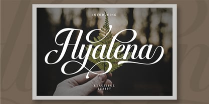 Ayalena is a modern calligraphy font. It brings a beautiful and attractive typeface. Made for any professional project branding. It is the best for logos, branding, wedding and quotes. Features: Stylistic Set Beautiful Ligatures Multilingual Support PUA Encoded Numerals and Punctuation Thank you for downloading premium fonts from Din Studio
 - Garetha by Din Studio,
$29.00 Garetha is modern sans serif font. Made for any professional project branding. It is the best for branding, printing, wedding and quotes. Every letter has a unique and beautiful touch. Features: Swashes Stylistic Sets PUA Encoded Multilingual Support Numerals and Punctuation Thank you for downloading premium fonts from Din Studio
 - Soage by Din Studio,
$29.00 Soage is modern sans serif font. Made for any professional project branding. It is the best for branding, printing, wedding and quotes. Every letter has a unique and beautiful touch. Features: Alternates Stylistic Set PUA Encoded Multilingual Support Numerals and Punctuation Thank you for downloading premium fonts from Din Studio
 - Finest Butter by Din Studio,
$29.00 Finest Butter is a modern script font. Made for any professional project branding. It is the best for logos, branding and of quotes. Every letter has a unique and beautiful touch. Features: Beautiful Ligatures Multilingual Support PUA Encoded Numerals and Punctuation Thank you for downloading premium fonts from Din Studio
 - Vianova Serif Pro by Elsner+Flake,
$59.00 The font superfamily Vianova contains each 12 weights of Sans and Slab and 8 weights of the Serif style. The design from Jürgen Adolph dates back into the 1990s, when he studied Communication Design with Werner Schneider as a professor at the Fachhochschule Stuttgart. Adolph started his carrier 1995 at Michael Conrad & Leo Burnett. He was responsible for trade marks as Adidas, BMW, Germanwings and Merz. He has been honored as a member of the Art Directors Club (ADC) with more than 100 awards. On February 26, 2014, Jürgen Adolph wrote the following: “I was already interested in typography, even when I could not yet read. Letterforms, for instance, above storefronts downtown, had an irresistible appeal for me. Therefore, it is probably not a coincidence that, after finishing high school, I began an apprenticeship with a provider of signage and neon-advertising in Saarbrücken, and – in the late 1980s – I placed highest in my field in my state. When I continued my studies in communications design in Wiesbaden, I was introduced to the highest standards in calligraphy and type design. “Typography begins with writing” my revered teacher, Professor Werner Schneider, taught me. Indefatigably, he supported me during the development of my typeface “Vianova” – which began as part of a studies program – and accompanied me on my journey even when its more austere letterforms did not necessarily conform to his own aesthetic ideals. The completely analogue development of the types – designed entirely with ink and opaque white on cardboard – covered several academic semesters. In order to find its appropriate form, writing with a flat nib was used. Once, when I showed some intermediate designs to Günter Gerhard Lange, who occasionally honored our school with a visit, he commented in his own inimitable manner: “Not bad what you are doing there. But if you want to make a living with this, you might as well order your coffin now.” At that time, I was concentrating mainly on the serif version. But things reached a different level of complexity when, during a meeting with Günther Flake which had been arranged by Professor Schneider, he suggested that I enlarge the offering with a sans and slab version of the typeface. So – a few more months went by, but at the same time, Elsner+Flake already began with the digitilization process. In order to avoid the fate predicted by Günter Gerhard Lange, I went into “servitude” in the advertising industry (Michael Conrad & Leo Burnett) and design field (Rempen& Partner, SchömanCorporate, Claus Koch) and worked for several years as the Creative Director at KW43 in Düsseldorf concerned with corporate design development and expansion (among others for A. Lange & Söhne, Deichmann, Germanwings, Langenscheidt, Montblanc.”
 - Vianova Slab Pro by Elsner+Flake,
$59.00 The font superfamily Vianova contains each 12 weights of Sans and Slab and 8 weights of the Serif style. The design from Jürgen Adolph dates back into the 1990s, when he studied Communication Design with Werner Schneider as a professor at the Fachhochschule Stuttgart. Adolph started his carrier 1995 at Michael Conrad & Leo Burnett. He was responsible for trade marks as Adidas, BMW, Germanwings and Merz. He has been honored as a member of the Art Directors Club (ADC) with more than 100 awards. On February 26, 2014, Jürgen Adolph wrote the following: “I was already interested in typography, even when I could not yet read. Letterforms, for instance, above storefronts downtown, had an irresistible appeal for me. Therefore, it is probably not a coincidence that, after finishing high school, I began an apprenticeship with a provider of signage and neon-advertising in Saarbrücken, and – in the late 1980s – I placed highest in my field in my state. When I continued my studies in communications design in Wiesbaden, I was introduced to the highest standards in calligraphy and type design. “Typography begins with writing” my revered teacher, Professor Werner Schneider, taught me. Indefatigably, he supported me during the development of my typeface “Vianova” – which began as part of a studies program – and accompanied me on my journey even when its more austere letterforms did not necessarily conform to his own aesthetic ideals. The completely analogue development of the types – designed entirely with ink and opaque white on cardboard – covered several academic semesters. In order to find its appropriate form, writing with a flat nib was used. Once, when I showed some intermediate designs to Günter Gerhard Lange, who occasionally honored our school with a visit, he commented in his own inimitable manner: “Not bad what you are doing there. But if you want to make a living with this, you might as well order your coffin now.” At that time, I was concentrating mainly on the serif version. But things reached a different level of complexity when, during a meeting with Günther Flake which had been arranged by Professor Schneider, he suggested that I enlarge the offering with a sans and slab version of the typeface. So – a few more months went by, but at the same time, Elsner+Flake already began with the digitilization process. In order to avoid the fate predicted by Günter Gerhard Lange, I went into “servitude” in the advertising industry (Michael Conrad & Leo Burnett) and design field (Rempen& Partner, SchömanCorporate, Claus Koch) and worked for several years as the Creative Director at KW43 in Düsseldorf concerned with corporate design development and expansion (among others for A. Lange & Söhne, Deichmann, Germanwings, Langenscheidt, Montblanc.”
 - Vianova Sans Pro by Elsner+Flake,
$59.00 The font superfamily Vianova contains each 12 weights of Sans and Slab and 8 weights of the Serif style. The design from Jürgen Adolph dates back into the 90th, when he studied Communication Design with Werner Schneider as a professor at the Fachhochschule Stuttgart. Adolph started his carrier 1995 at Michael Conrad & Leo Burnett. He was responsible for trade marks as Adidas, BMW, Germanwings and Merz. He has been honoured as a member of the Art Director Club (ADC) with more than 100 awards. On February 26, 2014, Jürgen Adolph wrote the following: “I was already interested in typography, even when I could not yet read. Letterforms, for instance, above storefronts downtown, had an irresistible appeal for me. Therefore, it is probably not a coincidence that, after finishing high school, I began an apprenticeship with a provider of signage and neon-advertising in Saarbrücken, and – in the late 1980s – I placed highest in my field in my state. When I continued my studies in communications design in Wiesbaden, I was introduced to the highest standards in calligraphy and type design. “Typography begins with writing” my revered teacher, Professor Werner Schneider, taught me. Indefatigably, he supported me during the development of my typeface “Vianova” – which began as part of a studies program – and accompanied me on my journey even when its more austere letterforms did not necessarily conform to his own aesthetic ideals. The completely analogue development of the types – designed entirely with ink and opaque white on cardboard – covered several academic semesters. In order to find its appropriate form, writing with a flat nib was used. Once, when I showed some intermediate designs to Günter Gerhard Lange, who occasionally honored our school with a visit, he commented in his own inimitable manner: “Not bad what you are doing there. But if you want to make a living with this, you might as well order your coffin now.” At that time, I was concentrating mainly on the serif version. But things reached a different level of complexity when, during a meeting with Günther Flake which had been arranged by Professor Schneider, he suggested that I enlarge the offering with a sans and slab version of the typeface. So – a few more months went by, but at the same time, Elsner+Flake already began with the digitilization process. In order to avoid the fate predicted by Günter Gerhard Lange, I went into “servitude” in the advertising industry (Michael Conrad & Leo Burnett) and design field (Rempen& Partner, SchömanCorporate, Claus Koch) and worked for several years as the Creative Director at KW43 in Düsseldorf concerned with corporate design development and expansion (among others for A. Lange & Söhne, Deichmann, Germanwings, Langenscheidt, Montblanc.”
 - Minnak by Esintype,
$18.00 Minnak, as a whole geometric display type is our take on Square Kufic (Makili) style Latin script fonts, comes in eleven weights with linear progression. It is an Uniwidth typeface at the core. From Hairline to Black, all multiplexed weights take up the same space in width and can be used interchangeably. Supports wide range of Open Type features, with many stylistic alternates in 12 context. Minnak is also have a close relation with pixel fonts, because in spite of its based on Makili forms, it all started as a pixel font in the drawing stage before further steps came into play. The key difference between Minnak and Makili style is that the latter must have the exact square counters with no diagonal strokes, and any other components of a letterform must conform to be proportional. Such style-specific requirements determine the overall dimensions of the glyphs and therefore, there can be only minor differences between the typefaces. In Minnak, counters are rectangular because of its narrow and condensed proportions, but the Makili form influence is still manifest. This impression is best confirmed with Medium weight where negative spaces and stem thickness are equal. Contrast and virtually no optical correction were presented, as characteristic of its genre had to have equal horizontal and vertical line thicknesses. As per the minimal and authentic look of the type, all glyphs are drawn as straight or only as 45-degree diagonal strokes. The representation of the ‘diagonalless’ approach is preserved by stylistic alternatives, making its similarity in visual aesthetics clearly visible. Marks and punctuation is another feature that doesn’t follow the strict rules of the origin style. Although not a pixel font, all building parts of the glyphs in Minnak share the same unit precision as they are designed with pixel equivalents in mind. Even space characters are designed to match glyph widths, meeting the demands of certain typesetting or multi-line lettering compositions. With its Pseudo Ancient and Runic alternates, extention parts and ornaments included in all weights, Minnak is suitable for branding, logo and monogram designs, the screen titles and headlines, packaging, posters, book covers and more, where it shines at big sizes. Its pixel font-like appearance makes it a significant choice for the modern compositions. Thanks to mostly uniform width design, it is possible to use Minnak also as a system for lettering. This feature can be used as vertical fitting of the letters between the lines. As a casual expression in Turkish, “Minnak” is one of the seven typeface designs in Esintype's ancient scripts of Anatolia project, Tituli Anatolian series — representing Seljuk period in the medieval Anatolia and their tradition of architectural stone ornamentation.
 - Le Charisme by Prestige Artsy Studio,
$19.00 Le Charisme is a modern charismatic and timeless all-caps serif font that is perfect for any branding project. Le Charisme is also ideal for quotes, headings, or even wordmark logos. Le Charisme provides a beautiful touch of charisma and class to your projects. Le Charisme comes in with its official alternates and ligatures that are ideal to incorporate in your luxurious projects. The font is fully accessible by trying in lowercase and uppercase. I can't wait to see what you can do with Le Charisme.
 - Pueblito by Corradine Fonts,
$15.00 Pueblito is a hand drawn font with a rustic and antique appearance. Was inspired from old books and newspapers but express a very own personality and not necessary represent a specific classic style. The family consists of twelve fonts in six weights plus a set of ornaments in order to compose all kind of texts. Using Pueblito in your projects, you can obtain an original aged flavor and just by adding a subtle texture effect will help you to obtain the desired vintage look.
 - Mundial by TipoType,
$24.00 Mundial translates as “Worldwide”, this name is a statement: the idea of synthesizing characteristics from different traditions in a single typographic style. Here and there you can see gestures that are clearly associated with different eras and cultures, but not to be confused: the main characteristic of Mundial is the summary, the cohesion and the sum that results in more than each individual part. Mundial is a typeface for this time in which individual identity marks, are the best aid to build a world together.
 - Barock 1720 by SoftMaker,
$10.99 Blackletter is the classic “German” printing type. Starting in the 16th century and lasting well into the 20th century, most works in Germany were printed using blackletter types. Today, blackletter fonts are mainly used decoratively. If you want to communicate a feeling of old-world quality or nostalgia, blackletter fonts are the preferred choice – use them on signs, in brochures or on invitation cards. Barock 1720 is a classic blackletter font of its epoch which inspires you to create vintage-looking designs with ease.
 - Alethia Next by Pepper Type,
$40.00 Alethia Next is a grotesque sans-serif typeface with high contrast in all weights. It has been designed to serve as a display typeface in various editorial projects, such as magazines or corporate brochures, as a sans-serif pair to serif types of modern style. Alethia Next comes in 7 weights + matching italics and upright italics, each supporting numerous Latin-based languages as well as major Cyrillic languages including Bulgarian local forms. It is packed with OpenType features like ligatures, small caps, and numerous alternatives.
 - Hoax Vandal by Sipanji21,
$25.00 "Hoax Vandal" is a graffiti font designed with a monoline style, featuring consistent line thickness throughout the characters. Fonts in the monoline category maintain uniformity in stroke width, creating a clean and sleek appearance. In the context of graffiti, this style often provides a smooth and fluid look to the text, giving it a modern and artistic vibe. This font, "Hoax Vandal," with its monoline design, is suitable for various design projects where a graffiti-inspired typographic style with a clean and consistent appearance is desired.
 - America by Peliken,
$14.00 America otf color font. Letters and numbers in national flag design, stripes of red and blue, white stars ornament for festive decoration.You can use this font for design logos, quotes prints on t-shirts, Presidential election posters and other. OpenType-SVG Font was designed with Fontself Maker in Illustrator CC. WARNING Color fonts are pretty new technology - they currently show up in Photoshop CC 2017+, Illustrator CC 2018 and some Mac apps. Learn more about color font support on third-party apps here: https://www.colorfonts.wtf/
 - Scalter by Dirtyline Studio,
$25.00 SCALTER was designed in the early April and published in July 2020. Scalter Serif is inspired by the characteristics American vintage sign then the sans serif it’s combination retro typeface. All shape of this typeface is make strong and more contrast, giving a more dynamic and retro feel. Scalter are available in 5 Widths (Condensed – SemiCondensed – Normal – SemiExpanded – Expanded) with matches 4 style (Serif – Semi Serif – Sans Bold- Sans Black - Script) with a total 42 Styles. Also includes support for 26+ Latin (Extended) Languages.
 - Steno Pro by DBSV,
$10.00 About family “StenoPro” Short for stenography… The name of the font was taken from the method of high-speed writing (shorthand) with a special alphabet. In shorthand, the rule "write as you hear" applies, that is, spelling is not observed. Capitalization, accents, ghosts, and punctuation except the semicolon are removed. In narrow letters you have the advantage of more words in a limited space… This series is composed and includes dozen fonts with 633 glyphs each, with true italics, and supports of course: Latin, Greek & Cyrillic.
 - Legatum by Fontop,
$11.00 Legatum is a new look at a classical serif Roman font and inspired by Roman sycamore, columns and architectural details of the Eternal City. The shapes of the letters and perfectly balanced high-contrast makes each sign look elegant, sophisticated and eye-catching. Looks great in headlines of posters, text in magazines, books. Also can be used in logos and blog posts. Each font has Latin multi-lingual support as well as uppercase letters, lowercase letters, numbers and basic punctuations and all necessary ligatures and alternates.
 - Evcial by EVCco,
$20.00 Inspired by the elegant, rounded geometry of classic sans-serifs like Harry™ and Cirkulus™, Evcial was designed in 2000 to serve as the logo font for EVCco's website. The composition of each alpha-numeric glyph in Evcial is restricted solely to circular curves and lines of either 90 or 55 degrees, thus lending an air of chic consistency to this sophisticated typeface. Comes packaged in both TrueType and OpenType formats with standard complement of alpha-numeric glyphs, punctuation marks, mathematical symbols, and Western European diacritics.
 - Albrecht Duerer Fraktur Pro by SoftMaker,
$10.99 Blackletter is the classic “German” printing type. Starting in the 16th century and lasting well into the 20th century, most works in Germany were printed using blackletter types. Today, blackletter fonts are mainly used decoratively. If you want to communicate a feeling of old-world quality or nostalgia, blackletter fonts are the preferred choice – use them on signs, in brochures or on invitation cards. Albrecht Duerer Fraktur Pro is a classic blackletter font of its epoch which inspires you to create vintage-looking designs with ease.
 - Bellagio NF by Nick's Fonts,
$10.00This family, in normal and bold weights, is based on Advertisers Gothic, designed by Robert Wiebking for Barnhart Brothers & Spindler in 1917. The original might be considered a transitional design between Art Nouveau and Art Deco; this version accentuates the Deco traits, adding a thick-and-thin treatment not found in the original. The large x-height and short descenders allow for compact, commanding headlines with a carefree charm, a.k.a. bell'agio. Both versions of the font include 1252 Latin, 1250 CE (with localization for Romanian and Moldovan). - Fred by E-phemera,
$20.00The Fred family is based on the casual hand lettering of Fred G. Cooper: cover artist, cartoonist, and letterer for Life magazine in the 1920s and '30s. His relaxed style captures the flavor of the Roaring Twenties, and the digital font was developed for use in the credits and title cards for a 1920s-style silent movie, The Call of Cthulhu. In an effort to keep the hand-lettered look, the OpenType font has numerous discretionary ligatures and contextual alternates, along with fleurons and ornaments. - Traveller by Holland Fonts,
$30.00A geometric design, published in Rick Poynor’s Typography Now 1 (Booth-Clibborn Editions, London UK,1991). Discussing these kinds of angular styles, the critic Rick Poynor noted that "fate has overtaken the angular post-constructivist type design of Neville Brody, Zuzana Licko and Max Kisman". Poynor described a process by which typefaces, once “fresh, unexpected, precisely attuned to the moment”, get used increasingly often in less and less appropriate contexts and end up looking "irredeemably passé". (Poynor, Rick, ‘American Gothic’ in Eye Magazine, 6/1992) - MFC Deco Diamond Monogram by Monogram Fonts Co.,
$19.00 MFC Deco Diamond Monogram finds its historical influence in a vintage monogram transfer sheet of unknown origin. We've digitally recreated it, adding missing characters to fill out the character set, and programming in functionality to make customization a snap. MFC Deco Diamond Monogram is capable of creating two or three letter monograms, either free-floating or surrounded by a selection of different frames. If you are looking for a diamond format monogram with deco influence, then you've found yourself your mark maker in MFC Deco Diamond Monogram.
 - Option by Vladimir Likh,
$10.00 Option is a modern condensed sans serif. Inspired by geometric architectural fonts. But despite the geometric construction every single letter was build based on optical evaluation. This approach makes Option more organic and lively in a text line. Option was created for wide spaces. Condensed and thin, but extremely sweeping vertically font makes your massage elegance and strong. The font functions great in many sizes and surroundings. The family comes in one weights plus italics. Creating of bold weight is underway. Options supports Cyrillic as well.
 - Circolino by Aspro Type,
$19.99 Circolino is calligraphic script typeface set that is inspired by the letterforms taught in Italian schools. Each letter combination is designed to tie in perfectly within the word. In this regard, many contextual alternatives and letter variants have been designed, especially to make a more calligraphic feel. The Circolino character set consists of two families: Circolino Classic and Circolino Sport. The Classic Family has an almost vertical tilt axis, while Sport Family has a much more pronounced tilt axis that gives it more dynamism and movement.
 - Aleut by Peliken,
$14.00 Tribal Aleut OTF color font. Native Historic font, traditional ethnic characters in style of customs and traditions of national culture. You can use this font for design logos, quotes prints on t-shirts and other. OpenType-SVG Font was designed with Fontself Maker in Illustrator CC. Contains only uppercase letters and digits. WARNING Color fonts are pretty new technology - they currently show up in Photoshop CC 2017+, Illustrator CC 2018 and some Mac apps. Learn more about color font support on third-party apps here: https://www.colorfonts.wtf/
 - Shelf Numbers JNL by Jeff Levine,
$29.00Shelf Numbers JNL recreates the small plastic pricing tags that were used on grocery, drug, variety and liquor stores shelves for many years. The number keys have alternates in the shift position with a cent sign alongside the numbers. Also included are various phrases such as "for", "each", "lb." in the A-L/a-l keystrokes, and there is an additional set of numbers in the M-V/m-v keystrokes with a decimal point to the right of each numeral for dollar amounts. - Innsbruck Initials by SoftMaker,
$10.99 Blackletter is the classic “German” printing type. Starting in the 16th century and lasting well into the 20th century, most works in Germany were printed using blackletter types. Today, blackletter fonts are mainly used decoratively. If you want to communicate a feeling of old-world quality or nostalgia, blackletter fonts are the preferred choice – use them on signs, in brochures or on invitation cards. “Innsbruck Initials” is a classic blackletter font of its epoch which inspires you to create vintage-looking designs with ease.
