10,000 search results
(0.072 seconds)
- Monalibra by Keristyper Studio,
$14.00 Introducing Monalibra, an elegant vintage handcrafted font. Designed with a really clean and clear monoline cursive script typeface that is easy to read while keeping a sense of personality. This font is good for logo design, Social media, Movie Titles, Books Titles, short text even long text letters, and good for your secondary text font with sans or serif. **Featured:** * Standard Uppercase & Lowercase * Numeral & Punctuation * Multilingual : ä ö ü Ä Ö Ü ß ¿ ¡ * Alternate & Ligature * PUA encoded We recommend programs that support the OpenType feature and the Glyphs panel such as Adobe applications or Corel Draw. so you can use all the variations of the glyphs. Hope you enjoy our fonts!
 - Shelottra by Keristyper Studio,
$14.00 Shelottra is an elegant beauty fancy display font with expressive shapes and characteristics to bring magical imagination in your design. This font is good for logo design, Social media, Movie Titles, Books Titles, short text even long text letters, and good for your secondary text font with the script, sans, or serif. Featured: Standard Uppercase & Lowercase Numeral & Punctuation Multilingual : ä ö ü Ä Ö Ü ß ¿ ¡ Alternate & Ligature PUA encoded We recommend programs that support the OpenType feature and the Glyphs panel such as Adobe applications or Corel Draw. so you can use all the variations of the glyphs. Hope you enjoy our fonts!
 - Linotype Minos by Linotype,
$29.99Linotype Minos is part of the Take Type Library, chosen from contestants of Linotype’s International Digital Type Design Contests of 1994 and 1997. This fun font was designed by Swiss artist Christian Goetz, who named it after King Minos of Crete of the Bronze Age. Typical of scripts of this time were the ornamental borders around the characters, found on palaces of Knossos, Phaistos and Mallia. These borders surround every character of Linotype Minos, making it exclusively for headlines in larger point sizes. Single characters can also be used as initials mixed with other alphabets, especially with constructed sans serif and modern serif fonts. - Future Concept by Logofonts,
$10.00 Future Concept is Sans Serif fonts inspired by future design concept great for product logo, technology, game, design, space concept, poster, headline, card logo, web, magazine, packaging, stationery and much more. Easily creates your own logo type with fonts. Future Concept has an Open Type feature to access a large selection of unique alternative letters and many ligatures to make it easier for you to create. Future Concept can be accessed perfectly on design applications such as Adobe Illustrator, Adobe Photoshop, Corel Draw, Affinity Designer but does not rule out the possibility that it can also be accessed using web-based applications such as kittl, canva, artboard studio and others.
 - Laca by Nova Type Foundry,
$30.00 Laca is a semi-sans serif inspired by retro Portuguese packaging of soaps. Laca is the Portuguese word for hairspray. The starting point was to design a typeface that would bring a familiar feeling of closeness and warmth but giving it a modern look ensuring it works well on modern platforms. It’s a lively typeface that brings texture and personality to the text. Perfect for branding and for all communications. There is an upright italic version available through the stylistic set that brings even more friendliness to the font. The result is a versatile typeface that has many OpenType features that brings stylistic alternates to the designer.
 - Cairoli Now by Italiantype,
$39.00 Cairoli was originally cast by Italian foundry Nebiolo in 1928, as a license of a design by Wagner & Schmidt, known as Neue moderne Grotesk. Its solid grotesque design (later developed as Aurora by Weber and Akzidenz-Grotesk by Haas) was extremely successful: it anticipated the versatility of sans serif superfamilies thanks to its range of weights and widths, while still retaining some eccentricities from end-of the century lead and wood type. In 2020 the Italiantype team directed by Cosimo Lorenzo Pancini and Mario De Libero decided to produce a revival of Cairoli, extending the original weight and width range and developing both a faithful Classic version and a Now variant. The Cairoli Classic family keeps the original low x-height range, very display-oriented, and normalizes the design while emphasizing the original peculiarities like the hook cuts in curved letters, the high-waisted uppercase R and the squared ovals of the letterforms. Cairoli Now is developed with an higher x-height, more suited for text and digital use, and adds to the original design deeper ink-traps and round punctuation, while slightly correcting the curves for a more contemporary look. Born as an exercise in subtlety and love for lost letterforms, Cairoli stands, like its lead ancestor from a century ago, at the crossroads between artsy craftsmanship and industrial needs. Its deviations from the norm are small enough to give it personality without affecting readability, and the expanded weight and width range make it into a workhorse superfamily with open type features (alternates, stylistic sets, positional numbers) and coverage of over two hundred languages using the latin extended alphabet.
 - Cairoli Classic by Italiantype,
$39.00 Cairoli was originally cast by Italian foundry Nebiolo in 1928, as a license of a design by Wagner & Schmidt, known as Neue moderne Grotesk. Its solid grotesque design (later developed as Aurora by Weber and Akzidenz-Grotesk by Haas) was extremely successful: it anticipated the versatility of sans serif superfamilies thanks to its range of weights and widths, while still retaining some eccentricities from end-of the century lead and wood type. In 2020 the Italiantype team directed by Cosimo Lorenzo Pancini and Mario De Libero decided to produce a revival of Cairoli, extending the original weight and width range and developing both a faithful Classic version and a Now variant. The Cairoli Classic family keeps the original low x-height range, very display-oriented, and normalizes the design while emphasizing the original peculiarities like the hook cuts in curved letters, the high-waisted uppercase R and the squared ovals of the letterforms. Cairoli Now is developed with an higher x-height, more suited for text and digital use, and adds to the original design deeper ink-traps and round punctuation, while slightly correcting the curves for a more contemporary look. Born as an exercise in subtlety and love for lost letterforms, Cairoli stands, like its lead ancestor from a century ago, at the crossroads between artsy craftsmanship and industrial needs. Its deviations from the norm are small enough to give it personality without affecting readability, and the expanded weight and width range make it into a workhorse superfamily with open type features (alternates, stylistic sets, positional numbers) and coverage of over two hundred languages using the latin extended alphabet.
 - Prisma Grotesk by TOMO Fonts,
$20.00 Discover TOMO Prisma Grotesk, a contemporary typeface that beautifully blends elegance and functionality, making it perfect for a wide range of applications. This typeface is a polyglot of design, speaking the language of both modernity and classic taste, ideal for corporate branding and advertising. Its geometric construction and modest design lend a sense of understated sophistication. With its sans serif styling, Prisma Grotesk is incredibly legible, suitable for everything from body text to headlines. Whether you're crafting an editorial piece or designing a magazine layout, its neutral yet striking appearance adapts seamlessly. Designed for the digital age, Prisma Grotesk is a neo-grotesque typeface, providing flexibility and adaptability across various media. It's perfect for identity and package design, where a distinctive and memorable appearance is key. In the realm of branding, Prisma Grotesk stands out with its neo-grotesque style, offering a contemporary twist on the grotesk tradition. A casual, approachable feel, suitable for both corporate and creative environments. Prisma Grotesk is not just a font but a comprehensive tool for designers seeking a reliable, elegant, and functional typeface. Elevate your design work with Prisma Grotesk – where contemporary style meets classic elegance, and versatility meets functionality. This typeface is not just a choice; it's a statement in design excellence. www.tomofonts.com
 - Nagietha by Arterfak Project,
$26.00 Nagietha is a type of handwritten font with a dynamic & natural flow. This font is designed with original handwriting and gives it a personal touch. Carefully digitized by keeping the rough line still looks natural, romantic and personal. You can combine this font with many font styles such as serif, san-serif, oblique, italic, slab and etc. This font is specially made for personal branding but also works well for many applications. Perfect for logotype, labels, cosmetics, packaging, watermarks, quotes, apparel design, signature template, wedding invitation, food menu, doodle or any advertising needs. Nagietha is PUA Encoded, that allows you to access all of the alternates characters without any special software. You can simply access them by using Font Book (Mac) and Character Map (Win). TTF & OTF Format in a zip file featured : Uppercase Lowercase Numbers & symbols Accents Stylistic alternates Ligatures Swashes. Thank you for watching and stay safe everyone!
 - Sunshine Daisies by My Creative Land,
$19.00 Sunshine Daisies Hand Lettered collection brings 15 handwritten fonts infused with fun and sunshine. All of them, including sans serif layered font, can be combined in many ways. The script is full of alternates and the layered font has a pseudorandom function embedded that means two letters will never look the same when placed next to each other. To add even more fun we’ve included a special Sunshine Daisies Extra font that has 150+ doodles with 2-color fills. Perfect for quotes, t-shirts, book covers, posters, packaging projects, all Sunshine Daisies fonts are fully unicode mapped so you can use them in any application. Enjoy!
 - Manila Style by Sensatype Studio,
$15.00 Manila- Modern Elegant Serif Font Manila font is a modern Elegant Serif font with a Elegant , fancy, playful, unique, and versatile vintage sans serif that you can combine to get a beautiful typography. It is a Serif font with moderate contrast that perfect for branding projects, logo, wedding designs, social media posts, advertisements, product packaging, product designs, label, photography, watermark, invitation, stationery, and any projects, it makes with a high level of legibility. What's Included: Ready 9 Weight (Thin, Extralight, Light, Regular, Medium, SemiBold, Bold, ExtraBold, Black) Character set A-Z Alternative Uppercase & Lowercase Numerals & Punctuation Accented Characters (West Europe) Works on PC & Mac Wish you enjoy our font. :)
 - Antapani by Monoco Type,
$15.00 Antapani is a grotesk sans style with some stylistic style to some letter. Designed for readability but can also function as a display text. Come with 9 style from Thin to Black so you can choose which style you want. Designed with opentype features in mind. Each weight includes extended language support (+ Cyrillic), fractions, tabular figures, arrows, ligatures and more. Perfectly suited for graphic design and any display use. It could easily work for web, signage, corporate as well as for editorial design. Designed by Abdurrahman Hanif, a young Jakartans Graphic Designer who fell in love into type design after his graduation. Published by Monoco Type
 - Imperfection by LIGHTDESIGNS,
$9.00 IMPERFECTION Is a hand-written san-serif font inspired by human imperfections (mistakes). This is the first font created by LIGHTDESIGNS. It has no consistency in it's design which made the font looks like a lot of mistakes has been made. But this is done with purpose. With these characteristics, the font is given the name "IMPERFECTION', With surprising font and glyph designs, the intent of this font design is to pass a message that says, "SUCCESS IS NOT THE ACHIEVEMENT OF PERFECTION, BUT THE ACCOMMODATION OF IMPERFECTION™ This font design will be a fit in every design project it is utilised like logos, posters, flyers, magazine, card designs e.t.c. This font can be nicely pairs with script fonts & San serif font.
 - Corpid by LucasFonts,
$49.00 The name Corpid derives from “Corporate Identity” — which is what this family of low-contrast sans-serifs was made for. Corpid was originally commissioned by Studio Dumbar in the Netherlands as a corporate typeface for the Dutch Ministry of Agriculture, Nature Management and Fishing. The font was designed to replace the existing standard typeface (a well-known business-like sans-serif) to provide the organization with a unique and strong identity. Although it was designed to fit strict technical requirements, Corpid has a personality all of its own. This was in part a result of what Luc(as) calls “creating tension” between the inner and outer curves of each character. “I tend to put a little more diagonal contrast into fonts than is the case in most neutral sans serif fonts. This brings a certain humanistic touch to the typeface. Much more subtle here than in Thesis – but although it is almost invisible, it is still palpable.” Corpid was gradually expanded into a five-weight, three-width family. The new Corpid SemiCondensed has double functionality. It is a no-frills, compact headline font that offers optimum legibility in sizes from small to huge. It is also a great space-saving text typeface for magazines, newsletters or annual reports: economic, versatile, and provided with several different numeral sets. In this OpenType type version, all weights come with Small Caps. With its wealth of numeral styles and complete character sets (including Central European) the Corpid family is now well equipped to tackle the most complex of typographic tasks.
 - Densit by Adtypo,
$32.00 Densit is a display mega black typeface, containing 6 styles. It aims for a ultimate density with a maximum weight on a minimum place. Glyphs therefore balances on a slim border of touch. The typeface is designed for expressive and short texts at big sizes and is suitable for photography or other visual materials underlaying. The 3 basic styles parodies ordinary type styles. They only differents from each other lays in the lenght of straight thin lines. The stencil style without these lines is intended especially for spray stencils, the sans style is imitating linear sans types and the serif style having stronger contrast and indicated serifs. The typeface contains a large set of special ligatures for playing with aesthetic qualities of text and obtain maximum space saving. Densit contains 34 special forms for members and frequently used short words in various languages. Very short terminals offer compact setting of multi-lines captions. Densit can be used for music posters, eye-catching headlines of art articles and everything in which is possible graphic impression from legibility prefered. • 6 styles (2 alternatives, 3 kinds) • 12 OT features • 1313 glyphs • sophisticated system of ligatures • support of latin languages
 - Strogino by maganet,
$5.00 Strogino is a modern display pseudo-monospaced sans serif font. Due to the special design and some variants, all letters are easily identifiable though stuck together. It is as geometric as possible, being made with the simplest forms, capital letter sizes are exactly square. This allows to even create seamless patterns for backgrounds and watermarks. Diacritic can be added to any letter or even symbol and number, giving in total more than 1500 combinations! Strogino is perfect for logos, headings, titles, inscriptions, overlay text, backgrounds, and many more! Short paragraphs or quotes also look great with it. The font is named after Strogino (Russian: Строгино), a district in northwest Moscow, where the designer Roman Maganet came from. You can read more about making this font here.
 - Beatrice Script by Aminmario Studio,
$20.00 Beatrice Script is a modern script, full of personality and curves. This font was designed to give natural handwritten look in a digital world. Perfect for any awesome project that need hand writing taste. And good for pairing with Sans or Serif This is suitable for quotes, invitations, stationery, wedding design, logos, watermarks on photography, signatures, branding, advertisement, album covers, business cards, clothing, magazines, posters, and more! Also support multilingual. As usual ,the font comes with many opentype features such as Alternates,Ligature and underline. Also support multilingual. You can access all those alternate characters by using Opentype or Glyph program such as Adobe Illustrator cs,Adobe Photosop cc, Adobe InDesign, etc. Thanks for checking out this font. I hope you enjoy it! AminMario
 - Midpoint Pro by Mint Type,
$- Midpoint Pro is a soft sans-serif typeface with a modern technical look. Its spurless design creates a perfect balance between static rigid verticals and softened endings. The interplay of open and closed forms suggests increased legibility in small sizes and results in a vivid texture. The typeface will serve for a number of purposes, including posters, corporate branding or screen design of any kind like web or UI layouts. Midpoint Pro comes in 9 weights + oblique styles, each supporting numerous Latin-based languages as well as major Cyrillic languages. It is packed with OpenType features like ligatures, small caps, 4 sets of digits, 2 stylistic sets, superiors and inferiors, fractions, ordinals, respective punctuation varieties including all-cap punctuation, as well as language-specific alternates.
 - Malik by Zetafonts,
$39.00 Taking its name from the arabic word for "king", Malik is a flared sans serif typeface family designed in 2020 by Andrea Tartarelli. The designer wanted to find a way to bridge the classical letterforms of Roman Old Style typefaces with the readability of contemporary sans typefaces. This was achieved by using the so-called flared serif that emerges gradually from the stem of the letter, ending in a sharp angle. It's something that also reminds of the peculiar shapes of the Simoncini Method, invented by italian type designer Francesco Simoncini to get a sharper definition of letterforms. To this blend of classical elegance and modernist expertise, Malik adds the calligraphic influence of modern masters like Frederic Goudy or Ed Benguiat, visible in signature details like the reverse contrast uppercase B, or the calligraphic lowercase k. Malik also means "owner", and this font surely wants to rule the page. It manages to be extremely readable when used in body text size, but looks surprising and expressive in display use. The inclusion of the Malik Heavy Display weight, with its black texture balanced by deep inktraps, allows for striking logo design. The weight range of the family is extremely wide, including a Book alternative to the Regular weight for fine-tuning readability, a range of light display weights and a solid choice of bold weights for branding, all coming with matching true italics. The 16 cuts of Malik have been equipped with all the features you need to solve your editorial and design challenges, including a wide language coverage (thanks to over one thousand latin and cyrillic characters) and a complete set of open type features (including small capitals, positional numbers, case sensitive forms). Alternate characters and stylistic sets allow you to fine-tune your editorial and branding design by choosing variant letter shapes. Malik is the typeface for everyone who wants to design like a king...or like he doesn't care who the king is!
 - Elastica by Resistenza,
$39.00 Elastica is a new handwritten type system created by Resistenza, it is based on humanistic sans serif fonts of early 20th century. Irregular handwritten strokes that gives a D.I.Y feeling perfect to get a close sense of communication. When using all caps, It features three different sets of capitals which combine together randomly, creating an elastic random effect with infinite combinations. OpenType features offers also the opportunity to use the three different capital sets separately. Its optimized legibility, simple structure and low contrast was made to perform excellently with e-books and mobile apps in mind. We recommend combining Elastica with ‘Beach Please’.
 - Calps by Typesketchbook,
$55.00 Calps is a condensed sans serif font. An unfussy design, the font is designed to be consistent across such letters as a, b, d, q, p, g and C, G, O, Q, creating a uniformity for the set. Each corner of the line is carved to decrease its sharpness, adding a touch of friendliness. If the standard font is not sufficiently condensed, there is a slim variation offering narrower proportions. In addition to the slim variation, the font also comes in roman and italic versions in 9 weights, offering a total of 36 variations for the font.
 - Rutheroad by Keristyper Studio,
$14.00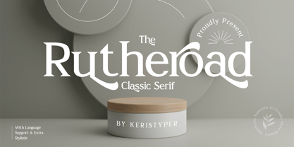 Rotheroad is an elegant classic serif font with a touch of minimalist modern style. This font is good for logo design, Social media, Movie Titles, Books Titles, short text even long text letters, and good for your secondary text font with sans or serif. Featured: Standard Uppercase & Lowercase Numeral & Punctuation Multilingual : ä ö ü Ä Ö Ü ß ¿ ¡ Alternate & Ligature PUA encoded We recommend programs that support the OpenType feature and the Glyphs panel such as Adobe applications or Corel Draw. so you can use all the variations of the glyphs. Hope you enjoy our fonts!
 - Vigofam by Keristyper Studio,
$14.00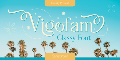 Vigofam serif typeface is an elegantly themed font that has a dynamic serif style. This font is good for logo design, Social media, Movie Titles, Books Titles, short text even long text letters, and good for your secondary text font with sans or serif. **Featured:** * Standard Uppercase & Lowercase * Numeral & Punctuation * Multilingual : ä ö ü Ä Ö Ü ß ¿ ¡ * Alternate & Ligature * PUA encoded We recommend programs that support the OpenType feature and the Glyphs panel such as Adobe applications or Corel Draw. so you can use all the variations of the glyphs. Hope you enjoy our fonts!
 - Melts Script by Estudio Calderon,
$20.00 Melts Script from Estudio Calderón is a typeface based on Harlow Solid SB from Colin Brignall. It is made by round traces, with a simple design and a slightly “chubby” look. We wanted to propose a new version that works as an alternative of Harlow Solid, with connectors at the same heightand a complementary Font “Melts Sanscript” with sans serif capitals to be combined with lowercase scripts. Specimen Supporting 219 latin based languages, which are spoken in 212 countries. Psssss....It includes alternatives, swashes, ligatures and a version called Glint Glint, especially designed for those who want to highlight their works.
 - Alkeno by Keristyper Studio,
$14.00 Alkeno is a rounded bold display font with an elegant old-school look. This font is good for logo design, Social media, Movie Titles, Books Titles, short text even long text letters, and good for your secondary text font with the script, sans, or serif. Featured: Standard Uppercase & Lowercase Numeral & Punctuation Multilingual : ä ö ü Ä Ö Ü ß ¿ ¡ Alternate & Ligature PUA encoded We recommend programs that support the OpenType feature and the Glyphs panel such as Adobe applications or Corel Draw. so you can use all the variations of the glyphs. Hope you enjoy our fonts!
 - Nagel by ParaType,
$40.00 Nagel is a contemporary uniwidth display sans serif for headlines and short texts. It’s a closed low-contrast typeface with an emphasis on stroke joints. The length of the line set in Nagel remains the same in all weights. Nagel has all the advantages of monospaced typeface graphics, but none of their functional disadvantages. Characters in Nagel are made monospace-like wide, as opposed to traditionally narrow characters of proportional fonts, and often have slab serifs. Letters of monospaced fonts that have to be narrowed down considerably, have the usual width here. The scope of Nagel is branding and identity of IT companies, infographics, scientific and technical documentation — any areas where a technical, modern typeface with distinctive graphics may be required. The typeface includes three upright styles — Regular, Medium, Bold; two sets of 11 and 18 slanting degrees and a variable version with two axes: Weight and Slant. The character set includes extended Cyrillic and Latin alphabets, arrows, triangular bullets, index numbers and fractions. Designed by Alexander Lubovenko.
 - Corporative by Latinotype,
$26.00 The first typeface developed by Latinotype Team. Corporative is a semi serif font that has a marked personality and distinctive traits, what makes it suitable to be used at large text sizes.Since it is a condensed font, it can also be used in smaller sizes. Corporative and Corporative Sans come with the Latinotype’s standard set of 350 characters, making it possible to use the font in 128 different languages. Corporative provides users with a wide range of characters, weights and widths for every project. By combining different variants,designers can achieve the best results. The family consists of 64 fonts: a basic family that includes 8 weights plus italics, an alternative family of 8 weights with matching italics and 2 condensed families, one regular and one alternative, both with italics. Latinotype has added new faces to its team. Latinotype Team nowcomprises: Javier Quintana, César Araya, Bruno Jara, Luciano Vergara and DanielHernández. Corporative was created by Latinotype Team and developed by Javier Quintana and César Araya, under the supervision of Luciano Vergara, Miguel Hernández and Daniel Hernández.
 - Amrys by Monotype,
$65.00 There's an appealing quirkiness about Amrys, which offers a confidently unusual alternative to more conventional designs. Its charm lies in its tapering tips, flexing stems, and unexpected notches, which combine to suggest something of the chiseller's tool at work. As a modulated serif, its letter shapes live between serif and sans serif, lending the design a sense of pleasing irregularity – something that's really highlighted at larger sizes. However this is also a typeface that works for text, injecting rhythm and texture into reading. “It's distinctive, idiosyncratic, and weird,” says its designer, Ben Jones. He started designing Amrys while studying an MA at Reading University, creating it in response to a brief for a magazine typeface. Amrys features an extensive and impressive character set. In addition to Latin, Amrys covers several scripts including Cyrillic, Greek, Arabic and Armenian. The family consists of 8 weights, from Light to Black, with matching italics.
 - Paralucent by Device,
$39.00 Paralucent is versatile all-purpose modern sans. Available in seven weights, from Thin to Heavy, and in two widths each with corresponding italics, it avoids some of the more eccentric calligraphic quirks of Akzidenz or Helvetica or the cool precision of Univers for an elegant, functional, yet warm design. There are two additions to the core 28-weight family: a three-weight stencil set, and a four weight text family. The text weights have been adjusted for use at small point sizes, and feature more open character shapes, looser inter-letter spacing for improved readability, and lining numerals for use in listings and tables. Several core ideas inform Paralucent’s design. Prime attention has given to the negative space between characters, giving a more even “colour”, especially in text. For example, the J, L and T have shorter arms than comparable sans typefaces, while the M and W are wider. The A has a lower bar, opening up the interior counter. An unusually high lower-case x-height again helps to give a more even colour and improve legibility. Care has been taken to rationalise repeated elements like the tails on lower-case letters, or the Q and the “ear” of the g. Typographic design solutions that are consistent across all these features add more stylistic cohesion. ‘Ink traps’ are exaggerated incisions used to open up a letter's narrower internal angles, which can become clogged with ink, especially in small point sizes. Now largely redundant due to the high quality of modern print, they are still sometimes used as a stylistic quirk or design feature. Now that digital fonts are often reversed or outlined, or enlarged to enormous sizes, these can also lead to unexpected or obtrusive results. Paralucent takes these inevitable digital manipulations into account, and adds optical corrections without resort to ink traps. The family has been picked up by many UK and US publishers, featuring heavily in magazines like Loaded, Heat and TV Quick, as well as high-end coffee-table photography books and gallery websites. A perennial Device bestseller.
 - Gimbal Egyptian by AVP,
$19.00 Gimbal Egyptian is a richly-featured font family providing many style options across a broad range of languages. It is twinned with Gimbal Grotesque, a sans-serif family with an identical range of weights and features. Originally conceived as a small webfont family, the letterforms have been revitalised to put a spring in their step and the family has been extended to create a versatile multi-script text face equally at home on the printed page. Carefully crafted at all weights, Gimbal also lends itself to headlines and display applications such as posters, exhibitions and signage while resolving well on-screen for general document creation and web-based applications. The letters are spaced for best readability on-screen and in the usual printed body text ranges but are tolerant of tracking adjustment to suit other uses. The styles are divided by width into four families (Compressed, Condensed, Normal, Extended), each family possessing six weights plus corresponding italics. Within each family, the 'regular' and 'bold' weights are style-linked, and all upright forms have an italic counterpart. The full opentype character set includes latin, greek and cyrillic scripts with appropriate local variants (also as stylistic sets) for Turkish, Polish and Romanian (latin) and Russian, Bulgarian and Serbian (cyrillic). All fonts contain small capitals for all scripts, superscript for latin and commonly used greek together with the usual numeral style, size and positioning options. The default numerals are 'proportional lining'. Other opentype features include case-sensitive marks, fractions, and some discretionary ligatures. A set of circled numerals and circled latin capitals is included, along with an unusual feature that composes 2-character country codes.
 - Sherbrooke by Eyad Al-Samman,
$- Sherbrooke is a simple and sans serif font. I have chosen the name of this typeface after the "Sherbrooke" Street in Montreal, Canada, that I daily walked in for several months in the late 2005 while I was studying in Montreal, Quebec, Canada. I do adore this street and also I adore the whole city of Montreal. This font comes in two different weights. "Sherbrooke" can be used in wide fields of publications such as the titles of novels, literary texts, short stories, dictionaries, books, newspapers, websites, and magazines. It is suitable for T-shirts, mugs, advertisement light boards in malls, subtitles of movies, logos, cans of foods, and medicines' names. The font is more attractive when it is printed in calendars and for displaying the contents and paragraphs of electronic encyclopedias and different online websites. "Sherbrooke" is specifically designed for educational, journalistic, literary, and social purposes. The main characteristics of "Sherbrooke" Typeface are in its sans serif new designed letters and also in its lowercase special numerals. I think that these characteristics have made "Sherbrooke" exceptionally unique with its alphanumeric combinations. You can enjoy this typeface and use it anywhere at any product or service. It is simply gratuitous for all. The word "Sherbrooke" is a person's name. Sherbrooke Street - officially Rue Sherbrooke - is a major east-west artery at 31.3 kilometers in length and it is the second longest street on the Island of Montreal in Canada. The street is named for John Coape Sherbrooke, the Governor General of British North America from 1816 to 1818.
 - Glancias by ScovType,
$45.00 Glancias Display is a contemporary typeface for article headings. In order to create a style that merges serif and sans serif and to attemp a minimalistic final appearance, Glancias Displas removed the serifs while remaining the high-contrast strokes which are usually found in a serif font. By removing serifs and cutting stroke ends vertically and horizontally, the font has been built in a modern, sleek, neutral and also concise look. Over 400 glyphs in total including upper and lowercase characters, figures, ligatures and signs are available. Glancias Display covers Latin based languages of North and South America and most of Western Europe.
 - FF Casus by FontFont,
$51.99 FF Casus was drawn for print – but is also as natural for textual content in interactive design. It brings warmth and a subtle, handcrafted quality to pages in books and periodicals as well as banners and informational copy on large and small screens. It pairs flawlessly with a wide range of sans serif typefaces to create inviting and easy to read text copy. Drawn by Eugene Yukechev, FF Casus is a fresh take on the robust serif typefaces produced early in the 18th century. The FF Casus™ typeface family takes advantage of slightly narrowed proportions, moderate contrast in stroke weight and an ample x-height to achieve high levels of legibility and efficient use of space. Born in Novosibirsk, Russia, in 1980, Yukechev earned degrees in philology in addition to editorial and graphic design. He also graduated from the British Higher School of Design in Moscow, studying type and typographic design. Yukechev now runs the Moscow-based studio “Schrift Publishers” and the online “Type Journal” with his colleagues. The six weights of FF Casus – each with an italic complement – are available as OpenType® Pro fonts with an extended character set supporting most Central European and many Eastern European languages. Looking for something new – with the panache and warmth of an old book face? FF Casus may be the perfect choice.
 - Hawkes by Kimmy Design,
$15.00 Hawkes is an extensive handmade typeface family that comes with a bundle of weights, widths and styles, all designed to work cohesively. Here is a breakdown of the Hawkes family. Hawkes Sans: The primary subfamily is a sans-serif typeface that includes nine fonts: three weights (light, medium and bold) and three widths (narrow, regular and wide). Within this set are an array of stylistic features; including small capitals, character style alternatives, discretionary ligatures and contextual alternatives. See details below for more information on OpenType Features. Hawkes Variable Width Sans: The secondary subfamily is the same base sans-serif fonts but combined in variating widths. Essentially, it takes all three widths of each weight and randomly mixes them together. This creates a funky and creative alternative to the more traditional sans-serif set. The variations are for the uppercase, lowercase, small capitals, ligatures and numbers. Hawkes Script: The last subfamily is the script typeface. It’s a quirky script with variations of its own, including ligatures, swashes and contextual alternatives (again, see below for further details.) The script font works great as a complimentary style to the sans-serif, or on it’s own. FEATURES Alright, let’s get into all the extra goodies this typeface has to offer. Small Capitals: Small caps are short capital letters designed to blend with lowercase text. These aren’t just capital letters just scaled down but designed to fit with the weight of both the lowercase and capitals. With Hawkes, small caps can either sit on the baseline (in line with the base of the capital and lowercase) or to be lifted to match the height of the capital letters by applying the discretionary ligature setting in the OpenType panel. These small capitals have a dot underlining them that sit along the baseline. The feature offers a unique display affect that is great for logos, titles and other headline needs. Discretionary Ligatures: A discretionary ligature is more decorative and unique combination than a standard ligature and can be applied at the users discretion (as the name indicates.) The specific styling for these ligatures varies for different fonts. With Hawkes, they are used as an all capital styling feature, or to lift the small capitals to align with the height of the capitals. In the former setting, both lowercase and uppercase letters are first changed to all capitals, then a specialized set of letter combinations are transitioned so small characters are positioned within a main capital letter. These combinations only happen with main characters that include an applicable stem, such as C F K L R T Y. Some of these combinations include two or three characters. When Small Caps is turned ‘on’, this feature will lift the small caps to the height of the capital letter. For more information, please check out the user guide! Stylistic Alternatives: Stylistic alternates are a secondary form of a character, often used to enhance the look or style of a font. For Hawkes, these alternatives provide a slightly more handmade feel. A - the capital and small capital A will lose its pointed apex and become rounded. Think of it more as an upside-down U than an up-side-down V ;-) Oo, G, Ss, Cc- these characters’ topmost terminal becomes a loop. The O is applied automatically, the G S and C need to be turn on individually. Titling Alternatives: This feature does sort of the opposite of what it intends. Instead of being used for titling purposes, this feature makes the text look better in paragraph text settings. Kk Rr h n m - curved terminals on the are straightened e - the counter stroke also gets straightened from a more looping motion y - the shape of y is changed from a rounded character to a sharper apex (think more like a ‘v’ than ‘u’) Contextual Alternatives: Contextual alternates are glyphs designed to work within context of other adjacent glyphs. With Hawkes Sans, there are three slightly different variations per character. The feature rotates the application of each variation. This helps with organic authenticity, so if you have two e’s next to each other, they won’t look identical (reflecting the natural variations in handwriting and lettering.) With Hawkes Variable width fonts, I have created a contextual pattern that randomizes the widths of each character. So, when the feature is turned ‘on’ in the OpenType panel, the widths would alternate in a pattern such as: Narrow, Wide, Regular, Narrow, Regular Wide, Narrow, etc. It happens automatically so the user doesn’t have to think or worry about getting a random seed. With Hawkes Script, contextual alternates allow strokes to connect properly from one character to the next while maintaining a believable, natural flow. Connecting strokes are present for two letters next to each other but are replaced by a shorter stroke when located at the end of a word or sentence. Some characters have in-strokes when located at the start of a word. When a character is preceded by a capital letter that doesn’t connect, it too needs an in-stroke or altered spacing. This feature is complicated and messy, but luckily you don’t really have to think about it! I’ve done all the coding so all you have to do is turn ‘on’ the feature in the OpenType panel and you are off to the races! I’m just letting you know what’s happening behind the scenes. Swashes: These are just for Hawkes Script and provide tail swashes to the start and ends of letters. There are three different options. You can pick the basic option by turning ‘on’ the swash feature in the OpenType panel, or you can pick using the Glyph panel. Stylistic Sets: This feature work in new versions of Illustrator CC and InDesign CC. You can pick specific styling sets instead of turning on an entire feature. For example, let’s say you want to have a loopy S, but not a loopy C or O, you can just turn on the S in the Style Set. It also helps create the little drop box that pops up when you hover over a character, showing you the alternates associated with that character. This makes it easy to pick and choose specific styles you want in a word or headline. ---------- And there it is folks! That’s all the basic info on Hawkes, I know it’s been a lot and I appreciate you hanging on. If you are like me and need more of a visual reference to accessing all these goodies, I’ve made a user guide to help navigate Hawkes and everything it has to offer. Altogether this extensive family boasts 14 total fonts in a wide array of styles, weights and widths, making it a great addition to any handmade type collection. Enjoy!
 - ALS Klinkopis by Art. Lebedev Studio,
$63.00 Yana Klink is an illustrator at Art. Lebedev Studio, whose works are often accompanied by lines of fancy text written in her own recognizable manner with long strokes and “beauty spots.” Once we needed to apply that style to a number of pieces of text, we decided to design a decorative script called Klinkopis. It comes in one weight (regular). Text set in Klinkopis looks best when arranged in waves, like the original. It is recommended to use large sizes—from 24 pt and up—and have no more than just a couple of lines that become an essential part of the artwork. Klinkopis is designed to use OpenType Contextual Alternates. To beautify your project even further, some characters can be manually replaced with their more intricate or plainer variations depending on the neighboring letters. Klinkopis features long descenders and ascenders, which requires large leading to avoid congestion.
 - FF Signa Round by FontFont,
$72.99 FF Signa Rounded is a natural complement to the rest of the FF Signa super family – and can stand on its own in a variety of print and on-screen applications. The design is Ole Søndergaard’s rounded branch in his FF Signa family three. In it, he took the distinctive shapes and proportions of FF Signa Sans and created a warm, inviting design for text and display copy. Like its parent design, FF Signa Round is not a humanistic sans, nor is it based on 19th-century grotesques. Its characters are minimalist interpretations of letterforms – distinctive, yet easy to read. Thanks to FF Signa Round’s large x-height, open counters and simple character shapes, the design does not overpower the message – and draws the reader in. At substantial sizes, especially in the bolder weights, the design communicates with amiable conviction. At text sizes, FF Signa Round remains inviting and legible. It can be used as a companion to the rest of the FF Signa family, providing depth of style and breadth of reach. The collection of designs can also be used on their own for brand, brochure, publication, and way-finding design in digital and hard copy environments. Like the rest of the FF Signa family, OpenType® Pro fonts of FF Signa Round provide for the automatic insertion of ligatures and alternate characters, and also offer an extended character set supporting over 100 languages, including most Central European and many Eastern European – in addition to Cyrillic and Greek.
 - Quiverleaf CF by Connary Fagen,
$35.00 Like the graceful movement of a ribbon, Quiverleaf® CF glides effortlessly from letter to letter. Five weights – from a delicate, yearning thin to a hearty extra bold – combine with striking italics and wide language support for a well-rounded and expressive typeface. Quiverleaf's versatile design allows for both beautiful text and airy headlines. Quiverleaf® CF pairs well with itself at contrasting sizes and weights; it can also be used effectively alongside both sans typefaces like Greycliff® CF, and simple humanist designs like Artifex Hand CF. Quiverleaf is also available in an Arabic version, Quiverleaf Arabic CF, which pairs perfectly with the original Quiverleaf for multi-script visual design. All typefaces from Connary Fagen include free updates, including new features, and free technical support.
 - Sackers Gothic by Monotype,
$32.99 Sackers Gothic is part of the larger Sackers series, a collection of fonts drawn from templates for producing engraved stationery and social cards by Gary Sackers, a Charlotte, North Carolina intaglio printer. Many typefaces were made from similar sources, including Monotype’s Engravers series, as well as Jim Spiece’s ITC Blair, and Mark van Bronkhorst’s Sweet Sans. Sackers’ typefaces, which were initially made into photo-set type, were digitized by Compugraphic and released in the late 1980s. Sackers Gothic has since become a popular choice for conveying sincere and plainspoken language on dust jackets, posters, and of course, in stationery. The face pairs well with display faces of a disparate nature, and serves as a ready foil for anything requiring an air of typographic sophistication.
 - Portheras by Identity Letters,
$39.00 What does “smart casual” look like as a font? Try Portheras: a fairly wide, contemporary humanist sans with a laid-back attitude. Inspired by the fine Cornish beach of Portheras Cove, this typeface pays homage to British design tradition while incorporating an informal idiom. At ease both in flip-flops and silk blouses, in Bermudas and knit ties, Portheras sports a low x-height and comes with italics between “oblique“ and “true italic”. Despite its approachable look, the font family is equipped for heavy duty—you’ll get 16 styles with 780 glyphs each and OT features such as small caps, numerous figure sets (with old-style figures at mid-cap height), a bunch of arrows, three stylistic sets, and more. Portheras is as classy as relaxed gets.
 - Peridot PE by Foundry5,
$9.00 Peridot is not just another typeface – it's a multifaceted sans serif type system crafted with passion and precision by Foundry5. Painstakingly developed through long hours and a keen focus on every minute detail, this typeface boasts a high-quality 10 weight family with matching italics in 6 widths, and the highly versatile variable format. Brimming with character, Peridot invites you to experiment with its various stylistic variants, allowing you to tailor the typographic tone to fit your creative vision perfectly. The diverse range of widths and styles in Peridot offers a dynamic typographic toolbox, ready to inspire and captivate even the most innovative designers. Peridot PE supports Cyrillic, Greek, and Latin and covers over 370 languages. It includes all required localised variants, tabular numerals and currencies, fractions, clever discretionary ligatures and many more features. Peridot performs in varied environments – from branding, display, corporate use, editorial, advertising, poster, web, screen usage etc. Think of any other use case as well, and Peridot will perform. Peridot comprises 120 static fonts, family packages, and variable support. It is the gem you ought to have in your collection.