9,402 search results
(0.023 seconds)
- Das Riese by Intellecta Design,
$22.90 Das Riese, a type specimen by the most productive Brazilian type foundry, Intellecta Design, is a mix of victorian and art deco influences. A beautiful display type for tiling with uppercases only. It's shadows and volumes refer to pre-modern age whereas its surface to last century 20's. This heavy sans serif strokes characters have a particular appearance, a parallel line texture that reminds Bifur, typeface created in 1929 by A. M. Cassandre. The sideways absence of volume at some leaning letters right side in addition to the patchy darkness of shadows support its handmade design. A type full of historical references designed to small titles printed in big sizes. It's impossible not to think about posters when you look at Das Riese strong face. - (source Slanted Magazine #8)
 - london 2012 - Personal use only

- Press Grotesk by Studio Vachement,
$19.99 Press Grotesk is a handmade sans serif, condensed font that takes inspiration from old letterpress printing processes & handcrafting. The font's slightly imperfect, uneven appearance works perfectly for surfing, skating, motorcycling, coffee shops, health, wellness, adventure brands, and much more. Press Grotesk features 2 weights (fat and skinny), upper- and lowercase, many advanced characters and illustrations in order to achieve a truly hand painted look.
 - AT Carterwood by Amera Type,
$20.00 Inspired by the old style serifs of 19th century print labels that have a classic touch in this modern era Carefully crafted with lowercase and uppercase to complement this font as well as using variable bold and thin shapes to give a sense of beauty and strength to the letterforms Carterwood is great for designing posters, labels, sign paintings and other media to enhance your visual appearance
 - Definety by DEFNST,
$30.00 Definety is a clean and sharp pixel font with lowercase and uppercase glyphs including Basic Latin, Extended Latin A, Cyrillic, numbers, and special symbols. Carefully crafted for a wide range of purposes like branding, logo, posters, print, games, web, and a lot more. Pixel perfect font size starts from 8px/pt and continues by adding another 8 points to the size. Examples: 8px, 16px, 24px, 32px, 40px...
 - Anthurea by Invasi Studio,
$19.00 Anthurea is a modern classy serif typeface. Featuring an elegant and classic all-caps style, this font reflects the elegance and style of the past. With its modern and minimal treatment, it makes a great starting point as well as an enhancement for your design. It is perfect for Logotype, printed quotes, invitations, cards, product packaging, headers, Letterhead, Apparel, Web design, magazines, books, etc.
 - Grizzly by Victory Type,
$15.00Grizzly is a handwritten display style typeface. It was designed by hand using a flair pen, then scanned in, vector traced and fontisized. It is a very detailed typeface that looks great at large point sizes on screen and in print. Grizzly"s aggressive, chicken scratch appearance definitely adds pizzazz to every document. Grizzly features a full character set including European and alternate characters! - ITC Mendoza Roman by ITC,
$29.99 ITC Mendoza is a serif typeface with old style characteristics. A generous x-height and a lack of contrast between thick and thin strokes, gives the ITC Mendoza Roman font family good legibility and provides a sturdiness which enables the face to withstand low resolution output and less than ideal printing conditions. It is ideal for continuous text use, particularly in small point sizes.
 - Modern Love by Resistenza,
$39.00 Breaking from our catalog of typefaces to create a new handwritten font family, Modern Love was born out of our desire to see what would happen if we took a step back from the norm. We weren’t looking for the perfection of the many calligraphy techniques, but more of a natural way of writing with the same tools. Our escapist experiment into casual lettering culminated into 4 fonts: Modern Love Regular, Grunge, Rough and Caps. Modern Love Regular is a hand-painted script, each glyph individually designed with a pointed brush and walnut ink. The aim was to create an effortless hand-drawn feel while keeping the contrast high density. Playful, yet polished, this font works very well when accentuated with the family’s two distinctive styles: Modern Love Grunge, simulating a washed-out effect, perfect to add a vintage look to your projects; and Modern Love Rough, with its crunchy borders, makes letters visibly rough-around-the edges and gives large letters an unmistakeable pop. All three fonts include a hand-painted set of ornaments, swashes and alternates to limitlessly customize and decorate your texts, accessible through Opentype features. Modern Love Caps is the fourth font, a handwritten Sans Serif that ties the family together with its simplicity and readability. Designed with a pointed nib and Indian ink, this font boasts a different style that perfectly complements Modern Love Regular, Grunge and Rough. The result is a fresh font family perfect to create headlines, posters, DIY hand-lettered artwork, books, holiday cards, wrapping paper, invitations, T-shirts, labels, packaging for cosmetics, fashion supplies, food products, artisanal goods, and an endless array of options for your projects. Modern Love…when brush meets passion. Check out also ‘Modern Love Slanted’ Turquoise Nautica
 - Novita by Autographis,
$39.50 Novita is a new something. This font is a new very elegant – extremely slanted – joining script with long ascenders and descenders. It is the fiancée of Novido which is the more elaborate male part of this font pair.
 - Rit Graph by Stawix,
$25.00 Rit Graph has been revived from old style font template often used by architects or engineers. The design of Rit Graph is casual yet sophisticate with a slanted proportion and little details of rough edges from writing tools.
 - HU Mois KR by Heummdesign,
$25.00 HU Mois KR is a calligraphy typeface with a sense of speed and a naturally slanted feel as if writing. It also gave a sense of free rhythm of handwriting. Includes Korean from the existing 'HU Mois' font.
 - Echountter by Maulana Creative,
$14.00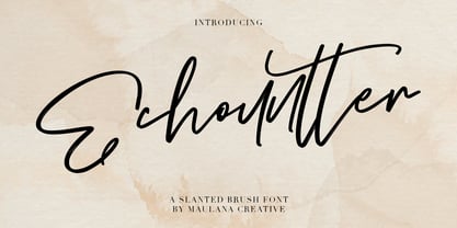 Give your designs an authentic handcrafted feel. "Echountter Slanted Brush Font" is perfectly suited to signature, stationery, logo, typography quotes, magazine or book cover, website header, clothing, branding, packaging design and more. Thanks for use this font ~ Maulana
 - M Razor HK by Monotype HK,
$523.99 M Razor is so called ""neo Sung-style"" typefaces. Crossbars (橫) and stems (豎) are orthogonal and upright. Their entry and finial points are squarish, parallel without flare. Contrast of strokes is extremely high. This creates sharpness, stiffness in the midst of elegance of Sungti. Even distribution of space, careful positioning, size and proportion of radicals create a slightly expanded, opened and balanced construction. Zhonggong are slightly expanded, its relatively less inter-character spacing makes the line of text better coupled and aligned. Its features and construction create a feel of wholesome, elegance with contrasting sharpness and stiffness. It is best suited for casual, creative display eye-catching text, set upright (non-slanted), non-condensed.
 - M Finance PRC by Monotype HK,
$523.99 M Finance is a design inspired by the popular M Elle. M Finance incorporates features of M Yuen or other rounded Gothic-style typefaces. Crossbars (橫) and stems (豎) have squarish entry and finial points with slight round corners, parallel without flare. Thick-thin contrast of strokes is low and the text is visible. Its extra bold stems (豎) make it suitable for eye-catching display. Even distribution of space, careful positioning, size and proportion of radicals create a slightly expanded, opened and balanced construction. Its features and construction create a feel of subtle sharpness and stiffness with wholesome elegance. It is best suited for casual display text, illustrations, set upright (non-slanted), non-condensed.
 - M Finance HK by Monotype HK,
$523.99 M Finance is a design inspired by the popular M Elle. M Finance incorporates features of M Yuen or other rounded Gothic-style typefaces. Crossbars (橫) and stems (豎) have squarish entry and finial points with slight round corners, parallel without flare. Thick-thin contrast of strokes is low and the text is visible. Its extra bold stems (豎) make it suitable for eye-catching display. Even distribution of space, careful positioning, size and proportion of radicals create a slightly expanded, opened and balanced construction. Its features and construction create a feel of subtle sharpness and stiffness with wholesome elegance. It is best suited for casual display text, illustrations, set upright (non-slanted), non-condensed.
 - Bream by Hackberry Font Foundry,
$24.95 This is the display version of Librum. Librum means “book” in Latin, which I thought was appropriate. Bream is Latin for proclaim—appropriate for display work. The fonts are very close to Librum-Book and Librum-Italic, with the same OpenType features. The glyphs are modified a bit to make them a little more elegant, but that’s not very noticeable. Mainly, the letterspacing and kerning is tighter and more carefully fit to large point sizes. As for classification, I like oldstyle, Venetian, geralde, English oldstyle. There’s discrete modulation, slanted crossbars, full brackets serifs of medium thickness and sharp cut ends. For a great deal, see Librum Book Design Group, for a package containing all fifteen fonts!
 - M Razor PRC by Monotype HK,
$523.99 M Razor is so called ""neo Sung-style"" typefaces. Crossbars (橫) and stems (豎) are orthogonal and upright. Their entry and finial points are squarish, parallel without flare. Contrast of strokes is extremely high. This creates sharpness, stiffness in the midst of elegance of Sungti. Even distribution of space, careful positioning, size and proportion of radicals create a slightly expanded, opened and balanced construction. Zhonggong are slightly expanded, its relatively less inter-character spacing makes the line of text better coupled and aligned. Its features and construction create a feel of wholesome, elegance with contrasting sharpness and stiffness. It is best suited for casual, creative display eye-catching text, set upright (non-slanted), non-condensed.
 - As of my last update in early 2023, Andreas Sans Cnd may not be widely recognized in the mainstream of typographic designs, yet the essence of its name provides insight into its style and characteris...
- Roemisch by Linotype,
$29.99The Roemisch type family is a historic hot metal face with left slanted weights that is used for the german cartographic map production. There are also special typefaces required like the Venus type family and Topografische Zahlentafel type family." - Delgos by Typebae,
$10.00 Delgos is a display font family. It is very suitable for logos, headlines, posters and various other designs that require an assertive touch. What's Included? 20 Font, 9 Weight Slanted & Outline All Caps, Numbers & Punctuation Multilingual Support PUA Encoded
 - Homeward Bound by Hanoded,
$15.00 Homeward Bound is a fat, grungy slab serif font - all handmade and inspired by a well known 1934 font. Together with sidekick Homeward Bound II, this baby will lighten up your day, bring you your newspaper and do your dishes to boot. Well, that may not be an accurate description of Homeward Bound’s abilities, but I am sure it will make your work stand out, giving it that ‘handmade eroded vintage’ look.
 - Friedrichsfeld by Otto Maurer,
$17.00 Friedrichsfeld is a small town near there where I live. Friedrichsfeld, Voerde and Wesel was Part of the Preussen Kingdom till 1912. Friedrichsfeld was a Parade ground of the preussen troops and get the name of the King Friedrich II (the old Fritz). Today there is a Preussen Museum near Friedrichsfeld in Wesel. The Font comes in two ground Version, one in the history Letters and old Ligatures and a modern Version.
 - Lookey Here JNL by Jeff Levine,
$29.00Lookey Here JNL is an "Alphading" - a term coined by Jeffrey N. Levine to describe dingbat fonts containing both images and letters and/or numbers. This one - partially based on the classic "Kilroy" icon from the World War II era is a newer, cleaner reworking of one of Jeff's early freeware fonts. The typeface used inside the images is Casual Lunch JNL, so you can match this text for a particular project. Limited character set. - Maleha by Afkari Studio,
$13.00 Maleha Bold Modern Sans Serif Font Introducing Maleha, a bold and sophisticated modern sans serif font designed to elevate your projects with its confident and sleek aesthetic. Crafted with precision, Maleha embodies a perfect balance between professionalism and contemporary style. With two versatile styles—regular and slant—Maleha offers a dynamic range of possibilities, enabling you to effortlessly convey a sense of authority and modernity in your designs. The bold strokes and clean lines of Maleha's characters exude confidence, making it ideal for headlines, branding, editorial designs, logos, posters, and more. Its versatile nature ensures readability across various mediums while maintaining a strong visual impact. Maleha's boldness is matched by its adaptability; whether for digital or print, its clarity and elegance remain consistent. The regular style presents a crisp, clean appearance, while the slant adds a touch of dynamic flair, perfect for emphasis or adding a contemporary twist to your typography. Features: - Uppercase, Lowercase, Number, and Punctuation - Standard and Special Ligatures and alternates - Works on PC & Mac - Simple installations - Accessible in Adobe Illustrator, Adobe Photoshop, Adobe InDesign, and even works on Microsoft Word - Fully accessible without additional design software - Multilingual Support, ä, ö, ü, Ä, Ö, Ü, ß, ¿, and ¡. Unleash the power of expression and professionalism with Maleha, the bold modern sans serif font that effortlessly commands attention while conveying a sense of sophistication and modernity in every project.
 - Liquida by Resistenza,
$49.00 Liquida is a decorative script font with slanted inclination. All characters were designed with brush and walnut ink on paper using real ink drops to generate a trickling effect. A display typeface perfect to set a refreshing liquified lettering in seconds!
 - Rafigen by Surotype,
$20.00 Rafigen is a thick and playful typeface . It comes in two different styles, plain and slant. Really great font to make it easier for you creative work such as — branding, film titles, packaging, advertising, posters, and web or app. Enjoy:)
 - Quick Rest by wearecolt,
$19.00 Quickrest is a tall & quirky type with slight irregularities, Quickrest does not do conformity - each character is entirely individual. A fun looking family with its heart set in the handmade / crafty scene. The Quickrest family features five weights and slanted versions.
 - Almost Broken by Rillatype,
$17.00 Almost Broken is a modern display font with bold and strong personality but charmful. this font comes with two version, regular and slanted. Almost Broken is perfect for headlines, logotypes, magazine, advertising, etc. this font also comes with multilingual support.
 - P22 Basel Roman by P22 Type Foundry,
$24.95 In mid 2001, P22 was approached by a Daniel Garrison, a Classics scholar at Northwestern University about possibly digitizing a long lost "Garamond" typeface. This font was used by Johannes Herbst (a.k.a. Ioannes Oporinus) in 1543 to publish Andreas Vesalius' "On the Fabric of the Human Body" (De humani corporis fabrica) in Basel. The story of the development of this font takes a few twists and almost becomes forgotten itself over time.Forteen years later it is available to the public.
 - Pocky Block by Arterfak Project,
$16.00 Introducing Pocky Block, a font that's bold and blocky with elegant and modern design. This font exudes a sporty, assertive, and daring vibe, making it a perfect fit for designs with sports, adventure, or futuristic themes. It's great for stickers, movie posters, flyers, displays, logos, motion graphics, advertising, and more. Pocky Block comes in two styles: Regular and Slanted. The Slanted style highlights a spirit of enthusiasm, speed, and confidence. This thick font also boasts over 100+ ligatures, allowing you to create dynamic and sophisticated letter combinations. What you'll get : All capital characters Numbers, punctuation & symbols Stylistic alternates Stylistic set 100+ Ligatures Multilingual support Help file. Thank you for your appreciation!
 - Juniper and Sage by Nicky Laatz,
$23.00 Let Juniper and Sage Script whisk you away for a romantic rendezvous with your love of handwritten scripts. A little bit chic, a little bit classy, Juniper and Sage is a must-have for any handwritten font collection. It includes 55 natural looking Opentype Ligatures - to make the font look more natural as you type. Juniper and Sage has 3 subtle variants - each adds a different feel due to their different slants. Upright being slightly more upbeat and casual and slanted being more elegant. Perfect for: elegant branding, wedding stationery, romantic book cover designs, classy packaging, album covers, handwritten quotes, greeting cards, unique social media posts, and so much more.
 - M Marker HK by Monotype HK,
$523.99 M Marker is a humanistic script design characterised by its italic, modern, box marker pen-like style. M Marker incorporates features of carton box marker pen, its strokes beginning and ending are rough, parallel without flare. Contrast of strokes is high. Its extra bold stems (豎) make it suitable for large display text to catch attention. Crossbars (橫) and stems (豎) are straight but slanted while angles (折) are smooth and well rounded. Dots (點), ticks (剔), hooks (勾) and downstrokes (撇、捺) are irregular, smooth and long to create softness, liveliness. It is best suited for casual and lively display, illustrations, set upright (naturally slanted), non-condensed.
 - Nextrue by Asenbayu,
$12.00 Nextrue font is a sans serif font with a sleek and sporty look. This font is shaped as a professional multipurpose font with a strong look in upright and a dynamic look in slant letter. You can use it in modern youth design, adventure, hobbies and sports. This font is perfect for a variety of projects, such as branding, poster displays, logo design, magazine covers, product labels, clothing and more. This font is perfect for taking your designs to the next level! Nextrue fonts feature opentype, kerning, ligatures, and alternative styles packed in 12 fonts (Condense, Extend, Slant). Nextrue fonts include uppercase, lowercase, numbers, punctuation and multilingual support.
 - Competition by sportsfonts,
$15.00 Competition is a state of the art sports typeface. A large width range, slant angles from –12 to 12, and an adjustable inline make it extremely versatile. It’s devided into 5 subfamilies, from the sizes S, M, L & XL with decreasing inline weights to Solid without an inline at all. (By the way: S doesn’t mean it doesn’t look good in large sizes!) Choose from 105 predefined styles, or 1 variable font with axes for width, slant and inline weight (which is included in the family package). Competition embraces the Latin S character set and therefore supports 400+ Latin-based languages. Go for Gold!
 - Julie Molly by Letterhend,
$11.00 Julie Molly is a typeface with fun and playful looks. Available in 4 styles - regular, slanted, semi bold & semi bold slanted. This type of font perfectly made to be applied especially in storybook children or child theme which is need a standout font, and the other various formal forms such as invitations, labels, logos, magazines, books, greeting / wedding cards, packaging, fashion, make up, stationery, novels, labels or any type of advertising purpose. Features : numbers and punctuation multilingual ligatures PUA encoded We highly recommend using a program that supports OpenType features and Glyphs panels like many of Adobe apps and Corel Draw, so you can see and access all Glyph variations.
 - Alburgone by Letterhend,
$15.00 Alburgone is a hand lettering typeface with nostalgic look and feel! This font perfectly made to be applied especially in logo, and the other various formal forms such as invitations, labels, magazines, books, greeting / wedding cards, packaging, fashion, make up, stationery, novels, labels or any type of advertising purpose. Features: 4 styles (Regular, Slanted, Outline Regular, Outline Slanted) numbers and punctuation multi-lingual support PUA encoded We highly recommend using a program that supports OpenType features and Glyphs panels like many of Adobe apps and Corel Draw, so you can see and access all Glyph variations. Email us to letterhend@gmail.com if you need something! Happy Designing!
 - Ravenstonedale by Hanoded,
$15.00 Ravenstonedale is a village in Cumbria, England. There’s not much to see in this quaint village, but the landscape surrounding it is beautiful. This font was sort of based on a number of handwritten letters by English author D.H. Lawrence. It is not a true reflection of the man’s handwriting, though, as I had to design a lot of missing glyphs myself; it was merely an inspiration. Ravenstonedale comes in a slightly slanted ‘regular’ version and a more slanted ‘Italic’ version. In order to stay true to the handwritten nature of this script, I have added a lot of ligatures, plus all the diacritics you could hope for.
 - M Marker PRC by Monotype HK,
$523.99 M Marker is a humanistic script design characterised by its italic, modern, box marker pen-like style. M Marker incorporates features of carton box marker pen, its strokes beginning and ending are rough, parallel without flare. Contrast of strokes is high. Its extra bold stems (豎) make it suitable for large display text to catch attention. Crossbars (橫) and stems (豎) are straight but slanted while angles (折) are smooth and well rounded. Dots (點), ticks (剔), hooks (勾) and downstrokes (撇、捺) are irregular, smooth and long to create softness, liveliness. It is best suited for casual and lively display, illustrations, set upright (naturally slanted), non-condensed.
 - LFT Etica Mono by TypeTogether,
$35.00 Milan-based Leftloft studio has produced a third leg to its hit Etica font family: LFT Etica Mono. Meant to be a coder’s go-to font for everyday use as much as a designer’s way to invoke a certain genre, it is part of a broader and more versatile family that already contains almost 80 sans and serif fonts. LFT Etica Mono’s ten weights carry the same modern, recognisable DNA of the Etica family while hewing to the defined requirements of a coding typeface: space, density, distinct forms, and clarity. It uses the same instroke on the ‘c’ and open form of the ‘a’ for which the Etica family is famous, but adds something new in the form of an additional italic style. Monospaced fonts usually incorporate slanted letters as italics, as does LFT Etica Mono, but its default italics have warmer, cursive shapes while the alternate italics are simply slanted. The default ‘a’ is a simplified bowl and stem instead of a two storey shape; the ‘d, f, i, l, t, y’ and others gain an outstroke tail; the ‘e’ is one smooth stroke; and the default ‘k’ is looped. These characters have basic, slanted alternates if the cursive look isn’t desired, and includes a set of arrows and geometric shapes. The monospaced design, by nature, makes the typeface useful in coding and in low readability situations. And how does LFT Etica Mono work from the designer’s perspective? The starting point was the need for a monospaced Etica companion intended for technical applications: captions in graphic layouts, small text, confined or predefined space, and overall tone. Flat terminals and counters maintain the colour and versatility of the original typeface, but choosing between the organic cursive or blunt slanted alphabet will give every layout its own character. Of particular aesthetic interest may be the & and % symbols. Designed to be applied to the common visual environment, the new LFT Etica Mono font family completes a more complex system. One benefit is to give an expressive tone — less serious and more friendly — to something inherently technical, to bytes and bots, to encode the beautiful life.
