9,402 search results
(0.023 seconds)
- Big by Walking Fearless,
$20.00 BIG is an elegant condensed display font created for strong and impactful headlines. It comes from a series of hand printed specimens taken from wood type found in Andrew Howard’s Studio in Porto (Portugal). A wooden type that reassembles the industrial victorian style which has now been expanded to 20 cuts, ranging from ExtraLight to Bold, with Italics and a stencil version, covering all your needs for a striking visual effect just with plain type with distinctive features and personality, standing out from the crowded world of display sans serif. The font was engineered with essential OpenType features, that allows the user to compose the headlines in two different heights, with case-sensitive punctuation, symbols and special ligatures such as “the”, “of” and “le”.
 - NorB Type Writer Roughen by NorFonts,
$25.00 NorB TypeWriter Roughen is the roughen version of my NorB TypeWriter typeface witch's my emulation of the IBM Selectric 'Light Italic' ball witch was used by my grand-brother for his correspondance during the 70’s and 80’s. It's however a slanted mono-spaced looking typewriter font. You may want to use this font with any word processing program for text and display use, print and web projects, apps and ePub, comic books, graphic identities, branding, editorial, advertising, scrapbooking, cards and invitations and any casual lettering purpose… or even just for fun! NorB TypeWriter Roughen features 677 glyphs, OpenType features and comes in 6 weights each with their matching italics and in a Light, Normal and Bold version.
 - Fiona Pro by Monday Type,
$15.00 Fiona Pro is the Extra Condensed answer to the beautiful didones of this world with a modern twist. It is made for brave designers who are not afraid to design big attention grabbing designs, whether it be on screen or in print. The recognition value of Fiona Pro is its biggest asset in world of uniformity. Fiona Pro's strong contrast is an homage to the great times of graphic design and makes it so elegant. Equipped with an italic version as well as a back slanted version for every style there is nothing you can't design with this beauty. MondayType can't wait to see the beautiful designs you are going to create with our Fiona Pro.
 - Royal Tropic by Tom Chalky,
$18.00 Proudly Introducing ‘Royal Tropic‘ – An expressive, quick dry stroke, signature style brush script font. With multilingual support, ligatures, and an extra slanted style. Royal Tropic is great for when you want to grab attention, especially within print design; Packaging, branding, posters, book cover design, etc. The goal was to create a fast-flowing, legible script font with enough personality to take center stage and shine, and I think the end result has delivered exactly that! TIP: Through trial and error, I feel Royal Tropic works best with clean serif/sans-serif fonts. Any other 'handwritten' fonts can disturb the rough/clean contrast, taking with it some of the impact of your design.
 - Sztos by Borutta Group,
$39.00 Sztos (2018-2022) is a remix of one of the most famous grotesques used in Poland – Baccarat (published by Jan Idźkowski i S-ka in 1922). My version loosely refers to the original. On the one hand, I wanted to modernize the drawing and proportions, on the other hand, I did’t want to lose the historical flavour and details in which you can still feel traditional printing. In addition to the fairly wide version of the normal style, there is also a narrow version. Thanks to this contrast, Sztos gives the possibility of expressive combinations of different styles. The whole family consists of 10 weights, two widths and an additional slant version. Design Support: Małgorzata Bartosik, Karol Mularczyk
 - Yahosch by Ingrimayne Type,
$9.00 Yahosch replicates informal hand writing. The typeface is based on egg-shaped circular elements, with the larger part of the oval on the bottom. It comes in three weights, each with an italic style. The regular is very readable even at smaller point sizes where it appears much like neat hand printing.
 - Evans by Zetafonts,
$39.00 Evans was named after Walker Evans, an american photojournalist whose photographs often featured unassuming subjects – ordinary people, roadside scenes, and the subtle details of the American landscape. His ability to find beauty in simplicity and appreciate the mundane inspired Cosimo Lorenzo Pancini and Andrea Tartarelli to create this typographic family that aims to convey the ideals of journalistic storytelling: simplicity, clarity, and unpretentious honesty. Looking for a soothing, relaxed visual flow in body text, Evans was designed by gently narrowing classical proportions to answer the designers' need of maximizing the arrangement of lengthy text within confined spaces. Combining the vintage appeal of a semi-condensed old-style structure with a very slight transitional slanted axis resulted in text-oriented typeface with visual charm on both printed and digital pages. Subtly reducing the size of majuscules allowed the effect of an increased x-height, balancing space saving with increased readability at same point size. Using soft, semi-calligraphic shapes and keeping a generous letter spacing, the designers embraced a minimalist approach, aiming at a smooth reading experience. For maximum versatility, Evans provides two distinct variations tailored to different purposes: the Regular and the Narrow subfamilies. While both are fine-tuned for body text applications , the second is suited also for display-oriented contexts, where attention-grabbing headlines take center stage. Each subfamily is developed in a range of 8 weights from Extralight to Heavy, and includes over 700 glyphs with full coverage of language using extened latin glyphs. True italics are designed for all weights, providing additional typographic control through the design of Swash Alternates, available through Open Type features that also include Standard and Discretionary Ligatures, Positional Numerals, Case Sensitive Forms and Stylistic Alternates. The family is complemented also by a rich set of Ornaments, available both as special glyphs or in a separate font. With its retro-inspired design and unwavering commitment to form and function, Evans effortlessly extends its versatility from editorial design to digital interfaces and logo creation, inviting users to appreciate the beauty in simplicity, find joy in the ordinary, and embrace a relaxed and unhurried mindset.
 - Hand Stamped JNL by Jeff Levine,
$29.00Years before the many "modern" ways to creates signs and posters, the popular method was the rubber stamp printing set. Many of these sets used the classic DeVinne typeface, and were manufactured by at least a half dozen different companies. The "sign and chart printers" (as they were known) often consisted of both upper and lower case letters, numbers, punctuation, pointing hands and other symbols. "Hand Stamped JNL" puts all the fun of the rubber stamp printing set into an easy-to-use digital font with no messy ink spills or clean-up. - MVB Peccadillo by MVB,
$39.00MVB Peccadillo is an interpreted revival of a metal typeface popular in the 19th Century, then known as Skeleton Antique. Highly condensed with extra short descenders, the face makes a big impact in a narrow space. Holly Goldsmith worked from letterpress-printed specimens of 96-point, antique metal type, deliberately retaining subtle distortions due to type wear and letterpress impression. Alan Dague-Greene, referring to printed samples of Skeleton Antique, adapted the design to create two additional optical sizes: “Eight” for smaller text and “Twenty-four” for subheads. - M Comic HK by Monotype HK,
$523.99 M Comic is a humanistic script design characterised by its modern, stiff, free and blocky construction. M Comic incorporates free and irregular characteristics of M Cute. Crossbars (橫) and stems (豎) are straight and slightly slanted. Entry and finial points of strokes are squarish and parallel without flare. Contrast of stroke is low, together with its bold stems (豎), making it suitable for large display text to catch attention. The result is a loosely coupled line of text of free, stiff and blocky glyphs. It is best for casual and humanistic display, illustrations, set upright, non-condensed.
 - M Comic PRC by Monotype HK,
$523.99 M Comic is a humanistic script design characterised by its modern, stiff, free and blocky construction. M Comic incorporates free and irregular characteristics of M Cute. Crossbars (橫) and stems (豎) are straight and slightly slanted. Entry and finial points of strokes are squarish and parallel without flare. Contrast of stroke is low, together with its bold stems (豎), making it suitable for large display text to catch attention. The result is a loosely coupled line of text of free, stiff and blocky glyphs. It is best for casual and humanistic display, illustrations, set upright, non-condensed.
 - Delm by Typesketchbook,
$39.00 Delm font family is one of those large and useful families that you really can’t miss if you are looking for typeface combining originality and legibility. Delm is one of these – a sans serif with geometric modern look designed very smart with soft round look and very specific inktraps that complement its uniqueness. It is developed in 9 separate weights ranging from Hairline to Black, each coming with corresponding slanted version (called ‘Oblicua’). The light weights look more elegant, gentle and with more sensible feeling for geometry while the black versions are more soft, friendly even puffy and the geometric skeleton of the family is dominated by the overall roundness. The mid-weights are strong and prominent setting right the middle point in the contrast range of the family. Delm is a font with dedication – with so many options for different character contrast combined with slanted styles, it is perfect for editorial design where it could be easily used either for text or display font. Editorial is not of course the only application – you could successfully rely on this typeface if create brand or corporate identity, typographic posters, signboards, instruction plates, etc. Very diverse and original, this font will not leave you unsatisfied – moreover – it will surely make you try it in more and different designs be it printed or designed for screen. Web sites, banners, applications and e-books are places where Delm will show its best because of its originality, finely tuned contrast and its enhanced legibility. Fully equipped with OpenType features like ligatures and multilingual support, Fontmatters highly recommends to get the whole Delm font family for maximum results and satisfaction.
 - Gorodets by Alexandra Korolkova,
$25.00 Gorodets is a symbol font based on traditional wood-painting style from the town Gorodets on Volga river, Russia. The main motifs of it are decorative flowers, birds, horses and even people, drawn in special way and painted in black, red, blue and green. The Gorodets typeface consists of 60 manually traced images divided into two parts: filled and empty ones. The typeface can be suitable in greeting cards and other printed materials to make them look decorative in a traditional Russian way.
 - Blackbirdy by Maulana Creative,
$15.00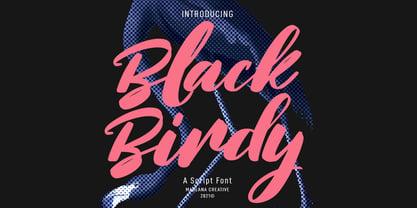 Blackbirdy is a super slanted script font. With bold contrast stroke, slanted, fancy and fun character with a bit of ligatures and lowercase alternates. To give you an extra creative work. Blackbirdy font support multilingual more than 100+ language. This font is good for logo design, Social media, Movie Titles, Books Titles, a short text even a long text letter and good for your secondary text font with sans or serif. Make a stunning work with Blackbirdy font. Cheers, MaulanaCreative
 - Poetica by Adobe,
$29.00Poetica font was designed by Robert Slimbach in 1992 with particularly generous characters. The typeface family consists of 21 weights to allow for an unusual variety of design possibilities within one typeface family. Numerous swash letters, ornaments and ligatures remind one of the early Renaissance and its unforgettable masters, for example, Giambattista Palatino, who later gave his name to Hermann Zapf's creation. Slimbach used the Lettera Cancellaresca as a model for his typeface, the cultivated humanistic italic which later served as a point of departure for the development of italics of the Renaissance and thereafter. Lettera Cancellaresca is very legible, extremely harmonic and impressively beautiful. The early forms display two different compositional tendencies, namely the static of the simple vertical capitals and the italic dynamic of the slanted lower case alphabet, as shown in the weight Chancery 4. The capitals later conform to the slant of the lower case, as shown in the weights Chancery 1-3. Poetica font should be set according to the included suggestion in order to see the full benefit of its grace and beauty. - Bounches by Trustha,
$16.00 Bounches is a fun handwritten font, it's dynamic handwriting. Comes with two font styles, regular and slant. Bounches are suitable for branding, advertising, headlines, packaging design, and many more.
 - Diamond Braille by Echopraxium,
$5.00 Here is a "Decorative Braille font". The initial design was indeed drawn on a K.I.S.S digital sketchpad, the Windows default drawing tool (Microsoft Paint, classic version). A. Glyph Concept The Braille 2x3 dot matrix is weaved around a diamond-shape. a.1. Each "dot" is represented by a "right-angle isocel triangle". a.2. Braille dots in Diamond Braille a.2.I. "Dots" are outside the diamond for first Braille row (Braille dots 1, 4) and third Braille row (Braille dots 3, 6). a.2.II. "Dots" are inside the diamond for second Braillle row (Braille dots 2, 5). a.3. Diamond lattice Glyphs are connected horizontally (to/bottom diamond's corners) and vertically (left/right corners) to each other (see poster 5). a.4. Special Glyphs - Space: its is either empty ("Empty cell") or a "non Braille shape" { _, ° } depending on your display needs (as explained in b.3.II) - 6 dots: { £, =, û } - 6 empty dots: { ç, ¥ } B. Font user guide b.1. Lowercase glyphs { A..Z } In these glyphs the "dots" are represented as a white right-angle isocel triangle filled with a smaller black triangle. b.2. Uppercase glyphs { a..z } In these glyphs, the "dots" are represented as an empty triangle (this is an "empty dot"). b.3. 'Space' vs 'Empty Cell' b.3.I. 'Space' - 'Space' glyph is an empty shape - '¶' glyph (at the end of each line in Microsoft Word) is also an empty shape b.3.II. 'Empty cell' glyphs: _ (underscore), ° (degree). In these glyphs there are 2 "empty dots" at top and bottom corners of the diamond, which differentiates them from regular Braille glyphs (which dont have a "dot in the middle"). b.4. Diamond Lattice To display text as a 'diamond lattice', replace each 'Space' by an 'Empty cell' (as explained in b.3.II, see poster 5) b.5. Connectors The connector glyphs allow the creation of "circuit like" designs (see poster 1). Here are the connector glyphs: { µ, à, â, ä, ã, è, é, ê, ë, î, ï } b.6. Domino feature Some Glyphs represent numbers 1..6 in a way which is similar than on dominos (see poster 6) C. Posters Poster 1: the "Font Logo", it displays "Diamond Braille" text together with the Connectors feature. Poster 2: a pangram which is published on pangra.me ( "Adept quick jog over frozen blue whisky mix" ). Poster 3: an illustration of the Domino feature. Poster 4: a DiamondBraille version of the Periodic table. Poster 5: illustration of the Diamond lattice using only 6 dots ( û ) and 6 empty dots ( ç ) glyphs.
 - Quadrivium NF by Nick's Fonts,
$10.00A classic typeface with timeless appeal, based on the venerable Weiss Initials II, designed by Eric Rudolf Weiss for Bauersche Gießerei in 1931. Essentially a monocase font, this version also includes variants located at lowercase a, e and g. Both versions of this font contain the Unicode 1252 (Latin) and Unicode 1250 (Central European) character sets, with localization for Romanian and Moldovan. - Latinate by K-Type,
$20.00 LATINATE is a condensed Latin typeface whose sharp serifs are not as fiercely pointed as traditional Latins. The fonts are derived from the serial numbers of bus tickets issued by the Bell Punch Company in the mid twentieth century, and the LATINATE ROUGH font is a distressed version based on scans of coarsely printed tickets.
 - FHA Tuscan Roman by Fontry West,
$20.00 The first Tuscan lettering was penned in the mid-fourth century by the calligrapher Furius Dionysius Filocalus. The style was still in common usage as calligraphy when Vincent Figgins designed the first Antique Tuscan for print in 1817. Antique and Gothic Tuscan woodtype fonts appeared in the 1830’s. By the 1850’s, Tuscan fonts had become popular in America. These styles continued in print use into the twentieth century. Tuscan Antique and Gothic styles, borrowed from print and calligraphy, were perfect for signs, posters, handbills and other large format advertising. Sign painter, Frank Atkinson demonstrated several Tuscan forms in his book Sign Painting, A Complete Manual. Modified & Spurred Tuscan Romans were inspired by this and other works of the same period.
 - Manstromer by Trustha,
$16.00 Manstromer is a dynamic handwritten font, written with fast movements. Comes with two fonts styles, regular and slant. Manstromer is suitable for branding, advertising, headlines, packaging design, and many more.
 - Ps Snackbar Prn by Fontopia,
$12.99 Snackbar prn is a typeface with a humorous slant. The font has its origins in an art project. It is now made available for design around festifals, parties, invitations, etc.
 - Linotype Puritas by Linotype,
$29.99The German designers Gerd Sebastian Jakob and Jörg Ewald Meißner developed the Linotype Puritas family in 1999. The family, which has six text styles as well as a ornament set, displays a very geometric design, which harks back to the German modernist experiments with typography and lettering from the 1920s. The letters in Linotype Puritas Light, Linotype Puritas Medium, and Linotype Puritas Bold all have a slight slant to them. Not to be confused with an italic-grade slant, which may be found in the Light, Medium, and Bold Italic styles, these acute slants add a dynamic quality to text. The Linotype Puritas Ornaments font contains several dingbats and border elements, all drawn in the same line style as the companion letters. The entire Linotype Puritas family is included in the Take Type 4 collection from Linotype GmbH." - Handu by Alex Jacque,
$20.00 Handu, designed by Alex Jacque in 2012, is an affable hand-drawn sans-serif inspired by the hand-painted type and signage on the streets of Kolkata, India. Fitting then that it come to life with brush and paint. When used for display purposes the organic, painted texture of Handu's glyphs really shines. At smaller point-sizes the hand-drawn aesthetic still translates. Handu comes in two styles, regular and shadow. Use each independently or overlay them for a little youthful emphasis.
 - Elpy by Wordshape,
$25.00 Elpy is a friendly rounded sans serif workhorse family inspired by all things music! Spanning 22 Condensed and Regular weights with true italics, Elpy will fit right in with your record collection and your font collection! The Elpy family includes language support for Western and Eastern European languages, Greek and Cyrillic. Ian Lynam dreamt up Elpy one day when he visited a record pressing plant outside Tokyo, watching vinyl pellets being melted down and a fresh batch of 7-inch records get pressed. Despite the smell, a seed was planted that would be extruded into Elpy's rounded forms half a year later... Elpy Light and Regular function as highly readable text typefaces, while the bolder and lighter weights are perfect for display work. Elpy's rounded terminals make the family perfect for screen-based work, as well as for print conditions of any resolution—from offset to Risograph.
 - Garden Collection by Cultivated Mind,
$25.00 Introducing the Garden Collection. A new Garden Grown font family by Cultivated Mind Type. This hand-painted collection includes four scripts, two caps fonts, plant art, extras art and free words. Garden Grown Pro scripts includes 260 alternates and 46 ligatures. Ligatures are programmed to pop up when specific letter pairs are typed. Try the alternates and ligatures together to give your designs a realistic hand-painted look. The all caps fonts and basic scripts do not include alternates or ligatures. Use the free words font for keyword and hashtag ideas. Garden Grown works great for cookbook covers, product design, packaging design, restaurant marketing, magazines and film.
 - Linotype Schachtelhalm by Linotype,
$29.99Linotype Schachtelhalm is part of the Take Type Library, chosen from the entries of the Linotype-sponsored International Digital Type Design Contests of 1994 and 1997. The inspiration of German designer Ilka Kwiatkowski is not hard to figure out and the font carries the German name of the plant which was its model. The alphabet consists exclusively of capital letters with clear geometric basic forms. The font is meant for headlines in point sizes of 18 and larger. The details which make Linotype Schachtelhalm unique and true to its inspiration are however best seen in large point sizes, such as on posters, and Schachtelhalm is best combined with neutral fonts. - Beach Please by Resistenza,
$39.00 Beach Please - Is a suite of handwritten fonts designed with pointed brush and watercolors. Beach Please Script is a relaxed and tender brush font, inspired by sign painting. The aim was to give a fun and fresh twist, exaggerating some curves and punctuation signs. There are also many alternates and swashes included accessible through opentype. Beach Please Caps & Wide have a bizarre look because of the reversed contrast on some letters, this particularity gives to the font a total new expression perfect for catchy headlines. Beach Please Wide works better when you need to use it in smaller sizes. It is full of ligatures to give to your text a realistic handwritten feeling. Beach Please works very will with our font family 'Aperó' We also present in this font family a slanted version for each font. To complete the Suite a set of tropical and fruity icons is also available. These sketchy vintage illustrations are perfect to create beautiful letterings and graphic layouts. Enjoy it! More about Opentype Features: https://bit.ly/opentype-rsz
 - Bountyman by Letterhend,
$14.00 Bountyman is a slab serif typeface with slant version. Perfectly to be applied to the other various formal forms such as invitations, labels, logos, magazines, books, greeting / wedding cards, packaging, fashion, make up, stationery, novels, labels or any type of advertising purpose. Features : Regular & Slant version Uppercase & lowercase Numbers and punctuation Multilingual PUA encoded We highly recommend using a program that supports OpenType features and Glyphs panels like many of Adobe apps and Corel Draw, so you can see and access all Glyph variations.
 - SbB Intermodal Stencil by Sketchbook B,
$9.00 Inspired by stenciled lettering on crates and shipping containers, Intermodal is a 18-typeface family consisting of six widths and corresponding italics in two different angles. Intermodal uses only vertical stencil cuts— creating a dynamic rhythm and a unique, industrial feel. The variable font allows for customization of weight, slant and stencil opening size. 18 fonts Six widths: A-F Regular and two different oblique angles Tabular Opentype Numbers and an alternate "9" Variable font allows you to change weight, slant and stencil opening size
 - Alphasnail - Unknown license

- Gronau by Zetafonts,
$35.00 Andrea Tartarelli discovered the letterforms that would inspire his Gronau family in a 1912 specimen that showcased the typeface Fette Reichs-Deutsch, designed by Wilhelm Gronau in 1902. Fette Reichs Deutsch has been digitised by Tartarelli as Gronau Fette. With Gronau Neue, Tartarelli tried to find a contemporary, gestural interpretation of blackletter shapes, adding a slightly calligraphic look and feel to the original hasty lines and energetic construction.
 - Visconte by Zetafonts,
$51.00 After Marcovaldo, here comes Visconte: a new singularity variant expanding the Calvino typeface family by Andrea Tartarelli with Cosimo Lorenzo Pancini and Francesco Canovaro as a branding font for the Desina Graphic Design Festival in 2023. It takes the design of the original Calvino typeface in the "brutal serif" territory, expanding spiky serifs and creating unexpected distortions and connections while keeping the original calligraphic old style structure of the Calvino Family.
 - Pace by Ratzlaff Type,
$9.00 Pace is a geometric minimalist typeface with a large range of weight options to suit multiple scenarios, from videogames to sports magazines. To inspire movement and speed, try the Slanted styles.
 - Right Hand by Okaycat,
$19.50 Right Hand is a legible naturally written script. Tidy pen writing with a casual slant. Right Hand is extended, containing West European diacritics & ligatures, making it suitable for multilingual environments & publications.
 - SmoothyPro by Resistenza,
$39.00 Smoothy Pro, is a new version of Smoothy, our brushy textured font launched last summer. This summer we propose a smoother version without textures and also a light and slanted version
 - Thistails Font Duo by Panatype Studio,
$9.00 Thistails is font duo with modern vintage look design style, available as a script and Display Sans serif typeface. These two lovely fonts would be perfect to combine in your design. Suitable for digital lettering, logo, t-shirt, print, business cards, branding materials, quotes, nature photography, etc, made with hand painted and carefully crafted. OpenType Features: Ligatures, Stylistic Set
 - Balboat by Ingrimayne Type,
$9.95 Balboat is a plain calligraphic face with a very small x-height, long descenders, and tall ascenders. Having the appearance of a pen-drawn sans serif, it has four styles: regular, bold, italic, and bold italic. Although Balboat is quite legible, it is condensed and may need to be printed at a larger point size than other typefaces.
 - Bloodstone by sizimon,
$16.00 Bloodstone is strong, sharp and have a painted look feel. Suitable for digital lettering, branding materials, t-shirt, print, business cards, quotes, logo, poster, t-shirt, nature photography and applicable for any graphic design. It contains a full set of lower & uppercase letters, a large range of punctuation, numerals, and multilingual support, also has alternative characters.
 - Code Pro by Fontfabric,
$29.00 Code Pro is a font family inspired by the original Sans Serif fonts like Avant Garde or Futura, but with a modern twist. It is clean, elegant and straight-to-the-point. Code font is applicable for any type of graphic design—web, print, motion graphics, etc.—and perfect for t-shirts and other items like posters and logos.
