10,000 search results
(0.032 seconds)
- Comenia Sans by Suitcase Type Foundry,
$75.00Comenia Sans was designed in the framework of a unique typographic project for all types of schools. It is a complementary face for Comenia Serif, released by our friends at Storm Type Foundry. Comenia Sans has a lot in common with its serif sister: the height of both upper and lower case, the length of ascenders and descenders, and the general weight. This makes the two perfect partners which work well even when set side by side in a single line of text. Comenia Sans does, however, lack all serifs, ornamental elements and stroke stress variation. All these elements freshen up the feel of long texts, but for shorter texts use, they are not necessary. Despite that, Comenia Sans retains the soft, friendly character of its big sister, as well as a few tiny details which lend it its unique character without compromising legibility or utility. Open counters give all letters an airy feel and permit enough variation in construction. This is why the face works well even in multiple-page texts. All its letters are easily distinguished from each other, so the reader's eyes are not strained. Diacritics and punctuation harmonize with both upper and lower case. As usually, all diacritical marks fully respect conventional shapes of accents and they are perfectly suitable for Czech, Slovak, Polish and other Central European languages, where a lot of diacritics abounds. Similarly to the renaissance italics which refers to the cursive forms, Comenia Sans introduces novel shapes of some characters drawing from the hand-written heritage. This is most apparent in the single-bellied a, the simplified g, and the stem of f which crosses the baseline and ends with a distinct terminal. In the text, emphasized words are thus distinguished not only by the slant of letters, but also by the shapes of the letters themselves. All twelve styles contain set of small caps, suitable for the names, in the indexes or the headlines in longer texts. Legibility in small sizes under 10 points was at the center of designers' attention, too. This is why the counters of a, e and g are large enough to prevent ink spread in small sizes, both on-screen and in print. After all, the font was specifically optimized for screen use: its sober, simple forms are perfectly fit to be displayed on the computer screen and in other low-resolution devices. When used in the context of architecture, the smoothness of all contours stands out, permitting to enlarge the letters almost without limit. A standard at the Suitcase Type Foundry, each style of Comenia Sans boasts a number of ligatures, an automatic replacement of small caps and caps punctuation, a collection of mathematical symbols, and several types of numerals which make it easy to set academic and other texts in an organised, well-arranged way. For the same purpose, fractions may come in handy, too. Apart from the standard emphasis styles, the family also contains six condensed cuts (each set has the same number of characters), designated for situations where space is limited or the need for striking, poster-like effect arises. Comenia Sans is the ideal choice for the setting of magazines, picture books, and navigation systems alike. Its excellent legibility and soft, fine details will be appreciated both in micro-typography and in poster sizes. Although it was designed as a member of a compact system, it will work equally well on its own or in combination with other high-quality typefaces. - Brother Dreams by Ditatype,
$29.00 Brother Dreams is a captivating brush font that exudes a raw and artistic vibe. With its bold capitalized letterforms and ragged edges, this typeface brings a unique and rebellious touch to your designs. The defining feature of Brother Dreams lies in its rugged and ragged edges, giving the font a handcrafted and slightly distressed appearance. This font is designed with expressive brush strokes, capturing the essence of brush calligraphy. The bold capitalized letterforms command attention, making a powerful statement with their unconventional and untamed style. Inspired by the untamed spirit of artistic expression, Brother Dreams embodies a sense of creativity and authenticity. The rough and ragged edges add a touch of uniqueness and individuality to each letter, as if they were painted with passion and emotion. This font embraces imperfection and celebrates the beauty of artistic spontaneity. Each letter of Brother Dreams is meticulously crafted to maintain its boldness and legibility while embracing the rugged and ragged edges. The resulting composition is a balance of artistic expression and readability. This font allows your message to stand out with its raw energy and rebellious charm. Enjoy the various features available in this font. Features: Multilingual Supports PUA Encoded Numerals and Punctuations Brother Dreams is ideal for headlines, titles, logos, and any design that requires a lively and energetic display. Whether you're working on posters, packaging, branding materials, or any project that needs a touch of liveliness, this font will bring a contagious sense of cheer. Find out more ways to use this font by taking a look at the font preview. Thanks for purchasing our fonts. Hopefully, you have a great time using our font. Feel free to contact us anytime for further information or when you have trouble with the font. Thanks a lot and happy designing.
 - BR Candor by Brink,
$30.00 BR Candor is a geometric sans based on the functional characteristics and raw geometry of early European sans serifs. BR Candor however, is a more modernist interpretation of these classic styles, and its distinctly geometric letterforms produce a strikingly clear and contemporary typographic aesthetic. As the name suggests BR Candor is open, honest and straight talking.
 - Holofernes NF by Nick's Fonts,
$10.00The raw emotional energy of German Expressionism is evident in this font, based on Judith Type, designed by C. H. Kleukens in 1923. This version takes its name from the Biblical character who lost his head to the original font’s namesake. Both versions of the font include 1252 Latin, 1250 CE (with localization for Romanian and Moldovan). - Concrete Forge by Get Studio,
$10.00 ConcreteForge: A fearless brutalist font with extended shapes, exuding strength, and resilience. Captivating and impactful, it embraces simplicity while making a bold statement for branding and design projects. Inspired by the raw aesthetics of brutalist architecture, this typeface exudes strength and confidence. The family includes 9 fonts in a variety of weights and supports Variable Font.
 - Blackway Brush by Stringlabs Creative Studio,
$25.00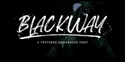 Blackway is a raw and natural handdrawn display font that radiates authenticity. Fall in love with its modern charm! Blackway is a handbrush font with a great personality for outdoor or events. It will elevate a wide range of design projects to the highest level, be it branding, headings, wedding designs, invitations, signatures, logos, labels, and much more!
 - Hai Brush by Sabrcreative,
$30.00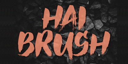 Unleash your creativity with the all-caps captivating Hai Brush Font. This unique typeface effortlessly combines the raw energy of hand brush strokes with a touch of elegance, making it an exceptional choice for a variety of design endeavors. Whether you're crafting logos, posters, or branding materials, Hai Brush Font adds an authentic, artistic flair to your projects.
 - Siempre by 38-lineart,
$19.00 Introducing the Siempre Font. The Siempre font is a distinctive typeface created with the bold strokes of an ink pen. Its rough and raw aesthetics give it a unique and memorable character. This font exudes a powerful impression that makes it the perfect choice for brands, logos, and promotions, ensuring that people will always remember your message.
 - Crypton Ink by Olivetype,
$18.00 Crypton Ink is a raw brush typeface. Its cool texture is carefully handcrafted to straight away grab the attention of the viewers. Suitable if use for logos, posters, headlines, brandings, apparel, etc. This font is supporting Multi-Languages, which includes: Afrikaans Albanian Catalan Danish Dutch English Estonian Finnish French German Italian Norwegian Portuguese Spanish Swedish Zulu. Thank you
 - Pumpkins Brush by Inumocca,
$13.00 Pumpkin’s Brush Pumpkin’s Brush Family Font inspiration from Halloween character, scream, wets, dirty and raw. Absolutly modern glyph and great to playing typography, or your logos , signature , signage your shop, Logos, catalog , all about of fashions and arts. Its very easy to use Unique glyphs - Multilingual Characters Support - UPPERCASE - Lowercase - Numeric - Symbol - Punctuation Character Inumocca type Studio
 - Eveningnews by Wiescher Design,
$39.50 Since many years I live in Munich and read the daily newspaper Abendzeitung. One morning they had redesigned the paper, using Eric Gill's Joanna for the body copy and a tweaked version of Franklin Gothic for the headlines. Since both typefaces are my all-time favorites, I was very pleased. The old hand-lettered title lettering designed by in-house designer Ernst Friedrich Adler around 1947 or 48 was untouched as it always was. Adler had worked for the newspaper an incredible 47 years! Ernst Friedrich Adler celebrated his 100th birthday in the summer of 2007 looking very healthy. But someone had adapted his title lettering for use in the chapter headings, and I did not like the way that was done. Every morning I saw those letters and thought "one day I have to clean that up". About 15 years later I finally did it! Being at it, I designed the whole typeface and added a second fancy cut. And, what do you know, the people at the Abendzeitung called me up and said they liked what I did and started using it. So since that day in 2005 I can read my morning paper without having to wonder about the chapter headings. Well maybe one day they will do another redesign and maybe they will use another one of my fonts. Your editorial typeface designer, Gert
 - Dan Panosian by Comicraft,
$29.00 It’s true -- having your own font IS The Secret Of Happiness! At times suave and sophisticated, at other times rough and ready for anything, superstar comics artist Dan Panosian has worked on the likes of CAPTAIN AMERICA, SPAWN, THE FLASH,, SPIDER-MAN, X-THE X-MEN and GREEN LANTERN, as well as the movie, HARRY POTTER AND THE SORCERER'S STONE and games like DUKE NUKEM. He hasn't been seen in comics for some time, but he’s back, baby, working on a series of JOHN TIFFANY bandes desinée, and he’s brought his own font with him, courtesy of that awfully nice John JG Roshell at Comicraft. John Tiffany is one of the best bounty hunters in the world and he has no illusions about the world that employs him. Tiffany relies exclusively on four people: the Reverend Lovejoy, who taught him to love his money; Wan Chao, of the geek underworld who serves as an interface with the outside world; Dorothy, his partner, and Magdalena, the ‘call girl in his life.’ But in Mexico, the hunter has become prey, his head has a price. And if his rivals know his location, it means that John Tiffany was betrayed by one of four people he thought he could trust...and now he can rely on only ONE thing, his secret weapon. His FONT. See the families related to Dan Panosian: Urban Barbarian.
 - Stampoo by Typodermic,
$11.95 Welcome to the world of Stampoo, where creativity meets typography. This isn’t your run-of-the-mill typeface—this is a joyful, wild, and curvaceous font that is guaranteed to make your words pop. When you use Stampoo, your message will be transformed from a mundane statement to a laid-back expression of kindness. It’s like giving your words a warm hug, but without the awkwardness of physical contact. The rubber stamp letterforms are as natural as the grass under your feet, and the bespoke pairs will make your text flow like a mountain stream. But Stampoo isn’t just a pretty face. Oh no! This font is a true workhorse, designed to make your life easier. With OpenType ligatures, those tricky letter combinations are replaced by bespoke pairs, making your text look more natural and realistic. It’s like having a personal typographer at your fingertips, without the exorbitant hourly rate. So why settle for boring, run-of-the-mill typography when you can have the natural, creative, and joyful letterforms of Stampoo? Add a touch of whimsy to your next project, and let Stampoo do the heavy lifting. Your audience will thank you for it. Some Latin-based European writing systems are supported, including the following languages. Afaan Oromo, Afar, Afrikaans, Albanian, Alsatian, Aymara, Basque, Bemba, Bikol, Breton, Cape Verdean, Creole, Catalan, Cebuano, Chamorro, Chavacano, Danish, Dawan, Dholuo, Dutch, English, Estonian, Faroese, Fijian, Filipino, Finnish, French, Frisian, Friulian, Galician, Genoese, German, Guadeloupean Creole, Haitian Creole, Hiligaynon, Icelandic, Ilocano, Indonesian, Irish, Italian, Jamaican, Kaqchikel, Kikongo, Kinyarwanda, Kirundi, Lombard, Low Saxon, Luxembourgish, Makhuwa, Malay, Ndebele, Neapolitan, Norwegian, Novial, Occitan, Papiamento, Piedmontese, Portuguese, Quechua, Rarotongan, Romansh, Sango, Saramaccan, Sardinian, Scottish Gaelic, Shona, Sicilian, Silesian, Slovak, Slovenian, Somali, Sotho, Spanish, Swahili, Swazi, Swedish, Tagalog, Tetum, Tshiluba, Tsonga, Tswana, Tumbuka, Uzbek (Latin), Venetian, Võro, Walloon, Waray-Waray, Wayuu, Xhosa, Yapese, Zapotec Zulu and Zuni.
 - Sapore by Fonderia Serena,
$23.90 Sapore is a script font family, mostly monoline, inspired by the elegant handmade signs in the beautiful city of Venice, Italy, where I work and live. Many of these signs were made at the beginning of the 20th century by skillful craftsmen and artists, carrying that distinct vintage Italian flavour, and this is why I named the font Sapore, which means precisely flavour (also, one of the signs is from a pastry shop that makes the most delicious things). The design takes this retro vibe into the 21st century, making it up-to-date and fresh, while keeping it authentic. It is a script font, but I added some stand alone capitals that you can use in all caps words and texts effortlessly, as the open type code is taking care of using the right set of letters at the right time, I could have made two separate fonts, but I wanted to give you the best value I could and ease of use. Make sure contextual alternates are always on! There are also swashes, alternate styles, stylistic sets, small caps, 2 figure sets and decorative elements, all accessible through open type. I think the font is particularly suited for display use, as in logos, packaging design, branding, but it is readable enough for small text blocks. You can access the non-linking caps by clicking on the discretionary ligatures button. You can access the loopy caps by clicking on the titling alternates button. The main version has straight terminals but I included a round version and a calligraphic one, called “classico”. Hope you like it!
 - Quinoa by Catharsis Fonts,
$29.00 Quinoa is display typeface by Catharsis Fonts that unites the seemingly opposed concepts of clean geometric architecture and organic humanist warmth. While it is designed for display and editorial purposes, its accessible forms make for comfortable reading even at small text sizes. Its exuberant adaptive "f", "j", "Q" and refreshing titling alternates bring display text to life. Quinoa covers multilingual Latin, Cyrillic, Greek, Hebrew, Arabic, and Armenian. The Quinoa family spans four stylistic cuts (Quinoa, Quinoa Titling, Quinoa Round, and Quinoa Text) with matching hand-slanted obliques, each of which comes in nine weights. The Titling cut offers a number of alternate capital letter designs with lowercase-inspired forms for a refreshing unicase look, and the Round cut additionally removes the spurs from arched letters like n. The text cut introduces true diagonals and a two-storey "a" for a more sober, reading-friendly look. A host of other OpenType features including ligatures, contextual alternates, small caps, figure sets, and character variants are built into all cuts. Furthermore, the small caps of Quinoa, Quinoa Titling, and Quinoa Text are available as dedicated font files under the names "Quinoa SC", "Quinoa Unicase" and "Quinoa Text SC" for ease of use. Acknowledgements: I am thankful to the TypeDrawers and the Typografie.info communities for great feedback and support. In particular, Thorsten Daum has been tremendously helpful with suggestions and quality control. Thanks to Craig Eliason and Jan Willem Wennekes for their help with the Latin, Alexander L. Stetsiuk for Cyrillic, Ofir Shavit and Jonathan N. Washington for Hebrew, Khaled Hosny for Arabic, and Hrant H. Papazian for Armenian.
 - Ringtail by Din Studio,
$25.00 Every font designer has their own favorite font type, which you do not need to find as it takes too much time to figure it out for you until you can match it with a perfect font. Ringtail has the best answer to your needs. Ringtail is a font containing two font types to use together or separately: sans serif and script fonts. Sans serif font has firm, modern, simple looking lines without curvy edges. Meanwhile, the script font has curvy lines in water paint or ink textures. The textures are extra lines added to each letter and to the background letter patterns. A textured script font looks more artistic and more detailed than the other ordinary script fonts to show elegant, romantic impressions in your designs. Additionally, script font can be applied for adding extra visual contrasts to designs with sans serif font. Features: Stylistic Sets Ligatures Multilingual Supports PUA Encoded Numerals and Punctuations Ringtail fits best for various design projects, such as brandings, posters, banners, logos, magazine covers, quotes, headings, printed products, invitations, name cards, merchandise, social media, etc. Find out more ways to use this font by taking a look at the font preview. Thanks for purchasing our fonts. Hopefully, you have a great time using our font. Feel free to contact us anytime for further information or when you have trouble with the font. Thanks a lot and happy designing.
 - Morgan Sans by Feliciano,
$50.00The Morgan Project can be considered a big type family with ‘many styles’ or a set of different types that match with each other. For me it’s one typeface with different versions with deliberate and visible differences according to the propose to which each version was created. The design started in 2000 as a display type with the design of the Morgan Tower, to which more two display versions were added; Morgan Poster and Morgan Big — all together the make our: FTF Morgan Display Kit 1. All three versions consist only in uppercase with alternate letters in the lowercase and a set of special ligatures. Morgan Tower has four variants that differ in width/weight, Morgan Poster has six variants (often called styles), three weights in upright and oblique and Morgan Big has twelve, six weights in upright and oblique. Lately, the FTF Morgan Tex Kit 1 was added. Apropriate versions to use in text setting. Both versions, FTF Morgan Sans and FTF Morgan Sans Condensed share the same structure and character mapping. Four variants each; regular, bold, oblique and bold oblique with a large character set including: small caps, lining and old style figures (here called Office figures) — both tabular —, small caps lining figures, mathematical symbols and fraction figures, and, a set of foreign characters expanding the possibilities of use for a wider range of languages. Characters are distributed in six different font layouts: Lining, Office, Expert, Caps, Figures & Pi. - Klang MT by Monotype,
$29.99Will Carter, well known in connection with his private press in Cambridge, has combined the skills of a calligrapher with a practical knowledge of printing. His mastery of pen-drawn letterforms was put to practical use in the design of Klang. Klang is a slightly inclined and calligraphically shaped sans serif with short ascenders and descenders. The Klang font is useful for informal applications, such as invitations, greetings cards and posters, but can also be used in advertising. - Holistic Duo by Letrasupply Typefoundry,
$15.00 Pure and natural hand drawn typeface, it's Holistic font! Comes with two casual yet delicate style (script and sans), then wrap in three different look (solid, textured and rough). Holistic Script includes alternative characters, you can play with it to get a bit messy but still pretty. Have fun with these fonts and make a lovely combination for logos, displays, posters and other project that needs natural handwritten work. All in one package to get an organic feeling.
 - Dry Cowboy by Chank,
$99.00 Yee haw! Send me a shot of sarsparilla and let's celebrate a new cowboy font! This time we're pleased to introduce a new, more legible counterpart to Chank's Drunk Cowboy font. The resultant new font has a bit less of a drawl to it and is known as Dry Cowboy. Now you have a choice for smaller text setting when using Drunk Cowboy as the headline font. Wrangle the two together and put a little giddyup in your designs.
 - Worthless by Gassstype,
$23.00 Here comes a New font, Introducing WORTHLESS It's Weird Display Font is a Natural Style and Authentic classy style, this font is great for your creative projects such as watermark on photography, and perfect for logos & branding, invitation,advertisements,product designs, stationery, wedding designs,label ,product packaging, special events or anything that need handwritting taste. WORTHLESS a natural Hand Drawn feel. This handmade font will make your design has a beautiful natural touch for each details.
 - Roelandt BT by Bitstream,
$50.99Roelandt BT is another beautiful script font drawn by calligrapher Rob Leuschke. Perfect for informal invitations and documents, the standard semi-connecting glyphs are simple, yet elegant. An OpenType font, Roelandt also contains a set of Swash characters. Using the OT Swash feature to access these alternate glyphs, you can quickly transform your text into a stylish and more formal presentation complete with generously sized uppercase swashes. Basic and alternative glyphs in the font support Central Europe. - MVB Greymantle by MVB,
$39.00Kanna Aoki had fairy tales in mind when she designed MVB Greymantle. She drew dots with a felt pen to build up the forms, giving them their particular rough character. The “Extras” font contains a set of whimsical illustrations, including a portrait of Greymantle—her 18-pound cat, a set of curly initial caps, and border parts. MVB Greymantle has been spotted on numerous children's books, in magazines, in salad dressing advertisements, and on food packaging. - Back Groove Outline by Gatype,
$9.00 The Back Groove font is smooth in totality and elegance. One of the best releases earlier this year, drawn with pinpoint accuracy. Back Groove has the perfect simplicity and refinement for your next project. Back Groove It perfectly represents a precise and vintage aesthetic. Because it's guided by Outlen's Back Groove I recommend this font for your next celebrations, logos, invitations, and home decor projects that need a touch of compact alternative combinations! Check it out and enjoy!
 - Roquen by Letterhend,
$14.00 Meet Roquen, a display typeface, hand drawn! Bold, stands out, with a rustic and nostalgic look! Works perfectly for headline, logotype, apparel, invitations, branding, packaging, advertising, and more. This typeface is comes in uppercase, lowercase, punctuation, symbols, numerals, stylistic set alternate, ligatures, and also has multi-lingual support. We hope you enjoy Roquen. Please feel free to comment if you have any thoughts or feedback. Or simply send me a PM or email me at letterhend@gmail.com
 - Naturaliya by Atharuah Studios,
$18.00 Introducing Naturaliya; An monoline script font! Naturaliya is a hand-drawn monoline script font that showcases beauty and balance in flawless writing. It's the perfect choice for stylish branding & logo projects, product packaging, handwritten quotes, editorial design, and more. What's Included: Naturaliya comes with a single font file that includes uppercase, lowercase, numbers, punctuation, and multilingual support. That's it! I hope you enjoy it. You can also say hello to me on Instagram: https://www.instagram.com/atharuah_ Thank You!
 - ITC Edwardian Script by ITC,
$40.99 In 1994, Edward Benguiat designed ITC Edwardian Script, an emotional, lyrical, even passionate calligraphic typeface. Its appearance was influenced by the look of writing with a steel pointed pen, an instrument which can be pushed as well as pulled, and which produces stroke contrast when pressure upon it is varied. The delicate, sophisticated letterforms of ITC Edwardian Script font were drawn and redrawn until the connective elements of the letters were perfected to create the look of true handwriting.
 - We Love Nature Summer Flowers by kapitza,
$79.00 We Love Nature Summer Flowers is a picture font inspired by a late summer visit to an organic flower farm in the south of England. The farm specializes in growing local seasonal flowers for lovely bouquets and arrangements. This picture font features 52 hand-drawn illustrations inspired by these flowers. The contemporary flower illustrations can used on their own or in combination with the other illustrations in the We Love Nature font collection to create striking designs.
 - Too Sweet To Eat by Cuda Wianki,
$20.00 Too Sweet To Eat is a hand-drawn font that has many variations because you can choose from simple outline version, only shadow version, normal version and filling version. If You put one on another then you have a great possibility to apply different colors on different layers! That makes your letters multicolor! Great stuff for decorative writings, posters, informal stationery! SPECIFICATION: alternate characters for all numbers and letters, nearly 400 kerning pairs, multi-language coverage, ornaments.
 - Fiddle Sticks NF by Nick's Fonts,
$10.00The roly-poly serifs, inspired by West Banjo, designed by Dave West, add such irrepressible charm to this typeface that you just want to pinch its little cheeks, if you are so inclined. Equally at home in the 1960s, when it was originally released, as the 1860s, from which it drew its inspiration. The PC Postscript, Truetype and Opentype versions contain the complete Latin language character set (Unicode 1252) plus support for Central European (Unicode 1250) languages as well. - Kutaraja by BaronWNM,
$14.00 Kutaraja is a hand-drawn script font that gives a natural-looking impression that is perfect for those of you who want to use script-style fonts, very suitable for writing product labels, printing t-shirts, greeting cards, invitation cards, etc. Kutaraja family has 2 choice models, namely regular and italic. both have several ligatures, alternate, swash at the beginning and end of lowercase letters to give a sweet touch to the written word or sentence.
 - Jugenstil Kunsthand by Scriptorium,
$12.00Jugendstil Kunsthand is based on a sample of late 19th century lettering in a style often associated with artists of the Jugendstil Art Nouveau movement in Germany. The characters are done in heavy outline with a rough-hand drawn look. The style is interesting because it shows the influence of the Arts and Crafts movement on Art Nouveau with many of the characters featuring alternate versions that nest together in a manner typical of Arts & Crafts lettering. - Mayaglyph by Parker Creative,
$18.00 Introducing Mayaglyph, a modern typeface inspired by the hieroglyphics left behind by the Ancient Mayan civilization. Every character in Mayaglyph is manually created with hand-drawn markings for consistency and balanced visuals, including diacritic marks, symbols, and more! Each character in Mayaglyph is distinctly imperfect in its own way, just as if it was taken right off an ancient stone. Also included is a 'solid' background version, which is ideal for creating beautiful multi-layer designs.
 - Salomonstera by Gassstype,
$25.00 Hello Everyone, introduce our new product Salomonstera is Handmade Script Font .This Authentic brush script that is written casually and quickly. Letters are made with brushes on paper. Then scanned and carefully drawn into vector format. That is why Salomonstera has charming, authentic and relaxed characteristic more natural look to your text with a more natural look to your text. Salomonstera Perfect for designs,branding projects, Logo design, Quotes product packaging You can activate Ligature OpenType panel.
 - Cowboy Burt by Cool Fonts,
$25.00 Cowboy Burt was once a cowboy, but now he's a carnie at who runs the tilt-a -whirl. This hand drawn font was designed for use in a skate-punk layout, but will be quite at home in the old west, the circus, or underground cartoons. There are two versions Regular, and Extrude which work together or apart. There are even some goofy dingbats scatter throughout. You'll have hours of fun with Cowboy Burt...Where's my waitress?
 - Antums Brush by Siwox Studios,
$11.00 Introducing Antums Brush Fonts! A hand drawn brush font style, designed especially for you. Every creative love something new. Thats why We love handmade and freestyle designs, because it will make us look Unique and Fresh. Antums Brush Fonts ready to make your design shining and sparkling.. Antums Brush Fonts suitable for any modern design such as for ad banner, modern card, invitation, announcement, seasonal design, social media promotion, web design, branding and logo stylist and many more.
 - Foundry Form Serif by The Foundry,
$90.00 Foundry Form Serif was drawn concurrently as a sans and a serif, with matching capital and x-height proportions for harmonious use. The Foundry Form Serif design has a strong horizontal emphasis, slightly condensed proportions for economic use of space, and open counters ensuring legibility at small sizes. Both families function independently. Foundry Form Serif includes a true italic; the angularity and sharp serifs help to retain maximum clarity, with the contrasting stroke widths adding refinement.
 - Kalli Sketch by Posterizer KG,
$19.00 Basicly, Kalli Sketch is humanistic cursive drawn with pen. Inside the font you'll find a host of Opentype features, alternate characters, including a full set of alternate ampersand characters (stylistic alternates), standard ligatures that automatically connect as you type and discretionary ligatures. Also, font contains basic and alternative Cyrillic characters, and more than 50 floral ornaments. Because of lightness and transparency, Kalli Sketch is looking good in combination with serif and sans serif (particularly bold) fonts.
 - Louis by Canada Type,
$24.95 Louis is a faithful digital rendition and expansion of a design called Fanfare, originally drawn by Louis Oppenheim in 1927. Redrawn digitally by Rod MacDonald, and engineered in-house by Canada Type, Louis includes the many alternates that came with the original design, and then some. It was also expanded into three variations, including a soft-cornered style, and a rough woodcut one. And of course, the codepage support covers the majority of Latin-based languages.
 - Sanes by Gassstype,
$23.00 Introducing SANES is Sans Display Font,This Font Authentic that is written casually and quickly. Then scanned and carefully drawn into vector format. This handmade font will make your design has a beautiful natural touch for each details. It is perfect for any design project as Invitation,logo, book cover, craft or any design purposes. That is why SANES has charming, authentic and relaxed characteristic more natural look to your text with a more natural look to your text.