10,000 search results
(0.03 seconds)
- Dandy JY by JY&A,
$29.00 Danielle Smith describes her friendly, hand-drawn typeface family, available in roman and italic, as ‘non-élitist and accessible’. Originally created for a theatre project at Massey University, Dandy is reminiscent of Pablo Ferro’s hand-lettering.
 - Alt Wet by ALT,
$20.00 Wet is a experimental typeface -- I drew all the glyphs by hand. I came up with this font idea after all the positive comments I received from my Type Treatments project I publish recently on Behance.
 - Danza Macabra by 2D Typo,
$36.00 That's a special horrific font with an intricate pattern of bones. All letters are put together of nonrecurring elements drawn individually by hand. The classical forms as we see it sound afresh with the bones attire.
 - Packed JNL by Jeff Levine,
$29.00One of six fonts inspired by old stencil lettering guides, Jeff Levine has drawn a font which captures the feel of simpler times when signs and posters were stencilled by school children, teachers, librarians and shopkeepers. - Starge by Mans Greback,
$59.00 Starge is a professional hand-drawn typeface. It works perfectly for a crafty project where a functional font is required. The font supports all Latin-based European languages, contains numbers and all symbols you'll ever need.
 - Canadian Animals by Okaycat,
$29.50 Canadian Animals is a picture font with highly detailed illustrations drawn by hand. Comes in outline and silhouettes, it is easy to colour in photoshop. These detailed vector illustrations will help you create your ultimate design.
 - Scurlock by Scriptorium,
$18.00Scurlock is an original Dave Nalle design. It is a rough-hewn, hand-drawn font with some interesting character. It's excellent for doing unique, eye-catching titles and has a bit of a wicked, fantastical look. - LUELLA by Cultivated Mind,
$29.00 Luella is an elegant, hand drawn vintage inspired font by Cultivated Mind. Luella has been carefully crafted and comes in three weights (Regular/Bold/Black). This font works perfectly with the Luella frames and ornaments sets.
 - 2009 Handymade by GLC,
$38.00 This font is not a historical one. Although to make it was quite time-consuming (each glyph was hand-drawn separately, except for the ligatures), this cartoon or comics style font is just made for fun.
 - Crossbar by Gassstype,
$27.00 Crossbar - Natural Hand Drawn Typeface Introducing of our new product that inspired by Street Tagging, graffiti style with a fun theme very good for graffity poster, Hip Hop music, kids poster, flyer, childrenbook, cartoon, comic etc
 - Cafeterio MS by Redcollegiya,
$10.00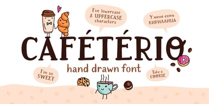 Cafeterio is a hand drawn cute font which makes it great for any children's design, be it a book cover, a t-shirt or a poster. Font includes latin and cyrillic characters, diacritics, numbers and punctuation.
 - Signed JNL by Jeff Levine,
$29.00One of six fonts inspired by old stencil lettering guides, Jeff Levine has drawn a font which captures the feel of simpler times when signs and posters were stencilled by school children, teachers, librarians and shopkeepers. - Shipped JNL by Jeff Levine,
$29.00 One of six fonts inspired by old stencil lettering guides, Jeff Levine has drawn a font which captures the feel of simpler times when signs and posters were stencilled by school children, teachers, librarians and shopkeepers.
 - Delivered JNL by Jeff Levine,
$29.00One of six fonts inspired by old stencil lettering guides, Jeff Levine has drawn a font which captures the feel of simpler times when signs and posters were stencilled by school children, teachers, librarians and shopkeepers. - Sealed JNL by Jeff Levine,
$29.00One of six fonts inspired by old stencil lettering guides, Jeff Levine has drawn a font which captures the feel of simpler times when signs and posters were stencilled by school children, teachers, librarians and shopkeepers. - MollyO by Atlantic Fonts,
$28.00 MollyO font family is based on the original, reliably cool handwriting of illustrator (and dear friend), MollyO of mollyOcards. Like MollyO herself, this font is unique, unpretentious, and beautiful. Part printed and part script, it has the authentic connections and stops of a contemporary, casual font. For the truest handwritten feel, keep discretionary ligatures on, or turn them off where you want more evenness. MollyO is expressive in all-caps, available in two weights, and with effortless warmth and inky flow, will bring a wide range of creative projects to life.
 - Montesori by Variable Type Foundry,
$19.99 Montesori is inspired by the economic forms and large x-height with a condensed style and a humanistic-grotesque typeface forms. It is a perfect option for editorial projects, branding, logos and packaging. Montesori comes in a variety of nine weights (Fine, Extra Light, Ultra Light, Light, Regular, Semi Bold, Bold, Ultra Bold and Black) with its two styles (round and italic) classified in two forms, Basic and Alternative. In addition, its case-sensitive shapes, ordinals, scientific inferiors, denominators, superscripts, subscripts, numerators, fractions... make it ideal for posters or infographics.
 - Koren Siddur by Masterfont,
$59.00 This is a unique design by Elyahu Koren. He wanted to design another version of his Koren Tanakh sacred font that was for Biblical use only. So he designed Koren Siddur to be used for page numbers etc. OpenType Pro Excellent support for Niqqud (Vowels). All marks are programmed to fit each glyph's shape and width. OpenType Pro includes new advanced features like Dagesh Hazak, ShevaNa, Qamatz Katan, Holam Haser and wide letters. Best used with Adobe InDesign CC that support complex Hebrew text. Please check these advanced features in this link: tinyurl.com/2fbkuy95
 - Fontazia AquaFlorium by Deniart Systems,
$15.00 Fontazia AquaFlorium is a new addition to our Fontazia series , featuring an assortment of flowers and aquatic accents inspired by the idea that not only sponges can live at the bottom of the sea, flowers can too. When in need of aquatic accents or modern floral decorations, this combination of dingbats are sure to do the trick. Like other type, you can easily add them to any text document or if splicing and dicing artwork is your game, these will add a little pizzazz to all your designs.
 - Kilometro Display by Hueso,
$20.00 Kilometro Display is a Font Family inspired by the chrome car emblems of the auto industry. In the early 1950s Car manufacturers started using this sort of joint-lettering (script) to write their brand or model on their cars. The trend quickly made it’s way to other industries like electric appliances and it lasted for a good 30 plus years. Today only a handful of brands still uses this font style for their products. This geometric script re-lives a bold past all the way through 5 styles to a thin future.
 - Daddy's Hand by Breauhare,
$39.00 Daddy’s Hand is based on the actual handwriting of my dad. He always prided himself on his fine penmanship, and to see him write was kind of like watching a ballroom dance--his pen would smoothly and elegantly waltz across the paper as he wrote, gliding effortlessly. I know if he were alive today he would be quite honored that his handwriting is now a font. This font can be used for all sorts of elegant occasions or advertising, and has ligatures & alternate letters. Digitized by John Bomparte.
 - Motley Crew by Hanoded,
$20.00 Motley Crew is my last font for 2016. It is quite a lively, quirky and a little bit scary typeface, which will give your designs a little more ‘joie de vivre’. It was made with a soft brush and Chinese ink. The splatter was added after I had painted the glyphs. I forgot to put away my laptop, which now looks like this font… Motley Crew wishes you all the best for the coming year - in a lot of languages, as it comes with a generous splatter of diacritics.
 - URW Akropolis by URW Type Foundry,
$39.99 The design of this display face is based on the hot metal typeface Acropolis, issued by the German type foundry Ludwig Wagner in Leipzig in 1940. To further increase its usefulness a Cyrillic was added to it: URW Akropolis, redrawn and digitally remastered by Coen Hofmann for the URW Font Forum, is a true display design that should not be set below 48 point if you want to preserve it's fine details like the open triangular sections, e.g. in L, G, S, T etc. and gain the full typographic splendidness of this beautiful typeface.
 - Reed by ParaType,
$30.00 Reed is a refined calligraphic font based on humanist italic. It contains two weights and a high-contrast Display style for extra large point sizes. Two unusual stencil styles add zest to the type family. The character set includes lots of swashes and contextual alternates. This makes text set in Reed look very close to live calligraphy. Reed works perfectly in labels and packaging of confectionery, cosmetics, perfumery and sparkling wines, as well as greeting cards and event design. Reed was designed by Isabella Chaeva and released by Paratype in 2020.
 - Typold by The Northern Block,
$29.55Typold originated out of the desire to improve geometric forms and push beyond previous achievements through collaborative working methods and knowledge sharing. The result is a finely balanced modern sans serif constructed from mathematical inputs, typographers needs, and the natural hand and eye of an artisan. Details include nine weights and matching italics, three separate widths, 1000 characters with an alternative lowercase a and y, small caps, 12 variations of numerals, Opentype features inferiors, superiors, fractions, case sensitive punctuation, extended symbols including emoji's and language support covering Western, South and Central Europe. - Ratatatat by Comicraft,
$19.00 So y'think youse gonna whack me, huh? Y'think that font o' yours is packin' enough heat to finish me off? Huh? Is that what youse is thinkin'? Well go ahead, but if y'whack me then every two bit hood in Alphabet City is gonna hunt youse down and kern youse like the rat you are! So go ahead, show them you're the Big Boss, the Kingpin of Crime, the Godfather... but you won't see me beggin' for my life, 'cause I got pride, see? I got --RATATATATATATTATATATATTATAT... Ahhh... fuggedaboutit!!
 - Ring Neck by Ochakov,
$9.00 Ring Neck incredibly elegant and at the same time effortless. Another graceful set of Ring font family! Introducing Ring Neck is a condensed sans serif which has styles from thin to black to make your design more variative and unique. Good for bold branding, titling and headline who has come to be seriously and fun. This typeface can be so serious, fun, and bold it depends on for what purpose. Ring Neck like an other fonts of Ring family is still ready to meet the challenges of everyday life.
 - FairyTale by Comicraft,
$29.00 In its beauty, Comicraft's Fairytale font is without rival in the heavens, the earth, or the stuff of men's dreams! A wee thing it may be, but 'tis like a star pulled from the sky. Luminescent. Radiant. Perfect. Yes! PARADISE can be yours...from the pages of "Captain Stoneheart and the Truth Fairy," comes a font that might very well change your life forever... it's a dream, a myth, a neverending story, it's a FairyTale! Words by Joe Kelly & art by Chris Bachalo from Captain Stoneheart and the Truth Fairy
 - Jus Hangin PB by Pink Broccoli,
$16.00 Jus Hangin was inspired by the lettering on the cover of the 1999 Counting Crows album, “This Desert Life”. It was one of those child-like lettering styles that was just begging to be fleshed out and made into a typeface that was as wild and carefree as the lettering inspiration. With an open spacing format, and an exuberant baseline bounce, Jus Hangin is fun to typeset with, while alternates and double letter ligatures keep things from getting repetitive. You’ll find Jus Hangin is ready and waiting to announce your festivities.
 - LTC Francis by Lanston Type Co.,
$24.95 Francis is a design previously offered by the Lanston Type Co. in the early 1990s. It is a revival of a 1955 Günther Gerhard Lange design, but with a heavier overall weight. Coming out of retirement, it has been fully reworked and refined with elegant curves and an expanded character set. This font works well at small sizes and larger display sizes for everything from wine labels to personal stationery. This type evokes the elegant sophistcation of the Jazz age and pairs well with a Martini and a fine selection of charcuterie.
 - Whatchamacallit by Comicraft,
$19.00 We popped the Doohickey into the Framistat and out popped this Whatchamacallit! Is it fat? is it thin? Is it tall? Is it short? Is it light? Is it heavy? Is it condensed?! is it expanded?! Yes, yes, yes and yes -- It’s all of the above and more! Our resident mad scientist John “Mr. Fontastic” Roshell has developed a single contraption that can handle any design emergency, from crimelords to supervillain team-ups to alien invasions. Whatchamacallit is a friendly and readable sans-serif, inspired by some of our all-time favorites -- Gill Sans, Futura, Venus and Antique Olive. But, like its machinery-contraption namesakes Doohickey and Framistat, Whatchamacallit has a lively personality -- the strokes are a little wavy, the ends a bit bulbous, and the circles are like little loaves of bread, rising in the Whatchamacallit's oven... delicious!
 - Tusque by Eclectotype,
$40.00 Tusque is a layered chromatic type family with a Tuscan flavor. Regular, Circus and Tooled can stand alone, while Highlight and Deco are purely for layering up multicolored gorgeousness. Tusque lends itself to fairy tales, wine labels and boutique logos, and makes some particularly delectable drop caps. Although it’s all caps, the lower case slots are all different from the upper case so you can mix and match to your heart’s content. There are also a bevy of swash alternates and ligatures at your disposal. The contextual alternates feature cleverly substitutes alternate versions of more triangular glyphs like A and V to give a better fit. The ordinal feature changes ‘a’ and ‘o’ to the feminine and masculine ordinals for Spanish etc. but also changes ‘c’ and ‘ac’ to superscript lowercase versions for names like McBride and MacDonald.
 - Ptolemei by Kaer,
$21.00 These initials set I collected from Early 15th century manuscript called Claudii Ptolemei Cosmographia, created by the famous Greek scholar Claudius Ptolemaeus in the middle of the 2nd century. The origins of this style called White Vine with interlaced patterns and vine should be found in Ottonian Renaissance manuscripts. The highest level of porthole craftsmanship points to the Florentine workshop, headed by Francesco d'Antonio del Chierico, as the most likely place of execution. --- *You can use color fonts in PS CC 2017+, AI CC 2018+, ID CC 2019+, macOS 10.14 Mojave+ * *Please note that the Canva & Corel doesn't support color fonts!* *Please download this test file with only A letter ( https://www.dropbox.com/s/u3novoj7mm2vrth/Ptolemei-Test.otf?dl=0 ) to check your app & system.* --- Please feel free to request any help you need: kaer.pro@gmail.com Best, Roman. Thank you!
 - Gailenia by HandletterYean,
$20.00 A special person deserves a special font. That is why we present you Gailenia. Make your design or any project of yours look stunning and wonderful with all the features of this font, like alternates, swashes, titling, and stylistic alternates. This font looks amazing for packaging, business cards, invitations, posters, labels, and any kind of design. Accessible in Adobe Illustrator, Adobe Photoshop, Adobe InDesign, & CorelDraw. Multilingual Support: ä ö ü Ä Ö Ü ß ¿ ¡ To access the alternate glyphs, you need a program that supports OpenType features such as Adobe Illustrator CS, Adobe Photoshop CC, Adobe Indesign, and CorelDraw. For more information about how to access alternate glyphs, please go to this link ( goo.gl/ZT7PqK ) Check out our font collection for more great and artistic fonts. Pick your most favorite font and use it as you like to reach your goals.
 - Larks Tongues by Hanoded,
$15.00 Larks' Tongues in Aspic is the fifth studio album (released in 1973) by the English progressive rock group King Crimson. I have always liked this name, as it reminded me of old stories in which witches threw all kinds of weird ingredients (larks’ tongues, bat wings and petrified dragon dung) into a big cauldron. When I created this font, it looked like the writing in an old book of spells, so I just had to call it Larks’ Tongues. Larks’ Tongues is a very lively headline font which would look good on (children’s) book covers, posters and product packaging. So, if you are about to write a book about witches, want to throw a halloween party or want to market your Larks’ Tongues in Aspic, then by all means, use this font! Comes with a magical amount of diacritics.
 - Dionisio by CastleType,
$49.00 Dionisio, a CastleType original, takes its inspiration from one of the overlooked treasures of the CastleType library: Ransahoff. The latter is extremely condensed and very elegant. I particularly like its hairline slab serifs and cross-bars. I decided to use it as a starting point for a new design, but to make the proportions more classic and to make it more sensuous with gentler curves and bracketed cross-bar serifs. The result is very Bodoni-like, but less extreme and more contemporary looking. Meanwhile, Dionisio maintains a hint of Ransahoff with condensed letterforms and very fine serifs. Dionisio brings together the best of both, making it the perfect choice where a slender, sophisticated typeface is needed. Dionisio is available in two widths: normal and condensed, five fonts each. Includes an extensive character set and OpenType features.
 - Blomma by Up Up Creative,
$16.00 Blomma is a hand-lettered all-caps display font with intricate botanical details. It includes full support for 201 languages, plus a full set of punctuation, numerals, and more, all drawn in the same botanical style. The uppercase and lowercase versions of each letter were drawn independently of one another, so that means you get two versions of each letter to play with. This is so helpful if you want to give a more authentic hand-lettered look to type with repeating letters. Blomma is perfect for monograms, logos, headlines, editorial design, branding, poster design, and more. Blomma includes approximately 390 glyphs.
 - Franklin Stone by Ironbird Creative,
$15.00 Franklin Stone is a organic hand drawn typeface inspired by vintage type with hand drawn feel. Comes with regular, condensed and stamp. This typefaces is perfect for people looking for vintage aesthetic. Suitable for any graphic designs such as branding materials, t-shirt, print, logo, poster, t-shirt, quotes .etc You may not use the fonts in templates or for sale/free or on template websites. ( web/print/app ) We hope you enjoy the font, please feel free to comment if you have any thoughts or feedback. Thanks for purchasing and have fun! Regards, Ironbird Creative
 - Silent Forest by Gassstype,
$27.00 Introducing Silent Forest is a best Terrible Hand Drawn Font that is handwritten brush casually and quickly. Letters are made with brushes on Procreate. Then scanned and carefully drawn into vector format. That is why Silent Forest has charming, authentic and relaxed characteristic more natural look to your text with a more natural look to your text. You can activate Ligature OpenType panel to make these two styles. It also has many alternatives and underlines that make your text and design more interesting. Silent Forest is perfect for homeware designs,branding projects, Logo design, Quotes product packaging.
 - Felek by Mili + Wise,
$12.00 Introducing Felek - hand-drawn sans serif font with a lot of character. Playful, bouncy & cute. Perfect for creating logos, greeting cards, posters, packaging and so much more! Suitable also for longer paragraphs, for example in children's books. Its charming and warm character will help you give your project a truly unique feel. Designed and kerned with care and love to make using it a breeze. What you will get - a hand-drawn font with lots of stylistic alternates and ligatures - a dingbat font with 53 illustrations and icons - multilingual support with accented characters for international designers Happy creating!