10,000 search results
(0.052 seconds)
- Times Eighteen by Linotype,
$29.00In 1931, The Times of London commissioned a new text type design from Stanley Morison and the Monotype Corporation, after Morison had written an article criticizing The Times for being badly printed and typographically behind the times. The new design was supervised by Stanley Morison and drawn by Victor Lardent, an artist from the advertising department of The Times. Morison used an older typeface, Plantin, as the basis for his design, but made revisions for legibility and economy of space (always important concerns for newspapers). As the old type used by the newspaper had been called Times Old Roman," Morison's revision became "Times New Roman." The Times of London debuted the new typeface in October 1932, and after one year the design was released for commercial sale. The Linotype version, called simply "Times," was optimized for line-casting technology, though the differences in the basic design are subtle. The typeface was very successful for the Times of London, which used a higher grade of newsprint than most newspapers. The better, whiter paper enhanced the new typeface's high degree of contrast and sharp serifs, and created a sparkling, modern look. In 1972, Walter Tracy designed Times Europa for The Times of London. This was a sturdier version, and it was needed to hold up to the newest demands of newspaper printing: faster presses and cheaper paper. In the United States, the Times font family has enjoyed popularity as a magazine and book type since the 1940s. Times continues to be very popular around the world because of its versatility and readability. And because it is a standard font on most computers and digital printers, it has become universally familiar as the office workhorse. Times™, Times™ Europa, and Times New Roman™ are sure bets for proposals, annual reports, office correspondence, magazines, and newspapers. Linotype offers many versions of this font: Times™ is the universal version of Times, used formerly as the matrices for the Linotype hot metal line-casting machines. The basic four weights of roman, italic, bold and bold italic are standard fonts on most printers. There are also small caps, Old style Figures, phonetic characters, and Central European characters. Times™ Ten is the version specially designed for smaller text (12 point and below); its characters are wider and the hairlines are a little stronger. Times Ten has many weights for Latin typography, as well as several weights for Central European, Cyrillic, and Greek typesetting. Times™ Eighteen is the headline version, ideal for point sizes of 18 and larger. The characters are subtly condensed and the hairlines are finer. Times™ Europa is the Walter Tracy re-design of 1972, its sturdier characters and open counterspaces maintain readability in rougher printing conditions. Times New Roman™ is the historic font version first drawn by Victor Lardent and Stanley Morison for the Monotype hot metal caster." - Times Europa LT by Linotype,
$29.99In 1931, The Times of London commissioned a new text type design from Stanley Morison and the Monotype Corporation, after Morison had written an article criticizing The Times for being badly printed and typographically behind the times. The new design was supervised by Stanley Morison and drawn by Victor Lardent, an artist from the advertising department of The Times. Morison used an older typeface, Plantin, as the basis for his design, but made revisions for legibility and economy of space (always important concerns for newspapers). As the old type used by the newspaper had been called Times Old Roman," Morison's revision became "Times New Roman." The Times of London debuted the new typeface in October 1932, and after one year the design was released for commercial sale. The Linotype version, called simply "Times," was optimized for line-casting technology, though the differences in the basic design are subtle. The typeface was very successful for the Times of London, which used a higher grade of newsprint than most newspapers. The better, whiter paper enhanced the new typeface's high degree of contrast and sharp serifs, and created a sparkling, modern look. In 1972, Walter Tracy designed Times Europa for The Times of London. This was a sturdier version, and it was needed to hold up to the newest demands of newspaper printing: faster presses and cheaper paper. In the United States, the Times font family has enjoyed popularity as a magazine and book type since the 1940s. Times continues to be very popular around the world because of its versatility and readability. And because it is a standard font on most computers and digital printers, it has become universally familiar as the office workhorse. Times™, Times™ Europa, and Times New Roman™ are sure bets for proposals, annual reports, office correspondence, magazines, and newspapers. Linotype offers many versions of this font: Times™ is the universal version of Times, used formerly as the matrices for the Linotype hot metal line-casting machines. The basic four weights of roman, italic, bold and bold italic are standard fonts on most printers. There are also small caps, Old style Figures, phonetic characters, and Central European characters. Times™ Ten is the version specially designed for smaller text (12 point and below); its characters are wider and the hairlines are a little stronger. Times Ten has many weights for Latin typography, as well as several weights for Central European, Cyrillic, and Greek typesetting. Times™ Eighteen is the headline version, ideal for point sizes of 18 and larger. The characters are subtly condensed and the hairlines are finer. Times™ Europa is the Walter Tracy re-design of 1972, its sturdier characters and open counterspaces maintain readability in rougher printing conditions. Times New Roman™ is the historic font version first drawn by Victor Lardent and Stanley Morison for the Monotype hot metal caster." - Times Ten by Linotype,
$40.99In 1931, The Times of London commissioned a new text type design from Stanley Morison and the Monotype Corporation, after Morison had written an article criticizing The Times for being badly printed and typographically behind the times. The new design was supervised by Stanley Morison and drawn by Victor Lardent, an artist from the advertising department of The Times. Morison used an older typeface, Plantin, as the basis for his design, but made revisions for legibility and economy of space (always important concerns for newspapers). As the old type used by the newspaper had been called Times Old Roman," Morison's revision became "Times New Roman." The Times of London debuted the new typeface in October 1932, and after one year the design was released for commercial sale. The Linotype version, called simply "Times," was optimized for line-casting technology, though the differences in the basic design are subtle. The typeface was very successful for the Times of London, which used a higher grade of newsprint than most newspapers. The better, whiter paper enhanced the new typeface's high degree of contrast and sharp serifs, and created a sparkling, modern look. In 1972, Walter Tracy designed Times Europa for The Times of London. This was a sturdier version, and it was needed to hold up to the newest demands of newspaper printing: faster presses and cheaper paper. In the United States, the Times font family has enjoyed popularity as a magazine and book type since the 1940s. Times continues to be very popular around the world because of its versatility and readability. And because it is a standard font on most computers and digital printers, it has become universally familiar as the office workhorse. Times™, Times™ Europa, and Times New Roman™ are sure bets for proposals, annual reports, office correspondence, magazines, and newspapers. Linotype offers many versions of this font: Times™ is the universal version of Times, used formerly as the matrices for the Linotype hot metal line-casting machines. The basic four weights of roman, italic, bold and bold italic are standard fonts on most printers. There are also small caps, Old style Figures, phonetic characters, and Central European characters. Times™ Ten is the version specially designed for smaller text (12 point and below); its characters are wider and the hairlines are a little stronger. Times Ten has many weights for Latin typography, as well as several weights for Central European, Cyrillic, and Greek typesetting. Times™ Eighteen is the headline version, ideal for point sizes of 18 and larger. The characters are subtly condensed and the hairlines are finer. Times™ Europa is the Walter Tracy re-design of 1972, its sturdier characters and open counterspaces maintain readability in rougher printing conditions. Times New Roman™ is the historic font version first drawn by Victor Lardent and Stanley Morison for the Monotype hot metal caster." - Times Ten Paneuropean by Linotype,
$92.99In 1931, The Times of London commissioned a new text type design from Stanley Morison and the Monotype Corporation, after Morison had written an article criticizing The Times for being badly printed and typographically behind the times. The new design was supervised by Stanley Morison and drawn by Victor Lardent, an artist from the advertising department of The Times. Morison used an older typeface, Plantin, as the basis for his design, but made revisions for legibility and economy of space (always important concerns for newspapers). As the old type used by the newspaper had been called Times Old Roman," Morison's revision became "Times New Roman." The Times of London debuted the new typeface in October 1932, and after one year the design was released for commercial sale. The Linotype version, called simply "Times," was optimized for line-casting technology, though the differences in the basic design are subtle. The typeface was very successful for the Times of London, which used a higher grade of newsprint than most newspapers. The better, whiter paper enhanced the new typeface's high degree of contrast and sharp serifs, and created a sparkling, modern look. In 1972, Walter Tracy designed Times Europa for The Times of London. This was a sturdier version, and it was needed to hold up to the newest demands of newspaper printing: faster presses and cheaper paper. In the United States, the Times font family has enjoyed popularity as a magazine and book type since the 1940s. Times continues to be very popular around the world because of its versatility and readability. And because it is a standard font on most computers and digital printers, it has become universally familiar as the office workhorse. Times™, Times™ Europa, and Times New Roman™ are sure bets for proposals, annual reports, office correspondence, magazines, and newspapers. Linotype offers many versions of this font: Times™ is the universal version of Times, used formerly as the matrices for the Linotype hot metal line-casting machines. The basic four weights of roman, italic, bold and bold italic are standard fonts on most printers. There are also small caps, Old style Figures, phonetic characters, and Central European characters. Times™ Ten is the version specially designed for smaller text (12 point and below); its characters are wider and the hairlines are a little stronger. Times Ten has many weights for Latin typography, as well as several weights for Central European, Cyrillic, and Greek typesetting. Times™ Eighteen is the headline version, ideal for point sizes of 18 and larger. The characters are subtly condensed and the hairlines are finer. Times™ Europa is the Walter Tracy re-design of 1972, its sturdier characters and open counterspaces maintain readability in rougher printing conditions. Times New Roman™ is the historic font version first drawn by Victor Lardent and Stanley Morison for the Monotype hot metal caster." - Times by Linotype,
$40.99In 1931, The Times of London commissioned a new text type design from Stanley Morison and the Monotype Corporation, after Morison had written an article criticizing The Times for being badly printed and typographically behind the times. The new design was supervised by Stanley Morison and drawn by Victor Lardent, an artist from the advertising department of The Times. Morison used an older typeface, Plantin, as the basis for his design, but made revisions for legibility and economy of space (always important concerns for newspapers). As the old type used by the newspaper had been called Times Old Roman," Morison's revision became "Times New Roman." The Times of London debuted the new typeface in October 1932, and after one year the design was released for commercial sale. The Linotype version, called simply "Times," was optimized for line-casting technology, though the differences in the basic design are subtle. The typeface was very successful for the Times of London, which used a higher grade of newsprint than most newspapers. The better, whiter paper enhanced the new typeface's high degree of contrast and sharp serifs, and created a sparkling, modern look. In 1972, Walter Tracy designed Times Europa for The Times of London. This was a sturdier version, and it was needed to hold up to the newest demands of newspaper printing: faster presses and cheaper paper. In the United States, the Times font family has enjoyed popularity as a magazine and book type since the 1940s. Times continues to be very popular around the world because of its versatility and readability. And because it is a standard font on most computers and digital printers, it has become universally familiar as the office workhorse. Times™, Times™ Europa, and Times New Roman™ are sure bets for proposals, annual reports, office correspondence, magazines, and newspapers. Linotype offers many versions of this font: Times™ is the universal version of Times, used formerly as the matrices for the Linotype hot metal line-casting machines. The basic four weights of roman, italic, bold and bold italic are standard fonts on most printers. There are also small caps, Old style Figures, phonetic characters, and Central European characters. Times™ Ten is the version specially designed for smaller text (12 point and below); its characters are wider and the hairlines are a little stronger. Times Ten has many weights for Latin typography, as well as several weights for Central European, Cyrillic, and Greek typesetting. Times™ Eighteen is the headline version, ideal for point sizes of 18 and larger. The characters are subtly condensed and the hairlines are finer. Times™ Europa is the Walter Tracy re-design of 1972, its sturdier characters and open counterspaces maintain readability in rougher printing conditions. Times New Roman™ is the historic font version first drawn by Victor Lardent and Stanley Morison for the Monotype hot metal caster." - Brightfield by Tadiar,
$19.00 Brightfield Font is classic and modern serif font carefully designed to excellent connections between letters. It is good for Text and Headers with lowercase and uppercase letters both! Please see the large preview images to see how it works.
 - Seritta by Rashatype,
$10.00 Seritta is a sweet and friendly handwritten font. Its natural and unique style makes it incredibly fitting to a large pool of designs. This font is PUA encoded which means you can access all glyphs and swashes with ease!
 - Ageitha by Sakha Design,
$14.00 Ageitha is a modern and luxurious handwritten font. Elegant and stylish, this font will become your top choice in no time. This font is PUA encoded which means you can access all of the glyphs and swashes with ease!
 - Strima by Nicolas Deslé,
$24.90 Strima is a geometric sans serif typeface that stands for minimalism and legibility. With over 1000 glyphs and extensive language support Strima offers full professional typographic features. The Strima family consists of 4 weights: light, book, medium and bold.
 - Broken Legend by Yoga Letter,
$30.00 “Broken Legend” is a unique and nice graffiti font. This font is equipped with uppercase, lowercase, numerals, punctuation, and multilingual support. Very suitable for use for city wall graffiti, tattoos, banners, posters, stickers, branding, business branding, logos, and others.
 - Oliver Quin by Gittype,
$20.00 Oliver Quin, a beautiful and stylish low italic script handwriting font. Oliver Quin offers a harmonious pen movement for a diversity of design projects, including logos and branding, wedding designs, social media posts, advertisements, poster, watermark photography, and more.
 - Morpho by ErlosDesign,
$19.00 Morpho - A Display Typeface by erlosDESIGN Morpho is a beautiful modern display typeface. It includes uppercase and lowercase letters, numeral, a large of punctuation and also multilingual support. Perfects for poster, web design, magazine cover, branding and many more.
 - Human Syndicate by Yoga Letter,
$20.00 “Human Syndicate” is a unique and elegant graffiti font. This font is equipped with uppercase, lowercase, numerals, punctuation, and multilingual support. Very suitable for wall art, urban street art, logos, banners, branding, posters, stickers, Christmas, Halloween, comics, and others.
 - Gavers by Nirmana Visual,
$24.00 Introducing our sophisticated modern serif ligatures font, crafted to add an extra touch of elegance and sophistication to your designs. With its intricate ligatures and unique design, this font is perfect for creating eye-catching headlines, logos, and branding.
 - Enchatty by Gassstype,
$23.00 Hello Everyone, introduce our new product Font Enchatty it is Handwritten Font.This is a Textured Natural Style and classy style with a clear style and dramatic movement. You can activate 13 Ligatures glyphs and 4 Alternate glyphs OpenType panel.
 - Khadijah by Nandatype Studio,
$13.00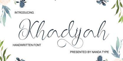 Khadijah is a classy and elegant modern calligraphy font. It can be used for various purposes, such as logos, wedding invitations, t-shirts, letterhead, signage, posters and more. It includes OpenType features including alternates, ligatures and multi-language support.
 - Gaela by Letterena Studios,
$17.00 Gaela is a modern and classic serif typeface with a unique style and modern look. This typeface is perfect for an elegant & luxury logo, book or movie title design, fashion brand, magazine, clothes, lettering, quotes, and so much more.
 - Brush Stroke by Letters&Numbers,
$21.00 Use of a thick brush and expressive strokes make Brush Stroke a raw, bold typeface. It is suitable for headings and short paragraphs. Brush Stroke is extended, containing West European diacritics making it suitable for multilingual environments and publications.
 - Esta Pro by DSType,
$26.00The multi award winning ESTA is back, renewed and improved in OpenType format. Now named Esta Pro, is available in Regular, Italic, Bold, Bold Italic, Display and Swashes. Includes plenty of features, like SmallCaps, Alternates, Ligatures and CE characters. - DGS Art Deco Greek by dgsdesigns,
$10.00 DGS Art Deco Greek is a unique typeface breaking all boundaries available in Latin and Greek scripts. It can be used in a wide range of projects including invitations, theatre and cinematic productions, branding, logos , adverts and much more.
 - Baronessa by Juraj Chrastina,
$39.00 Baronessa is a handmade font with a “once-upon-a-time” world feeling, warm and friendly but not excessively childish. No swashes or ornaments, subtle irregularity and carefully chosen letter shapes make it sweet and funny but not crazy.
 - Kare by Fontfabric,
$25.00 Kare is a custom font which is applicable for any type of graphic design - web, print, motion graphics etc and perfect for t-shirts and logos. Inspired by the popular and unique Motter Ombra typeface designed by Othmar Motter.
 - Kadya by TM Type,
$12.00 Kadya is a very detailed and thin lettered script font. Get inspired by its beautiful style and use it to create lovely designs. This font is PUA encoded which means you can access all the glyphs and sweeps easily!
 - Genoock by Tama Putra,
$12.00 Genoock is a bold handwritten typeface. It is suitable for any design needs, branding, cover title, t-shirts, posters and more. The Genoock typeface includes multi-lingual and currency support, numerals, and punctuations. It comes comes with stylistic alternates.
 - Sekek by Gholib Tammami,
$14.00 Sekek is a cute display font. It embodies playfulness and authenticity and is the perfect choice for any children’s activity or school project. Add this chunky lettered font to your designs and notice how it makes them come alive.
 - Aryana by melifonts,
$5.00 Aryana is young, fresh, and has arrived just in time for the back-to-school season! The perfect typeface for labeling notebooks and putting together poster projects. This handcrafted font is a casual and fun addition to your library.
 - Millrich Olivian NF by Nick's Fonts,
$10.00 Fat, wide and friendly—that describes this offering from the Miller and Richards foundy of Glasgow to a tee. Use it in good health. Both versions support the Latin 1252, Central European 1250, Turkish 1254 and Baltic 1257 codepages.
 - Black Stamp by Andrey Font Design,
$9.00 Black Stamp is a unique, strong, and original handwritten font. Natural and elegant, this font can be used on a wide variety of designs such as headlines, titles, headings, logos, branding, posters, invitations, books, and any other creative design.
 - Malikasthi by Yoga Letter,
$16.00 "Malikasthi" is an elegant and beautiful brushed handwriting font. This font is equipped with uppercase, lowercase, numerals, punctuation, and multilingual support. It is suitable for weddings, engagements, business branding, stickers, banners, branding, posters, valentines, back to school, and others.
 - Cassella by Gassstype,
$29.00 Hello Everyone, introduce our new product Font Cassella This Is Quick Brush Font.This is a Textured Natural Style and classy style with a clear style and dramatic movement. You can activate 28 Ligatures and 22 Alternate glyphs OpenType panel.
 - Medieval Dragons by Deniart Systems,
$15.00 The beasts of mythological and medieval times. From semi-dragons like lindorms and wyverns to classical and serpent-like dragons, this package features 52 unique medieval beasts that are sure to add a little fire to all your presentations.
 - Dekros by FontHaus,
$14.00 Dekros has the look and feel of an Art Nouveau font when a key feature in much of the design of the 1890s was characterized by intricate linear and flowing curves that were based on natural and organic forms.
 - Wargika by Letterena Studios,
$17.00 Wargika is a modern and classic serif font with a unique style and modern look. This typeface is perfect for an elegant & luxury logo, book or movie title design, fashion brand, magazine, clothes, lettering, quotes, and so much more.
 - Minda Script by Nandatype Studio,
$13.00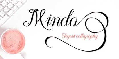 Minda is a classy and elegant modern calligraphy font. It can be used for various purposes, such as logos, wedding invitations, t-shirts, letterhead, signage, posters and more. It includes OpenType features including alternates, ligatures and multi-language support.
 - Totem Forms by LMD,
$20.00Totem Forms is based on a series of aluminum and rubber wall constructions currently showing in Europe and the United States. Mirek's work has been shown internationally for many years and this is his first foray into type development. - Circularis by JAF 34,
$12.00 The Circularis family includes 8 styles and weights - eight uprights with eight italics. Circularis is characterized by the nice and smooth unordinary circle geometric contruction inspired at last century, nice readability, low price and finaly many variation of useful.
 - Chachka by Slonica,
$9.00 Natural forms inspired us to design this font. A very simple, cute and somewhat playful font. The use of this font is various, and we would especially recommend it when the design requires the theme of nature and health.
 - Marslow by JprintStudio,
$20.00 Marslow is a modern look font with a futuristic vibe, bold and clean. Get inspired by its incredible youthful vibe. Add this lettering font to your designs and watch how it comes to life and your creations stand out!
 - Willgray by NicolassFonts,
$35.00 The Willgray family offers three options: A, B, and C, each equipped with 20 fonts. This versatile family is ideal for a wide range of applications, including signage, packaging, brand identity, software, editorial design, and web and screen design.
 - Razkes Brush by Rvandtype,
$11.00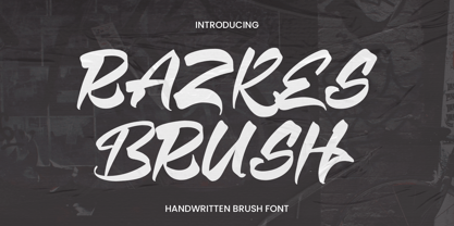 Razkes Brush is a cool urban style font. Its elegant and cool look makes it the perfect choice for logos, branding, invitations, stationery, wedding designs, social media posts, and so much more. Features : Numbers and punctuation Multilingual PUA encoded