10,000 search results
(0.472 seconds)
- Smoke Signals by Ana's Fonts,
$18.00 Smoke Signals is a calligraphy font handmade using a real dip pen and ink with lots of bonus goodies. Smoke Signals includes: tons of ligatures for a smother text small caps that act as an all caps font a bonus set of ornaments a bonus set of grunge elements, such as splatters, ink blots, scratches Smoke Signals is perfect for any design that needs a vintage calligraphy look. Use it in signatures and logos, notes and quotes, social media posts, and branding and packaging.
 - Geegantic by Campotype,
$19.00 The rainforest of Borneo which has a wealth of big trees and lush is the basis of inspiration of the Geegantic font. Therefore Geegantic has little difference with a similar font that usually appear in the feminine form. As you can see, Geegantic has the form of contrast stroke, a thick and casual. As display fonts, Geegantic aims to touch the needs of the general usage of displays, branding and advertising. However, under certain conditions, it is also possible to fill the text area.
 - Bing by Pelavin Fonts,
$20.00 The sinuous, organic forms of Bing first came into being on a poster for a Smithsonian Institution exhibit on Siegfried Bing, a German art dealer in Paris who figured prominently in the development of Art Nouveau towards the end of the nineteenth century. Inspired by the natural forms of Antonio Gaudi, and the Paris Metro stations of Hector Guimard, Bing can be used effectively in the modernist style of Art Nouveau and is equally at home in the 1960s psychedelic rejuvenation of that genre.
 - Doric by Wooden Type Fonts,
$15.00 A revival of one of the popular wooden type fonts of the 19th century, suitable for text.
 - Clarendon Condensed by Wooden Type Fonts,
$15.00A revival of one of the popular wooden type fonts of the 19th century; suitable for text. - Number 154 by Wooden Type Fonts,
$15.00A revival of one of the popular wooden type fonts of the 19th century. Suitable for display. - Clarendon Heavy by Wooden Type Fonts,
$15.00A revival of one of the popular wooden type fonts of the 19th century, suitable for display. - News Gothic Light by Wooden Type Fonts,
$15.00 A revival of one of the popular fonts of the early 20th century, suitable for light text.
 - De Vinne by Wooden Type Fonts,
$15.00 A revival of one of the popular wooden type fonts of the 19th century; suitable for text.
 - News Gothic by Wooden Type Fonts,
$15.00 A revival of one of the popular of the early 20th century fonts, suitable for bold text.
 - William Page 506 by Wooden Type Fonts,
$15.00 A revival of one of the popular wooden type fonts of the 19th century, somewhat condensed, square.
 - William Page 500 by Wooden Type Fonts,
$15.00 A revival of one of the popular wooden type fonts of the 19th century, somewhat condensed, square.
 - Antique Three by Wooden Type Fonts,
$15.00A revival of one of the popular wooden type fonts of the 19th century, suitable for text. - Clarendon Condensed Bold by Wooden Type Fonts,
$15.00 A revival of one of the popular wooden type fonts of the 19th century, suitable for display.
 - Cabrito Didone by insigne,
$- A graceful kid if ever you’ve seen one, Cabrito Didone joins the Cabrito family of fonts--a family designed to provide young infants with clear recognition of letter forms. The original letters were released as part of the children’s book about fonts, The Clothes Letters Wear. Now, this latest addition brings a new Didone flavor to the table. But don’t judge the book by its cover. While Didones can be stodgy in the way they deliver a sense of luxury, this stubborn goat of a Didone bucks the stodgy stereotypes with its high-contrast, carefree, flowing fun, taking a more calligraphic direction than most. Cabrito Didone joins structure and handwriting to create a flowing balance of both characteristics. It’s a unique combination of functional and friendly. Its 42 well-designed fonts give you plenty of easy-going, highly readable options to work with as you craft your design. The typeface has unique serifs that give the sense of ink pooling slightly at the points, drawn with a sharp nib. Cabrito Didone supports OpenType features and is packaged with upright obliques, alternates, ligatures, old-fashioned figures, and compact caps. Preview any and all of these features in the interactive PDF manual. The family member font also includes glyphs for 72 languages; over 600 glyphs per font await. Cabrito Didone is an excellent choice for websites as well as flyers and packaging. Like Cabrito, which is currently used by a number of visible brands, Cabrito Didone is also a great option for defining your brand. Grab a taste of the Cabrito Didone flavor--and those of the other Cabrito members: Sans, Semi and Inverto.
 - Telepath by Coniglio Type,
$19.95 TELEPATH Telepath by Coniglio Type, first appeared in 1998. It is now in opentype .otf as of 2021. Telepath is a master sampling of a Royal office typewriter of industrial strength provided by the Miller Furniture store, of Dunkirk, New York. It had a baseline set of numbers to make accounting practices easy and line up nicely on the statements. (No gentile old fashioned numerical ascenders and descenders.) Yet, for a a rather old and stolid machine, it was very luxurious and built to definitely take the test of time. Cudo's for Royal Typewriter Company, is all I can say. The set of images were very carefully gathered and has fallen into the preferred category for a typewriter font that has it all. The font has exceptional value as a text font -and- a display font. It contains a great deal of graphic information and doesn't spike at higher sizes. Telepath presents a strikingly handsome typewriter font with a uniquely intuitive difference. Unlike the original source material—scans of monospaced typewriter copy, every font is painstakingly hand kerned for your most demanding copy fitting work in justified or casually ragged settings for print or the web. All Coniglio Type fonts are 100% embeddable. It will get you there.
 - Techari by Letterjuice,
$35.00 Techarí comes from a commission in which the brief consisted of the creation of a typeface family to be used for the design of the third disc of the band called Ojos de Brujo based in Barcelona. This disc was called Techarí, which means “free” in Caló, the language of the Spanish gypsies. The starting point of the design was the music of this band, the meaning of the disc 's name, and three words given by the band as key concepts: ethnic, baroque and graffiti. Techarí is a mixture of lots of influences, which give it its unique personality. From its technical viewpoint designing Techarí was a challenge, on the one hand it had to have lots of personality, and on the other it had to work in text at 9 or 10 pt size. Its goal is precisely that, while keeping a strong personality it works in text size. The typeface also contains a Stencil version for use in display sizes which keeps Techarí's innovative spirit. The way it has been “cut" is unconventional, it has been carefully done to keep the freshness of the typeface by taking advantage of the letterforms' flow. Techarí extra complements the typeface by taking a classical typographic form, the ornament, and making it a contemporary graphic tool, vindicating this wonderful typographic element.
 - ATF Railroad Gothic by ATF Collection,
$59.00 First introduced by the American Type Founders Company in 1906, Railroad Gothic was the quintessential typographic expression of turn-of-the-century industrial spirit—bold and brash in tone, and a little rough around the edges. A favorite for the plain speak of big headlines, Railroad Gothic quickly gained popularity among printers. Its condensed but robust forms were likely a source of inspiration for later families of industrial sans serifs. The design feels like a cleaned-up version of some earlier Victorian gothics, notable for their uneven proportions and awkward letterforms. ATF offered a number of sizes of Railroad Gothic as metal type, with cuts varying in design considerably from size to size. Creating this new digital version involved interpreting the characteristics of different sizes and making some aesthetic choices: where to retain the design’s familiar unstudied gawkiness, and where to make improvements. The new ATF® Railroad Gothic features a measured, harmonious interpretation of the original, and has been extended with four new weights (each bolder than the last). The heaviest weights are carefully designed to keep counters open, no matter how dense the overall effect may be, maintaining legibility at any display size. This contemporary rendition of a historic American design boasts a full Latin character set, including glyphs undreamed-of in the heyday of railroads.
 - Romanist by Rochart,
$25.00 Introducing Romanist - a modern twist on the classic textura/blackletter style font that brings a bold and contemporary edge to your designs. This versatile typeface combines the rich heritage of traditional blackletter with sleek, clean lines and a touch of modern sophistication. With its distinctive Gothic-inspired letterforms, Romanist adds a touch of elegance and intrigue to any design project. Whether you're creating stunning t-shirt designs, captivating magazine covers, or eye-catching posters, this font is sure to make a statement. Whether you're a professional graphic designer, a clothing brand, or a magazine publisher, Romanist is your go-to font for adding a touch of sophistication and originality to your designs. Elevate your creative projects to new heights with the timeless allure of Romanist. Experience the power of Romanist and let your imagination run wild as you create captivating designs that leave a lasting impression.
 - Adinah by Brink,
$30.00 Adinah is a lively brush script with a strong sense of rhythm. Adinah’s expressive letterforms are based on pointed brush calligraphy with a hint of sign painting. This Sign painting influence reveals itself the further you dig into the family styles. Eight combined styles are complimented by a sub family of Six Layered Font options.
 - Asterism Clean by Great Lakes Lettering,
$30.00 Asterism Clean is the smooth lined version of Asterism. It is a calligraphy style font with a moving baseline and lots of shining personality. Also contains a bold and a monoline version. This hand written style font is based on one of Molly’s signature calligraphy styles and pairs beautifully with Frosted, Icing, Saint Agnes.
 - Alambart by Greater Albion Typefounders,
$18.00 Alambart is one of a new series of ‘wood type’ inspired fonts. Alambart is a hand-cut oblique Roman, suggesting the late Victorian era, but the type of thing that continued in use well into the twentieth century. If you want a title face that has versatility and suggests a past history, this is it!
 - Hackish Script by Letterhend,
$17.00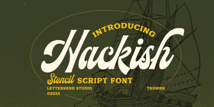 Hackish is a captivating stencil script font that effortlessly infuses your designs with a touch of class and a dash of vintage charm. Its unique blend of elegance and ruggedness makes it the perfect choice for projects seeking a timeless and sophisticated appeal Features : Uppercase & lowercase Numbers and punctuation Alternates & Ligatures Multilingual PUA encoded
 - Kids At Play by Celebrity Fontz,
$19.99 Kids at Play is a playful and curious font with children silhouettes in the form of letters. The letters/children are engaged in a variety of poses and activites. If you want to develop a text, story, or publication for or about children, this is a must-have font. Includes full set of accented characters.
 - Abramo by PeachCreme,
$16.00 Abramo is a perfect blend of elegance and modernity. Abramo is a set of two modern fonts: an all-caps serif and a stylish script. the smooth curves of the serif create a feminine feel. Abramo works great for logos, social media posts, invites and many other projects. It comes with multilingual support also.
 - Friday After by Adita Fonts,
$16.00 Friday After is a vintage calligraphy font that exudes timeless charm and sophistication. Inspired by the elegance of classical handwriting, this font features intricately crafted letterforms with graceful curves and delicate strokes. Its vintage appeal transports you to a bygone era, adding a touch of refinement to your designs. Perfect for invitations, greeting cards, and projects that require a touch of old-world beauty, Friday After captures the essence of traditional calligraphy with a hint of nostalgia. This font is PUA encoded which means you can access all of the amazing glyphs and ligatures with ease! COMPATIBILITY Windows Apple/Mac Linux Easily convert to webfont Cricut Silhouett
 - Austin Pen by Three Islands Press,
$29.00 Empresario Stephen F. Austin (1793-1836) is considered by many the “Father of Texas” for leading the first Anglo-American colony into the then-Mexican territory back in the 1820s. A few years later, while on a diplomatic mission to Mexico City, Austin was arrested on suspicion of plotting Texas independence and imprisoned for virtually all of 1834. During this time he kept a secret diary of his thoughts and musings—much of it written in Spanish. Austin Pen is my interpretation of Austin’s scribblings in this miniature prison journal (now in the collection of the wonderful Dolph Briscoe Center for American History, in the Texas city that bears his name). The little leather-bound book is filled with notes in ink and pencil—some of the faded penciled pages traced in ink years later by Austin’s nephew Moses Bryan. A genuine replication of 19th century cursive, Austin Pen has two styles: a fine regular weight, along with a bold style that replicates passages written with an over-inked pen. Each is legible and evocative of commonplace American penmanship of two centuries ago.
 - Kompakt by Linotype,
$29.99 Kompakt is one of the early typefaces of type designer Hermann Zapf, whose Palatino has long been a standard in almost every area of application. Kompakt consists of a single weight and was designed in 1952, two years after Palatino. It was produced by the foundry D. Stempel AG in Frankfurt am Main, Germany, where Zapf was at the time in the artistic department. The figures of this extremely strong and heavy typeface are decidedly those of a broad tipped pen. When enlarged, the sharp outlines of the characters can be clearly seen. The unique dynamic of the alphabet is a result of its strong serifs, which on the lower case letters almost connect the letters in a line. Together with the slight slant to the right, this gives Kompakt the character of handwriting, making it look like it is always striving to go forward. Kompakt is an excellent choice for advertisements, especially for posters which should display a hint of nostalgia, and should be used only in headlines.
 - Cannoli by Eurotypo,
$36.00 Cannoli is a brush lettering style font, designed specially for use in logotypes, advertising and packaging. It is interesting to note the use of free-flowing lettering to perform its own eye-catching. This vintage typeface is a reminiscent of the posters of the 50s, painted with a brush in enamel advertising signs. Cannoli was inspired by the delicacy of the Sicilian pastry, and the robust charm of its landscape.
 - Berkah Raya Arabic by Nirmana Visual,
$39.00 Introducing Berkah Raya Arabic our stunning Arabic style font, crafted to add an extra level of sophistication and cultural depth to your designs. Our Arabic style font features a harmonious balance of curves and angles, creating a sense of flow and rhythm that perfectly captures the beauty of Arabic calligraphy. beautiful typographic harmony for a diversity of design projects, including logos & branding, social media posts, advertisements & product designs.
 - Neutral Sans by Brave Lion Fonts,
$28.00 Join us on a journey to explore the world of Neutral Sans, delving into its historical roots, evolutionary path, and contemporary applications. Whether you are a designer in search of the perfect typeface for your next project or someone with a keen interest in the subtleties of typographic design, our exploration of Neutral Sans promises to be an illuminating adventure into the heart of timeless and neutral typography.
 - Cirulis Display by Asketic Design Studio,
$40.00 Cirulis is a display sans family of two weights. Inspired by the lettering of Ansis Cīrulus (1883-1942) one of the first Eastern European designers. The artist’s heritage is characterized by letters with asymmetric widths, sliced cuts and various intrinsic features. By carefully studying forms and origins of the letters Asketic designed a new typeface that in a contemporary fashion relives early 20th century national romanticism of Eastern Europe.
 - La Orleans by Genetype,
$14.00 Introducing La Orleans Typeface: Timeless Luxury Redefined Step into a world of refined elegance with La Orleans – a font that captures the essence of luxury in every curve and stroke. Whether you're crafting exquisite invitations or elevating your brand identity, La Orleans infuses your designs with an air of distinction. Embrace the epitome of sophistication – explore La Orleans and elevate your creations with a touch of enduring opulence.
 - African Shield by Scholtz Fonts,
$19.00African Shield is named for the cow-hide shields used by Zulu warriors. The shield was an essential part of the weaponry of the Zulu Nation. In the days of the great King Shaka, every Zulu warrior was armed with a shield, one or more throwing assegais (type of spear) and a stabbing spear. The high-contrast design of the shield has inspired a font that translates into exciting graphic designs. - Swanville by Ingrimayne Type,
$5.00 Swanville developed as part of a train font that eventually became LetterTrain. The letters of Swanville are bold, have a funny “serif” on the top but not on the bottom, and when the letters have interiors, the interior has the shape of the letter. Lower-case letters are smaller versions of the upper-case letters. Because development of this face stopped long ago, it has a limited character set.
 - Cobe by Stawix,
$39.00 The result of reducing elements of letterforms to only its necessity in lowercase is mostly influenced by the ideal of Aerodynamics. The true intention behind the design of Cobe is to construct a fluid typeface while maintaining a strong structure of uppercase that possessed distict forms, shapes and corners, resulting in an eye-pleasing texture when forming a sentence. Cobe comes in 9 consecutive weights with italics and standard features.
 - Pompeian Cursive by Wordshape,
$30.00 Pompeian Cursive is a calligraphically-inspired display typeface featuring a limited number of alternate characters and a handful of graceful ligatures. A lively set of non-lining numerals accompanies, as well as a few calligraphically-inspired flourishes for ornament. The history of this typeface: Oswald Cooper’s relationship with the Barnhart Brothers & Spindler foundry was one instigated under the auspices of creating new styles of type in lieu of following stylistic trends. In 1927, BB&S requested that Cooper create a script-like cursive typeface design in step with Lucien Bernhard’s Schoenschrift and ATF’s similarly-styled Liberty typeface. In response to BB&S’s desire to emulate instead of innovate, Cooper wrote to Mcarthur, “I am desolated to see Barnhart’s hoist the black flag. Your own efforts through the years to boost the foundry into a place in the sun as an originator seem wasted.” Still, Cooper took up the task at hand, creating a delicate, sophisticated type design which he named Pompeian Cursive. The typeface featured a limited number of alternate characters and a handful of graceful ligatures. A lively set of non-lining numerals accompanied, as well as a few calligraphically-inspired flourishes for ornamenting the end of lines of type accompanied the typeface, as well. By reviewing the few remaining original drawings for the type, as well as copious samples of Pompeian Cursive from both Cooper & BB&S' proofing process and period-specific type specimens, Wordshape presents the first digital version of this classic hybrid script/sans typeface, complete with all original alternate characters and ornaments. Pompeian Cursive has been intensively spaced and kerned for the finest setting for weddings, announcements, and general display work. - What was the inspiration for designing the font? While researching a biographic essay for Japan’s IDEA Magazine, I came across the original proofs and drawings for Pompeian Cursive. While a number of foundries have released interpretations of Cooper’s assorted typefaces, they stray from the original rather dramatically in parts. Cooper is without a doubt my favorite type and lettering designer, and to bring a refined return to his original intentions is an immense gift. - What are its main characteristics and features? Pompeian Cursive is a typeface which functions as both a display face and a limited text face. It features classy, thoughtful, and delicate swash capitals and rugged lowercase characters with a low x-height and gracefully long ascenders and descenders. - Usage recommendations: Display type or text-setting. Perfect for newspaper work, editorial design, materials intended to invoke an "old-timey" flavor, or just about anything in need of personality.
 - Clephons by Zamjump,
$13.00 Introducing, Clephons is a captivating serif display font that exudes timeless elegance. Crafted as an all-capital typeface, this font is a homage to vintage letterforms, blending classic charm with a touch of modern sophistication. Perfectly tailored for branding, headlines, logos, and designs with a classic or vintage theme, Clephons effortlessly captures the essence of a bygone era. Its distinctive serifs and refined details make it a versatile choice for projects that demand a touch of retro flair. Elevate your designs with Clephons, where every character tells a story of refined aesthetics and enduring style. **Uppercase
 - Sporty Pro by Sudtipos,
$39.00 We love sports – like billions of fans all over the world – but in Argentina, we really love fútbol (soccer). Fútbol is part of our culture: it makes our hearts’ race and our pulses quicken, it inspires screams of joy and screams of anguish, and it has been the cause of more than a few heated conversations amongst friends. So you can imagine our delight when, in recent years, a local team’s fútbol jersey used a Sudtipos font; it got us thinking about designing a font that explicitly had sports in mind yet still had the versatility to work for other types of projects. Sporty has a geometric and modular structure with many potential applications that far exceed jerseys, score boards and stadium wayfinding. Its flexibility is evident when examining its four style – from a square style to a rounded one – as well as the Shadow and Inline options. Each of the styles also comes with a set of miscellaneous shapes including modular banners, plates and arrows. Sporty comes in 3 widths – Condensed, Regular and Expanded – and 7 weights that equate to a total of 39 fonts.
 - TurvyTopsy by Greater Albion Typefounders,
$9.00 TurvyTopsy offers all the fun of delightful hand-drawn irregularity, captured in a typeface. Designing this was a wonderful exercise in ignoring all the rules of precise geometric construction to which we normally work. These irregular forms somehow achieve a delightful character & legibility all of their own.