10,000 search results
(0.039 seconds)
- Quince by Atlantic Fonts,
$26.00 Quince is a playful, zesty, handwritten font. Lower case letters are energetic and sweet, then as all-caps its essence shifts to more architectural and stylish. Both upper and lower case have a set of double-letter ligatures to keep it lively. Quince family also features Quince Designs, an original, floral picture font drawn by Amy Dietrich, rich with charming patterns, borders and spots. See your projects bloom with Quince. Posters also include images from Kiwi Fruits, another picture font by Atlantic Fonts.
 - Zigarre by Canada Type,
$24.95 Though Zigarre can easily be categorized a brush script, Jim Rimmer actually drew it using a big marker. Jim’s original face, inspired by inter-war German poster lettering, was a rough one, with the marker’s juicy ink roughing it out all over the place. The smooth version, Zigarre Script, was produced as part of a major update and remastering the design underwent in 2012. Both Zigarre Script and Zigarre Rough come with extended Latin language support, as well as a few built-in stylistic alternates. 20% of this font’s revenues will be donated to a GDC scholarship fund, supporting higher typography education in Canada.
 - Blacktones by Nathatype,
$29.00 Are you looking for a blackletter font? Do you dream of creating headings that stand out and inspire creativity, imagination, and endless fun? Wait no more, we will give you the best choice. Blacktones-A Blackletter Font Blacktones is a simple blackletter font with big loopy letters. Perfect for adding a touch of whimsy to your already amazing designs. A real head-turner for your presentation, designs, branding, quotes, invitation, website illustrations, and much more. Our font always includes Multilingual Support to make your branding reach a global audience. Features: PUA Encoded Numerals and Punctuation Thank you for downloading premium fonts from Natha Studio
 - Trashbone by Arterfak Project,
$18.00 Introducing Trashbone, a playful marker font, designed with an additional rusty effect applied to the strokes. This font represented courage, youth, spirit, freedom, that recommended for many themes such as sports, dark, teen, movement, adventure, etc. Equipped with ligatures, alternates, and multilingual support! Thank you for visiting and enjoy!
 - Cradley by CastleType,
$59.00 Cradley™, a CastleType original, was inspired by the work of William Caslon, considered by some to be the finest type designer of the Baroque era. With its classic proportions, beautifully bracketed serifs, and high contrast, Cradley is a contemporary design with a Baroque spirit. The family of three beautifully crafted fonts support most European languages, including modern Greek and many languages that use the Cyrillic alphabet. Includes over 30 "flowers" (as Caslon called them), useful for creating borders or adding an accent. Спасибо / thanks to Alexei Elfimov for his suggestions for improving the Cyrillic, and to Max Fernandes for his helpful feedback and overall enthusiasm for this design.
 - Forte by Monotype,
$29.99 Forte was designed by the Austrian commercial artist by Carl Reissberger who was trained as a compositor and later taught typography and drawing in Vienna. The idea for the Forte script font came from the study of plants, individual letter forms being inspired by the long stems and furry heads of the reed. Slightly inclined, it gives the impression of having been made with a bold brush or marker, and can therefore be used in work that requires an informal appearance. Forte is a strong design which contrasts well with sans serif faces and classical modern types. Use the Forte font in advertising, flyers and labels.
 - Old Tijuana JNL by Jeff Levine,
$29.00 Old Tijuana JNL was modeled from the hand lettered title on the cover of the 1939 sheet music for "Class Will Tell" and is available in both regular and oblique versions. Casual, playful and reminiscent of the "serape" style of pseudo-Mexican lettering found on ad designs of the 1930s and 1940s, the type face isn't just for South of the Border themes. Use it for any festive occasion and the design will blend in well.
 - Mir by Juliasys,
$22.00 Мир is Mir. The Russian word Мир (Mir) means both World and Peace. The rendezvous of the two terms seems quite unique and utopistic today, but it is comforting to see that it was natural at some time deep down in Russian history. Bits of both meanings were going through my mind while I was designing this typeface. Mir’s character set is multiscript – Latin, Cyrillic and Greek – and extends to many parts of the linguistic world. In fact it covers more than 100 languages. Stylistic consistency between the language systems make typographic border crossings painless even where national borders are still closely guarded. And in regions where mathematics, physics or chemistry are to be expressed, a rich set of OpenType features lets Mir master also these situations. Serious things are best be said in a relaxed, unpretentious way. So Mir doesn’t put on a show. Mir has authority without being authoritarian, it is serious but not stern. It can explain difficult things and stay calm and down to earth at the same time. Mir Medium has another useful feature: It can be freely downloaded and used by anybody anywhere. You can test the Mir Family with free Mir Medium and get more styles when you need them. @juliasys
 - Straight Angles by Celebrity Fontz,
$24.99Straight Angles is a precisely designed three-dimensional font with a clean and futuristic look. The predominant angles are 90 degrees and 180 degrees with parallel and perpendicular lines. Each character is surrounded by a crisp black border of even thickness throughout the font. Upper- and lower-case letters are the same, providing a constant maximum top height while the stems extending below are allowed to show off their distinct personalities in order to spice things up. The 3D extrusion effect makes text appear to stand out from the page. - Elfen Fraktur by FDI,
$25.00 Elfen-Fraktur is monolinear blackletter typeface, that was originally designed by M. Beck and published in 1919. This revival comes in two extended versions with a complete Latin 1 character set: Elfen-Fraktur A uses the original blackletter skeletons and is suitable for setting texts with traditional German typesetting and orthography rules. Elfen-Fraktur B includes modernized letter designs for a broader and more legible use in various languages. A free bonus is the set of 22 border elements called Elfen-Schmuck. Check out the type specimen PDF for more details and instructions.
 - Karika Swirls by Deniart Systems,
$20.00 Add charm with intricate swirls! Karika Swirls was inspired by our obsessive love of swirly patterns and symmetric designs. Karika, a Hungarian word for circle, is a charming way of saying we love circular symmetrical forms. These 52 original illustrations are great for creating stationery, adding borders to greeting cards or design projects, background images, etc. The glyphs can be used individually or combined with other glyphs to form complex patterns. Karika Swirls is part of the Karika Collection of fonts. These intricate swirls are symmetrically sized in height and width so they'll work charmingly together for any project. See also Karika Hearts and Karika Encore .
 - HWT Star Ornaments by Hamilton Wood Type Collection,
$24.95 Star Ornaments are seen as a long standing companion to many wood type poster layouts. Various manufacturers managed to derive many variations of the five pointed star motif and offered them as a ubiquitous ornament option in almost all of their catalogs. Manufacturers such as Wm. H Page, Morgans & Wilcox, Tubbs Mfg. Co. and of course, Hamilton Wood Type each had their own slight variations. This digital font features almost 100 glyphs of mostly stars, but it also features a unique star border that can create boxes just like the modular offerings of the 19th century. The twist on this digital version is the inclusion of additional connection options that become a unique lettering 'kit' that can create typography or maze-like connections using a limited set of component parts.
 - Kolm Keltek by 2D Typo,
$36.00 Kolm Keltek is a collection of ornaments organized into two font files. The ornaments can be divided into two groups: Friezes (borders) and Rapports (patterns). All ornaments belong to the Celtic culture. These ornaments are taken from manuscripts. This makes the font exclusive and unique among other digital collections of ornaments. These patterns perfectly suit to be used in the design of invitations, diplomas, certificates or other printed materials in historical style design. Kolm Keltek - Demo Guide contains basic examples of how to combine the ornaments that significantly facilitates the use of the collection. Kolm Keltek is one of the many high-quality ornamental fonts offed by the 2D Typo foundry.
 - Skippy Sharp by Chank,
$99.00 Skippy Sharp was drawn by Skippy McFadden in 1995 and faxed to Mister Chank Diesel. Chank completed the character set, added extensive kerning and created a very friendly, informal marker handwriting font. The font is also enhanced for OpenType use with Contextual Alternates for a more natural and organic handwriting style, and true Small Caps, too.
 - Battle Bingo by Zeenesia Studio,
$15.00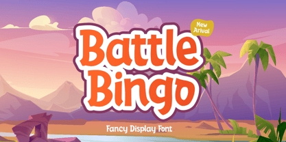 Battle Bingo is Playful and Fancy font. It was created with freehand handwriting style using a marker. It look classy and happiness to all your designs. You can use this font for a logo, kids clothing, invitation, poster, friendly design, fun design, book cover, adventure poster, outbound poster, and any cute and funny typeface needs and more.
 - Sticky Notes by Hendra Pratama,
$19.00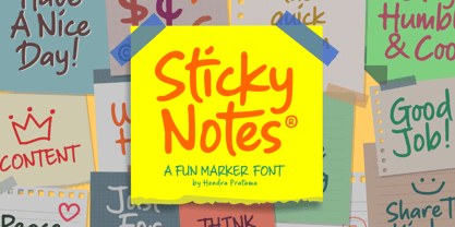 Sticky Notes is a handmade font, made from a marker pen. It's fun yet playful font for variety design graphics project. From Logotype, Poster, Quotes design, Comics book or illustration, T-shirt design, Magazine titles and many more. Sticky Notes is Good used in small or large size. Please check out all the preview images. Best!
 - Saxo by Eurotypo,
$35.00 The Saxo family is based on the typefaces of the twenties and thirties, where through the Art Deco and Futurism were built the foundations of the modern movement. Designed from basic geometric shapes (triangle, circle and square). This font transmits his solid character and modern spirit, through 470 glyphs, including Opentype features like ligatures, stylistic alternates and borders based on the geometry of the typeface. All Saxo fonts come with CE languages support.
 - Hearts by kapitza,
$29.00 Hearts contains 70 groovy heart illustrations and repeat patterns. It’s great for designing unique and personal t-shirts, greeting cards, gifts and even wrapping paper. You can use individual characters as illustrations and create repeat patterns and borders by selecting a character and pressing the same key over again. Easy!
 - NS Champtone by Novi Souldado,
$25.00 The NS Champtone Font Collection is inspired by Copperplate Script, Sign and vintage style labels. Comes with two font styles and extra swashes, ornament borders, panels, ligatures and stylistic alternates. Makes it ideal and perfect for creating a design piece such as letterheads, posters, signage, charters, labels, packaging, logotypes, etc.
 - Between The Lines BF by Bomparte's Fonts,
$29.00 The famous Catalan architect, Antoni Gaudí, used to say “there are no straight lines or sharp corners in nature…” However, with Between The Lines that’s exactly what you’ll find: straight lines, parallel and perpendicular, all in a glorious display of Art Deco style. Here the verticals and horizontals dominate while the diagonals “sit this one out”. Curvilinear lines also run free here: they serve as refreshing counterpoints to prominent straights. These forms suggest a somewhat expressive script-like characteristic, (especially in lowercase) wherever the font’s many initials, terminals and contextual alternates are employed. Between The Lines offers many options for alternate letterforms (ligatures, stylistic alternates, contextual alternates, etc.). When these OpenType features are used judiciously and selectively, your typography will be greatly heightened. You’ll find BTL right at home in a number of environments: music album covers, snack food packaging, magazine headlines, cosmetics, signage and more. PLEASE NOTE: due to its very tall ascenders, Between The Lines benefits from generous leading (line spacing). Multilingual support included.
 - Qipao by TEKNIKE,
$39.00 Qipao is a display monospace handwriting font. The typeface is a distinct hand drawn font using a felt marker. The Qipao name is derived from the traditional Chinese dress that Manchu women wore in China in the 17th century and became known as the qipao (旗袍), meaning “banner gown”. Qipao is great for display work, invitations, writing, architecture, posters, logos and headings.
 - Freehand 471 by ParaType,
$30.00 Freehand 471 is the Bitstream version of Cascade Script by Matthew Carter. Released by Mergenthaler Linotype in 1965, this design is based on an earlier type by the Ludlow foundry. It's a dark, disconnected script with angular forms. It seems written by heavy marker and thus suitable for informal posters and signage and for advertising and display typography as well. Central European, Cyrillic, and Greek Monotonic characters were designed by Oleg Karpinsky. Released by ParaType in 2011.
 - Katenila by Arterfak Project,
$16.00 Katenila is a cute handwriting font with a joyful taste. Inspired by marker handwriting and modern calligraphy, Katenila offers the flexibility of the upper & lowercase that you can mix and match and get your typographic mood. Katenila equipped with alternates and swash to give you more variants. This font is suitable for any design themes such as summer, bright, minimalist, holiday, feminine, and etc. Also featured with multilingual supports in 350+ glyphs total, Katenila is perfect for branding, apparel, editorial, poster, quotes, menu, and more! Thank you for visiting, and have a nice day! Ramz.
 - Rainbow Paper by Mozatype,
$19.00 Rainbow Paper is a stylish, cute, friendly, and original display font. It is made from a marker pen. Its casual charm makes it look very down-to-earth, easy to read, and, in the end, very versatile. Add this beautiful display font to your every creative idea. It is PUA encoded, which means you can easily access all of the glyphs and swashes! Fall in love with its incredibly versatile style and use it to create spectacular designs! Use this font for any crafting project that requires a personalized look!
 - Milky Cream by Keristyper Studio,
$14.00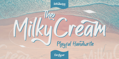 Milky Cream is a cool and playful handmade marker font. This font is good for logo design, Social media, Movie Titles, Books Titles, short text even long text letters, and good for your secondary text font with sans or serif. Featured: Standard Uppercase & Lowercase Numeral & Punctuation Multilingual : ä ö ü Ä Ö Ü ß ¿ ¡ Alternate & Ligature PUA encoded We recommend programs that support the OpenType feature and the Glyphs panel such as Adobe applications or Corel Draw. so you can use all the variations of the glyphs. Hope you enjoy our fonts!
 - Ongunkan Phrygian by Runic World Tamgacı,
$50.00 Phrygia is the Greek name of an ancient state in western-central Anatolia (modern Turkey), extending from the Eskişehir area east to (perhaps) Boğazköy and Alishar Hüyük within the Halys River bend. The Assyrians, a powerful state in northern Mesopotamia to the south, called the state Mushki; what its own people called it is unknown. We know from their inscriptions that the Phrygians spoke an Indo-European language. Judging from historical records supported by ceramic evidence, settlers migrating from the Balkans in Europe first settled here a hundred or more years following the destruction of the Hittite empire (ca. 1200 B.C.). Most of what is known about Phrygian archaeology and its language derives from excavations at the capital city Gordion, located about 60 miles southwest of the modern Turkish capital of Ankara (also a Phrygian site). Gustav and Alfred Körte first excavated Gordion in 1900. The excavators did not reach Phrygian levels, but they did reveal burials dated to the late eighth century B.C. with Phrygian ceramic, metal, and wooden artifacts. From 1950 to 1973, Rodney S. Young of the University of Pennsylvania led excavations at Gordion. Archaeological work at the site resumed in 1988 and continues to the present.
 - Minnak by Esintype,
$18.00 Minnak, as a whole geometric display type is our take on Square Kufic (Makili) style Latin script fonts, comes in eleven weights with linear progression. It is an Uniwidth typeface at the core. From Hairline to Black, all multiplexed weights take up the same space in width and can be used interchangeably. Supports wide range of Open Type features, with many stylistic alternates in 12 context. Minnak is also have a close relation with pixel fonts, because in spite of its based on Makili forms, it all started as a pixel font in the drawing stage before further steps came into play. The key difference between Minnak and Makili style is that the latter must have the exact square counters with no diagonal strokes, and any other components of a letterform must conform to be proportional. Such style-specific requirements determine the overall dimensions of the glyphs and therefore, there can be only minor differences between the typefaces. In Minnak, counters are rectangular because of its narrow and condensed proportions, but the Makili form influence is still manifest. This impression is best confirmed with Medium weight where negative spaces and stem thickness are equal. Contrast and virtually no optical correction were presented, as characteristic of its genre had to have equal horizontal and vertical line thicknesses. As per the minimal and authentic look of the type, all glyphs are drawn as straight or only as 45-degree diagonal strokes. The representation of the ‘diagonalless’ approach is preserved by stylistic alternatives, making its similarity in visual aesthetics clearly visible. Marks and punctuation is another feature that doesn’t follow the strict rules of the origin style. Although not a pixel font, all building parts of the glyphs in Minnak share the same unit precision as they are designed with pixel equivalents in mind. Even space characters are designed to match glyph widths, meeting the demands of certain typesetting or multi-line lettering compositions. With its Pseudo Ancient and Runic alternates, extention parts and ornaments included in all weights, Minnak is suitable for branding, logo and monogram designs, the screen titles and headlines, packaging, posters, book covers and more, where it shines at big sizes. Its pixel font-like appearance makes it a significant choice for the modern compositions. Thanks to mostly uniform width design, it is possible to use Minnak also as a system for lettering. This feature can be used as vertical fitting of the letters between the lines. As a casual expression in Turkish, “Minnak” is one of the seven typeface designs in Esintype's ancient scripts of Anatolia project, Tituli Anatolian series — representing Seljuk period in the medieval Anatolia and their tradition of architectural stone ornamentation.
 - AlbertBetenbuch by Ingrimayne Type,
$14.95 The inspiration for AlbertBetenbuch came from a typeface drawn by Albert Dürer and an interpretation of that face in Arthur Baker’s Historic Calligraphic Alphabets (Dover, 1980). It is not a recreation of either. The characteristic common to AlbertBetenbuch and the faces inspiring it is the decorative zig-zag with the upper-case letters. In late 2018 the inside of the shadowed style was separated out. It looks very much like the plain face but its spacing matches the shadowed version. It can be layered with the shadowed version to easily create two-colored letters.
 - Pointe by Wilton Foundry,
$29.00It is the point that creates the expression from the writer via the pen unto the paper. The artist guides the point in unique ways to not only communicate, but also to make the resulting expression unique. The point can take the form of a quill or a marker or a pencil or chalk or a fountain pen or a chisel or a brush. What's so funny about that? Maybe that's the point:) Pointe is loose, fun and informal lending itself ideally to Advertising, Packaging design, Invitations and Scrapbooking. Pointe is available in Postscript, Truetype and Opentype for Macs and PCs - Dutch Deco JNL by Jeff Levine,
$29.00 Although the Art Deco movement is generally attributed to the 1930s and 1940s, a number of design influences were showing up during the late 1920s in what is referred to as the Art Nouveau period. The Dutch illustrator Anton Kurvers’ hand lettering on the front cover of the (1927) magazine “Het Vlaamsche Volstooneel” clearly shows the clean lines and Avant Garde geometrics that foreshadow Art Deco. This attractive pre-Deco lettering has been recreated digitally as Dutch Deco JNL, and is available in both regular and oblique versions.
 - Nordique Pro by Leksen Design,
$29.00 Inspired by her Swedish and Norwegian heritage, Andrea Leksen created this modern geometric sans serif reminiscent of Scandinavian design and typography. With its tall x-height, Nordique will be best showcased at large sizes, in headlines and other display uses. The Light, Regular, Semibold and Bold versions each contain over 50 ornaments, swashes, alternates and borders to play with—a modern take on the traditional rosemåling and kurbits painting styles. See some of the creative and beautiful ways Nordique Pro can be used in this YouTube clip! Check out Nordique's cousin Nordeco!
 - Roots N Branches by Crumphand,
$16.00 Hello, Introduce the new font : Roots N Branches Roots N Branches inspired by hipster life. Handmade fonts & Sharpie marker What's Included Inside The Fonts ? Uppercase Lowercase Symbols Numerals European Multilingual Thank You, Regards!
 - J Scott Campbell Sketchbook by Comicraft,
$29.00 Created for J. SCOTT CAMPBELL'S DANGER GIRL SKETCHBOOK, this slick and stylish font is perfect for architectural drawings, marker comps or, um, sketchbooks! Artwork from Elephantmen: Man and Elephantman by J. Scott Campbell
 - Fort Mayhem by Letterhend,
$17.00 Fort Mayhem is a display marker font with hand drawn feel. The strokes make this font outstanding and looks great for title. This type of font perfectly made to be applied especially in logo, headline, signage and the other various formal forms such as invitations, labels, logos, magazines, books, greeting / wedding cards, packaging, fashion, make up, stationery, novels, labels or any type of advertising purpose. Features : 3 Styles-Regular, Extrude, & Online numbers and punctuation multilingual alternates / swashes and ligatures PUA encoded We highly recommend using a program that supports OpenType features and Glyphs panels like many of Adobe apps and Corel Draw, so you can see and access all Glyph variations.
 - Gik by Serebryakov,
$39.00 Gik is sans serif font family with modular aesthetic and the elegance of contemporary typography. Its compositional and plastic solution combines echoes of (de)constructivism, brutalism, de Stijl and other manifestations of 20th century antiquity + techniques characteristic of italics. But this does not make the font old-fashioned — on the contrary, it helps to understand how to use it. Gik is a product of the metamodernism era — it is on the border between modernist enthusiasm and postmodernist mockery, between simplicity and awareness, wholeness and cleavage, clarity and ambiguity — a kind of conceptual oxymoron. Looking at Gik, you could imagine it at Fashion Week, if there was one for typography. Gik has a message for both the designer and the viewer, it stimulates the imagination, it is the anthology of all fonts of the future.
 - Titul by ParaType,
$30.00 Titul is a display typeface with strong historical connotations. It is based on a series of stylish lettering for book covers, designed by Russian graphic artist Alexander Leo in the 1920s. The historical reference for him was book design of the 1st half of the 19th century. Type family consists of four ornamented and three basic styles: one solid, one inline and one striped. All seven faces have corresponding oblique styles. Also, there is a beautiful vignette font and a style for constructing ornamental borders. Titul suits best for vintage spirited typography, from the 19th to early 20th century. It is perfect for book covers, theater posters, packaging and greeting cards. Typeface was created by Isabella Chaeva and released by Paratype in 2020.
 - Andron Ornamente by SIAS,
$34.90 Andron Ornamente contains a set of about 48 fancy classical typographic ornaments. You can embellish pages, headings, memos, invitations or title settings … you can compose lines and borders and even rich graphical textures. The Andron ornaments perfectly match the timeless classical mood of all Andron typeface fonts. (Note that the glyphs contained in this font are identical to those ornament glyphs in the Italic and Scriptive fonts of the Andron 2 series as well as the Scriptive font of the Andron 1 Latin family.) For the ease of use the glyphs of the Andron Ornamente font are double-coded and also mapped to the keyboard-friendly a–z and A–Z positions. If you like fine ornaments you should also have a look at Arthur Ornaments, Behrens Ornaments and Leipziger Ornamente.
 - Bllides by Maulana Creative,
$14.00 Bllides is a Handwritten Marker font casual and clean stoke font with alternate and opentype features Ligatures inspired by the 60's notes letterform. It support multilingual more than 100+ language. This font is suitable for logo design and any awesome project you create. Make stunning work with Bllides Handwritten font. Cheers, MaulanaCreative
 - Rama Gothic Rounded by Dharma Type,
$19.99 Rama Gothic Rounded is an antiqued sans serif designed inspired by 1800s-style wood type. All glyphs had been designed carefully to be retro-looking of the old time and to fill all with nostalgia. This condensed font family with 42 styles will be the best solution for posters, titles and anywhere you need impact. To complete your work perfectly, Gothic Extras family is ready for free. They include borders, ornaments and frames designed using vintage catalog of Hamilton in 1800's as a model. Be sure to check out the slab serif style of this Rama series named Rama Slab.
 - Stylin' BRK - Unknown license

