10,000 search results
(0.055 seconds)
- Omega Pixel by João Henrique Lopes,
$- OmegaPixel Font Description I created this font for the game Hyper Ninja Blast (but made it useful to all kinds of games!). While creating the game, I searched for pixel fonts, but could not find a suitable one. The fonts were generally ugly and lacking the basic variations (italic and bold). So I decided to create my own pixel font. Just as pixel art can be better than a high-resolution painting, so pixel fonts don’t need to be always worse than traditional fonts. In OmegaPixel I tried to achieve elegance, readability and flexibility within the limitations of a 6 pixel x-height. With 4 versions (regular, italic, bold and bold italic), and a neutral feel, OmegaPixel can be used in any genre of games. Considering the general lack of money among indie game devs, I’m giving the regular version for free! For inspiration, I often remebered Minion’s lowercase ‘a’, Galliard italic lowercase ‘g’, and the calligraphy of Chinese emperor Huizong.
 - ITC Modern No. 216 by ITC,
$40.99 Modern typefaces refer to designs that bear similarities to Bodoni and other Didone faces, which were first created during the late 1700s. Ed Benguiat developed ITC Modern No. 216 in 1982 for the International Typeface Corporation (ITC). Showing a high degree of contrast between thick and thin strokes, as well as a large x-height, this revival is more suited to advertising display purposes than the setting of long running text, or books. Many traits in Benguiat's design are worth further notice. The thick stems of the roman weights have a very stately, solid presence. Their thin serifs have been finely grafted on, a masterful solution to the challenge of bracketing presented by Modernist designs. The italic weights have a very flowing, script-like feel to them, and the letters take the form of true italics, not obliques. The ITC Modern No. 216 family contains the following font styles: Light, Light Italic, Medium, Medium Italic, Bold, Bold Italic, Heavy, and Heavy Italic.
 - Schneider Kontrast by Intellecta Design,
$9.00a naive interpretation of the F. H. Ernst Schneidler's art deco font... - Altemus Corners by Altemus Creative,
$11.00 A collection of 174 corner deco, geometric, fan, palm and arc designs.
 - Nikita by Autographis,
$39.50Nikita is a very lively upright script with lots of 1950s flair. - DB Animal Occasion by Illustration Ink,
$3.00DB Animal Occasion is a collection of fun animal sketches and doodles. - Fishface by Monotype,
$50.99The Fishface font contains a collection of pen-drawn, ornamental Pi characters. - ALT Apollo13 by ALT,
$5.00 Apollo13 is a custom decorative typeface for any type of graphic design.
 - Numerals by ParaType,
$25.00A set of figures designed at ParaType in 1992 by Elvira Slysh. - Alum by Typotheticals,
$5.00A rough blocky text of uneven thickness for use in general purposes. - Altemus Flowers by Altemus Creative,
$11.00 A collection of 174 flower designs based on '50s and '60s textiles.
 - Toothpaste by Funk King,
$5.00 Toothpaste is a fun swirly font with lots of pizzazz and energy.
 - CoughingNails by Ingrimayne Type,
$12.95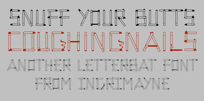 CoughingNails is a letterbat font composed of cigarettes and an occasional match.
 - Yolanda by Device,
$39.00 Yolanda, a family of three weights each more florid than the last.
 - Altemus Cuts by Altemus Creative,
$11.00 Each style is a collection of 174 illustrative and printer cut designs.
 - Pascal by GRIN3 (Nowak),
$16.00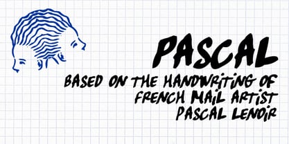 Pascal is a font inspired by handwriting of mail artist Pascal Lenoir.
 - Brashee by Gerald Gallo,
$20.00 Brashee is a serif font with characters made up of straight lines.
 - Janda Silly Monkey by Kimberly Geswein,
$5.00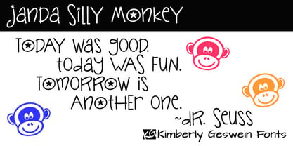 Cute and fun handwriting inspired by the playful antics of a child.
 - Salden by Canada Type,
$40.00 The Salden fonts are our tribute to the man who was dubbed the face of the Dutch book, and whose work is considered essential in 20th century Dutch design history. Helmut Salden’s exquisite book cover designs were the gold standard in the Netherlands for more than four decades. His influence over Dutch lettering artists and book designers ranges far and wide, and his work continues to be used commercially and exhibited to this very day. At the root of Salden’s design work was a unique eye for counter space and incredible lettering skills that never failed to awe, regardless of category or genre. This made our attention to his lettering all the more focused within our appreciation to his overall aesthetic. Though Salden never designed alphabets to be turned into typefaces (he drew sets of letters which he sometimes recycled and modified to fit various projects), we thought there was enough there to deduce what a few different typefaces by Salden would have looked like. The man was prolific, so there were certainly enough forms to guide us, and enough variation in style to push our excitement even further. And so we contacted the right people, obtained access to the relevant material, and had a lot of fun from there. This set covers the gamut of Salden’s lettering talents. Included are his famous caps, his untamed, chunky flare sans serif in two widths, his unique Roman letters and an italic companion and, most recognizable of all, his one-of-a-kind scripty upright italic lowercase shapes, which he used alongside Roman caps drawn specifically for that kind of combination titling. All the fonts in this set include Pan-European glyph sets. They’re also loaded with extras. Salden Roman (908 glyphs) and Salden Italic (976 glyphs) each come with built-in small caps (and caps-to-small-caps), quite a few ligatures, and two different sets of alternates. Salden Black and Salden Black Condensed (636 glyphs each) come with a set of alternates, and both lining and oldstyle figures. Salden Caps (597 glyphs) comes with a set of alternates, and Salden Titling (886 glyphs) comes with a quite a lot of swashed forms and alternates (including as many six variants for some forms), a few discretionary ligatures, and two sets of figures. There are also some form alternates for the Cyrillic and Greek sets included in all six fonts. These alphabets were enjoyably studied and meticulously developed over the past ten years or so. We consider ourselves very fortunate to be the ones bringing them to the world as our contribution to maintaining the legacy of a legendary talent and a great designer. The majority of the work was based on Salden’s original drawings, access to which was graciously provided by Museum Meermanno in The Hague. The Salden fonts were done in agreement with Stichting 1940-1945, and their sale will in part benefit Museum Meermanno.
 - Shakila by Alifinart Studio,
$17.00 Shakila Script is a handwritten font created at the end of March 2021. It is a unique bold font with a pretty and charming casual style with many variants of beautiful swashes, as well as an alternative to capital letters. Shakila is a lovely and delicate font duo (script and sans serif), that exudes elegance and class. This font was particularly crafted for those who need a beautiful and refreshing look to their designs. Also, this font is perfect for branding projects, logo, product designs, invitation cards, wedding cards, stationery designs, advertisements, label, photography, blogging, social media or watermark. Key Features: - Multilingual Accents - Alternative capital letters - Stylistic Alternates up to 20 choices - Has a heart connected feature for a-z and A-Z letters - Available shortcut for Stylistic Alternate by simply adding "period" (.) and “number” (1-20) to each letter. - Has lots of ligatures so the letters connect well together - Has OpenType and PUA Encodes features. This font has a total of 885 glyphs, including capital letters, uppercase alternates, lowercase, numeral and punctuation, multilingual accents, beginning and ending swashes for lowercase, and includes a large number of stylistic alternates and heart swashes (for lowercase-lowercase and uppercase-uppercase). The advantage of the Shakila Script font compared to other fonts is that the alternative capital characters are in 1 font file, so it will make it easier for you to work. Therefore, you are free to choose it as you like, especially this font has the OpenType and PUA Encodes features which means you can access all of the glyphs and swashes with ease. As I mentioned earlier, Shakila Script has a large number of Stylistic Alternates features, up to 14 options for letter a-z and up to 20 options for letter b d h k l. In fact, there is also a swash feature in the form of a connected for the combination of each lowercase-lowercase and uppercase-uppercase letters. Interestingly, you can activate all Stylistic Alternates that are owned by each letter, just by typing; letter + period + number. For example: a.1 a.2 a.3 or b.1 b.2 b.3 and so on. As for activating the heart connected for each letter a-z or A-Z is quite easy. Namely by simply typing; letter + underscore + underscore + letter. For example: a__a or A__A and so on. Shakila Script is a Font Duo pack that pairs with Shakila Sans. The two were created at about the same time, but made in separate file packages. The reason I created this font duo is to make your projects more harmonious and unique. At the end of the sentence, Shakila Font Duo is a very authentic and amazing. If there are things you want to ask, don't hesitate to contact my email. For complete details, please visit my Behance profile. Alifinart Studio alifinart@gmail.com Thank you.
 - Minuet by Canada Type,
$24.95 Minuet, an informal script with crossover deco elements giving it an unmistakable 1940s flavor, is a revival and expansion of the Rondo family, the last typeface drawn by Stefan Schlesinger before his death. This family was initially supposed to be a typeface based on the strong, flowing script Schlesinger liked to use in the ads he designed, particularly the ones he did for Van Houten’s cocoa products. But for technical reasons the Lettergieterij Amsterdam mandated the face to be made from unattached letters, rather than the original connected script. Schlesinger and Dooijes finished the lowercase and the first drawings of the uppercase just before Schlesinger was sent to a prison camp in 1942. Dooijes completed the design on his own, and drew the bold according to Schlesigner’s instructions. The typeface family was finished in February of 1944, and Schlesinger was killed in October of that same year. Though he did see and approve the final proofs, he never actually saw his letters in use. It took almost four more years for the Lettergieterij Amsterdam to produce the fonts. The typeface was officially announced in November of 1948, and immediately became a bestseller. By 1966, according to a memo from the foundry, the typeface had become “almost too popular”. This digital version of Schlesigner’s and Dooijes’s work greatly expands on the metal fonts. Both weights include a complete set of lowercase alternates — based on Schlesinger’s own drawings, as well as alternative variations for some of the capitals, a few ligatures, and extended language support covering Western, Eastern and Central European languages, plus Baltic, Celtic/Welsh, Esperanto, Maltese and Turkish. Minuet is available in all popular formats. The OpenType version, Minuet Pro, takes advantage of internal font programming to combine the main and alternate fonts into a single file per weight, making all alternates and ligatures automatically available at the push of a button in OpenType supporting programs.
 - Marintas by insigne,
$22.00 Marintas is a sleek upright italic that offers you a modern look and feel. This elegant sans serif comes across as lively, yet comfortable. Some semi slab characteristics of the font give it a face-forward momentum. These semi slabs, even with their geometric construction, are fluid shapes with a soft hint of brushstroke. The soft curves of Marintas paired with its playful but geometric semi slabs or ending strokes give the face its spirited--though friendly--eye-catching appearance. The Marintas family is comprised of 8 variants, ranging from Thin to Ultra. Its incredible versatility ranges from the delicate hairline to the extreme ultra weight. The heavier weights show some similarity to Antique Olive, and the face has an exuberant South American or Latin feel. This type of family is well-suited for advertising, retail, food and beverage products as well as for use in magazines, logotypes, and books. The fonts lend themselves to display settings, but are still very usable for longer copy. Because of its large x-height, the typeface is legible at very small sizes and as a webfont. Marintas has support for extended Latin character set. A wide range of Western languages are also supported, including Central, Eastern and Western European languages. In all, Marintas supports over 40 languages that use the extended Latin script, making Marintas a great choice for multi-lingual publications and packaging. All insigne fonts are fully loaded with OpenType features. Marintas is also equipped for complex professional typography and includes ligatures, alternate characters and fractions. The face includes a number of numeral sets, including old-style and lining figures with superiors and inferiors. OpenType-savvy applications such as Quark or the Adobe Creative Suite can take full advantage of the automatically replacing ligatures and alternates. This family also includes the glyphs to support a wide range of languages. Check out the informative .pdf brochure to see these features in action.
 - Sancoale Softened by insigne,
$22.00 Sancoale Softened is the new rounded companion to Sancoale. While the original Sancoale is crisp and defined, its delicate forms also lend themselves well to a lighter, more rounded version. The stems of Sancoale Softened are blunted, and its corners have been carefully rounded, avoiding the “sausage” look seen with some rounded fonts. This blend of definition and delicacy makes the Sancoale Superfamily versatile and appropriate for a variety of applications. The design minimizes the characters to their essence, leaving a default set of simple characters without notches or spurs. However, the typeface family’s slightly technological feel still appears friendly and approachable to the reader. It’s slightly condensed proportions and tall x-height also make the design readable at a wide range of sizes, which works especially well for web pages. These softer letterforms give Softened its unique, futuristic look--great for distinguishing your text or display. There are six weights with true italics. All insigne fonts are fully loaded with OpenType features. Sancoale Softened is also equipped for complex professional typography, including alternates with stems, small caps and plenty of alts, including “normalized” capitals and lowercase letters. The face includes a number of numeral sets, including fractions, old-style and lining figures with superiors and inferiors. OpenType capable applications such as Quark or the Adobe suite can take full advantage of automatically replacing ligatures and alternates. You can find these features demonstrated in the .pdf brochure. The Sancoale family also includes the glyphs to support a wide range of languages, including Central, Eastern and Western European languages. In all, Sancoale Softened supports over 40 languages that use the extended Latin script, making the new addition a great choice for multi-lingual publications and packaging. Sancoale Softened continues with Sancoale’s successfully simple, geometric and legible structure. With its suitability for a wide range of uses, the Sancoale superfamily is a very economical and versatile addition to any designer’s font collection.
 - Code Next by Fontfabric,
$39.00 10 years later, one of the first geometric typefaces in our portfolio and a popular favorite of yours is rising to a whole new level! We’re revealing the stand-alone type family Code Next—a staggering evolution from Code Pro in functionality, versatility, and application. The transformation includes 6 new weights, 10 new Italics, full support of Extended Cyrillic and Greek, full redesign and glyphs refinement, 2 variable fonts, to name but a few. Going back to 2011, the grotesque-inspired Code Pro was designed to complement memorable pieces that make a statement. Balancing between stylization and simplification, it was encoded with the distinct voice of basic organic shapes to stand the test of time. Little did we know, it would expand and live up to the potential of a “font from the future” as the new Code Next. Today, a type family of 22 styles, this geometric sans solidifies its relevance and carries a strong constructive aesthetic through simplified forms with a twist. These fit any modern design in print, web, and display visualization. Developed to go above and beyond, Code Next comes prepared for multi-script projects with Extended Latin, Extended Cyrillic, and Greek. Explore Code Next’s versatility and switch things up with the help of 2 variable fonts, more than 1280 glyphs, and an extensive OpenType features set including small caps, standard and discretionary ligatures, contextual and stylistic alternates, stylistic sets, case sensitive forms, and much more. Overview: • Font family of 22 fonts • 10 weights • Languages - Full support of Extended Latin; Extended Cyrillic; Greek • Entirely refined design and metrics • Glyph count - 1288 • Variable fonts - 2 fonts OpenType features: • Small Caps • Standard Ligatures • Discretionary Ligatures • Contextual Alternates • Stylistic Alternates • Stylistic Sets • Case-Sensitive Forms • Ordinals • Localized Forms • Lining Figures • Proportional Figures • Tabular Figures • Oldstyle Figures • Subscripts • Scientific Inferiors • Superscripts • Numerators and Denominators • Fractions • Roman figures • Extensive mathematical support • Navigation symbols
 - Syntachron by Mofr24,
$11.00 Syntachron is an extraordinary monospaced font that stands out with its futuristic and mecha-inspired design. What sets this font apart is its unique ability to combine simplicity, modernity, and boldness, resulting in a visually captivating typeface. It is the perfect choice for those seeking to create impactful posters, eye-catching marketing materials, captivating logos, attention-grabbing headlines, and engaging book and magazine layouts. One of the distinguishing features of Syntachron is its compatibility with the Cyrillic alphabet, offering versatility and style for a wide range of design projects. Whether you're working on international branding campaigns or multi-language publications, this font seamlessly integrates with the Cyrillic characters, ensuring consistency and cohesiveness across different languages. In terms of typeface pairing, Syntachron harmonizes exceptionally well with related families and typefaces that share its sleek aesthetics and futuristic vibe. It complements and enhances other fonts, enabling designers to create stunning combinations that amplify the impact of their designs. Beyond its striking appearance, Syntachron excels in its functional aspects. The font comes in a variety of styles, allowing for versatility in design choices. Its monospaced nature ensures consistent character widths, making it ideal for code snippets, technical documentation, and typewriter-style layouts. Furthermore, Syntachron offers a comprehensive character set with special features, enabling the seamless creation of diverse and engaging designs. The design concept behind Syntachron was to capture the essence of a futuristic world and merge it with the mechanical elements of mecha-inspired aesthetics. The result is a font that exudes a sense of cutting-edge technology and boldness, empowering designers to create visually striking and impactful designs that captivate their audience. Syntachron was meticulously created to fulfill the need for a font that seamlessly merges modern simplicity with futuristic design elements. Its purpose is to provide designers with a versatile tool that sparks creativity and enables them to craft stunning visual experiences. With its sleek aesthetics, support for the Cyrillic alphabet, and functional aspects, Syntachron is an indispensable asset for any design project seeking to embrace the future.
 - PF Lindemann Sans by Parachute,
$49.00 Lindemann Sans is an immediately-inviting typeface with a pleasing distinct visual voice grounded by geometry and golden proportions. This modern geometric san serif typeface serves the interpretive needs of modern design through its legibility. This legibility is achieved through proportional balance of each letter based on the golden ratio, open counters, high x-height and wider individual shapes. In addition, a high level of legibility is arrived through distinctive glyphs like a, e, @, and f, which are engaging and add to Lindemann Sans visual voice. Being a modern, spirited, tech-savvy typeface, Lindemann Sans has many of the features demanded by today's designers. These features include 800 characters within each font, many ligatures, full numbers sets, small caps, alternative characters and other niceties found in opentype fonts. Due to Lindemann Sans high legibility, geometric sans tradition, and a large feature set list, it is a very versatile typeface and can be used in replacement of the more commonly used sans. Specifically, Lindemann Sans can be used by technology corporations, architectural firms in their supporting materials, in magazines as headers and key-points, as the typeface for professional keynotes, for the package design industry as a whole, in automotive concept projects, and for cosmetic branding for high class hair products. With its inviting nature it may also be used for liberal arts promotional materials. In addition, this typeface can be used by green industries because of its nature derived proportions. Each style and weight of Lindemann Sans adheres to the same geometric and golden proportions, however, each weight is innately noteworthy. For example, there is a charm that is found in the ultralight weight's elegant geometry and lights impressive use as oversized headlines. It shines with true clarity of vision with the book weight and the versatility of the medium. One cannot overlook the power and pacing of the bold and extra bold weights with its clear counters and restrained letter forms. Within Lindemann Sans family each weight has a distinctive role to play but stays true to its purpose.
 - Aramus by Hackberry Font Foundry,
$24.95 Aramus is a new serif font in my continuing objective of designing book fonts that I can really use. In many ways, Aramus is a very different direction for me. It comes from a scan of an old display face that has been radically modified to a much smaller x-height than I have been using lately, plus taller ascenders. Many of the characters needed a lot of correction to bring them into my taste. In general, I have decided that many of my fonts create a type color that is too dense. Aramus is an attempt to get away from that look. Although Amitale has been a very successful book family and excellent to work with, I find I still need something more open with a lighter color. Aramus is the first look at the new direction. The original hand-cut serifs vary a lot, different for almost every character. This gives a little looseness and helps the lightness I am looking for. It will be interesting to see where this all goes. This is a normal serif for me in that it has caps, lowercase, small caps with the appropriate figures for each case. This font has all the OpenType features in the set for 2009. I didn't bother with the CE accents (though I can add them upon request. They will be in the final new book family). There are several ligatures for your fun and enjoyment: bb gg ff fi fl ffi ffl ffy fj ft tt ty Wh Th and more. Like all of my fonts, there are: caps, lowercase, small caps, proportional lining figures, proportional oldstyle figures, & small cap figures, plus numerators, denominators, superiors, inferiors, and a complete set of ordinals 1st through infinity. Enjoy!
 - Cabrito Inverto by insigne,
$- Life’s always more fun when you reverse the stress. The same goes for the new member of the Cabrito family. Cabrito itself is a recently developed slab serif made for the kid’s book The Clothes Letters Wear. Cabrito proved to be more popular than I thought, and I promised I would create an inverted style for this new addition to the font world--a variant that would pair well with the original or even stand well on its own. And so now, here it is. Cabrito Inverto, which features the reversed stress of the strokes from a font’s “normal” traits. Inverted stress fonts are most often associated with cowboys and the Old West. The inverted stress gives it a happy-go-lucky appearance, not to be taken too seriously. It’s a pleasantly rounded, not-so-strictly geometric typeface with handwriting-inspired forms. Whew, that’s a mouthful! Inverto’s bundle of alternates is accessible in any OpenType-enabled program. It contains a workforce of alternates, swashes, and alternate titling caps to embellish the font. Also bundled are swash alternates, aged design and style figures, and compact caps. Peruse the PDF brochure to examine out these solutions in action. OpenType-enabled purposes such as Adobe suite or Quark will allow ligatures and alternates. This font family also includes the glyphs for 72 different languages. Cabrito Inverto does pair well with Cabrito. There is even an extra font weight, Black, for when you want to punch it up a bit. Jeremy Dooley designed Inverto to be a welcoming, day-to-day font family. Use it to express friendliness on just about anything, from candy to food to children’s toys. Cabrito Inverto’s one-of-a-kind visual appearance brings a bundle of fun to the party. Buy Cabrito Inverto to give a boost to your designs every day of the week.
 - Choret Fudyng by Alit Design,
$19.00 Introducing Choret Fudyng, a font with a captivating Bubble style that will elevate your designs to new heights. This font family offers a range of options to suit your creative needs, including the enchanting 3D, classic Regular, and elegant Light variants. Whether you're designing logos, posters, or social media graphics, Choret Fudyng has the perfect style to make your text pop. Each letter is meticulously crafted with attention to detail, ensuring a visually pleasing and harmonious look. With Choret Fudyng, you can effortlessly add depth and dimension to your typography, creating stunning visuals that leave a lasting impression. Choret Fudyng is not just a font; it's a complete typographic solution. With full support for PUA Unicode, this font allows you to access a wide range of additional characters and symbols, expanding your creative possibilities. It's also designed to be multilingual, enabling you to effortlessly communicate in different languages and alphabets. But that's not all - Choret Fudyng takes ligatures to the next level. With an extensive collection of ligature options, this font lets you create fluid and seamless connections between characters, enhancing the overall aesthetic appeal of your designs. Whether you're designing logos, branding materials, or invitations, Choret Fudyng's ligatures will add a touch of elegance and sophistication. Experience the power of Choret Fudyng and unlock a world of typographic versatility. With its PUA Unicode support, multilingual capabilities, and abundant ligature options, this font is a must-have for any designer or creative enthusiast. Language Support : Latin, Basic, Western European, Central European, South European,Vietnamese. In order to use the beautiful swashes, you need a program that supports OpenType features such as Adobe Illustrator CS, Adobe Photoshop CC, Adobe Indesign and Corel Draw. but if your software doesn’t have Glyphs panel, you can install additional swashes font files.
 - Frontiersman JNL by Jeff Levine,
$29.00 The pages of the Speedball® Lettering Textbook have yielded a number of classic typefaces for digital designers. Frontiersman JNL and Frontiersman Black JNL have the wonderful hand-lettered look that adds just the right touch of nostalgia to any layout.
 - Littera Plain by ABSTRKT,
$30.00Littera project is a modern interpretation of one of the most widespread sans serifs in USSR "TextBook font". It is not an exact revival, but an interpretation of its typographic feel executed in two different ways: Littera Plain and Littera Text. - Stencilvania JNL by Jeff Levine,
$29.00Stencilvania JNL is one of the growing number of stencil fonts based on original source material by Jeff Levine. In this case, a "solid letter" stencil from years ago was modified to give it the classic stencil look of broken lines. - Piacere by Michael Rafailyk,
$9.00 Piacere is a spacious, full of air typeface with broad letters and wide serifs. Design of serifs inspired by the sound waves of pleasant classical music. In musical terms, piacere means pleasure, so type with pleasure, or “Digita con Piacere”!
 - Littera Text by ABSTRKT,
$30.00Littera project is a modern interpretation of one of the most widespread sans serifs in USSR "TextBook font". It is not an exact revival, but an interpretation of its typographic feel executed in two different ways: Littera Plain and Littera Text. - Bluebeard by Canada Type,
$24.95Named after the famous French fairy tale, Bluebeard is a surprisingly legible, slightly worn-out mix of majestic blackletter majuscules and roman minuscules. Perfect for designs of old settings, like books of fairy tales, old war books, or anything historical. - Calligraffiti Pro by Open Window,
$19.95 Calligraffitti by Open Window owes its credit to mom and all her years of Calligraphic experience. This impromptu rendering of her calligraphic alphabet captures her years or formal practice blended with a rare encounter with the mood altering music of Santana.
 - Adhesive Letters JNL by Jeff Levine,
$29.00 Adhesive Letters JNL was drawn from sample letters and numbers once manufactured by the Tablet and Ticket Company of Chicago. Originally sold under the brand name of Willson's, these gummed letters were available in a number of styles and sizes.
 - Millerstown by Greater Albion Typefounders,
$16.00 Millerstown is full of that solid, 19th Century, transatlantic spirit of enterprise. It is an all capitals face, decorative but clear and legible, ideal for signage, posters and banners. Bring a touch of American inspired flair to your next design project!
 - Mamut by Totem,
$29.00 Mamut is a display type family of three weights. It has elegant and distinctive letterforms with lots of character. Mamut is your chunky friend, perfect for designing headlines, logos, labels, lettering works, posters and lots of eye-pleasing typographic works.
 - Pretzel Dough by Celebrity Fontz,
$19.99 The Pretzel Dough font was inspired by a challenge to make the letters of the alphabet and numbers from the same bowl of pretzel dough. The result is this whimsical and fun typeface. Comes with full set of accented characters.