10,000 search results
(0.304 seconds)
- Neue Frutiger Cyrillic by Linotype,
$89.00During planning for the new Roissy Charles de Gaulle airport in Paris at the beginning of the 1970s, it was determined that the airport's signage system had to include the clearest and most legible lettering possible. The development of all signage was put into the hands of Adrian Frutiger and his studio. The team carried out their task so effectively that a huge demand for their typeface soon arose from customers who wanted to employ it in other signage systems, and in printed materials as well. The Frutiger® typeface not only established new standards for signage, but also for a range of other areas in which a clear and legible design would be required, especially for small point sizes and bread-and-butter type. The typeface family that which emerged as a result of this demand was added into the Linotype library as "Frutiger" in 1977. Frutiger Next, created in 1999, is a further development of Frutiger, not necessarily a rethinking of the design itself. It was based on a new concept, the most obvious visual characteristics of which is the larger x-height, as well as a more pronounced ascender height and descender depth for lower case letters in relation to capitals. This new design created a balanced image and included considerably narrower letterspacing. Frutiger Next meets the demand for a space-saving, modern humanist sans. 2009's Neue Frutiger is a rethink of the 1977 Frutiger family, now revised and improved by Akira Kobayashi in close collaboration with Adrian Frutiger. Despite the various changes, this "New Frutiger" still fits perfectly with the original Frutiger family, and serves to harmoniously enhance the weights and styles already in existence. The perfect mix, guaranteed Neue Frutiger has the same character height as Frutiger. As a result of this, already existing Frutiger styles can be mixed with Neue Frutiger where necessary. Likewise, Neue Frutiger is perfect for use alongside Frutiger Serif. Newly added are the "Neue Frutiger 1450" weights. Especially for the requirements of the newly released German DIN 1450 norm we have built together with Adrian Frutiger specific weights of the Neue Frutiger. The lowercase l" is curved at the baseline to better differentiate between the cap "I", additionally the number "0" has a dot inside to better differentiate between the cap "O", and the number "1" is now a serifed 1. The font contains additionally the origin letterforms from the regular Neue Frutiger font which can be accessed through an Opentype feature." - Neue Frutiger 1450 by Linotype,
$71.99 During planning for the new Roissy Charles de Gaulle airport in Paris at the beginning of the 1970s, it was determined that the airport's signage system had to include the clearest and most legible lettering possible. The development of all signage was put into the hands of Adrian Frutiger and his studio. The team carried out their task so effectively that a huge demand for their typeface soon arose from customers who wanted to employ it in other signage systems, and in printed materials as well. The Frutiger® typeface not only established new standards for signage, but also for a range of other areas in which a clear and legible design would be required, especially for small point sizes and bread-and-butter type. The typeface family that which emerged as a result of this demand was added into the Linotype library as "Frutiger" in 1977. Frutiger Next, created in 1999, is a further development of Frutiger, not necessarily a rethinking of the design itself. It was based on a new concept, the most obvious visual characteristics of which is the larger x-height, as well as a more pronounced ascender height and descender depth for lower case letters in relation to capitals. This new design created a balanced image and included considerably narrower letterspacing. Frutiger Next meets the demand for a space-saving, modern humanist sans. 2009's Neue Frutiger is a rethink of the 1977 Frutiger family, now revised and improved by Akira Kobayashi in close collaboration with Adrian Frutiger. Despite the various changes, this "New Frutiger" still fits perfectly with the original Frutiger family, and serves to harmoniously enhance the weights and styles already in existence. The perfect mix, guaranteed Neue Frutiger has the same character height as Frutiger. As a result of this, already existing Frutiger styles can be mixed with Neue Frutiger where necessary. Likewise, Neue Frutiger is perfect for use alongside Frutiger Serif. Newly added are the "Neue Frutiger 1450" weights. Especially for the requirements of the newly released German DIN 1450 norm we have built together with Adrian Frutiger specific weights of the Neue Frutiger. The lowercase l" is curved at the baseline to better differentiate between the cap "I", additionally the number "0" has a dot inside to better differentiate between the cap "O", and the number "1" is now a serifed 1. The font contains additionally the origin letterforms from the regular Neue Frutiger font which can be accessed through an Opentype feature."
 - Groucho by Authentic,
$39.50 Groucho is a very high-contrast script. It remined me of Groucho's moustache so I thought it was a good name.
 - Tribal Council JNL by Jeff Levine,
$29.00 Tribal Council JNL is a variant of Fun and Games JNL with a linocut look that emulates jungle or tribal lettering.
 - Doodlebirds by Greater Albion Typefounders,
$5.95 Here's a bit of fun! Need a dingbat with character? Let these birds strut their hand-drawn way across your work.
 - FT Hidden Forest by Fenotype,
$59.95 Hidden Forest is a collection of 52 hand drawn tree silhouettes. It is a super fast tool for creating wonderful illustrations!
 - Graphique-AR by ARTypes,
$35.00Graphique-AR is a digital version of a type designed by Hermann Eidenbenz and issued by the Haas foundry in 1946. - Easy Living JNL by Jeff Levine,
$29.00 Easy Living JNL is a bold Art Deco type face modeled from the name of a 1930s magazine entitled "Country Living".
 - Number5 Reg by Wooden Type Fonts,
$15.00 A William Page font, a variation of the William Page 500 font, with wider lower case, more clearly worked upper case.
 - Vinegar Pro by Jelloween,
$19.95Vinegar Pro is a modern, legible serif typeface. It contains a wide range of characters, sexy ligatures, lining & old style numerals. - Invitation Script by Intellecta Design,
$69.00 Iza W and Intellecta Design are proud to announce Invitation Script, a modern and clean revival of the classic work of the Portuguese master penman Manuel de Andrade de Figueiredo, whose work can be seen in “Nova Escola para aprender a ler, escrever, e contar (...)'' (1722). Invitation Script is the third script superfamily published by Intellecta Design, after Penabico and Van den Velde Script. Invitation Script has original letters designed by Iza W. Creative direction and core programming were provided by Paulo W. Chyrllene K assisted with some work on unusual and archaic styles, resulting in a special font - Invitation Script Archaic (soon available). Invitation started out from Andrade’s script style and evolved into a voluptuous script font family. The result is a typeface ideal for beautiful headings, signatures, art work typography, titles and short pieces of hand-lettered text. Invitation family includes two multi-table Opentype fonts, three supplementary fonts for ornaments and fleurons, and the Archaic font with some of the Andrade’s original characters. Embedded in the regular fonts are additional sets of letters. Over 40 variations are available for certain letters via the Special Sets Opentype table. The two regular versions of Invitation Script contains the following: (i) An extensive set of ligatures providing letterform variations that make eye-popping designs or simulate real handwriting. These are accessible via contextual alternates and other open-type features. (ii) Many stylistic alternates for each letter (upper and lowercase, accessed via the glyph palette, encoded in the ranges of the Special Set Opentype feature). Since there are over 1100 glyphs in each font, we suggest using the glyph palette. (iii) A set of ornaments and fleurons accessed with the glyph palette or using the Ornaments feature. Additional ornaments can be found in the two Invitation Script Ornaments fonts. (iv) Initial and final letters with artistic variations accessible using the initial and final form open-type features. (v) Major kerning work: over 6000 kerning pairs, hand-set to avoid collisions and to create intricate combinations of letters, using swashes and other resources. These powerful features are all accessible in InDesign, Illustrator, QuarkXpress and similar software. We recommend exploring the magic of this font using the glyph palette. Our sample illustrations and PDF brochures showcase the power and pizzazz of this calligraphic script. Let your imagination go wild and use Invitation Script in ways that Andrade could not have foreseen. In non-OpenType-savvy applications, Invitation Script is still an exceptionally beautiful calligraphic typeface that stands up to the competition. The regular fonts contains the complete Latin alphabet, including Central European, Vietnamese, Baltic and Turkish, with a full set of diacritics and punctuation marks. --- 1 FIGUEIREDO, Manuel de Andrade de, 1670-1735 Nova Escola para aprender a ler, escrever, e contar. Offerecida á Augusta Magestade do Senhor Dom Joaõ V. Rey de Portugal. Primeira parte / por Manoel de Andrade de Figueiredo, Mestre desta Arte nas cidades de Lisboa Occidental, e Oriental. - Lisboa Occidental: na Officina de Bernardo da Costa de Carvalho, Impressor do Serenissimo Senhor Infante, 1722. - [18], 156 p., 44 f. grav. a buril : il., ; 2º (31 cm)Engraved royal coat of arms supported by angels over the city of Lisbon, engraved portrait of the author (both of the foregoing by Bernard Picart), (12)ff., 156pp., engraved calligraphic section title, 44 engraved plates. Wood-engraved culs-de-lampe and lettrines. Sm. folio. “Andrade de Figueiredo was born in Espirito Santo, where his father was Governor of the ‘Capitania.’ The fine portrait is dated 1721 and is showing Figueiredo at the age of 48. He was an eminent calligrapher and a creator of the Portuguese handwriting until the reign of Don José I (ca. 1755). His work follows the style of the great Italian masters in its use of clubbed ascenders and descenders, and of Diaz Morante, the famous Spanish writing master, in its very elaborate show of command of hand. By his contemporaries, he was known as the ‘Morante portugues’” (Ekström). “Ce livre est un manuel, composé de quatre parties, destiné à apprendre à lire, à écrire, à conter ainsi que l’orthographe. Les planches comportent des examples d’écritures, d’alphabets et de textes ornés de remarquables traits de plume exécutés d’une main sûre et enjouée” (Jammes).
 - TE Nastaaliq by Tharwat Emara,
$59.00 TE Nastaaliq Font It is one of the Persian calligraphy or ta'liq line that appeared in Persia in the seventh century AH (thirteenth century AD), as it was extracted from the lines of naskh, patch and thuluth. It is a beautiful font whose letters are distinguished by precision and extension. It is also characterized by its ease, clarity and lack of complexity. It does not tolerate diacritics, despite its difference with the line of the patch, as it is one of the best fonts in the world and the best without a competitor and admires many Arab calligraphers, and no cultural or literary exhibition is devoid of a painting written in Persian script. It is one of the most beautiful lines that has a special character that distinguishes it from others, as it is characterized by gracefulness in its letters, so it appears as if it descends in one direction, and its beauty is increased by the soft and rounded lines in it, because it is more flexible in drawing and more flexible, especially if it is drawn with precision, elegance and good distribution, and the calligrapher may baptize In his use of decoration to reach strength in expression by taking advantage of arches and circles, in addition to the grace of painting, the artist may link the letters of one word and the two words to reach the composition of a frame or curved and wrapped lines in which he shows his genius in imagination and creativity.
 - Hurricane by TypeSETit,
$44.99 A storm has been brewing. It’s Hurricane. A complete redesign of a popular style. New flair and excitement abounds with this fast moving spirited brush script. This updated version of Hurricane was created with high end advertising in mind but can also be used for designs outside of commercial uses— greeting cards and social expression, or even scrap-booking projects. There are three regular styles and a PRO version of the script styles, plus a graphics font to add an extra breeze to your work. Hurricane Regular is straight forward with the more Roman capital forms. The Script version swaps the caps out for the more flourished uppercase. And finally, the Swash version contains many of the alternate letter forms found in the PRO version. Hurricane Pro offers the features of all three of the regular Hurricane versions with added OpenType programming and additional alternate glyphs. The Contextual feature of Hurricane swaps out the regular forms for more flashy characters along with necessary ligatures and alternates that give perfect flow to the words. Access the stylistic sets for even more creative options. In addition, see GLORY— a sans serif spin-off (pun intended) to complement the script styles. The Glory styles contrast to Hurricane’s slanted, brushy speed. In addition, an inline font has added to complete the pro package. I sincerely hope you enjoy this exciting update to a font I have always found to have huge potential.
 - Aviano Contrast by insigne,
$22.00 The Aviano series returns, refined and sophisticated with an extended, high-contrast sans-serif family. Aviano Contrast is a contemporary typeface radiating with luxury. It's classic elegance makes it perfect for high-end applications such as cosmetic, jewelry or fashion brands. Aviano Contrast's extended forms give the face a smart look, and the curves are carefully honed to be sinuous and seductive. This high-contrast face is in a class of its own, composed in the style of a classic Didone but lacking the typical serifs. Aviano Contrast comes in six different weights and is packed with OpenType features. Need swash forms? Ball terminals? Art Deco alternates inspired by the inscriptions and signage of the '20s and '30s? Aviano Contrast includes 230 alternate characters. Twelve style sets are available, including four complete sets of art deco-inspired alternates, small forms, swash, titling and a wide array of other alternates to make your designs unique. As a complement to these characters, Aviano Contrast also includes 40 discretionary ligatures for artistic typographic compositions. Please see the informative .pdf brochure to see these features in action. OpenType capable applications such as Quark or the Adobe Creative suite can take full advantage of the automatically replacing ligatures and alternates. This family also includes the glyphs to support a wide range of languages. The rest of the Aviano series pairs very well with this face. These include Aviano, Aviano Serif, Aviano Sans, Aviano Didone, Aviano Flare, Aviano Future and Aviano Slab.
 - Bastardilla - Personal use only

- Schnebel Slab Pro by URW Type Foundry,
$35.99 The refreshingly clear Antiqua Schnebel Slab is a refreshingly clear and strong interpretation of a contemporary Antiqua with subtle contrast and firm serifs, which offer excellent readability at very small size, and, at the same time, provide a lot of expression for use in headlines. The italics, drawn specifically for this purpose, contribute to a harmonious picture, which never loses creative tension, thanks to its aesthetics. The careful addition of ligatures, small caps, and proportional and old-style figures allows for well-proportioned typesetting. The condensed and expanded variants, which also come in 6 weights each, offer plenty of freedom to design with numerous combinations. Schnebel Slab Pro combines especially well with Schnebel Sans Pro.
 - Amoretti by IKIIKOWRK,
$17.00 Proudly Present Amoretti - Handwriting Type, created by ikiiko. Amoretti is an expressionist handwritten typeface whose ethereal and flowing strokes perfectly reflect the soul of a poet's work. The erratic twists and turns give the appearance of an authentic, passionate, and emotional handwritten message. This font have a different iterations of each character were made to accentuate the font's organic appearance and to convey a sense of spontaneity and randomness. This typeface is perfect for an nature design, feminine layout, wedding & invitation, book cover, and also good for quotes, or simply as a stylish text overlay to any background image. What's included : Uppercase & Lowercase Number & Punctuation Alternates & Ligature Multilingual Support Works on PC & Mac
 - Goodwater by Fenotype,
$19.00 Goodwater is an original collection of a Brush, three weights of a monoline Script and four weights of condensed Sans typeface. Goodwater also has a “Print” version with rugged outline and worn-out texture of each font. Goodwater is a great pack for any display use from online to logo and from headline to packaging. All the styles are designed using the same proportions and soft corners so that they’ll place nice together. All Print versions have the same texture style and size too so that they’ll fit smooth together. Goodwater Script and Brush fonts are equipped with automatic Standard Ligatures and Contextual Alternates to keep the flow smooth and it’s best to keep those features on.
 - Disco Rendezvous by Wing's Art Studio,
$20.00 Disco Rendezvous: An Adaptive Font Pair Inspired by Neon Soaked Club Culture Combining an elegant script and a tall sans serif font, Disco Rendezvous is a perfectly contrasted design that evokes the golden-age of disco, inspired by neon soaked night clubs and epic dance floor hits. The superstar of this show is the highly customisable script that takes full advantage of OpenType features to offer countless creative options via alternative characters and automatic ligatures, giving your headers and title designs an authentically hand-made look. It features a complete set of uppercase and lowercase characters, along with numerals, punctuation and language support, and used with the included Sans Serif font pair you have a perfectly matched type treatment.
 - Transcribed JNL by Jeff Levine,
$29.00 The term "transcribed" takes on many definitions. In sheet music (the source of this type face design) it means to set down onto paper. In the formative days of radio, and until the advent of the tape recorder, radio stations depended on 16 inch wide recordable discs known as transcriptions. These discs were generally aluminum base with a soft lacquer coating that was cut with a heated stylus. This was the only way a program could be recorded and preserved for later broadcast or copied for syndication. Transcribed JNL is a hand lettered sans in the chamfer style of block lettering, based on vintage sheet music displaying the name and address for Zenith Music Publications.
 - Wild About Myself JNL by Jeff Levine,
$29.00 Lettering found on the cover of the 1923 song "I Love Me (I'm Wild About Myself)" can take on various graphical possibilities. Although its design is Art Nouveau in concept, it is somewhat reminiscent of the "bubble letters" most school kids used to doodle on notebook and portfolio covers; yet the lettering style also evokes the 1960s-70s Hippie movement. As a sidebar, a couple of lines from the song's lyrics were used by Jeff Levine's late mother to chastise him as a youth when he got "a little too full of himself". The lyrics were: "I love me! I love me! I'm wild about myself! I love me! I love me! My picture's on the shelf!"
 - Jorge by Galapagos,
$39.00(pronounced hor-hay) Some years ago my wife and I had our evening meal in a restaurant on what is called the northshore of Massachusetts. Of course, if you check a globe or map you'll see that the pilgrims needed a compass, it should have been called the eastshore as it's on the east end of the rectangle/hook we call the Commonwealth of Mass. In any event, the menu our waitress gave us was hand-lettered with shapes that I used to develop the 4 fonts called Jorge. When I brought the preliminary drawings into the office Steve Zafarana, a designer and cartoonist referred to them as Jorge's new design, the name stuck. - Reimbrandt by IKIIKOWRK,
$19.00 Proudly Present Reimbrandt - Art Nouveau Type, created by ikiiko. Reimbrandt is a classic typeface that is a perfect representation of the timelessness and romance of the past, inspired by the beautiful Art Nouveau era. This alluring typeface transports you back to a time when elegance and grace were the norm. This font exudes beauty and romance with its simple, decorative shapes reminiscent of the painstaking craftsmanship of the Art Nouveau era. This typeface is perfect for an vintage vibes, classic & vintage poster layout, fashion look book, book cover, packaging, food & beverages and also good for quotes, or simply as a stylish text overlay to any background image. What's included? Uppercase & Lowercase Number & Punctuation Multilingual Support Works on PC & Mac
 - Komunikat FA by Fontarte,
$39.00 FA Komunikat is an experimental and geometrical typeface based on simple elements: a circle, it's parts and straight lines. The typeface communicate the spirit of future, dynamism and modernity. FA Komunikat design was based on the sketch of unique lettering from 1932 made by Władysław Strzemiński, Polish vanguard abstract painter, an artist and a typographer. Strzemiński claimed that modern economic letter forms should be standardized and based on lines and arches. He wrote that readability is a matter of habit and after a practice the new letter forms would be very well readable for everyone. In 2004 Artur Frankowski revived original design creating set of characters, widen up with numerals, punctuation marks and diactrics.
 - Valintina by Letterhend,
$19.00 Valintina Signature is a signature script based on manual hand writing. The stylistic alternate, ligatures and the tick and thin stroke make this font looks a real hand writing instead of typing a font. This type of font perfectly made to be applied especially in logo, and the other various formal forms such as invitations, labels, logos, magazines, books, greeting / wedding cards, packaging, fashion, make up, stationery, novels, labels or any type of advertising purpose. Features : uppercase & lowercase numbers and punctuation multilingual alternates and ligatures PUA encoded We highly recommend using a program that supports OpenType features and Glyphs panels like many of Adobe apps and Corel Draw, so you can see and access all Glyph variations.
 - Sequel 100 Black by OGJ Type Design,
$35.00 Sequel 100 Black is a neogrotesque font family for forceful headlines, confident titles, and striking posters. An extension of Sequel Sans and primarily designed for display use, it has wider proportions than the original typeface. It also sports a larger x-height that allows for maximum impact on the page. And Sequel 100 Black ain’t no lightweight: it’s the boldest member of the Sequel superfamily, with weights starting at 45 (a sturdy medium style) and going all the way up to an ultra-black 115. Use Sequel 100 Black whenever you want to combine a touch of cool mid-century modernism with the scintillating tension of maximum ink use and minimal whitespace.
 - Sangday by Bosstypestudio,
$12.00 Sangday is an elegant calligraphy font that comes with a very beautiful character change, a kind of classic decorative script with a modern touch, designed with high details to present an elegant style,.. BSangday is attractive because the typeface is pleasing to the eye, clean, feminine, sensual, glamorous, simple and very easy to read, thanks to its many luxurious letter relationships. I also offer a decent number of stylistic alternatives for some of the letters. Classic style is very suitable to be applied in various formal forms such as invitations, labels, restaurant menus, logos, fashion, make up, stationery, novels, magazines, books, greeting/wedding cards, packaging, labels or all kinds of advertising purposes and many others. .. Thanks & Happy Designing!
 - Kalpa by Octotypo,
$15.00 The early inspiration designs for Kalpa comes from some old wrist watches dials from an iconic diving watch company. The result is a sharp and sleek design that gives an extremely strong look to the font. Kalpa comes in 4 weights and italics to make it versatile and easy to use on all kinds of media. It is a wise choice for headlines, logos, branding, packaging, publications and websites. The design comes with some alternatives glyphs which enhanced the use of the font and let you customise your letter works. The name comes from a Sanskrit word meaning a relatively long period of time to connect with its early inspirations of wrist watches dials.
 - Market Street Neon by LLW Studio,
$22.00 Market Street Neon is an all-caps condensed display font constructed with two rounded-end strokes; the lowercase set is included as a repeat of the uppercase to make setting type just that little bit easier. I designed this font to be a little bit more “San Francisco” (hence the name of the font), with a contemporary and upscale feeling. It’s intended for use in larger sizes of type, upwards of 48 pt. Market Street Neon is perfect for a design that wants to imitate neon—use it in Photoshop, InDesign, Illustrator or Corel with color & blend effects, and its geometry also lends itself well to simple color for signage, packaging, posters etc. that will pop.
 - Mc Laren Pro by Stiggy & Sands,
$29.00 Our McLaren Pro was created to act as a generic go-to comic style lettering. Its simple and clean letterforms mixed with a mild bounce have an offbeat quality to it without going too far. It is cleanly legible for small bursts of copy to larger bodies of text, perfect for books for children, comics, and anything requiring a mildly playful yet clearly readable font. The SmallCaps and extensive figure sets give McLaren a profoundly diverse design voice, ranging from slightly serious to downright ludicrous. Opentype features include: - SmallCaps. - Full set of Inferiors and Superiors for limitless fractions. - Tabular, Proportional, and Oldstyle figure sets (along with SmallCaps versions of the figures). - Stylistic Alternates for Caps to SmallCaps conversion.
 - Bridal Routine by Letterhend,
$19.00 Bridal Routine is a beautiful signature script based on manual hand writing. The stylistic alternate, ligatures and the tick and thin stroke make this font looks a real hand writing instead of typing a font. This type of font perfectly made to be applied especially in logo, and the other various formal forms such as invitations, labels, logos, magazines, books, greeting / wedding cards, packaging, fashion, make up, stationery, novels, labels or any type of advertising purpose. Features : uppercase & lowercase numbers and punctuation multilingual alternates and ligatures PUA encoded We highly recommend using a program that supports OpenType features and Glyphs panels like many of Adobe apps and Corel Draw, so you can see and access all Glyph variations.
 - Meilia Beauty by Letterhend,
$17.00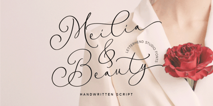 Meilia & Beauty is a gorgeous handwritten script font that embodies the essence of femininity and beauty. Its flowing curves and classy details create a look that is both charm and classy. Perfect for fashion, beauty, and lifestyle brands, this font will add a touch of sophistication and glamour to the other various formal forms such as invitations, labels, logos, magazines, books, greeting / wedding cards, packaging, fashion, make up, stationery, novels, labels or any type of advertising purpose. Features : Uppercase & lowercase Numbers and punctuation Alternates & Ligatures Multilingual PUA encoded We highly recommend using a program that supports OpenType features and Glyphs panels like many of Adobe apps and Corel Draw, so you can see and access all Glyph variations.
 - Hanstone by Letterhend,
$19.00 Hanstone is a beautiful signature script based on manual hand writing. The stylistic alternate, ligatures and the tick and thin stroke make this font looks a real hand writing instead of typing a font. This type of font perfectly made to be applied especially in logo, and the other various formal forms such as invitations, labels, logos, magazines, books, greeting / wedding cards, packaging, fashion, make up, stationery, novels, labels or any type of advertising purpose. Features : uppercase & lowercase numbers and punctuation multilingual alternates and ligatures PUA encoded We highly recommend using a program that supports OpenType features and Glyphs panels like many of Adobe apps and Corel Draw, so you can see and access all Glyph variations.
 - Silver Lovely by Selotype,
$12.00 Silver Lovely is a script that is both narrow and modern. It is slender, feminine and classy, while still maintaining a friendly feel. Silver Lovely is versatile and will work perfectly for fashion, e-commerce brands, trend blogs, wedding boutiques or any business that wants to appear upscale and chic. With its many different stylistic characters, Silver Lovely is perfect for creating original and functional designs. It has extensive language support and tons of ligatures, alternates, stylistic sets that add visual interest to every letter. The overall feel of the font is elegant, sophisticated with a touch of informal and it is ideal if you want to convey a sense of class and style. Thanks so much for looking.
 - Hollow Sky by Letterhend,
$19.00 Introducing, Hollowsky - A beautiful signature script based on manual hand writing. The stylistic alternate, ligatures and the rough texture make this font looks a real hand writing instead of typing a font. This type of font perfectly made to be applied especially in logo, and the other various formal forms such as invitations, labels, logos, magazines, books, greeting / wedding cards, packaging, fashion, make up, stationery, novels, labels or any type of advertising purpose. Features : uppercase & lowercase numbers and punctuation multilingual alternates and ligatures PUA encoded We highly recommend using a program that supports OpenType features and Glyphs panels like many of Adobe apps and Corel Draw, so you can see and access all Glyph variations.
 - Anastas by Michael Brosnan,
$42.50 Anastas is a modern high-end serif. The font is ideally suited for editorial use in books, magazines, publishing, logo, branding and creative industries as well as poster and billboards. Anastas supports all most all European Languages. It equally includes a series of Opentype features of standard ligatures, discretionary ligatures and stylistic sets. Anastas is a modern, sophisticated and stylish typeface that boarders on the edge of a classic font. It draws inspiration from modern structural grids that are responsible for our rigid movement with in our cosmopolitan landscapes. The constant redevelopment and revitalisation of London’s metropolis excited me to develop Anastas. Anastas is greek in origin coming from the word “Anastasi” which means “resurrection” or “revitalisation”.
 - Courtneth by Rifa Studio,
$15.00 Courtneth is a calligraphy script font that comes with lovely alternates character. a mixture of from copperplate calligraphy with handlettering style. Designed to convey style elegance. Moritza is attractive like a smooth, clean, feminine, sensual, glamorous, simple and highly legible typeface. Its classic style is perfect to be applied in any type of formal pieces such invitations, labels, menus, Logos, fashion, make up, stationery, letterpress, romantic novels, magazines, books, greeting / wedding cards, packaging, labels. Courtneth features 400+ glyphs. including multiple language support. With OpenType features with stylistic alternates, ligatures and swash characters, that allows you to mix and match pairs of letters to fit your design, and also a touch of ornament makes this font look elegant.
 - Shafia King by Letterhend,
$19.00 Shafia King is a beautiful signature script based on manual hand writing. The stylistic alternate, ligatures and the tick and thin stroke make this font looks a real hand writing instead of typing a font. This type of font perfectly made to be applied especially in logo, and the other various formal forms such as invitations, labels, logos, magazines, books, greeting / wedding cards, packaging, fashion, make up, stationery, novels, labels or any type of advertising purpose. Features : uppercase & lowercase numbers and punctuation multilingual alternates and ligatures PUA encoded We highly recommend using a program that supports OpenType features and Glyphs panels like many of Adobe apps and Corel Draw, so you can see and access all Glyph variations.
 - Zophina by Letterhend,
$17.00 Say hello to The Zophina, a new handwritten script font that perfectly balances casual style with a hint of femininity. With its effortless charm and carefully crafted ligatures, this font is ideal for adding a touch of elegance and personality to any project, especially in various formal forms such as invitations, labels, logos, magazines, books, greeting / wedding cards, packaging, fashion, make up, stationery, novels, labels or any type of advertising purpose. Features : Uppercase & lowercase Numbers and punctuation Alternates & Ligatures Multilingual PUA encoded We highly recommend using a program that supports OpenType features and Glyphs panels like many of Adobe apps and Corel Draw, so you can see and access all Glyph variations.
 - Gangsoka by Prioritype,
$15.00 A unique looking but classy and elegant looking font, that's the conclusion of this font. It's perfect for your design project and there is a choice of unique character alternatives. Can be applied to your designs such as logos, packaging, accessories, clothing, crafts, creative posts, branding, landing pages, UI / UX and others. See some of the previews above for reference. Features: -Uppercase -Lowercase -Numeral -Punctuation -Stylistic Alternate -Multilingual Note: To access the Opentype feature, it would be better if you use a program that supports it and is available with a glyph panel so you can see various alternative characters. Examples of programs such as Adobe Illustrator, Corel Draw or Inkscape. Thanks.
