10,000 search results
(0.047 seconds)
- Mergansers by Tyler Jamieson Moulton,
$11.00 Merganser is a Typeface intended for text and copy and was inspired to serve the avid community of Birders. Birders and birding material historically have a lot to say. Merganser serves that tendency because its designed legible at small scales. The Natural world also inspires the slightly humanist strokes of Merganser. Merganser was created as part of the Type@Cooper winter certificate in Type Design.
 - mathieu by Gino Belassen,
$10.00 mathieu was created with a Krink K-60 marker – a paint marker that allowed gravity to dictate the outcome of each handwritten letterform. The font is the union of 26 mixed-case letters, 10 numbers, and roughly 100 glyphs, and has been seen in videos by artists Marshmello and Louis the Child. mathieu reflects Gino’s abstract style of writing, and reveals beauty in imperfection.
 - Stage Play JNL by Jeff Levine,
$29.00 Vintage sheet music for Earl Carroll's dramatic mystery-comedy production "Murder at the Vanities" has its title hand-lettered in the Art Deco style which served as the basis for Stage Play JNL.
 - Decorative Panels JNL by Jeff Levine,
$29.00Decorative Panels JNL is a collection of twenty-six border design panels inspired by old decal and rubber stamp catalogs of the 1940s. - Kudos Kaps NF by Nick's Fonts,
$10.00Introducing a series of decorative initials with a twist: each font contains two complete alphabets, A-Z, and numerous border elements in the numeral and shift-numeral positions. Classic, ornate, quaint and exotic, these fonts are essential tools for adding style and charm to your next project. Kudos Kaps Five features Jakob Erbar’s eponymous Initials in the uppercase slots, and Aldo Novarese’s Fontasi in the lowercase AND numeral slots. The font also includes three complete eight-piece borders, a two-piece accent set, two single border elements and an elegant penman dingbat. - PIXymbols Chess by Page Studio Graphics,
$29.00Attractive chess and checkerpieces, as well as board components, in a font. Generate boards with light, bold or no border, or a border with rank and file identifiers. - Manaslu by Juraj Chrastina,
$29.00 Manaslu is based on handwriting with a marker. This font is suitable for cartoons, advertising or anything with need of a personal tone.
 - Abendschroth by SIAS,
$34.90 Abendschroth is a wonderful dreamy and whimsical typeface for novel titlings and other fiction headline settings. Also a sophisticated choice for lullabies, girl’s literatur, murder poems, fairy tales, short stories and christmas gift books. New! There is now two alternative fonts: Abendschroth Scriptive and Abendschroth Slim. Even more jolly, whimsical and – wonderfully odd! – Enhance your means of typographic expression with this brandnew romantic fonts. Abendschroth supports every Euro-Latin language. For the choice of a similar font go to Albyona.
 - Brasika Display by Nurrontype,
$14.00 Hello my name is Brasika Display, a fun, funk and swirly font. I was designed with versatility, easy to adapt to your needs. I'm playful enough to make you happy. Just look my styistic and anatomy, it's cool, isn't it ? You can put me in your logo project. Or your magazine title. In your Christmas greetings card, wedding invitation, perhaps use me in your Instagram feeds, Youtube title, and many more, you name it. All my friends called me Polyglat, because I'm speaking and understand many languages. I'm Brasika, buy me now, and I will help you to ignite your next project.
 - Fat Sally by Autographis,
$39.50 FatSally is written with a broad felt-tip marker, scanned and finished by hand on screen, taking care to emphasize the typical "marker" feeling.
 - Wordwalker by Cititype,
$16.50 Wordwalker is a freehand casual marker script that designed to appear as if it was written by wide marker. This original look will appeal to a wide range of crafty ideas, from letterheads and titles, to stationery. A clean legible style yet friendly & fun. Wordwalker features extended characters, containing West European diacritics & ligatures, making it suitable for international environments & publications.
 - Quarter Braille by Echopraxium,
$20.00 Presentation QuarterBraille (Abbreviated as "QB" thereafter) is a decorative, steganographic and lattice font. Its core design concept is that Braille dots are represented as "quarters of a square"[1]. This is illustrated by posters 1 and 2 (NB: these glyph parts will be called "QB dots" thereafter). The other glyph parts (see poster 3) are purely decorative and meaningless in terms of Braille dots encoding[2]. All glyph parts are meant to generate a wide variety of patterns from horizontal and vertical combinations of glyphs. There is also a graphic convention to differentiate uppercase from lowercase letters with the presence or absence of shape subparts (in the "endings", "quarter of a circle with a ring" and "quarter of a diamond with a small square in the middle") like shown by poster 4. This font is suitable for very short texts (e.g. logos, acronyms, quotes, ambigrams, pangrams, palindromes, etc...) but on the other hand it may be used for steganographic purpose like geocaching as well as fictive alphabets (e.g. Alien/SciFi/Fantasy/Antique civilizations). Posters 1. Font Logo: the displayed text is " Quarter " followed by " Braille". There's a rainbow layer above the text to highlight the "QB dots", this is achieved by A..Z glyphs with "only QB dots" (codes 230..255) 2. Anatomy of a Glyph (L) and "QB Dots" (quarters of a square) 3. Glyphs Parts: Square and Cross (Inverted square), Circle and Inverted Circle (with or without the small circle in the middle), Diamond (with or without the small square in the middle), Inverted Square and Circle, Shape combos, Ending 4. Uppercase vs Lowercase (tiny shape subparts are shown in red) 5. Sample 1: Bathroom sink with QB tiles on the credence 6. Sample 2: Hands knuckle tatoos: "LOVE/HATE"[4] 7. Sample 3: Poker Hand: pocket Aces. It's an Ace of Hearts (Ah) on the left and an Ace of Spades (As) on the right. Like in regular cards, the card value (e.g. Ah) is displayed twice: at the top and rotated by 180 degrees at the bottom. This poster also illustrates that QB could be used to print embossed playing cards with tactile and visual display of card values. 8. Sample 4: Pangram: "Adept quick jog over frozen blue whisky mix" 9. Sample 5: Latin Magic Square: "SATOR AREPO TENET OPERA ROTAS" (NB: for compensation of the 2/3 glyph ratio, letters on each line are separated by a space: "S A T O R", ...). 10. Sample 6: Quote of Mahatma Gandhi: "Learn as if you will live forever, live like you will die tomorrow.". This is also a demonstration of border glyphs combinations. 11. Sample 7: Steganography use case: the text is a sequence of 64 aminoacids (1 Letter notation), this protein was described in a research paper "The complete Aminoacid sequence of an amyloid fibril protein AA of unusual size (64 residues) 1975". 12. Sample 8: Border Glyphs with the provided styles and mixed styles. The words are the same than in poster 9 ("SATOR AREPO TENET OPERA ROTAS"). Despite the 2/3 glyph ratio, the "TENET cross" was achieved by both inserting spaces in horizontally ("T ENE T") and by using the "thin borders glyphs". Notes a. Border glyphs[3] are meant to enhance the esthetics of text samples displayed with QB b. Special characters (e.g. *$()[].,;:&@# ...) are provided and follow the NABCC (North American Braille Computer Code) convention. c. A..Z Glyphs with only the "QB dots" are provided as demonstrated by posters 1 and 2 (A/N: this was very useful to create them). d. Glyph Map: 32..64: Special characters - 161..187: "Thin variant" of Border glyphs, 192..229: Border glyphs, 230..255: A..Z with only the "QB dots" - Codes 176 an 181 are "regular SPACE" (empty glyph). Footnotes 1. There is indeed two shapes which represent the braille dot: the "quarter of a square" and the "quarter of a cross". It's because a cross may be considered as an "inverted square" because the square corners are merged in the center. 2. That's why the SPACE glyph is only made of decorative/meaningless glyph parts (i.e. no "QB dots"). 3. For other fonts with border glyphs, please take a look at my other "decorative Braille fonts" (GoBraille, HexBraille, KernigBraille, StackBraille, MaBraille, DiamondBraille, LorraineBraille). 4. LOVE/HATE knuckle tatoos are inspired by the anthology scene from "The Night of the Hunter" movie (Charles Laughton 1955), it also appearead in "Do The Right Thing" movie (Spike Lee 1989). Disclaimer This font is not appropriate and not meant to print text documents in Braille for the blind readers audience.
 - Early Edition JNL by Jeff Levine,
$29.00 A bold, classic wood type newspaper headline was the inspiration for Early Edition JNL. The source of the type design was actually a dummy newspaper with the headline “Thursby and Archer Murders Linked” [which was used in the 1941 film noir classic “The Maltese Falcon” featuring an all-star cast headed by Humphrey Bogart, Mary Astor, Peter Lorre and Sidney Greenstreet]. Early Edition JNL is available in both regular and oblique versions.
 - Rurable by Mans Greback,
$59.00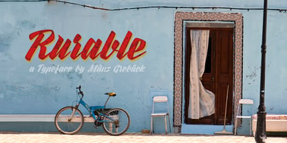 A confident marker typeface.
 - KG Flavor And Frames Five by Kimberly Geswein,
$5.00 Fun frames and borders in a variety of styles. The binder tabs can be printed, folded, and adhered to binder page dividers.
 - Museum Ornaments by T4 Foundry,
$7.00Museum Borders and Ornaments is part of a typographical treasure, the Norstedts type collection in Sweden. Type designer Torbjörn Olsson has painstakingly translated the original 34 Ornament matrices in the collection to Open Type. Among them are several of Granjon's arabesques, as well as symbols from both Swedish and Danish typefoundries. The signs were cut in the 16th, 17th and 18th centuries. The old Swedish name for these "type trademarks" were "rössjor". Museum Borders and Ornaments is an OpenType creation, for both PC and Mac. Swedish type foundry T4 premiere new fonts every month. Museum Borders and Ornaments is our tenth introduction. Museum Borders and Ornaments is part of the growing Museum type family. Museum also includes Museum Tertia Cursive, an exquisite 1700's typeface with modern additions, and Museum Fournier, a set of Rococo capitals designed by Pierre Simon Fournier le Jeune circa 1760. - Black Memory by Dumadi,
$25.00 Black Memory is a Brush-style font created with the App. The natural stroke texture makes this font look more perfect to use. Black Memory consists of capital letters and lowercase letters with different shapes so that you have a choice that fits the design you make. This font is perfect for Movie Titles, horror movie titles, action, murder, spooky, ghost, and other movie titles. You can see the sample preview above for comparison, stay the center of attention and classy!
 - Conners Corners NF by Nick's Fonts,
$10.00 Here's another collection of ornate border elements gleaned from the 1888 specimen books of James Conner's Sons United States Type Foundry in New York City. Refer to the PDF guide for detailed, yet simple, instructions for constructing nine delightfully different border patterns.
 - Candillas by Forberas Club,
$16.00 This Candillas font is made with a marker that has a curve that looks beautiful to look at and can be used for a variety of purposes.
 - Print Art JNL by Jeff Levine,
$29.00 Borders, embellishments, spot illustrations and a miscellany of other dingbats are gathered in Print Art JNL as another collective of nostalgic imagery for print and web projects.
 - Galix by Eclectotype,
$40.00 Galix is a technical sans designed to look futuristic without any of the retro appearance often found in this genre. It has a squarish, slightly condensed anatomy, and is characterized by thin joints and deep ink traps that add a sparkle to the otherwise monoline typeface. In the italic styles, these cuts are accentuated even more which creates a feeling of speed in the letterforms. Galix is optimized for display typography (the ascender height is the same as the cap height, and the spacing is somewhat tight) but the middle weights are very readable at smaller sizes, where I'd recommend adding a little tracking. OpenType features include ft and tt ligatures, stylistic sets/alternates, automatic fractions, tabular, superscript and subscript figures, case sensitive forms. Perfect for websites, apps, infographics, magazines and logotypes, Galix is technical but with a warmth and personality that is often missing from this genre.
 - PIXymbols Signet Classic by Page Studio Graphics,
$29.00A font package to generate traditional three-letter monogram designs, or a single initial. Includes 29 borders, each accessed by a single keystroke on the computer keyboard. The borders will automatically line up with the initials. - Culinary by Latinotype,
$39.00 Culinary is a typographic system inspired by the art of cooking. This family comes with 2 subfamilies: one Regular Family of 4 weights plus a Sans Line font and a set of Borders, and one 4-weight Script Family that also includes Sans Line and Borders. Culinary is well-suited for packaging, restaurant and cafe branding, bakeries, logos, magazines, menus, recipe books, invitations and much more. The OpenType features allow access to a wide set of characters, including ligatures, swashes, endings, initial and terminal forms, and lots of alternates.
 - XRoomingHouse by Ingrimayne Type,
$9.95 XRoomingHouse is a typeface of pictures that I did many years ago. Most of the pictures are border elements, and within a set they can be combined to make borders or frames. There is no real style consistency in the font—it is an eclectic collection of elements. (Minor corrections and additions were made in 2018 to improve sets that can form frames. For a more ambitious attempt at a font that can form frames, see Framealot). As for the name, boarders stay in a rooming house.
 - Citrus Shore by SilverStag,
$19.00 Introducing "Citrus Shore," a cool and chic modern handwritten marker font that embodies a refreshing and vibrant aesthetic. With its lively brush strokes and contemporary style, Citrus Shore brings a burst of energy to any design project. Whether you're creating invitations, branding materials, or social media graphics, this font's playful and dynamic character adds a delightful touch of modernity. Its versatility and undeniable charm make Citrus Shore the perfect choice for those seeking a trendy and captivating typeface that leaves a lasting impression. With its expressive and authentic appeal, Citrus Shore ensures flawless communication across borders. Supporting a wide range of languages, from English to Spanish, French, and more, this font guarantees your message is effectively conveyed. What sets Citrus Shore apart is its inclusion of over 400 alternate letters and ligatures, offering endless creative possibilities for stunning and original typography. From captivating logos to distinctive headlines, this font breaks free from the ordinary, infusing your designs with a touch of individuality. If you end up publishing your designs on Instagram, tag me - @silverstagco and I will make sure to showcase your design and work to my audience as well! Citrus Shore - Playful Marker Font Includes: Over 400 ligatures and alternate letters Numerals & Punctuation Language Support Web Font Kit is included as well Detailed instructions on how to use alternates in most of the apps on your computer as well for Canva Happy creating everyone!
 - Kickback by Comicraft,
$39.00 Joe Canelli is a crooked cop working in a corrupt police force. Joe is haunted by nightmares of powerlessness. When his partner is brutally murdered and he's betrayed by his colleagues, it appears that Joe's nightmares are coming true. With his back against the wall there's only one thing he can do -- turn against the criminal network that he once embraced... KICKBACK is a fast-paced, action-filled, noir-style, crime thriller from the co-creator of V FOR VENDETTA, David Lloyd. KICKBACK is also a font. This one.
 - Print Embellishments JNL by Jeff Levine,
$29.00 Print Embellishments JNL gathers together a number of vintage typographic enhancements that can be used as simple spot decorations, rule lines or borders, adding a bit of design elegance to any project.
 - Brema by Andrey Sharonov,
$22.00 Brema is a modern Sans Serif typeface with light weight anatomy. Created for using principally in big sizes, there is perfect solution first of all for web design, but also very well for fashion magazine tittles, luxury perfumes and cosmetics, logotypes, outdoor advertising and other design projects. Opentype Brema comes with 38 beautiful Ligatures and 17 Stylistic Alternates. To get Alternate just add number 2 after character (works with activated Standard Ligatures). Or use Stylistic Alternate option for change all available characters. Ligatures works with activated Discretionary Ligatures option. Note that this features only works with lowercase letters. Multilingual Support You can use Brema for following languages: Danish, Dutch, English, Estonian, Faroese, Finnish, French, German, Hungarian, Icelandic, Italian, Norwegian, Polish, Portuguese, Slovene, Spanish, Swedish, Turkish.
 - Print Enhancers JNL by Jeff Levine,
$29.00 Decorative border, spacer and ornamental elements comprise the bulk of Print Enhancers JNL, with a few extra goodies included to round out the collection.
 - Napolitanka by Tour De Force,
$25.00 Napolitanka is an elegant high contrasted font family. Contains a set of ligatures and swashes in each weight and borders as separate OTF file.
 - User Stencil by DSType,
$30.00 User is a monospaced type family with 30 styles, from Hairline to Bold, divided in Regular, Upright and Stencil, with five weights (Hairline, ExtraLight, Light, Medium and Bold) all with Cameo versions. Complexity and versatility are the keywords for this type family. Despite being a monospaced font, which means there's no kerning, all the glyphs were designed in order to sit comfortably in the 600 points width, a hard task because some glyphs are too narrow ('i' and 'l'), while others are too wide ('m' and 'w'), but they must fit the same width. The desire for keeping a comfortable readability in User was one of the key elements, therefore we designed several ligatures that fit both single and double space width, allowing to maintain a certain idea of proportional design. In this digital booklet you will find a detailed vision of the anatomy of the typefaces, the amount of characters available, the styles and weights, along with a series of features, specially designed to make User a very versatile and usable type system.
 - User Upright by DSType,
$30.00 User is a monospaced type family with 30 styles, from Hairline to Bold, divided in Regular, Upright and Stencil, with five weights (Hairline, ExtraLight, Light, Medium and Bold) all with Cameo versions. Complexity and versatility are the keywords for this type family. Despite being a monospaced font, which means there's no kerning, all the glyphs were designed in order to sit comfortably in the 600 points width, a hard task because some glyphs are too narrow ('i' and 'l'), while others are too wide ('m' and 'w'), but they must fit the same width. The desire for keeping a comfortable readability in User was one of the key elements, therefore we designed several ligatures that fit both single and double space width, allowing to maintain a certain idea of proportional design. In this digital booklet you will find a detailed vision of the anatomy of the typefaces, the amount of characters available, the styles and weights, along with a series of features, specially designed to make User a very versatile and usable type system.
 - User by DSType,
$30.00 User is a monospaced type family with 30 styles, from Hairline to Bold, divided in Regular, Upright and Stencil, with five weights (Hairline, ExtraLight, Light, Medium and Bold) all with Cameo versions. Complexity and versatility are the keywords for this type family. Despite being a monospaced font, which means there's no kerning, all the glyphs were designed in order to sit comfortably in the 600 points width, a hard task because some glyphs are too narrow ('i' and 'l'), while others are too wide ('m' and 'w'), but they must fit the same width. The desire for keeping a comfortable readability in User was one of the key elements, therefore we designed several ligatures that fit both single and double space width, allowing to maintain a certain idea of proportional design. In this digital booklet you will find a detailed vision of the anatomy of the typefaces, the amount of characters available, the styles and weights, along with a series of features, specially designed to make User a very versatile and usable type system.
 - Mission Art by Woodside Graphics,
$19.95Mission Art contains 26 design elements from many of the California missions. From a dove about to alight on a mission wall, to floral accents of all kinds, to a mission cross, there's a design here for everyone and every purpose. An important part of this collection is 6 decorative borders that are designed in such a way that they can be used as single elements by themselves, or repeated to make a long border across a page. They join seamlessly by simply typing the appropriate letter over and over again. - Kaonug by Twinletter,
$18.00 This Kaonug display font will make your work stand out. It brings just the right amount of uniqueness and style to whatever project you’re working on, the anatomical shape of the letters makes it unique and artistic. This is a great font to use when creating logos, posters, advertisements, and all your projects or anything else that needs to stand out in a variety of media. What’s Included : Standard glyphs Iso Latin 1 Simple installations We highly recommend using a program that supports OpenType features and Glyphs panels like many Adobe apps and Corel Draw, so you can see and access all Glyph variations. PUA Encoded Characters – Fully accessible without additional design software. Fonts include Multilingual support
 - Angie Lou by FontFuel,
$12.00 Angie Lou is a contemporary clean informal face. More formal than most handwritten faces, it surprises the eye with its clean rhythm. It gives that "marker on paper" or "dry erase board" feel. But the thin nature of Angie Lou sets it apart from most marker style fonts. Angie Lou offers two variants: regular and italic.
 - Vecto by ryan creative,
$10.00 Vecto is a typography designed by Ryan creative that encapsulates a modern minimalist vision approach, formal rigor, and shows a variety of designed characters including glyphs as well as depicting graphics in a modern way, that subtle constructive anatomy, those geometric ratios produces kerning and precision lines. FEATURES; Uppercase. Support Foreign, Numbers and Punctuation. Regular & Italic. Works on PC. Simple installation. Accessible in Adobe Illustrator, Adobe Photoshop. Adobe InDesign, it even works in Microsoft Word. Fully accessible without additional design software. Vecto is encoded with Unicode PUA, which allows full access to all additional characters without having to design any special software. Mac users can use the Font book, and Windows users can use the Character map to view and copy any extra characters to paste into your favorite text editor/app. Thanks for visiting, have a nice day ;)
 - Kokomo Breeze by Nicky Laatz,
$35.00 Say hello to Kokomo Breeze - A deliciously bold and nonchalant casual marker font. Kokomo Breeze was designed to keep a naturally handwritten marker-style look , while still maintaining some subtle inky marker imperfections on its edges , to keep in line with a more realistic, yet very legible look. Great for headlines, bold branding, classy packaging, eye-catching callouts and stand-out advertising, Kokomo Breeze is designed to be your jack of many trades. Be sure to turn on your OpenType features when type with Kokomo Breeze - it’s packed with natural-looking ligatures and alternate characters for both upper and lower case - all of these opentype extras make your type design look mush less mechanical, and much more like naturally formed words as you type. Pair it with a bold tall sans serif font, or a classy serif to add another whole new dimension to this very versatile marker font. Great as large and small sizes, Kokomo Breeze is perfect for any size design.
 - Nibbles by Typogama,
$19.00 Nibbles is a linear dingbat typeface inspired by the theme of food and food trucks. With symbols ranging from burgers, pancakes, or desserts, to food trucks and toilet signs, this font aims to cover all your hungry design needs! To help with its application, each pictogram can either be found through its glyph placement or by simply typing out the name of the food item. Type burger and presto, your burger pictogram will appear! With its simple application and extensive symbols, Nibbles can be used for branding, menus, editorial layouts, posters, and any food related projects.
 - Masteng by Twinletter,
$18.00 Turn your designs into something special with the Masteng Groovy Font. This font features an anatomical design between thick and thin lines, making it visually unique from most other fonts. The combination of words that arise will make your project bold and powerful. Take advantage of this awesome font for a project that’s superior and more striking than ever! What’s Included : Standard glyphs Iso Latin 1 Simple installations We highly recommend using a program that supports OpenType features and Glyphs panels like many Adobe apps and Corel Draw, so you can see and access all Glyph variations. PUA Encoded Characters – Fully accessible without additional design software. Fonts include Multilingual support