10,000 search results
(1.339 seconds)
- Finetitle by 2D Typo,
$24.00 A set of elegant designed framework for headers.
 - Intellecta Bodoned by Intellecta Design,
$15.95a complete family of Bodoni style inspired typeface - Doodles by Classic Font Company,
$14.95A small collection of 'Doodles' and frame pieces. - TheMix Mono by LucasFonts,
$49.00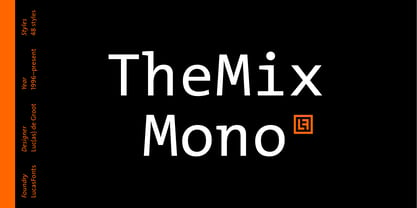 TheMix Mono is a monospaced version of TheMix.
 - Delamotte Large Relief by Intellecta Design,
$9.00digitization of a vintage lettering from Delamotte's book - Flexy by AKTF,
$25.00 This is a sans serif version of Flexy.
 - GP Leonardo by Intellecta Design,
$9.00a extensive family of naive brush typeface font... - American Advertise 015 by Intellecta Design,
$14.95digitization of a classic font from America heritage - Altemus Shields by Altemus Creative,
$11.00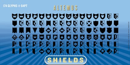 A collection of 174 shield and heraldry designs.
 - Simone by Berthold,
$67.99 Simone is a trademark of Berthold Types Limited.
 - Digibeck by Volcano Type,
$19.00 Digibeck represents a new style of digital font.
 - Bitwild by Pechay Studio,
$10.00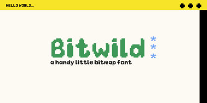 A bitmap font with the roughness of handwriting.
 - Rombi Technocrat by Mans Greback,
$39.00 Rombi Technocrat is a geometric, heavy font that features a unique combination of square shapes and slanting angles. Inspired by the dynamics of forward movement and the rigidity of structured design, this italicized font family brings a sense of purpose and direction to your creative projects. The Rombi Technocrat font family includes five weights: Thin, Light, Regular, Bold, and Black, providing a broad range of stylistic options for designs that call for a distinct, angular touch. The font is built with advanced OpenType functionality and has a guaranteed top-notch quality, containing stylistic and contextual alternates, ligatures, and more features; all to give you full control and customizability. It has extensive lingual support, covering all Latin-based languages, from Northern Europe to South Africa, from America to South-East Asia. It contains all characters and symbols you'll ever need, including all punctuation and numbers.
 - Nilkuza by Twinletter,
$15.00 Welcome to the world of typography full of charm and nostalgia! Nilkuza is a Retro Display style font that brings a classic touch and fun to any of your projects. It's the perfect solution to bring a unique, vintage, and rustic look to life in a variety of visuals. Nilkuza is not just an ordinary font. With four family variants that include regular, distort, outline, and shadow, this font provides unlimited flexibility to explore your creativity. By using the ligature and alternate features, you can create unlimited letter combinations, making each of your works truly unique. We understand that every project has its own character and language, that's why Nilkuza supports multiple languages, so you can connect with a global audience without limitations. Make your every visual appearance an unforgettable nostalgic journey with Nilkuza. Get this font right away and take your projects into a dazzling era!
 - Magical Tours by IKIIKOWRK,
$17.00 Proudly Present Magical Tours - Psychedelic Type, created by ikiiko. Magical Tours is a stunning typeface with the retro appeal and allure of a psychedelic design. This distinctive bottom thickness typeface takes you on a fantastic journey through time while still maintaining a timeless aesthetic. Magical Tours, inspired by the writing styles of the 60s, where the psychedelic trend perfectly encapsulated the restless essence of youth at the time. This font has a distinct personality due to its inventive mix of vintage components and psychedelic influences, making it ideal for evoking the romance of the past. This typeface is perfect for an vintage stuff, retro poster layout, fashion ads, book cover, packaging, food & beverages and also good for quotes, or simply as a stylish text overlay to any background image. What's included? Uppercase & Lowercase Number & Punctuation Multilingual Support Works on PC & Mac Enjoy our font and if you have any questions.
 - Gerlach Sans by Juraj Chrastina,
$29.00 As the foundry’s top–of–the–line family, Gerlach Sans was named after the highest peak in Slovakia. Its functional design is enhanced by a few subtle ingredients, adding life and giving words a more playful voice. The family has eight weights ranging from delicate hairline to the super thick black. Each of them includes a genuine italic companion with variant shapes. The large character set accessible through OpenType features provides the designer with a wealth of opportunities and supports a wide range of Latin-based languages. It is stuffed up with tabular and proportional figures, old-style and lining figures, fractions, superscripts and subscripts, ordinals, case-sensitive forms, circled numbers, arrows, icons and many more. Combining legibility and usability of its grotesque style with cool elegance, Gerlach Sans provides a strong partner for your print and web project. You can download the instruction PDF here.
 - Terrapin by Missy Meyer,
$12.00 Introducing Terrapin! I named this after listening to a song called "Terrapin on a Tightrope." Considering the fact that a terrapin is a kind of turtle, it makes that song title seem pretty harrowing! This font has heavy roots in one of my favorite lettering styles. It's rough, scrappy, and likes to do its own thing. It has a full uppercase and lowercase set, numbers, punctuation, and lots of extended Latin characters for language support. It also includes alternate versions of 17 lowercase letters. Where Terrapin really shines is in the ligatures. I've written separate two- and three-letter combined forms for some of the most common letter combinations, and a few uncommon ones to boot. There are almost 100 ligatures in here, all PUA-encoded so everyone can access them (and also coded so if your software does automatic ligature replacement, they'll pop right in).
 - Grrr by ParaType,
$30.00 Grrr is a headstrong modular display typeface with a large amount of alternative glyphs. It consists of eight weights ranging from Thin to Black. A variable font is also available. The typeface is designed on a modular grid and it proudly ignores the rules of optical compensations: the horizontal and vertical strokes have identical thickness, and round and triangular letters have no overshoots at all! All these peculiarities are making the typeface usable at sizes from 21pt and larger in print and approximately from 24px on non-retina screens. Grrr is especially good at extremely large sizes. The typeface includes three stylistic sets with even more bizarre letterforms. These sets activate a cyclic pseudorandom substitution of letters from a range of alternates — the letterforms keep changing as you type! The typeface was designed by Dmitry Goloub and Alexandra Korolkova and released by Paratype in 2019.
 - Carmensin by Rafael Jordan,
$35.00 Carmensin is a beautiful humanist serif typeface created by Rafael Jordán. Designed in the 21st Century with all the flavor of the Renaissance. The conclusion of a story that began in Type@Paris program in June, 2015 & ended at February, 2020. Inspired by historical models, its classic conventional appearance with small details, smooth curves, large x-height and open counters made of Carmensin a great, efficient and solid typeface for long text settings. Also, its bigger sizes styles show the beautiful shapes and contrast, exhibiting its exuberance. Carmensin has a great collection of OpenType features that will satisfy any typographic necessity as ornaments, ligatures, stylistic sets, small caps, automatic fractions and more options along 3 optical styles (Text, Headline and Display) plus a fancy Stencil style. With an extensive Latin character set, Carmensin covers a wide amount of Latin-based languages, including Latin Plus encoding.
 - Amateur Typewriter by Ana's Fonts,
$12.00 Amateur Typewriter is a monospaced typewriter font, sampled from a real vintage typewriter, that is so much fun to use. Each letter and number includes 3 versions that are slightly different from each other and appear “randomly” through the contextual aternates OT feature. This gives this typewriter font an extra dose of realism. The alternative versions of the font (strikethrough, crossed and underlined variations) make it perfect for any design that needs a quirky but very legible typewritten feel, in both titles and longer texts. Use Amateur Typewriter in: logotype design, postcards and tags, editorial and website designs, projects that need a retro look, such as digital collages, among others. What you will get in this set: - A regular version of the Amateur Typewriter font with an Italic variation - Strikethrough, Crossed-out and Underlined versions of the font, with Italic alternatives, for a total of 8 fonts
 - Chypre by insigne,
$- 21st century innovation demands a 21st century style. It’s the age of virtual assistants. It’s machine learning and AI. It’s blockchain and cryptocurrencies. Shape the feel of these modern concepts with the mechanically-inspired forms of Chypre. Chypre’s subtle technological feel is perfect for our culture’s evolving electronic media applications. At its source, the carefully adjusted character designs and the balanced weight contrast convey to the modern reader an understanding of cutting edge concepts through a pleasing human feel. Unlike many other tech-driven fonts out there, this next-gen cyborg is a great option for text settings as well as headlines. The new face is composed of six styles, including numerous alternates which dramatically alter the appearance. There are also extra letter shapes, numerous figure options, and extensive language support. Designed to fit where you need a high-tech feel, Chypre is a modern font for a modern age.
 - Lavire by Nathatype,
$29.00 Elevate your design projects with the distinctive and captivating Lavire. Lavire is an uppercase display serif font that is effortlessly made in a truly unique typographic masterpiece. Each uppercase letter in Lavire is a work of art in itself. The serifs, which are typically known for their traditional elegance, take on a modern and imaginative twist with Lavire's addition of artistic lines and flairs. The artistic lines and flairs in this font are carefully crafted to enhance the overall composition of each letter. They bring a sense of motion and dynamism to the font, making it particularly well-suited for projects that seek to convey a sense of movement or elegance. Lavire fits in headlines, logos, posters, flyers, branding materials, print media, editorial layouts, and many more designs. Find out more ways to use this font by taking a look at the font preview.
 - Curvi Technocrat by Mans Greback,
$39.00 Curvi Technocrat is a rounded, geometric font that captures the essence of speed and forward movement. Inspired by the smooth curves of race cars and the energy of urban graffiti, this heavy, slanted font family adds a touch of dynamism and softness to your designs. The Curvi Technocrat font family offers five weights: Thin, Light, Regular, Bold, and Black, making it a versatile choice for a wide range of design projects that require a modern, geometric touch. The font is built with advanced OpenType functionality and has a guaranteed top-notch quality, containing stylistic and contextual alternates, ligatures, and more features; all to give you full control and customizability. It has extensive lingual support, covering all Latin-based languages, from Northern Europe to South Africa, from America to South-East Asia. It contains all characters and symbols you'll ever need, including all punctuation and numbers.
 - Bestyline by MJB Letters,
$20.00 Bestyline is a captivating Bold Script Font that seamlessly blends bold lettering with the artistic elements of calligraphy. Its unique design exudes confidence and energy, creating a striking visual impact. The font features thick, well-defined characters with artistic contours, adding a touch of elegance to each letter. The strong and impressive script style makes Bestyline an ideal choice for projects that require a bold and classy appearance, such as headlines, logos, posters, and other designs. The standout features of Bestyline include the clarity of each letter, ensuring that text using this font effortlessly captures attention. Its boldness and distinctiveness make it well-suited for both print and digital designs. Whether used in headlines or logos, 'Bestyline' brings a modern and sophisticated flair to any project, making it the perfect choice for those seeking a seamless combination of boldness and beauty in their typography.
 - Yesterday Morning by Mans Greback,
$59.00 Yesterday Morning is a lively handwriting font that captures the essence of an active and cute brush style. This handmade calligraphy font is perfect for fashion projects, adding a sense of energy and excitement to your designs. The font family's hand-brushed appearance brings an authentic, personal touch to your creative work, making it feel warm and approachable. The Yesterday Morning font family includes four engaging styles to suit various design needs: Regular: A balanced and energetic style for everyday use Regular Italic: Adds a playful touch and a sense of movement Bold: Offers a bolder, more assertive presence for impactful designs Bold Italic: Combines the strength of bold with the flair of italic Built with advanced OpenType functionality, Yesterday Morning ensures top-notch quality and provides you with full control and customizability. It includes stylistic alternates, ligatures, and other features to make your designs truly unique.
 - Hansplatz Grotesk by Heypentype,
$20.00 Hansplatz Grotesk is a sans serif type family of nine weight. Influenced by Akzidens Grotesk, Hansplatz typeface bring a new approach to this utilitarian style of grotesk. With more square proportions rather than geometric style, Hansplatz grotesk aimed to ease typesetting job when arranging a words or paragraph easily. A wide range of weight gives flexibility to every design project, hansplatz fit nicely to grid-system because of proportions. Furthermore Hansplatz Grotesk supplied with smart Opentype scripting to assist typesetter and designer very easily to Hansplatz feature. Hansplatz Grotesk truly a utilitarian, workhorse, neutral, and of course faceless. But, it makes the work done quickly. For display use, Hansplatz Grotesk Black to Semi-Bold is recommended, for paragraph heavy design, use regular and light weight. To spice up, adding Hairline or extra-light weight will make a design execution looks great and catchy but not intimidating.
 - Structorator by Furiosum,
$15.00 Structorator is a grid-based, experimental display font. This typeface emerged from experiments with generative type design. It evolved from a piece of code into a fully usable opentype font. The two main features are its rigid but playful design and a multitude of alternate glyphs. These features make it possible to create interesting lettering when using the default spacing. The glyphs are constructed from a limited set of patterns which are arranged within a predefined grid. The line thickness corresponds to the different cuts. Due to the rather complex shape this font will look best in larger sizes and resolutions. Its best suited for headline, display or illustrative work. - 3 weights: light, medium and heavy - 5 character sets - 3 number sets - Basic punctuation - Seperate diacrits - Ornamental glyphs - Access via stylistic sets *OT feature - Random access from the whole range of chars *OT feature - Total of 1062 Glyps
 - HU Makingfilm by Heummdesign,
$15.00 HU Makingfilm gives a solid feeling of a full module, and it is a font that adds softness by rolling the angled part.
 - Hallandale JNL by Jeff Levine,
$29.00Hallandale JNL is versatile enough to be a headline font as well as a text font, without a loss of style or integrity. - Miedinger by Canada Type,
$24.95 Helvetica’s 50-year anniversary celebrations in 2007 were overwhelming and contagious. We saw the movie. Twice. We bought the shirts and the buttons. We dug out the homage books and re-read the hate articles. We mourned the fading non-color of an old black shirt proudly exclaiming that “HELVETICA IS NOT AN ADOBE FONT”. We took part in long conversations discussing the merits of the Swiss classic, that most sacred of typographic dreamboats, outlasting its builder and tenants to go on alone and saturate the world with the fundamental truth of its perfect logarithm. We swooned again over its subtleties (“Ah, that mermaid of an R!”). We rehashed decades-old debates about “Hakzidenz,” “improvement in mind” and “less is more.” We dutifully cursed every single one of Helvetica’s knockoffs. We breathed deeply and closed our eyes on perfect Shakti Gawain-style visualizations of David Carson hack'n'slashing Arial — using a Swiss Army knife, no less — with all the infernal post-brutality of his creative disturbance and disturbed creativity. We then sailed without hesitation into the absurdities of analyzing Helvetica’s role in globalization and upcoming world blandness (China beware! Helvetica will invade you as silently and transparently as a sheet of rice paper!). And at the end of a perfect celebratory day, we positively affirmed à la Shakti, and solemnly whispered the energy of our affirmation unto the universal mind: “We appreciate Helvetica for getting us this far. We are now ready for release and await the arrival of the next head snatcher.” The great hype of Swisspalooza '07 prompted a look at Max Miedinger, the designer of Neue Haas Grotesk (later renamed to Helvetica). Surprisingly, what little biographical information available about Miedinger indicates that he was a typography consultant and type sales rep for the Haas foundry until 1956, after which time he was a freelance graphic designer — rather than the full-time type designer most Helvetica enthusiasts presume him to have been. It was under that freelance capacity that he was commissioned to design the regular and bold weights of Neue Haas Grotesk typeface. His role in designing Helvetica was never really trumpeted until long after the typeface attained global popularity. And, again surprisingly, Miedinger designed two more typefaces that seem to have been lost to the dust of film type history. One is called Pro Arte (1954), a very condensed Playbill-like slab serif that is similar to many of its genre. The other, made in 1964, is much more interesting. Its original name was Horizontal. Here it is, lest it becomes a Haas-been, presented to you in digital form by Canada Type under the name of its original designer, Miedinger, the Helvetica King. The original film face was a simple set of bold, panoramically wide caps and figures that give off a first impression of being an ultra wide Gothic incarnation of Microgramma. Upon a second look, they are clearly more than that. This face is a quirky, very non-Akzidental take on the vernacular, mostly an exercise in geometric modularity, but also includes some unconventional solutions to typical problems (like thinning the midline strokes across the board to minimize clogging in three-storey forms). This digital version introduces four new weights, ranging from Thin to Medium, alongside the bold original. The Miedinger package comes in all popular font formats, and supports Western, Central and Eastern European languages, as well as Esperanto, Maltese, Turkish and Celtic/Welsh. A few counter-less alternates are included in the fonts.
 - Argone LC by Graphite,
$22.00 Argone LC is a handmade organic typeface family. It is a variant of Argone typeface, but has lower case letters. It comes in four weights– light, regular, bold and black, which is a feature not seen much in handmade typefaces. This makes Argone LC a versatile and flexible type family. There is also a version of Argone LC which only has upper case letters – Argone
 - Lovato by Philatype,
$35.00 Lovato is a family of five fonts, perfect for branding applications, books, or poster designs that require a clear, sharp, stylish tone. The styles range from an elegant, delicate light weight up to a brazen, commanding black weight. This original Latin-serif family, designed by Kosal Sen, has primarily a geometric construction, with hints of details inspired by inscriptional lettering, all coalescing to fit a contemporary palette.
 - Foundry Origin by The Foundry,
$90.00 Foundry Origin has an elemental quality hinting at its ‘Egyptian’ roots. Developed out of the desire to create a serif typeface with a difference, Foundry Origin's elegant design and versatile family of weights, with lyrical cursive italic, generous x-height and classical proportions, make it ideal for editorial and information design. A quiet design with a big presence, tipped to become a modern classic.
 - Robot Monster NF by Nick's Fonts,
$10.00A design experiment run amok! To some, the upper case A of this font resembles a diving helmet. If you put same on a guy in a gorilla suit, you have the really cheesy 50s sci-fi movie that gives the font its name. Both versions of this font contain the Unicode 1252 (Latin) and Unicode 1250 (Central European) character sets, with localization for Romanian and Moldovan. - Matchstick by Fenotype,
$25.00 Matchstick is a hand drawn brush script. Matchstick is packed with loads of ligatures and alternates that help simulate a swift look of a handwriting. This feature is set in Standard Ligatures and it is normally automatically on. Matchstick is a great display brush to be used in writing headlines, packaging, posters or as a logotype. Matchstick works great when paired with strong sans serifs.
 - PR Sprucewood 01 by PR Fonts,
$5.00 This font is a collection of sketched spruce trees. Some are filled outlines, some are bare trunks and branches, and some are rough squiggles. Each can be used individually to suggest a tree, and the different shapes can be layered in different colors, to suggest texture, or snow cover. There is also a glyph of a mountain range, for a horizon behind your forest.
 - AT Move Specx by André Toet Design,
$39.95 SPECX This is my #11/12 Font a slabserif typeface. In fact it’s a very, very basic and extreme strong typeface! We gave this new Font a special touch by adding an extra family-member: a stencil-version of the SPECX. My inspiration for the SPECX is based on the cover of a 1955 French School-Notebook. Concept/Art Direction/Design: André Toet © 2017
 - Pringle & Tweed by Nicky Laatz,
$16.00 Stylish and unique, Pringle & Tweed is a new handwritten font with a graceful nuance.It’s gentle curves and natural lettering make it distinctive and elegant. To make your lettering look truly unique, Pringle and Tweed comes with a comprehensive set of double letter ligatures , and a set of stylistic alternate lowercase letters in it's opentype features. Pringle and Tweed includes a slanted version for an extra elegant feel.
 - Furius by Typogama,
$29.00 Furius is a display typeface inspired by the split serif style of woodcut or chiseled letters found in roman inscriptions and later popularized by the western genre in the United States. Created as a display typeface, Furius combines a host of Opentype features and equally incoporates a full extended latin and cyrillic character set to provide a versatile and complete design solution for titles or display settings.
 - Tea And Oranges by Hanoded,
$15.00 Tea And Oranges is a line from Leonard Cohen’s song Suzanne. “She feeds you tea and oranges that come all the way from China”… The song was a favourite of my brother Rizja who, sadly, recently passed away. Tea And Oranges is a a handwritten ‘pencil’ style font. It comes with impressive language support and a bunch of Discretionary ligatures for you to play with!