10,000 search results
(0.047 seconds)
- Audace Std by Typofonderie,
$59.00 Between geometry & shapes inspired by nature, in 4 fonts Audace was born as a response to a simple brief: how to visually express human interaction and technology with abstract forms? The starting point is a humanistic sanserif, to which are added external references: design pieces, furniture, buildings. Architects shape our world with the intention to reconnect nature, human and address a perfect functionality. Not so far to typeface design which combines a personal vision and ensures good legibility in a certain context. Audace — like the works of those artists, designers, architects — is clearly influenced by the tension of the line, the play with negative space, the dynamics, the surprise, the nature that will influence the shapes of the letters. So if a v is asymmetrical, and the y based on similar asymmetry but in reverse, these two shapes help to distinguish from one to the other. This is a consequence of the influence of forms from design and art in the design of the Audace. And this small example illustrates the confrontations of the designer’s influences: the search for the most unique shapes, but without compromising on function: to be read, to be legible, even at very small size in the worst conditions. Audace, between geometry and shapes inspired by nature
 - KG Two Is Better Than One by Kimberly Geswein,
$5.00 This font was created in honor of my husband for our 12th wedding anniversary. 14 years ago, I met this tall, skinny guy from Indiana in the lobby of a hotel in Hong Kong. We talked. The next day, we had lunch together. And that night we had dinner together. And the next day. And the next. We met just before my 19th birthday, and on my birthday he took me to the top of Victoria Peak, where we looked out over the city of Hong Kong- such a beautiful place to begin a lifetime of love! We spent 4 months together in Hong Kong, falling in love with each other and with the beautiful city we were privileged to call home for that short time. We married the next year. We've lived in Indiana, Texas, China, Kentucky, and Florida over those 12 years of marriage and have welcomed 2 daughters into our lives. I know beyond a shadow of a doubt that he completes my life in a way I didn't know was possible. And I know that I'm blessed beyond words to have a supportive, wonderful, encouraging husband who is also a loving, involved, caring dad to our daughters. This font is for you, Keith!
 - Mildred by Burghal Design,
$29.00Remember when a coyote was a light-boned rangy member of the canine family and not the name (spelled C-A-O-T-I) of your neighbor's four year old daughter? When a cricket was a leaping, chirping insect and not the name (spelled K-R-I-Q-U-I-T-T-E) of your purple-haired, pierced-tongued waitress? When Madison and Austin were cities, when brie was a variety of cheese, when radon and alar were hazardous substances and NOT FIRST NAMES? Burghal Design remembers the good old days, when people were not named Whisper, Zandren, Skylar or Dakota but were called Eleanor, Arthur, Edward and Irene. In the spirit of these classic monikers, we give you Mildred, a script font family for proud and simple folk: the down to earth Mildred Plain, hearty Mildred Stout, the barely-there Mildred Scrawn,and the barfly Mildred Cocktail. There's also the slightly more formal (but still all-purpose) Mildred Fancy, bolder Mildred Strong, and the wisp of Mildred Mild. Rounding out the family is Mildred Ornaments, a collection of symbols that can be used for snowflakes, for bullets, or just for fun. Mildred: just an old-fashioned, hard working font. - Eurotypo Bodoni by Eurotypo,
$48.00 Talking about the numerous types that today bear the name of Giambattista Bodoni are a kind of tribute as much to his reputation as a printer as to his ability as designer and engraver. In fact, all of them tent to be more in the way or style of Bodoni than simply copy of his letterforms. Like many other type designers, we’ve been seduced also to develop our own point of view of his work, nowadays enriched by some features of OpenType format that allows a variety of combinations: standard ligatures, discretional ligatures, stylistic alternates and old styles figures. Whereas the Bodoni serif in the capitals was of the same weight as the thin stroke but joined with a very slight fillet (Bracket) and the lowercase serif were like his French rivals, the Didots, featured straight- edged serifs that were unbracketed. The ascenders and descenders of this new Bodoni are shorter, giving in this way, more space for enlarge x high. Specially designed for editorial design and advertising, can be used in magazines, annual reports and all kind of fine print materials or web pages. The beauty of his letterforms can enrich headlines; this font can also be used as body text for its good legibility and accurate kerning.
 - Malabar by Linotype,
$29.99 Malabar is a type family for extensive text. Its design was developed with a nod toward newspapers. Malabar's characters are seriffed and of the Old Style genre. A strong diagonal axis is apparent within the curves. Sturdy serifs help strengthen the line of text in small point sizes, as well as define the overall feeling of the face. Malabar's x-height is very high, a deliberate choice that makes the most important parts of lowercase letters visibly larger in tiny settings. The height of the capital letters is also rather diminutive, allowing for better character fit, as well as eliminating a bit of clumsiness in German, which often includes quite a few uppercase letters. Diacritical marks and additional alphabetic forms required by many Western, Central, and Eastern European languages are naturally a part of the character set, including those needed in the Baltic states, for Romanian, and for Turkish. Malabar's accents are bold and direct, sitting well with their base glyphs. The family includes three weights, each with a companion Italic. Malabar Regular is equipped with small caps, and both it and Malabar Italic include oldstyle figures. All members of the family have both proportional and tabular-width lining figures, as well as special variants of certain punctuation marks vertically adjusted for all-caps text setting. Malabar is informed both by contemporary ideas of typeface design (sheared terminals, the wider-drawn s) as well as by 16th-century masters. Malabar Heavy and Heavy Italic are very loud; their blackness almost shouts out from the page. The Regular's wedge serifs become more slab-ish in nature as the letters' weight increases. Malabar Heavy and Heavy Italic are best relegated to headline use only. Malabar Bold and Bold Italic may be used for text emphasis, a job for which the Heavy is to dark. Malabar received a Certificate of Excellence in Type Design at the Type Directors Club of New York TDC2 competition in 2009.
 - Grit Sans by Baseline Fonts,
$39.00 Grit Sans is a font balanced enough to stand strong on the tippy-toes of its pointed "t" ascenders. Even all caps communicates calm. Dashes of whimsy in the proportionately plump X-Heights tell of the accountant drinking too much sherry at the office Christmas party, but thick, consistent strokes never lets you forget his job title. Ascenders and descenders consistently reach the same heights and depths, further attesting to the reliability of this typeface, at even very small sizes. Available in both regular and bold face, Grit Sans is a faithful complement to thin fonts with a pinch of frivolity such as Heirloom Artcraft. It is ideal in use for titles, subheadings, menus, playbills, custom stamps, logos - anywhere a solid font can speak at a volume just above all others.
 - Panforte Pro by Zetafonts,
$39.00Panforte Pro is the basic ingredient for any tasty visual feast: a prime-cut font family, deliciously readable online and offline, space-saving and organic, appealing to hipster consumers and seasoned gluttons. Hand drawn in easy big strokes, its a very condensed typeface that allows you to typeset easily long texts. Lovers of world cuisine will be delighted to discover that it supports over forty languages using the latin alphabet, spiced with hand-picked diacritics and comes also with a tasty side dish of greek and cyrillic characters. For all the nouvelle cuisine open type chefs, it features a set of proper small case character set and alternate oldstyle numerals, as well as a set of repeating letter ligatures to avoid that metallic taste of repeating double characters. - Acolyte by Altered Ego,
$45.00An elegantly refined typeface with a subtle wedge serif, the character shapes of Acolyte STF set a rhythm of light and dark like windows in a cathedral. Standing tall (as in condensed!) and respectful, Acolyte STF is aptly named as a companion to any design, packaging and advertising. Acolyte will illuminate your designs with a display typeface reminiscent of European 20th century letterforms. Its distinctive letterforms are slightly chiseled and angular with curves in just the right places. Wrapped in an aura of mystery, Acolyte's origins are from condensed typefaces, with an understated gothic feel. Available for Macintosh and Windows, Acolyte will set an edgy tone for all of your design needs. Complete with an Adobe-standard character set, this font also includes the Euro and is cross-platform compatible. - Isidora by Latinotype,
$26.00 Designed by Enrique Hernández V. Isidora is a modern geometric design based on the classic typefaces of the early 20th Century with a contemporary and functional touch. In spite of its strong and rational structure, the font also looks friendly and expressive, thanks to its rounded terminals. In addition, its diagonal terminal cuts give it a softer and more rounded appearance. Isidora consists of two 7-weight subfamilies: one (more classic) Regular and one Alternative (more contemporary and for display use). Both subfamilies come in italic version, giving a total of 28 fonts. Isidora is the perfect font for headlines, logotypes, branding, packaging, publishing and web use. The family contains a set of 438 characters—supporting 207 different languages—and also includes an alternative character set, which allows for more versatility when composing text.
 - Streetscript Redux by Eclectotype,
$40.00 Streetscript Redux is an update to the now discontinued Streetscript. In the original version, it seems a lot of users didn't like the s’s in the font, and after seeing them redrawn (not always with the best results!) a few times, I decided to make a new version of the font with less idiosyncratic s’s, and this is the result, Streetscript Redux. (I should have listened to my other half - “those s’s look like fives,” she said) All other features of the original Streetscript are intact (barring a couple of s-ligatures no longer necessary). There’s been a little tweaking of some outlines, and slight changes with spacing too, but for the most part, all I've done is redraw those pesky five-like s’s, so that you don't have to.
 - Varisse Variable by AVP,
$79.00 Varisse spans over two centuries of type design and draws its inspiration from well-loved classics that are as fresh today as they were when they were created. The range stretches from a quintessential 18th century transitional serif to an uncompromising 20th century sans. Think Baskerville, think Gill. The idea was to create a family that shared similar forms and the same vertical metrics, allowing them to be mixed to provide impact and readability as required. With a generous x-height and a host of options, Varisse Variable is ideally suited to branding, packaging, magazines and editorial. It also provides a wealth of opportunity in website presentation. The variable axes of weight and serif allow selection of styles from sans light to serif heavy with all the options in between.
 - Andaluz by Storm Type Foundry,
$38.00 The land of beauteous angels, Andalucia, connects different cultures with a curved arch. Almond trees bloom there in February, and orange trees grow in the heavenly courtyards of Gothic churches. A Catholic cathedral stands in a mosque, Moorish fountains gush with water, and ornate arcades are reflected in the mirrors of the Alhambra pools. Fishing villages have long been busy with tourism, but there are remote pubs where only locals go for fresh fish. Beer is served in wine glasses, and with each one you get a piece of cheese, shrimp, or a few slices of specially smoked ham, sitting on the bar counter. Here, in the off-season, it is possible to gaze into the distance towards the African shores and sketch watercolors for the diary completely undisturbed.
 - Omnibus by Linotype,
$29.99Omnibus is one of my absolute favourites. My intention was to design a typeface as easy to read as Baskerville, without being a copy of it. It is easy to see that I was influenced by Baskerville, e.g. in the open lowercase g. I had in mind to design a Baskerville with the looks of the Baskervilles used in earlier typesetting. I put aside those plans for a while (but fulfilled them later on) and dedicated myself to Omnibus. In both cases my aim was to achieve a typeface with darker looks than the most used Baskerville. The name has nothing to do with buses, it is Latin with the meaning of for all". It is also in the name of Omnibus Typografi. Omnibus was released in 1993. - Nolan by Kastelov,
$55.00 The idea behind Nolan is to create emotional response due to its inviting character and legibility. It is ideal for headlines, presentations, product signage and bespoke logotypes. Due to the structure of the letters, Nolan can also stand its ground in body text, although this is not its primary purpose. Nolan is created slightly wider than what is to be expected from a typical sans font, yet not to the point of being considered a wide typeface. This uniqueness lends the family an air of originality while adhering to already established standards in the creation of contemporary sans typefaces. Nolan has a large x-height, so as to deliver a better punch and be legible at a glance . Its clean and modern lines are reminiscent of architectural aesthetic.
 - Stevie Sans by Typefolio,
$29.00 Some years ago I had my first contact with a grotesque typeface, when handling a sample catalog of typographic specimens from the age of phototypesetting. The style eventually settled in my memory waiting for the work of time. Behind its apparent neutrality, there is a complex balance game, that almost leads to the basic principles of design which deliver such power to the grotesque style. Stevie Sans is the answer to the action of time. A bridge that allows the designer to go into the past, while being in the present and looking towards the future. It is what it’s expected from a grotesque designed in the 21st century. With 7 roman styles ranging from thin to black, support to many languages and essential opentype features, Stevie Sans is the ideal choice for your project.
 - Rigoletto by Sabrcreative,
$15.00 Introducing Rigoletto Font Duo, a stunning combination of a monoline script and Sans Serif fonts. This font duo offers a neat and clean monoline style, complemented by the versatility of the Sans Serif fonts, resulting in designs that are sophisticated, expensive, and elegant. With 70 alternates included, Rigoletto allows you to add decorative elements to your designs effortlessly. It supports a wide range of languages, including English, Danish, Dutch, Estonian, Faroese, Filipino, Finnish, French, German, Hungarian, Icelandic, Irish, Italian, Norwegian, Polish, Portuguese, Spanish, Swedish, and more. Unleash your creativity with Rigoletto Font Duo! It is perfect for various applications such as logotypes, wedding invitations, vintage labels, romantic cards, and much more. Its unique combination of monoline script and Sans Serif fonts adds a touch of elegance to any project.
 - Mellony by Alit Design,
$12.00 Introducing Mellony brush script font which has a elegant hand lettering brush style. So it looks naturally handmade, the Mellony family is unique because it has more choice of characters, like a swash, end characters and many more. This font is best used for your design project that has the concept of fun, girly, romantic and elegant. Can also be applied to the design of a logotype, header website, wedding logo, romantic design, make some lettering a quote, t-shirt design etc. Mellony family font has two font styles that are similar but a different character, namely Mellony regular and Mellony dry brush. The Mellony family deserve to be one of your fonts collections, because it is unique, elegant and has many options of alternative glyphs for your fresh designs. Thank you and enjoy :)
 - Expectation by Linotype,
$29.99Making a Christmas card takes a lot of work! Finding the right typeface can be tough, too. Have you ever spent hours searching for the right one? Well, in 2003, instead of spending hours searching, German designer Guido Bittner made his own. Expectation was first used on the Christmas card for Bittner's Wiesbaden design studio. This delicate series of letters maintains a handwritten feel, in part because it began as a digitalization of Bittner’s own handwriting. Expectation Swash includes additional swash letters, which can be paired with regular version of Expectation to create superior effects. Perhaps it is already time for you to begin working on next year’s holiday cards. Let these fonts be the starting port for your inspiration! Expectation was a winner in the 2003 International Type Design Contest, sponsored by Linotype GmbH. - Carpenter Script by GroupType,
$19.95 Carpenter® is a beautiful script perfectly suited for invitations and announcements. Created by James West, the design was a facsimile of the penmanship of Mr. Carpenter of R. Hoe & Co. and released by the Cleveland Type Foundry as one weight in 1882. It is now also available in SemiBold and Bold. The style of this script is very reminiscent of formal handwriting popular in the late 19 and early 20th centuries. It is graceful with formal structure. Its x-height is very small, with unusually long ascenders and descenders. Although there are many script fonts available, Carpenter is a historical design with a truly unique personality that will add a truly unique look and feel to your design. From GroupType™, Carpenter is available in TrueType and OpenType.
 - AJSHA by Fontex,
$49.00 AJSHA font, even though being our newest font, is inspired by ancient Japanese and Chinese culture, eastern style of life of about 5000 years before present day, when honor and a good sword were respected. Japanese special sword Katana is known to be handcrafted to be extremely sharp and deadly. Therefore, the shapes of the AJSHA font accompanies the moves of a Katana master when he uses the power of his sword. The font comes in two styles, light and medium. Medium is a bit bolder style while the exact bold or strong version lacks due to the fact that the font's lines needed to be sharp as a swordsman's cuts. We expect this font to be a great asset tool for top-notch designer companies that put quality before everything else.
 - MV Bombay by ManVsType,
$40.00 Bombay is serif type family by ManVsType. It is ideal to use at larger sizes as a display font. The family comes in 5 weights in 2 styles (normal stem height and low stem height). This font is variable in its weight and "connection" heights in the letters a, b, d, h, m, n, p, q, r and u. The typeface has a number of ligature including an R+s ligature that automatically turns into the ₹ (rupee symbol) to solve a major problem in the Indian subcontinent where people don't know how to type it. Bombay is inspired by the colonial version of the city. The city being a melting pot of all kinds of people. Poets, writers, filmmakers enjoyed the city and it quickly became the cultural hub of the entire country.
 - VLNL Wasabi Turbo by VetteLetters,
$35.00 Wasabi is one of the key ingredients in the Japanese kitchen. Also known as japanese horseradish, it is an extremely spicy condiment made out of the graded root of the Wasabi plant. Its spiciness is different than that of a chili pepper though, more like a hot mustard. The spicy taste shoots right through your nose, but does not last for long. Wasabi is traditionally used in sushi and sashimi dishes, soba noodles, and in a number of Japanese snack foods. Equally sharp and stingy, VLNL Wasabi Turbo was designed by Donald Roos. Despite its japanese outward appearance, the font has its origin in lettering found on a German book. It is hot, and edgy like a samurai sword. Wasabi Turbo will stand out as headline and logo!
 - Moments by DearType,
$35.00 Moments is a charming font family inspired by all those moments in life that make us smile. As usual, it is a combo of an informal script, two handmade sans variations and some extras to spice up your designs. The script has 1300+ lovely glyphs with lots of stylistic variations, ligatures and swashes, which you can mix and match for a more interesting effect. The dancing baseline makes it very casual and full of personality, thus a great addition to every design project. Moments is versatile and can be used on cards, posters, merchandise, book covers, websites, packaging, and basically anywhere you like. The overall feel of the font is warm, elegant and informal and it is perfect if you want to convey a sense of friendliness and style.
 - Old Wood JNL by Jeff Levine,
$29.00 One of the charming features of vintage wood type is the unusual interplay of stroke widths or letter shapes that can vary from character to character. In today's world of digital perfection, a set of letters, numbers and punctuation marks must conform to rigid standards of uniform lines, balanced curves and other form-and-function rules that has often removed the human feel from the overall type design. While this is fine when applied to most text fonts and some modern display faces, Old Wood JNL is a simple throwback to an earlier time when type design was an artistic, not engineering endeavor. Modeled in part from vintage source material, this wood type design retains that charming imperfection of a time long passed.
 - F2F Styletti by Linotype,
$29.99The Face2Face (F2F) series was inspired by the techno sound of the mid-1990s, personal computers and new font creation software. For years, Sibylle Schlaich and her friends formed a unique type design collective, which churned out a substantial amount of fresh, new fonts, none of which complied with the traditional rules of typography. Many of these typefaces were used to create layouts for the leading German techno magazine of the 1990s, Frontpage. Schlaich and her fellows would even set in type at 6 points, in order to make it nearly unreadable. It was a pleasure for the kids to read and decrypt these messages! F2F Styletti Medium is one of 41 Face2Face fonts included in the Take Type 5 collection from Linotype GmbH." - Magical Journey by Letterhanna Studio,
$19.00 "Magical Journey" is a captivating handwritten script font that invites you to embark on a whimsical adventure through its enchanting curves and graceful strokes. This font encapsulates the essence of imagination and wonder, as if each letter carries the secrets of a fantastical realm waiting to be explored.
 - Octagone Monogram by MonogramBros,
$8.00 Octagon Monogram is a perfect Octagon shaped monogram font consisting of 52 letters and 1 frame. Octagon Monogram Font comes with font files in OTF format. With just a single font file you will be able to create beautiful monograms in just a matter of minutes after the purchase!
 - RMU Herkules by RMU,
$25.00 At the end of the 19th century, the fin de siècle, both Bauer and Berthold released ‚Herkules‘, a heavy Art Nouveau font for ads and posters. This font was carefully redesigned and makes it a great font in Jugendstil surroundings and a splendid partner of the Carlsbad font family.
 - Giddelham by wearecolt,
$29.00 Giddelham is classy curvy and italic. A bold set of characters which flow in to an elegant, simple flourish. Giddelham offers several ligatures to help the flow and shape of your words. Giddelham is ideal for titles, subheadings and makes for a great start point for a sexy logo.
 - Hugedelia by Invasi Studio,
$19.00 This modern handwritten brush script is stylish and fresh. Featuring a touch of class and a fabulous brush style. It has a huge and sophisticated look, so we named it Hugedelia. The font offers tons of ligatures and multi-language support, which adds more naturalness to the application.
 - Oak Ridge JNL by Jeff Levine,
$29.00Oak Ridge JNL gives a Westernized treatment to Flivver JNL; which in turn is a serif derivative of Two Reeler JNL. Although all three fonts come from the same root source—inter-title cards from an old Charlie Chaplin movie, they each take on a personality of their own. - Rinat by Samtype,
$34.00 This hebrew typeface is inspired in prayer books from the beginning of the XX century. You can apply modern hebrew marks like Kamats Katan, Sheva Na, Dagesh Chazak and Cholam Chaser. It's a classic style with the most modern of a digital font technology and a easy lecture.
 - MD Pen by Margarita Dyakovich,
$12.00 MD pen is a unique handwritten sans serif font family ( based on MD Grotesque) with a feel of elegance and with high readability. It’s versatile and can be used for a big variety of design projects. Perfect for any simple text. Each style includes Latin and Cyrillic character set.
 - Round Branch Monogram by MonogramBros,
$12.00 Round Branch Monogram Font is a perfect shaped monogram font consisting of 52 letters. With just a single font file you will be able to create beautiful monograms in just a matter of minutes after the purchase! Round Branch Monogram Font comes with font file in OTF format.
 - Andovai by Eurotypo,
$39.00 Andovai, a modern Roman cursive family, fast and slightly aggressive as today's Rome, deriving its name in Roman dialect of the phrase "Ma 'ndo vai...", the meaning of which in Italian is "Dove vai?" (Where are you going?) ... in a game to define a current and irreverent gestural typography.
 - Keswah by Twinletter,
$15.00 Keswah is a calligraphic display font inspired by the heritage of Middle Eastern typography. Each letter is carefully drawn by hand and then digitized to add subtle stroke variations. This font is suitable for a variety of your design needs, especially for designs that require a middle eastern theme
 - MNRagnala by Mantra Naga Studio,
$20.00 MNRagnala is a display serif typeface that boasts a versatile collection of 18 font families, encompassing 9 weight weights and 2 unique styles. With an inherent blend of elegance and boldness, this font exudes a commanding presence, making it an ideal choice for branding endeavors and diverse design requirements.
 - Resolution by Emil Kozole,
$29.99 Resolution is a modern monospaced typeface with 4 weights. The typeface is a satire of rendering of early screens and inherited its name through this sentiment. Since screen resolution is getting higher, this font is a memorial to low resolution screens. Resolution is also an excellent programmer’s choice.
 - Chilia by Craft Supply Co,
$15.00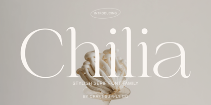 Chilia is a stylish serif font where contemporary upper serifs meet a feminine allure, making it ideal for beauty and display purposes. With its unique blend of modern and elegant features, Chilia adds a touch of sophistication with eye-catching presence that perfect for captivating displays that demand attention.
 - Bajt Rounded by Fontsphere,
$12.00 BAJT Rounded is a futuristic all-caps display font. It was created as a rounded version of the BAJT Font. Use for awesome display, illustrations, posters, logos, t-shirts, titles, and much more.. The font includes multilingual support (Latin-1), uppercase letters, numerals and a large range of punctuation.