10,000 search results
(0.048 seconds)
- F2F Haakonsen by Linotype,
$29.99The Face2Face (F2F) series was inspired by the techno sound of the mid-1990s, personal computers and new font creation software. For years, Stefan Hauser and his friends formed a unique type design collective, which churned out a substantial amount of fresh, new fonts, none of which complied with the traditional rules of typography. Many of these typefaces were used to create layouts for the leading German techno magazine of the 1990s, Frontpage. Hauser and his fellows would even set in type at 6 points, in order to make it nearly unreadable. It was a pleasure for the kids to read and decrypt these messages! F2F Haakonsen is one of 41 Face2Face fonts included in the Take Type 5 collection from Linotype GmbH. Hauser designed two of these himself." - F2F El Dee Cons by Linotype,
$29.99The Face2Face (F2F) series was inspired by the techno sound of the mid-1990s, personal computers and new font creation software. For years, Thomas Nagel and his friends formed a unique type design collective, which churned out a substantial amount of fresh, new fonts, none of which complied with the traditional rules of typography. Many of these typefaces were used to create layouts for the leading German techno magazine of the 1990s, Frontpage. Nagel and his fellows would even set in type at 6 points, in order to make it nearly unreadable. It was a pleasure for the kids to read and decrypt these messages! F2F EI Dee Cons one of 41 Face2Face fonts included in the Take Type 5 collection from Linotype. Nagel designed nine of these himself." - Hiragino Serif by SCREEN Graphic Solutions,
$210.00 Hiragino Serif (Mincho) is a font adapted for the digital age. It was designed to permit finely detailed tuning that allows the sizes of both kanji and kana to be adjusted for greatest visibility. It also broadly satisfies the needs of modern graphic design in advertising, posters, pamphlets, magazines, and other such uses. The font makes the counters comfortably wide while gracefully raising the text's center of balance, ensuring that the typeset characters will be smooth and well-defined. It gives each line a modern impression thanks to a judicious balance of light and shade and draws out a vivid readability that makes it possible to comfortable push forward with one’s reading. Latin alphabet and numbers have all been originally designed so that the weights of typeface and the flow of the baseline between Japanese and Latin characters are extremely consistent. Of particular note, vertically formatted text that mixes both Japanese and Latin characters can be beautifully rendered using only this typeface. Thanks to the use of authentic and sophisticated basic design , it creates a different atmosphere by combination of optional unique kana typefaces.
 - Newbery Sans Pro by Sudtipos,
$49.00 Newbery Sans is a new contrasted sans serif designed by Alejandro Paul and the Sudtipos team. As Paul has lately found inspiration from different German instructional books, Newbery Sans finds its initial inspirations from the lettering work of E. Nerdinger and invokes the spirit of German designs but is imbued with personality all its own. The idea was to make the letterforms more usable and suitable for everything from corporate branding to editorial. It is an elegant, functional family with contemporary detail that will effortlessly meet the demands of the screen and printed page. From a condensed thin to an expanded black, Newbery Sans provides a usable workhorse system of three widths and seven weights, each with the original design of real italics, a selection of alternate glyphs and a complete set of small caps. Each weight is professionally crafted and includes extended Latin support for Central, East and Western Europe languages. The font’s name nods to its imagined uses in airports and street signage: Jorge Newbery was one of the first Latin American aircraft pilots, Newbery is the street where I live and it is also the name of Buenos Aires’s local airport.
 - Ongunkan Varna Vinca by Runic World Tamgacı,
$50.00 The Vinča script is a cache of symbols found belonging to the Vinča culture of the central Balkans over 7000 years ago. The symbols have been a topic of debate amongst historians. The Tărtăria tablets are three tablets discovered in 1961 in the village of Tărtăria(Hungarian: Alsótatárlaka). This is about 30 km (19 mi) from Alba Iulia in Romania.The tablets, dated to around 5300 BC, have symbols inclay: the Vinča symbols. Some claim they are a yet undeciphered language. If this is so, they would be the earliest known form of writing. In 1908 similar symbols were found during excavations, by Miloje Vasić (1869–1956) in Vinča. This is a suburb of Belgrade (Serbia), some 300 km from Turdaș. Later, more were found in another part of Belgrade. Since 1875 over one hundred and fifty Vinča sites have been found in Serbia alone. Many, including Vinča itself, have not been fully excavated. The culture of the whole area is called the Vinča culture. Although some of these symbols look exactly the same as some letters in Etruscan, Greek, and Aramaic, they are generally regarded as a an original, independent development.
 - Quiller by Canada Type,
$24.95Quiller is another catch from the hot metal days, another one that managed to slip through the fingers of both the photo-typers and digitizers of last 4 decades. JJ Sierke’s Privat design from 1966 is now resurrected and heavily extended to be used by computer users everywhere. The original design was revived, and two whole new fonts were added to it - one with very unique swash caps and alternates, and one with many many ligatures and letter-combination ornaments. Quiller is a cross between brush calligraphy and very casual fast handwriting. It even has a slight Arabic simulation to it. Given such traits, the addition of a swash font and a multitude of ligatures comes in very handy to keep the natural flow of the font and maintain the elegance of its spirit. Those who like the auto-magic of OpenType’s intelligent substitution should like the fact that the OTF version is a single font with all the bells and whistles ready to go in the swash and discretionary ligatures features. If you use the latest versions of Adobe programs, the OTF version of Quiller is highly recommended. - The Amoret Collection by Set Sail Studios,
$16.00 Introducing the Amoret Collection; A stunning pair of luxury script and sans fonts, designed to contrast & compliment each other with elegant beauty and contemporary style. Design luxurious logos, branding, product packaging, wedding invites and quotes in a flash. Here's what's included; Amoret Sans • A classy, high contrast sans font containing uppercase characters only, numerals and a large range of punctuation. Creates a perfect pairing contrast with the Amoret Script fonts. Amoret Script • A thin and elegant script font with exaggerated strokes and a loose flow. Contains upper & lowercase characters, numerals and a large range of punctuation. Amoret Script Alt • This is a second version of Amoret Script, with a completely new set of upper & lowercase characters. If you wanted to avoid letters looking the same each time to recreate a custom-made style, or try a different word shape, simply switch to this font for an additional layout option. Amoret Script Alt also contains 4 swashes assigned to the [ ] { } keys. Fonts include multilingual support for; English, French, Italian, Spanish, Portuguese, German, Swedish, Norwegian, Danish, Dutch, Finnish, Indonesian, Malay, Hungarian, Polish, Croatian, Turkish, Romanian, Czech, Latvian, Lithuanian, Slovak, Slovenian
 - Narrow Roman Stencil JNL by Jeff Levine,
$29.00 Narrow Roman Stencil JNL was modeled from a vintage brass sign for identification of a ballroom.
 - Georgie by Jonahfonts,
$29.00 Georgie— A script font. The designers choice for greeting cards and a host of other applications.
 - DB Flower Power by Illustration Ink,
$3.00DB Flower Power is a collection of cute flowers in bloom with a spring themed feel. - Scriptelle by Jonahfonts,
$39.95 A script that has a freedom-ring to it, inspired by my personal feeling of liberty.
 - Eachtra by Fontdation,
$18.00 Introducing our latest release, Eachtra: a modern blackletter font with a touch of Celtic/Gaelic letters.
 - Schneidler Grobe Gotisch by Intellecta Design,
$24.90a revival of a classic bold blackletter from the great german typedesigner F. H. Ernst Schneidler - Qurillian by insigne,
$19.99 A simplistic but usable sans-serif from DooleyType. Qurillian includes a number of advanced OpenType features.
 - Deco Inline by BA Graphics,
$45.00A hot revival of the 60s and 70s a great headline face with that retro look. - Ciao Bella by Oddsorts,
$29.00 Oddsorts’ Ciao Bella family pairs the funky elegance of a hand-drawn copperplate script with a bouquet of ornament fonts. Ciao Bella’s expansive range of alternate opening and closing forms, word-connecting ribbons, and swash characters use the power of OpenType to create a genuinely hand-lettered look. Bursting with over 2,000 characters, the Ciao script mates broad linguistic support with expressive possibilities galore in an easy-to-use software experience. But then there are the ornaments! What’s truly innovative about Ciao Bella’s ornaments is that most of the characters come in pairs that can be set in multiple colors without any stacking, layering, or aligning. They work in any application that supports kerning — even most word processors. See the slideshow and Gallery link above to see how they work. Ciao Bella marries the best of the old world — the warm, classic feel of ink on paper — and the new — the amazing capabilities of “smart” OpenType fonts — in a union that’s sure to delight.
 - Steiner Special by Canada Type,
$24.95 Steiner Special is a revival and expansion of an art nouveau face called Swing, originally designed by Peter Steiner in 1974. Some of the original film type letters were slightly normalized and toned down for concept consistency, though this digital version lacks none of the original face's charm and sunny disposition. This particular kind of art nouveau face is one that appeals very much to kids. Steiner Special can be used in upper-lower or all-upper, and can maintain its enthusiasm and excitement through any bending, stretching, squeezing, warping or any thinkable filter your favourite design program has. Children book covers, candy and cereal packaging, fun headlines and posters for kid events are but few of the possible uses of this font. If you're designing anything for kids, give this font a try and you won't regret it. Steiner Special comes with over 500 glyphs and support for the majority of Latin languages. A full set of ligatures in included, as are a few stylistic alternates.
 - Abigail Adams by Three Islands Press,
$39.00 “My Dearest Friend” is how she began nearly all her letters to her husband, John. I refer, of course, to Abigail Smith Adams, first Second Lady and second First Lady of the United States. Her famous correspondence with John Adams produced nearly 1,200 letters over a span of some 40 years, leaving us with a priceless record of early American life — from household routines to war and politics to expressions of personal worry and devotion. Although Abigail’s was not the loveliest hand, I found it sure and expressive, as befitting her extraordinary sway and intelligence; it also carries a genuine flavor of the period. In making the font I focused chiefly on her handwriting from the 1780s and ’90s, when she’d taken to using a disconnected cursive, which struck me as distinctive and alluring. The OpenType release of Abigail Adams has scores of ligatures, standard and contextual alternates, lining and old-style figures, cross-outs, ink blots, and full Latin language support.
 - ITC Kendo by ITC,
$29.99 ITC Kendo is the work of British designer Phill Grimshaw, suggesting the dash and verve of quick, sketchy calligraphy, complete with splatters of ink. Grimshaw says he worked deliberately against his own habits to create the forms, drawing the letters with slow deliberation" and a pointed pen. He overloaded the pen with ink and drew on rough paper, "applying a lot of pressure at the beginning of a stroke and easing off towards the terminals. Accidental splashes occurred frequently owing to the nib catching the 'tooth' of the paper." Those splashes were refined into features which enhance but do not overwhelm the characters and carefully worked so as not to leave an obvious white strip of unsplattered space between lines and letters. The initial capitals can be used alone or combined with the lowercase alphabet, and the font includes a full set of f-ligatures and some extra ligatures as well as decorative elements."
 - Callove Script by Genesislab,
$15.00 Latest styles callove script with the kind of modern hand scratches, I hope you are interested in this font, if you want to use for your work this font can be used easily and simply because there are a lot of features in it to contain a complete set of letters lower and uppercase letters, assorted punctuation, numbers, and multilingual support. font also contains alternate style Stylistic Sets, Swsh for those of you who have software that is able to work OpenType (Photoshop / Illustrator / InDesign). Callove script is suitable use for market design developed at this time, this font has a model Trendy, natural and gentle, with this font you can take advantage of the opportunity in every moment of one wonderful way to highlight the celebration of the feast of your best, because this font will be advocates for purposes such as wedding invitations, party, graduation, birthday, gathering, etc. if you have a problem? Contact me: genesislabstudio@gmail.com
 - Galano Classic by René Bieder,
$30.00 Galano Classic is the display companion of the Galano Grotesque family. Like the Grotesque family, it also pays tribute to the geometric shapes of Futura, Avant Garde, Avenir and the like. However, instead of that family’s modern interpretation of the geometric genre, Galano Classic prefers to stay in the past, a tendency characterized by a moderate x-height and details like the long stretched leg of uppercase “R”, as well as the traditional shaped lowercase “g”, to mention only a few details. Galano Classic, compared to Galano Grotesque, includes lots of redesigned glyphs and consequently adjusted kerning pairs, an extended number of alternative characters, ligatures and opentype features to match a great many design applications. It comes in 10 different weights with matching italics containing 555 glpyhs per font. Although Galano Classic was planned to be the display version of Galano Grotesque, it feels great in small sizes and long text passages, too.
 - Propaganda - Unknown license

- Asterism by Great Lakes Lettering,
$30.00 Asterism is a calligraphy style font with a moving baseline and lots of shining personality. This hand written style font is based on one of Molly’s signature calligraphy styles and pairs beautifully with Frosted, Icing, Saint Agnes.
 - Coreopsis by Andrew Harper Fonts,
$19.00 Coreopsis is a family of fonts that combines mathematical precision with a hand-drawn feel. Versatile enough to be applied to an attention-grabbing headline, or to blocks of paragraph text. Coreopsis is available in three weights.
 - Memimas by Type-Ø-Tones,
$50.00 The Memimas family was commissioned in 1991 by the publisher Barcanova, for a digital version of their model for learning how to write. Memimas has two ductus versions for the capitals and a complete set of ligatures.
 - Blues City by Haiku Monkey,
$10.00 Inspired by neon signage, Blues City is a display font you can sink your teeth into. The font features hundreds of ligatures, along with a full complement of diacritical characters. Put some neon blues into your designs!
 - TiredOfCourier by Ingrimayne Type,
$14.95 Courier is the king of typewriter faces. But if you want an alternative, something with a look reminiscent of the older, manual typewriters, consider TiredOfCourier. The family includes true italics, something very unusual in a typewriter face.
 - Spedora by Fromletterel,
$12.00 Spedora is a curly and cute display font. Expertly designed to make your creation look out of this world, this font will look gorgeous on a variety of ideas such as posters, stickers, social media materials, etc.
 - Karin Pro by SoftMaker,
$9.99 A great script typeface of Art Nouveau
 - Warped Pasted by Ingrimayne Type,
$9.00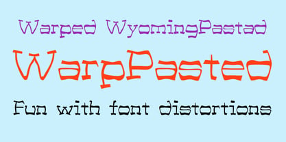 A warped version of the font WyomingPastad.
 - KG Girl On Fire by Kimberly Geswein,
$5.00 The cute handwriting of a teen girl.
 - Deco Experiment 6 by Intellecta Design,
$11.00a naive family of art deco inspiration - Gans Adorno by Intellecta Design,
$15.00 a large family of Gans classic revivals
 - WarpedAnark by Ingrimayne Type,
$9.00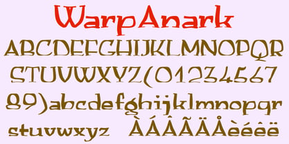 A warped version of the font Anarckhie.
 - LoveBirds by PintassilgoPrints,
$24.90 A handful of birds silhouettes. Sing along!
 - Knew Font Jagged by Ingrimayne Type,
$9.00 KnewFontRagged is a distorted version of KnewFont.
 - Janda Flower Doodles by Kimberly Geswein,
$5.00 Flower doodles in a variety of styles.
 - Boeotian by Fatchair,
$9.95A modern interpretation of Ancient letter shapes - Gelion by Halbfett,
$30.00 Gelion is a large family of geometric sans serif fonts. It ships both as two Variable Fonts or as 16 traditional fonts. Those static fonts span eight different weights, ranging from Extralight to Black. Each has an upright and an italic font on offer. The italics are carefully crafted, with an 8° slope. Gelion is inspired by 20th-century geometric sans serifs and classic neo-grotesque designs from the late 19th century and the middle of the 20th century. Its forms remain true to the gracefully geometric look of its classic predecessors, which will surely tick off any client’s long list of branding requirements. Letters in all of Gelion’s weights are drawn with virtually monolinear strokes. Its lowercase letters have a tall x-height. Yet, that still leaves enough room for the fonts’ diacritical marks. Gelion’s default “a” and “g” each have single-storey forms by default. The dots on the ‘i’, ‘j’, and diacritics are round, as are the punctuation marks. Gelion is an excellent choice for both corporate design and editorial design projects, thanks to its range of weights and its legibility in text. The fonts include a lot of ligatures, some monochromatic emoji, a set of arrows, lovely Roman Numerals, and more. Thanks to Gelion’s stylistic alternates, if a project comes up where you do not need a geometric vibe, you can activate Stylistic Set 1. That will replace many of the fonts’ letters with more humanistic-sans alternates, giving your text the feeling of a whole other type design with just one click. Last but not least, the descending “f” available in Gelion’s italics is a nice typographic trait.
 - Bona Nova by Borutta Group,
$- ☞ Bona Nova is a collective revival project of Bona typeface designed in 1971 by the author of polish banknotes Andrzej Heidrich. Besides giving the project a digital font form the aim was to expand the base character set: preparation of small caps, designing the alternative glyphs and multiple opentype features. Working together with the author we designed two new text versions: regular and bold – to give the family a form of a classic script triad. ☞ It is accompanied by three title versions and three contour styles under the name of Bona Sforza. All styles contains over 1200 glyphs. ☞ Bona Nova is an unprecedented typographic adventure for our team. We hope that our work will allow the cultural heritage of Bona and the work of Andrzeja Heidricha to gain new followers and fans. This project connected three generations of graphic designers who graduated the same school – the Academy of Fine Arts in Warsaw. ☞ Bona Nova isn’t only a typeface. We have also prepared a book about the project (including an interview with Andrzej Heidrich, my text about the digitalisation and a font specimen). The Bona Nova release party was a big exhibition (over 1000 guests). I’ve invited 26 graphic designers to prepare their own initials of Bona Nova – they were presented as posters on exhibition too. LINKS Bona Nova WEB Bona Nova FP Bona-Nova-(FREE-FONT) Bona Nova Book BONA NOVA IN THE MEDIA Typeroom Typography Guru Slanted Designalley Stgu Typografie Info Wikipedia Bona Nova is a non-profit project, all founds that we raise we reinvest to develop the Bona Nova project (new styles, Cyrillic & Greek, extend character set).
