10,000 search results
(0.04 seconds)
- Wishful by Sensatype Studio,
$15.00 Wishful is a Fancy BEauty Display Font A new font that we created special for branding needs, with unique characters and awesome alternative characters are ready to add value of your brand. It so nice to leverage designer or product owner that need solutions to make their design look more beauty and modern. And specially for Salute font, We prepared any swash and any alternate characters to help you create unlimited variations for your creative needs. Wishful is a Fancy BEauty Display Font ready with: Any options to get creative variations (combination of Alternate and Ligature) Preview as a inspirations that you can do with Wishful font Ready with Lowercase and Uppercase characters Wish you enjoy our font. :)
 - Amaris by Craft Supply Co,
$15.00 Amaris is a nostalgic serif fonts features high contrast between thick and thin strokes, and traditional letterforms. They evoke elegance, sophistication, and tradition. Ideal for formal designs and branding. You want to make a greeting card or a package design, or even a brand identity, craft design, any DIY project, book title, poster, pop vintage design, retro design or any purpose to make your art/design project look pretty and trendy? Feel free to play with this typeface!
 - Hello Tiffany by HIRO.std,
$21.00 Hello Tiffany is a funny & elegant font. This font describes about elegant, dynamic, stylish, funny, feminine, easy to use and will bring a good harmony when the letters are connected and paired each other. FEATURES - Support Opentype Features - Variation Swash - Support Ligatures - Numbering and Punctuations - PUA Encoded Characters - Multilingual Support - Works on PC or Mac USE Hello Tiffany works great in any wedding invitations, branding, logotype, quotes and any projects that need funny and elegant taste.
 - Makio by HIRO.std,
$25.00 Makio is San Serif Typeface Makio inspired by modern life, clean, simple life, Japan culture, and minimalist symbols. This font works great in any branding, name card, logos, title, websites, product packaging, flyers, magazines, label, films, stationary, posters, etc. and any design project that requires clean, modern and simple touch. FEATURES - Six Weight - Uppercase and Lowercase letters - Support Opentype Features - Numbering and Punctuations - PUA Encoded Characters - Ligatures - Multilingual Support - Works on PC or Mac Enjoy using! Thanks. HIRO.std
 - Sikat Rusak by Azetype,
$59.00 Presenting Sikat Rusak! A Dry Brush Font with a stylish alternate and extra 9 swashes. This font made with the perfect combining of each character. You can type by Mix & Match with alternate version to get a unique combining. It looks original and can be used for all your project needs. Each glyph has its own uniqueness and when meeting with others will provide dynamic and pleasing proximity. This font can be used at any time and any project.
 - Thurkle by Grontype,
$15.00 Thurkle is bold new serif font, look tough and playable. Comes with sharp edges, inspired by sword making dynasty in British History. This display typeface is semi condensed and included some extra unique ligatures. Thurkle is perfect for any project such as magazine header, flyer header, logotype, invitation card name, and some any other design. Features: All Caps and Small Caps Character Numbers and Punctuation Special Characters Ligatures. Multilingual Support Thankyou For Picking The Font, Enjoy. Grontype
 - Sweetest by Supersemarletter,
$11.00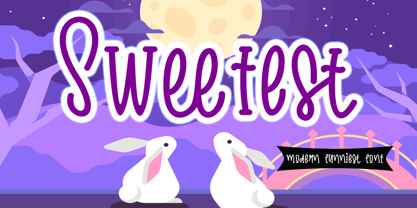 Sweetest is a cute and friendly handwritten font. It embodies playfulness and authenticity and is the perfect choice for any children activity or school project. Provide Ligatures with special character make the design letters looks incredible. Honestly it works perfectly for headlines, logos, posters, packaging, T-shirt and much more. Font Features : . Regular Version . Character set A-Z in Uppercase and Lowercase . Ligatures in lowercase and special . Numerals and Punctuation . Accented Characters . Multiple Languange Supported Recomended to use in Adobe Illustrator or Adobe Photoshop with opentype feature. If you have any questions, just send me a message and I'm glad to help.
 - Golden Meaning by HIRO.std,
$17.00 Golden Meaning is a handwritten font. This font describes about stylist, fun and elegant, catchy, dynamic, simple, humanist, clean, easy to use and will bring a good harmony when the letters are connected and paired each other. FEATURES - Support Opentype Features - Support Ligatures - Lowercase beginning and ending alternate - Alternate Swash - Numbering and Punctuations - PUA Encoded Characters - Multilingual Support - Works on PC or Mac USE Golden Meaning works great in any wedding invitations, branding, logotype, apparel, and any projects that need simple script taste. Enjoy using! Thanks. HIRO.std
 - Margareth Rosinante by Creative17studio,
$12.00 Introducing "Margareth Rosinante" is a modern serif font family. With luxury and sophistication that are consistent with one another. Margareth Rosinante is designed for an epic comparison between serif and script styles. The stark contrast between the Margaret Rosinante serif and the script makes this font family always suitable to be paired with in any design. Features: - Two different font types (serif and script style) -Standard basic characters -Multilingual support -Numeral and punctuation -Many ligatures (serif) -Beginning and ending swashes (script) Any questions? Jus ask. Free updates,
 - Aron Wergel by madeDeduk,
$12.00 Aron Wergel is a Futuristic sans come with two style regular and rough. You can explore and combine creating rhythm and texture for comfortable reading. Use this font for any branding, product packaging, invitation, quotes, headline, label, poster, logo etc. Feature Uppercase & Lowercase Number & Symbol International Glyphs Multilingual support Alternative Ligature Feel free to drop us a message any time and follow my shop for upcoming updates Hope you enjoy it.
 - Bubbly by Gatype,
$16.00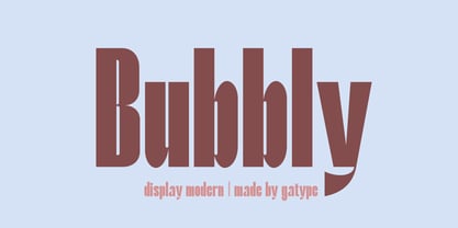 Stylish Bubbly Display with bold looking letters and Harmonious Impact to form a unique & elegant typography design. Perfect for branding projects, logos, wedding designs, social media posts, advertising, product packaging, product design, labels, photography, watermarks, invitations, stationery and any project. . uppercase and lowercase . multilingual symbol . number . punctuation . What will you get? Hope you enjoy our fonts and if you have any questions feel free to message & I'm happy to help
 - Look Like Coffee by HIRO.std,
$17.00Look Like Coffee is a Display font. This font describes about fun, semi casual, stylish, headline, easy going, dynamic, and easy to use. FEATURES - Support Opentype Features - Support Ligatures - Numbering and Punctuations - PUA Encoded Characters - Multilingual Support - Works on PC or Mac USE Look Like Coffee works great in any product packaging, logotype, magazine, editorial, quotes and any projects that need all about fun and dynamic taste. Enjoy using! Thanks. HIRO.std - Quickly Brown by HIRO.std,
$14.00 Quickly Brown Bold Script Font This font describes about fun, bold, chubby, wide and easy to use. Quickly Brown inspired from Doodle and Junk Food. FEATURES - All Capital Bold - Numbering and Punctuations - PUA Encoded Characters - Multilingual Support - Works on PC or Mac USE Quickly Brown works great in any craft, logotype, magazine, quotes, social media and any projects that need all about Bold taste. Enjoy using! Thanks. HIRO.std
 - John Sans by Storm Type Foundry,
$49.00 The idea of a brand-new grotesk is certainly rather foolish – there are already lots of these typefaces in the world and, quite simply, nothing is more beautiful than the original Gill. The sans-serif chapter of typography is now closed by hundreds of technically perfect imitations of Syntax and Frutiger, which are, however, for the most part based on the cool din-aesthetics. The only chance, when looking for inspiration, is to go very far... A grotesk does not afford such a variety as a serif typeface, it is dull and can soon tire the eye. This is why books are not set in sans serif faces. A grotesk is, however, always welcome for expressing different degrees of emphasis, for headings, marginal notes, captions, registers, in short for any service accompaniment of a book, including its titlings. We also often come across a text in which we want to distinguish the individual speaking or writing persons by the use of different typefaces. The condition is that such grotesk should blend in perfectly with the proportions, colour and above all with the expression of the basic, serif typeface. In the area of non-fiction typography, what we appreciate in sans-serif typefaces is that they are clamorous in inscriptions and economic in the setting. John Sans is to be a modest servant and at the same time an original loudspeaker; it wishes to inhabit libraries of educated persons and to shout from billboards. A year ago we completed the transcription of the typefaces of John Baskerville, whose heritage still stands out vividly in our memory. Baskerville cleverly incorporated certain constructional elements in the design of the individual letters of his typeface. These elements include above all the alternation of softand sharp stroke endings. The frequency of these endings in the text and their rhythm produce a balanced impression. The anchoring of the letters on the surface varies and they do not look monotonous when they are read. We attempted to use these tricks also in the creation of a sans-serif typeface. Except that, if we wished to create a genuine “Baroque grotesk”, all the decorativeness of the original would have to be repeated, which would result in a parody. On the contrary, to achieve a mere contrast with the soft Baskerville it is sufficient to choose any other hard grotesk and not to take a great deal of time over designing a new one. Between these two extremes, we chose a path starting with the construction of an almost monolinear skeleton, to which the elements of Baskerville were carefully attached. After many tests of the text, however, some of the flourishes had to be removed again. Anything that is superfluous or ornamental is against the substance of a grotesk typeface. The monolinear character can be impinged upon in those places where any consistency would become a burden. The fine shading and softening is for the benefit of both legibility and aesthetics. The more marked incisions of all crotches are a characteristic feature of this typeface, especially in the bold designs. The colour of the Text, Medium and Bold designs is commensurate with their serif counterparts. The White and X-Black designs already exceed the framework of book graphics and are suitable for use in advertisements and magazines. The original concept of the italics copying faithfully Baskerville’s morphology turned out to be a blind alley. This design would restrict the independent use of the grotesk typeface. We, therefore, began to model the new italics only after the completion of the upright designs. The features which these new italics and Baskerville have in common are the angle of the slope and the softened sloped strokes of the lower case letters. There are also certain reminiscences in the details (K, k). More complicated are the signs & and @, in the case of which regard is paid to distinguishing, in the design, the upright, sloped @ small caps forms. The one-storey lower-case g and the absence of a descender in the lower-case f contributes to the open and simple expression of the design. Also the inclusion of non-aligning figures in the basic designs and of aligning figures in small caps serves the purpose of harmonization of the sans-serif families with the serif families. Non-aligning figures link up better with lower-case letters in the text. If John Sans looks like many other modern typefaces, it is just as well. It certainly is not to the detriment of a Latin typeface as a means of communication, if different typographers in different places of the world arrive in different ways at a similar result.
 - Megaflakes 2010 by Baseline Fonts,
$20.00 Snowflakes and doodles to complement any design on the fly.
 - LD Fundamental by Illustration Ink,
$3.00LD Fundamental brings energy and fun to any journaling need. - Mozaik by Sensatype Studio,
$15.00 Mozaik is Modern Islamic Ramadan , Islamic and Arabic Signature are ready for Ramadan event.It is a Display font with moderate contrast that perfect for Ramadan branding projects, logo, social media posts, designs, and any projects, it makes with a high level of legibility. Font ready with: Any options to get creative variations (combination of Any Alternates) Preview as a inspirations that you can do with this font Ready with Lowercase and Uppercase characters Wish you enjoy our font. :)
 - Losta Parka by Creativemedialab,
$20.00 Parka is a unique and fashionable stencil font with tons of alternatives and ligatures. Softly curved alternates match the solid and masculine looks for the balance of shape. Perfect for any titles, branding, logo, and many more.
 - Station by Kimmy Design,
$15.00 Station is a bold headline typeface inspired by old Train Station type and graphics. It can be used in a modern and retro way, and its different patterns and styles give a unique look to any design.
 - Bornice by Tanziladd,
$15.00 Bornice is a modern serif, typeface a refined touch that give any headline an elegant appearance, with both modern and vintage curves. Bornice represented luxury, glamour, exuberance, and faith in social and technological progress and support multilingual.
 - Souttia by Sakha Design,
$10.00 Souttia is a slim and exquisite handwritten font. Stylish, graceful, and flowing, this font will definitely elevate the look of any of your beautiful creations while keeping them grounded and natural.
 - Flora by Sensatype Studio,
$15.00 A new Sans serif that we created special for branding needs, with extra ligature in unique shape add value of your brand. It so nice to leverage designer or product owner that need solutions to make their design look more stylish and modern. And specially for Flora font, We prepared any ligatures, and any alternate characters to help you create unlimited variations for your creative needs. Flora - Modern Branding Stylish Font ready with: Any options to get creative variations (combination of Alternate and Ligatures) Preview as a inspirations that you can do with Satisfy font Ready with Lowercase and Uppercase characters Wish you enjoy our font!
 - Olivany by Sensatype Studio,
$15.00 A new Sans serif that we created special for branding needs, with extra ligature in unique shape add value of your brand. It so nice to leverage designer or product owner that need solutions to make their design look more stylish and modern. And specially for Young font, We prepared any ligatures, and any alternate characters to help you create unlimited variations for your creative needs. Olivany Modern Beauty sans serif font ready with: Any options to get creative variations (combination of Alternate and Ligatures) Preview as a inspirations that you can do with Olivany font Ready with Lowercase and Uppercase characters Wish you enjoy our font!
 - Original SS by Sensatype Studio,
$15.00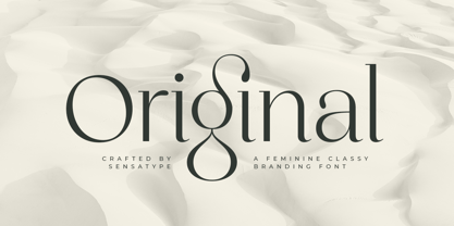 Original is a Feminine Classy Branding Font A new font that we created special for branding needs, with extra ligature in unique characters add value of your brand. It so nice to leverage designer or product owner that need solutions to make their design look more stylish and modern. And specially for satisfy font, We prepared any ligatures, and any alternate characters to help you create unlimited variations for your creative needs. Original Branding font ready with: Any options to get creative variations (combination of Alternate and Ligatures) Preview as a inspirations that you can do with Original font Ready with Lowercase and Uppercase characters Wish you enjoy our font. :)
 - GR Norch by Garisman Studio,
$20.00 GR Norch - Sports Display Font Norch is a very cool font for a design with sports themes: football, basketball, bowling, athletics, badminton, and others. With a strong display and clean nodes make a text in a design become more character and great. Inspired by the current trend of sports texts with a very modern and cool geometric style. It is formed from very carefully sports display font. Norch has 400+ glyphs. Suitable for any graphic design projects, prints, logos, posters, t-shirts, packaging and applicable for some types of graphic design. Norch is compatible with any software without any pain, especially in sports design.
 - Rosane by Sensatype Studio,
$15.00 A new Sans serif that we created special for branding needs, with extra ligature in unique shape add value of your brand. It so nice to leverage designer or product owner that need solutions to make their design look more stylish and modern. And specially for satisfy font, We prepared any ligatures, and any alternate characters to help you create unlimited variations for your creative needs. Satisfy sans serif font ready with: Any options to get creative variations (combination of Alternate and Ligatures) Preview as a inspirations that you can do with Satisfy font Ready with Lowercase and Uppercase characters Wish you enjoy our font!
 - BuggyFont by Ingrimayne Type,
$14.95 AntsyPantsy, BuggyFont, and MousyFont are based on the same design; only the building blocks—ants, bugs, and a stylized mouse—have been changed.
 - Bangke by Typefactory,
$14.00 Bangke is a textured brush font with rough and casual letters. It’s great for logos, branding, print projects and any attention drawing headline.
 - AntsyPantsy by Ingrimayne Type,
$14.95 AntsyPantsy, BuggyFont, and MousyFont are based on the same design; only the building blocks—ants, bugs, and a stylized mouse—have been changed.
 - MousyFont by Ingrimayne Type,
$14.00 AntsyPantsy, BuggyFont, and MousyFont are based on the same design; only the building blocks—ants, bugs, and a stylized mouse—have been changed.
 - Shunsine by Portograph Studio,
$19.00 Shunsine is a distinct and elegant display serif font. Its stylish alternates and ligatures make this font the perfect match for any project.
 - Grufy by Stefani Letter,
$12.00 Grufy is an awesome bold and fun display font that will look stunning on any poster flyer or print. It will put a modern twist on any design project with its urban charm. Use this font for your designs and explore its endless possibilities.
 - Donsky by Lemonthe,
$14.00 Donsky is a dry brush font. Suitable for any projects such as logos, branding projects, product packaging, mugs, quotes, posters, shopping bags, t-shirts, book covers, labels, photography, watermark, and more. Use this gorgeous and unique handwritten font to bring any DIY project to life!
 - Maestro by Canada Type,
$24.95 Out of a lifelong inner struggle, Philip Bouwsma unleashes a masterpiece that reconciles classic calligraphy with type in a way never before attempted. Maestro takes its cue from the Italian chancery cursive of the early sixteenth century. By this time type ruled the publishing world, but official court documents were still presented in calligraphy, in a new formal style of the high Renaissance that was integrated with Roman letters and matched the refined order of type. The copybooks of Arrighi and others, printed from engraved wood blocks, spread the Italian cancellaresca across Europe, but the medium was too clumsy and the size too small to show what was really happening in the stroke. Arrighi and others also made metal fonts that pushed type in the direction of calligraphy, but again the medium did not support the superb artistry of these masters or sustain the vitality in their work. As the elegant sensitive moving stroke of the broad pen was reduced to a static outline, the human quality, the variety and the excitement of a living act were lost. Because the high level of skill could not be reproduced, the broad pen was largely replaced by the pointed tool. The modern italic handwriting revival is based on a simplified model and does not approach the level of this formal calligraphy with its relationship to the Roman forms. Maestro is the font that Arrighi and his colleagues would have made if they had had digital technology. Like the calligraphic system of the papal chancery on which it is modelled, it was not drawn as a single finished alphabet, but evolved from a confluence of script and Roman; the script is formalized by the Roman to stand proudly in a world of type. Maestro came together on screen over the course of several years, through many versions ranging widely in style, formality, width, slant, weight and other parameters. On one end of the spectrum, looking back to tradition it embodies the formal harmony of the Roman capitals and the minuscule which became the lower case. On the other it is a flowing script letter drawing on the spirit of later pointed pen and engravers scripts. As its original designers intended, it works with simple Roman capitals and serifs or swash capitals and baroque flourishes. The broad pen supplies weight and substance to the stroke which carries energy through tension in balanced s-curves. Above all it is meant to convey the life and motion of formal calligraphy as a worthy counterbalance to the stolid gravity of metal type. The Maestro family consists of forty fonts distributed over two weights. The OpenType version compresses the family considerably down to two fonts, regular and bold, each containing the entire character set of twenty fonts, for a total of more than 3350 characters per font. These include a wide variety of stylistic alternates, ligatures, beginning and ending letters, flourishes, borders, rules, and other extras. The Pro version also includes extended linguistic support for Latin-based scripts (Western, Central and Eastern European, Baltic, Turkish, Welsh/Celtic, Maltese) as well as Greek. For more thoughts on Maestro, its background and character sets, please read the PDF accompanying the family.
 - Agustus Signature by IbraCreative,
$14.00 Agustus Signature is a sophisticated and stylish font that embodies elegance and refinement. Drawing inspiration from the grace and poise of a personalized signature, Agustus Signature delivers a timeless and luxurious feel to any design. Each letter is meticulously crafted with intricate curves and fine details, mirroring the fluid strokes of a genuine signature. This font is perfect for high-end branding, luxury products, and exclusive invitations, adding a touch of prestige and class to any project. With its versatile nature, Agustus Signature seamlessly adapts to a wide range of creative applications, showcasing its impeccable style and leaving a lasting impression of sophistication and distinction
 - Contentor by erzaehlzeichen,
$15.00 Contentor is a display type originated in the habour and made for long journeys. Inspired by the industrial lettering on containers, hardcases and boxes, Contentor and Contentor Stencil are a condensed and bold typeface fit for any voyage.
 - Glomersa by Pixesia Studio,
$23.00 Introducing Glomersa - Modern Luxury Serif Font Glomersa is a modern aesthetic serif font inspired with an elegant and bold design. It brings more chances and possibilities to craft a design with an elegant, strong, and sophisticated vibe. Glomersa suits perfectly in the use of any fashion brand. Glomersa is better used for fashion product packaging, clothing labels, any masculine related brand, or any projects seeking for a touch of elegant, luxury, classic, bold and any sophisticated vibe. FEATURES - Stylistic Alternates - Ligatures - Uppercase and Lowercase letters - Numbering and Punctuations - Works on PC or Mac - Simple Installation - PUA Encoded Characters – Easily accessible without additional design software. - Support Adobe Illustrator, Adobe Photoshop, Adobe InDesign, also works on Microsoft Word - Multilingual Support for 68 languages including Afrikaans, Albanian, Basque, Catalan, Danish, Dutch, English, Estonian, Faroese, Filipino, Finnish, French, Galician, German, Icelandic, Indonesian, Irish, Italian, Malay, Norwegian Bokmål, Portuguese, Spanish, Swahili, Swedish, and Zulu Hope you Like it. Thank you for your purchase!
 - Vianova Serif Pro by Elsner+Flake,
$59.00 The font superfamily Vianova contains each 12 weights of Sans and Slab and 8 weights of the Serif style. The design from Jürgen Adolph dates back into the 1990s, when he studied Communication Design with Werner Schneider as a professor at the Fachhochschule Stuttgart. Adolph started his carrier 1995 at Michael Conrad & Leo Burnett. He was responsible for trade marks as Adidas, BMW, Germanwings and Merz. He has been honored as a member of the Art Directors Club (ADC) with more than 100 awards. On February 26, 2014, Jürgen Adolph wrote the following: “I was already interested in typography, even when I could not yet read. Letterforms, for instance, above storefronts downtown, had an irresistible appeal for me. Therefore, it is probably not a coincidence that, after finishing high school, I began an apprenticeship with a provider of signage and neon-advertising in Saarbrücken, and – in the late 1980s – I placed highest in my field in my state. When I continued my studies in communications design in Wiesbaden, I was introduced to the highest standards in calligraphy and type design. “Typography begins with writing” my revered teacher, Professor Werner Schneider, taught me. Indefatigably, he supported me during the development of my typeface “Vianova” – which began as part of a studies program – and accompanied me on my journey even when its more austere letterforms did not necessarily conform to his own aesthetic ideals. The completely analogue development of the types – designed entirely with ink and opaque white on cardboard – covered several academic semesters. In order to find its appropriate form, writing with a flat nib was used. Once, when I showed some intermediate designs to Günter Gerhard Lange, who occasionally honored our school with a visit, he commented in his own inimitable manner: “Not bad what you are doing there. But if you want to make a living with this, you might as well order your coffin now.” At that time, I was concentrating mainly on the serif version. But things reached a different level of complexity when, during a meeting with Günther Flake which had been arranged by Professor Schneider, he suggested that I enlarge the offering with a sans and slab version of the typeface. So – a few more months went by, but at the same time, Elsner+Flake already began with the digitilization process. In order to avoid the fate predicted by Günter Gerhard Lange, I went into “servitude” in the advertising industry (Michael Conrad & Leo Burnett) and design field (Rempen& Partner, SchömanCorporate, Claus Koch) and worked for several years as the Creative Director at KW43 in Düsseldorf concerned with corporate design development and expansion (among others for A. Lange & Söhne, Deichmann, Germanwings, Langenscheidt, Montblanc.”
 - Vianova Slab Pro by Elsner+Flake,
$59.00 The font superfamily Vianova contains each 12 weights of Sans and Slab and 8 weights of the Serif style. The design from Jürgen Adolph dates back into the 1990s, when he studied Communication Design with Werner Schneider as a professor at the Fachhochschule Stuttgart. Adolph started his carrier 1995 at Michael Conrad & Leo Burnett. He was responsible for trade marks as Adidas, BMW, Germanwings and Merz. He has been honored as a member of the Art Directors Club (ADC) with more than 100 awards. On February 26, 2014, Jürgen Adolph wrote the following: “I was already interested in typography, even when I could not yet read. Letterforms, for instance, above storefronts downtown, had an irresistible appeal for me. Therefore, it is probably not a coincidence that, after finishing high school, I began an apprenticeship with a provider of signage and neon-advertising in Saarbrücken, and – in the late 1980s – I placed highest in my field in my state. When I continued my studies in communications design in Wiesbaden, I was introduced to the highest standards in calligraphy and type design. “Typography begins with writing” my revered teacher, Professor Werner Schneider, taught me. Indefatigably, he supported me during the development of my typeface “Vianova” – which began as part of a studies program – and accompanied me on my journey even when its more austere letterforms did not necessarily conform to his own aesthetic ideals. The completely analogue development of the types – designed entirely with ink and opaque white on cardboard – covered several academic semesters. In order to find its appropriate form, writing with a flat nib was used. Once, when I showed some intermediate designs to Günter Gerhard Lange, who occasionally honored our school with a visit, he commented in his own inimitable manner: “Not bad what you are doing there. But if you want to make a living with this, you might as well order your coffin now.” At that time, I was concentrating mainly on the serif version. But things reached a different level of complexity when, during a meeting with Günther Flake which had been arranged by Professor Schneider, he suggested that I enlarge the offering with a sans and slab version of the typeface. So – a few more months went by, but at the same time, Elsner+Flake already began with the digitilization process. In order to avoid the fate predicted by Günter Gerhard Lange, I went into “servitude” in the advertising industry (Michael Conrad & Leo Burnett) and design field (Rempen& Partner, SchömanCorporate, Claus Koch) and worked for several years as the Creative Director at KW43 in Düsseldorf concerned with corporate design development and expansion (among others for A. Lange & Söhne, Deichmann, Germanwings, Langenscheidt, Montblanc.”
 - Vianova Sans Pro by Elsner+Flake,
$59.00 The font superfamily Vianova contains each 12 weights of Sans and Slab and 8 weights of the Serif style. The design from Jürgen Adolph dates back into the 90th, when he studied Communication Design with Werner Schneider as a professor at the Fachhochschule Stuttgart. Adolph started his carrier 1995 at Michael Conrad & Leo Burnett. He was responsible for trade marks as Adidas, BMW, Germanwings and Merz. He has been honoured as a member of the Art Director Club (ADC) with more than 100 awards. On February 26, 2014, Jürgen Adolph wrote the following: “I was already interested in typography, even when I could not yet read. Letterforms, for instance, above storefronts downtown, had an irresistible appeal for me. Therefore, it is probably not a coincidence that, after finishing high school, I began an apprenticeship with a provider of signage and neon-advertising in Saarbrücken, and – in the late 1980s – I placed highest in my field in my state. When I continued my studies in communications design in Wiesbaden, I was introduced to the highest standards in calligraphy and type design. “Typography begins with writing” my revered teacher, Professor Werner Schneider, taught me. Indefatigably, he supported me during the development of my typeface “Vianova” – which began as part of a studies program – and accompanied me on my journey even when its more austere letterforms did not necessarily conform to his own aesthetic ideals. The completely analogue development of the types – designed entirely with ink and opaque white on cardboard – covered several academic semesters. In order to find its appropriate form, writing with a flat nib was used. Once, when I showed some intermediate designs to Günter Gerhard Lange, who occasionally honored our school with a visit, he commented in his own inimitable manner: “Not bad what you are doing there. But if you want to make a living with this, you might as well order your coffin now.” At that time, I was concentrating mainly on the serif version. But things reached a different level of complexity when, during a meeting with Günther Flake which had been arranged by Professor Schneider, he suggested that I enlarge the offering with a sans and slab version of the typeface. So – a few more months went by, but at the same time, Elsner+Flake already began with the digitilization process. In order to avoid the fate predicted by Günter Gerhard Lange, I went into “servitude” in the advertising industry (Michael Conrad & Leo Burnett) and design field (Rempen& Partner, SchömanCorporate, Claus Koch) and worked for several years as the Creative Director at KW43 in Düsseldorf concerned with corporate design development and expansion (among others for A. Lange & Söhne, Deichmann, Germanwings, Langenscheidt, Montblanc.”