10,000 search results
(0.166 seconds)
- Dreamspeak - Unknown license
- Stencil Export - 100% free
- FuturistStencil - Unknown license
- Diogenes - Unknown license
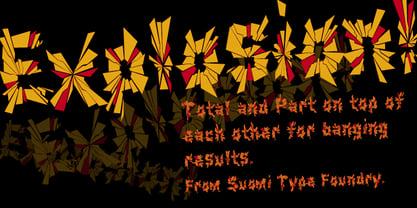
- Explosion by Suomi,
$25.00 - Monotype Baskerville eText by Monotype,
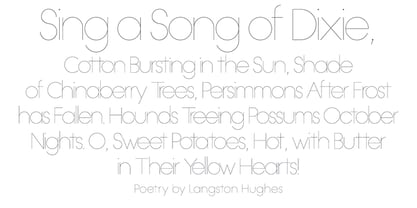
$103.99 - OL Hairline Gothic by Dennis Ortiz-Lopez,
$75.00 - Candycorn Overdose by Fontosaurus,
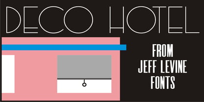
$19.95 - Deco Hotel JNL by Jeff Levine,
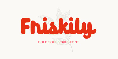
$29.00 - Friskily by Ali Hamidi,
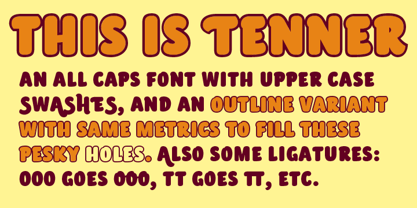
$12.00 - Tenner by Suomi,
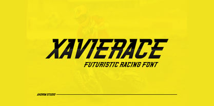
$35.00 - Xavierace by Portograph Studio,
$20.00 - Antique Shadow by Wooden Type Fonts,
$15.00 - Backpage Article JNL by Jeff Levine,
$29.00 - Presidential Dingbats by Loaded Fonts,
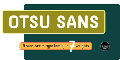
$15.00 - Otsu Sans by TeGeType,
$- - Greeting Monotone by Monotype,
$29.99 - Neographik by Monotype,
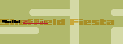
$29.99 - Sheffield Fiesta by Device,
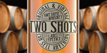
$39.00 - Two Shots by Vozzy,
$10.00 - Jackie Sue BF by Bomparte's Fonts,
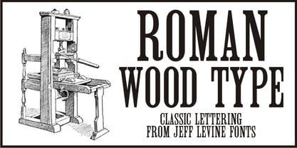
$39.00 - Roman Wood Type JNL by Jeff Levine,
$29.00 - French Antique by Wooden Type Fonts,
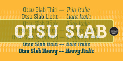
$20.00 - Otsu Slab by TeGeType,
$19.00 - Dance Time JNL by Jeff Levine,
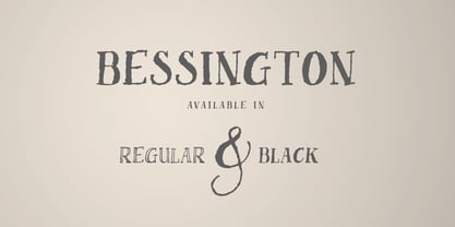
$29.00 - Bessington by wearecolt,
$16.00 - Futhark by Deniart Systems,
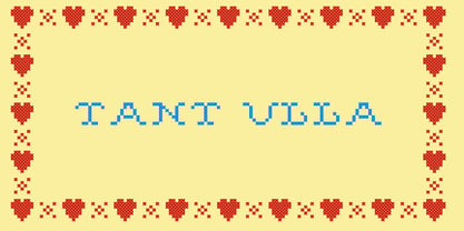
$10.00 - Tant Ulla by Cercurius,
$19.95 - Hearst Roman by Solotype,
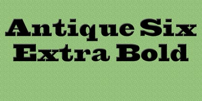
$19.95 - Antique Six by Wooden Type Fonts,
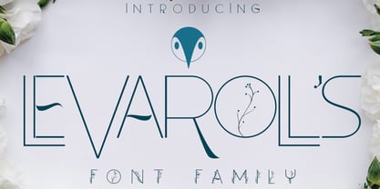
$15.00 - Levarolls by Jehansyah,
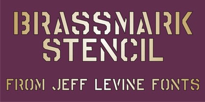
$9.00 - Brassmark Stencil JNL by Jeff Levine,
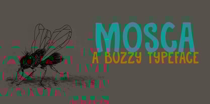
$29.00 - Mosca by Hanoded,
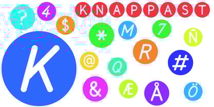
$15.00 - Knappast by Cercurius,
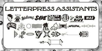
$19.95 - Letterpress Assistants JNL by Jeff Levine,
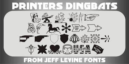
$29.00 - Printers Dingbats JNL by Jeff Levine,
$29.00 - Fango by Typo5,
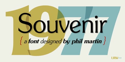
$16.95 - Souvenir Gothic by URW Type Foundry,
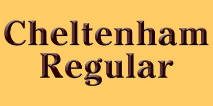
$35.99 - Cheltenham by Wooden Type Fonts,
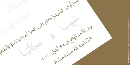
$15.00 - JH Naskh Expanded light by JH Fonts,
$120.00


