2,396 search results
(0.026 seconds)
- Xpress by Wiescher Design,
$12.00 »XPress« is a very distinct, expressive, typical new Sans. »XPress« is my new Sans-Serif that impresses – especially in small sizes – with its outstanding readability. Seven precisely calibrated weights from »Thin« to »Heavy« and its corresponding italics make this font-family universally usable. »XPress« got its bearings from the fabulous American »Gothic« fonts of the twenties of last century. Modern, present day elements, high lowercase letters and infinitesimal elegant slight curves in start- and end strokes make the font family not only great for body copy, but also very useful in advertising. »XPress« ist eine individuelle, expressive, typische neue Sans. »XPress« ist meine neue Serifenlose die – speziell in kleinen Schriftgraden – durch aussergewöhnliche Lesbarkeit auffällt. Sieben präzise aufeinander abgestimmte Schnitte von »Thin« bis »Heavy« und dazu passende Kursive machen die Schriftfamilie vielseitig einsatzfähig. »XPress« orientiert sich bewusst an den grossen amerikanischen Groteskschriften der zwanziger Jahre des letzten Jahrhunderts. Durch moderne Formelemente, große Mittellängen und unendlich leichte, elegante An- und Abstriche ist die Schrift jedoch nicht nur als Textschrift, sondern auch im gesamten Bereich der Werbung vielseitig einsetzbar.
 - Ravensara Antiqua Stencil by NaumType,
$19.00 Ravensara Stencil - elegant high contrast classic serif. Ravensara family was born from the idea of taking the Didone concept to weight extremes. In light and medium weights Ravensara transmits a very elegant and high fashion style attitude, but stays readable in small sizes and can even be used as a text font. That makes it an ideal solution for projects, that needs an injection of contemporary sophistication. Heavy weights perfectly complement light and medium ones and also works great by their own in large sizes. It is a part of the Ravensara superfamily, united by the same anatomy, which currently also includes Ravensara Sans and Ravensara Serif. Ravensara Stencil is available in 9 weights, including Thin, Light, Regular, Medium, SemiBold, Bold, ExtraBold, Black and ExtaBlack. Ravensara font family, combining its classic origins and contemporary elegance, is a perfect choice for bold headlines, oversize typography, fashion logos, branding, identity, website design, album art, posters, advertising, etc. Ravensara Stencil extends multilingual support to Basic Latin, Western European, Euro, Catalan, Baltic, Turkish, Central European, Pan African Latin and Afrikaans.
 - Internacional by Los Andes,
$26.00 Internacional, inspired by the International Style, is a Latin American-flavored neo-grotesque sans serif typeface made with organic ingredients and sweetened with organic sugar and chocolate. Internacional is well-suited for corporate identity, branding, publishing projects, logotypes, magazines and advertising. Its large x-height and small difference between x-height and cap-height make it a high-impact font, ideal for powerful headings, while providing legibility. Internacional was designed for use with short and mid-length paragraphs that require a balanced type color. Internacional is an extended width font with rounded forms and angled terminal ends, in characters such as “c” or “a”, which make it suitable for use in advertising and branding. The proportional relation in height between uppercase and lowercase letters may be useful when composing text in German language. The Internacional font family comes in 7 weights with matching italics and includes an alternative version, with the same number of styles, yet it tastes differently. Special thanks to everyone in the Latinotype Team (especially to Rodrigo Fuenzalida) for their support, help with corrections and digital editing.
 - Bordonaro Script by Estudio Calderon,
$35.00 Bordonaro Script - Bordonaro Spur’s partner - is an interpretation of the “English Roundhand” style with a strong influence by the logos of American basketball and baseball teams. It is designed from simple shapes ideal to be used in long titles and fits perfectly into the branding design. Psss...Check out the NEW Bordonaro Script with Rounded corners , same version but soft! Bordonaro has a complete set of special and original characters: Stylistic Ligatures, Discretionary Ligatures, Swashes, Contextual Alternates, Titling, ss01,ss02, ss03 & apostrophes' ligatures that work as complements to enrich the text composition. Bordonaro Script and Bordonaro Spur are two typographic styles that were designed under the same characteristic features with the idea of combining them to obtain better results, for that reason, we recommend merging them in a creative way and you will realize everything you can design with them. The banners designs are based on old brands of beer labels, coffee packaging, sports logos and in some cases we use Copperplate Gothic but only as a complementary font in order to harmonize the layout of the elements in each banner.
 - ITC Eborg by ITC,
$29.99Designed by the highly regarded American designer George Ryan of the Galapagos Design Group. George is the veteran of a number of successful display fonts and there is no reason why ITC Eborg, with it's striking appearance, should not follow suit. Is it a bold casual sans serif or a disciplined brush script? Probably the former but only just. Whatever it's category though, ITC Eborg has the pedigree to become a highly successful and much sought after font. It has been carefully designed to maximize it's usage potential with conventional capitals combining well with a lowercase in which the x-height is just about right for both large display application whilst retaining good legibility at some of the smallish point sizes. ITC Eborg, with it's warm friendly qualities which are very much in evidence, and in a world where it has become so important to convey that casual approachable air," even in the most aggressive of advertising, be it product or service, it is definitely a style to fill the need." - Slate by Monotype,
$34.99 A typeface of grace, power and exceptional versatility, the Slate collection is a truly beautiful design that achieves stellar levels of readability, both in print and on screen. Created by the award winning type designer Rod McDonald, this six-weight sans serif family is a rare example of sublime aesthetics meeting world-class functionality. The typeface’s legible letterforms embody an amalgam of the best traits of both humanistic and grotesque letterforms. “I didn’t want a face with an ‘engineered’ look, or with any noticeable design gimmicks or devices,” admits designer McDonald. “I wanted a pure design. I confess that I was ruthless with any character that wanted to stand out from the rest.” The Slate collection is available in six weights with complementary italics, with slight changes in structure from the light to the black weights. Its light weight is reminiscent of early American sans. Whether for use in display work or in longer-form settings, few typefaces possess the beauty and power of this design, leaving the Slate family an excellent addition to any designer’s typographic quiver.
 - News Gothic No. 2 by Linotype,
$40.99News Gothic No. 2 is an enhanced version of News Gothic produced by the D. Stempel AG type foundry in 1984. It added more weights to the News Gothic family than were available in other versions, increasing its use in contemporary design and communication. The lighter weights of the original News Gothic were designed by Morris Fuller Benton in 1908 for American Typefounders (ATF). News Gothic typeface is quite similar to Benton's other sans serifs from the early twentieth century, including Franklin Gothic and Lightline Gothic. The bold weights were added to the News Gothic scheme in 1958. The capital letters in News Gothic No. 2, just like those found in News Gothic, have a similar visual width to each other. The lowercase is compact and powerful. These design attributes contributed to Benton's strong handle on the sans serif genre, and for years his types have been popular for newspaper headlines and many other uses. Still a popular presence on the font charts, News Gothic has proven its ability to get the job done right. - P22 Saarinen by IHOF,
$39.95 P22 Saarinen is a typeface based on the architectural lettering of Finnish American architect Eero Saarinen.The Saarinen fonts were created to help commemorate the 75th anniversary of Kleinhans Music Hall in Buffalo, NY, which was designed by Saarinen in collaboration with his father Eliel Saarinen and is recognized as one of the greatest concert halls ever built in the United States. Saarinen’s own lettering styles were combined with various lettering manual suggestion for proper lettering to create a flexible casual lettering style in regular and bold weights. The Pro fonts include multiple variations of each letter for a more natural lettering style as well as stylist in variants to achieve various highs for crossbars and other customizable variants. The Pro fonts also include Central European character set, fractions, small caps and an array of hand drawn directional arrows. Individual non-pro versions feature: Saarinen Regular - characters with low cross bars Saarinen Alt 1 - characters with high cross bars Saarinen Alt 2 - characters with mid cross bars and old style figures Saarinen Arrows - bold and regular arrows combined in one font
 - Afrobeat Light by Resistenza,
$39.00 Inspiration The pounding tribal rhythms of Afrobeat music is expressed through this psychedelic brand new font, Afrobeat. Every letter becomes art as every letter is elegantly placed side by side, like music notes, creating music for the eyes. Afrobeat is a musical style performed by many African artists such as Fela Kuti, Femi Kuti, Antibalas and many more, which is a fusion of jazz,funk, and psychedelic rock, originating from the 60s and was based on the political movements of Nigeria. The Font This font is perfect for when you want to use eye-catching big texts for anything from posters and flyers for concerts, events, parties, to CD covers, advertisements, and art, but it´s especially striking for printed projects. Afrobeat Light thinks green Think green. With Afrobeat light you save up to more than 35% of your ink toner. Being green in no longer a luxury, but an an essential. By using Afrobeat light you openly demonstrate that your company integrates the 3 Ps into its operations: People, Planet. Profit. Go ahead - be green! Check out also the original ‘Afrobeat’
 - Rodley by Fettle Foundry,
$10.00 Rodley is a geometric sans-serif typeface and a ground-up redrawing of Bairne – the first ever typeface from Fettle Foundry – with a completely new character set that closer resembles the original vision for the typeface. The changes are so substantial that Rodley has taken on a life of its own, becoming a brand new typeface. Inspired by low-contrast Swiss and Modernist grotesque typefaces, with the addition of characterful geometric shapes, Rodley aims to be a more disruptive choice for brands, while retaining the appeal of those popular styles. Based upon a Latin S character set with additional glyphs, Rodley supports many latin-based languages, with a focus on pan-European and South American languages. Thorough kerning has been applied to uppercase/lowercase, uppercase/uppercase, lowercase/lowercase and CamelCase character combinations, with thorough attention paid to an incredibly large number of diacritical combinations. Available in 5 weights, from thin to bold, with matching italics, Rodley has been designed with a wide range of uses and sizes in mind.
 - Epilepsja Round by Mikołaj Grabowski,
$29.00 Here I present Round - a type family that is derived form Epilepsja, which was my first alphabet commercially out. After its release I came to think that there should be other fonts of this design that would enrich the variety of choice. Here comes ‘Epilepsja Round’ which is soft and friendly while the Regular family remains firm and sharp. It supports all Latin-based European and African languages and acts as a multicolour layered font. best for headlines, titles and other display uses.. It is an all-caps alphabet of stencil-sprayed and painted letters found in the city space. The glyphs are simple but unordinary. Every letter has something from Escher-like 3D illusion, but is flat simultaneously. Epilepsja Round consists of three styles: Outline, Solid and Fill. Outline is the base from which the other two styles are created. When you mix Solid with Fill, you can create two-color Outline style. You can even mix it with not-Round Epilepsja! Solid is neat and legible in small sizes. Use it for posters, headlines, magazines, websites or anything you like.
 - Caslon #540 by Linotype,
$29.99The Englishman William Caslon punchcut many roman, italic, and non-Latin typefaces from 1720 until his death in 1766. At that time most types were being imported to England from Dutch sources, so Caslon was influenced by the characteristics of Dutch types. He did, however, achieve a level of craft that enabled his recognition as the first great English punchcutter. The original Caslon specimen sheets and punches have long provided a fertile source for the range of types bearing his name. Identifying characteristics of most Caslons include a cap A with a scooped-out apex; a cap C with two full serifs; and in the italic, a swashed lowercase v and w. A few of the many interpretations from the early twentieth century were true to the source, as well as strong enough to last into the digital era. These include two from the American Type Founders company, Caslon 540 and the slightly heavier Caslon #3. Both fonts are relatively wide, and come complete with small caps, old style figures, and italics. - Ares by Adam Jagosz,
$15.00 Ares is a crisp all-caps display typeface suitable for sci-fi logos and titles. It owes its peculiar futuristic vibe to angular, top-heavy letters that hang from the cap-height instead of sitting on the baseline. The typeface consists of six subfamilies available in 10 weights, as well as as two variable fonts of three axes: Weight [wght], ranging from 1 to 1000, Mid-height [MHGT], ranginf from 0 to 1000, Tracking [TRAK], ranging from 0 to -40. The mid-height axis affects the typeface's waistline, including crossbars, and divides the fonts into three subfamilies: Ares Lo, Ares, and Ares Hi. These three families are solid-stroked, and the other three families are their stencil-stylized counterparts: Ares Broken Hi, Ares Broken, and Ares Broken Lo. The tracking axis is only available in the variable versions, and proportionally affects the kerning, thus helping set the type more tightly without effort. Ares supports a wide range of Latin-based orthographies, including not only European, but also Vietnamese as well as major African languages like Hausa, Fula or Ewe.
 - Ermis Pro by Wannatype,
$62.00 Ermis Pro – handwritten, multilingual, natural Ermis Pro is a cross between a perfectly finished, comprehensive, classically cut old face type and handwriting. It combines the slightly irregular contours you see in very small letter sizes caused by the flow of ink on paper with the elegant look and feel of a serif font. This makes Ermis Pro the perfect choice for stylish printed materials with a personal touch, doubtlessly winning fans in the worlds of fiction and fantasy alike. Ermis Pro is robust and easy to read in both display and body copy. With its comprehensive character set, it is suitable for a wide range of typographical uses. Besides the standard Latin, the character set includes the Greek and Cyrillic alphabets as well as extended Latin with pan-African letters and the complete International Phonetic Alphabet (IPA). Ermis Pro also comes with numerous OpenType features such as discretionary ligatures, small capitals and nine number variants. The typeface features upright and italic fonts in three weights: Light, Regular and Bold.
 - Faux Pas JNL by Jeff Levine,
$29.00 The lettering found on an 1878 Salt Lake City advertisement for the Forepaugh’s Circus inspired Faux Pas JNL, which is a bit of a pun on the circus’ name and also a commentary on how this unusual lettering style seems to break all of the rules on stroke width and balance. According to Wikipedia: “Adam John Forepaugh (February 28, 1831 - January 22, 1890) was an American entrepreneur, businessman, and circus owner. Forepaugh owned and operated a circus from 1865 through 1890 under various names including Forepaugh's Circus, The Great Forepaugh Show, The Adam Forepaugh Circus, and Forepaugh & The Wild West. In 1889, Forepaugh sold his circus acts to James Anthony Bailey and James E. Cooper and he sold his railroad cars to the Ringling Brothers. The Ringlings used the equipment to transform their circus from a small animal-powered production to a huge rail-powered behemoth, which later purchased the Barnum & Bailey Circus. Thus, in liquidating his circus assets, he indirectly contributed to the demise of his arch-rival.” Faux Pas JNL is available in both regular and oblique versions.
 - Mommie by Hubert Jocham Type,
$59.90 In the early 1980s, at the start of my career, I had the opportunity to work in a print shop with classic lead setting. In those days I would study issues of U&lc magazine from ITC. What really caught my attention were scripts in the Spencerian style. I’ve been fascinated by this American penmanship tradition ever since. A few years ago I developed a font. Boris Bencic used it when he was redesigning L’Officiel magazine in Paris. I took these initial forms and developed them into the font Mommie when I started my own foundry. Although I usually design text typefaces, working on Mommie taught me how complex it can be to create a script headline font. The biggest challenge in this process has been to keep it alive and fresh. The Regular weight is only made for very big headlines. The thin lines with the bold drops are very elegant. For smaller sizes use the Medium and Small weight. It won the TDC 2008 award and was Judges Choice of Christian Schwartz.
 - SST by Monotype,
$82.99 Designed for global branding and supporting 93 languages, the SST® typefaces blend the organic readability and controlled structure of modern sans serif designs. In combining these attributes, the SST family is understated, versatile – and sure to be a timeless design. The SST Pan-European family has 17 fonts in total, supporting the W1G character set. It spans six weights from ultra light to heavy, each with an italic complement. In addition, three condensed designs and two monospaced (typewriter) typefaces were drawn to further expand the family’s vast range of uses. SST’s subtle design traits provide a quietly handsome and consistently friendly typographic presence that can be used for just about any typographic application. Broad range branding applicability combined with coverage for almost a hundred languages, makes SST one of the most widely accessible and usable typefaces available. Originally designed in partnership with the global consumer brand, Sony, the SST family is one of the most comprehensive type families available. Since extensive multi-lingual support was a critical design goal from the beginning, Akira Kobayashi, Monotype type director and primary designer on the project, turned to a network of local designers around the world for their individual language expertise. As a result, the details – which could be as subtle as stroke curvature and width – are consistent across Latin, Greek, Cyrillic, Arabic and multiple Asian languages. SST performs equally well in print and on-screen and the designs can be used at very small sizes in packaging and catalogs; while massive print headlines – even complicated wayfinding projects pose no stumbling blocks to the family’s typographic dexterity. While the family is also large enough to manage complicated typographic hierarchy, SST pairs handsomely with typefaces as far reaching as ITC Berkeley Old Style®, Meta®, PMN Caecilia®, Malabar® and Neue Swift®.
 - Typist Slab Prop by VanderKeur,
$25.00 The Typist SlabSerif is part of a big family, the Typist Family. The family consists of a monospaced, a SlabSerif and a SansSerif version. The idea behind this family originated from the research into the design of typewriter typestyles, which is also the reason why the monospaced version was released first. Since it was decided from the start to make a SlabSerif and a SansSerif version of these monospaced fonts, it was also a logical consequence that the proportional variants also became available in these versions. The monospaced SansSerif fonts have been given the name 'Code' since they are designed to be used while writing code for a software program, for example. The proportional variants with each 6 weights of the Typist Slab Serif and Code (SansSerif) are now available. Although the name may seem a bit strange, it is a logical consequence from the monospaced variant. The SlabSerif variant therefore has Typist Slab Prop, written in full the Typist SlabSerif Proportional. After all, who wants to be bothered with long font names in their font menu. The entire Typist family is designed as a font for use in editorial and publishing publications. A lot of attention has been paid to the spacing and kerning of the fonts. Due to the many variants and weights, this font is versatile. Typist Font Family was designed by Nicolien van der Keur and published by vanderKeur design. Typist Slab Prop and Typist Code Prop contains each 6 styles (Thin, Light, Regular, Medium, SemiBold and Bold, each weight also designed as a true italic) and has family package options. The links to the monospaced version of The Typist are here: https://www.myfonts.com/collections/typist-slab-font-vanderkeur https://www.myfonts.com/collections/typist-code-font-vanderkeur
 - Typist Code Prop by VanderKeur,
$25.00 The Typist Code SansSerif is part of a big family, the Typist Family. The family consists of a monospaced, a Slab Serif and a SansSerif version. The idea behind this family originated from the research into the design of typewriter typestyles, which is also the reason why the monospaced version was released first. Since it was decided from the start to make a SlabSerif and a SansSerif version of these monospaced fonts, it was also a logical consequence that the proportional variants also became available in these versions. The monospaced SansSerif fonts have been given the name 'Code' since they are designed to be used while writing code for a software program, for example. The proportional variants with each 6 weights of the Typist Slab Serif and Code (SansSerif) are now available. Although the name may seem a bit strange, it is a logical consequence from the monospaced variant. The SansSerif variant therefore has Typist Code Prop, written in full the Typist Code Proportional. After all, who wants to be bothered with long font names in their font menu. The entire Typist family is designed as a font for use in editorial and publishing publications. A lot of attention has been paid to the spacing and kerning of the fonts. Due to the many variants and weights, this font is versatile. Typist Font Family was designed by Nicolien van der Keur and published by vanderKeur design. Typist Slab Prop and Typist Code Prop contains each 6 styles (Thin, Light, Regular, Medium, Semi-Bold and Bold, each weight also designed as a true italic) and has family package options. The links to the monospaced version of The Typist are here: https://www.myfonts.com/collections/typistslabfont-vanderkeur https://www.myfonts.com/collections/typist-code-font-vanderkeur
 - "Top Secret" is a captivating font created by the talented Koczman Bálint, that whisks you away to a world of intrigue and espionage straight out of a Cold War-era spy novel. Its design is heavily in...
- Rusticana by Linotype,
$29.99Rusticana is a part of the 1990 program Type before Gutenberg, which included the work of twelve contemporary font designers and represented styles from across the ages. Linotype offers a package including all these fonts on its web page, www.fonts.de. Rusticana was designed by Adrian Frutiger and appeared with Linotype in 1993. Its historical roots go back to the Roman Capitalis, the all caps engraved writing of ancient Rome which reached its peak in the first century. From this style evolved other Roman forms, and one, Rustica, proved particularly good for text on bronze, as opposed to in stone. The Rusticana of Frutiger has open, seemingly irregular forms which lend a distinctive rhythm to text. - Neue Frutiger Thai by Linotype,
$79.00 Neue Frutiger Thai was created by Anuthin Wongsunkakon and a team of designers and font engineers from the Monotype Studio, under the direction of Monotype type director Akira Kobayashi. The family is available in 10 weights from Ultra Light to Extra Black in both Traditional (loop terminals) and Modern (loop-less terminals) styles. Neue Frutiger Thai embodies the same warmth and clarity as Adrian Frutiger's original design, but allows brands to maintain their visual identity, and communicate with a consistent tone of voice, regardless of the language. It is part of the Neue Frutiger World collection, offering linguistic versatility across environments – suited to branding and corporate identity, advertising, signage, wayfinding, print, and digital environments.
 - Westside by Linotype,
$29.99 Westside was designed by Adrian Frutiger in 1989 and is a kind of wood type. It is reminiscent of dusty streets, Wild West heroes and swinging saloon doors. The origins of this kind of typeface can be found in the early 19th century. Called Italian or Italienne, these typefaces quickly became very popular. They are distinguished by square serifs whose width is larger than the stroke width of the characters. When the letters are set together, the heavy serifs build dark horizontal bands. Westside is a particularly decorative typeface which will have a marked effect when used expertly. It is perfect for headlines in larger point sizes, which will highlight its special character.
 - Neue Frutiger Devanagari by Linotype,
$99.00 Neue Frutiger Devanagari was created by Mahendra Patel and Kimya Gandhi and a team of designers and font engineers from the Monotype Studio, under the direction of Monotype type director Akira Kobayashi. The family is available in 5 weights from Light to Extra Black, with matching italics to support the Devanagari script and languages such as Hindi. Neue Frutiger Devanagari embodies the same warmth and clarity as Adrian Frutiger's original design, but allows brands to maintain their visual identity, and communicate with a consistent tone of voice, regardless of the language. It is part of the Neue Frutiger World collection, offering linguistic versatility across environments – suited to branding and corporate identity, advertising, signage, wayfinding, print, and digital environments.
 - Sixties Pin Buttons JNL by Jeff Levine,
$29.00 During the turbulent era of the 1960s, the youth of America found various ways to protest against "The Establishment". Whether it was campus unrest, protest songs, sit-ins or other methods, the message was the counter-culture movement. Arising from this disenchantment with traditional social standards, a small but effective means of protest arose that made no sound, yet spoke volumes - the pin button. Statements against the war in Vietnam, free love, drug use and other messages popped up on little metal discs pinned to tee shirts, suspenders, head band and hats. Sixties Pin Buttons JNL recreates twenty-six of these messages in both white on black (upper case keys) and black on white (lower case keys). Blank buttons in both white and black are found on the parenthesis keys.
 - Postmark Display by Milan Pleva,
$22.00 Postmark Display is a clean geometric display font with one basic and three special styles: Postmark Display Postmark Display Style 1 Postmark Display Style 2 Postmark Display Style 3 Special styles were created to complement the main font and to differentiate words or sentences. Postmark Display is ideal for headlines, headers, logos, labels, packaging, magazines, invitations, etc. FEATURES Basic latin alphabet A-Z Three special styles (each with 50 basic glyphs) 56 Accented characters Numbers, Punctuation, Currency, Symbols, Math symbols & Diacritics Old style figures LANGUAGE SUPPORT Latin 1 + Latin 2 Western Europe and Americas: Afrikaans, Basque, Catalan, Danish, Dutch, English, Faroese, Finnish, French, Galician, German, Icelandic, Irish, Italian, Norwegian, Portuguese, Spanish and Swedish. Latin-written Slavic and Central European languages: Czech, German, Hungarian, Polish, Romanian, Croatian, Slovak, Slovene. Enjoy Postmark Display!
 - Nougat Script by Sudtipos,
$59.00 The first glyphs of Nougat Script were born in 2010 to honor the birth of my first chubby and charming daughter, Siena. The ongoing project with significant progress was presented at Tipos Latinos, the biennal of Latin America typography where Nougat Script was selected among 70 of the best fonts. After a long pause, the project had a powerful restart at the begining of 2018. In those days, it not only grew in number of signs but in complexity of behavior. There are 4 different types of writing within the same font file accesible via opentype features: Script (base or normal), two glyphic alternatives with well differentiated swashes and finally a small cap version. Nougat Script has a fresh and relaxed lettering attitude combined with the typographic harshness for elegant text compositions.
 - Forjada by Latinotype,
$26.00 Forjada—designed by Raúl Israel—is a monolinear, rounded and condensed typeface, belonging to the slab serif classification, inspired by wrought iron window and door grills on facades of historic buildings in America and Europe. Forjada is a rigid yet softly curved font with exquisite ornaments and optimized for great legibility. Forjada Family comes in 3 weights—Light, Regular and Bold—with matching italics and includes alternate swash caps and ligatures plus Ornaments and Catchwords sets that provide a wide range of choices for creating the most beautiful designs. The font character set supports 212 languages. Forjada is well-suited for branding, packaging, food & drinks menus, wedding invitations, party invitations, guidebooks to old cities or any glamorous design you want to add a fresh and modern touch to!
 - 1651 Alchemy by GLC,
$38.00 This family is a compilation created from a Garamond set in use in Paris circa 1651, but similar to those, eroded and tired, that were in use during centuries to print cheap publications, as well as in Europe than in America, and from a large choice of printed symbols—all specially redrawn—used for alchemical, pharmaceutical and astrological books, covering 1550 to late 1800s period. Each alphabet is doubled by a slightly different one, and a special OTF encoding allows to give an irregular effect with never the same twin letters in a single word. The Normal style is enriched by small caps, and the Italic style by Swashes. A lot of symbols, too, are given twice with differences. This font may be used with our calendar specialized 1689 Almanach.
 - NovaMono is a distinctive typeface that captures the essence of modernity while nodding to the traditional monospaced fonts historically used in typewriters and early computing. Designed by fontcolle...
- OregonDry is a font meticulously designed by Pat Snyder that evokes a distinctive and captivating essence of rustic charm and vintage appeal. This font stands out with its unique take on the serif ge...
- GOST type A font embodies a slice of history, particularly emanating from the Soviet era. It's an interesting typeface that's a part of a larger standardization system known as GOST, short for "Gosud...
- Rahere Esoteric by ULGA Type,
$25.00 Rahere Esoteric is a gothic-flavoured, quasi-Roman display font with an eccentric persona and more quirks than a Tim Burton film. A member of the extended Rahere typeface family, it’s the enigmatic cousin of Rahere Roman Display & Rahere Sans. This is a niche display font that doesn’t try to please everyone. Rahere Esoteric revels in its mystical aura, using a bewildering array of ligatures to magically transmute itself as characters loop, curl, jerk and strut, randomly connecting and disconnecting into words like a retro-futuristic steam train clattering along a disused railway track, challenging and delighting the reader at the same time. To add more sparkle, there are alternatives, inferior and superior caps plus a [Wicca] basketful of symbols, ornaments, weird faces and even a snake-infused ampersand. Whilst Rahere Esoteric has been designed primarily as an all-caps font, the lowercase slots contain small caps with corresponding numerals. However, because this is an arcane, unpredictable font, order and regularity are frowned upon, which means there are no tabular numerals – so company reports or accounts are a solid no! Unless they’re for the Golden Circle of Alchemists PLC or Gothic Blackstar Corporation. It is ideal for all things pagan, esoteric, alchemy, other-worldly or magic-related projects and particularly useful for music genres across the Gothic / Darkwave / Ethereal spectrum. What about legibility? Hey, look into my eyes: Esoteric is all about the mystique. If a secondary font is needed for the important stuff, I recommend its cousin, Rahere Sans, which pairs beautifully with this display font and is perfect for long passages or small text. The initial idea for Rahere Esoteric came about during a visit to Whitby, a small coastal town in Yorkshire, UK and famous for its inclusion in Bram Stoker’s novel, Dracula. A Steampunk festival was in full swing and the narrow streets of the town centre were teeming with people adorned in a glorious fusion of clothing and accessories influenced by a love of 19th-century life, science fiction, horror, fashion and art. I was fascinated by the juxtapositions of colour, patterns, material and style – archaic mechanical Sci-fi, gothic, the American Wild West and romantic Victorian. But what intrigued me the most, somehow, all the disparate elements worked as a whole. Thus, like Frankenstein, this font jolted into existence. Supported languages include Western Europe, Vietnamese, Central/Eastern Europe, Baltic, Turkish and Romanian.
 - Ongunkan Sidetic by Runic World Tamgacı,
$49.99 The Sidetic language is a member of the extinct Anatolian branch of the Indo-European language family known from legends of coins dating to the period of approximately the 5th to 3rd centuries BCE found in Side at the Pamphylian coast, and two Greek–Sidetic bilingual inscriptions from the 3rd and 2nd centuries BCE respectively. The Greek historian Arrian in his Anabasis Alexandri (mid-2nd century CE) mentions the existence of a peculiar indigenous language in the city of Side. Sidetic was probably closely related to Lydian, Carian and Lycian. The Sidetic script is an alphabet of the Anatolian group. It has about 25 letters, only a few of which are clearly derived from Greek. Consensus is growing that the script has essentially been deciphered.
 - President by Linotype,
$29.99In 1952, Charles Peignot made a bold and fortuitous move: he invited a young Swiss designer to Paris to be the art director of the Deberny & Peignot type foundry. This started the professional type design career of Adrian Frutiger; and since then he has designed an astonishing range of masterful typefaces. One of the earliest for Deberny & Peignot was Président, a sharp-seriffed Latin titling face. Latin" is a typographic designation for roman typefaces with wedge or triangular-shaped serifs, a stylistic form that Frutiger would return to later with his beautiful typeface Méridien. Président™ has wide, solid shapes; very little contrast between thick and thin strokes; and an air of assurance. Use this titling font for business cards, announcements, or artistic signage." - Hard Rain by Scholtz Fonts,
$19.00 Hard Rain is named after the torrential thunderstorms that occur in the subtropical regions on the east coast of southern Africa -- the land of the Zulu. During the two-month long rainy season the steamy downpour usually lasts for a few days, and is then followed by the welcoming sun. The diagonal stripes represent the heavy drops of water that drench everything they touch. The resulting font has something of a grunge look to it. As with other grunge fonts, Hard Rain is best used for posters and display work. However, the crisp edges mean that it can be very readable even if used at a small size. Unlike most grunge fonts, Hard Rain has a full character set and this greatly extends its usability.
 - Los Lana Pro by Latinotype,
$39.00 Los Lana Pro is a handmade display typeface. Unlike other font families, this type has not a modular structure, that is, each character has been individually designed. The coherence of structure elements across different characters is given by irregular strokes. This curveless typeface is perceived as being curved because of its straight lines, which form different-size angles. Los Lana Pro is a rustic typeface that captures the stereotypical “Andean hippie” handmade aesthetics. Irregular shapes and broken lines give it a distinct personality. Los Lana Pro looks better in larger sizes. Includes many ligatures, two groups of alternate characters, and titling caps characters. Languages include: Basic Latin, Western European, Euro, Catalan, Baltic, Turkish, Central European, Romanian and Pan Africa Latin. Photos by Sergio Recabarren.
 - Chaco by Tipo,
$69.00 The idea behind the font called Chaco originated after testing the deficiency shown in road signs in Latin America. The design began after a long documenting period. Throughout the various stages of the work, there were several tests and checks conducted of the formal solutions implemented which, based on the results, would gradually be changed until we finally reached, in this way, its definite design. The original project for the font features three steps, namely: regular, light and bold, yet by making progress in the development, it was possible for us to perceive that by enlarging the black and thin variances, the family with 5 different weights could offer very good results in mass media, such as newspapers, magazines and television. In order to expand its possibilities of utilization, the set was completed with italics and small capitals.
 - Summer Journey by Hatftype,
$15.00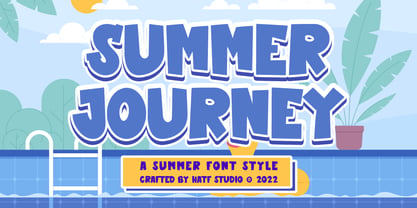 Summer Journey - Summer Font Style is a font with distinctive handwritten characters perfect for branding projects, logos, wedding designs, media posts, advertisements, product packaging, product designs, labels, photography, watermarks, invitations, stationery, and any project who need handwritten dishes. Features : • Character Set A-Z • Numerals & Punctuations (OpenType Standard) • Accents (Multilingual characters) • Ligature. Multilingual Support : Afrikans, Albanian, Asu, Basque, Bemba, Bena, Catalan, Chiga, Cornish, Danish, English, Estonian, Faroese, Filipino, Finnish, French, Friulian, Galician, German, Gusii, Icelandic, Indonesian, Irish, Italian, Kabuverdianu, Kalenjin, Kinyarwanda, Low German, Luo, Luxembourgish, Luyia, Machame, Makhuwa-Meetto, Makonde, Malagasy, Malay, Manx, Morisyen, North Ndebele, Norwegian Bokmål, Norwegian Nynorsk, Nyankole, Oromo, Portuguese, Romansh, Rombo, Rundi, Rwa, Samburu, Sango, Sangu, Scottish Gaelic, Sena, Shambala, Shona, Soga, Somali, Spanish, Swahili, Swedish, Swiss German, Taita, Teso, Vunjo, Zulu. There it is. I really hope you enjoy it. Comments & likes are always welcome and accepted.
 - Salish by Saja TypeWorks,
$29.00 Salish is a sans-serif typeface inspired by the art of the Salishan tribes in the Northwest Americas. It draws heavily on the concept of the ‘ovoid’, a wide ovular shape that is flat on the bottom and top heavy, that is central to the art style known as ‘Formline’. Designed by Aaron Bell of Saja Typeworks, Salish comes in 5 weights, from Thin to UltraBold. Language support includes some 200 Latin-based languages as well as the necessary orthographies for all Salishan languages, including: Comox, Sliammon, Klahoose, Pentlach, Sechelt, Squamish, Halkomelem, Nooksack, Straights Salish (Saanich), Lushootseed, S'Klallam, Quinault, Upper Chehalis, Lower Chehalis, Cowlitz, Bella Coola, Ditidaht, Tseshaht, Nuu-chah-nulth, Ehattesaht-Nuchatlaht, Kwak'wala, Shuswap, Lillooet, Thompson River Salish, Coeur d'Alene, Columbia-Moses, Colville, Okanagan, and Montana Salish. Haida (a non-Salishan language) is also supported.