10,000 search results
(0.023 seconds)
- Linotype Startec by Linotype,
$29.99Linotype Startec, from Jan Tomás, is part of the TakeType Library, chosen from the entries of the Linotype-sponsored International Digital Type Design Contest 1999 for inclusion on the TakeType 3 CD. This is another fun font from Tomás, who also designed Alphabat, and the two share some characteristics. Linotype Startec is an outline font whose unique forms are reminiscent of futuristic dreams and space adventures. It should be used in point sizes of at least 18, but the phrase 'the bigger the better' fits this font well. The careful details and figures of the alphabet turn into UFOs and space ships from another world when set in very large point sizes. Linotype Startc is best for very short texts and headlines. - Beshkasteh by Si47ash Fonts,
$17.00 An innovative combination between Persian Nastaliq calligraphy and Bannai script. Beshkasteh is designed so that the letters are attached to each other while going up the baseline. In result it creates an experience of typing a Kufic Bannai script like it is a Nastaliq or Tahriri calligraphic font. This inventive approach to Persian And Arabic calligraphy scripts is what a creative designer wants for his artistic projects. Shahab Siavash, the designer has done more than 30 fonts and got featured on Behance, Microsoft, McGill University research website, Hackernoon, Fontself, FontsInUse,... Astaneh text and headline font which is one of his latest designs, already got professional typographers, lay-out and book designers' attention as well as some of the most recognizable publications in Arabic/Persian communities.
 - Vinque by Typodermic,
$- Vinque is an interpretation of a nineteenth century Arts & Crafts revival of medieval lettering. British type designer William Morris completed Troy in 1891—a splendid blackletter typeface in the medieval style. It’s beautiful but some modern uses like UI and video game text require a less ornate gothic appearance. Vinque is simple. It avoids strong vertical blackletter strokes which can present problems for contemporary readers. The end result is an uncomplicated, crisp typeface that successfully conveys medievalness to the reader. Vinque was released in 2002 in one style: Regular. In 2019, Vinque was expanded to seven weights and italics. Language support was bolstered to support most current Latin based languages as well as Greek and Cyrillic. OpenType fractions, f-ligatures and old-style numerals are supported.
 - Pentagram Two Letter by Fauzistudio,
$9.00 Pentagram TwoLetter Monogram Logo Font Family with OpenType magic that can adjust to front and back letters, there are 10 frame variations that you can access at numbers 0-9 how to activate it simply by adding a number in front of your initials, typing something (0AB - 9AB) it will automatically compose . you can use it on any Logo project it is perfect to add to your collection. Pentagram TwoLetter font FAMILY – includes 9 weights (Thin, Extra light, Light, Regular, Medium, Semi Bold, Bold, Extra Bold, Black) : Pentagram TwoLetter Thin Pentagram TwoLetter Extralight Pentagram TwoLetter Light Pentagram TwoLetter Regular Pentagram TwoLetter Medium Pentagram TwoLetter Semibold Pentagram TwoLetter Bold Pentagram TwoLetter Extra Bold Pentagram TwoLetter Black Hope you enjoy. Intuisi Creative
 - Lovtony by Khaiuns,
$15.00 Indulge yourself in a luxurious typography pairing with Lovtony; a classic font duo consisting of an elegant Script & Sans Serif. Lovtony is also great for creating beautiful logos, posters, wedding invitations, blog posts, social media, and more! FEATURES: 7 Weights font All caps Stylistic Alternates & Ligatures Numerals & Punctuation Accented characters Multiple Languages Supported HOW TO ACCESS ALTERNATE CHARACTERS Open glyphs panel: In Adobe Photoshop go to Window - glyphs In Adobe Illustrator go to Type - glyphs Please message me if you want your language included or If there are any features or glyph requests, feel free to send me a message, I would like to update it. I hope you have a blast using Lovtony Font Duo! Thanks for use this font ~ Khaiuns
 - TBS Gartek Condensed by TypoBureau Studio,
$25.00 TBS GARTEK CONDENSED is a latin based condensed type of font that has a different characters from the previous TBS GARTEK BLACK font, TBS GARTEK CONDENSED has a strong yet sharp looks character, with a post modernism and semi 90's nostalgic, supported by more than 60± accent languages ranging from West, South East, Central Europe and a bit of Vietnamese. TBS GARTEK CONDENSED is able to complete your current needs who are designing something great. the single DemiBold weight is stunning in Magazine, Posters, Social Media Content, headlines, clothing, large print formats and wherever you want to see it. Inspired by the design styles of post modernism and popular style's nowadays, let's get your project elevate works with TBS GARTEK CONDENSED.
 - Headline Helpers One SG by Spiece Graphics,
$39.00 Wouldn't it be nice to have an assortment of little hand-lettered words? Words like “The” or “A”; “With” or “At”; “To” or “From”? Headline Helpers are word accents that can go just about anywhere. Set off the title of your next design project with one of these little gems. Or use a Helper with your new product introduction headline. Convenient instructions and character map come as standard equipment with this highly desirable addition to your type library. Headline Helpers One is available in the OpenType Std format. Advanced features currently work in Adobe Creative Suite InDesign, Creative Suite Illustrator, and Quark XPress 7. A Windows TrueType version of this font has also been provided if you prefer normal keyboard access.
 - Sanggar by Gatype,
$12.00 The newest Sanggar serif font, which is iconic and skilled with many unique alternative styles, based on our experience as graphic designers working in many companies, we are often asked to design logos with a unique style but with an elegant shape. So, we tried to create a Studio type and create this font to get the idea out. It is perfect for BRANDING and LOGO DESIGN. You will get a classy, elegant, and of course unique logo with this font. Important information: To access the alternatives, you must have access to an older version of Photoshop to copy/paste the glyphs from the included PSD, OR the Glyphs Panel, which can be found in Photoshop CC or any Version of Adobe Illustrator.
 - Graphite Club by Comicraft,
$19.00 The eight rules of Graphite Club: You do not talk about Graphite Club… You do NOT talk about Graphite Club. If someone types "Stop" taps out “Limp,” the Graphite is over. Only two -- Waitasecond! EVERYBODY wants to talk about Graphite Club! It's the font for rough and tough typesetting that looks as etchy and sketchy, sleek and sexy as Brad Pitt on an off day. It's Light as a featherweight, it's as Regular as wetwork and as Bold as Brass Knuckles. And don't let anyone tell you this font is not special. It's as beautiful and unique as a snowflake. And so are you. Features six weights with alternate uppercase alphabets, language support for Western & Central Europe, Automatic alternates, Stylistic Alternates & Crossbar I Technology™
 - Graublau Sans Pro by FDI,
$49.00 The design of Graublau Sans Pro took Georg Seifert over 5 years. With 7 weights and over 1000 glyphs per style, Graublau Sans is a type family that suits all typographic tasks. The regular styles have a rather clean and neutral appearance. The italics on the other hand, have a vivid design based on handwriting. For the use in headlines or logotypes Graublau Sans Pro offer 6 additional display styles with rounded corners and tighter spacing. Beside the typical western codepages, Graublau Sans Pro also supports Greek, Cyrillic, CE (Central European) and Turkish. There are also several sets of figures available: oldstyle figures and lining figures (both proportional and tabular), small caps figures, fraction figures, subscript and superscript figures and figures inside circles.
 - Andalush by Dora Typefoundry,
$18.00 Andalush is a new type of bold script that is modern and elegant designed with a sense of pleasure, Andalush is suitable for use in various media such as; packaging, logos, labels, posters, clothing designs, wisdom quotes, newsletters, typography and many other media. You can mix and match alternatives with the OpenType feature. Andalush comes with uppercase and lowercase Standard Characters, Punctuation, Numbers. And other Glyph variations of OpenType features such as Standard Ligature, Stylistic Alternate, and Stylistic Set, and includes a series of multilingual characters. We really hope you enjoy and are interested in our offer. If you want to upgrade or need a license or ask questions, you can send me a message and you can immediately start your service doratypefoundry@gmail.com. Thank You
 - ITC Coconino by ITC,
$29.99ITC Coconino is the work of Serbian designer Slobodan Miladinov. His original inspiration for this monostroked typeface was the idea of translating certain auditory impressions into type, in this case, the surprising and confusing music of the Serbian hip hop musician Voodoo Popeye." Miladinov is an art director in Belgrade and created Coconino using a "freemouse" technique with Adobe Illustrator and sees his work as "computer calligraphy which allows for a specific directness and immediacy in notation." The strokes of this font are simple and abrupt with a studied irregularity. The forms can look either cheerful and lighthearted or chaotic and subtly disturbing. Coconino was named for the home of hte Krazy KAt comics and even includes a few additional characters from the strip." - Ramadhan Amazing by Sealoung,
$20.00 Ramadhan Amazing is Arabic-style font. Designed with digital flat pen and gothic typography technique that gives the letters an elegant look. Equipped with an Arabic character display. This font is very useful for designing all kinds of graphic designs related to Islamic Content. Ramadhan Amazing font is suitable for branding, logotype, apparel, T-shirt, Hoodie, product packaging, quotes, flyers, posters, book covers, advertising, etc. What's Included? - Open support type - Multilingual support - PUA encoded - Features: uppercase, lowercase, numbers, punctuation, multilingual, alternative, and stylish set. - Accessible in the Adobe Illustrator Glyphs panel, or under Stylistic - Alternative in OpenType menu Adobe Photoshop, Adobe InDesign, Corel Draw, even works in Microsoft Word Please message me if you have any questions. We are happy to help you.
 - Donchenko Serif by Donchenko,
$15.00 Donchenko Serif is a leisurely, elegant, minimalist serif typeface that combines references to medieval half-uncials with Art Nouveau motifs. Its styles are well readable and at the same time have individual features, which makes this typeface stand out from the rest. Donchenko Serif is a "universal soldier". It's great for any challenge. It is also good for typing books or articles, designing corporate identity and promotional materials, or creating display cases. A wide range of Latin, Greek, Cyrillic and special characters provides extensive language support for all European languages. Font Donchenko Serif Regular was developed by designer Oleksandr Donchenko in Lviv (Ukraine) in the first half of 2022. His daughter - Sofia Donchenko - took part in the development some letters. Donchenko Serif - Good font for good people!
 - Molisha Script by Gian Studio,
$12.00 Introducing the new Molisha Script Model which you can get now! the script has been given a combination of fantasy and handwritten ink. This font will look beautiful on all designs, Wedding designs, branding materials, blog titles, quotes and invitations, business cards. Open Type includes: - Alternate style - Set style - Ligature - SWASH To enable the OpenType Stylistic alternative, you need a program that supports OpenType features such as Adobe Illustrator CS, Adobe Indesign & CorelDraw X6-X7, Microsoft Word 2010 or later. There are additional ways to access the alternative/swash, using the Character Map (Windows), Nexus Fonts (Windows), Font Book (Mac) or a software program such as PopChar (for Mac and Window). This font has provided PUA unicode (custom code font).
 - Bodoni by ParaType,
$30.00 Designed at ParaType in 1989 by Alexander Tarbeev. A modern replica of the typeface by Giambattista Bodoni, the Italian punchcutter and typographer of the late 18th century. Bodoni was a director of printing house of Duke of Parma in Italy. His early types were based on those of Fournier and Didot, but he developed the designs to become what are now considered to be the first modern typefaces. His letters have strong vertical stress, sharply contrasting thick and thin strokes and unbracketed hairline serifs. The contrast of thick and thin in Bodoni typefaces can produce a sparkling effect on a page: should be carefully used in texts; good for headlines and display. Condensed and decorative styles were added in 1993–97.
 - Apothicaire by Sudtipos,
$49.00 Apothicaire is a new font designed by Ale Paul and the Sudtipos team that is inspired in, but not limited to, an antique style casted by a German type foundry during the late XIX century. With the addition of a contemporary design approach, Apothicaire comes in three widths —from condensed to expanded— and five weights —from light to extra bold—, offering a wide range of combinations to explore. As a bonus the font family is also available in a single variable format. An elegant small caps set, a variety of ball terminals and delicate swashes, as well as the possibility to choose from many alternates are also included in the OpenType features. Apothicaire supports a wide range of Latin alphabet-based languages.
 - Brantley Script by Shape Studio,
$12.00 Brantley Script is a romantic and vintage script. It Can be used for various purposes such as logos, wedding invitations, t-shirts, letterhead, signage, news, posters, badges and more. Brantley Script features 300+ glyphs and extruded fonts, alternative characters, binders. To activate the OpenType Stylistic alternative, you need a program that supports OpenType features such as Adobe Illustrator CS, Adobe Indesign & CorelDraw X6-X7. How to get alternative glyphs from open type fonts: http://youtu.be/iptSFA7feQ0 There are additional ways to access alternatives, using Character Map (Windows), Nexus Fonts (Windows), Font Book (Mac) or software programs such as PopChar (for Windows and Mac). How to access all alternative characters, using Windows Character Map with Photoshop: https://www.youtube.com/watch?v=Go9vacoYmBw
 - NEOMETRA - Personal use only

- NeometraCaps Black - Personal use only

- Serendipity by Nicky Laatz,
$15.00 Say hello to **Serendipity** - A font that you were meant to find, and is now destined to be with you :) An elegant cousin of Saturday Script, Serendipity is a lovingly handwritten brush script , with an air of grace and flamboyancy. **Serendipity** is special in that one word can be written in a million different ways - thanks to the large selection of extra letters that it has built in. It comes with 2 sets of alternate lowercase letters, a set of alternate uppercase letters as well as a set of double letter ligatures - all for you to play with, and make your words look exactly how you need them to look. Perfect for Type-based creations, branding, websites, merchandise, packaging, quotes, invites, greetings and so much more, Serendipity will take you where you need to be. The brush script comes in 2 variants - Regular, and Wide each with its own unique feel.
 - FS Hackney by Fontsmith,
$80.00 Elliptical The squareness of curves. That was the elliptical – in more than one sense – notion being explored in the making of FS Hackney. The squareness of curves and vertical terminals to create a gentle, soft sans serif, with a little bit of magic. A momentary thought – “It doesn’t have to be like this” – provided the spur to explore the verticals and skeletons of letterforms beyond conventional type design limits. A 12-month gestation period gave rise to a font with a larger-than-usual character set, including non-lining figures, small caps and superior and inferior numbers. It’s a collection that speaks confidently for itself. Assertive It was the Hackney carriage – the black London cab – that gave this font its name, not the north London neighbourhood. Solid, dependable, effective and built to last, FS Hackney was honed to perform in all conditions. Cool, compelling lines and a satisfying overall simplicity lend FS Hackney its assertive air. Assured, versatile and effective; just like a black cab (but without the grumbling). Machined Over a string of meetings, Jason Smith and FS Hackney designer Nick Job worked out how to infuse Nick’s sketched letterforms with Fontsmith’s familiar geniality. “Nick is very meticulous and produces very clean design work,” says Jason. “Hackney is ideal for branding as it’s very clear and its quirks are sensible ones, not odd ones, that don’t distract from the message.”
 - Dash Decent by Comicraft,
$19.00 Are you feeling the need...the need for speed? Dash Decent is a top flight executive font that won't leave you high and dry... Unless we're talking dry martinis in the air stewardess's lounge. Our speedball cocktail is guaranteed to get you up into the atmosphere and guide you in for a smooth landing. And that really is dash decent of us, don't you think? Splendid, I'd say!
 - Guile by Bunny Dojo,
$10.00 A timeless and mighty sans-serif, Guile's chiseled forms make the font ideal for reaching into history, while its minimalism and balance are fit for propelling into the future. Guile voraciously absorbs and enhances the style of its surroundings. In sports, it's a true team player, from the jerseys to the on-air presentation. In film, it's a blockbuster star, from the title treatment to the billing block.
 - Houseplant by PizzaDude.dk,
$20.00 Houseplants are commonly grown for decorative purposes, positive psychological effects, keeping fresh or health reasons such as indoor air purification. Actually, just like this font has a positive effect on your artwork! This font comes with a heavy load of diacritics! On top of that, it has contextual alternates, which means your text cycles through 6 different versions of each letter! Hard to tell that this is actually a font!
 - Goudy Initialen - Personal use only

- Prêt-à-porter by Latinotype,
$39.00 Prêt-à-porter is a project developed as part of a series of type experiments appearing on the blog ‘Letritas’. Prêt-à-porter is a very expressive friendly font with a handwritten look, smooth curves and strong identity. Its counterforms make it a carefree, wild, cheerful, light and highly readable typeface. This type system consists of two Script families—Contrast and Linear—and a Slab family. The Contrast set works as a complement, providing more elegance and formal refinement. Both Linear and Contrast come in 5 weights plus Ornaments, which can be used as initial and terminal forms since they have been designed for connecting with each letter. Linear and Contrast families include ligatures and the whole font family supports 208 different languages.
 - Sheepman by Dharma Type,
$19.99 Sheepman inspired by and based on retro William Page’s No.506 typeface which is popular wooden type fonts of the 19th century. To make soft and natural impressions, the original polygonal design was changed to rounded design. All glyphs had been designed carefully to be retro-looking of the old time and to fill all with nostalgia. This modern wood type includes 3 weights and their matching slanted style and all style have sprayed ends(beginning) alternates for F, H, L, M, N, P, U, f, h, j, m, n, p, q, and u which can be accessed by using OpenType Stylistic alternates or swash alts. Sheepman will be the best solution for posters, titles and anywhere you need vintage lettering.
 - Bulmer by Monotype,
$29.00Cut as a private version for the Nonesuch Press in the early 1930s, Monotype Bulmer was first released for general use in 1939. Based on types, cut by William Martin circa 1790, used by the Printer, William Bulmer, in a number of prestigious works, including Boydell's Shakespeare. Martins types combined beauty with functionality. Narrower and with a taller appearance than Baskerville, it anticipated the modern face of Bodoni but retained vital qualities from the old face style. This new digital version of the Bulmer font family was drawn by Monotype following extensive research into the previous hot metal versions and a study of Bulmer's printed works. Additional weights have been designed together with a wide range of Expert and alternative characters. - Liberta TA by Elsner+Flake,
$40.00 Between 1958 and 1961, Herbert Thannhaeuser developed the typeface Liberta for Typoart as a broadly conceived newspaper type which established itself quickly. Its positive adaptation by publishing houses and printing companies was based, next to its agreeable and reader-friendly general impression, also on a relatively robust typeface character which does not sacrifice its power of impression and elegance even when confronted with poor paper and printing qualities. In the 1970s, a bullish and robust design style took over the area of consumer goods which then required a corresponding advertising face. Harald Brödel re-worked the Liberta Ultra for phototypesetting, and, with great sensitivity, designed a matching cursive variation. Both types work especially well as an attention getter for advertising and for emphasis purposes.
 - Supria Sans by HVD Fonts,
$50.00 Supria Sans™ and Supria Sans Condensed is an extended family of 36 fonts designed by Hannes von Döhren. It contains two widths, six weights and three styles, including the curvy, feminine Italic as well as the more conventional Oblique. Although it is inspired by the utilitarian clarity of Swiss type design, subtle curves and fine detailing impart a more playful character to the whole Supria Sans family. Supria Sans™ is equipped for complex, professional typography. As an exclusively OpenType release, these fonts feature small caps, five variations of numerals, arrows and an extended character set to support Central and Eastern European as well as Western European languages. Supria Sans™ received the “Certificate of Excellence in Type Design” at the TDC2 (2011).
 - Cynapse OT by Positype,
$29.00 Several years ago I was faced with a project that required very small type to be used in a directory. In general, there was a need for a lot of 'fine print'. Faced with this, all of the tests I was making with existing faces were producing too much bleed of the individual glyphs...Cynapse was born. It evolved into this pseduo-techy looking type that standardized and glorified the ink trap (the small, tiny allowances of white space that reduces the amount of ink hitting the page, and in effect, reducing the appearance of bleed). The results was promising. The new OT version contains additional OpenType features that include expanded ligature sets, fractions, 5 sets of numerals as well as small caps and Central European diacritics.
 - Raleigh Gothic Condensed by GroupType,
$29.00 In 1932, the great American type designer, Morris Fuller Benton was busy directing the creative departments of ATF and designing type. Big on his plate during that period was the development of the Bank Gothic® family among other typefaces like Raleigh Gothic. Bank Gothic and Raleigh Gothic share some very similar design traits. The most obvious difference being the ultra condensed style of Raleigh Gothic. Although the Bank Gothic family was released with a condensed, Raleigh Gothic could have originally been planned as an ultra condensed Bank Gothic but for reasons we can only speculate, the Ultra Condensed Bank became its own design. So, If you like Bank Gothic, you may also like Raleigh Gothic. Separated at birth? Fun to speculate.
 - LTC Nicolas Cochin by Lanston Type Co.,
$24.95 Nicolas Cochin (not to be confused with another font named simply "Cochin") was originally designed by Georges Peignot in the early 20th Century and was based on engraved letters of the 17th Century artist Charles Nicholas Cochin. Many foundries including Lanston released versions in the 1920s. Several digital versions can now be found, but none have kept the irregular details of the metal type which include strokes that cross over each other as if hand drawn (see letters K & y). The new Lanston digitization is the only digital version to retain the idiosyncratic treatment which makes the metal type so alluring. The Opentype version included an expanded Central European character set as well as ligatures, alternates, fractions, superior/inferior numerals (the Italic also has swash characters).
 - Lamborte by Haksen,
$18.00 Lamborte is a strong modern sans serif style with All Caps feel nice balanced. Its wide range of uppercase with ligatures allow versatile design options and works perfectly for headlines, logos, posters, packaging, T-shirts and much more. Recommended to use in Adobe Illustrator or Adobe Photoshop with opentype feature. Ligatures feature is default setting in Adobe Illustrator or Adobe Photoshop in Uppercase character. So when you want not to use the ligatures. Open glyphs panel : In Adobe Photoshop choose tool Window Character and then please klick fi symbol In Adobe Illustrator choose tool Window Type Open Type and then please klick fi symbol If you have questions, just send me a message and I'm glad to help. Have a great day, Haksen
 - Circus Didot by ParaType,
$25.00 Circus Didot typeface presents a rework of a typical neoclassical serif type in a constructivist style. Analyzing the shapes of characters author placed basic geometric figures — triangles, rectangles, circles… above the contours of letters. Resulting constructions staying recognizable letters at the same time bore a resemblance to pictures of Russian avant-garde artists from 20th century. This discovery has brought an idea to design a typeface where the tendency of a modern serif type to rationalism and geometry is realized in maximum possible extent. The prototypes for the project were taken from the works of Didot, lettering experiments of Russian constructivists and art deco artworks. The technique of juggling with shapes and overall grotesque approach to the design explains the selection of the name for the font.
 - Linotype Party Time by Linotype,
$29.99Linotype Party Time is part of the Take Type Library, chosen from the entries of the Linotype-sponsored International Digital Type Design Contests of 1994 and 1997. The typeface is the work of Bulgarian designer Christo Velikov and is composed exclusively of capital letters. Different components make up this cheeful, frolicking font: stripes, dots, triangles, arrows, a trumpet, a ribbon, and others. The characters of Linotype Party Time stand straight on the base line while those of Linotype Party Time Drunk take on the stance typical of this state. Linotype Party Time is perfect for anything which has to do with fun and should be used exclusively in larger point sizes to emphasize the details which make the figures so unique. - Ranshell by Letterhend,
$19.00 Introducing, Ranshell - A dry brush calligraphy script. This font was made based on real hand brushed lettering. The rough texture make this font looks cool and tough. This type of font perfectly made to be applied especially in apparel, clothing, labels, logos, magazines, books, greeting / wedding cards, packaging, fashion, make up, stationery, novels, labels or any type of advertising purpose. Features : uppercase & lowercase numbers and punctuation multilingual swash and ligature alternates PUA encode We highly recommend using a program that supports OpenType features and Glyphs panels like many of Adobe apps and Corel Draw, so you can see and access all Glyph variations. How to access opentype feature : letterhend.com/tutorials/using-opentype-feature-in-any-software/ Email us to letterhend@gmail.com if you need something! Happy Designing!
 - Galea Display by Letra Type,
$50.00 Galea is a slightly condensed serif typeface with long extenders. Its elongated proportions and graceful terminals seek to bring femininity and elegance to any layout. It is a display face that works well at large sizes in editorial contexts as a headline, titling or introduction to a text. Galea was designed by Isabel Urbina Peña while at Cooper Union’s Type@Cooper Extended Program, 2012 and released on May, 2014. Galea obtained an Honorable Mention from the Fine Press Book Association in the Text Family Category, 2013. Also, it is featured in the book "Playing with Type: 50 Experiments" by Lara McCormick, Rockport Press, on Parenthesis Magazine, Autumn 2013 on Behance's Typography Served and will appear on "Typography Magazine", Japan (Nov 2014).
 - Dustyland by Letterhend,
$19.00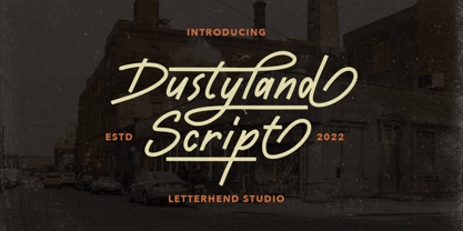 Dustyland Script is a monoline script with a touch of vintage look and feel. This type of font perfectly made to be applied especially in logo, headline, signage and the other various formal forms such as invitations, labels, logos, magazines, books, greeting / wedding cards, packaging, fashion, make up, stationery, novels, labels or any type of advertising purpose. Features : uppercase & lowercase numbers and punctuation multilingual alternates / swashes and ligatures PUA encoded We highly recommend using a program that supports OpenType features and Glyphs panels like many of Adobe apps and Corel Draw, so you can see and access all Glyph variations. How to access opentype feature : letterhend.com/tutorials/using-opentype-feature-in-any-software/ Email us to letterhend@gmail.com if you need something! Happy Designing!


