10,000 search results
(0.273 seconds)
- Polipop Playful Display Font by Maulana Creative,
$14.00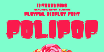 Polipop playful display font. Bold stroke, fun character with a bit of ligatures and alternates. To give you an extra creative work. Polipop playful display font support multilingual more than 100+ language. This font is good for logo design, Social media, Movie Titles, Books Titles, a short text even a long text letter and good for your secondary text font with script or serif. Make a stunning work with Polipop playful display font. Cheers, Maulana Creative
 - Star Candy 3d Display by Sipanji21,
$15.00 "Star Candy" is a display font with cute and thin characters. Fonts like this are often used in designs that aim to convey a charming and adorable feel. The thin and cute letterforms give a cheerful and enchanting appearance, making it suitable for a variety of design projects that want to emphasize a sense of cuteness, such as children's designs, greeting cards, decorations, or products that want to attract attention with their adorable appeal. If you have further questions about using this font or need assistance in a specific design context, please feel free to ask!
 - MC Blothe Display Font by Maulana Creative,
$13.00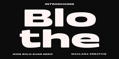 Blothe is a wide sans serif basic font. With bold extended stroke, fun character with a bit of ligatures and alternates. To give you an extra creative work. Blothe font support multilingual more than 100+ language. This font is good for logo design, Social media, Movie Titles, Books Titles, a short text even a long text letter and good for your secondary text font with handwritten or script. Make a stunning work with Blothe font. Cheers, Maulana Creative
 - FF Zine Sans Display by FontFont,
$65.99 German type designer Ole Schäfer created this sans FontFont in 2001. The family has 10 weights, ranging from Regular to Black (including italics) and is ideally suited for editorial and publishing and sports. FF Zine Sans Display provides advanced typographical support with features such as ligatures, alternate characters, case-sensitive forms, super- and subscript characters, and stylistic alternates. It comes with proportional lining and tabular lining figures. This FontFont is a member of the FF Zine super family, which also includes FF Zine Serif Display and FF Zine Slab Display.
 - Display Black Serif Rough by Gerald Gallo,
$20.00 Display Black Serif Rough is a rough version of my font Display Black Serif . It is a display font not intended for text use. It was designed specifically for display, headline, logotype, branding, and similar applications. Display Black Serif Rough has an uppercase alphabet located under the character + shift keys and a complete set of alternate uppercase characters located under the character set keys. It also has numbers and punctuation.
 - Display Dots Two Sans by Gerald Gallo,
$20.00 Display Dots Two Sans is a display font not intended for text use. It, along with its serif counterpart were designed specifically for display, headline, logotype, branding, and similar applications. Display Dots Two Sans has an uppercase alphabet, numbers, and punctuation.
 - Neue Haas Grotesk Display by Linotype,
$33.99 The first weights of Neue Haas Grotesk were designed in 1957-1958 by Max Miedinger for the Haas’sche Schriftgiesserei in Switzerland, with art direction by the company’s principal, Eduard Hoffmann. Neue Haas Grotesk was to be the answer to the British and German grotesques that had become hugely popular thanks to the success of functionalist Swiss typography. The typeface was soon revised and released as Helvetica by Linotype AG. As Neue Haas Grotesk had to be adapted to work on Linotype’s hot metal linecasters, Linotype Helvetica was in some ways a radically transformed version of the original. For instance, the matrices for Regular and Bold had to be of equal widths, and therefore the Bold was redrawn at a considerably narrower proportion. During the transition from metal to phototypesetting, Helvetica underwent additional modifications. In the 1980s Neue Helvetica was produced as a rationalized, standardized version. For Christian Schwartz, the assignment to design a digital revival of Neue Haas Grotesk was an occasion to set history straight. “Much of the warm personality of Miedinger’s shapes was lost along the way. So rather than trying to rethink Helvetica or improve on current digital versions, this was more of a restoration project: bringing Miedinger’s original Neue Haas Grotesk back to life with as much fidelity to his original shapes and spacing as possible (albeit with the addition of kerning, an expensive luxury in handset type).” Schwartz’s revival was originally commissioned in 2004 by Mark Porter for the redesign of The Guardian, but not used. Schwartz completed the family in 2010 for Richard Turley at Bloomberg Businessweek. Its thinnest weight was designed by Berton Hasebe.
 - Hard Lines Display Font by Sipanji21,
$16.00 Hard Lines - A Fun Display Font With Shadow Decoration inside. It will elevate a wide range of design projects to the highest level, be it branding, headings, wedding designs, invitations, signatures, logotype, wall art illustration, apparel, labels, and much more!
 - Deco Display Stencil JNL by Jeff Levine,
$29.00 Titles hand lettered for articles appearing in the November, 1938 issue of Hollywood Magazine were done in a condensed Art Deco stencil style in just lower case. This novelty type design is now available as Deco Display Stencil JNL in both regular and oblique versions.
 - Meave Multipurpose Display Typeface by Eotype,
$12.00 Meave is high contrast serif font features a mixed modern-classic design. Meave support multilingual languages, numbers, punctuation and alternative-ligatures. Create unique & beautiful logotype, use it as an elegant solution for your next magazine layout, or choose Meave for any graphics that require a sleek look with a elegant flair.
 - FF Zine Serif Display by FontFont,
$65.99 German type designer Ole Schäfer created this serif FontFont in 2001. The family has 10 weights, ranging from Regular to Black (including italics) and is ideally suited for editorial and publishing. FF Zine Serif Display provides advanced typographical support with features such as ligatures, alternate characters, case-sensitive forms, super- and subscript characters, and stylistic alternates. It comes with proportional lining and tabular lining figures. This FontFont is a member of the FF Zine super family, which also includes FF Zine Sans Display and FF Zine Slab Display.
 - Dro by KC Fonts,
$25.00 The Dro family is an all uppercase handmade font that resembles cut-out construction paper; Both fonts have 6 glyphs for each letter & 2 per number which are accessed by uppercase, lowercase, small caps & Contextual Alternates. Each font has 550+ glyphs total. When using Opentype applications Dro and Dro Fill take the handmade look further by cycling through Contextual Alternates, Small Caps & Double Letter Ligatures for a unique and authentic look to your creative. When not using the Contextual Alternates feature, you can still alternate between uppercase and lowercase letters and using Stylistic Sets to switch up the flow. The Dro family has an extended character set for multilingual support.
 - Gros by Atom,
$14.00 Gros is a handwritten font with a raw texture and consisting of all uppercase letters. If you want the writing to stand out, bold, very bold, giving your design a very strong impression and attract attention, Gros is perfect for your design needs. Highlight your designs with Gros!
 - Pero by Dharma Type,
$24.99 Pero is a condensed rounded sans-serif family designed by Ryoichi Tsunekawa and the whole family consists of 7 weights from ExtraLight to ExtraBold.The range of styles provides flexibility for title, headline and body text. And the large x-heights add to legibility. The basic skeleton of the letterform was designed modularly and minimalized by removing unnecessary stems and ends were rounded out. The minimalized modular design gives this family contemporary urbane taste and rounded corners make this family warm and friendly. This rounded feature will also accentuate your design work moderately. Pero supports almost all European languages: Western, Central, South Eastern Europeans and afrikaans. And superior figures, inferior figures, denominators, numerators and fraction can be accessed by using OpenType features.
 - Progs by Holis.Mjd,
$14.00 Progs Font is a messy, disorganized handwriting font equipped with several unique special alternates in the uppercase “O” and lowercase “o” letters, looks natural and realistic, suitable for social media, branding, quotes, packaging labels and other designs.
 - Pea Amy*Rica Script - Unknown license

- Nuixyber Pro Convert - Personal use only

- Source Code Pro - 100% free

- Dot.com Reverse Pro - Unknown license

- Wolf's Bane Pro - Personal use only

- VTC Letterer Pro - Unknown license

- Amiga Forever Pro - Unknown license

- Schnebel Slab Pro by URW Type Foundry,
$35.99 The refreshingly clear Antiqua Schnebel Slab is a refreshingly clear and strong interpretation of a contemporary Antiqua with subtle contrast and firm serifs, which offer excellent readability at very small size, and, at the same time, provide a lot of expression for use in headlines. The italics, drawn specifically for this purpose, contribute to a harmonious picture, which never loses creative tension, thanks to its aesthetics. The careful addition of ligatures, small caps, and proportional and old-style figures allows for well-proportioned typesetting. The condensed and expanded variants, which also come in 6 weights each, offer plenty of freedom to design with numerous combinations. Schnebel Slab Pro combines especially well with Schnebel Sans Pro.
 - Chocolate Box Pro by CheapProFonts,
$10.00 The lowercase has classical Roman letterforms, and together with the cute, swirly capitals they make for a slightly more feminine take on the genre. Trajan lettering - with added sugar! ALL fonts from CheapProFonts have very extensive language support: They contain some unusual diacritic letters (some of which are contained in the Latin Extended-B Unicode block) supporting: Cornish, Filipino (Tagalog), Guarani, Luxembourgian, Malagasy, Romanian, Ulithian and Welsh. They also contain all glyphs in the Latin Extended-A Unicode block (which among others cover the Central European and Baltic areas) supporting: Afrikaans, Belarusian (Lacinka), Bosnian, Catalan, Chichewa, Croatian, Czech, Dutch, Esperanto, Greenlandic, Hungarian, Kashubian, Kurdish (Kurmanji), Latvian, Lithuanian, Maltese, Maori, Polish, Saami (Inari), Saami (North), Serbian (latin), Slovak(ian), Slovene, Sorbian (Lower), Sorbian (Upper), Turkish and Turkmen. And they of course contain all the usual "western" glyphs supporting: Albanian, Basque, Breton, Chamorro, Danish, Estonian, Faroese, Finnish, French, Frisian, Galican, German, Icelandic, Indonesian, Irish (Gaelic), Italian, Northern Sotho, Norwegian, Occitan, Portuguese, Rhaeto-Romance, Sami (Lule), Sami (South), Scots (Gaelic), Spanish, Swedish, Tswana, Walloon and Yapese.
 - Schuss Slab Pro by typic schuss,
$42.56 I was working about 10 years exclusively for a type company. Based on my experiences, I built this superfamily. Schuss™ Sans PCG is a humanistic sans-serif with a little contrast. Small Caps, greek and cyrillic are included. Also tab, prop, lining, old style and small cap figures. It's a typeface with clear and open characters. All complicated shapes are cleaned and simplified with a bit elegance. Schuss™ Slab Pro is a slab serif, based on the Schuss™ Sans. Schuss™ News Pro is the modeled style between Schuss™ Slab Pro and Schuss™ Serif Pro. Schuss™ Serif Pro is the antiqua shape. Additionally all serifs are cleaned up. There is just one-side-serif in the "n" for example. Tab figures (except small caps), mathematical signs and currency symbols have a width system accross all styles and weights.
 - Iwata Kyokasyo Pro by IWATA,
$199.00 児童教育のためにトメ、ハネ、ハライ、筆順や画数を明確にした書体です。 教育用書籍だけでなく、様々な書籍にもご使用いただけます。
 - Appetite Pro Rounded by Serebryakov,
$39.00 Appetite Pro Rounded is an extension of the world wide popular display fonts Appetite Pro (2016) and Appetite Rounded (2011). Appetite Pro Rounded consists of 10 weights — 5 regular and 5 italic — from Light to Heavy. It’s a multilingual and international rounded font, with a full western latin, cyrilyc (russian, belarusian, ukrainian) and basic Greek support. Appetite Pro Rounded font family special designed made in addition for Appetite Pro. Due to the 10 weights rounded font and 10 weights normal weights palette you can solve a wide variety of professional problems without spending money on extra fonts for titles, sub-titles and main text.
 - Nexus Typewriter Pro by Martin Majoor,
$49.00 Nexus (2004) consists of three matching variants – a serif, a sans and a slab – which makes it a highly versatile typeface. Nexus started as an alternative to Seria, a typeface Majoor had designed some 5 years earlier. But soon the design developed into a new typeface, with numerous changes in proportions and in details and with a redrawn italic. Besides the three connected versions (Nexus Serif, Nexus Sans, Nexus Mix) Majoor designed a monospaced version called Nexus Typewriter. The Nexus family is a workhorse typeface system like Scala, with features such as small caps in all weights, four different sorts of numbers and an extensive set of ligatures. All fonts in the Nexus family come in regular, italic, bold and bold italic. Free bonus: there are more than 100 elegant Swash italics and dozens of arrows and other icons. The Nexus family was awarded the First Prize at the Creative Review Type Design Awards 2006.
 - Economica Cyrillic PRO by Underground,
$29.90 Economica Pro is a font especially developed for design in complex situations: It is ideal for use in small sizes on screen and in print. It has been tested successfully for use in very small sizes without losing legibility. Its ink traps ensure smooth operation even on low quality papers. It is an ideal font for newspapers, news portals and all designs requiring space saving. Now also in Cyrillic!
 - Laureen pro Arabic by Zaza type,
$29.00 Laureen pro typeface Laureen pro is an Arabic typeface that has a very particular appearance. It combines the characteristics of different genres; most notably the contrast of serif faces. While its design is influenced by Kufic and the Naskh style. Laureen pro consists of two typefaces, text and display, and 4-weights. It’s a perfect choice for bold headlines, oversize typography, fashion logos, branding, identity, website design, album art, covers, posters, advertising, etc.
 - Fontleroy NF Pro by CheapProFonts,
$10.00 I have completely redone the spacing in this font, making the sidebearings more conventional. And after replacing the kerning with fresh pairs working together with the new spacing the font looks like a real gem. I love it! The inline version has a wider spacing after the letters CEK = no connecting words. Otherwise just as lovely and retro! Nick Curtis says: "Here’s a strange hybrid: I took the lower case from the formal script font Stuyvesant, straightened out its rather extreme 22° slant, and combined them with caps from the font Bellevue, again making them upright, and adding an inline effect. The result is a font that flows very nicely, with a nice balance between clean lowercase characters and swashy caps. Thanks to Deb Dunbar for naming this font. Fontleroy Brown is the solid version, produced at the request of the King of Ding, Jeff Levine." ALL fonts from CheapProFonts have very extensive language support: They contain some unusual diacritic letters (some of which are contained in the Latin Extended-B Unicode block) supporting: Cornish, Filipino (Tagalog), Guarani, Luxembourgian, Malagasy, Romanian, Ulithian and Welsh. They also contain all glyphs in the Latin Extended-A Unicode block (which among others cover the Central European and Baltic areas) supporting: Afrikaans, Belarusian (Lacinka), Bosnian, Catalan, Chichewa, Croatian, Czech, Dutch, Esperanto, Greenlandic, Hungarian, Kashubian, Kurdish (Kurmanji), Latvian, Lithuanian, Maltese, Maori, Polish, Saami (Inari), Saami (North), Serbian (latin), Slovak(ian), Slovene, Sorbian (Lower), Sorbian (Upper), Turkish and Turkmen. And they of course contain all the usual “western” glyphs supporting: Albanian, Basque, Breton, Chamorro, Danish, Estonian, Faroese, Finnish, French, Frisian, Galican, German, Icelandic, Indonesian, Irish (Gaelic), Italian, Northern Sotho, Norwegian, Occitan, Portuguese, Rhaeto-Romance, Sami (Lule), Sami (South), Scots (Gaelic), Spanish, Swedish, Tswana, Walloon and Yapese.
 - Faber Sans Pro by Ingo,
$42.00 A classic-modern sans serif appearing in two forms — ”standard“ and a ”stylistic alternate“ with uncial script-orientated characters which give the font a completely different ”look.“ Faber Sans is a sans serif in the classic-modern style of type creations of the early 20th century — godfathered by Futura from Paul Renner and Gill Sans from Eric Gill. Unlike classic sans serifs, Faber Sans includes a ”true“ italic. Faber Sans Pro will perfectly pair with the accompnying Roman Faber Serif Pro.
 - SF Droob Pro by Sultan Fonts,
$19.99 Droob Pro is a Latin Arabic typeface for print and web, an upgraded version of the Droob7 font, featuring clarity and high readability. The Droob Pro font family contains two weights: Regular and Bold. This font supports Arabic, Latin, Farsi, Urdu, and Kurdish.
 - Railroad Gothic Pro by Red Rooster Collection,
$60.00 Railroad Gothic Pro is a condensed, sans serif typeface, exclusively licensed from the Ludlow Collection. The original Railroad Gothic was produced by Ludlow in the early 1900’s, and Steve Jackaman (ITF) produced the digital version in 2017. The font provides support for Latin 1, Central, and Eastern European languages, and Cyrillic. Railroad Gothic Pro is reminiscent of typefaces used in 1900’s railyards, hence the name.
 - Iwata GMincho Pro by IWATA,
$199.00 教科書や参考書、問題集などの教育教材作成のために開発された明朝体です。 筆やペンの入り、押さえ、ハネ、トメ、筆順などを理解しやすいようデザインしています。
 - Korpus Serif Pro by RMU,
$50.00 Inspired by Timeless, Korpus Serif Pro is a completely fresh redesign of this former Typoart font family. All four styles - Regular, Italic, Demibold and Demibold Italic - contain besides the West and Central European glyph tables also those of Greek and Cyrillic as well as Small Caps and Oldstyle figures. All these features make this font family a highly versatile one.
 - Jay Handwriting Pro by SoftMaker,
$15.99 Digitized handwriting fonts are a perfect way to give documents the “very special touch”. Invitations look simply better when handwritten than when printed in bland Arial or Times New Roman. Short handwritten notes look authentic and appealing. There are numerous occasions where handwritten text makes a better impression. “Jay Handwriting Pro” is a beautiful typeface that mimics true handwriting closely. Use Jay Handwriting Pro to create stunningly beautiful designs easily.
 - Pro League 2020 by Alphabet Agency,
$20.00 Pro League 2020 font family is a sleek modern sans serif font family that provides italic and weight options that balance well with each other and provide various options for the user. If you are looking to present a clean, sleek professional look that is easy on the eyes - then this is a font family for you. Pro League 2020 font family contains 6 fonts - Pro League 2020 Condensed Regular, Pro League 2020 Condensed Regular Italic, Pro League 2020 Condensed Light, Pro League 2020 Condensed Light Italic, Pro League 2020 Condensed Extra Light and Pro League 2020 Condensed Extra Light Italic.
 - Vigilance BRK Pro by CheapProFonts,
$10.00 A very angular font, not one curve in sight - it's hip to be square! The font includes quite a few alternate letterforms, which I've also made available in combinations with diacritics. These alternates are available via your programs' glyph palette or using the OpenType functions "Stylistic Alternates" and/or "Stylistic Sets ss01-ss04". ALL fonts from CheapProFonts have very extensive language support: They contain some unusual diacritic letters (some of which are contained in the Latin Extended-B Unicode block) supporting: Cornish, Filipino (Tagalog), Guarani, Luxembourgian, Malagasy, Romanian, Ulithian and Welsh. They also contain all glyphs in the Latin Extended-A Unicode block (which among others cover the Central European and Baltic areas) supporting: Afrikaans, Belarusian (Lacinka), Bosnian, Catalan, Chichewa, Croatian, Czech, Dutch, Esperanto, Greenlandic, Hungarian, Kashubian, Kurdish (Kurmanji), Latvian, Lithuanian, Maltese, Maori, Polish, Saami (Inari), Saami (North), Serbian (latin), Slovak(ian), Slovene, Sorbian (Lower), Sorbian (Upper), Turkish and Turkmen. And they of course contain all the usual "western" glyphs supporting: Albanian, Basque, Breton, Chamorro, Danish, Estonian, Faroese, Finnish, French, Frisian, Galican, German, Icelandic, Indonesian, Irish (Gaelic), Italian, Northern Sotho, Norwegian, Occitan, Portuguese, Rhaeto-Romance, Sami (Lule), Sami (South), Scots (Gaelic), Spanish, Swedish, Tswana, Walloon and Yapese.
 - Directors Cut Pro by Type Innovations,
$39.00 Directors Cut Pro is a compelling new font series designed by Alex Kaczun. It recently won the second place—a commendation in the Canberra Typeface Competition. This handsome Geometric Antique serif design is based on the early 19-century Moderns and Scotch styles, infused with the warm charm of traditional antique, added for interest. Capturing the best of both ages: it's warm, comforting and persuasive. Directors Cut Pro's graceful aspects naturally invite uses at large sizes, for which we have created a stunning and elegant lighter weight. But, this workhorse typeface series incorporates a solid regular weight, along with its italic—ideal for a multitude of text purposes, at varying point sizes. A robust Bold weight is available for headlines and emphasis. Director Cut Pro comes with proportional as well as tabular lining figures for quickly setting up charts and tables. It also contains an extended character set—including most Central European languages. Alex Kaczun is in the process of expanding this typeface series to include additional weights, styles and proportions. Stay tuned! The large Pro font character set supports most Central European and many Eastern European languages.


