10,000 search results
(0.032 seconds)
- Bearish by Trim Studio,
$12.00 Bearish is a handwritten modern display font, inspired by kids handwriting. It's perfectly suited for crafters and graphic artists to complete their design such as invitations, advertisements, posters, logos, birthday carts, product signs, and many more. Bearish contains all standard glyphs and punctuations.
 - Spooky Vibes by Ake,
$18.00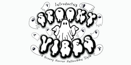 Spooky Vibes is a charming and groovy Halloween display font. Infuse your designs with playful retro spirit and delightful spookiness. Perfect for invitations, posters, and more, this font adds a captivating twist to your Halloween creations. Unleash your creativity with Spooky Vibes today!
 - Distressed Groovy Funky by Beast Designer,
$15.99 Distressed Groovy Funky Font is a cute classic display font. It’s suitable for retro design also perfect for designing t-shirts, tote bags, hats, stickers, wedding designs, logos, cards, and more! Incredibly distinct and timeless style and use it to create spectacular designs!
 - Smileday by PandAE86,
$8.00 Smileday embodies fun, quirkiness and authenticity. Use this gorgeous and unique display font to bring any DIY project to life! What will you get ? Uppercase Lowercase Numeral Punctuation Ligatures Multilingual characters support Thank you and have a nice day ! Dedi T A
 - Momotako by Almarkha Type,
$22.00 Momotako is a Cute Playful Display font that will make your designs look modern, unique and fun. It’s perfect for labels, quotes, posters, DIY projects, branding, packaging, greeting cards, websites, photos, photography overlays, signs, window art, scrapbooking, tags and so much more!
 - Kopi Arabica by Gassstype,
$22.00 Kopi Arabica is Unique Playful Display Font that will make your designs look modern, unique and fun. It’s perfect for labels, quotes, posters, DIY projects, branding, packaging, greeting cards, websites, photos, photography overlays, signs, window art, scrapbooking, tags and so much more!
 - Pinot Grigio Modern by Alan Meeks,
$45.00 A modern update of the unique sans display font Peignot originally designed in 1937 by A. M. Cassandre. The font has been modernised by making all the terminals soft and making a larger x height and lessening the contrast between thick and thin.
 - ATC Duel by Avondale Type Co.,
$20.00 ATC Duel is a strong, extra heavy multi-width sans-serif display font with sharp edges and an extended horizontal span, inspired by the automotive industry. Font contains 500+ glyphs, full alphabet, ligatures, numberals, accents and punctuation. ATC Duel was released in 2016.
 - New Prairie by Aboutype,
$24.99A modern text design with a medium x-height and short ascenders. The axis of the curves is inclined to the left in the Old Style tradition. New Prairie was kerned for text point sizes but requires subjective display kerning and compensation. - HV Constantine by Harmonais Visual,
$10.00 Constantine - an exquisite display modern serif, inspired by classic roman arts and vintage cars aesthetics. Specially designed for luxury, clean, high-end projects, perfectly suitable for creating elegant, classy design such as magazine, social media, and more. The font features standard ligatures.
 - ST Titan by ShimanovTypes,
$20.00 ST Titan is a retro futuristic display font with vintage vibes, inspirated by old sci-fi book's headers and posters. It's good for social media, headlines, large-format print, branding, posters, fashion designs and websites. Extended Latin and Cyrillic support. 30+ languages
 - Smile Yellow by Sakha Design,
$10.00 Smile Yellow is is a cute and colorful display font. It embodies playfulness and authenticity and is the perfect choice for any children activity or school project. Add this chunky lettered font to your designs and notice how it makes them come alive!
 - FP Head by Fontpartners,
$29.00 FP Head is a redesign of a corporate typeface for the Danish trade union FOA. Head is a extended display font, with a blurred look and a touch of FF Max: Hard and soft at the same time. Available in two versions.
 - Riveno by GuseType,
$12.00 Riveno is a display font with sharp edge. This font can be used in a various of designs such as headlines, cover, poster, logo and more. Feature: - Kerning - Alternative Style and Ligature - Uppercase and Lowercase Letters - Numeral - Punctuation and Symbols - Multilingual Supports
 - Kunze by Kitchen Table Type Foundry,
$15.00 Kunze font was inspired by the work of German graphic artist Carl Kunze (Minden, 1884). Kunze is a fat display font; a little rough around the edges, a little wonky in places, but very distinguishable and useful. Comes with extensive language support.
 - Dash Grid by Gleb Guralnyk,
$13.00 Hi there, introducing an abstract font named Dash Grid. At's a geometric display typeface made of square dashed blocks. Dash Grid font supports most of the european latin languages and includes ukrainian cyrillic alphabet (check out all available characters on the last screenshot).
 - Merchanto by Type Juice,
$19.00 Merchanto is a condensed sans serif display typeface made up of 8 fonts in a variety of styles and weights. Included are over 500 stylized alternate glyphs for creative control and customization. 8 fonts total Over 500 Alternates Multilingual Over 2300+ glyphs
 - Absolute Kiddos by Krakenbox Studio,
$15.00 Absolute Kiddos is a cute and playful display font. Use this font to add that special cool touch to any design idea you can think of! It is perfect for any branding project such as logos, t-shirt printing, creative products, and more
 - Slutsker Script by ParaType,
$30.00Designed in 2003 by Isay Slutsker and Irina Smirnova. Based on the calligraphic typeface of mid-1980 by Moscow type designer Isay Slutsker (1924-2002). There is a free variation of flat nib pen calligraphy. For use in advertising and display typography. - Wavy Rounded BT by Bitstream,
$50.99Wavy Rounded is a stylized sans serif display typeface by Japanese designer Hajime Kawakami. Some of the characters possess quirky features that randomly create fun visual “waves”. There is a handful of alternate characters including an old style figure set. Catch the Wave. - Golden Signer by Letrasupply Typefoundry,
$20.00 Golden Signer was inspired by vintage and tattoo letters. The font family comes with Regular and Serif type, completed with alternates characters, deboss style, shapes and also free ornaments. Golden Signer is a perfect package for any project that needs display lettering.
 - Fokers by Letterhend,
$14.00 Fokers, a new display typeface with classy and luxury look! Fokers' different styles works perfectly for headline, logotype, apparel, invitation, branding, packaging, advertising, and more. Fokers comes in uppercase, lowercase, with punctuation, symbols, numerals, stylistic set alternate, ligatures and also multi-lingual support.
 - Ysobel by Monotype,
$29.99 The Ysobel™ typeface family is not only elegant; it is also exceptionally legible and space economical. A collaborative design effort between Robin Nicholas, as lead designer and project director, Delve Withrington and Alice Savoie of Monotype Imaging, the project had the primary design goal of creating a typeface family for setting text in newspapers and periodicals. The result, however, is also ideal for any application that requires quick and easy assimilation of text. According to Nicholas, “The idea for the design started when I was asked to develop a custom version of Century Schoolbook. I wanted to give the design a more contemporary feel, although the client ultimately decided to keep their typeface closer to the original. The project nevertheless gave me ideas for a new design. Since designing Nimrod, some 30 years ago, I had wanted to make a more modern typeface family for newspapers and magazines – this seemed the ideal candidate.” Ysobel (pronounced “Isabel”) has the soft, inviting letter shapes of Century Schoolbook but contrasts these with more incised serifs and terminals. Its capitals are also narrower than those of Century Schoolbook, and care was taken to ensure that they harmonize perfectly with the lowercase. Ysobel’s x-height is full-bodied without disrupting lowercase proportions. In addition, curved terminals, such as those in the “C,” “c” and “e,” were drawn more open as an aid to legibility and readability in text copy. Weight stress is near vertical, and hairlines are robust to ensure character fidelity in small point sizes. Development began with the text version of the family, which has four weights, each with an italic companion. All weights feature lining and old style numerals, fractions, superiors and extended Latin language coverage. Small caps are also available in the Roman Regular design. Ysobel Display is a completely redrawn version of the typeface; it is narrower, and has a slightly smaller x-height, thinner hairlines and subtle design changes to improve its appearance when set at large sizes. The Display Italic received particular attention to make it ideal for setting headlines, subheads and short blocks of copy. Changes include a slightly greater italic angle and more cursive treatment of some letter shapes. Alternative styles of capital “J” and “Q,” to provide variation, are available in all weights.
 - Obcecada Sans - Personal use only

- Gotten Say by Rhd Studio,
$20.00 Gotlen Say, I hope you are interested in this font, if you want to use it for your work This font can be used easily and simply because there are many features in it it contains a complete set of lowercase and uppercase letters, various types punctuation, numbers, and multilingual support. Fonts also contain several Binder and Device Style Style for those of you who have software it can work. Any question? Send me a message! I'm ready to answer any pre-sale or post-purchase questions you may have about this product!
 - HGB Bluesband Two by HGB fonts,
$23.00 The roots of this font go back to 1967. A book title in trendy letters was created in a completely ingenuous way as a film prop for a Super 8 fun film. I drew the letters with felt-tip pen and poster paint without thinking too much about it. It wasn't until a good 50 years later that I realized, this was a first awkward typeface draft. The flower power vibe was captured here subconsciously. In 2019 I completed the few glyphs and created variants that I would not have thought of at the time.
 - Bridget by Anaya Studio,
$18.00 Bridget I hope you are interested in this font, if you want to use it for your work. This font can be used easily and simply because there are many features in it contains a complete set of lowercase and uppercase letters, various types punctuation, numbers, and multilingual support. Fonts also contain several Binder and Device Style Style for those of you who have software it can work. Any question? Send me a message! I'm ready to answer any pre-sale or post-purchase questions you may have about this product! Enjoy! Regards,
 - Deco Eccentrique JNL by Jeff Levine,
$29.00 The inspiration for Deco Eccentrique JNL was initially hand drawn contoured lettering from a mid-1920s piece of sheet music; the style of the letters showing influences of the upcoming Art Deco movement. This was made into a digital font entitled Poster Contoured JNL. Once all of the excess parts of the previous design were stripped away to only the inner letters, the pre-Art Deco influences remained along with characters of varying stroke widths and shapes. This non-conformist type face is available in both regular and oblique versions.
 - Dutch Deco JNL by Jeff Levine,
$29.00 Although the Art Deco movement is generally attributed to the 1930s and 1940s, a number of design influences were showing up during the late 1920s in what is referred to as the Art Nouveau period. The Dutch illustrator Anton Kurvers’ hand lettering on the front cover of the (1927) magazine “Het Vlaamsche Volstooneel” clearly shows the clean lines and Avant Garde geometrics that foreshadow Art Deco. This attractive pre-Deco lettering has been recreated digitally as Dutch Deco JNL, and is available in both regular and oblique versions.
 - Psychophante by Kenn Munk,
$15.00Remember back in the day when medals where for The Beatles and foreign dictators only? No more! Psychophante is a 64 pixel medal-building dingbat. Make fresh pixly medals (like the 'I Really Like Your 'fro medal' and the 'Best Hotel Booker medal') for yourself and/or for friends who deserve them. Each medal is made up of three interchangable parts: - Uppercase consonants are the top of the medal. - Vowels are the middle. - Lowercase consonants are the dangly bit. Numerals are special characters, to be followed by a lowercase consonant - HGB Bluesband One by HGB fonts,
$23.00 The roots of this font go back to 1967. A book title in trendy letters was created in a completely ingenuous way as a film prop for a Super 8 fun film. I drew the letters with felt-tip pen and poster paint without thinking too much about it. It wasn't until a good 50 years later that I realized, this was a first awkward typeface draft. The flower power vibe was captured here subconsciously. In 2019 I completed the few glyphs and created variants that I would not have thought of at the time.
 - PAG Trust by Prop-a-ganda,
$19.99Prop-a-ganda offers retro-flavored fonts inspired by lettering on retro propaganda posters, retro advertising posters, retro packages all the world over. This is perfect font for your retrospective project. Almost all the letters of PAG Trust are drawn by bold line, but some bars are very thin line and counters are extremely small. With this font, regular typed text transformed into unique typography. We can’t decide the impression of PAG Trust, depending on how to use it, it can be cute package, retro book cover or propaganda poster of Cuba. - Antoine by Anastasia Kuznetsova,
$19.00 Introducing Antoine — is a vintage retro display typeface. The three font combinations I launched are very compatible if for the victorian classic design concept. As for if the font was worn by itself, without combinations are also brave!! In addition to many get unique character, luxury, brave and elegant. You also have a collection ornament, very suitable if in the gradient. This font is also very easy to use with other design programs or with out design program. Antoine Typeface is perfect for beverage label design project. coffee label. logotype design, badges, classic wedding concept. victorian design concept and so on. gig poster, letterhead, droop cap, titles, and any artworks. Now it’s your time to go crazy and explore the uniqueness of this typeface!! I invite you to familiarize yourself with the preliminary images and hope that you will be imbued with my vision of this creative font, which, I am sure, will be suitable for all the interesting projects you are working on. Fonts can be opened and used in any software that can read standard fonts, even in MS Word. No special software is required to get started. It is recommended to use it in Adobe Illustrator or Adobe Photoshop. Made with love and magic ♡ Thank you for reading it, and do not hesitate to send me a message if you have any questions! ~ Anastasia
 - Cora by TypeTogether,
$49.00 Cora is a sans serif with an experimental bent, offering a large x-height, some contrast of stroke weight, and capitals inspired by classical lettering. The large x-height gives it a voice with a little more volume so that those in the back of the room have no trouble hearing. Because the letters seem slightly large, Cora remains clear at smaller point sizes. It is a typeface intended to perform well on screen without losing its attraction in print and the nature of its shapes allows for condensation or expansion without becoming severely distorted. The uppercase exhibits classical proportions found in ancient Roman inscriptions, which provides opportunities for setting titles in all caps. Cora Opentype Pro has a full range of numerals for every use, small caps, the most common open type features and supports many languages that use the latin extended alphabet. It is available in a range of three weights plus Italics. CoraBasic is a reduced version of Cora. It is still an OT-font but without any particular features except of a set of ligatures, class-kerning and language support including CE and Baltic.
 - Festive by TypeSETit,
$49.95 It's Festive! But don't let the name fool you... It's a fun script font (plus a Roman) accompanied by an assortment of exciting ornamental dingbats. In fact, it's the ornamentals that make this font so much fun! At first glance, Festive appears to be suited only for the Christmas holiday season. But wait… you can use the ornamental dingbats for any occasion where festivities abound— New Years, Valentines, St. Patty's Day, Back to School, Graduation, Baby & Wedding Showers, Halloween, Thanksgiving, and much more— even Sports. The base font works well with bodies of copy, while the alternate fonts can be used to swap out individual characters to give a custom, hand written look. Be sure to scroll thru to see all 14 fonts in this package—especially the fun ornamental dingbats. Festive Regular is included with all the alternate fonts (Festive One thru Ten) which are sold as two font sets. The PRO version contains all the glyphs of the family plus OpenType programming to easily access alternates. The Festive family of fonts are PUA encoded, so you can access them easily. So, get in the mood and have FESTIVE fun!
 - Romp by Positype,
$30.00 With all ego aside, Romp was designed and influenced by my daughter, Angel. For some time now, she has wanted me to design a font based on her handwriting. But each time I sit down to do it, I run into more that she needs to do and redo. On a recent attempt, I ran into the same situation again. Instead of moving on to something else, I decided to whip out a sumi brush and start making letters...for me, type design is something a little ‘serious’ and never a time to just have fun. This typeface proved that notion wrong—it really was fun. As a result, each letter encouraged another and the design grew...and grew! The happy result spawned 3 separate sets of letters & numerals (small caps and some ligatures too!). Using the beauty of OpenType, these 3 sets have been fused into one, randomly generating font set. If you are using any type of OpenType enabled application, then the Romp Pro typeface is the way to go. They include everything found in the 3 separate variants for each style as well as entirely expanding offering of additional small cap and ligature sets.
 - Sagrantino by Monotype,
$50.99 Sagrantino™ shines at large sizes – and in vibrant colors. Think big posters, commanding headlines, massive banners and oversized packaging. Set headlines in the Highlight or Shadow designs and running copy in the Regular – all on the same page! Sagrantino could be called the Lava Lamp of fonts. It’s slick, glossy, retro and futuristic. Somehow, it’s fresh and quirky-classic at the same time. This is a design that challenges you to think outside the text box. In fact, Sagrantino is so lively, it took three Monotype typeface designers, Karl Leuthold, Juan Villanueva and Carl Crossgrove, to draw it. Because it’s a script, Sagrantino pairs perfectly with just about any other design – except another script. Maintain the futuristic retro vibe by combining Sagrantino with a typeface like Biome™ or Neo™ Tech. Looking for a counterpoint? Try a cool sans like Avenir® Next or Univers® Next. OpenType® Pro fonts of Sagrantino enable automatic insertions from a crowd of fancy ligatures and delightful alternate characters – in addition to offering an extended character set supporting most Central European and many Eastern European languages.
 - Blanchard by Canada Type,
$39.95 Blanchard is a revival and elaborate extension of Muriel, a 1950 metal face made by Joan Trochut-Blanchard for the Fonderie Typographique Française, that was published simultaneously by the Spanish Gans foundry under the name Juventud. Blanchard is a script that embodies the post-war narrow decorative aesthetic that would become the instantly recognizable feature of that era’s design. Its high ascenders corners make it the tuxedo of fonts, with slight and casual angles gradually revealing a trustworthy confidante, and sharp corners signaling a most expressive ally. Font. James Font. This digital version updates the original metal shapes to work within today’s design tools and designer needs. Some of the questionable metal shapes were optimized, plenty of alternates were added, and as many as five ending forms were built for most lowercase letters. Overall, this is one of the most useful packages for book cover, magazine and packaging design. Blanchard is available in all popular formats. Blanchard Pro combines all five fonts into a single one that makes use of OpenType’s cross-platform compatibility and programs that support OT’s fine typography features, like recent versions of Adobe InDesign and QuarkXpress.
 - Dreaming Outloud by My Creative Land,
$15.00 Say hello to a casual handwritten font family - Dreaming OutLoud. 8 handwritten typefaces made to complement each other in the best possible way. They are easy to use and perfect for expressing your thoughts, posting quotes and simple daily updates on social media. The font package is complemented by more than a 100 transparent background marker lines (easy to change color!) - to emphasise what you are saying :) - and dingbats & doodles font. Two sub-packages included: Elementary package. Use this one if you primarily work in Canva/Cricut and similar applications and don’t want to deal with OpenType features of the PRO fonts. To access alternates - simply change the font to it’s ALT version. Voilà. You can use these fonts on your iPad in Procreate app! Charged package. You need this one if you feel comfortable with OpenType features, if you work in Adobe Suite and similar applications that have OpenType panel to access OT features. You can use these fonts in Canva-like applications as well - they are fully unicode mapped. Contact me with your MyFonts order # to get a free bonus - more than a 100 "Marker selection lines" in png and psd
 - Quijote Sauvage by Lián Types,
$45.00 It was in the beginning of 2008 when I designed a font named Quijote, its predecessor. In the middle of 2009, I looked at it again and thought it could be a good idea to make an update of it. Variables and Features: Quijote Sauvage Pro is the most complete variable. It includes all the ligatures, alternates and swashes. It has the OpenType function in order to alternate glyphs easily when running applications which support this. The font is also offered separately. Quijote Sauvage Standard has the right glyphs to get an equilibrium between wildness and softness. It includes standard and discretionary ligatures. Quijote Sauvage Stylistic has the sharpest glyphs. Its decorative traces are discreet in order not to have problems as regards legibility. Its upper case are less wild than the other variables. Quijote Sauvage Text is the most discreet of its partners. This one was thought in order to improve legibility. Its ascenders and descenders are shorter, so the words are easier to read in small sizes. Quijote Sauvage Contextual, Swash and Titling, are the ones with wonderful terminals. They decorate words, adding a wonderful look of wildness or passion.
