10,000 search results
(0.044 seconds)
- Skagwae by Ingrimayne Type,
$7.95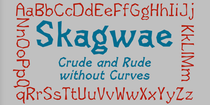 The characters of Skagwae have no curves, just straight line segments. The letter shapes themselves are fairly standard, but the choppy line segments used to construct them give the fonts a crude, unfinished look that is highlighted at large point sizes. At small point sizes the fonts are surprisingly legible. The family has nine styles. The regular, bold, italic, bold italic, shadow, and shadow inside styles are proportionally spaced. Shadowinside is very similar to regular but is spaced to be used in a layer with the shadow style. SkagwaeMono-Regular and SkagwaeMono-Bold are monospaced versions of the family. A third monospaced style, SkagwaeMono-Rippled, is a distorted version with squiggly lines full of curves.
 - Ledare by Mans Greback,
$39.00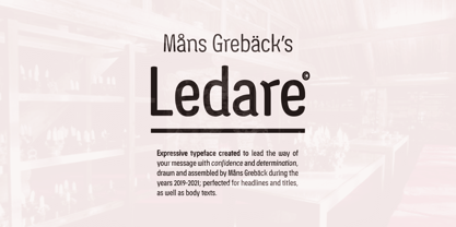 Ledare is a dynamic sans-serif typeface. Created by Mans Greback between years 2019-2021, this expressive font leads the way of your message with confidence and determination. It has a soft, easy-going outlook, yet is formal and rigid. The Ledare family consists of 14 fonts: Thin, ExtraLight, Light, Medium, Bold, ExtraBold and Black, with each weight as italic. The font is built with advanced OpenType functionality and has a guaranteed top-notch quality, containing alternates, ligatures and more features; all to give you full control and customizability. It has extensive lingual support, covering all Latin-based languages, from North Europa to South Africa, from America to South-East Asia. It contains all characters and symbols you'll ever need, including all punctuation and numbers.
 - San Andre by Mans Greback,
$59.00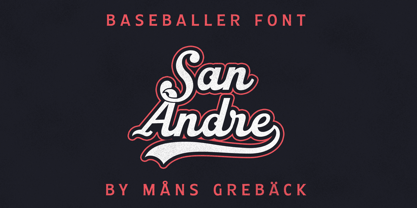 San Andre is a sport script font. Drawn and created by Mans Greback in 2021, this logotype lettering has a distinct retro style and a strong vintage personality, with a combination of soft brushes and strict backbones. Use multiple underscores to make swashes of different lengths. Examples: Andreas______ Athletics_______ (Download required.) San Andre is built with advanced OpenType functionality and has a guaranteed top-notch quality, containing stylistic and contextual alternates, ligatures and more features; all to give you full control and customizability. The font has extensive lingual support, covering all Latin-based languages, from North Europa to South Africa, from America to South-East Asia. It contains all characters and symbols you'll ever need, including all punctuation and numbers.
 - 1776 Independence by GLC,
$38.00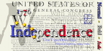 1776 Independence was designed inspired mainly from the Caslon typeface used by John Dunlap in the night of 1776 July 4th in Philadelphia to print the first 200 sheets of the Congress' Declaration of Independence establishing the United States of America. I just added accented letters and a few others, with respect for the original design. A render sheet,enclosed with font file, help to identify them on keyboard. It can be used as web-site titles, posters and fliers, editing ancient texts, menus or greeting cards as a very decorative font... This font supports as easily enlargement or small size, remaining clear and easy to read from 8 or 9 points to 72 and over. It gives a smart look especially to prints.
 - Stayola by Mans Greback,
$49.00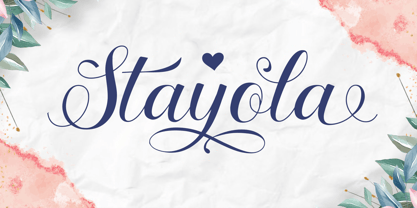 Stayola is a beautiful calligraphic typeface. This script font has strong contrasts and wonderful flow. Its feminine twists and swirls makes for a lettering with a charming style and quirky personality. The Stayola family consists of eight distinct font styles: The weights Light, Bold, Black, each as the cute Heart style and the decorative Swash variation. The font is built with advanced OpenType functionality and has a guaranteed top-notch quality, containing stylistic and contextual alternates, ligatures and more features; all to give you full control and customizability. It has extensive lingual support, covering all Latin-based languages, from North Europe to South Africa, from America to South-East Asia. It contains all characters and symbols you'll ever need, including all punctuation and numbers.
 - Quilt Patterns Three by Gerald Gallo,
$20.00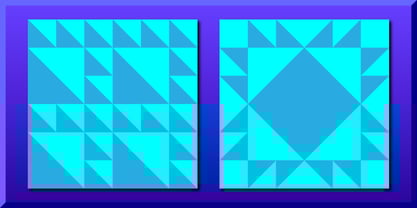 Quilt Patterns Three was inspired by the patchwork designs used in quiltmaking in early America. There is an assortment of 94 patterns located under the character set and shift+character set keys. Quilt Patterns Three is based on the nine patch pattern, a block that is 3 squares by 3 squares, the most basic and most common. The nine patch pattern can be subdivided into 6 squares by 6 squares, 9 squares by 9 squares, etc. Characters of Quilt Patterns Three can be typed in a vector drawing program and then converted to paths/outlines, color may then be added to various parts of a given pattern. Patterns can be stacked horizontally and vertically creating an infinite number of quilt designs.
 - Quilt Patterns One by Gerald Gallo,
$20.00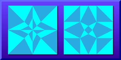 Quilt Patterns One was inspired by the patchwork designs used in quiltmaking in early America. There is an assortment of 94 patterns located under the character set and shift+character set keys. Quilt Patterns One is based on the nine patch pattern, a block that is 3 squares by 3 squares, the most basic and most common. The nine patch pattern can be subdivided into 6 squares by 6 squares, 9 squares by 9 squares, etc. Characters of Quilt Patterns One can be typed in a vector drawing program and then converted to paths/outlines, color may then be added to various parts of a given pattern. Patterns can be stacked horizontally and vertically creating an infinite number of quilt designs.
 - Cosmic Turtle by Hanoded,
$10.00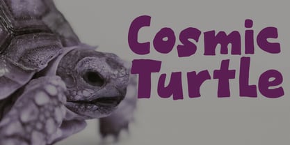 Cosmic Turtle is the belief that the world is supported by a giant turtle. It is mostly found in Hindu and Chinese mythology and the mythologies of the indigenous peoples of the Americas. I had to think of this, as the idea of the Cosmic Turtle is referenced to in the 1982 book ‘A Wild Sheep Chase’ by Haruki Murakami - my favourite author. Cosmic Turtle is a font that I made using a broken chop stick and Chinese ink. I was actually trying to create something scary for Halloween, but this is what came out and I quite like it. Cosmic Turtle is a fat display font with rough edges, wobbly glyphs and a set of double letter ligatures for you to play with.
 - Dottingham by Sharkshock,
$115.00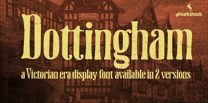 Dottingham is a vintage style display font with a look that will take you back to the Victorian era. Inspiration for this 2 member family came from signage, publications, and old advertisements that appeared not only in Europe, but North America as well during the 19th century. Exaggerated serifs, wispy strokes, and high contrast dominate the character set. For those looking for a bit more authenticity, a distressed version is available for a straight-out-of-the-box eroded look. This unique styling makes it a strong choice when attention is paramount to your project. Dottingham is equipped with Basic Latin, Extended Latin/diacritics, kerning, ligatures, fractions, and some alternates. Use it for a Pub logo, book cover, or restaurant menu.
 - FHA Tuscan Roman by Fontry West,
$20.00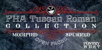 The first Tuscan lettering was penned in the mid-fourth century by the calligrapher Furius Dionysius Filocalus. The style was still in common usage as calligraphy when Vincent Figgins designed the first Antique Tuscan for print in 1817. Antique and Gothic Tuscan woodtype fonts appeared in the 1830’s. By the 1850’s, Tuscan fonts had become popular in America. These styles continued in print use into the twentieth century. Tuscan Antique and Gothic styles, borrowed from print and calligraphy, were perfect for signs, posters, handbills and other large format advertising. Sign painter, Frank Atkinson demonstrated several Tuscan forms in his book Sign Painting, A Complete Manual. Modified & Spurred Tuscan Romans were inspired by this and other works of the same period.
 - Quilt Patterns Four by Gerald Gallo,
$20.00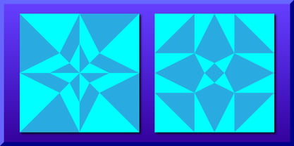 Quilt Patterns Four was inspired by the patchwork designs used in quiltmaking in early America. There is an assortment of 94 patterns located under the character set and shift+character set keys. Quilt Patterns Four is based on the nine patch pattern, a block that is 3 squares by 3 squares, the most basic and most common. The nine patch pattern can be subdivided into 6 squares by 6 squares, 9 squares by 9 squares, etc. Characters of Quilt Patterns Four can be typed in a vector drawing program and then converted to paths/outlines, color may then be added to various parts of a given pattern. Patterns can be stacked horizontally and vertically creating an infinite number of quilt designs.
 - Quilt Patterns Two by Gerald Gallo,
$20.00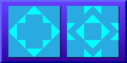 Quilt Patterns Two was inspired by the patchwork designs used in quiltmaking in early America. There is an assortment of 94 patterns located under the character set and shift+character set keys. Quilt Patterns Two is based on the nine patch pattern, a block that is 3 squares by 3 squares, the most basic and most common. The nine patch pattern can be subdivided into 6 squares by 6 squares, 9 squares by 9 squares, etc. Characters of Quilt Patterns Two can be typed in a vector drawing program and then converted to paths/outlines, color may then be added to various parts of a given pattern. Patterns can be stacked horizontally and vertically creating an infinite number of quilt designs.
 - Death Mohawk by Mans Greback,
$69.00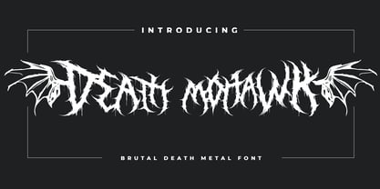 Death Mohawk is a rough metal font. This Korn/Slipknot style typeface with is distressed letterforms is optimized for a musical logotype. Its eroded and destroyed edges gives it a heavy and grungy look. Use parenthesis symbols ( ) [ ] { } < > to make wings around any word. Example: [Heavy Metal] Use % after any letter to make it symmetric. Example: MayheM% or Roxo%R% The font is built with advanced OpenType functionality and has a guaranteed top-notch quality, containing stylistic and contextual alternates, ligatures and more features; all to give you full control and customizability. It has extensive lingual support, covering all Latin-based languages, from Northern Europe to South Africa, from America to South-East Asia. It contains all characters and symbols you'll ever need, including all punctuation and numbers.
 - Dont Walk Run - Unknown license

- Corton by Greater Albion Typefounders,
$14.00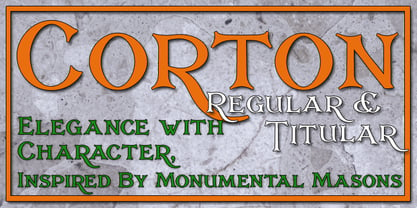 Corton was inspired by the traditional lettering on a gravestone in an English village. While that might sound a rather solemn beginning, Corton has wonderfully lively air, with distinctive lively serifs and beautifully swashed downstrokes. Eight faces are offered: regular and titular each in three weights plus regular condensed. Between them they are ideal signage and display faces, merging 'olde-worlde' charm and fun character, but remaining clear and legible.
 - Sideshadow by Aah Yes,
$12.25The Sideshadow family has 4 weights, Regular, Bold, Light and Half Light (which is intermediate between Regular and Light). The distinguishing feature of the font (you don't actually need me to explain this, do you?) is the partial shadow to the side of the main character, giving it a distinct and eye-grabbing look. The zip files contain both OTF and TTF versions of the font - install one version only. - Smart Cookie by PizzaDude.dk,
$15.00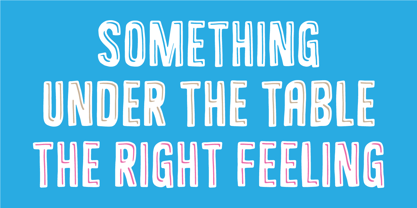 Smart Cookie is a happy and handmade font, ideal for packaging, posters or books (especially children's books!) It's highly legible and comes int 3 versions: Regular, Shine and Layer. Mix the Regular and Shine layer (using different colours) to make a cool shiny effect, or use the Shine version where the colours rely on the fore- and background colours...also a nice way of making your text stand out!
 - Broaek by Linecreative,
$10.00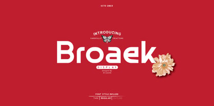 Broaek is a display typeface with a modern impression. This font consists of 3 types of styles, namely regular, thin, and outline. This font is perfect for use in headlines, posters, branding, titles, and other graphic designs. What you get dear, you will get : 1. Broaek- A clean San serif font including Upper & Lowercase characters(Regular,thin,Outline) 2. Numbers and Pointing 3. Supports Multi linguage (Latin Western Europe)
 - Lunar Outline by RagamKata,
$12.00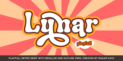 Lunar - Retro Serif Font Introducing Lunar, a charismatic font that seamlessly fuses playfulness with a touch of nostalgia. This unique typeface falls under the playful retro serif display category, offering not just one, but two distinctive personalities in its regular and outline versions. Features : - Regular & Outline - Ligatures & Alternates - Letters, numbers, symbols, and punctuation - No special software is required to use this typeface even work in Canva - Multilingual Support
 - Mixottally by Zamjump,
$17.00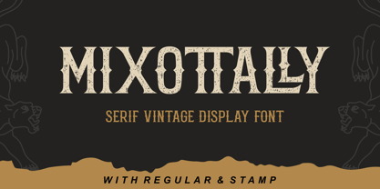 Introducing Mixottally Serif Display Font – a perfect fusion of vintage and classic themes, available in both regular and stamp styles. The regular style exudes timeless elegance, ideal for branding and logo design. Meanwhile, the stamp style adds a touch of vintage authenticity, perfect for a weathered, classic look. Elevate your creative projects with this versatile font, designed for a range of applications from modern branding to nostalgic designs.
 - Nano Pix by Ahmad Jamaludin,
$15.00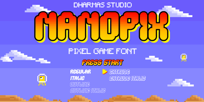 Embrace the nostalgic charm of pixelated games with its versatile 6 Styles: Regular, Italic, Outline, Extrude, Outline Italic, and Extrude Italic. Whether you're crafting captivating logos, designing captivating posters, NANO PIX is your ultimate toolkit. Features: Nano Pix Main File Has 6 Variable: Regular, Italic, Outline, Extrude, Outline Italic, and Extrude Italic Multilingual Support Instructions (Access special characters, even in Cricut Design) Simple Installations Enjoy Designing! Dharmas Studio
 - OregonDry is a font meticulously designed by Pat Snyder that evokes a distinctive and captivating essence of rustic charm and vintage appeal. This font stands out with its unique take on the serif ge...
- The "Joe DiMaggio" font, conceptualized by an artist named Chloe, embodies the swift, elegant essence of its namesake, the legendary American baseball player Joe DiMaggio. Reflecting DiMaggio's smoot...
- PackardClipperNF, crafted by the talented type designer Nick Curtis, is a font that exudes old-world charm and sophistication, reminiscent of the golden era of American automotive elegance, specifica...
- Linotype Afroculture by Linotype,
$29.99Like the name suggests, the pi font Afroculture from typeface designer Boule Yvan depicts symbols and figures from African folk art. Stylized masks with different expressions and a number of sculptures lend variety to this font. The figures are consciously simple but shown from different perspectives. The black and white surfaces contrast with another and suggest the interplay between shadow and light. The figures of Afroculture are perfect for illustrating texts in a related context and their details come through best in larger point sizes. - Generis Slab by Linotype,
$29.00The idea for the Generis type system came to Erik Faulhaber while he was traveling in the USA. Seeing typefaces mixed together in a business district motivated him to create a new type system with interrelated forms. The first design scheme came about in 1997, following the space saving model of these American Gothics. Faulhaber then examined the demands of legibility and various communications media before finally developing the plan behind this type system. Generis’s design includes two individually designed styles; each of with is available with and without serifs, giving the type system four separate families. Each includes at least four basic weights: Light, Regular, Medium, and Bold. Further weights, small caps, old style figures, and true italics were added to each family where needed. The Generis type system is designed to meet both optical criteria and the highest possible measure of technical precision. Harmony, rhythm, legibility, and formal restraint make up the foreground. Generis combines aesthetic, technical, and economic advantages, which purposefully and efficiently cover the whole range of corporate communication needs. The unified basic form and the individual peculiarity of the styles lead to Generis’ systematic, total-package concept. The clear formal language of the Generis type system resides beneath the information, bringing appropriate typographic expression to high-level corporate identity systems, both in print and on screen. The condensed and aspiring nature of the letterforms allows for the efficient setting of body copy, and the economic use of the page. A range of accented characters allows text to be set in 48 Latin-based languages, offering maximal typographic free range. This previously unknown level of technical and design execution helps create higher quality typography in all areas of corporate communication. Optimal combinations within the type system: Generis Serif or Generis Slab with Generis Sans or Generis Simple. - Let's Jazz by Unio Creative Solutions,
$9.00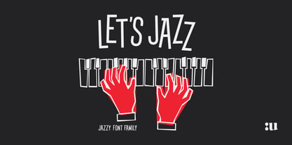 Introducing “Let’s Jazz” - a playful typeface which is inspired by iconic mid-century American advertising and lettering. With this project we wanted to homage the dazzling graphics of those booming years and the result is a jazzy typeface that provides a condensed aspect with a bouncy rhythm. As previously said, Let’s Jazz gives the spontaneous vibe of this sensational music genre but it has been also designed with a strong focus to the very distinct look of Saul Bass graphics, which are honestly still fresh and convincing, even nowadays. Let’s Jazz offers two versions, Regular and Stamp. Each version contains more than 450 glyphs and covers several languages based on the Latin alphabet; the jazzy experience is enhanced with OpenType (OTF) support for small caps and includes some neat ligatures and alternates plus the oldstyle bouncy numerals*. This package is a powerful tool in a wide variety of design purposes: headlines, packaging, logotypes, badges, posters and much more. *Let’s Jazz has built-in OpenType features enabled for Adobe® Creative Suite® and any other opentype capable software. All the extra characters has been additionally coded with “PUA Unicode”, which basically means that this font duo is totally accessible without any additional design software. All the extra characters can now be copied straight out the FontBook (Mac) or CharacterMap (Win) and pasted into your favorite text editor. Official mini-tutorials available here: - How to access alternates, ligatures and swashes in Font Book®: https://youtu.be/mGKlvKr0ReI - How to use alternates, ligatures and swashes in Photoshop®: https://youtu.be/46ZtDbHwUAc Specifications: - Multi-language Support (Central, Eastern, Western European languages) - OpenType features (Standard and Discretionary Ligatures, Alternates, Small Caps, OldStyle Numerals) - PUA Coded Extra Characters Thanks for viewing, Unio.
 - P22 Kilkenny by IHOF,
$69.95Kilkenny is a decorative, Victorian-style font based on the metal type named Nymphic that was designed by Hermann Ihlenberg. Ihlenburg was born in Germany in 1843 where he studied art and worked for several German type foundries. He moved to the USA in 1866 and worked for the L. Johnson & Co. foundry, later MacKellar, Smiths & Jordan. American Type Founders acquired this typeface when they took over the MacKellar, Smiths & Jordan foundry and Nymphic appears in the ATF catalog of 1896. For this digital version, the character set has been expanded to include accented characters, punctuation, and currency symbols—and most everything you would expect to find in a digital font. The original metal font consisted of swash caps, upper case characters, and a “morticed” lower case, which was raised off the baseline. This mortcied form was designed to nestle inside the ornate swash caps as well as to work with the upper case. The five digital versions contained in this set are basically different configurations of these different alphabet sets, they differ as follows: Kilkenny—the original upper case version with a modified lower case that has been enlarged, shifted to align along the baseline, and given taller ascenders to give it a more “regular” appearance. Kilkenny Eureka—true to the original design with the “morticed” or superior lowercase forms. Kilkenny Swash—original swash caps with the modified lower case. Kilkenny Swash Caps—original swash caps with the original caps as the lower case. Kilkenny Swash Eureka—swash caps that have been adjusted to match the weight of the original lower case forms. The OpenType version contains all of the above, plus additional Central European and Cyrillic characters for a total of almost 1000 glyphs. - Generis Serif by Linotype,
$29.00The idea for the Generis type system came to Erik Faulhaber while he was traveling in the USA. Seeing typefaces mixed together in a business district motivated him to create a new type system with interrelated forms. The first design scheme came about in 1997, following the space saving model of these American Gothics. Faulhaber then examined the demands of legibility and various communications media before finally developing the plan behind this type system. Generis’s design includes two individually designed styles; each of with is available with and without serifs, giving the type system four separate families. Each includes at least four basic weights: Light, Regular, Medium, and Bold. Further weights, small caps, old style figures, and true italics were added to each family where needed. The Generis type system is designed to meet both optical criteria and the highest possible measure of technical precision. Harmony, rhythm, legibility, and formal restraint make up the foreground. Generis combines aesthetic, technical, and economic advantages, which purposefully and efficiently cover the whole range of corporate communication needs. The unified basic form and the individual peculiarity of the styles lead to Generis’ systematic, total-package concept. The clear formal language of the Generis type system resides beneath the information, bringing appropriate typographic expression to high-level corporate identity systems, both in print and on screen. The condensed and aspiring nature of the letterforms allows for the efficient setting of body copy, and the economic use of the page. A range of accented characters allows text to be set in 48 Latin-based languages, offering maximal typographic free range. This previously unknown level of technical and design execution helps create higher quality typography in all areas of corporate communication. Optimal combinations within the type system: Generis Serif or Generis Slab with Generis Sans or Generis Simple. - Generis Simple by Linotype,
$39.00The idea for the Generis type system came to Erik Faulhaber while he was traveling in the USA. Seeing typefaces mixed together in a business district motivated him to create a new type system with interrelated forms. The first design scheme came about in 1997, following the space saving model of these American Gothics. Faulhaber then examined the demands of legibility and various communications media before finally developing the plan behind this type system. Generis’s design includes two individually designed styles; each of with is available with and without serifs, giving the type system four separate families. Each includes at least four basic weights: Light, Regular, Medium, and Bold. Further weights, small caps, old style figures, and true italics were added to each family where needed. The Generis type system is designed to meet both optical criteria and the highest possible measure of technical precision. Harmony, rhythm, legibility, and formal restraint make up the foreground. Generis combines aesthetic, technical, and economic advantages, which purposefully and efficiently cover the whole range of corporate communication needs. The unified basic form and the individual peculiarity of the styles lead to Generis’ systematic, total-package concept. The clear formal language of the Generis type system resides beneath the information, bringing appropriate typographic expression to high-level corporate identity systems, both in print and on screen. The condensed and aspiring nature of the letterforms allows for the efficient setting of body copy, and the economic use of the page. A range of accented characters allows text to be set in 48 Latin-based languages, offering maximal typographic free range. This previously unknown level of technical and design execution helps create higher quality typography in all areas of corporate communication. Optimal combinations within the type system: Generis Serif or Generis Slab with Generis Sans or Generis Simple. - Generis Sans by Linotype,
$29.00The idea for the Generis type system came to Erik Faulhaber while he was traveling in the USA. Seeing typefaces mixed together in a business district motivated him to create a new type system with interrelated forms. The first design scheme came about in 1997, following the space saving model of these American Gothics. Faulhaber then examined the demands of legibility and various communications media before finally developing the plan behind this type system. Generis’s design includes two individually designed styles; each of with is available with and without serifs, giving the type system four separate families. Each includes at least four basic weights: Light, Regular, Medium, and Bold. Further weights, small caps, old style figures, and true italics were added to each family where needed. The Generis type system is designed to meet both optical criteria and the highest possible measure of technical precision. Harmony, rhythm, legibility, and formal restraint make up the foreground. Generis combines aesthetic, technical, and economic advantages, which purposefully and efficiently cover the whole range of corporate communication needs. The unified basic form and the individual peculiarity of the styles lead to Generis’ systematic, total-package concept. The clear formal language of the Generis type system resides beneath the information, bringing appropriate typographic expression to high-level corporate identity systems, both in print and on screen. The condensed and aspiring nature of the letterforms allows for the efficient setting of body copy, and the economic use of the page. A range of accented characters allows text to be set in 48 Latin-based languages, offering maximal typographic free range. This previously unknown level of technical and design execution helps create higher quality typography in all areas of corporate communication. Optimal combinations within the type system: Generis Serif or Generis Slab with Generis Sans or Generis Simple. - Okojo Pro by Wordshape,
$20.00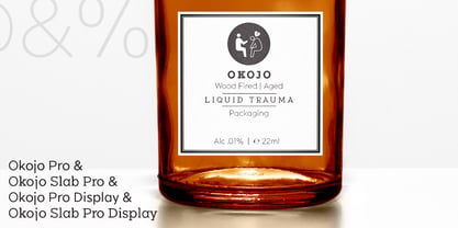 The Okojo Pro Complete family is a reworking of Wordshape’s immensely popular Okojo family of typefaces. It includes Okojo Pro, a semi-geometric sans serif, Okojo Slab Pro, a semi-geometric slab serif, Okojo Pro Display, a round-cornered sans serif variation, and Okojo Slab Pro Display, a round-cornered slab serif. The entire Okojo Pro family looks great at small or large sizes. The Okojo Pro family is designed for readability in long texts while simultaneously functioning as effective display type. Features of Okojo Pro Display: - all lowercase characters have an enlarged x-height, creating less optical dazzle than typefaces like Futura, Neutra or Avant Garde - more humanist numerals and punctuation for enhanced readability - complete Western, Central and Eastern European characters sets - radically improved spacing guaranteeing beautiful results in print and on screen for the Czech, English, Hungarian, Croatian, Esperanto, Maltese, Romanian, Turkish, Albanian, French, Portuguese, Spanish, Basque, Bulgarian, Finnish, Swedish, Norwegian languages The Okojo Pro Display family is influenced by the type designs of Paul Renner and Herb Lubalin, but smoothed over with more than a bit of Americana. Both work well on-screen as webfonts and in print as book type. Each is hinted with accuracy and kerned with precision.The lighter weights are slightly slimmer than the regular and bold weights to give the typeface more of a vertical feel, inviting readers' to rapidly read typeset text with a maximum of contrast and a minimum of optical distortion. Okojo: it’s a little bit country and a little bit rock’n’roll.
 - Anger Styles - Personal use only

- HUFace132 - Unknown license

- Ibiza - 100% free

- Fletcher-Gothic - Unknown license

- So Sue Me - Unknown license

- West Fork JNL by Jeff Levine,
$29.00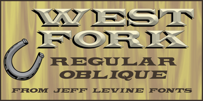 West Fork JNL is based on the classic wood type Latin Extended (Hamilton, 1888) and is available in both regular and oblique versions.
 - Golos by Hiekka Graphics,
$25.00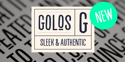 Golos is a sleek and authentic font face with two styles: regular and italic. Golos is recommended for use as a display typeface.
 - Merrant by Max Prive,
$28.00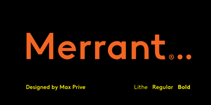 Merrant® is a lithe geometric display typeface designed by Max Prive. The Merrant® family has 3 weights – Lithe, Regular, and Bold.


