10,000 search results
(0.127 seconds)
- Aptifer Slab by Linotype,
$39.00 Aptifer Sans and Aptifer Slab are two 21st century typeface families created by Mårten Thavenius. Each family has seven weights, in roman and italic respectively, making 28 font styles in total. A heritage from two design traditions can be seen in Aptifer. One is the robust American gothic typefaces, like M. F. Benton’s, from around 1900. This is combined with the openness and legibility that comes from the humanist tradition. The sans serif part of the family, Aptifer Sans, is designed without excessive details disturbing the reading. Its sibling Aptifer Slab with its wedge slab serifs is more eye-catching but still suited for text settings. The italics fit well into the text flow of the roman. They are a bit narrower than the roman and have cursive characteristics. Both Aptifer Sans and Aptifer Slab are highly legible typefaces and can be used both in print and on screen. Featured in: Best Fonts for PowerPoints
 - Geographica Script by Three Islands Press,
$39.00 Time-tested elegance is what you’ll get with Geographica Script, a handwritten typeface steeped in 18th century sophistication. Source materials include the maps of Emanuel Bowen (circa 1694–1767), Geographer to King George II, as well as English and American trade cards from the middle 1700s, including the work of artist and printmaker William Hogarth (1697–1764). A kindred font to our Geographica serif family, Geographica Script is a painstaking replication of the elegant roundhand cursive seen in engravings of the period. Geographica Script has more than 1,100 glyphs, including scores of standard and contextual ligatures, three full uppercase alphabets, historical forms, decorative flourishes, and full Latin support. It’s also got fifty evocative ornaments inspired by map and trade card illustrations, e.g., lion rampant, unicorn rampant, crowns, anchors, sailing ships, whale, dolphin, sun, moon, and many others. Note: To prevent Microsoft Word from cutting off Geographica Script’s extra-long descenders, set line spacing (Format —> Paragraph —> Spacing) to 1.5 lines.
 - Janna by Linotype,
$40.99 Janna is designed by Lebanese designer Nadine Chahine. It is based on the Kufi style but incorporates aspects of Ruqaa and Naskh in the letter form designs. This results in what could be labeled as a humanist Kufi, a Kufi style that refers to handwriting structures and slight modulation to achieve a more informal and friendly version of the otherwise highly structured and geometric Kufi styles. Janna, which means heaven" in Arabic was first designed in 2004 as a signage face for the American University of Beirut. So, the design is targeted towards signage applications but is also quite suited for various applications from low resolution display devices to advertising headlines to corporate identity and branding applications. The Latin companion to Janna is Adrian Frutiger's Avenir which is included also in the font. The font also includes support for Arabic, Persian, and Urdu as well as proportional and tabular numerals for the supported languages."
 - OCR B by Linotype,
$40.99OCR A and OCR B are standardized, monospaced fonts designed for Optical Character Recognition" on electronic devices. OCR A was developed to meet the standards set by the American National Standards Institute in 1966 for the processing of documents by banks, credit card companies and similar businesses. This font was intended to be "read" by scanning devices, and not necessarily by humans. However, because of its "techno" look, it has been re-discovered for advertising and display graphics. OCR B was designed in 1968 by Adrian Frutiger to meet the standards of the European Computer Manufacturer's Association. It was intended for use on products that were to be scanned by electronic devices as well as read by humans. OCR B was made a world standard in 1973, and is more legible to human eyes than most other OCR fonts. Though less appealingly geeky than OCR A, the OCR B version also has a distinctive technical appearance that makes it a hit with graphic designers. - Hadriano by Monotype,
$29.99When traveling in Paris, American designer Frederic W. Goudy did a rubbing of a second century marble inscription he found in the Louvre. After ruminating on these letterforms for several years, he drew a titling typeface in 1918, all around the letters P, R, and E. He called the new face Hadriano" as that name was in the original inscription. Robert Wiebking cut the matrices, and the Continental Typefounders Association released the font. Goudy designed a lowercase at the request of Monotype in 1930, though he didn't really like the idea of adding lowercase to an inscriptional letterform. The lowercase looks much like some of Goudy's other Roman faces. Compugraphic added more weights in the late 1970s, and made the shapes more cohesive. Hadriano has nicely cupped serifs and sturdy, generous body shapes. Distinctive individual letters include the cap A and Q, and the lowercase e, g, and z. Hadriano™ is an excellent choice for impressive headings and vigorous display lines." - Sicret by Mans Greback,
$29.00 Sicret is a perfectly geometric typeface family. It was drawn by Måns Grebäck in 2020, and each one of its glyphs was manually created by following a strict mathematical pattern consisting of only two basic shapes, in four different combinations, set on a three units tall grid. The resulting product is a true monoline font with a solid character, with an official look while yet going towards sci-fi because of its digital nature. The family consists of nine weights: Thin, Extra Light, Light, Regular, Medium, Semi Bold, Bold, Extra Bold and Black. The range of weights makes it very adaptable, and all the weights works very well together to give a sentence or graphic tone and emphasization. As Sicret is a font with over 850 glyphs, it is guaranteed to contain all characters you'll ever need, including all punctuation and numbers. It has a very extensive lingual support, covering Greek, Cyrillic, Hebrew as well as European and American languages.
 - Frock by Wahyu and Sani Co.,
$28.00 Please welcome Frock! It is a sans serif typeface for broad range of usage. It is designed with a slightly slanted oval shaped counters, medium contrast and based on American gothic typefaces with "not so formal" feel. The italic styles are flowy and almost true italic. Swash alternates for some uppercases and lowercases are useful for logo, display and poster. This family comes with 16 styles, uprights and matching italics, consisting of 8 weights from thin to ultra. It is also equipped with useful OpenType features such as Ordinals, Superiors, Stylistic Sets, Proportional Lining Figures, Standard Ligatures, Discretionary Ligatures, Fractions, Numerators & Denominators. Each font has 770+ glyphs including swash alternates which covers Western & Eastern Europe, and other Latin based languages – over 200 languages supported! Frock will be suitable for many creative projects. This typeface will be perfect for logos, packaging, greeting cards, presentations, headlines, lettering, posters, branding, quotes, titles, magazines, headings, web layouts, mobile applications, art quotes, advertising, invitations, packaging design, books, book title, and more!
 - Stabile by PintassilgoPrints,
$26.00 Stabile is a rather stylish casual font with loads of good vibes and alternates: there are four glyphs for each letter, two for each numeral plus swashes to this side and the other. Two for each side, in fact. It's a flexible font that looks unique and quite distinctive, with its charming uneven look that gets even more uneven when Contextual Alternates are turned on. Stabile family brings a delish accompanying font, Stabile Toys, packed with organic shapes inspired by the breathtaking work of the american artist Alexander Calder. These play together deliciously well, you can bet. Are you prepared to balance them? Enough reading, then, just go ahead! A couple quick notes on usage: . Go with Contextual Alternates to instantly cycle glyphs. Eye-catching results guaranteed! . Swash feature turns on (guess what...) swashes. But there's always alternative swashes, like to this side going up or to this side going down, that side up or down, so it's cool to pick your choices through a glyphs palette.
 - Swonderful by The Ampersand Forest,
$19.00 Everyone loves an Art Deco typeface. And there are hundreds of similarly-designed deco faces out there! But not one of them seems to have every form of every character that you want or need at any given moment. That’s why Swonderful was created! It has more letterform variations than you can shake a stick at (if you're inclined to shake sticks at things). With four variations of every uppercase form, two variations of every lowercase form (plus diacritical characters for the standard set), you’re bound to find the character you need for any given project, whether the style is French Art Deco, American Streamline Moderne, or Jazzy Midcentury Gaspipe. Just switch between stylistic sets! And you’ll find all those characters in three standard weights: Light, Regular, and Bold. They’re designed as a unicase, so they’re all height-compatible, and every set works with every other set, so you can mix and match to your heart’s delight!
 - California Poster SG by Spiece Graphics,
$39.00 Known to many eastern artists as the California Poster Letter because it originated in the West, this old 1930s style has reappeared in digital form. Carl Holmes, in his wonderful book on old lettering styles, pays tribute to this uniquely American design. Faintly reminiscent of the lettering of Fred G. Cooper, California Poster Bold is at times wildly exaggerated and boisterous. Letters appear to be inflated and loopy. The design might aptly be described as a kind of rollicking Cooper Black (Oswald Bruce Cooper). An extensive range of alternates and figures has been provided for your convenience. California Poster Bold is now available in the OpenType Std format. Some new characters have been added to this OpenType version as stylistic alternates and historical forms. These advanced features work in current versions of Adobe Creative Suite InDesign, Creative Suite Illustrator, and Quark XPress. Check for OpenType advanced feature support in other applications as it gradually becomes available with upgrades.
 - Looking Flowers by Sudtipos,
$49.00 Lu Nolasco, also known as Lunol, is a fresh representative of a new generation of Souther American lettering artists. She was born in Lima, Peru. After learning from some of the region’s best teachers and exploring the pointed nib on her own, she became a prolific lettering workshop instructor herself. Miraflores is one of Lima’s main tourist attractions. An upscale district with a great window on the Pacific ocean, it is the place where Lu looks for inspiration. It particularly inspired this “Looking flowers” (Miranda las flores), Lunol’s first typeface, designed in collaboration with Ale Paul. It is a comprehensive informal script that comes with many alternates, swashes and ligatures, along with small cap and quite a few ornaments. The fonts cover an expansive range of Latin languages, and are intended for use in stationery, menus, packaging, and general design where the main objective is to relay a sense of fun, playfulness and sensibility.
 - Wanderly Sans by BeckMcCormick,
$16.00 Introducing Wanderly Sans - Wanderly Sans is a sleek, modern font. Its contemporary aesthetic makes it a perfect fit for effortlessly designing logos & branding, elegant paper products like wedding invitation suites, or for displaying content on your website. Wanderly Sans can also be used for other print design like magazines and flyers or printed marketing materials. This font can also be used for digital marketing materials and social media items! Wanderly Sans includes: - full upper + lowercase characters - numbers + punctuation - 10 alternate characters - A, E, K, M, N, P, R, f, j, t - PUA-encoding Extensive Language Support: Western European, Central European, South Eastern European, South American, Oceanian, Vietnamese, Esperanto Wanderly Sans can be used with graphic design programs such as Illustrator or Photoshop, word processing programs like Pages or Word, Design Space, Silhouette, Procreate, Canva Pro, Glowforge, GoodNotes, & more. This font is an installable for desktop & laptop machines, as well as iPads or iPhones. See below for links to help with installation.
 - Murs Gothic by Kobuzan,
$- Murs Gothic is a bold sans serif with sharp dynamic forms. It is a collective image of American Gothics from the 19th and early 20th centuries. It is quite massive, has tight letter spacing and increased contrast. Somewhere elongated, as well as asymmetric details give it a characteristic emotionality and playfulness. Especially against the backdrop of neutral geometric sans-serifs. The set comes with 694 glyphs. Among which are Latin and Cyrillic characters, a couple of ligatures, alternatives, geometric symbols, arrows and much more! Murs Gothic consists of 56 styles that are adjustable in weight and width + italics. Or one variable font with 3 axes. This allows it to be very flexible and adapt to many different designs. All styles include an extended set of Latin characters and a basic Cyrillic. A font style Murs Gothic Wide Dark is free for unlimited use. Murs Gothic was designed by Maksym Kobuzan in 2023.
 - Big Brush by Canada Type,
$20.00Big Brush is the result of me seeing Brush Script everywhere around me. Toronto signage is full of Brush Script. My last two trips to the West Coast showed me mostly Brush Script. Brush Script must be the most widely overused North American script font of all time. Don't we all know at least one restaurant or bar with its sign made in Brush Script? And aren't you just sick of the weird F, Q and T of Brush Script? Well, out with the old and in with the new. Big Brush was made as a replacement for Brush Script, and then some. While Brush Script has only the single familiar letters we all know, Big Brush comes in two fonts, so you can keep the design fresh the neat and keep them guessing at the same time. The next time you want to design something that calls for strong, fast brush calligraphy, do the world's bored eyes a favor and use Big Brush instead. - Caslon Classico by Linotype,
$29.99The Englishman William Caslon (1672-1766) first cut his typeface Caslon in 1725. His major influences were the Dutch designers Christoffel van Dijcks and Dirck Voskens. The Caslon font was long known as the script of kings, although on the other side of the political spectrum, the Americans used it as well for their Declaration of Independence. The characteristics of the earlier Renaissance typefaces are only barely detectable. The serifs are finer and the axis of the curvature is almost or completely vertical. The overall impression which Caslon makes is serious, elegant and linear. Next to Baskerville, Caslon is known as the embodiment of the English Baroque-Antiqua and has gone through numerous new interpretations, meaning that every Caslon is slightly different. Caslon Classico appeared in 1993 and was designed by Franco Luin, the designer of various interpretations of classic typefaces. Luin kept his design true to the original and Caslon Classico consists of two cuts with corresponding italic and small caps characters. - Upper Clock by Casloop Studio,
$5.00 Introducing Upper Clock Typeface, your ticket to a world of typographic innovation, drawing inspiration from the sleek design of the ETCH Clock. Prepare to explore a myriad of creative possibilities for your Display Text with this cutting-edge typeface. Tired of mundane, uninspiring fonts that lack personality and flair? Upper Clock Typeface is here to infuse your digital designs with the vivacity of Retro Flat, the whimsy of Memphis, and the evocative nostalgia of Modern Nostalgia. Comprehensive multi-language support, including Western European, Central European, South Eastern European, South American, Oceanian, and even Esperanto. Upper Clock isn't merely a typeface; it's your ultimate solution to typographic challenges. This versatile tool is your gateway to crafting visually stunning, one-of-a-kind designs within the realm of Display Text. As you implement Upper Clock Typeface, watch in awe as your typographic dilemmas seamlessly transform into relics of the past. Take your design endeavours to new heights with Upper Clock Typeface today! Upper Case.
 - OCR A Extended by Monotype,
$40.99OCR A and OCR B are standardized, monospaced fonts designed for Optical Character Recognition" on electronic devices. OCR A was developed to meet the standards set by the American National Standards Institute in 1966 for the processing of documents by banks, credit card companies and similar businesses. This font was intended to be "read" by scanning devices, and not necessarily by humans. However, because of its "techno" look, it has been re-discovered for advertising and display graphics. OCR B was designed in 1968 by Adrian Frutiger to meet the standards of the European Computer Manufacturer's Association. It was intended for use on products that were to be scanned by electronic devices as well as read by humans. OCR B was made a world standard in 1973, and is more legible to human eyes than most other OCR fonts. Though less appealingly geeky than OCR A, the OCR B version also has a distinctive technical appearance that makes it a hit with graphic designers. - Davison Spencerian by House Industries,
$33.00 As one of the most distinguished lettering artists of the 20th century, Meyer “Dave” Davison’s greatest contribution to the American visual landscape is arguably Davison Spencerian. The alphabet made its first appearance in Photo-Lettering’s 1946 catalog and remains a benchmark of the ornamental script genre. Thanks to the skillful hands of Mitja Miklavčič and the tireless eyes of House Industries designers Ben Barber and Ken Kiel, we have preserved the poise and precision of Davison’s masterwork in this faithfully-rendered digital incarnation. From automotive exhaust accessories and pirate-themed wedding invites to New Orleans sissy bounce hip-hop CD covers and upmarket bivalve ambrosia packaging, Davison Spencerian offers sober sophistication and unparalleled flexibility. DAVISON SPENCERIAN CREDITS: Typeface Design: Meyer “Dave” Davison Typeface Digitization: Mitja Miklavčič Typeface Direction: Ben Kiel and Ken Barber Like all good subversives, House Industries hides in plain sight while amplifying the look, feel and style of the world’s most interesting brands, products and people. Based in Delaware, visually influencing the world.
 - Integra by Sudtipos,
$39.00 Semi-serif? Semi-sans? Emerging from the hazy border that divides Sans from Serif, Integra aims to integrate both styles in a cool, elegant, contemporary fashion. With its sleek anatomy, flared terminals and almost non-existent straight lines, Integra was inspired by the stressed, modulated, unserifed letterforms incised in the early 15th-century ledger tombs at Santa Croce church in Florence, and the neoclassical grotto inscriptions at Stourhead in England that dates from the mid 18th-century. Integra, however, gives a contemporary, even futuristic twist to these references by featuring original, audacious shapes on key letters like L, E and X; as well as with the modern, generous proportions of its lowercase; infusing it all with a flowing, luminous, Latin American feel. Integra comes in several weights and italic styles, for text composition and display usage. Its rounded counterforms and arch-like shapes lend texts a spacious, neat, architectural quality, perfect for sophisticated content.
 - ITC Magnifico by ITC,
$29.99ITC Magnifico Daytime and ITC Magnifico Nighttime are inspired by nineteenth-century decorated types and letterings. “Although they are designed as display typefaces, their use is not limited to large headings. Usually three-dimensional types are employed in gigantic headings in large posters, but I thought it would be interesting if such decorative types were used as well in small sizes, say at 12 point,” says designer Akira Kobayashi. “There were a few examples of small three-dimensional types used in cards printed in the nineteenth-century. I studied their letterforms carefully and became more and more interested in those small three-dimensional types. The outlines of ITC Magnifico are robust enough to endure use at small sizes. Sometimes the angle or the shape of the 'shadow' had to be slightly modified or even illogical, because the letterforms ought to look as simple as possible. The resulting types are fairly easy to read at small sizes, and I hope that at large sizes those occasional oddities will appear charming.” - Tertius by Scholtz Fonts,
$21.00 Tertius, with its high ascenders and clubbed serifs, is a modern interpretation of the classic Carolingian style (7th - 9th centuries AD). There was no capital form in the Carolinian hand and Roman square capitals were originally used with it. The Carolingian hand began, after a while, to develop more cursive tendencies as people looked for a way to speed up the writing process. I have “capitalized” on this trend and have devised an appropriate and dramatic set of flowing capitals for this family. With its elegant swashes and bold letter shapes, Tertius embodies the romance of medieval life, of knights, castles, and chivalry. Tertius comes in four styles:- -- Regular: with elegant, smoothly penned characters; -- Crenellated: written with a scratchy pen over rough parchment -- many drops of ink and blotches have been left on the parchment (“Crenellated” means battlements -- the rough protrusions on the top of castle walls); and -- Romantic: the capitals have been loosely overwritten generating a contemporary version of illuminated capitals. -- Illuminated: richly decorated illuminated capitals for use with Tertius Regular (28 characters) All fonts have been carefully crafted, letterspaced and kerned and contain full character sets of 237 characters.
 - Visine FF by Koral Creative,
$32.00 Visine FF is a typeface that aims to question the geographical borders that in so many ways can define people's lives. It was developed with the experience of advertising and commercial use in mind. The name Visine can be translated most simply as HEIGHTS. Visine FF was developed out of the necessity to make the most of the space on the visual format. With the tall arches and narrow bodies with exceptional, easy-to-read features, Visine FF aims to complement visual languages in many linguistic regions. Visine FF was developed in the Balkans, where Cyrillic, Latin and Glagolitic were the three historical writing systems used in the former Yugoslavia to denote cultural, ethnic, religious and political identities. Today, the languages of the Western Balkans are so similar that they can easily be called dialects, although they are written in different scripts. This is the result of their coexistence and parallel evolutions, which gave a rise to the common traits. This font family celebrates all the languages and scripts of the Western Balkans and is a labour of love. Love of design, love of language and the human need to communicate across borders, cultures and identities.
 - Gothic Leavenworth by Wooden Type Fonts,
$20.00 Gothic Leavenworth, a display type, very bold, sans serif.
 - Century Schoolbook DT by DTP Types,
$49.00From M.F. Benton 1917 and DTP types Limited 1992. - Tissot by Intellecta Design,
$26.90Variations of a classic egiptian wood type font era - Carve by Scholtz Fonts,
$19.00 Carve is an African font that was inspired by fonts such as Othello and Neuland designed in the mid-1920s. Rather than attempting to re-create these fonts in a digital form as so many others have done, I have tried to capture the “spirit” of the period and emphasize the “woodcarving” style of the font, while simultaneously giving it a contemporary feel. As a result the characters differ markedly any of the original styles and have much less of an “Art Deco” look to them. To further modernize Carve, I have included all the characters required for a full character set (lower case, as well as all punctuation, numerals, diacritics, special characters etc). The result is a thoroughly modern re-interpretation. The numbers (0 to 9) bear no relation to any originals but, I believe, are fully in keeping with the upper and lower alphabetic characters of my font. Carve comes in two styles: --Regular: contemporary, angular African style --Incised: exaggerating the chunky, hand-carved "woodcut" effect. The "in-line" effect has been hand-crafted to avoid the mechanical effect of computer-generated inline effects.
 - Outlaw by Billy Argel is a distinctive font that embodies a bold and rebellious spirit. It is a typeface that immediately captures attention due to its unique style and character. The design of Outla...
- Sure, diving into the vibrant and playful world of font design, let's take a look at Rickles, a creation that springs from the imaginative minds at Font Diner. Picture this: a font that captures the ...
- Wild Rhytm by Forberas Club,
$16.00 This new script font is written by our team, and ready to pop up your project by using this font for your party, event, invitation or at your wedding decor.
 - Horror Brush by Gassstype,
$27.00 Introducing of our new product the name is Horror Brush is Handmade Brush Font Rough and Creepy typeface. This is a Rough Brush Typeface that is written casually and quickly.
 - Manstromer by Trustha,
$16.00 Manstromer is a dynamic handwritten font, written with fast movements. Comes with two fonts styles, regular and slant. Manstromer is suitable for branding, advertising, headlines, packaging design, and many more.
 - Button Faces by Greater Albion Typefounders,
$5.95 ButtonFaces explores just how much emotion and description of a character can be put into a simple iconic representation of a face. Use them as 'Emoticons' or traditional printers ornaments.
 - Signamaestro by Almarkha Type,
$35.00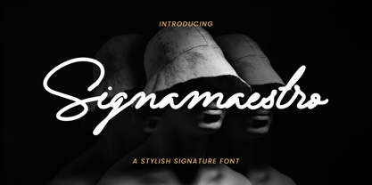 Introducing Signamaestro - Stylish Signature Script is a Quality script that is written casually and quickly Signamaestro is perfect for homeware designs,branding projects, Logo, design, Quotes, Product packaging, Photography, Watermark.
 - Drac Tombstone by Forberas Club,
$16.00 This new Handwritten font is written by our team, and ready to pop up your project by using this font for your party, event, invitation or at your wedding decor.
 - Ongunkan Irk Bitig Viking by Runic World Tamgacı,
$99.00 This is the Viking font that I developed based on the letters in the Irk Bitig book, which is written with the brush line of the old Turkish runic alphabet, the information below. It was interesting work. Irk Bitig or Irq Bitig (Old Turkic: 𐰃𐰺𐰴 𐰋𐰃𐱅𐰃𐰏), known as the Book of Omens or Book of Divination in English, is a 9th-century manuscript book on divination that was discovered in the "Library Cave" of the Mogao Caves in Dunhuang, China, by Aurel Stein in 1907, and is now in the collection of the British Library in London, England. The book is written in Old Turkic using the Old Turkic script (also known as "Orkhon" or "Turkic runes"); it is the only known complete manuscript text written in the Old Turkic script. It is also an important source for early Turkic mythology.
 - Action Man - Unknown license

- Action Man Extended - Unknown license

- Action Man Shaded - Unknown license

- Action Man Extended - Personal use only

- Chamfer Serif JNL by Jeff Levine,
$29.00 A set of vintage wood type printing blocks yielded the alphabet which was to become Chamfer Serif JNL. With its heavy vertical serifs and interesting character shapes, the design is unique when compared to the more familiar wood type offerings of the past.


