10,000 search results
(0.039 seconds)
- CHANL - Unknown license

- Entropy - Unknown license

- Grand Canyon by Red Rooster Collection,
$45.00 Based on an early wood type design. An original creation, that kept growing...!
 - Pretorian DT by DTP Types,
$49.00A revival design by Ron Carpenter and Malcolm Wooden of DTP Types Limited. - LD Underwood 5 by Illustration Ink,
$3.00This font represents the type style created by this very famous classic typewriter. - Brawn by BA Graphics,
$45.00A soft serif for any type application; packs a good punch; great look. - Janda Spring Doodles by Kimberly Geswein,
$5.00 Doodles ranging from cute animals to Easter eggs to flowers of various types.
 - Eingraviert by Intellecta Design,
$29.90 Eingraviert is based on old books capitals, with a wood type engraving style
 - Elisar DT by DTP Types,
$49.00An original design by Malcolm Wooden and Lisa Wooden of DTP Types Limited. - Topanga JNL by Jeff Levine,
$29.00Topanga JNL is based on an ultra-condensed sans serif wood type design. - ThaiType by Oporto Design,
$39.90 Latin characters were turned into Tha-like types to create the ThaiType font.
 - Brute Aldine by Intellecta Design,
$12.90a revival of a classic wood type font, in many family variations provided - Walonka by TripleHely,
$18.00 Hello! Let me introduce Walonka – a modern calligraphy font. With its natural, elegant shapes Walonka is the perfect choice for logos, branding, web, blog headlines, invitations, magazine and book design, product packaging – or for any text on postcards and on your favorite photos. Walonka includes: a standard set of characters with wide multilingual support: Western-, Central- and Eastern-European, Baltic, Turkish, Latin-type Africans, and Asian (94 languages in total) two additional character sets: lowercase letters with alternates shapes and lowercase letters without a connection stroke - for the position at the end of a word another two additional lowercase character sets – initial and final swashed forms 75 ligatures for double letters and frequent combinations Walonka has a large number of embedded context-dependent auto-replacement features that give the text a natural, handwritten look and correct inharmonious combinations of letters. These features work well in many apps (even simple ones like Notepad/TextEdit), and if you need to customize their application – you could use programs that support OpenType features (for example, Adobe apps or CorelDraw). All these additional glyphs are PUA-encoded, so if your software does not support OpenType — you could access them through Character Map (Windows) or Font Book (Mac). I hope you will like Walonka and create great designs with it!
 - Weiss Rundgotisch by Linotype,
$67.99The German designer Emil Rudolf Weiss originally created Weiss Rundgotisch for the Bauer typefoundry in 1937. In their catalog for the typeface, Bauer began with this quote from Leonhard Wagner: The round gothic (rundgotisch) script is the most beautiful kind of script; she is called the mother and the queen of all the rest." While designing Weiss Rundgotisch, Weiss was inspired by Renaissance types cut by the Augsberg printer Erhard Ratdolt. Ratdolt had spent some time in Venice, which is most likely where he became familiar with round gothic letters. This sort of letterform was never as popular in Germany as Fraktur or Gotisch may have been, but round gothic types were used there for centuries to represent arts and craft feelings, as well as old-fashioned handwork. For a blackletter typeface, Weiss Rundgotisch is very similar to normal serif and sans serif designs, especially its uppercase letters, which seem to have some uncial influence in them as well. Therefore, Weiss Rundgotisch is more legible for contemporary readers, making this an excellent choice for anyone looking to set text, logos, or headlines with in blackletter. Weiss Rundgotisch was apparently quite a difficult typeface to design, even for a master designer like Weiss. He began work on the face in 1915; Weiss Rundgotisch's development took over 20 years to complete." - Garino Variable by Julien Fincker,
$185.00 About Garino: Garino is a modern sans-serif typeface family. It gains its expressive character from a dynamic sweep in the curves and high-contrast transitions. The thinner and thicker weights are particularly suitable for strong headlines, while the middle weights can be used for typographic challenges and body text. As a result, it can be used in a reserved as well as an expressive way. Thanks to an extensive character collection, it becomes a real workhorse. A versatile allrounder that is up to all challenges – for Corporate Identity, Editorial, Branding, Orientation and Guidance systems and much more. Variable Font The Variable font contains 2 axes: weight and oblique – all in just one file. Features: With over 1165 characters, it covers over 200 Latin-based languages. It has an extended set of currency symbols and a whole range of Open Type Features. There are alternative characters as stylistic sets, small caps, automatic fractions – just to name a few. Arrows and numbers: In particular, the extensive range of arrows and numbers should be highlighted, which are perfectly suited for use in orientation and guidance systems. Thanks to Open Type Features and an easy system, the various designs of arrows and numbers can also be simply "written" without first having to select them in a glyph palette. Get the static version of the Garino family here: https://www.myfonts.com/fonts/julien-fincker/garino/
 - Garino by Julien Fincker,
$34.99 About Garino: Garino is a modern sans-serif typeface family. It gains its expressive character from a dynamic sweep in the curves and high-contrast transitions. The thinner and thicker weights are particularly suitable for strong headlines, while the middle weights can be used for typographic challenges and body text. As a result, it can be used in a reserved as well as an expressive way. Thanks to an extensive character collection, it becomes a real workhorse. A versatile allrounder that is up to all challenges – for Corporate Identity, Editorial, Branding, Orientation and Guidance systems and much more. Features: The Garino family has a total of 20 styles, from thin to heavy with matching italics. With over 1165 characters, it covers over 200 Latin-based languages. It has an extended set of currency symbols and a whole range of Open Type Features. There are alternative characters as stylistic sets, small caps, automatic fractions – just to name a few. Arrows and numbers: In particular, the extensive range of arrows and numbers should be highlighted, which are perfectly suited for use in orientation and guidance systems. Thanks to Open Type Features and an easy system, the various designs of arrows and numbers can also be simply "written" without first having to select them in a glyph palette. Get the Variable Font here: https://www.myfonts.com/fonts/julien-fincker/garino-variable/
 - Alverata by TypeTogether,
$58.00 Gerard Unger’s new typeface Alverata is a twenty-first-century type-face inspired by the shapes of romanesque capitals in inscriptions of the eleventh and twelfth centuries, without being a close imitation of them. It is additionally based on the early twentieth-century model, but tweaked so as to prevent blandness and monotony. Alverata performs beautifully in both screen and on paper, delivering excellent legibility. Its letters are open and friendly in small sizes and lively and attractive in large sizes. They are robust, and show refinement in their detail. It is an extensive type family, with versions for both formal and informal applications. Alverata consists of three different fonts: Alverata, Alverata Informal and Alverata Irregular, that variate in form and width, but maintain the same spirit. The ‘irregular’ version is particularly inspired by the Insular letterforms, the uncials, and their constantly changing positioning. Alverata PanEuropean includes Greek and Cyrillic relatives. The typeface strikes a balance among Europe’s diversity of languages, combining contemporary typographical practices with features of medieval letterforms, from the time when Europe came into being. Visually, some written languages, such as Czech and Maltese, differ quite strongly from languages like English and German, notably because of their many accented characters. While other typefaces will show this difference, Alverata removes it. As a result, Alverata enables harmonious convergence of languages.
 - Corpo Sans by Borutta Group,
$19.00 Corpo Sans is REFRESHED version of my old font Korpo Sans. Corpo Sans is a sans type family with a friendly feel. This type contains 12 variants with 6 weights.The high contrast and high x height is perfect for headlines and display uses. Corpo Sans is great complement for Corpo Serif.
 - Calasans by Letterhend,
$13.00 Calasans is a sans serif font with 7 layered style. You can create a 3D look without using any add-ons, only with fonts! This font is suitable for a vintage poster, 3d type, or retro. Including numbers and punctuations, also support multi-language. Create your own 3D type now!
 - Penny Arcade by Solotype,
$19.95A popular caps-only type of late Victorian times was called Mural, brought out by Boston Type Foundry in 1890. We always liked it, drew a lowercase for it, and then strengthened it by adding a bit of weight. It now has a nice, understated retro look for paragraphs of copy. - Runic by Monotype,
$29.99 This 1935 design from Monotype is an extremely condensed display font that has a slight flavor of nineteenth-century wood type. Runic Condensed font is tall and lean with a huge x-height and hairline serifs. It is an ideal display type for eccentric pieces where space is at a premium.
 - Chase by Device,
$39.00 Type that preserves the over- and under-inked textures of true old-fashioned wood faces, now available without ink on your fingers straight from your keyboard. Based on samples taken from early and mid Nineteenth century Clarendons, the font carefully preserves all the battered idiosyncracies of vintage print shop type.
 - HT Maison by Dharma Type,
$19.99 HT Mason is bold and hand painting font. This font is retrospective and decent, but it is also funny and cute. Holiday Type Project offers retro hand drawing scripts. Inspired by retro script on shopfront lettering, wall paint advertisements in Italy around 1950s. Check out the script fonts from Holiday Type!
 - Zaire SF by Scholtz Fonts,
$19.00 Zaire SF is a distinctive, elegant, ethnic style font, inspired by the ancient masking traditions of the tribes indigenous to Zaire in Central Africa. The font captures the magic of the mask, representing the dance, the ceremony, the secret society. It evokes the very heart of Africa. Zaire is best used as a display font and is also effective for headings and posters. The tall, slim silhouette epitomizes the elegance of contemporary African design. It includes a full character set: characters for English, French, Italian, German, and Portuguese.
 - Bongani by Scholtz Fonts,
$19.95Bongani has its origins in wood-carved African design and art. The letter forms are informal and asymmetric and the "decorative" elements are matched to each letter shape and have no mechanical rigidity. It is was designed for situations that require: -- the look and feel of Africa -- strong ornamental headlines It can be effectively used in advertising and in applications such as greeting cards and book covers. The font is fully professional: carefully letterspaced and kerned. It contains over 235 characters - (upper and lower case characters, punctuation, numerals, symbols and accented characters are present). - Freya by MysticalType,
$10.00 Freya is a strong font family and sophisticated sans serif. His firm and uncompromising style are felt through letters that are controlled with a modern touch. Hardline balance and smooth curves. Each font in the family can stand alone, dynamic, and authoritative as they wish. It offers extensive language support, ALL Central & Western European Languages, Vietnamese and African languages. Freya works very well in all brands, logos, magazines, films. Different weights give you a full range to explore a number of applications, while the fonts described giving a real modern feel to any project.
 - ITC Matisse by ITC,
$40.99ITC Matisse was designed by Gregory Gray while he was designing an editorial layout for Madame Figaro, a supplement to the Paris newspaper Figaro. While working on a feature on the work of Henri Matisse, Gray created a typeface with paper and an X-Acto knife, and then scanned the cutouts into a computer. The style of the design comes in part from Gray's passion for African art, with its contrasts between flat areas and protruding surfaces. ITC Matisse is ideal for offbeat display applications and initial capitals. - Mafuta by Scholtz Fonts,
$19.00Mafuta is a round, happy font, named for the Zulu word for "fat". In tribal societies in Africa, where food was often scarce and almost never easily come by, it was considered desirable to appear "well fed". Roundness was a symbol of high status in the tribe, and a sign of wealth. The up-beat, bold outline of the font celebrates the confidence of people who feel comfortable being who they are. The font manages to be both contemporary and African. It is best used for posters and for headings. - Magallanes Condensed by Latinotype,
$29.00 Say hello to the new Magallanes Condensed Family, a contemporary neo-humanist sans serif font designed by Daniel Hernández. Its strokes and terminals are related to the calligraphic strokes from humanist typefaces. It comes with 8 styles, from Ultra Light to Black, each with its true italics. Every weight comes with alternative glyphs for a more dynamic use. Magallanes is the perfect titling font to complement text faces in magazines, logotypes, etc. Languages supported include Basic Latin, Western European, Euro, Catalan, Baltic, Turkish, Central European, Romanian, Pan African Latin.
 - Magallanes by Latinotype,
$29.00 Say hello to the new Magallanes Family, a contemporary neo-humanist sans serif font designed by Daniel Hernández. Its strokes and terminals are related to the calligraphic strokes from humanist typefaces. It comes with 8 styles, from Ultra Light to Black, each with its true italics. Every weight comes with alternative glyphs for a more dynamic use. Magallanes is the perfect titling font to complement text faces in magazines, logotypes, etc. Languages supported include Basic Latin, Western European, Euro, Catalan, Baltic, Turkish, Central European, Romanian, Pan African Latin.
 - Yamatoshi by Cititype,
$16.50 Yamatoshi is a handwritten script font inspired by Japanese calligraphy culture. Suitable to energized your design with free spirit vibe. Seems like it was written effortlessly that makes Yamatoshi stands out for its natural charm.
 - Christmas Melisya by Yoga Letter,
$18.00 "Christmas Melisya" is a unique and elegant blackletter font. This font is equipped with uppercase, lowercase, numerals, punctuation, and multilingual support. Very suitable for Christmas, weddings, winter, Valentine's, invitations, photography, spring, summer, fall, and others.
 - Christmas Everyday by Yoga Letter,
$16.00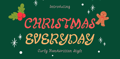 "Christmas Everyday" is a unique and cute handwritten font. This font is equipped with uppercase, lowercase, numerals, punctuation, and multilingual support. Very suitable for Christmas, wedding, engagement, invitations, Valentine, Halloween, Christmas, winter, fall, and others.
 - Kazincbarcika Script by Roland Hüse Design,
$9.00 An elegant calligraphy script. I named it after my hometown, Kazincbarcika. I think it looks interesting written down.The first letter I designed was the initial "K" and I have built the whole set around that.
 - KG Legacy Of Virtue by Kimberly Geswein,
$5.00 This font is based on the handwriting of an elderly gentleman who hand-copied the Bible twice in his lifetime. His neat, fluid penmanship leaves a written legacy of love for his family and God.
 - P22 Broadwindsor by IHOF,
$24.95 Broadwindsor is part of the "Staunton Script Family" of fonts designed by Ted Staunton for his historic novel. The Broadwindsor font is a neatly written script with capitals and lower case in a close relationship.
 - Christmas Sabila by Yoga Letter,
$18.00 "Christmas Sabila" is an elegant and simple blackletter font. This font is equipped with uppercase, lowercase, numerals, punctuation, and multilingual support. very suitable for Christmas, weddings, invitations, certificates, Valentine's, spring, summer, winter, parties, and others.
 - Script Love by Okaycat,
$29.95 Script Love is a connected cursive script appearing as hand written in three weights: fine pen, pen & marker. Script Love features extended characters, containing West European diacritics & ligatures, making it suitable for international environments & publications.
 - Text Book by ParaType,
$30.00 Designed at Polygraphmash in 1958 by Elena Tsaregorodtseva; Latin characters and italic were added in 1987 by Emma Zakharova. An early sans serif ('Grotesque'), it was developed for primers and the first level school textbooks.
 - Karlo by The Northern Block,
$28.95 Karlo is a super family of several branches, originating in the same lightweight skeleton. The lightweights are based on a pen of an even stroke-width. Inspired by the writings of calligrapher Edward Johnston, the family moves on in two directions in the heavier weights. Johnston demonstrated that the broad nib pen can produce different writing styles. Following this, one heavy weight has a humanistic low stroke contrast (KarloSerifBold and KarloSansBold), and another has a high stroke contrast of vertical axis with references to the 19th century jobbing typefaces (KarloOpen). The latter is inspired by Johnston’s demonstration of the broad nib pen, where he suggested fastening two pencils together. With each pencil representing an edge of the pen, it becomes more evident how the pen works in writing. The friendly informal look makes KarloSans and KarloSerif usable for both running text and for display sizes. KarloOpen, on the other hand, is solely designed for display purpose showing few words at a time. In Denmark, a guy named Karlo would typically be an old fellow with a slick hairstyle that makes an effort with his appearance. He is a handyman who can do a bit of this and that when needed. He is a happy go lucky kind of guy that takes one day at a time. To me, the typeface family has some of the same qualities. Check out Pyke which is a great pair for Karlo.

