10,000 search results
(0.04 seconds)
- Paradigm by Shinntype,
$9.00 Originally released in 1995 as a three font family, Paradigm forcefully addressed the emaciating effect that digitization was then exerting upon traditional serifed typography. Investigating the new media of a much previous era, Nick Shinn deconstructed the first roman type, designed by Sweynheym and Pannartz in 1467, and gleaned, from its minuscules, the low contrast and discreet serif treatment (portrayed by a novel convex effect), which he subsequently applied to both capitals and lower case of a classically proportioned Venetian invention. Now in 2008, the glyphs, metrics and hinting of the 1995 fonts have been refined, Extra Bold and Light weights added, a full range of OpenType features instituted, and the number of characters per style increased almost threefold. It is a major upgrade to a unique typeface.
 - Good Faster by Mans Greback,
$59.00 Good Faster is a bold script typeface. In a quirky calligraphic style, this flowing font has a rustic look and soft lines. The Good Faster family consists of four styles: Regular, Bold, Italic and Bold Italic, complimenting each other for the greatest design possibilities. The font is built with advanced OpenType functionality and has a guaranteed top-notch quality, containing stylistic and contextual alternates, ligatures and more features; all to give you full control and customizability. It has extensive lingual support, covering all Latin-based languages, from Northern Europe to South Africa, from America to South-East Asia. It contains all characters and symbols you'll ever need, including all punctuation and numbers.
 - Brenham JNL by Jeff Levine,
$29.00 Before typography had 'rules', lettering artists set down designs that have endured as classics. A perfect example is Brenham JNL, which was modeled after an antique wood type. The extra elongation of some characters, the irregular shapes of others and the overall hand-made charm of the entire design makes this digital font the perfect choice for replicating broadsides, posters and anything needing a nostalgic look as if from the past.
 - Messner by Juraj Chrastina,
$29.00 Hairline fonts are very clean, shining, elegant and even luxurious. They look great in fashion magazines, in the expansive world of beauty and glory. Messner is an extra-light all-caps face, especially suitable for larger sizes. Simplicity, purity and readability of its classic forms were on the first place in the creation process. Messner was a resource for designing the Kammerlander family and their combination looks very natural.
 - Riborn by Garisman Studio,
$15.00 Rebirth begins with light streaks that form a vintage style with a touch of rough and stamp. Riborn with 4 fonts in number, as "ribs" in your design work, and able to beautify also strengthen your work in the form of type logos, typography, hand-lettering, packaging, t-shirts, labels, and much more. This family also equipped with an extras weight, which includes beautiful ornaments in a classic and minimalist impression.
 - Mencken Std by Typofonderie,
$59.00 An American Scotch remixed in 27 fonts Mencken has twenty seven styles, divided into three widths, three optical sizes, romans and italics. Generally, optical size typeface families belong to a same common construction. It falls into the same category of type classification, while presenting different x-heights or contrasts. Mencken is unique because it is designed according to different axis and optical sizes. Firstly, Mencken Text is a low-contrast transitional typeface, designed on an oblique axis, asserting horizontal with featuring open counters. Its capitals follow Didots to better harmonize the rest of the family. On the other side of the spectrum, Mencken Head (and narrow variations) is designed on a vertical axis, high contrast, in a contemporary Didot style. The Mencken is therefore a typeface answering to different sorts of uses, whose design is different according to its uses: from oblique axis in small size to vertical axis in large sizes. Vertical proportions (x-height, capitals height, etc.) were calibrated to be compatible with many Typofonderie typeface families. Lucie Lacava and I followed the idea launched by Matthew Carter few years ago for some of his typefaces intended for publications. From Baltimore Sun’s project to Typofonderie’s Mencken It is a bespoke typeface for American newspaper The Baltimore Sun started at the end of 2004 which marks the beginning of this project. The story started with a simple email exchange with Lucie Lacava then in charge of redesigning the American East Coast newspaper. As usual, she was looking for new typeface options in order to distinguish the redesign that she had started. At the time of its implementation, a survey of the newspaper’s readers has revealed that its previous typeface, drawn in the mid-1990s, was unsatisfactory. The Mencken was well received, some reader responses was particularly enjoyable: “It’s easier to read with the new type even though the type is designed by a French.” Why it is called Mencken? The name Mencken is a tribute to H. L. Mencken’s journalistic contributions to The Sun. According to the London Daily Mail, Mencken ventured beyond the typewriter into the world of typography. Because he felt Americans did not recognize irony when they read it, he proposed the creation of a special typeface to be called Ironics, with the text slanting in the opposite direction from italic types, to indicate the author’s humour. Affirming his irreverence, the Mencken typeface does not offer these typographic gadgets. Henry Louis Mencken (1880 — 1956) was an American journalist, satirist, cultural critic and scholar of American English. Known as the “Sage of Baltimore”, he is regarded as one of the most influential American writers and prose stylists of the first half of the twentieth century. He commented widely on the social scene, literature, music, prominent politicians and contemporary movements. Creative Review Type Annual 2006 Tokyo TDC 2018
 - Moycen by Muksal Creatives,
$10.00 Introducing Moycen font is the perfect blend between bold, modern and feminine. It's strong yet soft, urban and high fashion. The hard lines with subtle rounded edges gives it a perfect mix of contemporary typography and classic design. Versatile is an understatement.
 - Luckenbach by Deeezy,
$14.00 Trendy, bold & modern style serif font for your fancy projects. Elegant, luxury and classic style on Luckenbach font will be great for any branding project. Lot of ligatures will help you to create unique and original logo design or website header! Enjoy :)
 - Dunsmuir by Deeezy,
$14.00 Trendy, bold & modern style serif font for your fancy projects. Elegant and classic style on Dunsmuir font will be great for any branding project. Lot of alternates and ligatures will help you to create unique and original logo design or website header! Enjoy :)
 - Hallie by Gleb Guralnyk,
$14.00 Introducing a classic bold font Hallie. It's an elegant typeface with very high contrast shapes. Thin curly elements combined with bold base shapes brings vintage and modern impression at the same time. Hallie also has a lot of ligatures and swash symbols that helps to create an original lettering composition. It's perfect for labels and postcard design. Thank you and have a nice day!
 - Engage by Sohel Studio,
$14.00 "The 'Emerge Font' is a captivating typeface with a unique and bold serif display style. Featuring distinctive thick lines, each letter exudes strength and firmness. This font combines classic serif elements with modern touches, creating a visually striking and bold appearance. Emerge Font evokes elegance while maintaining a modern edge, making it ideal for graphic design projects, posters, and layouts that require unforgettable visual appeal."
 - Salsiccia by Bech Type,
$19.00 Inspired by bold and rounded typefaces on signs from the 1970s, Salsiccia can promote both your hot dog stand and your international toy store enterprise. Its boldness and roundness is combined with classical proportions, with wide letters — like the O — next to little nubby ones — like the T. This not only looks nice, but helps us even out the white spaces across words and sentences.
 - Tallings by Grontype,
$14.00 TALLINGS is a bold modern, urban-condensed font, inspired by street urban poster that combines the classic and modern style. TALLINGS will be best suited for creating logotypes, branding, headlines, corporate identities, Invitation card, and other graphic design elements. TALLINGS Features: Bold condensed font Punctuation & Characters Ligatures and alternates Glyphs included superscript & Symbol Currencies Multilingual Thankyou for picking up this font. Happy creating! Regard, Grontype
 - Frontis by Tipo Pèpel,
$24.00 Inspired by the Roman lettershapes that Asensio y Mejorada drew in 1780, Frontis is a text typeface that takes this reference just as a starting point. The delicate appearance of Neoclassical fonts becomes confidence in Frontis. The characters have a solid skeleton, and the text looks classy in the condensed half of the family. A style that shines especially at display sizes. A collection of vegetal motifs and some stylistic uppercase ligatures complete the character set. These extra shapes serve to frame and bring together all the weights and styles in the type family. The lapidary ligatures and the ornaments underline the 18th-century roots of the design. There is a connection between Frontis and those classic letters that were once engraved on stone. And yet, the design is daring enough to make it a perfect choice for contemporary use.
 - Brophy Script by Monotype,
$29.99Brophy Script is a bold connecting brush alphabet. This brush script typeface was designed in 1953 by the American type designer Harold Broderson. Broderson worked for ATF (the American Type Founders), who were the original publishers of this design. Brophy Script is a version with more handwritten letters than to its other version called Body. This a brush script face that mimics the show card style of lettering, which was very popular throughout the United States during the first half of the 20th Century. The letters appear as if they were drawn quickly and spontaneously with a wide, flat lettering brush. The lowercase letters connect to each other, cursive script style. Brophy Script is the perfect display face to provoke a nostalgic feeling for the 1950s. Anything having to do with apple pie, home cooking, or last minute sales would look great in this face. You could outfit a whole supermarket signage system in a snap with Brophy Script. - Penang by AdultHumanMale,
$20.00 Penang is a modern take on an old piece of Art Deco signage I had discovered in Penang Malaysia. The font is available in four styles: Regular, Bold and Italics of both. It looks great as All Caps but works equally well in standard copy. The font is loaded with plenty of extras and glyphs (256 but who is counting). I have various cuts of certain letters available as alternates to enhance whatever design you’re working on. I’m really happy with how this font finished, so I hope you enjoy using it.
 - Nouveau Techno JNL by Jeff Levine,
$29.00 The French publication “La Lettre Dans le Decor et La Publicite Modernes” (“The Letter in the Modern Décor and Advertising”) was a 24-page booklet showcasing the then-current trends of the time (circa late 1930s-early 1940s). On one page was found a squared, extra bold sans serif alphabet set with strong Art Nouveau influences, yet it was ahead of its time by taking on the look and feel of 1980s techno typography. They say “everything old is new again”, and Nouveau Techno JNL is now available digitally in both regular and oblique versions.
 - Metafiz by Java Pep,
$17.00 Hello, proudly present my newest serif font. Metafiz is an elegant typeface that presenting standout, classy, sophisticated, and outstanding purpose. Metafiz comes with 4 styles - regular, italic, bold, and bold italic. Don't worry about the features, Metafiz completed with uppercase & lowercase, numeral, punctuations, and multilingual that support 17 languages.
 - Sweet Revenge PS by pentagonistudio,
$14.00 Sweet Revenge Is A Modern Family Font Serif Including 8 Font Style. Font Features : Sweet Revenge Thin OTF/TTF/WOFF/WOFF2 Sweet Revenge Extra Light OTF/TTF/WOFF/WOFF2 Sweet Revenge Light OTF/TTF/WOFF/WOFF2 Sweet Revenge Regular OTF/TTF/WOFF/WOFF2 Sweet Revenge Medium OTF/TTF/WOFF/WOFF2 Sweet Revenge Semi Bold OTF/TTF/WOFF/WOFF2 Sweet Revenge Bold OTF/TTF/WOFF/WOFF2 Sweet Revenge Extra Bold OTF/TTF/WOFF/WOFF2 SOFTWARE REQUIREMENTS : Fonts and alternate : No special software required they may be used in any basic program /website apps that allows standard fonts That's it folks! You can go ahead and get cracking :) Follow My Shop For Upcoming Updates Including Additional Glyphs And Language Support. And Please Message Me If You Want Your Language Included or If There Are Any Features or Glyph Requests, Feel Free to Send me A Message. Have a Good Day !
 - Widy by Pasternak,
$12.00 Wide font family is a geometric sans serif font, which features 9 styles. It’s based on the Futura developed by Paul Renner and neo sans-serif fonts. At the same time, it has significant stylistic differences. Massive lengthy letters are among the unique features of this font. They will help you come up with the perfect composition. The letters have optical compensation, while a circle is the main figure of the fonts. Due to wide fonts, your project will have modern and fresh design. The composition will keep its contrast regardless of a background you’ve chosen. The Widy family includes 9 styles: Thin, Extra Light, Light, Semi Light, Regular, Medium, Semi Bold, Bold and Extra Bold. Each of them also has Italic variation. The fonts are perfect for both graphic design projects (posters, brand identities, logotypes) and simple interface design, which needs the necessary style.
 - Billie Eilish by Zane Studio,
$15.00 Introducing the new Billie Eilish Modern Ligature Serif!!! Billie Eilish is a modern, elegant and classy serif typeface, best used as a display for headings, logos, branding, magazines, product packaging and invitations. Billie Eilish comes with clean lines and smooth curves that give any project an extra touch of class. Billie Eilish is built with OpenType features and includes 136 ligatures, alternatives, numbers, punctuation, and also supports other languages. If there's anything else you're not sure about, feel free to message me :) That's it! Have fun using Sparkling Modern Serif Ligatures!!! Feel free to follow, like and share. Thank you so much for checking out my shop!
 - Gemas by Allmo Studio,
$22.00 Gemas is a wide typeface that looks incredible and has attractiveness when you see it. Each letter shape has been designed to have a character that is easily recorded in the mind. This font has cute and classy characters, clean lines, and smooth curves giving any project an extra touch of class. A serif modern and wide typeface that his own unique style & modern look. This typeface is perfect for large point size, for example in magazine layouts, packaging, book, title design, fashion brand, clothes, lettering, quotes design, and many other ways to your work. A-Z Character Set a-z Character set Numerals & Punctuations Multilingual Thanks, Alamsa
 - Lostgun by Qaratype,
$20.00 Lostgun is a Stunning, classy upper and lowercase typeface that looks incredible in both large and small settings. Best used as a display for headings and logos, Lostgun has clean lines and smooth curves that gives any project an extra touch of class. IMPORTANT NOTE: Lostgun includes a lot of Ligatures that may show by default. If you want to use an alternate character in the place of a ligature or to use the basic characters instead, you may need to disable the OpenType Feature on your software. Main Features: Uppercase & Lowercase letters Punctuation and special characters Multilingual support OTF Format Alternate and Ligatures
 - Alquitran Stencil by RodrigoTypo,
$45.00 Alquitran Stencil is a variant of Alquitran Pro. Alquitran stencil is specially designed for titles, with stencil effect.,Iin addition to Regular and Bold Alquitran Stencil also contains Rough and Rounded with additionally traces Extras (1-2) that are dingbats that support the text to look much more realistic.
 - Outdoor Cafe JNL by Jeff Levine,
$29.00 The movie poster for the 1937 film “Cafe Metropole” served as the basis for Outdoor Cafe JNL, which is available in both regular and oblique versions. The extra bold, stylized letter forms with their rounded corners typify the wide variety of typographic styles the Art Deco period offered.
 - Churchward Legible by BluHead Studio,
$25.00 Churchward Legible is an extensive typeface family designed by New Zealand type designer Joseph Churchward. A geometric sans serif, it is, as its name boasts, highly legible and readable on screen as well as in print. The family includes five weights from Light to Extra Bold, with companion italics.
 - Carrosserie by Letterwerk,
$27.00 Carrosserie is made for display use, inspired by the shapes of the ’30s. It is a capital letter font with alternate characters and special domain symbols (check the PDF in the gallery for details). The font is now available in thin, extra light, light, regular, medium, bold & fat. Enjoy!
 - Cadaques by Supfonts,
$18.00 Cadaques is a bold, condensed font inspired by the nostalgia and aesthetics of the early 90s. Ideal for advertising, headlines, editorial design, branding, and posters. Cadaques Font Features: - Full Set of standard alphabet and punctuation - PUA Encoded - no special software needed to access extra characters - Multilingual Characters AÁĂÂÄÀĀĄÅÃÆBCĆČÇĊDÐĎĐEÉĚÊËĖÈĒĘẼFGĞĢĠḠHĦIIJÍÎÏİÌĪĮĨJKĶLĹĽĻŁMNŃŇŅÑ OÓÔÖÒŐŌØÕŒPÞQRŔŘŖSŚŠŞȘẞTŤŢȚUÚÛÜÙŰŪŲŮŨVWẂŴẄẀXYÝŶŸỲỸZŹŽŻ
 - Boldiva by Graphicfresh,
$9.00 Looking for a way to add a touch of bold, retro charm to your designs that evoke the fun and creativity of the 70s, 80s, and 90s? Look no further than our collection of classic and modern fonts that are perfect for logos, posters, and all kinds of design projects, whether you're going for an old-school vibe or a fresh new twist on retro design. With our carefully curated selection of fonts, you'll have everything you need to create eye-catching and memorable designs that capture the essence of classic design from the past. Whether you're looking to add some vintage flair to a modern design, or you want to create a throwback look that's right at home in the 90s, our fonts are the perfect tool for the job. From bold, geometric designs that harken back to the 80s, to playful, colorful fonts that embody the fun-loving spirit of the 70s, our collection has something for everyone. And with our easy-to-use design tools and resources, you'll have everything you need to bring your creative vision to life in no time. So why wait? Start exploring our collection of classic and modern fonts today, and discover how easy it can be to create stunning logos, posters, and designs that are truly one-of-a-kind. Whether you're a seasoned designer or just starting out, our fonts are the perfect way to add a touch of old-school charm to any project.
 - Qanoar by Hishand Studio,
$15.00 Classy look font of Qanoar. a modern serif font family that drawn inspiration from elegant, modern, but classic at the same time. just have a look at this beautiful handcrafted serif typeface. Use it for logo, design, branding, and many more. Complete with ligatures alternates regular italic icon kerning multilingual support
 - Silo Slab by TypeUnion,
$25.00 Designed and built in London by TypeUnion, Silo Slab is a fluid slab serif typeface embodying energetic curves and a clean, functional structure. The Silo Slab Family is made up of 6 weights, which range from a delicate Extra-Light, all the way through to a punchy, loud Extra-bold and each carry a versatility for multiple applications and uses. Each weight has a matching italic. Silo Slab features open type alternate characters, and extensive language support to provide a flexible, substantial user experience.
 - Honey Drops by Fenotype,
$25.00 Honey Drops is a bold brush family with Script, casual Caps and Extras. Honey Drops is divided into three styles -regular, distressed and one with stylised cuts that strengthens the brush stroke. Honey Drops is packed with several OpenType features: Contextual Alternates and Standard Ligatures are automatically on to keep the flow. For flashier characters try Swash or Titling Alternates. Font is PUA encoded so you can access extras from character map in most design softwares. For the best price purchase the complete pack!
 - Carputins by Maulana Creative,
$14.00 Carputins is a casual script font. With bold felt tip stroke, fun character with a bit of ligatures and has a two files lowercase alternates extra swashes. To give you an extra creative work. Carputins font support multilingual more than 100+ language. This font is good for logo design, Social media, Movie Titles, Books Titles, a short text even a long text letter and good for your secondary text font with sans or serif. Make a stunning work with Carputins font. Cheers, Maulana Creative
 - Revaux by Wahyu and Sani Co.,
$18.00 Revaux is elegant display serif designed with ball terminals and back-slanted counters which is uncommon in type design. Modern, Stylish and Elegant were the main keywords to keep when designing the typeface. Revaux is a family of 14 fonts, consisting of 7 weights from Extra Light to Extra Bold for both upright and italic styles. Each font has 230+ glyphs including alternates & ligatures which support Major Western European languages - 61 languages supported! Revaux is unique, different, and a must have item to complete your font arsenal!
 - Mommie by Hubert Jocham Type,
$59.90 In the early 1980s, at the start of my career, I had the opportunity to work in a print shop with classic lead setting. In those days I would study issues of U&lc magazine from ITC. What really caught my attention were scripts in the Spencerian style. I’ve been fascinated by this American penmanship tradition ever since. A few years ago I developed a font. Boris Bencic used it when he was redesigning L’Officiel magazine in Paris. I took these initial forms and developed them into the font Mommie when I started my own foundry. Although I usually design text typefaces, working on Mommie taught me how complex it can be to create a script headline font. The biggest challenge in this process has been to keep it alive and fresh. The Regular weight is only made for very big headlines. The thin lines with the bold drops are very elegant. For smaller sizes use the Medium and Small weight. It won the TDC 2008 award and was Judges Choice of Christian Schwartz.
 - Megante by Sensatype Studio,
$15.00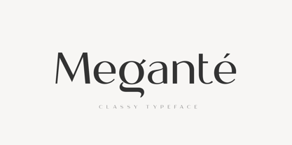 A Modern Classy Luxury Font that we created special for Luxury and Fashion branding needs, with extra characters alternate in unique shape will be ready to add value of your brand. It so nice to leverage designer or product owner that need solutions to make their design look more classy and modern. And specially for this font, We prepared any alternate characters to help you create unlimited variations for your creative needs. Megante Classy Font ready with: Any options to get creative variations (combination of Any Alternates) Preview as a inspirations that you can do with Megante Ready with Lowercase and Uppercase characters Wish you enjoy our font. :)
 - Gray by Sensatype Studio,
$15.00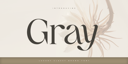 A Modern Classy Luxury Font that we created special for Luxury and Fashion branding needs, with extra characters alternate in unique shape will be ready to add value of your brand. It so nice to leverage designer or product owner that need solutions to make their design look more classy and modern. And specially for this font, We prepared any alternate characters to help you create unlimited variations for your creative needs. Gray Modern Classy Luxury Font ready with: Any options to get creative variations (combination of Any Alternates) Preview as a inspirations that you can do with Gray font Ready with Lowercase and Uppercase characters Wish you enjoy our font. :)
 - Kilura Style by Sensatype Studio,
$15.00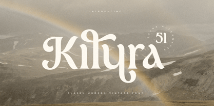 An Classy Modern Vintage Font font that we created special for elegant branding needs, with extra alternates in unique shape will be ready to add value of your brand. It so nice to leverage designer or product owner that need solutions to make their design look more classy and modern. And specially for Kilura font, We prepared any alternate characters to help you create unlimited variations for your creative needs. Kilura Classy Modern Vintage Font ready with: Any options to get creative variations (combination of Alternate characters) Preview as a inspirations that you can do with kilura font Ready with Lowercase and Uppercase characters Wish you enjoy our font. :)
 - Kage by Balibilly Design,
$12.00 Welcome to the old version of Kage. "Old does not mean obsolete" In April 2022, we updated whole letterforms. We redrew all glyphs and refined the nodes, corners, rounded shapes, flowing tails, etc. Of course, you can still use the update of an older version of Kage, although we highly recommend you move to the Pro version for the full benefits. Kage Pro has massive development, puts forward experimentation on alternate letters, and applies an oblique style to provide diverse style choices. Come with tons of swirly ligatures and advanced opentype features include case-sensitive forms, small caps, standard and discretionary ligatures, stylistic alternates, ordinals, fractions, numerator, denominator, superscript, subscript, circled number, slashed zero, old-style figure, tabular and lining figure. Learn more about Kage Pro here: Kage Pro 2.0 | Type Specimen About Kage The Inspiration: The radical exploration world of fashion inspires us. It leads our minds to the Neo-classical type style created during the age of enlightenment in the 18th century. It has a reasonably extreme contrast from the previous serif style, making the impression that it is emitted more expensive and classy. Organically, this Neo-Classical typeface is closely related to the fashion world, especially in Europe, and even spread across the globe. Fashion and this typeface reflect each other. After, we boldly observed Japanese fashion designer Rei Kawakubo. Famous for radical & deconstructive fashion, which makes the world of fashion more flexible and dynamic. The Design: As well as the typeface that we made, we started it with a cultural foundation of the Didone typeface. We tried to deconstruct the appearance. The decoration that better reflected the dynamic of fashion implemented in the fashionable alternate and calligraphical stylistic set ended with ball terminals. The versatile impression created is like taking off a scarf on the model's hair during a fashion show. The deconstructive image is combined with a legibility structure like the appearance of the Neo-Classical style. Kage is designed to visualize a costly and exclusive image of a thing, product, world clothing brand, famous fashion magazine, etc. The modern transitions of each letterform are softer, so when repositioning and escalating the size of this font, it will remain beautiful without injuring other elements. So, Kage is a bold choice on headlines and more prominent media with a portion of 50% even more. The Feature: Kage has 11 styles, from thin to black; all family-style consist of one variable font with two axes. The total number of glyphs is 748 in each style. She comes with tons of swirly ligatures and stylistic alternates in Advance OpenType features, including: discretionary ligatures, stylistic alternates, ordinals, fractions. Support multi-language including Western European, Central European, Southeastern European, South American, Oceanian, Vietnamese.
 - Deco Wood Type JNL by Jeff Levine,
$29.00 When people usually think of wood type, images of bold and ornate designs reminiscent of the Old West or the Victorian Era come to mind. In truth, wood type was manufactured well into the late 20th century, and only fell out of favor when the letterpress was replaced by the offset press and computerized typesetting. Although there are hard-core collectors who have started a small resurgence in the preservation and use of wood type, it's the digital interpretations of these classic faces that see the most use in today's electronic layout work. Deco Wood Type JNL reinterprets one of these later designs, a bold sans with a decidedly Art Deco influence.