10,000 search results
(0.03 seconds)
- JP MultiColour by jpFonts,
$29.90 Multicolored Fonts Many years ago, when Xerox Corporation still had its own font department, I came to Los Angeles in 1985 to train the IKARUS program. One day Bill Kienzel, head of the Xerox font department at the time, said we should go to the Hollywood Hills together; he knew people there who were experimenting with multicolored fonts. After a little wandering through the winding streets of the many hills, we reached a somewhat overgrown, simple family house standing under trees. A group of very inspired designers were waiting for us there. They immediately showed us the works they created using photomechanical tricks. They were fascinating. The American colors and the whole look seemed noble and enchanting. The problem was that this process was very difficult to implement and required a lot of effort on individual letters. They dreamed of a colored font that could be used for normal typesetting. We thought back and forth about how to save the individually colored letters in a common font, but soon gave up because we didn't see a technical option. So this idea and the memory of the time in Hollywood lay dormant in the back of my mind for many years, until at the beginning of this year 2023 I received an order to produce an outline typeface and the story came back to me. Suddenly I knew how to solve the problem from back then: if only the areas that should have the same color in all letters were saved in their own separate fonts, they could be colored independently of each other and later placed on top of each other. I implemented this in the 5 fonts that are now available with the 3 variants “Outside”, “Middle” and “Inside”. Together with the background, 4 colors can be combined with each other. This method works in text programs such as Word or InDesign. In Photoshop or Illustrator, the individual surfaces can also be colored by converting them into paths if the additional “Complete” variants (which contain all 3 contours) are used. There is also a “Basic” variant that can be used to achieve special effects such as overlay, bleed, etc. The first 5 fonts in this series are all based on the principle of contouring. Anyone who claims that you don't need any special fonts because they can be created automatically from any font using common programs is wrong or is only telling only half the truth. Anyone who has ever dealt with this knows that many individual adjustments to the design are necessary after contouring. This has happened in the 5 fonts that are now available and have very different styles. The dream from back then has come true. The user can set any text, long or short, in multiple colors, freely design the color scheme and apply all the usual typographic settings. Volker Schnebel, November 2023
 - Rawson by Latinotype,
$45.00 Designed by Alfonso García and Latinotype Team. Rawson is inspired by early humanist sans-serif English typefaces. We have added a bit of Johnston, a bit of Gill and a lot of Latinotype to the font. Rawson is an elegant font—but definitely not a black tie one—with the strength of a geometric sans but as friendly as a humanist typeface. This mixture, though not capricious, gives the font a ‘classic’ personality and a modern look at the same time. Rawson is a typeface with a large x-height, open counterforms and classical ductus. The font is well-suited for branding, signage, packaging and short text. Rawson has a 778-character set that supports 219 languages and includes alternative characters, discretionary ligatures, small caps, a variety of figures and fractions—a wide range of typographic tools to meet different design needs.
 - Rhizo by Stiggy & Sands,
$29.00 A Stylized Sans Serif with a Futuristic Flavor. The Rhizo font began as a digitization of a film typeface from LetterGraphics known simply as "Rodin". The original specimen included standard Capitals and Lowercase, Numerals and limited punctuation. We've fleshed out the original style to include alternates, ligatures and a full character set with all the trimmings. Stylish, gorgeous, a little dark, a little friendly...a variety of attitudes conveyed in this typeface. Opentype features include: Full set of Inferiors and Superiors for limitless fractions. A collection of Standard Ligatures. A small set of Stylistic Alternates Smallcaps Approx. 592 Character Glyph Set: Rhizo comes with a glyphset that includes standard & punctuation, international language support, and additional features.
 - Gandarita by IbraCreative,
$17.00 Gandarita, a vintage serif typeface, exudes timeless elegance and sophistication. With its carefully crafted letterforms, inspired by classic typography, Gandarita seamlessly blends tradition with a contemporary flair. The typeface boasts distinctive serifs that evoke a sense of refinement and nostalgia, making it an ideal choice for projects that require a touch of vintage charm. Its balanced proportions and intricate details lend a sense of authenticity, capturing the essence of bygone eras while maintaining a versatile appeal for a wide range of design applications. Whether used for editorial layouts, branding, or signage, Gandarita imparts a sense of enduring style, making it a standout choice for those seeking a classic serif typeface with a hint of character and sophistication.
 - Sumera Dita by IbraCreative,
$17.00 Sumera Dita is a contemporary serif font that seamlessly merges classic sophistication with a modern aesthetic. Its refined and elegant letterforms exude a sense of timeless grace, making it a versatile choice for a wide range of design applications. With a balanced and harmonious design, Sumera Dita strikes the perfect equilibrium between tradition and innovation. The subtly sculpted serifs and distinctive letter shapes contribute to its unique character, ensuring readability while adding a touch of personality to any project. Whether used in print or digital media, Sumera Dita brings a touch of refined professionalism to typographic compositions, making it a go-to choice for those seeking a modern serif font with a timeless appeal.
 - Pofukyso by IbraCreative,
$17.00 Pofukyso, a captivating monoline handwritten typeface, seamlessly blends simplicity with a touch of whimsy. Its uniform strokes and consistent line weight create a harmonious and contemporary aesthetic, making it ideal for a range of design applications. Pofukyso’s graceful letterforms evoke a sense of fluidity and friendliness, adding a personal and approachable charm to any project. Whether used in branding, invitations, or editorial design, this monoline typeface effortlessly bridges the gap between casual and refined, offering a versatile and delightful solution for those seeking a handwritten touch with a modern twist.
 - Twirrewyn by Hanoded,
$15.00 Twirrewyn is Frisian for ‘Whirlwind’. I have always liked the Frisian language; it’s like a crossover between English and Dutch. When I studied journalism in Zwolle (a city close to Fryslân) there were a lot of Frisian students and I did pick up a few words! Twirrewyn is a handmade font family: the fat version was made using a brush and ink; the light version was made using that same ink, but with a broken satay skewer instead of a brush. And yes, you have guessed right, we eat a lot of Satay! ;-)
 - Clootie by Hanoded,
$15.00 My wife was watching a baking show in which a Scottish guy attempted to cook a clootie. A what?? A clootie??? Never heard of a clootie! Apparently it is a suet dumpling, containing dried fruits (like raisins) and boiled in a piece of cloth (clootie means ‘rag’ or ‘strip of cloth’ in Scottish). Clootie font is a handmade bundle of happiness. It is rounded, soft and legible and will look particularly good on book covers. And I promise you all: one day I will cook clooties to find out what they taste like!
 - Bokahume by IbraCreative,
$23.00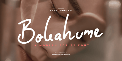 Bokahume is a captivating modern script font that effortlessly blends elegance with a contemporary edge. Its fluid and graceful letterforms flow seamlessly, creating a harmonious rhythm that captures attention. With its stylish swashes and gentle curves, Bokahume adds a touch of sophistication and versatility to any design project. From wedding invitations to fashion branding, Bokahume exudes a sense of refined beauty and modernity. Its balance between classic script elements and a contemporary twist makes it a perfect choice for those seeking a font that embodies both timeless elegance and a fresh, current aesthetic.
 - Goia by Almarena,
$29.00 Introducing Goïa™, a variable sans serif typeface available in 2 styles: A first one, very readable with a touch of originality, ideal for body text and a second one "Display", more impactful with a more assertive originality. Both styles are available in a variable or static version (9 weights + italics) with many alternates divided into 3 stylistic sets. Whether you are working on a branding project, an editorial project or any other graphic project, Goïa™ is the perfect choice for a modern and elegant look with a touch of personality.
 - Dubia by Ilhamtaro,
$17.00 DUBIA is a western style font, a font that goes well with cowboy, rodeo and vintage designs. The font, which is based on a serif font, is bold and tends to carry a strong and tough character like a cowboy taming a wild horse. This font is allcaps so it is perfect for creating a title or headline on a poster or magazine cover design. To enable the OpenType Stylistic alternates, you need a program that supports OpenType features such as Adobe Illustrator CS, Adobe Indesign & CorelDraw X6-X7. Cheers!
 - Sleepy Time by Hanoded,
$15.00 Sleepy time… Ah, if only your kids would go to bed, close their eyes and drift off to sleep. This font was created when my son had some problems falling asleep: he'd cry, he wanted to sleep in a different bed, he wanted a different animal friend (he has Tij - a tiger, Meh - a sheep, Rafi - a giraffe, Moo - a cow, Woofy - a dog, Kikker - a frog). Sleepy Time font is an all caps typeface with uneven letters and a very different upper and lower case. It comes with all languages, including Cyrillic!
 - Biscuit Juice by PizzaDude.dk,
$20.00 A biscuit and a cup of coffee, a biscuit and a cup of tee ... both are obvious - but what about a biscuit and a glass of juice? I loved that combination as a kid (and I even crumbled the biscuit in the juice...yuck...I wouldn't do that today!!! Anyway, here you have a legible uppercase font with a nice handmade look. I've added 4 different versions of each letter, which makes the font look really nice and slightly jumpy. I even added two nice swashes to the N and K. Enjoy!
 - Inverted Squircle by Aurora Borealiz Design,
$- What is an inverted squircle? To answer that we must first identify a squircle, which is a square with rounded edges. An inverted squircle isn't just a regular old square. It is a square with inverted rounded edges. This font is a modular font designed to create inverted rounded square edges. This font was created with using just a few shapes stacked and rotated to make a unique, digital font with a little bit of quirky personality.
 - Landslide by Ana's Fonts,
$12.00 Landslide is a cute handwritten font family with: 4 fonts: regular, bold, italic and bold italic, each hand-drawn separately for a true handwritten feel a bonus set of ornaments (A-Z, a-z and 0-9) to help decorate your text Each font includes: A-Z, a-z, 0-9, accents punctuation and symbols Ligatures Landslide is perfect for any design that needs a handwritten feel, such as signatures, notes and quotes, logos and branding.
 - ZT Kofimoya by Zelow Type,
$14.00 ZT Kofimoya is a brand new font that offers two distinct styles to choose from. The first style features a stiffer sans concept with a somewhat square shape, giving it a modern and assertive appearance. The second style is a normal sans, with a slightly rounded shape, providing a softer and friendlier look. With these two different styles, ZT Kofimoya offers flexibility in design and can be used for a variety of purposes. Thanks for using this font ~ Zelowtype
 - La Coffee by Creativetacos,
$12.00 Introducing La Coffee Font, a sleek, cool and professional handmade font that is perfect for adding a unique touch to your branding, logos, or your instagram quotes. It includes uppercase, lowercase, numbers, symbols and with Latin extended character support, it is versatile for a variety of creative endeavors, while exuding a rustic charm. La Coffee will look great on invitations, packaging, slideshows, logos, headlines, lettering, posters, branding, inspirational quotes, headlines, magazine layouts, website designs, advertising, invitations, packaging designs, book covers and any other creative endeavour. What's Inside the Product? - Weight of the Font: Regular The Font Kit comes packed with: - Big Letters (Uppercase) - Small Letters (Lowercase) - Numbers & Symbols - Multilingual Support Here's a sneak peek at the characters supported: - All the letters from A-Z (uppercase and lowercase) - All the numbers from 0-9 - All these special characters - !"#$%&'()*+,-./:;=?@[]^_`{|}~ ¡¢£¤¥§¨©ª«®°±²³´¶¸¹º»¿ˆˇ˜–—‘’‚‛“”„†‡•…‰‹›⁄€™− - And a range of international characters like á â à ä å ã æ ç é ê è ë í î ì ï ı ñ ó ô ò ö õ ø œ š ß ú û ù ü ý ÿ ž  À Ä Å Ã Æ Ç É Ê È Ë Í Î Ì Ï Ñ Ó Ô Ò Ö Õ Ø Œ Š Û Ù Ü Ý Ÿ
 - Irish Stout BB by Blambot,
$20.00 Created by Blambot’s Nate Piekos for a party invitation, IRISH STOUT has a deep, dark aroma and a creamy, white head. Serve ice cold with a heaping plate of Shepherd's Pie! Comes with a six-pack of European characters.
 - HU BlueoceanKR by Heummdesign,
$25.00 This is a headline typeface created by imagining the appearance of waves in a square glass tube. It is a typeface that adds a wave shape to the gothic style in a full square module. HU BlueoceanKR includes Korean.
 - Casper Marker by Biroakakarati,
$15.00 Casper Marker is a script that simulates writing with a marker and has a thick stroke, which is excellent for titles and large text. It was born as a font in block letters, but here it is in a minuscule version with numbers and glyphs. Casper Marker has a fresh and modern style, leaning a bit to the right which gives it dynamism and feeling with reading.
 - Blue (Not) Mono by Volcano Type,
$35.00 As a binary system, at the junction to two antagonist drawings, the Blue (Not) Mono typeface is a hybrid between the monospace and the humanistic sans-serif families. Declined to several variants and weights: a true monospace and a proportional one, a roman and italic style, bold and the main purpose is obviously to maintain in the same time a calligraphic identity, and a computing legacy.
 - Desk Drawer JNL by Jeff Levine,
$29.00Desk Drawer JNL is a collection of twenty-six images representing the kinds of small items lying around inside a desk at any given time… From a thumbtack to a spring clip… from a postage stamp to a roll of tape… even some shirt pins or some gummed labels… the center drawer of a desk can house just about anything that fits inside it! - Senhan by Studio Principle Type,
$17.00 A timeless serif with a distinctly contemporary attitude. The Senhan font family makes a statement with confidence. Defined by sexy, sharp, angular contours when used in headline and display scenarios, this family of 5 weights and italics is a real eye-catcher. But with a tall’ish x-height for legibility, and a medium contrast, Senhan is a workhorse at small sizes and in lengthy blocks of copy.
 - Fundevogel by Hanoded,
$15.00 Fundevogel is a Brothers Grimm fairytale about a boy who was found in a tree. The story, of course, has all the obligatory characters in it: a fair maiden, a wicked cook, an old forester and lots and lots of shapeshifting. And, yes, a happy end! Fundevogel font is a handmade fairytale font. It comes with extensive language support and all the cuteness you could wish for.
 - Waterman by John Moore Type Foundry,
$20.00 Waterman is a display font, its form is based on the figure of a fluid, creating a texture of undulating forms, rhythmic and free to make reading a stream wave experience. Waterman comes in Regular and Bold. The letter shape was developed from the design of the letter "a" and “l” lower case. The curve model is related on a stylized form of a fluid wave.
 - Jungle Man by PleasureFonts,
$14.00 Looking for a typeface with a unique appearance? Jungle Man is the right choice for advertising, graphic design and webdesign to make a personal statement. And when it comes to readability, you are on a safe side by using Jungle Man. There are numerous occasions where a handwritten font makes a great impression.
 - Sweet Ponch by Gleb Guralnyk,
$12.00 Hi, introducing a bold smooth font Sweet Ponch. It has a rounded simple shape in a childish funny style. It's perfect for various food packaging, logo design and lettering compositions. Ponch font has a west european multilingual support, check out a screenshot with all available characters. Thank you and have a nice day!
 - Belle Script by melifonts,
$- Belle Script is the first in a new series of melifonts, created entirely digitally using a pen tablet. A hybrid of script and print, it combines structure and elegance and makes for a stylishly clear typeface. Belle Script is the perfect font for a letter to a friend, printed labels, or graphic logos.
 - Wylgate by Greater Albion Typefounders,
$18.50 Wylgate us a classic sign writer’s lettering style, designed on an oblique line to capture and a sense of motion and speed. It’s a timeless design which can be used to draw attention to a headline or a sign, while maintaining perfect legibility. Bring a ‘middle 20th century’ feel to your next project.
 - 210 Jamak by Design210, Korean Fonts,
$300.00 It is a font designed in a balanced manner by optimizing the width and spacing of letters to make use of readability. Serif was treated as a curve to emphasize a soft and comfortable feeling. The serifs of the letters gave a distinct impression and gave it a natural look by adding inclination.
 - Calling Card JNL by Jeff Levine,
$29.00In today's day and age, the term "calling card" refers to a prepaid means of making long distance phone calls. In a more gentler time, the calling card (similar to a business card) was what a gentleman presented to a housekeeper or butler when visiting (calling) on a friend or business contact. - Bank Sans EF by Elsner+Flake,
$35.00 With its extended complement, this comprehensive redesign of Bank Gothic by Elsner+Flake offers a wide spectrum for usage. After 80 years, the typeface Bank Gothic, designed by Morris Fuller Benton in 1930, is still as desirable for all areas of graphic design as it has ever been. Its usage spans the design of headlines to exterior design. Game manufacturers adopt this spry typeface, so reminiscent of the Bauhaus and its geometric forms, as often as do architects and web designers. The creative path of the Bank Gothic from hot metal type via phototypesetting to digital variations created by desktop designers has by now taken on great breadth. The number of cuts has increased. The original Roman weight has been augmented by Oblique and Italic variants. The original versions came with just a complement of Small Caps. Now, they are, however, enlarged by often quite individualized lower case letters. In order to do justice to the form changes and in order to differentiate between the various versions, the Bank Gothic, since 2007 a US trademark of the Grosse Pointe Group (Trademark FontHaus, USA), is nowadays available under a variety of different names. Some of these variations remain close to the original concept, others strive for greater individualism in their designs. The typeface family which was cut by the American typefoundry ATF (American Type Founders) in the early 1930’s consisted of a normal and a narrow type family, each one in the weights Light, Medium and Bold. In addition to its basic ornamental structure which has its origin in square or rectangular geometric forms, there is another unique feature of the Bank Gothic: the normally round upper case letters such as B, C, G, O, P, Q, R and U are also rectangular. The one exception is the upper case letter D, which remains round, most likely for legibility reasons (there is the danger of mistaking it for the letter O.) Because of the huge success of this type design, which follows the design principles of the more square and the more contemporary adaption of the already existing Copperplate, it was soon adopted by all of the major type and typesetting manufacturers. Thus, the Bank Gothic appeared at Linotype; as Commerce Gothic it was brought out by Ludlow; and as Deluxe Gothic on Intertype typesetters. Among others, it was also available from Monotype and sold under the name Stationer’s Gothic. In 1936, Linotype introduced 6pt and 12pt weights of the condensed version as Card Gothic. Lateron, Linotype came out with Bank Gothic Medium Condensed in larger sizes and a more narrow set width and named it Poster Gothic. With the advent of photoypesetters and CRT technologies, the Bank Gothic experienced an even wider acceptance. The first digital versions, designed according to present computing technologies, was created by Bitstream whose PostScript fonts in Regular and Medium weights have been available through FontShop since 1991. These were followed by digital redesigns by FontHaus, USA, and, in 1996, by Elsner+Flake who were also the first company to add cursive cuts. In 2009, they extended the family to 16 weights in both Roman and Oblique designs. In addition, they created the long-awaited Cyrillic complement. In 2010, Elsner+Flake completed the set with lowercase letters and small caps. Since its redesign the type family has been available from Elsner+Flake under the name Bank Sans®. The character set of the Bank Sans® Caps and the Bank Sans® covers almost all latin-based languages (Europe Plus) as well as the Cyrillic character set MAC OS Cyrillic and MS Windows 1251. Both families are available in Normal, Condensed and Compressed weights in 4 stroke widths each (Light, Regular, Medium and Bold). The basic stroke widths of the different weights have been kept even which allows the mixing of, for instance, normal upper case letters and the more narrow small caps. This gives the family an even wider and more interactive range of use. There are, furthermore, extensive sets of numerals which can be accessed via OpenType-Features. The Bank Sans® type family, as opposed to the Bank Sans® Caps family, contains, instead of the optically reduced upper case letters, newly designed lower case letters and the matching small caps. Bank Sans® fonts are available in the formats OpenType and TrueType.
 - Noemi Slab by Brackets,
$22.00 Noemí is a broad typeface based on a formally classic skeleton, but with a strong Meccano character, where its quadrangular serifs are the protagonists of the slab style. It is a typeface designed to solve the basic problems of newspaper printing, adapted to a novel and strong communication, in the case of a wide typeface and with generous ink traps making the impression. Noemí was born from the need to create a broad, functional typeface family with a strong compact character intended for use in the press. Intended for editing and layout in a newspaper / magazine with a wide range of subfamilies thought and designed to achieve a diverse graphic functionality; designed from the same common skeleton, with a style based on the mix between the Mecan characters of traditional typewriter fonts and Roman fonts.
 - HU Hikiki KR by Heummdesign,
$25.00 HU Hikiki KR is a handwritten font that embodies the desire to become an adult as a child and imitate adults. It is a unique typeface with a large initial consonant and a sense of rhythm. This font contains Korean.
 - My Crooked Hand by Pitt's Hand,
$10.00 A useful font to have a handcrafted note effect "on the fridge". It can be used both in a graphic context and to letter a comic or create a slightly informal cover graphic. Handcrafted and then digitally converted and expanded.
 - Vapor by The Hiscott Foundry,
$35.00This font was inspired by the swirling steam drawn on a chalkboard at a coffee shop. Not actually a script font though it has a similar feel. This font dances and twirls the way a wisp of smoke or steam would. - Mizar Grotesk by Fatchair,
$9.95Mizar Grotesk is a sans-serif with a few quirks and a slight retro feel. - Inspiration by TypeSETit,
$29.95 Have a party with Inspiration. A fun, script font with a less-than-serious bounce.
 - Nacho Rough by RodrigoTypo,
$25.00 Nacho Rough! A dirty version accompanied by a Thin version, including a set of dingbats.
 - Thin Mint JNL by Jeff Levine,
$29.00Thin Mint JNL has a square, condensed look with a bit of a Deco influence.