10,000 search results
(0.048 seconds)
- Bembo MT by Monotype,
$45.99 The origins of Bembo go back to one of the most famous printers of the Italian Renaissance, Aldus Manutius. In 1496, he used a new roman typeface to print the book de Aetna, a travelogue by the popular writer Pietro Bembo. This type was designed by Francesco Griffo, a prolific punchcutter who was one of the first to depart from the heavier pen-drawn look of humanist calligraphy to develop the more stylized look we associate with roman types today. In 1929, Stanley Morison and the design staff at the Monotype Corporation used Griffo's roman as the model for a revival type design named Bembo. They made a number of changes to the fifteenth-century letters to make the font more adaptable to machine composition. The italic is based on letters cut by the Renaissance scribe Giovanni Tagliente. Because of their quiet presence and graceful stability, the lighter weights of Bembo are popular for book typography. The heavier weights impart a look of conservative dependability to advertising and packaging projects. With 31 weights, including small caps, Old style figures, expert characters, and an alternate cap R, Bembo makes an excellent all-purpose font family.
 - Bembo Infant by Monotype,
$45.99The origins of Bembo go back to one of the most famous printers of the Italian Renaissance, Aldus Manutius. In 1496, he used a new roman typeface to print the book de Aetna, a travelogue by the popular writer Pietro Bembo. This type was designed by Francesco Griffo, a prolific punchcutter who was one of the first to depart from the heavier pen-drawn look of humanist calligraphy to develop the more stylized look we associate with roman types today. In 1929, Stanley Morison and the design staff at the Monotype Corporation used Griffo's roman as the model for a revival type design named Bembo. They made a number of changes to the fifteenth-century letters to make the font more adaptable to machine composition. The italic is based on letters cut by the Renaissance scribe Giovanni Tagliente. Because of their quiet presence and graceful stability, the lighter weights of Bembo are popular for book typography. The heavier weights impart a look of conservative dependability to advertising and packaging projects. With 31 weights, including small caps, Old style figures, expert characters, and an alternate cap R, Bembo makes an excellent all-purpose font family. - Quartan by Linotype,
$29.99Quartan is an industrial, unicase sans serif family, with three weights. The Austrian designer Maria Martina Schmitt developed this series of typefaces for designers to use when setting chunks of text en masse. Being a unicase design, Quartan¿s letterforms have no ascenders or descenders; lines of text may be stacked virtually on top of one other. This offers a multitude of possibilities for headline, logo, or corporate identity design. - ITC Medea by ITC,
$40.99The designer of ITC Medea , Silvio Napoleone said: “I've always had an interest in early letter shapes, particularly how they influenced modern typographic designs. While I was on vacation in Greece, I had a chance to see, first-hand, examples of early letterforms and typography. They really made an impression on me.” The idea of combining the ancient and the modern to create something new was the primary inspiration behind ITC Medea. ITC Medea is essentially a careful blending of the modern sans serif with the elegant forms of the uncial. At first glance, Medea appears to be constructed of geometric shapes. However, closer inspection reveals many calligraphic subtleties. Stroke terminals are flared slightly in characters like the 'e' and 'c.' The top curve of the 'd' is more pronounced than the bottom, and characters like the 'o' are elliptical rather than round. “I gravitated towards the simplicity and legibility of the uncial and half-uncial,” Napoleone recalls. “I thought it would make a great titling font, and I was surprised at how attractive ITC Medea looked in a body text.” - Aldine 401 by ParaType,
$30.00Aldine 401 is a Bitstream version of Bembo type family. It was designed on the base of artwork of Francesco Griffo for Aldus Manutius. Originally the font appeared in “De Aetna” in 1495 — the book by Pietro Bembo about his journey to Mount Etna. Griffo’s design was one of the first old style typefaces followed by Garamond. It was the forerunner for the standard text types in Europe for the next two centuries. A modern version of Bembo was designed at Monotype under the supervision of Stanley Morison in 1929. Aldine 401 is still very popular in book design due to its well-proportioned classic letterforms and lack of peculiarities. Italic was based on the handwriting of Giovanni Tagliente. Books and other texts set in Aldine 401 can encompass a large variety of subjects and formats because of its classical beauty and high readability. Cyrillic version was developed by Isabella Chaeva and released by ParaType in 2008. - Margon by ParaType,
$30.00 Margon is a serif font family with a temperate design -- small serifs, moderate contrast, tiny roundings on the corners make it calm and serene. The Margon font family consists of 18 members divided into 4 groups of different proportions marked by indexes 360, 380, 400, 430. These values correspond to densities of sets -- 360 is the widest style, 430 is the most narrow one. The peculiarity of Margon family is a rather small difference in proportions of characters between neighbor groups, it’s less than 10%. Such tiny step gives possibility to select the font that gives the best result in combination of capacity and readability. Margon can be used in book, magazine and newspaper design.
 - Applied Sans by Monotype,
$57.99 The Applied Sans™ family is a reinterpretation of the first sans serif typefaces used in what was then called, “jobbing or trade” work – typefaces like Venus and Ideal Grotesk. While built on the foundation of these late 19th and early 20th century designs, Applied Sans adds to it all the required features for modern typographic communication. The design benefits from a large x-height, open counters, generous apertures and a subtle modulation in stroke weight. These ensure character legibility and make for a design that is inviting and easy to read. Applied Sans family’s wide range, precise gradation of weights and extensive language support guarantees the design’s effectiveness in a wide and varied range of uses.
 - Blackoak by Adobe,
$29.00Joy Redick designed Blackoak, a big and heavy Egyptienne-sytle titling slab serif face, in 1990. The extremely robust style of the characters in this typeface was consciously distorted; creating letterforms that appear flattened and stretched, like a rubber band. Blackoak is drawn in the style of old wood tpes, just like those that one envisions when one thinks of the large, decorative posters that once filled Wild West America. The wood type collection of the Smithsonian Institute in Washington, DC acted as a primary source of inspiration for this design. True to its rooks, Blackoak is meant for use exclusively in headlines in very large point sizes, or for logos and other corporate advertising purposes. - NS Lasttown by Novi Souldado,
$40.00 Inspired by the 18th - 19th century of Penmanship specimens archive from Europe and America, carefully crafted with precise mood, technique, and visual touch to bring back your design works into that specific era. It comes with a collection of 3 fonts that match well with each other. Also a set of wide features such as Ligatures and alternative swashes. Lasttown will be a great choice for your classy and formal visual looks such as certificate design, vintage label, commercial lettering works, sign painting, glass gilding, logo type projects, liquor store branding, wine packaging, anytime you need a classic visual touch, please, be our guest. What you get : Standard & Discretionary Ligatures Stylistic set Numerals & Punctuation
 - Meloso by Rachel Kick,
$14.00 Meloso is an easygoing typeface. It has a playful and organic feel that has its own hand-drawn charm while still being incredibly legible due to its simple shapes and high x-height. It has the unique ability to stand alone as a title text or work in small paragraph form. It's the perfect way to bring the friendly feel of an "imperfect" and slightly rounded font into your next project. Meloso is a variable font with 6 set weights. If you're using a program that supports variable fonts, you'll be able to choose any point between the "Extra Thin" and "Extra Bold" weights to get the perfect thickness and adjust the italic to the angle you need. You can also use the standard OTF files to have the 6 set weights.
 - The Cactus Sandwich Plain font by FontMesa is a versatile and charming typeface that carries a distinctive personality, blending the rustic charm of the American Southwest with the readability and fu...
- Fairway by Alan Meeks,
$45.00 The thinking behind Fairway was to create a relatively conventional soft sans with a certain amount of movement at the top of the x-height line. The face is casual and quirky but can still be used as a text face.
 - Glendale by Sarid Ezra,
$15.00 Introducing, Glendale - an extreme expanded sans family! Glendale is a basic sans font with unique lowercase form. With expanded lowercase, this font will standout and make a great choice for your next project! The important things is, you can access the special features with any software. You can use this font for any designs. Cool for logos and powerful for posters! With light, regular, and bold version, you can make your headline text more standout! This font also support Multi Language.
 - Rolfter by AlienValley,
$13.00 Introducing Rolfter, a classic serif typeface with many features including ligatures, tons of alternates and multilingual support. All the ligatures and alternates can be accessed by installing just one font file. LIGATURES & CONTEXTUAL ALTERNATES We recommend that you turn on both ligatures and contextual alternates for best results. You can do this in either Photoshop or Illustrator. Photoshop: Open the "Character" panel via Window - Character and check the standard ligatures and contextual alternates icons at the bottom left corner of the panel. Illustrator: Open the "OpenType" panel via Window - Type - OpenType and also check the standard ligatures and contextual alternates at the bottom of the panel. OPTIONAL ALTERNATES These are optional alternates that can be used depending on your current design. We recommend moderate use of these for optimal results as using too many can easily make the font unreadable. To access these you need to open the following panels depending on your software: Photoshop: Window - Glyphs (Note that this panel may not be available in earlier PS versions) Illustrator: Type - Glyphs You will then have access to all the glyphs inside the font file to use them as you like.
 - Roadart Grafiti by Sipanji21,
$13.00 Amanzinc Graffiti is an awesome display font that features the street art vibe. Take your designs to the next level with this stunning font!
 - Kuschelfraktur by Catharsis Fonts,
$36.00 Kuschelfraktur is a unique, eye-catching take on the theme of blackletter that replaces the broad nib with a brush pen and achieves stroke modulation through stencil-like gaps. It combines the texture and dignity of blackletter with the human warmth of informal handwriting. Kuschelfraktur offers five separate sets of capital letters and several additional customization option via stylistic alternates. The degree of ornamentation in the blackletter capitals can be increased (SS02) or decreased (SS07), while SS04 and SS05 offer two simpler approaches to capital letters that bridge from blackletter to Roman letters (Antiqua). The default single-storey �a� can be replaced with a two-storey version in SS01, and SS08 offers a single-storey capital �A� for the simple capitals. Finally, SS03 restores some of the more unique letter shapes of the Fraktur style of blackletter. The old-style figures can be replaced with lining and/or tabular figures. All these stylistic sets are accessible via OpenType from the main font, Kuschelfraktur, whereas the spin-off fonts (Traditional, Verziert, Text, Schlicht, Antiqua) offer convenient access to those sets even in environments without OpenType support. I am grateful to the helpful souls on the TypeDrawers and Typographie.info forums for encouragement and constructive feedback, and to the Glyphs team for their fantastic type editor. Kuschelfraktur is dedicated to my son Marius.
 - White Xmas by Mans Greback,
$59.00 White Xmas is a beautiful Christmas script typeface. This seasonal family is the ultimate set of decorative Christmas fonts, consisting of no less than 15 styles: Star, Snowflake, Plain, Clean, Swash, Background, and more. Use White Xmas as-is for your New Year's headlines or winter products, or as a layered color font to make the snow and stars shine in a brilliant white. The vast selection of styles makes for infinite decorative possibilities. Use symbols * + # for stars and snowflakes. Use underscore _ anywhere in a word to make a swash. Example: Sea_son Use multiple underscores for different swashes. Example: Christ_______mas (Download required.) Also includes a Color Font, for Photoshop and Illustrator! The two variations are colored in Red and Blue, both decorated with white snow. The font is built with advanced OpenType functionality and has a guaranteed top-notch quality, containing stylistic and contextual alternates, ligatures and more features; all to give you full control and customizability. It has extensive lingual support, covering all Latin-based languages, from North Europe to South Africa, from America to South-East Asia. It contains all characters and symbols you'll ever need, including all punctuation and numbers.
 - The Best We Could Do by Chank,
$39.00 The new font “The Best We Could Do” was created by artist and author Thi Bui who used the font in the graphic novel by the same name. The font is brush-script handwriting font which displays human personality rendered with bold confident strokes full of passion and expression. Chank’s work on this font captured Bui’s distinctive textual style and also saved her a ton of headache and time in inking. A debut memoir that tells the story of one family’s journey from their war-torn home in Vietnam in the 1970s to their new lives in America, the autobiographical book is lauded for its heart-breaking exploration of identity, family, and home. Bui ties her modern life with the multi-generational experiences of her family, weaving together the emotional threads of their relationships to find clarity in her current day. “The Best We Could Do” graphic novel is published by Abrams ComicArts and is available wherever fine books are sold.
 - Pentecoste by Tegaki,
$16.00 Pentecoste is created with stylist and handwritten characters. This handwritten font was PUA encoded. Pentecoste is a natural handwritten style that comes with Extended Latin Characters. Pentecoste works perfectly for logos, display, product branding, wedding invitation card, stationary, packaging, clothing, flyer, apparel, magazines, brochures, lable, posters, badges, etc. Pentecoste comes with 317 glyphs and 87 alternate characters contain with opentype features (supported with contextual alternates mode). Pentecoste also comes with 15 extended ligatures that allowing you to make stuff looks more exclusive and pro standard. You can access all those alternate characters by using OpenType savvy programs such as Adobe Illustrator, Adobe InDesign and CorelDraw X6-X7, Microsoft Word 2010 or later versions. There are additional ways to access alternates/swashes, using Character Map (Windows), Nexus Font (Windows), Font Book (Mac) or a software program such as PopChar (for Windows and Mac). For other programs that doesn't support OpenType features or Glyphs Panel such as Photoshop, you can use Character Map in Windows to access the alternate characters. Files included: Pentecoste (otf) How to access all alternative characters, using Windows Character Map with Photoshop: http://youtu.be/cxonI5QvULk How to access all alternative characters using Adobe Illustrator: https://www.youtube.com/watch?v=y5XTaWYwWA4 If you need help or advice, please contact me by e-mail "tegakiscript@gmail.com"
 - Linotype Renee Display by Linotype,
$29.00Linotype Renee is part of the Take Type Library, selected from contestants of Linotype’s International Digital Type Design Contests of 1994 and 1997. It was a prize-winning entry of American designer Renee Ramsey-Passmore. The letters of this font are strictly constructed with a grid, which is still visible in the weight Types + Lines. The figures are designed with only the basic forms of circle, rectangle and triangle, giving the font an individual and technical feel. Some letters are only recognizable in the context of a word, making Linotype Renee exclusively for short headlines in large point sizes. - French Plug by HiH,
$8.00 Frank H. Atkinson was a popular Art Nouveau sign painter in Chicago, Illinois. He designed signs for the Cadillac Motor Car Co., Chicago Academy of Fine Arts and the department store Marshall Field. Oddly enough, he even designed signs for other sign painters. In 1908 he published a book, Sign Painting, which sold well. French Plug, a bold, rounded, all-cap design in an American Art Nouveau style from that book. It has a relaxed, easy-going informality that is useful for ads and flyers. It also would have fit very nicely with many French posters of the period.
 - FF Providence by FontFont,
$72.99 American type designer Guy Jeffrey Nelson created this script FontFont in 1994. The family contains 4 weights: Regular, Italic, Bold, and Bold Italic and is ideally suited for advertising and packaging, festive occasions, poster and billboards as well as web and screen design. FF Providence provides advanced typographical support with features such as ligatures, small capitals, alternate characters, case-sensitive forms, and stylistic alternates. It comes with proportional oldstyle figures. As well as Latin-based languages, the typeface family also supports the Greek writing system. This FontFont is a member of the FF Providence super family, which also includes FF Providence Sans.
 - DXAngelus Mediaval by DXTypefoundry,
$45.00 The font DXAngelusMediaval was developed on the basis of the Angelus Mediaval font, which was issued by Russian type foundry from the beginning of the 20th century (type foundry of G. Bertgold, St. Petersburg and Moscow, before 1904). Probably, the font is a reworking of the DeVinne font (1892 (?), Designer Nicholas J. Werner) of the American Central Type Foundry. For the reconstruction, we used examples of font prints: Cyrillic from the catalog "Art Fonts", 1929, Latin part - Chicago font, from the catalog "La Fonderie Typographique Francaise" (FTF) 1924. In addition, in the font are available Digits of the old style and ligature.
 - News Gothic BT by Bitstream,
$29.99 The standard American sanserif of the first two thirds of the twentieth century, prepared for ATF by Morris Fuller Benton in 1908 under the name News Gothic, with a matching lightface known as Lightline Gothic. Linotype’s Trade Gothic follows News Gothic except for its widely-spaced straight-sided boldface based on ATF Alternate Gothic No.3. Linotype matches News Gothic Bold, a boldface version that originated at Intertype, with Trade Gothic Bold No.2. Ludlow Record Gothic follows News Gothic more loosely. News Gothic BT™ font field guide including best practices, font pairings and alternatives.
 - RF Marshall by Magpie Paper Works,
$18.00 RF Marshall was inspired by an 1883 tombstone, tucked away in a pioneer cemetery. The 4-sided marker is sparsely adorned with homespun carvings of a handprint, two tulip poplar leaves, and these words: "RF Marshall died 1883 Aged 72 years." The font faithfully reproduces the stone's hand-carved lettering and artwork, as well as artwork from other 18th and 19th century American headstones. It was drawn with calligraphy nibs dipped in walnut ink and delights in a range of end uses including period films, rustic decor, Halloween decorations, historical logos and branding, and on the pages of children's books.
 - Ariom Sans by S6 Foundry,
$25.00 Ariom is a fresh, geometric, sans-serif font family inspired by iconic typefaces. Ariom has a big x-height value, geometrical letterforms, sharp edges, and strong stroke contrast as the neo-grotesque fonts from the 20th Century. The typeface is versatile and can be successfully used in magazines, posters, branding, websites, headlines, large-format prints, brand identities, social media, advertising, editorial design, posters. The family contains over 40 alternative glyphs and over 50 ligatures in each style. The family comes in 3 weights with their corespondent italics. The family Latin supports Western, Central, South Eastern, South American, Oceanian, Pan African, Vietnamese, and Sámi.
 - Genteta by Typephases,
$25.00 In the tradition of the stock cuts that printing type foundries offered as metal, these spot illustrations remind you —for their look and technique— of vintage publications like victorian age newspapers and magazines. Similar to their counterparts in the Whimsies, Absurdies, Ombres, Bizarries and Whimsies series, the Genteta is another collection of little people in funny and absurd situations, recreated in black ink, from imagination and with no reference or models, and then carefully digitized. The Genteta trio of dingbats includes more than 150 new images. Their vectorial file format means you can use them at any size with no loss of quality. Every Genteta dingbat offers ready-made images for a variety of creative projects. They can be used as they come or easily customized in any graphics program. At small sizes they are ideal spot illustrations with a whimsical touch; at large sizes they can bring a whole page, a spread or even a big poster to life. Use them in creative projects including, but not limited to, flyers, brochures, book jackets and editorial illustration.
 - Sketchnote by Delve Fonts,
$29.00 The Sketchnote typeface was born of necessity: designer Mike Rhode needed a series of hand-drawn fonts to illustrate and produce his book, “The Sketchnote Handbook.” Because of its origin, this typeface was designed to be practical and convey the human character and quirks of his normal handwriting and hand-drawn lettering. The family is comprised of five fonts: Sketchnote Text in Regular, Bold, and Italic, the somewhat compressed and bold Sketchnote Square for headlines, and the playful Sketchnote Dingbats. Sketchnote Text is a casual script with a slightly bouncy baseline. In order to mimic the differences present in natural handwriting, OpenType features are built-in that automatically switch between multiple versions of each letter or number. In total, over 240 alternates in each of the text fonts are employed, making for a more authentic appearance. The warm texture of Sketchnote is the result of actual ink-spread on paper captured in the scans of written letterforms and was intentionally left intact during the digitization process to preserve that feeling. Rhode created Sketchnote Square as a display type to complement Sketchnote Text. Drawn instead of written, the letters often have neat little happenstance voids within the strokes. Sketchnote Dingbats features a selection of icons, rules, and arrows to provide some functional and fun tidbits, handy for bringing additional life to any design.
 - The KR All American font by Kat Rakos is a unique and captivating typeface that immediately evokes a sense of patriotic pride and nostalgia. This font is characterized by its bold and robust letterfo...
- CA Normal by Cape Arcona Type Foundry,
$40.00 CA Normal is a typeface aiming for beauty without ostensible effects, merely relying on clarity and well balanced proportions. True beauty is not to be found in perfect geometry, so slight irregularities and inconsequences are spread throughout the typographic image. That’s perfection through imperfection. CA Normal merges influences from European grotesques and American gothics, breeding an experimental mongrel. The underlying concept stays in the background, giving the design a great self-evidence. Although it is doubtful if there can be such thing as neutrality, CA Normal comes pretty close to what people mean when speaking of a neutral font. Nevertheless it’s not faceless, anonymous or confound able. It’s just that the charm comes from subtle details rather than obvious design features. As good text typefaces must not be too smooth nor too agitated, CA Normal is smuggling little uneven details into the typographic image, that keep the readers eye awake. The well crafted oblique follows the grotesque tradition which knows no individually drawn italics. A rather unexpected addition is the reverse oblique, a style mainly used for maps. Under the classic surface lies a modern well equipped font, featuring small caps, a Central European character set and numerals in all kinds of flavors. Numerous ligatures round up the overall impression. By default CA Normal will set numbers as proportional lining figures. But if you prefer oldstyle figures, or tabular figures, just use the OpenType functions of your layout program. These allow access to the small caps as well, which feature a complete central European character set, brackets, punctuation and lining figures in small caps height.
 - The Raslani American Letters font is a distinctive typeface that stands out due to its unique and stylized design. This font captures the essence of traditional American lettering, often associated w...
- Sulfforest by Maulana Creative,
$15.00 Sulfforest is a narrow handwritten font. With felt-tip stroke, slant and fun character with a bit of ligatures. To give you an extra creative work. Sulfforest font support multilingual more than 100+ language. This font is good for logo design, Social media, Movie Titles, Books Titles, a short text even a long text letter and good for your secondary text font with sans or serif. Make a stunning work with Sulfforest font. Cheers, MaulanaCreative
 - Westclock by Maulana Creative,
$11.00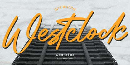 Westclock is a Script font. With regular felt-tip stroke, fun character with a bit of ligatures. To give you an extra creative work. Westclock font support multilingual more than 100+ language. This font is good for logo design, Social media, Movie Titles, Books Titles, a short text even a long text letter and good for your secondary text font with sans or serif. Make a stunning work with Westclock font. Cheers, MaulanaCreative
 - Kyliewest by Maulana Creative,
$11.00 Kyliewest is a signature script font. With regular felt-tip stroke, fun character with a bit of ligatures. To give you an extra creative work. Kyliewest font support multilingual more than 100+ language. This font is good for logo design, Social media, Movie Titles, Books Titles, a short text even a long text letter and good for your secondary text font with sans or serif. Make a stunning work with Kyliewest font. Cheers, MaulanaCreative
 - Jillstone by Maulana Creative,
$12.00 Jillstone is an Exspressive slanted signature script font. With regular felt-tip stroke, fun character with some of ligatures. To give you an extra creative work. Jillstone font support multilingual more than 100+ language. This font is good for logo design, Social media, Movie Titles, Books Titles, a short text even a long text letter and good for your secondary text font with sans or serif. Make a stunning work with Jillstone font. Cheers, MaulanaCreative
 - Askan Slim by Hoftype,
$49.00 Askan Slim has the same design features as Askan , cap-height, x-height, descenders and ascenders. It is a moderately condensed version of Askan and works superbly as an addition to Askan or as independently for space saving applications. It is the perfect complement of the Askan family. Like Askan, Askan Slim consists of 18 styles and is well equipped for advanced typography. It comes in OpenType format with extended language support. All weights contain small caps, ligatures, superior characters, proportional lining figures, tabular lining figures, proportional old style figures, lining old style figures, matching currency symbols, fraction- and scientific numerals, matching arrows and alternate characters.
 - Party Style by Sensatype Studio,
$15.00 Party is A Neon font for Event, Party, and Techno branding needs, with Fun style touch that you can combine to get any variations and unique shapes easily just in seconds with choose alternates of them. It is a serif display font with moderate contrast that perfect for branding projects, logo, wedding designs, social media posts, advertisements, product packaging, product designs, label, photography, watermark, invitation, stationery, and any projects, it makes with a high level of legibility. What's Included: Character set A-Z Numerals & Punctuation Accented Characters (West Europe) Works on PC & Mac Recommended using Adobe Illustrator or Adobe Photoshop. Wish you enjoy our font. :)
 - Elegancy Style by Sensatype Studio,
$15.00 Elegancy is Modern Luxury Elegant Font is a well-balanced contemporary font with a fancy, unique, and versatile Luxury serif, font that you can combine to get any variations and unique shapes easily just in seconds with choose alternates of them. It is a serif display font with moderate contrast that perfect for branding projects, logo, wedding designs, social media posts, advertisements, product packaging, product designs, label, photography, watermark, invitation, stationery, and any projects, it makes with a high level of legibility. What's Included: Character set A-Z Numerals & Punctuation Accented Characters (West Europe) Works on PC & Mac Recommended using Adobe Illustrator or Adobe Photoshop. Wish you enjoy our font. :)
 - Royal by Sensatype Studio,
$15.00 Royal is Modern Luxury Unique Serif Font is a well-balanced contemporary font with a fancy, unique, and versatile Luxury serif, font that you can combine to get any variations and unique shapes easily just in seconds with choose alternates of them. It is a serif display font with moderate contrast that perfect for branding projects, logo, wedding designs, social media posts, advertisements, product packaging, product designs, label, photography, watermark, invitation, stationery, and any projects, it makes with a high level of legibility. What's Included: Character set A-Z Numerals & Punctuation Accented Characters (West Europe) Works on PC & Mac Recommended using Adobe Illustrator or Adobe Photoshop. Wish you enjoy our font. :)
 - Jackhill by Sensatype Studio,
$15.00 Jackhill is Modern Unique Display font with stylistic and unique style ready for any project you want, font that you can combine to get any variations and unique shapes easily just in seconds with choose alternates of them. It is a display font with moderate contrast that perfect for branding projects, logo, urban designs, social media posts, advertisements, product packaging, product designs, label, photography, watermark, and any projects, it makes with a high level of legibility. What's Included: Character set A-Z Uppercase & Lowercase Numerals & Punctuation Accented Characters (West Europe) Stylistic alternates Works on PC & Mac Recommended using Adobe Illustrator or Adobe Photoshop. Wish you enjoy our font. :)