10,000 search results
(0.066 seconds)
- Chibi Chubby by Sipanji21,
$18.00 "Chibi Chubby" is a thick and realistic display font that mimics handwritten characters often associated with kids' styles. Fonts like this generally feature chubby, rounded, and playful letterforms, resembling the handwriting of a child. The thick strokes and rounded shapes contribute to its friendly and approachable appearance. This font could be an excellent choice for various projects targeting children, such as book covers, posters, invitations, or any design requiring a playful and charming typographic style. Its resemblance to children's handwriting adds a personalized and relatable touch to the text, making it appealing for kids-themed designs.
 - Sombre by VP Creative Shop,
$30.00 Introducing Sombre - stretched negative space font Sombre is super easy to use and advanced skills are not needed Sombre is stretched, innovative font loaded with ligatures and multilingual support. It's a very versatile font that works great in large and small sizes. Sombre is perfect for branding projects, home-ware designs, product packaging, magazine headers - or simply as a stylish text overlay to any background image. Uppercase, numeral, punctuation & Symbol Innovative Alternates Ligatures Multilingual support Feel free to contact me if you have any questions! Mock ups and backgrounds used are not included. Thank you! Enjoy!
 - Sadio by Abo Daniel,
$21.00 introducing SADIO - the extended signature - This font is created specifically for logotypes. Yes, this font is only suitable for making logos or headline text. This font is not suitable for use in subtitles or main content. It is great for branding, business card, signature, and more. I also created the lowercase swash to completed this product. You can combine the standard character and the swash. It is perfect. Very easy to access the lowercase swash, you only need to add underscore twice after the lowercase characters. For example a_ _ it will be a with swash. Features: Uppercase Lowercase Number & Punctuations Swash PUA encoded
 - Editors Note by Jen Wagner Co.,
$17.00 Say hello to the Editor's Note Family, an editorial serif display that includes 16 fonts, regular and italic, from Hairline weight to Bold, and still has all the clean lines, tight curves, and trendy minimalist vibes! I've been loving the clean, editorial type trend happening in design right now (let's be real, there's always a place for timeless editorial type). Editor's Note is a stunningly crisp upper and lowercase typeface that looks incredible in both large settings as a display text (think big headers, pretty quotes, calls to action, etc.). I've been loving combining the regular and italic, especially in big, bold quotes.
 - Aringgo by Letterara,
$15.00 Aringgo is a stylish and elegant serif font. It is suitable for a wide variety of designs due to its neat and clean style. Incredibly versatile, this font fits a vast pool of designs, elevating them to the highest levels. Comes with some alternates and ligatures, so you can combine them to make a perfect typography design. It is ideal for your upcoming projects. Such as luxury logo and branding, classy editorial design, magazines, Packaging, poster, movie, cosmetic brand, fashion promotions, art gallery branding, and more. This font is PUA encoded which means you can access all of the glyphs.
 - Ingleby Regular is part of the Ingleby typeface family, designed by David Engelby, a typeface designer who brings a detail-oriented and thoughtful approach to his creations. This particular font, Ing...
- Pagnol by Typorium,
$15.00 The Pagnol typeface has been designed with a principle developed by A. M. Cassandre in 1937, when the great French designer created the Peignot typeface following paleographic studies on the evolution of letterforms. Researches in the history of writing have proved that the lowercase "a" is at its origin nothing but the "A" shape transformed through centuries by scribes until the invention of printing. A large number of lowercases meanwhile kept their original shapes. If the scribes’ hand didn’t find the necessity to simplify them, it is only because these letters could be easily written. Integrating the classical shapes of capitals to the lowercases has already been used, keeping the lowercases which are only a deformation of capitals. Nevertheless, the respect of readability imposes to keep ascendants and descendants from traditional lowercases which serve as optical focus points in a text and make reading easier. The particularity of Pagnol is to use rounded shapes on top and bottom of pointed capital letters to make them fit with corresponding lowercases (Aa, Mm, Nn, Vv, Ww, Zz). Lowercases proportions are wide, to be in tune with classic lowercase shapes in order to optimize readability. Five weights in roman and italic have been designed to offer a wide palette of typographic possibilities in all sizes and all paper and screen supports.
 - FS Olivia Paneuropean by Fontsmith,
$90.00Antwerp On a visit to Belgium and the Netherlands while still an MA student at Reading University, Eleni Beveratou made some important discoveries. First, there was the letter ‘g’ from the Didot family seen at Plantin Moretus Museum in Antwerp, which seemed “almost like a mistake”. Then there were strange details such as the serifs on the “l”, “h”, “k”, “b” and “d” in Egmont Cursive and other typefaces by Sjoerk Hendrik de Roos, found in volumes of poetry she picked up from a chaotic bookshop in Amsterdam. These were characters that stood out from the text but seemed to blend harmoniously with the rest of the letters. “And there it was, the spark. I decided to design a typeface that would capture the details of the process of writing.” A guiding hand Eleni shared her initial thoughts with Phil Garnham and Jason Smith. They liked what they saw in her tentative first sketches, and gave her the chance to develop her ideas further. Phil, in particular, provided valuable input as FS Olivia took shape. Eleni’s main influence – the handwritten – would give the font its character. “When creating a typeface,” says Eleni, “it’s fair to say that it reflects some of the designer’s personality. And that’s certainly the case with FS Olivia. “Although technology is part of my everyday life. I am a great admirer of traditional graphic design where you can touch and feel paper and ink.” Irregular “What I particularly like,” says Eleni, “is that a printed item can develop its own personality sometimes as a result of imperfections in the print. “FS Olivia has some of these characteristics as it’s inspired by handwriting, and yet it also includes some very modern features.” Feminine and fascinating, FS Olivia captures the expressive twists and turns of (the poet’s?) pen on paper, with low junctions, deep top serifs and semi-rounded edges. Round outstrokes contrast with the rough corners of the instroke, while strong diagonals and inclined serifs create a richly textured pattern. Polytonic It’s only fitting that there should be a version of this poetic font for one of the birthplaces of poetry and song. Eleni, who hails from Athens, developed an extensive range of glyphs that could be used for the Greek language, in both modern and ancient texts. For the latter, there is a version of Olivia for displaying polytonic Greek (a system that utilises a range of accents and “breathings”), which brings the 21st century technology of OpenType to the presentation of poetic texts from Ancient Greece. Just think what Homer could have done with that. - FS Olivia by Fontsmith,
$70.00 Antwerp On a visit to Belgium and the Netherlands while still an MA student at Reading University, Eleni Beveratou made some important discoveries. First, there was the letter ‘g’ from the Didot family seen at Plantin Moretus Museum in Antwerp, which seemed “almost like a mistake”. Then there were strange details such as the serifs on the “l”, “h”, “k”, “b” and “d” in Egmont Cursive and other typefaces by Sjoerk Hendrik de Roos, found in volumes of poetry she picked up from a chaotic bookshop in Amsterdam. These were characters that stood out from the text but seemed to blend harmoniously with the rest of the letters. “And there it was, the spark. I decided to design a typeface that would capture the details of the process of writing.” A guiding hand Eleni shared her initial thoughts with Phil Garnham and Jason Smith. They liked what they saw in her tentative first sketches, and gave her the chance to develop her ideas further. Phil, in particular, provided valuable input as FS Olivia took shape. Eleni’s main influence – the handwritten – would give the font its character. “When creating a typeface,” says Eleni, “it’s fair to say that it reflects some of the designer’s personality. And that’s certainly the case with FS Olivia. “Although technology is part of my everyday life. I am a great admirer of traditional graphic design where you can touch and feel paper and ink.” Irregular “What I particularly like,” says Eleni, “is that a printed item can develop its own personality sometimes as a result of imperfections in the print. “FS Olivia has some of these characteristics as it’s inspired by handwriting, and yet it also includes some very modern features.” Feminine and fascinating, FS Olivia captures the expressive twists and turns of (the poet’s?) pen on paper, with low junctions, deep top serifs and semi-rounded edges. Round outstrokes contrast with the rough corners of the instroke, while strong diagonals and inclined serifs create a richly textured pattern. Polytonic It’s only fitting that there should be a version of this poetic font for one of the birthplaces of poetry and song. Eleni, who hails from Athens, developed an extensive range of glyphs that could be used for the Greek language, in both modern and ancient texts. For the latter, there is a version of Olivia for displaying polytonic Greek (a system that utilises a range of accents and “breathings”), which brings the 21st century technology of OpenType to the presentation of poetic texts from Ancient Greece. Just think what Homer could have done with that.
 - Crox Narrow by NumidiaType,
$25.00 Crox™ Narrow is the second family of Crox™, designed for long texts and gaining paragraph spaces. It's available in 19 styles, including upright and italic, and the majority of glyphs are compressed to make a different spacing between characters. The basic English characters are provided as both numerator and denominator sets in the narrow version too; this feature may assist with the creation of fractions with letters and numbers, such as in advanced scientific fraction form scripting. Within each style, all weights support over 25 professional OpenType features, with significant coverage of western languages. and include multi-alternative characters in Styles 1, 2, 4, 10, and 11, which were initially intended for advanced usage. Specimen Crox™ is a trademark of Yassine Abdi.
 - Arcus by CarnokyType,
$- Arcus OpenType is a geometrically constructed font. The grounding principle is the round curve. The homogeneous character of this font is guaranteed by using this principle not only in drawings of particular letters but in the shaping of diacritical signs, too. The scope of the typeface weight is from Extra Light to Extra Bold while the complete font family includes 6 weights and their respective, well turned italics. This font contains a wide range of alternative signs, small capitals, lining and oldstyle numerals, fractions, superiors, inferiors, ligatures and discretionary ligatures; all this is within the frame of OpenType functions. This font type is not made for the typography of extensive texts. Best it can be used for headline display typeface or in creating logotypes and corporate identities.
 - Boldini by Luxfont,
$18.00 Introducing the unique family of COLORED fonts "Boldini" with minimalistic clean letters of a harmonious form in the style of modern POP culture. You no longer need to adjust the gradient for each letter, letters are immediately printed in gradient! Gradient fonts is perfect for headlines for fashion websites, magazines, and print design, and the basic solid font is suitable for branding boutique signs as well as for large amounts of text, because the font is very readable in a small size. Font family has two thicknesses - bold & regular, 6 gradient directions, gradient fonts also 2 type - with transparency and without transparency, as well as 2 basic monochrome fonts. Font consists of letters of the same height without division into uppercase and lowercase glyphs. *See also these fonts, which based on this family: Culoare & Anaglyph. Which means that if necessary you can combine these families and they will be absolutely stylistically identical and complement each other. Check the quality before purchasing and try the FREE DEMO version of the font to make sure your software supports color fonts. Features: Such color combinations in gradients are universal and very convenient for repainting. IMPORTANT: - OTF SVG fonts contain vector letters with gradients and transparency. - Multicolor OTF version of this font will show up only in apps that are compatible with color fonts, like Adobe Photoshop CC 2017.0.1 and above, Illustrator CC 2018. Learn more about color fonts & their support in third-party apps on www.colorfonts.wtf - Don't worry about what you see all fonts in black and not in multicolor in the tab “Individual Styles” - all fonts are working and have passed technical inspection, but not displayed in multicolor they, just because the website MyFonts is not yet able to show a preview of colored fonts. Then if you have software with support colored fonts - you can be sure that after installing fonts into the system you will be able to use them like every other classic font. Question/answer: How to install a font? The procedure for installing the font in the system has not changed. Install the font as you would install the classic OTF | TTF fonts. How can I change the font color to my color? · Adobe Illustrator: Convert text to outline and easily change color to your taste as if you were repainting a simple vector shape. · Adobe Photoshop: You can easily repaint text layer with Layer effects and color overlay. Try to experiment, it is so interesting and very easy! ld.luxfont@gmail.com
 - Dokument Pro by Canada Type,
$29.95 Jim Rimmer aptly described his Dokument family as a sans serif in the vein of News Gothic that takes nothing from News Gothic. Building on that internal analysis, Dokument Pro is the thoroughly reworked and expanded of the original main set released in 2005, with different widths still in the pipeline. This new version updates Jim’s work to six Pro weights and their italic counterparts, each of which takes advantage of OpenType stylistic sets to introduce different degrees of graduation from gothic to humanist. Dokument Pro is now a unique text sans family, with an adaptable personality suitable for the kind of edgy, uncompromising corporate and media typography that just tells it like it is, instead of having to resort to the common contemporary luring and baiting tactics. Dokument Pro’s range of weights, styles and features (over 775 glyphs per font, built-in small caps, alternates galore, and support for over 45 Latin languages) allows for multi-application versatility and clear, precise emotional delivery. This is the kind of straight-shooter sans that should be in every designer’s toolbelt. For more details on the fonts' features, text and display specimens and print tests, consult the Dokument Pro PDF availabe in the Gallery section of this page. 20% of Dokument Pro’s revenues will be donated to the Canada Type Scholarship Fund, supporting higher typography education in Canada.
 - ITC Cali by ITC,
$29.99 There are a few professions in which being left-handed confers an advantage-think of the great southpaw pitchers in major league baseball, like Sandy Koufax. Now, think of all the great left-handed calligraphers. Not so easy, right? Here's a hint: Luis Siquot. Far from being an advantage, Siquot's lefty orientation proved a hurdle to overcome. When I was young, I had serious problems writing," he recalls. "If there was a lot of text, I almost always soiled the paper with wet ink as my hand followed the pen." Then, a friend told Siquot about a special store in London that catered to left-handed people. It was there that he found an Osmiroid pen specially designed for left-handed calligraphers. ITC Cali is based on Siquot's use of this pen. "Electronic scans of my calligraphy were the foundation of the design," he says. "I was careful to leave in some imperfections to avoid an excessively mechanical look, and added the little notches in the strokes to imitate the texture of writing on a rough cotton paper." ITC Cali works equally well in text and display sizes, but it is a calligraphic script, Siquot warns, "and shouldn't be set in all capitals." That said, ITC Cali is a remarkably versatile design, well-suited to a variety of communication projects."
 - As of my last update in early 2023, Canuth may not be among the most recognized or widely discussed typefaces within the vast and eclectic world of typography. However, let's embark on a creative jou...
- Coastline by Alcode,
$20.00 Coastline is a solid version of kiptide. Coastline comes with a set of upper and lowercase letters, numbers, alternative styles for some lowercase characters are also available, which makes your text and designs more attractive.
 - Display Squares Two by Gerald Gallo,
$20.00 Display Squares Two is a display font not intended for text use. It was designed specifically for display, headline, logotype, branding, and similar applications. Display Squares Two has upper and lowercase alphabets, numbers, and punctuation.
 - Gothic Special by Wooden Type Fonts,
$15.00 A revival of one of the popular wooden type fonts of the 19th century, suitable for text or display, short descenders, tall ascenders, the condensed bold version, completing the family of 4 fonts in total.
 - JH Oleph var by JH Fonts,
$200.00 JH Oleph is a modern neo sans humanist Typeface. It includes eight weights and five widths, total of forty weights and another forty italics. JH Oleph may be used as screen display and text type.
 - Display Dots One by Gerald Gallo,
$20.00 Display Dots One is a display font not intended for text use. It was designed specifically for display, headline, logotype, branding, and similar applications. Display Dots One has upper and lowercase alphabets, numbers, and punctuation.
 - JH Oleph by JH Fonts,
$9.00 JH Oleph is a modern neo sans humanist Typeface. It includes eight weights and five widths, total of forty weights and another forty italics. JH Oleph may be used as screen display and text type.
 - Lucida Fax by Monotype,
$40.99Lucida is a family of fonts with one basic design, but offered in two variations. It has both serif and sans serif characters. Lucida is suitable for books/text, documentation/business reports, posters, advertisement, multimedia. - Lucida Sans by Monotype,
$29.99Lucida is a family of fonts with one basic design, but offered in two variations. It has both serif and sans serif characters. Lucida is suitable for books/text, documentation/business reports, posters, advertisement, multimedia. - Anchora by TFA,
$7.00 Anchora is a contemporary sans serif font. Its characteristic feature is that it provides clear text at smaller sizes besides has a stulistic stance on screen sizes. The font contains Latin Characters support many languages.
 - Display Dots Seven by Gerald Gallo,
$20.00 Display Dots Seven is a display font not intended for text use. It was designed specifically for display, headline, logotype, branding, and similar applications. Display Dots Seven has upper and lowercase alphabets, numbers, and punctuation.
 - Hunter by Aboutype,
$24.99A redraw of Beton, Bauer, Intertype. with additional weights, shorter x-height and new Italic styles. Roman and Italic share same Roman Caps. Hunter has some text kerning but requires subjective display kerning and compensation. - SkyClad Gothic BB by Blambot,
$20.00A traditional calligraphy-style gothic font with a twist. The uppercase letters were designed for easier readability than typical gothic text. This gothic font can be used in all caps and still be extremely legible. - Santoria Christmas by Yoga Letter,
$18.00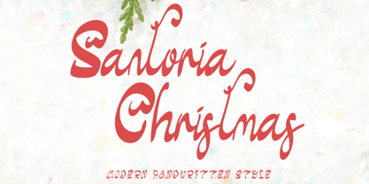 "Santoria Christmas" is a neat, beautiful, and elegant handwritten font. This font is equipped with uppercase, lowercase, numerals, punctuation, and multilingual support. Very suitable for Christmas, weddings, engagements, invitations, banners, branding, posters, photography, and others.
 - Clic by Jonahfonts,
$35.00 Clic is an upgrade with new alternates and improved kerning with an added styles ’Thin and Thin Italic’. Applications include Headlines, logos, ads, captions, packaging, bulletins, posters, and greeting cards as well as short texts.
 - Suisside by MendozaVergara,
$19.00 Suisside is a sans-serif unicase font design inspired by international style and the new typography. Works great when set in simple, clean and minimal type layouts is recommended for short texts, logos and posters.
 - TG Hagia by Tegami Type,
$20.00 TG Hagia is contemporary serif font inspired by Modern Culture. This font is highly recommended for use as display and body text. Tg Hagia is available in three widths namely regular, semi-bold and bold.
 - Merina by ActiveSphere,
$30.00 Merina is a fat slab typeface, and works best in text and display applications, such as headline, posters, signage, magazine, product branding, corporate branding, logos and titles. Several alternate characters are included in this typeface.
 - Sign Display Casual JNL by Jeff Levine,
$29.00 A vintage hand lettered sign for a carnival game was the basis for Sign Display Casual JNL, a classic example of the "one stroke" casual text lettering that sets sign painters apart from sign manufacturers.
 - Lucida Schoolbook by Monotype,
$29.99Lucida is a family of fonts with one basic design, but offered in two variations. It has both serif and sans serif characters. Lucida is suitable for books/text, documentation/business reports, posters, advertisement, multimedia. - KG Legacy Of Virtue by Kimberly Geswein,
$5.00 This font is based on the handwriting of an elderly gentleman who hand-copied the Bible twice in his lifetime. His neat, fluid penmanship leaves a written legacy of love for his family and God.
 - Display Squares One by Gerald Gallo,
$20.00 Display Squares One is a display font not intended for text use. It was designed specifically for display, headline, logotype, branding, and similar applications. Display Squares One has upper and lowercase alphabets, numbers, and punctuation.
 - Lucida Casual by Monotype,
$29.99Lucida is a family of fonts with one basic design, but offered in two variations. It has both serif and sans serif characters. Lucida is suitable for books/text, documentation/business reports, posters, advertisement, multimedia. - Corelia by Hurufatfont,
$24.00 Corelia; It has a compact, lean, industrial and neutral body structure. Text and Display versions provide a very wide usage area. Ideal for modern brand designs. It includes rich OpenType features with custom number styles.
 - MBF Marcos by Moonbandit,
$14.00 Marcos, a playful vintage display font, bold and quirky, perfect for that retro look. every glyph is uniquely crafted. Marcos is perfect for logo, title, headline, even text, it is versatile and have high exposure.
 - Cline by Typomancer,
$20.00 Cline, a family of slab and sans typefaces that seamlessly harmonize with each other. All styles have the same width, so changing font weight will not affect your typesetting. Suitable for both text and headlines.