10,000 search results
(0.028 seconds)
- Graffick Top by Graffiti Fonts,
$12.99Halfway between graffiti & typeography you find styles like Graffick™. These fonts are derived directly from hand written letters made mechanically perfect to behave more like common digital fonts. - Hyper Top by Bisou,
$12.00 Made in La Chaux-de-Fonds (Switzerland), Hyper Top is born while the designer (Bisou) watches "One from the Heart", a movie from Francis Coppola where Las Vegas is completely rebuilt in studio. The opening scene stages the signboard of the Dunes hotel and casino. This is the starting point of the most modern font ever designed by Bisou. Hyper Top is thought from ground up to give a strong impact. Dynamic, joyful, fast, this modern bold font is best suitable titles. It works perfectly with short texts for advertisement like candies, fireworks, protein bars or chewing gums. Just hang it over a prank and trap shop and see the coolest bad ass kids come in.
 - Top Comic by Mans Greback,
$59.00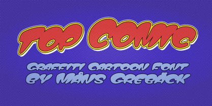
- Red Top by Studio K,
$45.00 Red Top is the UK name for the tabloid press, the scandal sheets of journalism, scourge of royalty, errant politicians and public figures, and celebrants of sex, celebrity and astrology: all human life is there as they used to say in the now defunct News of the World. For the budding media moguls amongst you – or for designers who want to make their headlines shout a little louder – here at last is Red Top the font. Splash it all over!
 - Top Heavy by m u r,
$15.00A font that's a little off balance because of its exaggerated serifs. - Big Top by Comicraft,
$19.00 Step Right Up, Step Right Up, the Font Circus is in town and ready to reveal our stupendous new tent-pole feature! Step inside for the best seat in the house. Ringmaster Roshell Beauregard dons his Big Top Hat especially for this occasion and promises us that Clowntime ain't over until the Bearded Lady takes a custard pie in the face. Our Big Top Bonanza performance begins with sideshow attractions and distractions, high-wire acrobats and low-cost rubber band guns. Can you smell the greasepaint and hear the roar of the crowd already...?
 - Top Forty by Jeff Levine,
$29.00 A 1963 issue of Billboard Magazine contained an ad for Jimmy Smith (along with some other artists on the same record label) that was hand-lettered in a free-form style similar to show-card ‘one-stroke’ typographic design. This was the inspiration for Top Forty JNL, which is available in both regular and oblique versions.
 - KG Next To Me by Kimberly Geswein,
$5.00 Hand sketched lettering in a chalkboard, Pinterest inspired style.
 - Comic Mode by 38-lineart,
$24.00 Comic Mode is a warm, fun and comical sans serif family, "its an alternative for comic sans, with a more formal looks". Availavle of 9 weights from thin to black. with a curved character that is round on thin and increasingly elliptical on black. The unique look of comic Mode is the combination of a technical sans serif and casual handwriting . These 9 diffrent weights also come with oblique style, so there are 18 styles in this family and 1 variable font that are a relatively new font format that allow one font file to contain multiple stylistic variations. Fresh, unique and casual, make this font really worth having.
 - Space Mode by Justin Penner,
$20.00 Space Mode is a multi-weighted typeface, sent back in time from the distant future. Forward-looking typeface designers often predict a reductive future where Latin letterforms have become increasingly modularized and simplified, or random bits have mysteriously gone missing. Thankfully, this is not the case, and typography has instead flourished and evolved. New forms have appeared, and some revived from historical references. A more complex drawing model has arisen that seems to add new curves in a effort to tame the strange diagonals that appear in the final quarter of the alphabet.
 - Mode Style by Motokiwo,
$10.00 Fashion is about style, pairing the right one with the best one. Let me introduce Mode Style, best paired font between Sans Serif and Handwritten Script. It's suitable for logo, display purpose, or something else that needs elegant style. YOU'LL GET: 1. Mode Style Sans, an elegant Sans Serif font with medium wide characters. This is All Caps font with large range of punctuation and multilingual support. 2. Mode Style Script, a classy thin Handwritten Script font with natural pen stroke feel. Comes with ligature make this font more close to the real handwritten, also support multilingual and already PUA Encoded.
 - Fashion Mode by Nirmana Visual,
$24.00 Inspired by Fashion magazine adverts from the 70'sand 80's. modern and minimal look, Fashion Mode Font brings a luxurious and clean style to websites, modern logos, branding identity, social media quotes, wedding stationery, and whatever your heart dreams up!
 - Americana by Linotype,
$40.99 Americana was designed by typeface artist Richard Isbell in 1965. The generous forms of this typeface contain large inner spaces. Lines of text look light and airy and require generous line spacing. The high cross strokes and the open inner spaces make this font highly legible even in small and very small point sizes. The triangular serifs are a distinguishing characteristic of Americana. These first appeared in the 19th century in France and inspired by the developments in lithography, which allowed for freer forms. The forms were typical for advertisement and display typefaces. The sophisticated Americana is particularly suitable for advertisements and personal correspondence.
 - Americana by Bitstream,
$29.99 An original design by Richard Isbell for ATF; in exaggerating the tapered stroke introduced eleven years earlier in Hermann Zapf’s Optima, Isbell created the first flareserif to achieve popularity in the United States.
 - Americano by Cocodesign,
$10.00 Americano Script is a modern calligraphy design, including Regular. This font is casual and beautiful with swash. Can be used for various purposes. such as logos, product packaging, wedding invitations, branding, headlines, signage, labels, signatures, book covers, posters, quotes, and more. If you need help or have questions, please let me know. I am happy to help :) Thank you & Congratulations on Designing
 - Americain by Hanoded,
$10.00 Americain is a retro-style font, which was based on a single headline from a thirties advertisement. The letters are all caps, but there's a little difference between 'upper' and 'lower' case. Americain is ideal for headlines and posters.
 - Americanus by Aerotype,
$29.00 Typical of early 1800s newsprint type, Americanus and Americanus Italics have three historically accurate ornaments and discretionary OpenType features for commonly used ligatures like ct and st. The Americanus Ornaments package contains a wider selection of authentic antique ornaments and border elements and is included as part of the Americanus Family package.
 - Americana by URW Type Foundry,
$35.99 Americana is a transitional typeface with very rounded, open characters. It was designed in 1967 by Richard Isbell for American Type Founders. Americana is a wide and open face with short, wedge serifs and a rather large x-height. Typical uses for this typeface are advertisements, short pieces of text, such as greeting cards and leaflets. The Americana font family is also ideal for headlines.
 - Amerika - Unknown license

- Averica by Letteralle,
$23.00 Introducing my latest creation, Averica! a playful and friendly display font that is sure to add a touch of personality to any project. Averica is handmade with love and attention to detail, ensuring that each character is unique and full of charm. Whether you're looking to create eye-catching headlines, playful graphics, or fun social media posts, title, branding, merchandise, ads, poster, Averica is the perfect choice. With its bold and distinctive style, it will help your message stand out and capture the attention of your audience. Crafted with precision and care, Averica boasts smooth curves, clean lines, and just the right amount of quirkiness. It's playful and approachable, yet still maintains a professional feel, making it ideal for a variety of projects. So why settle for a bland and boring font, when you can add a touch of fun and personality to your work with carefully fashioned display font? Try it out today and see the difference it can make! Any Questions? Just Ask! I hope you enjoy! Thank You. Letteralle Studios
 - Umerica by Typotheticals,
$4.00 Umerica first made its appearance in 2007 as a series of characters in a pdf I posted to Typophile. It has taken a lot of time, and determination, for me to finally decide to complete it. I had the basic font completed in 2008, but put it aside as the creation of the italics it deserved were beyond me. That was then. Now the italic version has finally been added twelve years later.
 - Nuixyber Next - Personal use only

- Next Star - Unknown license

- Next Star - Unknown license

- Alethia Next by Pepper Type,
$40.00 Alethia Next is a grotesque sans-serif typeface with high contrast in all weights. It has been designed to serve as a display typeface in various editorial projects, such as magazines or corporate brochures, as a sans-serif pair to serif types of modern style. Alethia Next comes in 7 weights + matching italics and upright italics, each supporting numerous Latin-based languages as well as major Cyrillic languages including Bulgarian local forms. It is packed with OpenType features like ligatures, small caps, and numerous alternatives.
 - Konga Next by RodrigoTypo,
$25.00 Konga has gone through different changes, the first idea was born in 2014 with the help of Andrey Kudryavtsev, then some time passed and the Rough version was developed, and a long time passed and in 2022 the idea of redesigning was taken with Bruno Jara, in addition to making many styles such as Rough, Inline, Shadow, as well as dingbats which was based on Stefania Ahumada's graphics, which results in a family of 6 styles, with different Alternatives, perfect for informal titles.
 - Okomito Next by Hanken Design Co.,
$30.00 Okomito Next is a sans serif inspired by the classic typefaces that were imbued with a sense of functionality, boldness and industrial strength. OpenType features: Access All Alternates, Case-Sensitive Forms, Glyph Composition / Decomposition, Discretionary Ligatures, Fractions, Kerning, Standard Ligatures, Localized Forms, Mark Positioning, Mark to Mark Positioning, Ordinals, Proportional Figures, Stylistic Alternates, Stylistic Set 1, Superscript, Tabular Figures
 - Aaux Next by Positype,
$22.00 When the original Aaux was introduced in 2002, I intended to go back and expand the family to offer more versatility. Years went by before I was willing to pick it up again and invest the proper time into building a viable and useful recut. Just putting a new designation and tweaking a few glyphs here and there would not do the designer or the typeface justice; instead, I chose to redraw each glyph's skeleton from scratch for the four main subsets of the super family along with their italics. Each glyph across the super family is 'connected at the hip' with each style—each character carries the no frills, simple architecture that endeared so many users to it. The new recut expands the family to an enormous 72 typefaces! The original has spawned Compressed, Condensed and Wide subsets—all with corresponding weights—for complete flexibility. Additionally, all of the original weight variants have all been incorporated within the OpenType shell: Small Caps and Old Style Figures are there along with new tabular figures, numerators and denominators, expanded f-ligatures and a complete Central European character set.
 - Placard Next by Monotype,
$50.99 Based on a Monotype 1930s condensed poster typeface, Placard Next is bursting with personality. Unexpected details appear throughout the design, from its wedged diagonals and single storey a to its round tittles – which would more ordinarily be square, and mechanical. The warmth and quirkiness of its character really shines through when set at larger sizes, making this a typeface for posters, headlines, and anywhere else designers need to make a statement. Designer Malou Verlomme has paid particular attention to the typeface's 'word images', further amping up its impact, and added some vintage flavor with Placard Next Round. As well as a striking display typeface, Placard Next's four widths and six weights – hairline to bold - mean it's a versatile design, that can be adapted for use in almost any environment. The complete family contains 48 fonts: 24 in Placard Next and 24 in Placard Next Round. It includes a large multilingual character set.
 - Syntax Next by Linotype,
$50.99 Syntax was designed by Swiss typographer Hans Eduard Meier, and issued in 1968 by the D. Stempel AG type foundry as their last hot metal type family. Meier used an unusual rationale in the design of this sans serif typeface; it has the shapes of humanist letters or oldstyle types (such as Sabon), but with a modified monoline treatment. The original drawings were done in 1954; first by writing the letters with a brush, then redrawing their essential linear forms, and finally adding balanced amounts of weight to the skeletons to produce optically monoline letterforms. Meier wanted to subtly express the rhythmical dynamism of written letters and at the same time produce a legible sans serif typeface. This theme was supported by using a very slight slope in the roman, tall ascenders, terminals at right angles to stroke direction, caps with classical proportions, and the humanist style a and g. The original foundry metal type was digitized in 1989 to make this family of four romans and one italic. Meier completely reworked Syntax in 2000, completing an expanded and improved font family that is available exclusively from Linotype GmbH as Linotype Syntax. In 2009 the typeface family was renamed into a more logical naming of "Syntax Next" to fit better in the Platinum Collection naming." Syntax® Next font field guide including best practices, font pairings and alternatives.
 - Logopedia Next by Bülent Yüksel,
$19.00 What makes "Logopedia Next" unique is that it has a strong body, upper and lower case letters are the same size and work in perfect harmony. All letters in the character have "alternatives" in various numbers. This feature provides you variety in your designs. It is possible to take your designs to the next level by using "Logopedia Next". "Logopedia Next" is ideal for especially logo design, advertising and packaging, branding and creative industries, banners and billboards and signage as well as web and screen design. "Logopedia Next" provides advanced typographical support for Latin-based languages. An extended character set, supporting Central, Western and Eastern European languages, rounds up the family. The designation “Logopedia Next 500 Regular” forms the central point. Logopedia Next comes 3 weights and italics total 6 types. The family contains a set of 543 glyphs. Classes and Features, Stilistic Style, Fractions and Old Style Numerator just one touch easy In all graphic programs. Logopedia Next"" is the perfect font for web use. Be sure to check out the other siblings of "Logopedia". - Logopedia Now - Logopedia Now Soft - Logopedia Next - Logopedia Next Soft You can enjoy using it.
 - Praxis Next by Linotype,
$57.99 Praxis® Next has the same robust shapes and proportions as the original 1976 Praxis design. Its large x-height, substantial counters and open apertures guarantee high levels of legibility and reading ease in print and on screen. More weights, condensed designs and true cursive italics differentiate Praxis Next from the older design. Praxis Next shines where space is at a premium. The regular designs are modestly narrow while the condensed typefaces perform with grace in the most crowded of environments. The bold designs create powerful headlines and banners and the lighter weights are ideal for both long and short-form text copy. Because of its many weights and proportions, Praxis Next is also an ideal design to build a brand identity. Praxis Next Variables are font files which are featuring two axis and have a preset instance from Light to Ultra and Condensed to Roman. Pair Praxis Next with old-style designs like Bembo® Book and Stempel Garamond™ to create a dynamic typographic contrast. Or complement the design with its serifed counterpart, Demos® Next . Unger also drew ITC Flora® as an alternative italic design. Looking for something a little different? Pair Praxis Next with Masqualero™ .
 - Galpon Next by RodrigoTypo,
$25.00 The "Galpon Next" typeface is a gestural and dynamic font specially designed for informal or children's texts. The idea behind this typeface is to capture the energy and spontaneity of handwriting, creating a sense of joy and fun in the designs.
 - Demos Next by Linotype,
$50.99 The Demos® Next typeface family is a complete renewal and expansion to Dutch type designer Gerard Unger’s classic from 1975. This enhanced typeface design introduces subtle changes to character shapes, proportions and spacing to improve legibility and readability in print and on screen. The new expanded family now has 6 weights of regular and condensed designs, each with a complementary italic for a total of 24 typefaces, and provides a welcome set of OpenType® typographic features.
 - Tobi Next by RodrigoTypo,
$35.00 Tobi Next is the improved version of Tobi pro, which in the extended version contains 213 ligatures, contains Greek and Cyrillic, as well as contains its basic version at a lower cost
 - Univers Next by Linotype,
$53.99 Linotype Univers is a completely reworked version of the original Univers typeface family designed by Adrian Frutiger in 1957. After a long process of painstakingly detailed revision, Frutiger and the design staff at Linotype completed this large joint project in 1997. The result: a brilliant and cohesive font family of 63 weights and styles including the 4 monospaced typewriter weights. All the existing weights were completely redrawn, with careful attention paid to making the proportions more consistent with each other and improving fine details such as curves and thick-to-thin stroke ratios. The family was expanded from 27 to 63 weights, providing a much larger framework to graphic designers for choosing just the right style. The bold and condensed weights were reworked for improved legibility and on-screen application. The stroke weights were revised for consistency within each face as well as in relationship to the other weights. By following Frutiger's original designs, the humanist character of the sans serif Univers now comes through more distinctly. T he systemized numbering system has also been updated. With its sturdy, clean forms Univers can facilitate an expression of cool elegance and rational competence. In fact, the strong familial relationships between all the styles and weights make it a serviceable choice for large graphic design projects that require versatility with consistency. Frutiger was successful in staying true to his initial aims; the new Linotype Univers does indeed work in longer texts as well as for display settings. In 2010 the typeface family was extended and renamed into a more logical naming of "Univers Next" to fit better in the Platinum Collection naming. Univers Next Variable are font files which are featuring two axis and have a preset instance from Light to Heavy and Condensed to Extended. Univers® Next font field guide including best practices, font pairings and alternatives.
 - Next Time by Seemly Fonts,
$14.00 Next Time is an incomparable and simple handwritten font. It can easily be matched to an incredibly large set of projects, so add it to your creative ideas and notice how it makes them stand out!
 - Interval Next by Mostardesign,
$25.00 Interval Next is a modern sans serif font family that is the successor of the successful Interval Sans Pro. Designed by Olivier Gourvat, Interval Next typeface consists of 16 fonts in 8 weights — Ultra Light, Light, Book, Regular, Medium, Semi Bold, Bold, Black— and has 4 styles. This super family combines a humanist mind with its contrasted shapes and a modern look with its open counters. With its four versatile styles (Condensed, Narrow, Roman and Wide) Interval Next has a creative palette able to meet the modern typographic demands. Its OpenType features will provide you almost unlimited multilingual support as well as small caps, case sensitive forms, proportional and tabular figures, slashed zero, numerators, superscripts, denominators, scientific inferiors, circled figures, subscript, ordinals, fractions, arrows and f-ligatures. Also extremely functional for professional editorial design, Interval Next has a pro kerning and would be extremely suitable for mobile applications, e-books, web sites, headlines, posters, signage and many more. Interval Next covers a large spectrum of languages such as West European, East European and the Cyrillic.
 - Loyola Next by RodrigoTypo,
$29.00 Loyola Next - the new version of Loyola "the previous year" - is a geometric typographic family with an organic touch. Contains 14 fun variants, Loyola is a perfect typeface for posters, packaging, logos and any visual communication application inherent to children and youth designs.
 - Code Next by Fontfabric,
$39.00 10 years later, one of the first geometric typefaces in our portfolio and a popular favorite of yours is rising to a whole new level! We’re revealing the stand-alone type family Code Next—a staggering evolution from Code Pro in functionality, versatility, and application. The transformation includes 6 new weights, 10 new Italics, full support of Extended Cyrillic and Greek, full redesign and glyphs refinement, 2 variable fonts, to name but a few. Going back to 2011, the grotesque-inspired Code Pro was designed to complement memorable pieces that make a statement. Balancing between stylization and simplification, it was encoded with the distinct voice of basic organic shapes to stand the test of time. Little did we know, it would expand and live up to the potential of a “font from the future” as the new Code Next. Today, a type family of 22 styles, this geometric sans solidifies its relevance and carries a strong constructive aesthetic through simplified forms with a twist. These fit any modern design in print, web, and display visualization. Developed to go above and beyond, Code Next comes prepared for multi-script projects with Extended Latin, Extended Cyrillic, and Greek. Explore Code Next’s versatility and switch things up with the help of 2 variable fonts, more than 1280 glyphs, and an extensive OpenType features set including small caps, standard and discretionary ligatures, contextual and stylistic alternates, stylistic sets, case sensitive forms, and much more. Overview: • Font family of 22 fonts • 10 weights • Languages - Full support of Extended Latin; Extended Cyrillic; Greek • Entirely refined design and metrics • Glyph count - 1288 • Variable fonts - 2 fonts OpenType features: • Small Caps • Standard Ligatures • Discretionary Ligatures • Contextual Alternates • Stylistic Alternates • Stylistic Sets • Case-Sensitive Forms • Ordinals • Localized Forms • Lining Figures • Proportional Figures • Tabular Figures • Oldstyle Figures • Subscripts • Scientific Inferiors • Superscripts • Numerators and Denominators • Fractions • Roman figures • Extensive mathematical support • Navigation symbols


