10,000 search results
(0.042 seconds)
- Signature of Incognito by Innire,
$17.00 Signature of incognito is a handwriting script font, that was created using a fountain pen. Diacritical symbols and glyphs allow you to use the font not only for Latin. Ligatures and swashes diversify the text and can be applied to design cards, logos, clothing design, wedding invitations, and much more
 - Diaspora by Letteralle,
$23.00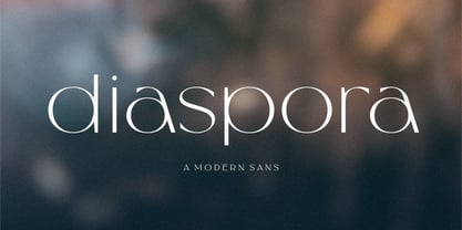 Diaspora is fancy modern sans serif font. Designed to give the impression of elegance and luxury. Contains uppercase & lowercase characters, all punctuation & numerals. Diaspora is absolutely perfect for editorial projects, Logo design, Wedding, Clothing Branding, product packaging, magazine headers, or simply as a stylish text overlay to any background image.
 - Melvin Eustace NF by Nick's Fonts,
$10.00Here’s a simple, classic hand-lettered gem, based on an old photoface named Adonis. Suitable for headline or text use, it’s a refreshing and lively alternate to Comic Sans. All versions of this font include the Unicode 1250 Central European character set in addition to the standard Unicode 1252 Latin set. - Choc by Linotype,
$29.99Choc is the work of French designer Roger Excoffon, based on the traditions of Japanese brush calligraphy, thick yet graceful. Choc light was designed by Phil Grimshaw, who had to redraw many times in different weights before finding one that worked as a text face and remained true to the original. - Perkly by Dyslexica,
$20.00 The theme of Perkly came from trying to envision a font that was easy to read yet had a distinctly unique look. Another neat feature of Perkly is that all its weights have the same overall spacing, meaning different weights can be layered over each other, allowing a lot of versatility.
 - KT Bureau by Kotivoro Lab,
$11.00 Beauty Feminine Serif on Bureau adapted from didot with a very narrow width and high contrast Serif. Our Goals was to make this font with double function which is Headline and Text. To achieve that goal we use all of our resource and start researching the archive and the typography history.
 - DraftWerk by The Northern Block,
$16.70 A minimal rounded typeface inspired by architecture and furniture detail drawings. The idea was to develop a font that would showcase precise radius corners at large formats and would also downsize to produce stylish body text. Details include 4 weights, a complete character set, manually edited kerning and Euro symbol.
 - Lust Sans by Positype,
$39.00 Lust Sans is the penultimate exploration of producing a high-contrast sans wholly influenced by its bracketed ancestor. The aspect of this endeavor I enjoyed the most was finding sneaky ways to infuse warmth and whimsy into the letterforms when you least expect it. The result, however, is subtle and uniquely balances against Lust and Lust Didone without becoming cold and overbearing. To accomplish this, Lust Sans has 6 weights. What I found during development was, based on any setting where Lust or Lust Didone were in the same layout, the amount of contrast shown with Lust Sans needed to be adjusted. Expanding the weight offering, produces opportunities for Lust Sans to modulate the rhythm of the layout comfortably while keeping contrast—this is even more obvious with the Italics. I love those. You will too. If you don’t, you do not have a soul. Not sorry. The Lust Collection is the culmination of 5 years of exploration and development, and I am very excited to share it with everyone. When the original Lust was first conceived in 2010 and released a year and half later, I had planned for a Script and a Sans to accompany it. The Script was released about a year later, but I paused the Sans. The primary reason was the amount of feedback and requests I was receiving for alternate versions, expansions, and ‘hey, have you considered making?’ and so on. I listen to my customers and what they are needing… and besides, I was stalling with the Sans. Like Optima and other earlier high-contrast sans, they are difficult to deliver responsibly without suffering from ill-conceived excess or timidity. The new Lust Collection aggregates all of that past customer feedback and distills it into 6 separate families, each adhering to the original Lust precept of exercises in indulgence and each based in large part on the original 2010 exemplars produced for Lust. I just hate that it took so long to deliver, but better right, than rushed, I imagine.
 - Baseface by Attractype,
$9.00 Baseface is a sans serif font family with a basic shape, simple and clean design. With a choice of six font styles, it is suitable for various typography designs, general text, text effects, logos, web pages, lettering, laser cutting, t-shirt design and others.
 - Industral by Little Type,
$20.00 Industral is a "pixel style" typeface for modern use. Highly suitable for small text. The common feature is sharp edges and square base construction which enables legibility for long text paragraphs. Contains a total of 413 glyphs, including latin extended diacritics for most languages.
 - Barnaul Grotesk by ParaType,
$25.00 A text sans serif type family of 8 styles was designed by Natalia Vasilyeva and released by ParaType in 2007. It has narrow proportions, open shapes and can be used in a wide variety of applications — for text setting, for headlines and for display matters.
 - CS Courthand by URW Type Foundry,
$39.99 CS are the initials of Carsten Strinkau, a young German graphic and type designer who studied in Hamburg. CS Courthand is based on 16 hundred century English monks handwriting. Text in CS Courthand looks like a pattern, like a text-carpet, but still readable.
 - Aeternus by Unio Creative Solutions,
$4.50 “Aeternus”, a new geometric Sans Serif typeface, with matching italics. The combination of several weights, provides versatility in any text usage. Developed in a range of nine weights from thin to heavy, with a matching set of italics, Aeternus has been designed to optimize the space and preserve the legibility in any text size. Use effortlessly this typeface for titling, contemporary branding, web design, UI/ UX design, clothing, large print formats. Specifications. - Files included: Aeternus Thin, Aeternus ExtraLight, Aeternus Light, Aeternus Regular, Aeternus Medium, Aeternus SemiBold, Aeternus Bold, Aeternus ExtraBold, Aeternus Heavy with corresponding italics - Formats:.otf - Multi language support (Central, Eastern, Western European Languages)
 - Milk and Balls by Alit Design,
$12.00 Introducing Milk and Balls Serif font family. This character that seems rigid and decisive is perfect for bold and formal design concepts. The unique shape of the letter makes the design made different from the others. Milk and Balls font is very suitable for header text, body text, and the contents of paragraphs because there are 11 family fonts from Thin to Heavy, in addition there is also an italic version. So Milk and Balls are very complete and suitable to be a collection of fonts that can be used at any time. Don't worry about Multilingual, because Milk and Ball’s are supported by multilingual.
 - CoolWool by Linotype,
$29.99Linotype CoolWool is part of the Take Type Library, featuring winners of Linotype’s International Digital Type Design Contest. This font was designed by A. Leonardi and P. Wollein, who took their inspiration from clothing labels and care instructions. CoolWool is designed to look like it was stitched, a style of typeface which goes back to the hand embroidery of the time of Biedermeier. CoolWool, however, is a distinctly modern font with a technical feel. The font is not suited for longer texts, but CoolWool is good for shorter texts and headlines, especially because of the possibilities allowed by its three different styles, regular, stone washed (bold) and Cotton Club (outline). - Recess Brush by Gassstype,
$25.00 Hello Everyone, Introduce our new collection, Recess Brush is Rough Display Brush Font and Ligature Brush Font. Recess Brush Font is a Strong Style and classy style, inspired by famous logos of Technology and brands that have very strong characteristics, this font is great for your creative projects such as watermark on photography, and perfect for logos & branding, invitation,advertisements,product designs, stationery, wedding designs,label ,product packaging, special events or anything that need handwritting taste. That is why Recess Brush has charming, authentic and relaxed characteristic ,strong ,cool more natural look to your text with a more natural look to your text. You can activate Ligature OpenType panel.
 - Igna Sans by Latinotype,
$29.00 Igna Sans is a humanist functional typeface, with a contemporary style, designed to be used in a wide variety of applications such as advertising, corporate projects, branding and retail product design. The font is highly legible when used in a large body of text and well-suited for headings, display use and short text. Its angled strokes and rounded forms give it a smooth feel and make it look friendly and expressive. The Igna Sans family comes in 7 weights, ranging from Extra Light to Black, with matching italics plus alternative glyphs. The font contains a 430-character set that supports 206 different languages.
 - Exec Corners by Wiescher Design,
$35.00 I created the »EXEC« sans font during the years 2018 to mid 2020. The »EXEC«-Corners-family is a very special, unusual design. »EXEC«-Corners has 7 weights, ranging from Thin to Bold (plus 7 italics). This exceptional font is suited for editorial, book text, advertising and packaging, logo, branding, small text as well as web and screen design. »EXEC«-Corners has advanced typographical support including ligatures, small caps, alternate characters, case-sensitive forms, fractions, super- and subscript characters. »EXEC«-Corners comes with a range of figures—oldstyle and lining figures, each in tabular and proportional widths. »EXEC«-Corners supports Basic-, Western-, and Central-European Latin-based languages including Turkish.
 - Gwen by Fontfabric,
$35.00Gwen is a variable type system in 7 weights. The complete font family consists of two subfamilies: the highly characteristic Display Serif family which shows its full potential and beauty in big sizes and a more subtle Text variation appropriate for smaller sizes. The variable font combines the best of both worlds and provides unique flexibility to switch between all of the font weights and the text and display style at the same time. The font supports Extended Latin and Cyrillic scripts and its main purpose is to be used in editorials, although it may find good implications in headlines, impactful landing pages, posters, and packaging. - Star Dust by Anmark,
$13.00 Star Dust Regular is an elegant, decorative, handwritten font. Uppercase letters with glitter and sparks are ideal for your wedding monograms and logos. Use this font for wedding invitation, branding, packaging, magazines, makeup business, social media, quotes, restaurant menu, greeting cards, flyer, banner, web header and many more. Star Dust Clean . This feminine calligraphy font style perfect for wedding design projects, instagram, watermarks, titles, birthday invitation, signatures, letterpress address, jewellery, hotel business and other. You can use it for long texts or short phrases. This font includes stunning ligatures and full set of lowercase alternates to make your text as close to a natural handwritten script as possible.
 - Venis by Chank,
$99.00 On first impression, Venis is a traditional text typeface: clean, simple and elegant with nice contrast. On closer inspection, you'll notice nuances that add charm and wonder, much like its name (rhymes with "tennis"). Is this font a serif or sans serif? Hmmmm, it never really commits. Further design liberties were taken to create unique qualities in its characters, which are best exemplified by the signature lowercase y. This font family is optimized for print, and has worked beautifully for letterpress projects including wedding invitations and birth announcements. Venis will also work well in newsletters, brochures, proposals, magazines, books, and other text-heavy paper products, bringing creative elegance to your designs.
 - Marons by Alit Design,
$16.00 Marons is my first font release of 2020. I created Marons from the initial sketch to the digital process and until it was released it took less than 2 months after I launched Black Quality. Marons is an elegant font that I combined from script and serif fonts, thus creating a unique and bold impression. Each Marons letter also has an additional alternate glyph and many variations of swash options, so you can use this font to create logo designs, header texts, t-shirt designs, YouTube cover texts, wedding designs, and others. With its many glyphs, Marons is indeed worthy of being called a collection of fonts in early 2020.
 - Nophine by Mantype Studio,
$18.00 Nophine is a typeface conceived by Sulai Man specifically for intensive editorial use, mainly in newspapers, magazines, and online, its personality and flexibility make it a true multipurpose typeface. The intermediate weights deliver a neutral look when used in text sizes, providing the usual robustness expected in a newspaper font. The unobtrusive appearance, excellent texture, and slightly colour allow it to behave flawlessly in continuous text, even in the most unforgiving editorial applications. As it becomes larger in print,Nophine shows its personality through a series of measured particularities which make it easy to remember and identify. Its energetic character, becomes evident when used for subheadings and headlines.
 - Stefani by Okaycat,
$19.50 Stefani EHYO was designed ultimately with pure simplicity in mind, to carry an inviting, friendly style. The result is an ultra clean look with versatility: useful for either full bodies of text or for a nice headliner. The simplified smooth forms are highly legible and carefully well-matched, so can even be used over a busy background or at very small point settings. Stefani is extended, containing the full West European diacritics & a full set of ligatures, making it suitable for multilingual environments and publications. Choose Stefani for any application where you want solid readable text, any time you want a pleasant and clean feel to your presentation.
 - Dofend by Twinletter,
$15.00 Dofend San Serif is a luxurious font family with 18 different styles to choose from. This font is the best choice for your various design projects because of its unique personality and beauty. The entire set includes a display and sans-serif styles that are suitable for a wide range of applications, including logos and posters. Allow this font to create stunning graphic designs, banners, posters, and texts for you! of course, your various design projects will be perfect and extraordinary if you use this font because this font is equipped with a font family, both for titles and subtitles and sentence text, start using our fonts for your extraordinary projects.
 - Gentleman by Juraj Chrastina,
$29.00 Gentleman font is a sans-serif font family of 10 weights – from hairline to black – designed by Juraj Chrastina. It is a legible typeface with clear geometry and spiced with nice humanist terminals enhancing its identity. We think Gentleman name suits perfectly to this family because of its beautiful outlines and elegant letterforms yet looking tight, compact and with own presence. Gentleman is surely a good choice both for screen applications and print media. Its multipurpose spreads over poster design, logos, headlines, body texts, stationery and back labels. Also very good for books, magazines and newspapers – an excellent choice even for small text size.
 - Psychedelic Xylophones by Mysterylab,
$22.00 Perfect in its imperfection, Psychedelic Xylophones is a retro trippy hippie font that brings a hand-lettered groove to your text graphics. It features a large complement of two-character alternate glyphs that adds a subtle sway and an ebb-and-flow that results in some customized surprises and other more subtle variations to your text. It's great for that bendy, melty, warped headline psychedelic poster thing. Try it on retro t-shirt messages and surf/skate graphics, or a daring branding choice for drink or snack packaging. The alternate glyphs are turned on by default but can be over-ridden easily in the Glyphs panel of many popular software packages.
 - Jantur Type by Lemon Studio Type,
$12.00 Jantur Type is a simple geometric sans family with charming curves and natural flow. variable font technology, and its axis weight range spreads from thin to black forms. Flexible and adaptable, it is 100% Latin Plus, Supporting 219 Latin-based languages, which are spoken in different 212 countries. This font is suitable for any project. Great for graphic design and any display use. It can easily work for web, signage, corporate as well as editorial designs. Jantur Type has 9 weights with a total of 9 styles. and legibility makes it suitable for any kind of text application, from brand design to extensive text layouts.
 - Jotia by Hashtag Type,
$32.00 Creating a combination between serif and sans serif typefaces, Jotia utilises the best of both worlds, resulting in a unique and modern neo-humanist font family. Taking its inspiration from lapidary inscriptions rather than pen drawn text, Jotia uses triangular serif shape details to create a strong uniformed personality with clear legibility. This original quality enables characters to be expressive in headlines, as well as in printed and onscreen text situations. Jotia also works beautifully alongside both serif and sans serif typefaces giving complex editorial work a more powerful and visually stimulating dynamic. Details include six weights, manual kerning and spacing, ligatures and alternatives.
 - Gerdika by Mantype Studio,
$22.00 Gerdika is a typeface conceived by Sulai Man specifically for intensive editorial use, mainly in newspapers, magazines, and online, its personality and flexibility make it a true multipurpose typeface. The intermediate weights deliver a neutral look when used in text sizes, providing the usual robustness expected in a newspaper font. The unobtrusive appearance, excellent texture, and slightly colour allow it to behave flawlessly in continuous text, even in the most unforgiving editorial applications. As it becomes larger in print,Gerdika shows its personality through a series of measured particularities which make it easy to remember and identify. Its energetic character, becomes evident when used for subheadings and headlines.
 - TT Octas by TypeType,
$29.00 TT Octas is a narrowly proportioned font family built upon the principle of octagonal forms: all circles in this font family are actually octagons. Thanks to small serifs, TT Octas has a saturated and vintage character to it. Simple depiction of the letters and the serifs make the family easily readable even in the smallest sizes. Narrow proportions allow for positioning of large text arrays even in small text fields. This font family is well fitted for brand visual identity and product labeling as well as for all digital media, such as web interfaces and gameplays. It is also great for mobile apps’ interfaces.
 - Gavora by Twinletter,
$12.00 Introducing the Gavora sans serif font. Modern strokes are the result of the harmonization of width and height, especially in lowercase letters, to support the best possible readability. Gavora Sans’ goal is to become a universal weapon not only because it works well in headlines, sorts, and long copy, but also because of its subtle neutrality. So that it creates a proportional text. of course, your various design projects will be perfect and extraordinary if you use this font because this font is equipped with a font family, both for titles and subtitles and sentence text, start using our fonts for your extraordinary projects.
 - Wiblz Serif by The Ampersand Forest,
$19.00 Meet Wiblz (say “Vibbles!”). Wiblz is a Modern/Didone text family in the great tradition of squarish text families like Walbaum, Ibis, and Georgia. He has a high x-height and a great balance of legibility and readability. Plus, he supports the Latin alphabet, basic Cyrillic, Monotonic and Polytonic Greek, and the International Phonetic Alphabet. That makes him superlative in his usefulness and versatility! When searching for a didone typeface, it's often a struggle between blackness/legibility and stylishness/contrast. this is especially true of squarish didones, which number less than their round counterparts. Wiblz is an excellent balance between the two — clean and striking, good for uses from text to heading, and at home in print and on screen. Give him a try! He's a smart, adaptable, useful guy!
 - FF Info Display by FontFont,
$72.99 German type designers Erik Spiekermann and Ole Schäfer, and German design agency MetaDesign created this sans FontFont between 1996 and 2000. The family has 18 weights, ranging from Regular to Bold (including italics) and is ideally suited for advertising and packaging, book text, editorial and publishing, logo, branding and creative industries, small text, wayfinding and signage as well as web and screen design. FF Info Display provides advanced typographical support with features such as ligatures, alternate characters, case-sensitive forms, fractions, super- and subscript characters, and stylistic alternates. It comes with proportional lining, proportional oldstyle, and tabular lining figures. In 1998, FF Info Display received the The Big Crit award. This FontFont is a member of the FF Info super family, which also includes FF Info Correspondence and FF Info Text.
 - Goxac by Twinletter,
$17.00 Introducing Goxac is a boldly shaped font that gives any project a cutting-edge, futuristic feel. Goxac’s slick lines and distinctive letterforms give your text a contemporary appearance, making it ideal for designs with a science fiction or technological theme. Goxac is the perfect tool for designing eye-catching headlines, posters, and social media graphics because of its bold aesthetic and futuristic theme. They are ideal for branding projects, packaging designs, book covers, and more due to their distinctive letter shapes. With a complete set of punctuation and numbers, Goxac is available in both upper- and lowercase letters. This multipurpose font is ideal for designers, marketers, and anyone looking to add a touch of futurism to their work because it has four different variants. With the Goxac font, rest assured that your designs will look unique, stylish, and futuristic. This font is perfect for those who want to stand out in the modern era, and for those who want to give their designs a touch of innovation. Goxac is a must-have for anyone looking to create a plan that really stands out. So don’t wait, make Goxac your font of choice today, and take your design to the next level! What’s Included : - File font - All glyphs Iso Latin 1 - Alternate, Ligature - Simple installations - We highly recommend using a program that supports OpenType features and Glyphs panels like many Adobe apps and Corel Draw so that you can see and access all Glyph variations. - PUA Encoded Characters – Fully accessible without additional design software. - Fonts include Multilingual support
 - Mantika News by Linotype,
$67.99 Mantika News™, from German designer Jürgen Weltin, was designed to expand the Mantika super family with text and display typefaces for setting newspapers and periodicals. The suite of typefaces is comprised of regular and bold designs, with italic counterparts, for setting continuous text, and light and extra bold versions for setting larger sizes in headlines, sub heads, pull quotes and decks. The typefaces intended for text copy were designed with shared character widths, so that changes can be made in typeface choice without disrupting line endings or column length. The display designs have a slightly smaller x-height and shorter ascenders creating a more elegant demeanor while ensuring compact multi-line display copy. In addition, fonts of Mantika News have a large Monotype W1G (World Glyph Set 1) character set enabling the setting of Greek, Cyrillic and over 20 Eastern and Western European Latin-based languages. Proportional figures are available, in the OpenType® fonts, as an alternative to the tabular designs.
 - Mayes by Sabrcreative,
$15.00 Mayes is a soft, geometric sans serif font family. It consists of 6 weights ranging from Thin to Black, combining elements of Bauhaus and modern styles with its distinctive softness. Its design is minimalist, elegant, and warm, offering a unique yet versatile and easily readable impression. Mayes was created with the purpose of providing text displays that are easy to read, strong, and make a standout impression. It is compatible with both text and display purposes, making it perfect for headers, titles, posters, websites, branding, apps, and various other creative designs or projects. Mayes features several OpenType functionalities, including standard ligatures and number variations such as old-style figures, fractions, numerators, and denominators. It also offers extensive support for the Latin language. With Mayes, you can effortlessly create text displays that stand out with a touch of specialty. Its soft yet strong design makes it an ideal choice for creating remarkable and captivating designs.
 - Plantin by Monotype,
$29.99 Plantin is a Renaissance Roman as seen through a late–industrial-revolution paradigm. Its forms aim to celebrate fine sixteenth century book typography with the requirements of mechanized typesetting and mass production in mind. How did this anomalous design come about? In 1912 Frank Hinman Pierpont of English Monotype visited the Plantin-Moretus Museum in Antwerp, returning home with “knowledge, hundreds of photographs, and a stack of antique typeset specimens including a few examples of Robert Granjon’s.” Together with Fritz Stelzer of the Monotype Drawing Office, Pierpont took one of these overinked proofs taken from worn type to use as the basis of a new text face for machine composition. Body text set in Plantin produces a dark, rich texture that’s suited to editorial and book work, though it also performs its tasks on screen with ease. Its historical roots lend the message it sets a sense of gravity and authenticity. The family covers four text weights complete with italics, with four condensed headline styles and a caps-only titling cut. Plantin font field guide including best practices, font pairings and alternatives.
 - Magpie by Elster Fonts,
$24.00 Magpie is a font family consisting of three sub-families with both regular and italic styles. Originally designed on squared paper, over time it has moved further and further away from this rigid grid, although its appearance is still based on it, so it can easily be used for logotypes or headlines with strict grid-based layouts. While Magpie Text is suitable for headlines and short texts, Magpie Display is ideal for logotypes or more playful headlines. Finally, Magpie Mix is a combination of both families. Magpie Text Regular represents stability, Magpie Display Italic is ideal for dynamic logos or headlines. To cover more languages, cyrillic and greek letters were added and Magpie can be used for nearly a hundred languages. In addition to the four common numeral variants, special numerals, punctuations and symbols for all-caps (c2sc) are included. Furthermore case-sensitive punctuations and symbols are available. To expand the typographic possibilities, four stylistic sets, different symbols, forms and standard- and discretionary ligatures have been added. Each Magpie-font contains more than 880 glyphs.
 - Preto Semi OT Std by DizajnDesign,
$- Preto Semi is an experiment. It is an attempt to create a readable type for text point sizes (other than sans-serif and serif). Preto Semi is not a Sans with added serifs or Serif with serifs removed. The use of the serifs is redefined and used for other purpose(s). The serifs became the extension of the stroke, they help to solve the spacing problem of sans-serif types and they use the primary function of serifs – keeping the eye on the baseline and emphasize the horizontal rhythm of the lines of text. Preto Semi is intended for magazines and editorial design, as other members of Preto family. Preto is an extensive type family, which explores the function of serifs on readability and legibility. Preto consist of three subfamilies: Sans, Semi and Serif. Preto is designed for multilingual typesetting. All of the subfamilies have equal gray value but different texture which can be use to differentiate languages. Preto sub-families have two text weights and two bold styles (Regular -> Bold, Medium -> Black). Every weight has a companion Italic style as well.