10,000 search results
(0.045 seconds)
- Holo by Missin Glyphs,
$25.00 Inspired by 'Neon Sign' lettering, Holo is a modern, modular, mechanical & industrial display font constructed entirely with polygonal shapes. Holo is suitable for large display settings like sports jerseys, shop fronts, billboards and neon signs.
 - Rotis II Sans by Monotype,
$50.99 Developed over several years by the late Otl Aicher and first released in the late 1980s, the Rotis® typeface has become a timeless classic. ROTIS II SANS HISTORY Aicher was a renowned German designer and corporate image consultant. He created the four basic designs of Rotis – sans serif, semi sans, semi seif and serif – within an extended typeface family concept, wherein all designs share a common cap height, lowercase x-height, basic stem weight and general proportions. While each version is part of the large, integrated family, each was also designed to function on its own as a distinctive typestyle. The result is that all members of the Rotis family combine smoothly with each other. Aicher, however, did not design the Rotis family with the weights and proportions normal for more contemporary releases. Rotis Sans Serif, for example, was drawn with just six weights and only two italics. Starting in 2010, Robin Nicholas, senior designer for Monotype Imaging in the UK, and freelance designer Alice Savoie collaborated to bring Rotis Sans Serif up to current standards. The result is Rotis II Sans, a completely new addition to the Rotis family. “We devised our approach together,” recalls Savoie, “deciding which weights to start with, what kind of alterations to make to the original Rotis, etc. I went to work on the typefaces, regularly submitting proofs to Robin. We would then decide in tandem on the next steps to take.” Nicholas elaborates, “We revisited the range of weights and added matching italics so that the new additions to the family offer increased versatility. We optimized the outlines, corrected the weight of several letters and re-examined overall spacing and kerning. In addition to a new set of numerals, with a height similar to the capitals, we also drew case-sensitive punctuation.” ROTIS II SANS USAGE The new Rotis II Sans suite comprises 14 typefaces: seven weights, ranging from extra light to black, each with a companion italic. The designs are available as OpenType® Pro fonts, allowing for automatic insertion of ligatures and fractions. Pro fonts also offer an extended character set supporting most Central European and many Eastern European languages. Aicher’s original Rotis designs were widely used for branding and advertising. With the addition of Rotis II Sans, the family is again poised to become a powerful communicator.
 - Juan Carlos by Homelessfonts,
$49.00 Homelessfonts is an initiative by the Arrels foundation to support, raise awareness and bring some dignity to the life of homeless people in Barcelona Spain. Each of the fonts was carefully digitized from the handwriting of different homeless people who agreed to participate in this initiative. A biography/story of each homeless person captures their story, to help raise awareness and bring some dignity to the life of homeless people. Monotype is pleased to donate all revenue from the sales of Homelessfonts to the Arrels foundation in support of their mission to provide the homeless people in Barcelona with a path to independence with accommodations, food, social and health care. Juan Carlos was born in Barcelona, Spain 46 years ago. Since the age of 17 – and during eleven years – he worked double shifts of eight hours every day in a factory. Excessive work and family problems debilitated his health and he lost his job. He then faced a dilemma: to spend unemployment benefits to pay for rent or for food. For a few years, he worked helping in the kitchens of different restaurants while he lived on a pension, until he was definitively left without work and ended up living in the street for 10 years. “In the street I tried to find rest in the ATMs of banks. I preferred to be alone, and if I ran into conflictive people, I looked for somewhere else” he explains. Living in the street he was the victim of an aggression. Since then, with the help of Arrels he moved into a pension. Today, Juan Carlos is a volunteer in the shower service of Arrels, the same showers he used during years. He also collaborates with the maintenance team, helps prepare hygienic and cleaning material, and participates in activities such as the theatre group and the football team.
 - Diesel Rudolf by Ingo,
$82.00 Write like the inventor of the diesel engine — it’s possible with the Diesel Rudolf Script (patterned after the original handwriting of Rudolf Diesel)... In 2008 the city of Augsburg and the MAN Group celebrated the 150th birthday of Rudolf Diesel, inventor of the diesel engine which was named after him. With the help of a few preserved original letters, it was possible to create a convincing digital version of Rudolf Diesel’s personal handwriting. The engineer and inventor Rudolf Diesel was born in Paris in 1858 and also went to school there. In1870 his family moved to England and Rudolf was sent to relatives in Augsburg where he continued going to school. Later, after completing his studies in Munich, he began working as an engineer in the machine factory Linde. Alone this part of his life makes clear why Rudolf Diesel’s handwriting was so ”jerky,“ hesitant and inconsistent. He learned to write according to the French style, that is, Latin cursive — completely different from the very correct and neat German handwriting taught at that time which he had to learn at 13 years of age. These circumstances explain why his handwriting is ”messy“ (especially for those days) with its mixtures of letter forms within a text, even within individual words. Plus, he obviously did not attach much importance to ”pretty writing.“ Sometimes the characters are wide, then narrow, sometimes large and clear and then again crammed and primitive. The individuality is emphasized with characteristics derived from quill and ink. The diversified images of the font Diesel Rudolf Script make more than 80 ligatures and stylistic alternates possible which can be selected with help from the OpenType functions Ligatures and Discretional Ligatures.
 - VLNL Irish Stew by VetteLetters,
$35.00 Obviously the Irish Stew font finds its origin in Ireland. During a vacation in West Ireland Donald® fell in love with the famous local dish. In fact, he loved Irish stew so much he couldn't wait to create a font dedicated to the stew from Ballymaloe. He found the inspiration for this font on an old shop front sign somewhere in Dublin. The sign only contained a few characters, but the stew had given him more than enough energy and inspiration to complete the whole alphabet!
 - Black Love Pink by Stefani Letter,
$14.00 Carefully designed, black love pink is a stunning and beautiful handwritten font with a light feel. Fall in love with its delicate and sophisticated characters, and use it for any design project that requires a romantic twist. This font is easy to use. it remains only to add symbols (--,++,--) in front, middle, and back to reveal the features. This font is PUA encoded which means you can access all of the glyphs and swashes with ease! It features a varying baseline, gorgeous glyphs, and stunning alternates.
 - Kianda by QubaType,
$20.00 Kianda typeface was created as a non-classic, sport logo typeface. Now it has only one style with Latin and Cyrillic uppercase, numerals and punctuation. Almost every letter have 3-4 alternates, which allows you to feature stylish text for your logo. Also this typeface works good with short slogans, packaging and more.
 - Chortler by FansyType,
$15.00 Chortle is the typeface with strict lines and rounded end strokes, making it perfect for logotypes, editorial design, corporate design, and media. This versatile typeface is also great for creating a set of inspirational phrases. It comes in an amazing range of widths, and there's even a specially prepared variable version available.
 - Beauty Gadish by Almeera Studio,
$15.00 Beauty Gadish is a lovely modern calligraphy that brings a luxury feel. The natural hand writing script is suitable for headline, logotype, apparel, wedding invitations, branding, packaging, advertising, watermark, and more. This typeface comes in uppercase, lowercase, with punctuations, symbols and numerals, stylistic set alternates, ligatures, and also has multi-lingual support.
 - Alpha by URW Type Foundry,
$39.99 Alpha is a modern Sans Serif design, very elegant and readable but still also economic. Alpha is offered in regular, bold and italic, with the bold italic still in the works. Alpha is strikingly clear and without any flourishes. Its pretty large x-height guarantees excellent readability, and the design is easily recognized.
 - Sablon B by Roman Cernohous Typotime,
$29.00 As a stand-alone version of our original Sablon, Sablon B delivers a bold expression without any distracting moments. The completely redesigned letters and numerals are available in four weights and are complemented by a vintage stylistic set based on lower horizontal lines. Wide language support including a complete set of Cyrillic characters.
 - Oksana Sans Narrow by AndrijType,
$33.00 Oksana Sans Narrow is a space-saving addition for Oksana Sans Roman faces. In six weights from Thin to Heavy it works well in long as in short texts. Supports Western, Central, Baltic Latin and European Cyrillic codepages. Old-style digits, some ligatures, alternative characters and Ukrainian hryvnia sign are also included.
 - Pablo by ITC,
$29.99 Pablo is the work of British designer Trevor Pettit, who based this dramatic typeface on the signature of Pablo Picasso. The chunky lowercase reflects the very essence of Picasso's influence and the initial capitals can also be used on their own. Pablo is excellent for work requiring a vivid, cutting edge appearance.
 - Nightsans by URW Type Foundry,
$19.99 The family Night by Nicolai Gogoll includes 10 styles – five serifs and five sans. Both variants harmonize well with each other and each come in five weights, which allows for good use in CI. Combining the Serif and Sans also enables versatile and hierarchical design, which is great for interfaces and infomedia.
 - ZAP by Wannatype,
$9.90 ZAP is an all-caps monospaced and (almost) monolined typeface family. ZAP comes along in square and round shape, 2 widths (ZAP 360 and ZAP 500), and 8 weights. ZAP also offers Slant and BAckslant styles. ZAP covers multiple languages with Extended Latin. Even complete Greek alphabets are part of the ZAP keymap.
 - Balise by NamelaType,
$19.00 Introducing our new product that called �Balise� A retro sans serif influenced from 60s style typeface and coupled with a touch of rounded corners to provide a playful concept with a vintage design style. Balise has 5 weights, and is also equipped with open type features and is supported by various international languages.
 - Purista by Suitcase Type Foundry,
$39.00Purista is a strict, orderly typeface based on a well-tried principle of geometric sans serifs from mid-20th century. Its obsession with technological precision makes it perfect for use in corporate systems and visual communications of technocratic businesses. Thanks to its broad range of cuts, it is also ideal for display advertising. - Norpeth by The Northern Block,
$32.00 A modern humanist sans serif typeface. The proportions of each character have a strong lateral dynamic that makes it ideal for on screen uses. Also consistent stroke contrast is used throughout each weight to maintain an optical balance. Details include 9 weights and italics, over 570 characters, manually edited kerning and opentype features.
 - Andralis ND by Neufville Digital,
$45.25 Andralis was designed by Ruben Fontana in tribute to the designer Juan Andralis. Its handcrafted, strong and robust appearance, maintains at the same time a friendly and human tone. It was specifically designed to perform well in long texts, also offering excellent results in headlines. Andralis is a Trademark of BauerTypes SL
 - Schwandner Versalia by Intellecta Design,
$35.00 A highly intrincated decorative capital from the work of Johann Georg Schwandner (1716-1791). An accurate historical revival and interpretation of Iza W, at Intellecta Design. State-of-art to use in headings, chapter initials from books, magazines and other publications. Also use in baroque and renaissance inspired layouts, or modern mixed proposals.
 - Sharon Baker by Letterhend,
$13.00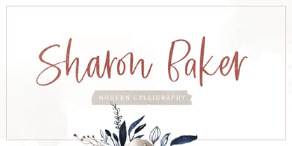 Sharon Baker a modern script that has a bright, lovely feeling. The natural hand written script is suitable for everyone who needs a typeface for headlines, logotype, apparel, invitations, branding, packaging, advertising, and more. This typeface is comes in uppercase, lowercase, punctuation, symbols, numbers, stylistic set alternate, ligatures, also contains multi-lingual support.
 - Cacko by Edyta Demurat,
$29.00 Cacko has a functional look with an elegant touch. The family is available in 18 weights with complementary italics. Cacko is very readability so is ideally suited for books, magazines, catalogs, posters, invitations as well as web design. Its simplicity with elegance details will also look great in logo, titles and short sentences.
 - Galexica by Ingrimayne Type,
$6.00 Galexica is a geometric, modernistic, sans-serif typeface. The original family had five members, but an upgrade in 2019 expanded that to ten, with five weights and italics for each of those weights. The eccentric letter forms have a techno or futuristic look. There is also a monospaced version of this design,
 - Maest by Omine Type,
$24.00Constructed only with straight lines, Maest is an unusual script typeface. The straight lines give the letters a striking visual effect, specially in small sizes. Maest also features four styles of figures, plus swash capitals, a few ending forms and the f-ligatures. It is available in three weights, from regular to black. - Pragma ND by Neufville Digital,
$45.25 Pragma ND is a sans serif typeface with calligraphic features. Its vital rhythm facilitates the reading of long texts. It also has an “authentic” italic imitating the movement of handwriting. Its high legibility makes it an ideal typeface for long texts in analog and digital contexts. Pragma is a Trademark of BauerTypes SL
 - Girder Poster by GroupType,
$15.00 Girder Poster, also named Spurred Gothic, was inspired by showcard lettering samples featured in the book, Commercial Art Of Show Card Lettering, published in 1945. Although similar to Cooper Bold, Girder Poster's serifs are spurred and the design's inception came out of theatrical poster studios of the mid 1900's in New York.
 - The Craprio by Muksal Creatives,
$12.00 The Craprio is a unique, simple, clean and well appointed display serif. It is perfect for gorgeous logos, titles, web layouts, fashion magazine and branding. It looks very nice and classy in an all-caps with a wide-set spacing, and also very beautiful on its own in capital and lowercase letters.
 - Fontazia Chateaux Deux by Deniart Systems,
$15.00 for all your royal invitations: The Fontazia Chateaux series features a unique assortment of characters inspired by some of the great castles and chateaus of Europe and beyond. These simple yet elegant symbols are delivered to you in both silhouette and outline format. For more in the Chateaux series, see also Fontazia Chateaux.
 - Nondescript JNL by Jeff Levine,
$29.00 One good pun is worth a simple description… Nondescript JNL… 'Non' - not. 'de' - of, in Spanish. script - a cursive (handwritten) letter form. So… while nondescript generally means lacking any defining description, in this case it also means "not of a script"… which is precisely what a typeface such as this one is!
 - Laricio by Présence Typo,
$36.00Laricio is the italian name of the larch tree. This typeface has naturalist and renaissance connotations. The design of the stems is organic. The general feeling is slightly prickling like the foliage of conifers. In french, the word "fût" qualifies the "stem" (of a letter) and also the "bole" (of a tree). - Ardenson by Tower of Babel,
$10.00 Ardenson is an invitingly delightful script with a retro flair. Inspired by apartment signage of the 1950s and 60s, Ardenson strikes a vintage note that also feels at home in the present time. Perfect for any logo, signage, label design or any other project that needs a unique charm and laid back attitude.
 - Starella Script by Mans Greback,
$59.00 Starella Script is a decorative typeface created by Måns Grebäck. It is bold, beautiful and works perfectly for majestic logotypes and graphics. Starella Script also includes alternate and swash letters, to give extra flexibility. Use underline to create a swash, example: S_tarella The typeface has support for all European, Latin based languages.
 - HU Masking Tape by Heummdesign,
$15.00 Masking tape, also known as painter's tape, is a type of pressure-sensitive tape made of a thin and easy-to-tear paper, and an easily released pressure-sensitive adhesive. It is available in a variety of widths. It is used mainly in painting, to mask off areas that should not be painted.
 - Rabenau by Linotype,
$29.99 Rabenau (formerly Lucinde), the distinctly warm and legible type family For 30 years the graphic designer Axel Bertram worked at creating his typefaces: He developed complete new alphabets for magazines and typewriters as well as for the constant demand for typefaces for use by commercial artists. He has developed wall charts the size of advertising posters as teaching aids for training commercial and graphic artists to write in a clean, classic cursive script. In the eighties he used the American Chyron computer to design a screen font for television. In the mid-nineties he discovered for himself the fabulous possibilities offered by the Fontographer font software program and explored them playfully. From the results of these experiments, Axel Bertram selected a design for further development. From 2003 onwards the calligrapher and type designer Andreas Frohloff collaborated with him on the further development and production of the 16 fonts of the Rabenau™ typeface family.The Rabenau font was inspired by many factors: From the fonts used as book covers to typewriter fonts and even printed material from England dating from the beginning of the nineteenth century (e.g. those used by the skilled printer William Bulmer), Rabenau's relatively high contrast is offset by some organic tapers, subtley rounded bracketed serifs, and a fairly generous x-height. This makes for a typeface that looks especially good in print. Its broad repertoire of weights and styles - Condensed, Poster, and Shadow - give it added versatility, and make it ideal for setting both display and text in the same typeface. Throughout the heavier weights, the contrast is maintained. The Poster Italic sparkles, and will make a fine display type for dynamic headlines, or logotypes. This family of sixteen fonts works beautifully together. All Rabenau font styles have a large set of ligatures and thus cover typical letter combinations in many European languages. Besides the standard ligatures for ff, fi and fl, letter connections are also available for tt, th and fj or ffi, ffl and ffk. The range is completed with lovely arched transitions for the characters st, ck or ct. The latter gives the font that certain something, both in continuous text and above all in headlines.
 - Arista 2.0 - Personal use only

- Bistecca - Personal use only

- Duepuntozero - Personal use only

- Targa - Personal use only

- Byron - Personal use only

- Sprout by The Northern Block,
$25.99 Sprout is a low-contrast sans serif, slightly condensed for economy of space, and complete with 6 weights in Roman and Italic. It has open apertures and a generous x-height for clarity of reading. It also comes with a weight balanced italic, which can be used for differentiation or as a standalone typeface in itself. The defining feature of the family is the taut curve, where the inner counter pushes out toward the outer contour, creating a feeling of tension in the curve. In the italic this shape language is pushed further, with a playful looped g and cursive form of the f. Sprout also comes with Old Style figures. Its range of weights makes for a versatile family suitable for branding, on-screen publishing and long-form reading.


